Mockups and Renders in a Pitch Deck: How to Show a Product
Can you show a mockup or a 3D render in a pitch deck before the product exists?
Mockup Slide: Show the Unbuilt Product Honestly, and Say What Exists Today
Many founders raise money before the product is finished. They still need to show investors what it will look like, so the deck carries a screen design, a 3D render or a picture of packaging that has not been printed. That is normal at pre-seed. The problem starts when the reader cannot tell which pictures show a working product and which show an idea. An investor who later finds out that a polished screen was a drawing will question the rest of the deck. This guide uses five slides from five startup decks to show how to label unbuilt work, what to put next to it, and the mistake that makes a mockup look like traction.
TL;DR
Show the mockup, label it as a mockup on the slide itself, and say in one line what exists today and what comes next. Lollipop Audio does the labelling best: the subtitle reads "Recording Tool Mock-up", and four callouts explain what each part of the screen does. Nemasu marks its sleep pod picture "Artist's concept render*" and its price "Estimated price*". Knowledgehook titles a slide "Packaging Mock-up". Oakai Labs states its stage in words on the traction slide: "Since we are still in our mockup/prototyping stage, we have yet to validate our idea". InternSource is the warning: its "Business Listings Mock-up" fills the screen with real company names such as Mazda and Viagogo, each with star ratings and review counts, which a quick reader could take as real data.
Five mockup slides, read in full
Each example shows how the slide presents unbuilt work, what it gets right and what to change. Quotes are taken from the slide images at full size.
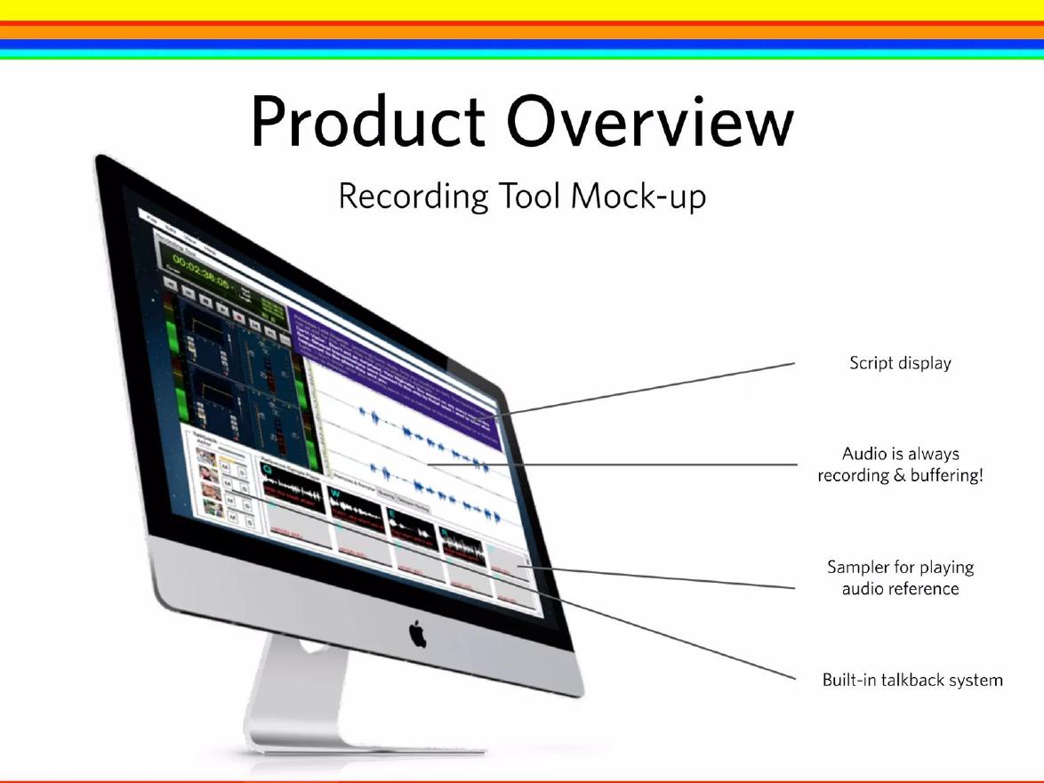
Lollipop Audio product slide — slide 22
Voice recording software. Product overview slide.
Lollipop Audio deck, slide 22. Exact stored slide matched to this analysis.
Our analysis: The status is in the subtitle and each feature is explained.
Evidence and limitation: A labelled design; no build status on the slide.
What a founder can adapt: Add one line on build progress and the next date.
Supporting analysis
What the deck claims: "Product Overview"; "Recording Tool Mock-up"; callouts "Script display", "Audio is always recording & buffering!", "Sampler for playing audio reference", "Built-in talkback system".
Presentation choice: The reader knows what is planned and that it is planned.
When it does not fit: A design whose distance from working is left unstated.
Knowledgehook deck, slide 9. Exact stored slide matched to this analysis.
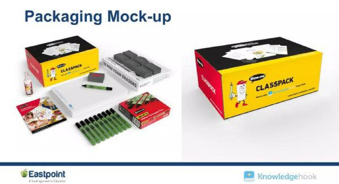
Our analysis: Plain title; the picture shows exactly what a buyer receives.
Evidence and limitation: A labelled mockup; production status and partner role not stated.
What a founder can adapt: Add status and what the named partner has agreed to.
Supporting analysis
What the deck claims: "Packaging Mock-up"; "Classpack" box shown closed and opened with whiteboards, markers and foam erasers; Knowledgehook and Eastpoint logos.
Presentation choice: An investor can judge contents and rough cost from the picture.
When it does not fit: A partner logo with no explanation.
Marketing tool for small businesses. Traction slide.
Oakai Labs deck, slide 5. Exact stored slide matched to this analysis.
Our analysis: Honest about stage, but leaves the traction slide empty.
Evidence and limitation: A statement of stage and plan; no results.
What a founder can adapt: Turn it into stage, next test and date, and add any early signal.
Supporting analysis
What the deck claims: "Since we are still in our mockup/prototyping stage, we have yet to validate our idea, but as we solidify our prototype we will begin reaching out to small businesses locally and in our own network..."
Presentation choice: Saying the stage plainly avoids a surprise later.
When it does not fit: A paragraph where three short lines would do.
InternSource deck, slide 25. Exact stored slide matched to this analysis.
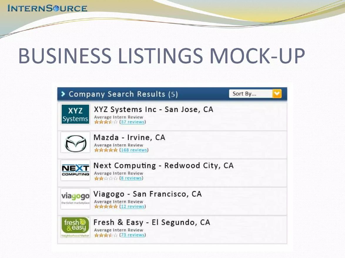
Our analysis: The content looks like data even though the title says mockup.
Evidence and limitation: Labelled as a mockup, but filled with real company names and specific counts.
What a founder can adapt: Use invented names and plainly sample numbers.
Supporting analysis
What the deck claims: "Business Listings Mock-up"; "Company Search Results (5)" listing XYZ Systems, Mazda, Next Computing, Viagogo and Fresh & Easy with star ratings and counts such as "168 reviews".
Presentation choice: The "XYZ Systems" row shows the safer choice.
When it does not fit: Real brands and precise figures inside a design.
Before: Product screen with live-looking customer names and revenue figures, no caption.
After: Same screen captioned "Design, not yet built", with sample names ("Clinic A") and "Today: booking engine live with 3 pilot clinics; dashboard ships in Q3".
What improved: Our illustrative rewrite; the company and figures are invented for the example. It labels the design, removes real-looking data and says what works today.
The question this guide answers
Founders ask whether they can put a mockup or a render in a deck when the product is not built, and how to do it without looking misleading. The product and solution guides in this library cover how to describe what a product does and how to show it working; the roadmap guide covers what will be built when; the milestones guide covers what has been done. None covers the specific job of showing a picture of something that does not yet exist, and making that status clear.
The question matters most at the earliest stage, when a design is often the most concrete thing a team has. A good mockup helps an investor picture the product and judge the team's taste and understanding of the customer. A mockup that is not labelled does the opposite: it raises a question that the founder has to answer in the meeting, often at the worst moment.
How we chose and read the examples
We searched the extracted text of the slide library for "mockup", "mock-up", "concept render", "artist's impression", "for illustrative purposes" and "prototype stage". We removed public-company and mining presentations, where these phrases appear in legal notices, and slides where "mockup" described a product feature (one company sells a mockup tool). We viewed the remaining candidates and kept five slides from five startup decks, each showing a different way of presenting unbuilt work.
Every slide was rendered from the original deck at full size and read in full before we wrote about it. We quote what is visible on each slide. We have not checked whether any product was later built, and we make no claim about the effect of any slide on fundraising.
A labelled mockup with callouts
Lollipop Audio, which makes software for recording voice actors, titles a slide "Product Overview" with the subtitle "Recording Tool Mock-up". The slide shows the design on a desktop monitor, with four callouts: "Script display", "Audio is always recording & buffering!", "Sampler for playing audio reference" and "Built-in talkback system". The deck repeats the pattern for its actor, director and engineer iPad apps on the following slides.
This is the clearest example in the set. The status is in the subtitle, where every reader sees it, not in a footnote. The callouts turn a busy screen into four features an investor can remember, and they describe what the product does rather than what it looks like. A reader leaves knowing both what is planned and that it is planned.
What the slide does not say is how far the build has gone. A line such as "Recording tool: in development, beta with two studios in March" (if true) would tell an investor whether this design is weeks or years from working.
A render with estimated price and specs
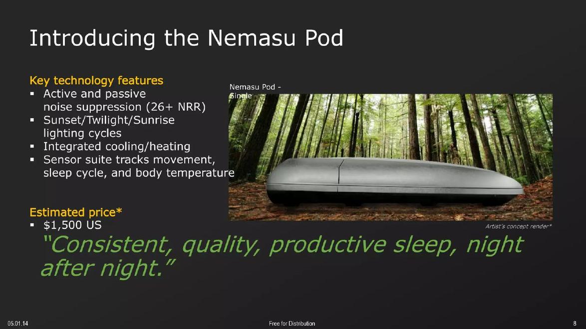
Nemasu, which is designing a sleep pod, titles its slide "Introducing the Nemasu Pod". On the right is a picture of a pod in a forest, captioned "Artist's concept render*". On the left, "Key technology features" lists "Active and passive noise suppression (26+ NRR)", lighting cycles, heating and cooling and a sensor suite, and below that "Estimated price* $1,500 US".
Hardware founders face this problem more than most, because a working unit can take years and a render is cheap. Nemasu labels both the picture and the price, which is the right instinct. The weakness is the asterisks: both point to a note that is not visible on the slide. If the note is elsewhere in the deck, a reader skimming one slide will not find it. Put the explanation next to the asterisk, for example "Estimated price, based on quotes for 1,000 units".
The features list carries the same risk unlabelled. "26+ NRR" is a specific measured figure. If it is a target rather than a test result, the slide should say so.
A mockup of physical packaging
Knowledgehook, an education company, titles a slide "Packaging Mock-up". It shows a "Classpack" box from two angles, one opened to display mini whiteboards, markers, foam erasers and a booklet, with the logos of Knowledgehook and a partner, Eastpoint, along the bottom.
The label is plain and sits in the title. The picture shows exactly what a school would receive, which is the useful part of any packaging mockup: an investor can judge what is in the box and roughly what it might cost to make. The slide does not say whether the box has been produced, priced or ordered by anyone, and the partner logo raises a question it does not answer: has Eastpoint agreed to make or sell it, or is it a proposed partner? One line on status and one on the partner's role would answer both.
Stating the stage in words
Oakai Labs, a marketing tool for small businesses, uses its traction slide for a plain statement: "Since we are still in our mockup/prototyping stage, we have yet to validate our idea, but as we solidify our prototype we will begin reaching out to small businesses locally and in our own network to gather information on their experience with trying to market on their own vs ease of use with the platform itself."
The honesty is useful, and it matches what investors will find out anyway. The slide could be stronger in two ways. First, it is a paragraph where a short list would do: stage, next test, date. Second, it leaves the traction slide empty. At the mockup stage, a founder can still show something: a count of interviews held, a waitlist, a letter from a prospective customer. The waitlist and validation guides in this library cover those.
The mistake: a mockup filled with real brands
InternSource, a site for intern reviews of employers, titles a slide "Business Listings Mock-up". The screen shows "Company Search Results (5)": XYZ Systems, Mazda, Next Computing, Viagogo and Fresh & Easy, each with a city, an "Average Intern Review" star rating and a review count, such as "168 reviews" for Mazda.
The title does say "Mock-up", so the slide is not hiding anything. But the content works against the label. Real company names with specific review counts look like data, and a reader who skims past the title could take them as live listings. Investors also notice when a famous brand appears in a deck, and may ask whether that company is a customer. The placeholder "XYZ Systems" in the first row shows the safer choice: fill mockups with obviously invented names and round, plainly sample numbers, or none at all.
What to put next to a mockup
The examples suggest a short standard. On the slide: the word "mockup", "design", "concept render" or "prototype" in the title or caption, not only in a footnote. Next to it: one line on what exists today, such as "clickable prototype", "working back end, design not built" or "first 20 units hand-made". Then one line on what comes next and when.
Any number shown with a mockup needs its own label. A price is an estimate until someone pays it; a specification is a target until it is measured. Writing "estimated" or "target" next to the figure, with the basis, costs a few words and removes a question from the meeting.
If parts of the product work and parts do not, say which. A single screen that mixes a live dashboard with planned features can carry a small tag per area, such as "live" and "planned".
When a real screenshot is better
Once any part of the product works, show that part as a real screenshot, even if it is less polished than the design. Investors give more weight to something working than to something beautiful. A deck can show both: the real screen labelled "live today" and the design labelled "next release".
Hardware is the exception where a render may stay in the deck longer, because the working unit may look like a lab prototype. In that case show both pictures side by side, with the prototype photo labelled by date, so the investor can see the distance between them.
Common mistakes
No label. Put "mockup" or "render" where every reader sees it.
Real brands in a design. Use invented names.
Unmarked numbers. Estimates and targets need the word and a basis.
Orphan asterisks. Explain them on the same slide.
No current status. Say what works today.
Diagnostic checklist
Every unbuilt picture labelled on the slide.
One line on what exists today.
One line on what comes next, with a date.
Prices and specs marked estimate or target.
No real brands or real-looking figures in designs.
Frequently asked questions
Is it acceptable to raise money with only mockups?
Yes, at the earliest stage many companies do. Investors judge the team and the plan; the mockup shows how well the founders understand the customer.
Should I use a polished render or a rough prototype photo?
Use both if you have both, each labelled. The render shows the goal and the prototype photo shows progress.
Where should the label go?
In the title, subtitle or picture caption. Footnotes are missed by readers skimming one slide.
How we chose these examples
Corpus: published pitch deck teardowns on StartupFundraising.com. Founder-uploaded private decks are excluded.
Selection (2026-10-01): we searched extracted slide text for mockup, mock-up, concept render, artist's impression and prototype-stage wording, excluded public-company and mining presentations and product-feature uses, and kept five slides from five startup decks that each show a distinct way of presenting unbuilt work.
Review: all five slides were rendered from the source decks at full size on 2026-10-01 and read in full against company, deck and page number (editorial model review, with AI assistance in drafting). No person has yet completed an editorial review of this page. We did not check whether any product was later built.