Pitch Deck Product Slides: Real Examples and What Works
How real startups show the product in a pitch deck: customer journeys, operator flows, multi-role diagrams and technical steps.
Pitch Deck Product Slides: Real Examples and What Works
Seven product slides from real decks, shown in full, compare the main ways founders let an investor see the product working without a live demo.
TL;DR
A product slide should let an investor picture one real use of the product from start to finish: who does what, what the company does behind the scenes, and what the user ends up with. The examples below do this with a numbered customer journey, an end-to-end operational flow, a map of each user role, or a short technical sequence. The common failure is showing steps that only restate the solution slide, or steps with no indication of what the user actually sees.
Product slides from real pitch decks
Each example shows the exact stored slide above its analysis and links to the full teardown. Claims and figures are the companies' own; we have not verified them. Stage and year are not recorded in our collection for these decks unless stated, and we do not guess them.
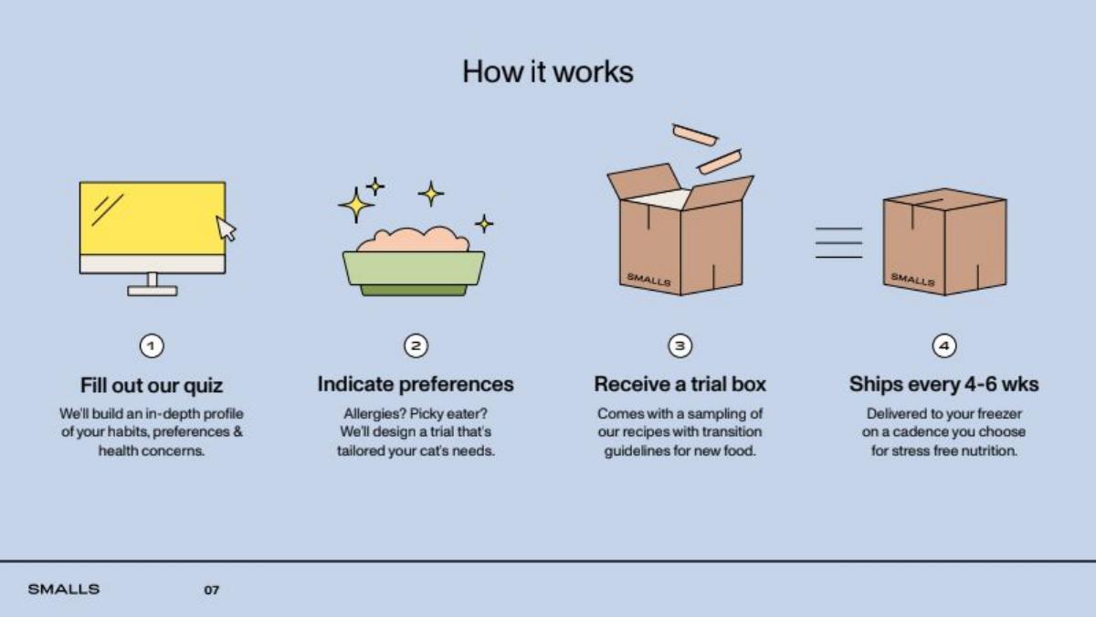
Smalls product slide — slide 6
Fresh cat food sold by subscription. Stage and year not recorded; the slide footer shows page 07 of the deck.
Smalls deck, slide 6. Exact stored slide matched to this analysis.
Our analysis: The fourth step is the important one: it shows the recurring shipment, so an investor sees retention built into the product rather than a one-off sale. Each step is short enough to read in a sent deck.
Evidence and limitation: Icons explain the process but do not show the product. "Stress free nutrition" is a claim, and nothing indicates how many customers pass from trial to subscription; that belongs on traction.
What a founder can adapt: End your sequence on the step that repeats or expands, because that is where the business model lives.
Supporting analysis
What the deck claims: "How it works" in four numbered steps with icons: fill out our quiz (an in-depth profile of habits, preferences and health concerns), indicate preferences (allergies, picky eater), receive a trial box (a sampling of recipes with transition guidelines), and ships every 4–6 weeks, delivered to your freezer on a cadence you choose.
Presentation choice: The fourth step is the important one: it shows the recurring shipment, so an investor sees retention built into the product rather than a one-off sale. Each step is short enough to read in a sent deck.
When it does not fit: Icons explain the process but do not show the product. "Stress free nutrition" is a claim, and nothing indicates how many customers pass from trial to subscription; that belongs on traction.
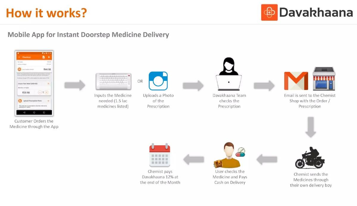
Mobile app for doorstep medicine delivery in India. Stage and year not recorded.
Davakhaana deck, slide 4. Exact stored slide matched to this analysis.
Our analysis: This is the most complete slide here. It shows the real app screen, the regulated step (prescription check), who delivers, how the customer pays, and how the company earns. An investor can see an asset-light model inside the flow.
Evidence and limitation: Eight small icons with tiny captions are hard to read on a laptop and nearly impossible on a phone. Delivery speed ("instant") is not supported anywhere on the slide.
What a founder can adapt: If your operations matter, draw the whole loop including who handles money and when. Label the step where you add value.
Supporting analysis
What the deck claims: "How it works? Mobile App for Instant Doorstep Medicine Delivery". A flow starts with an app screenshot: the customer types the medicine needed (1.5 lac, i.e. 150,000, medicines listed) or uploads a prescription photo; the Davakhaana team checks the prescription; an email goes to the chemist shop; the chemist sends the medicine with its own delivery boy; the user checks it and pays cash on delivery; the chemist pays Davakhaana 12% at the end of the month.
Presentation choice: This is the most complete slide here. It shows the real app screen, the regulated step (prescription check), who delivers, how the customer pays, and how the company earns. An investor can see an asset-light model inside the flow.
When it does not fit: Eight small icons with tiny captions are hard to read on a laptop and nearly impossible on a phone. Delivery speed ("instant") is not supported anywhere on the slide.
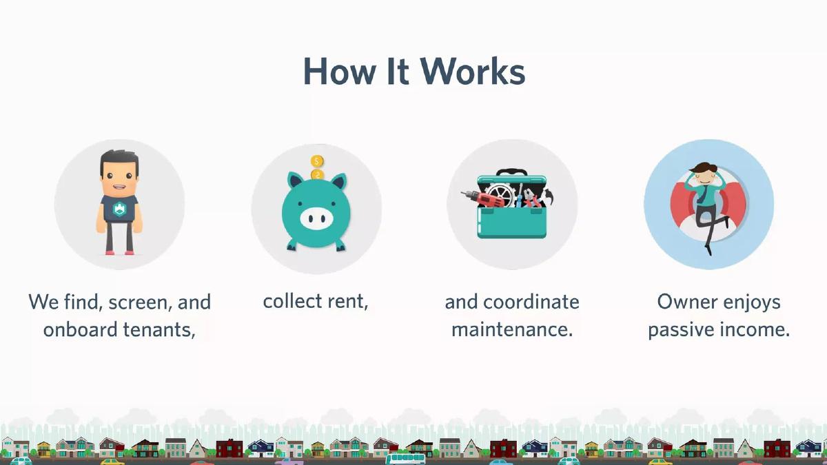
Property management for individual landlords. Stage and year not recorded.
Castle deck, slide 5. Exact stored slide matched to this analysis.
Our analysis: The whole service fits in one readable sentence, and splitting it under four pictures makes the slide skimmable. For a service business, stating what the company takes off the customer's plate is the product.
Evidence and limitation: Cartoons show nothing about how Castle does the work: no app, no process, no sign of what makes it cheaper or better than a traditional property manager. Add one operational detail or screen.
What a founder can adapt: If you sell a service, write it as one sentence of verbs you perform, ending with what the customer gets.
Supporting analysis
What the deck claims: "How It Works" as one sentence spread across four illustrations: "We find, screen, and onboard tenants, collect rent, and coordinate maintenance. Owner enjoys passive income."
Presentation choice: The whole service fits in one readable sentence, and splitting it under four pictures makes the slide skimmable. For a service business, stating what the company takes off the customer's plate is the product.
When it does not fit: Cartoons show nothing about how Castle does the work: no app, no process, no sign of what makes it cheaper or better than a traditional property manager. Add one operational detail or screen.
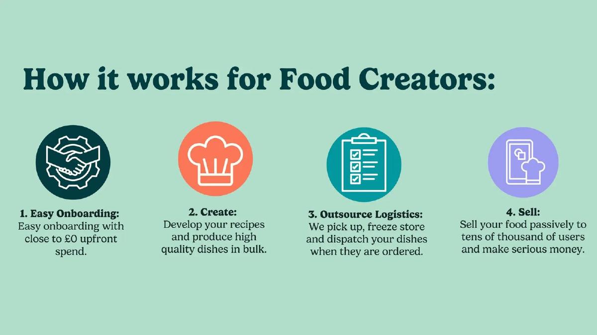
Marketplace for home-cooked frozen meals, UK. The teardown's deck is titled around a £3.2M raise; we have not verified that amount.
HomeCooks deck, slide 5. Exact stored slide matched to this analysis.
Our analysis: A marketplace's hardest side is often supply. Giving the food creators their own slide shows what HomeCooks handles for them (logistics) and why a cook would join, which is the question behind supply growth.
Evidence and limitation: "Tens of thousands of users" and "serious money" are unsupported on the slide. If you have figures, use them with dates; if not, drop the promise.
What a founder can adapt: In a marketplace, give the harder side its own flow and make clear which steps you absorb for them.
Supporting analysis
What the deck claims: "How it works for Food Creators": 1. Easy onboarding with close to £0 upfront spend; 2. Create: develop recipes and produce high-quality dishes in bulk; 3. Outsource logistics: "We pick up, freeze, store and dispatch your dishes when they are ordered"; 4. Sell passively to tens of thousands of users and make serious money.
Presentation choice: A marketplace's hardest side is often supply. Giving the food creators their own slide shows what HomeCooks handles for them (logistics) and why a cook would join, which is the question behind supply growth.
When it does not fit: "Tens of thousands of users" and "serious money" are unsupported on the slide. If you have figures, use them with dates; if not, drop the promise.
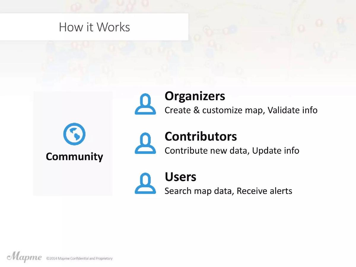
Mapme deck, slide 6. Exact stored slide matched to this analysis.
Our analysis: When a product has several kinds of user, a role list is clearer than a single flow. Each line is one verb phrase, so the reader understands who creates value and who consumes it.
Evidence and limitation: The slide does not say which role pays or how the community starts, and it shows no product screen, although the product is itself visual. A map screenshot would do more than the icons.
What a founder can adapt: List each role with the one thing it does, and say which role pays or is the growth driver.
Supporting analysis
What the deck claims: "How it Works" with one hub, "Community", and three roles: organizers create and customise the map and validate information; contributors add new data and update information; users search map data and receive alerts.
Presentation choice: When a product has several kinds of user, a role list is clearer than a single flow. Each line is one verb phrase, so the reader understands who creates value and who consumes it.
When it does not fit: The slide does not say which role pays or how the community starts, and it shows no product screen, although the product is itself visual. A map screenshot would do more than the icons.
Chatbot that prepares immigration applications. Stage and year not recorded.
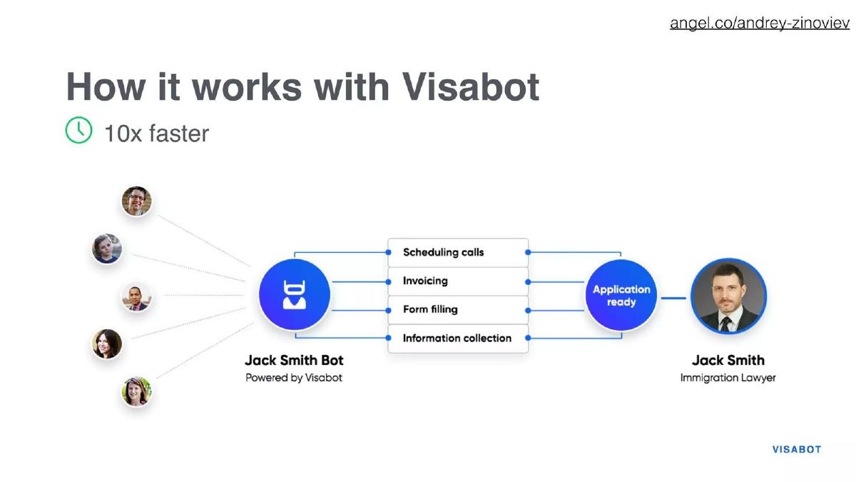
Visabot deck, slide 6. Exact stored slide matched to this analysis.
Our analysis: It shows the product's place clearly: between many clients and one professional, taking over the admin. Naming the bot after the lawyer signals a white-label product sold to lawyers, not to applicants.
Evidence and limitation: "10x faster" has no baseline or method. The slide also leaves the buyer implicit; state whether lawyers or applicants pay.
What a founder can adapt: If your product sits in someone's workflow, draw the before and after positions of the people involved and list the tasks you take over.
Supporting analysis
What the deck claims: "How it works with Visabot" with a "10x faster" label. A diagram shows several applicants connecting to "Jack Smith Bot, powered by Visabot", which handles scheduling calls, invoicing, form filling and information collection, before an "Application ready" hand-off to Jack Smith, immigration lawyer.
Presentation choice: It shows the product's place clearly: between many clients and one professional, taking over the admin. Naming the bot after the lawyer signals a white-label product sold to lawyers, not to applicants.
When it does not fit: "10x faster" has no baseline or method. The slide also leaves the buyer implicit; state whether lawyers or applicants pay.
API that detects bots and automated abuse on websites. Stage and year not recorded.
Quarantyne deck, slide 6. Exact stored slide matched to this analysis.
Our analysis: For a developer product, integration is the product experience. The three steps also show the go-to-market: free detection first, paid blocking later, so the growing circles double as an upgrade path.
Evidence and limitation: Text-only steps with decorative circles show neither the dashboard nor any detection result. A screenshot of a report would prove the classifier exists.
What a founder can adapt: For infrastructure or API products, show integration, what the customer learns, and the paid action. Make the free-to-paid step explicit.
Supporting analysis
What the deck claims: "How it Works" in three steps along a timeline of growing circles: 1. customers call a free passive API with web visitor metadata (HTTP headers, IP, URL); 2. a classifier identifies known abuse vectors and automation patterns, and offending traffic is reported in a web dashboard; 3. customers can upgrade to a paid, active API to block automation and abuse.
Presentation choice: For a developer product, integration is the product experience. The three steps also show the go-to-market: free detection first, paid blocking later, so the growing circles double as an upgrade path.
When it does not fit: Text-only steps with decorative circles show neither the dashboard nor any detection result. A screenshot of a report would prove the classifier exists.
Choose by what an investor most needs to see: the customer's experience, your operations, the roles in a network, or the integration path.
Approach
Best when
What it needs
Main risk
Examples
Numbered customer journey
Consumer or subscription products
3–4 user steps ending on the repeat purchase
Icons instead of the real product
Smalls; Castle
End-to-end operational flow
Services and marketplaces with physical fulfilment
Every actor, the money flow and your value-add step
Too many small steps to read
Davakhaana
Role map or supply-side flow
Multi-sided products and communities
One line per role, and who pays
Leaves the paying role unclear
Mapme; HomeCooks
Workflow position or integration steps
B2B tools, bots and APIs
Where the product sits and the free-to-paid step
Unsupported speed claims; no screen
Visabot; Quarantyne
Key Takeaways
Number the steps from the user's side. Smalls' four steps (quiz, preferences, trial box, recurring shipment) show both how a customer starts and how the subscription repeats, which is the part an investor cares about.
Show the work the company does, not just the app. Davakhaana's flow includes the prescription check, the chemist, the delivery and the 12% payment, so the business model is visible inside the product flow.
For multi-sided products, give each role one line. Mapme separates organizers, contributors and users; HomeCooks shows the supply side's journey on its own slide. Neither tries to fit every side into one diagram.
Pair the flow with a real screen when you have one. Only Davakhaana includes an app screenshot; Castle, Smalls and Quarantyne rely on icons or text, which explains the process but not what the product looks like.
Keep claims out of the step labels. Visabot's "10x faster" and HomeCooks' "make serious money" are the companies' assertions with no method on the slide; move proof to traction or state how it was measured.
Plan your product slide in four lines
Write these before you design. If you cannot fill one, that is what the slide is missing.
User and trigger. Who starts using the product, and what makes them start?
Steps. The three or four things that happen next, written from that user's side. Mark the step you perform.
Outcome and repeat. What the user ends with, and what makes them come back or pay again.
Real screen. Which one screenshot or photo proves the product exists? If none exists yet, say what stage it is at.
Copyable framework: [User] starts when [trigger]. Step 1: [action] → Step 2: [what we do] → Step 3: [result]. They return because [repeat]. Screen: [screenshot of the key step].
Illustrative example 1 — written by us
Before: Seamless end-to-end platform powered by AI for effortless results.
After: A [landlord] lists a unit in two minutes → we screen applicants and collect rent → they receive a monthly payout statement. Screen: [payout statement].
What improved: Our illustrative rewrite, not any company's text. It swaps adjectives for a user, three actions and a real screen; bracketed values are placeholders.
What the product slide has to do
The solution slide says what you do about the problem; Sequoia's business-plan outline frames that section around why the value proposition is unique and compelling. The product slide then shows the product happening, so an investor can judge whether it is real and whether the founder understands the user's experience. That second part is our editorial view, not Sequoia's wording.
That makes the product slide the place for concrete sequence and real interfaces, not for market size, team or pricing tables. If you only have one slide for both, keep the solution headline and use the body for the flow. (Sequoia Capital)
Common mistakes
Repeating the solution slide. If the product slide says the same sentence as the solution slide, the investor learns nothing new. Show sequence and screens.
Icons instead of the product. Illustrations explain a process; they do not prove a product exists. Add one real screen when you have it.
Unreadable detail. Eight tiny captions work in a live pitch but not in a sent deck. Cut to the steps an investor must remember.
Claims inside step labels. "10x faster" or "serious money" in a flow looks like fact. Move numbers to traction with a method.
Hiding who pays. Multi-sided flows should mark the paying role and the moment money changes hands.
Diagnostic checklist
One user, one start-to-finish use of the product.
Steps are written from the user's side, with your step clearly marked.
The flow ends on the outcome or the repeat purchase.
At least one real screenshot or photo, or an honest note on product stage.
For multi-sided products, each role has one line and the paying role is clear.
No unsupported speed, savings or earnings claims.
Readable on a laptop without zooming.
Frequently asked questions
How we chose these examples
Corpus: published pitch deck teardowns on StartupFundraising.com. Founder-uploaded private decks are excluded.
Selection (2026-09-24): we searched extracted slide text for slides 3–6 beginning with "product" or "how it works" that also have a stored slide image, inspected eight candidates, and chose seven that show distinct approaches across consumer subscription, health, property, marketplace, community, legal-tech and developer products. Improvado was excluded because it already appears in our solution-slide guide.
Review: all seven stored slide images were inspected on 2026-09-24 and matched to company, deck and slide number (editorial model review). No person has yet completed an editorial review of this page.
Figures and claims are the companies' own; we have not verified them. Stage and year are not recorded in our collection for these decks; dates shown come only from the slides themselves.
We make no claim that any product slide caused a fundraising outcome.