Who Actually Uses Your Product? Showing Your User Mix
"80% of users are students", "22% are senior execs", "60% of buyers are not trying to conceive".
User Mix on a Pitch Deck: Show Who Actually Uses It and Whether That Matches Your Target
Most decks describe the customer the founders are aiming for. Fewer show who is actually using the product today, and fewer still say whether the two match. That gap matters: an investor who sees a target persona on one slide and a different set of real users in the data will ask which one the plan is built on. This guide uses four real slides that break down current users or customers, by occupation, seniority, industry or reason for buying, to show how to present your user mix and what to say when it surprises you.
TL;DR
Show the share of current users in each group that matters to your plan, say how you know (sign-up form, payment data, survey), and say plainly whether that mix matches the target on your customer slide. Tilly is the most useful example: its fertility-tracking deck reports that "60% of buyers are not actively trying to conceive", which tells investors the test products are reaching people outside the core target. LinkedIn's "22% of users are CxOs/senior execs" turns a user count into a quality claim. Give the base number behind each percentage, and if the mix differs from your target, say whether you will follow the users or steer back to the target.
Four slides that break down current users, read in full
Each slide was rendered from the original deck at full size and read in full; Juro's labels were enlarged. No user figure was checked against outside records.
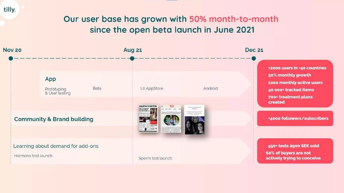
Tilly customer slide — slide 8
Fertility tracking app with add-on home tests. Growth timeline slide.
Tilly deck, slide 8. Exact stored slide matched to this analysis.
Our analysis: A surprising mix put on the slide honestly, without the founders' reading.
Evidence and limitation: Buyer mix that differs from the app's natural target, shown under a learning heading; base and method not stated; no conclusion drawn.
What a founder can adapt: Give the number of buyers, how intent was recorded, and what Tilly will do about the second group.
Supporting analysis
What the deck claims: "Learning about demand for add-ons"; "450+ tests à900 SEK sold"; "60% of buyers are not actively trying to conceive"; "+2000 users in +40 countries"; "1200 monthly active users".
Presentation choice: Shows the most useful kind of breakdown: one that tests the target.
When it does not fit: Leaving the investor to decide what a surprising share means.
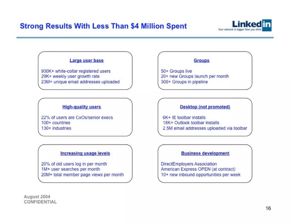
Professional network. August 2004 deck; results slide.
LinkedIn deck, slide 16. Exact stored slide matched to this analysis.
Our analysis: User mix used as a claim about the network's value.
Evidence and limitation: Seniority share with a total base on the same slide; definition and source of seniority not stated.
What a founder can adapt: Name the source (self-reported titles) and list the top industries by share.
Supporting analysis
What the deck claims: "High-quality users": "22% of users are CxOs/senior execs", "100+ countries", "130+ industries"; "930K+ white-collar registered users".
Presentation choice: Shows how a share turns a user count into a quality claim.
When it does not fit: Spread figures ("100+ countries") in place of concentration.
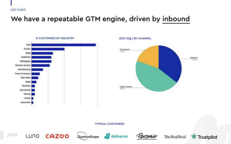
Contract software. Use cases slide with 2021 lead data.
Juro deck, slide 8. Exact stored slide matched to this analysis.
Our analysis: Good shape, missing numbers.
Evidence and limitation: Clear industry ranking with no values on bars or axis; headline about channels, not industries.
What a founder can adapt: Label each bar with a count or share and give the total customer number.
Supporting analysis
What the deck claims: "We have a repeatable GTM engine, driven by inbound"; "# CUSTOMERS BY INDUSTRY" (SaaS, FinTech, Retail ... Automotive); "2021 SQLs BY CHANNEL" (organic inbound about 45%, outbound about 35%, paid inbound about 20%); typical customer logos.
Presentation choice: Shows why a breakdown needs values, not just bar lengths.
When it does not fit: An unnumbered bar chart titled with "#".
Kibin deck, slide 9. Exact stored slide matched to this analysis.
Our analysis: A short confirmation of the target, which is enough when the target is obvious.
Evidence and limitation: One line confirming the target; unclear whether the share is of all or paid users; method and the other 20% not described.
What a founder can adapt: Say which base the 80% uses and who the other 20% are.
Supporting analysis
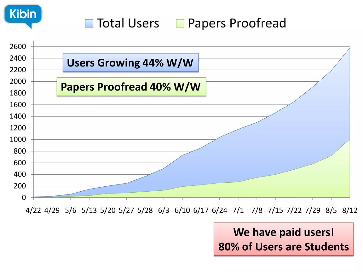
What the deck claims: "Total Users" rising to about 2,600 by 8/12; "Users Growing 44% W/W"; "Papers Proofread 40% W/W"; "We have paid users! 80% of Users are Students".
Presentation choice: Shows the minimum useful version of a user mix.
When it does not fit: Mixing a paid-user claim and a user-mix share in one line.
The split used, whether a base and method are given, and whether the mix is compared with the target.
Example
Split by
Base given
Method stated
Compared with target
Tilly
Reason for buying
Partly (tests, not buyers)
No
Implicitly; no conclusion
LinkedIn
Seniority
Yes (930K)
No
Used as quality claim
Juro
Industry
No
No
No
Kibin
Occupation
Partly (chart total)
No
Confirms obvious target
Key Takeaways
Show who uses the product today, not only who you plan to sell to.
Give a share for each group that matters, and the base it is a share of.
Say how the data was collected: self-reported, payment records or survey.
State whether the actual mix matches your target customer.
If it differs, say which way you will go and why.
Present your current user mix
Answer these before adding a user breakdown to your deck.
Split. Which one or two ways of splitting users would change your plan if the result were different?
Share and base. What share is each group, and of how many users or customers?
Method. Where does the data come from: sign-up form, payment records, survey or inference?
Target. Does the mix match the target on your customer slide?
Decision. If not, will you follow the users, steer back, or test both?
Copyable framework: "[Share]% of our [base] [users/customers] are [group] ([source]). Our target is [target]; this [confirms it / shows a second group], so we will [decision]."
Illustrative example 1 — written by us
Before: "60% of buyers are not actively trying to conceive."
After: "60% of our 380 test buyers are not yet trying to conceive (checkout question, 2021). We will market tests to them as a separate entry point to the app."
What improved: Our illustrative rewrite; the buyer count and method are invented for the example. It adds a base, a method and the founders' decision.
The question this guide answers
Founders often ask how to show their user base on a deck beyond a single total. Our customer guides cover how to describe a target customer or persona, and how to separate the person who uses a product from the person who pays. Our traction guides cover growth, retention and the source of each metric. None answers this specific question: how to present the breakdown of people already using the product, and what to do when that breakdown differs from the target described elsewhere in the deck.
The question matters because a breakdown of current users is evidence, while a target persona is a plan. An investor can check the first against the second. When the evidence supports the plan, the deck is stronger for showing it. When it does not, the founders are better off saying so than leaving the investor to notice.
How we chose and read the examples
We searched saved slide text in the teardown library for slides that state what share of users or customers belong to a group ("% of users are", "% of buyers are", "customers by industry"). We left out listed-company presentations and slides where the share described the market rather than the company's own users. We kept four slides that break down their own users in four different ways: by reason for buying, by seniority, by industry and by occupation.
The examples are Tilly (fertility tracking app with add-on home tests, deck covering November 2020 to December 2021), LinkedIn (professional network, August 2004 deck), Juro (contract software, deck with 2021 sales data) and Kibin (essay proofreading, early traction deck). Each slide was rendered from the original deck at full size and read in full. Juro's chart labels are small in the source file, so we enlarged them; its pie-chart percentages remain slightly blurred and we give them as approximate. We did not check any company's user data against outside records.
A mix that differs from the target: Tilly
Tilly's slide 8 is headed "Our user base has grown with 50% month-to-month since the open beta launch in June 2021". A timeline from "Nov 20" to "Dec 21" runs across three rows: the app, community and brand building, and "Learning about demand for add-ons", which shows a "Hormone test launch" and a "Sperm test launch". The results box for the add-ons row reads: "450+ tests à900 SEK sold" and "60% of buyers are not actively trying to conceive". Other boxes report "+2000 users in +40 countries", "1200 monthly active users" and "700+ treatment plans created".
The 60% line is the most interesting fact on the slide. A fertility app's natural target is people trying to conceive, yet most buyers of its tests are not. That could mean a wider market for hormone and sperm testing than the app itself serves, or it could mean the tests are pulling in buyers who will never use the core product. Either reading matters to an investor, and Tilly deserves credit for putting it on the slide under a heading about learning.
What the slide does not do is say what Tilly concluded. It does not say how many buyers the 60% is drawn from (450 tests is a count of tests, not of buyers), how buyers' intentions were recorded, or whether the company will build for this second group. One added line would complete the point: "Most test buyers are checking fertility before trying to conceive; we will market tests to them as a separate entry point."
A mix used as a quality claim: LinkedIn
LinkedIn's slide 16, "Strong Results With Less Than $4 Million Spent", has six boxes. One, headed "High-quality users", reads: "22% of users are CxOs/senior execs", "100+ countries", "130+ industries". Another, "Large user base", reads: "930K+ white-collar registered users", "29K+ weekly user growth rate" and "23M+ unique email addresses uploaded". The slide is dated "August 2004".
Here the breakdown does a specific job. A professional network is worth more if its members are people others want to reach, so the share of senior executives is a claim about the value of the network, not just its size. Pairing it with the total gives the reader a base: 22% of 930,000 is roughly 205,000 senior people, a number that matters to recruiters and advertisers.
The limits are about definition. The slide does not say what counts as a senior executive or how it was measured; on a network where members describe themselves, the figure is presumably based on job titles users entered. "100+ countries" and "130+ industries" describe spread, not concentration, and say nothing about which countries or industries hold most users. A stronger version would name the source ("self-reported job titles") and the top two or three industries by share.
A mix by industry: Juro
Juro's slide 8, labelled "USE CASES", is headed "We have a repeatable GTM engine, driven by inbound". On the left, a bar chart titled "# CUSTOMERS BY INDUSTRY" lists fifteen industries from SaaS (the longest bar, by a wide margin) through FinTech, Retail, Healthcare, Marketplace and Business services down to Charity and Automotive. On the right, a pie chart titled "2021 SQLs BY CHANNEL" splits sales-qualified leads into organic inbound (about 45%), outbound (about 35%) and paid inbound (about 20%). Logos of "TYPICAL CUSTOMERS" run along the bottom, including Deliveroo, Personio and Trustpilot.
The industry chart tells a clear story at a glance: Juro's customers are concentrated in software and finance companies, with a long tail elsewhere. For a contract tool that is useful, because it shows which sales teams to hire and which content to write.
The weakness is that the chart has no numbers. The title says "# customers", but there are no values on the bars or the axis, so the reader cannot tell whether SaaS is 30 customers or 300, or what share of the total it is. The headline also claims a repeatable engine "driven by inbound", but the pie chart is about leads by channel, not about which industries buy. The two charts sit side by side without being connected. Adding the count or share to each bar, and the total customer number, would turn the chart into evidence.
A single-line mix: Kibin
Kibin's slide 9 is a chart of "Total Users" and "Papers Proofread" from 4/22 to 8/12, rising to about 2,600 users and about 1,000 papers. Two callouts read "Users Growing 44% W/W" and "Papers Proofread 40% W/W". A box at the bottom right reads: "We have paid users! 80% of Users are Students".
One line is enough here, because the target is obvious: an essay proofreading service is built for students, and the line confirms that the people signing up are the people the product is for. A mix that confirms the target can be short.
The line still leaves questions. It does not say whether the 80% applies to all users or to paid users, which are mentioned in the same box but not counted. It does not say how student status was known. And it does not say who the other 20% are, which might be the more interesting fact (non-native speakers, job applicants, academics). A founder writing this today could add: "80% of 2,600 users are students (sign-up form); the other 20% are mostly job seekers."
What to show and how
Choose the one or two ways of splitting users that bear on your plan. For a consumer product that might be age, occupation or reason for buying; for business software, industry, company size or the buyer's role. Do not split by everything you can measure; a breakdown is useful only if a different result would change the plan.
Give each share with its base. "22% of 930K users" is checkable; "22% of users" is not, and a share of a small base (say, 50 users) means much less than the same share of 50,000. Say where the data comes from. Self-reported sign-up fields, payment records, surveys and inferred data (for example, from email domains) differ in reliability, and the investor will ask.
Put the mix next to your target. If your customer slide says "HR managers at companies with 50 to 500 staff" and your data shows most users are at companies under 50, say so and say what it means. The examples show the range: Kibin's users confirm the target, LinkedIn's support a quality claim, and Tilly's reveal a second group the founders had not planned for.
When the mix surprises you
A surprising user mix is not a weakness to hide. Many companies find their first real market among people they did not plan for. What investors want to know is whether the founders noticed and what they will do. There are three honest answers: follow the users (change the target to match the data), steer back (keep the target and explain why early users are unrepresentative), or test both (run a small experiment and report back).
Whatever the answer, put it on the slide. Tilly's slide shows the evidence but stops short of the conclusion, which leaves the investor to choose a reading. One sentence of interpretation removes the guesswork and shows the founders are using their data.
What these examples can and cannot show
These four slides show different ways to present a breakdown of current users. They do not show how investors responded, and we cannot verify any company's figures or how they were collected. Where we suggest how a figure was probably measured, we say so; none of the slides states its method.
The lesson is about presentation and honesty, not about which user mix is best. A breakdown that confirms the target is useful; one that contradicts it can be more useful, provided the founders say what it means.
Common mistakes
Share without a base. Say how many users the percentage is of.
No method. Say whether the data is self-reported, from payments or from a survey.
Unnumbered charts. Put a value on every bar.
Target and users never compared. Say whether the mix matches your customer slide.
Surprise without a decision. Say what you will do about an unexpected group.
Diagnostic checklist
One or two splits that matter.
Each share has a base.
Data source stated.
Mix compared with target.
Decision stated if they differ.
Frequently asked questions
Should I show user demographics on my pitch deck?
Show the split that bears on your plan, such as occupation, industry or reason for buying, with shares and a base.
What if my users are not my target customer?
Say so, and say whether you will follow the users, steer back to the target, or test both.
Is self-reported data good enough?
It is common and acceptable if you say it is self-reported. Payment or usage data is stronger where you have it.
Where should the user mix go in the deck?
Next to traction or the customer slide, so investors can compare real users with the target.
How we chose these examples
Corpus: published pitch deck teardowns on StartupFundraising.com. Founder-uploaded private decks are excluded.
Selection (2026-10-01): we searched extracted slide text for statements of the share of a company's own users or customers in a group, excluded listed-company presentations and market statistics, and kept four slides splitting users four different ways.
Review: the four slides were rendered from the source decks at full size on 2026-10-01 and read in full against company, deck and page number; Juro's chart labels were enlarged at higher resolution (editorial model review, with AI assistance in drafting). No user figure was checked against outside records. No person has yet completed a human editorial review of this draft.