Cumulative or Monthly Chart on a Traction Slide: Which
Should a pitch deck traction chart show cumulative totals or new figures per month?
Cumulative or Per-Period Chart: Show Momentum, Not Just a Line That Can Only Go Up
A cumulative chart adds every new user, order or signup to the total before it, so the line can never go down. That makes it look good and tells an investor little about whether growth is speeding up or slowing down. A per-period chart, showing what was added or used each week or month, shows momentum, including the bad months. This guide uses three real slides to show what each chart proves, what a cumulative line can hide, and when to show both.
TL;DR
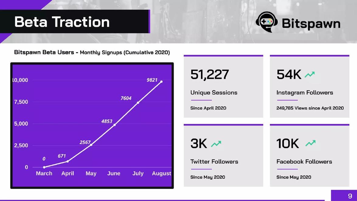
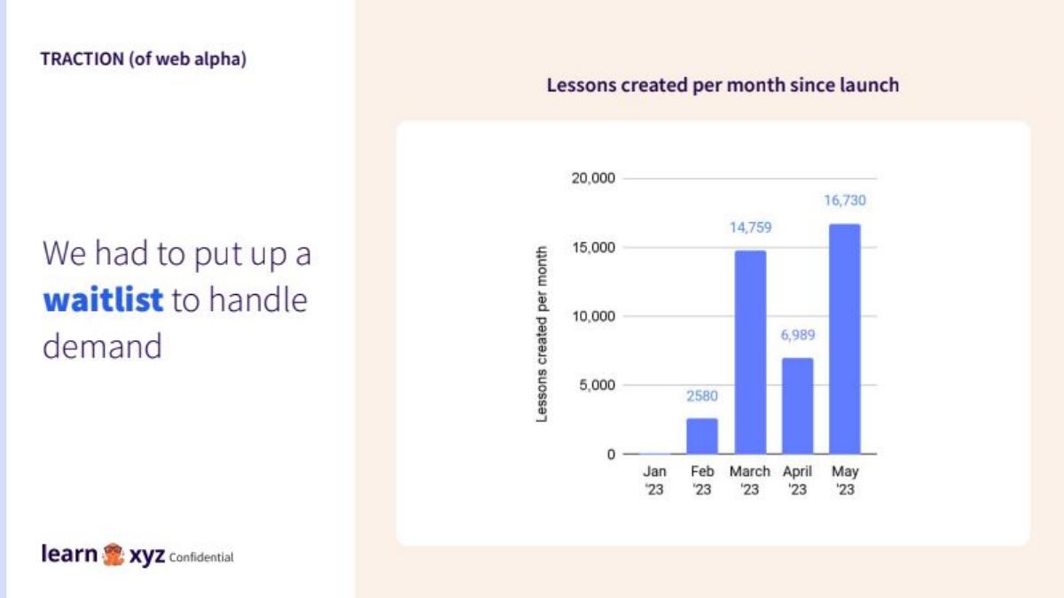
Lead with a per-period chart (new or active per week or month) because it shows whether growth is accelerating. Use a cumulative total only as a reach figure, labelled as cumulative, beside a per-period or active measure. Bitspawn's cumulative signup line rises every month, but the monthly additions behind it fell from 2,751 in July to 2,217 in August, which the chart hides. Learn XYZ's per-period bars show the opposite honesty: a drop from 14,759 lessons in March to 6,989 in April, then 16,730 in May. Accurx pairs both: weekly active users on the left, cumulative patients messaged on the right.
Three traction charts and what each choice shows, read in full
Each slide was rendered from the original deck at full size, with small chart labels enlarged before reading. We calculated Bitspawn's monthly additions and Learn XYZ's running total from the chart labels; we did not check any figure against the companies' own data.
Bitspawn traction slide — slide 9
Esports tournament platform. Beta traction slide.
Bitspawn deck, slide 9. Exact stored slide matched to this analysis.
Our analysis: A cumulative line that rises every month while monthly signups fell in August.
Evidence and limitation: Chart labelled cumulative. Monthly additions calculated from the labels: 671, 1,896, 2,286, 2,751, 2,217.
What a founder can adapt: Show monthly bars and annotate the August dip with its cause.
Supporting analysis
What the deck claims: "Beta Traction"; "Bitspawn Beta Users - Monthly Signups (Cumulative 2020)": March 0, April 671, May 2567, June 4853, July 7604, August 9821; "51,227 Unique Sessions Since April 2020"; "54K Instagram Followers"; "3K Twitter Followers Since May 2020"; "10K Facebook Followers Since May 2020".
Presentation choice: Shows how a running total can hide slowing growth.
When it does not fit: Relying on a cumulative line as the only momentum evidence.
AI lesson-creation product. Web alpha traction slide.
Learn XYZ deck, slide 7. Exact stored slide matched to this analysis.
Our analysis: A per-period chart that shows momentum honestly, including a dip it does not explain.
Evidence and limitation: Per-month bars show a fall of more than half in April, then a new high in May. A cumulative chart would have read about 41,100 by May and hidden the dip.
What a founder can adapt: Annotate the April bar, and add a user count beside lessons created.
Supporting analysis
What the deck claims: "TRACTION (of web alpha)"; "We had to put up a waitlist to handle demand"; "Lessons created per month since launch": Feb '23 2580, March 14,759, April 6,989, May 16,730.
Presentation choice: Shows what a per-period chart reveals that a cumulative one would not.
When it does not fit: Leaving a visible dip unexplained next to a demand claim.
UK messaging tool for GP practices. Traction slide.
Accurx deck, slide 15. Exact stored slide matched to this analysis.
Our analysis: The pairing done well: momentum on one chart, reach on the other.
Evidence and limitation: Active measure and cumulative reach shown side by side, each labelled. 130k matches the chart; the 60% claim's population base is not stated.
What a founder can adapt: Label a few midpoints, annotate the step in weekly users, and state the population base.
Supporting analysis
What the deck claims: "We're used in 96% of GP practices in the UK, by 130k staff each week and have messaged over 60% of the population..."; "Weekly active users" August 2019 to May 2021, ending 130,383; "Cumulative unique patients messaged", ending 36,243,706.
Presentation choice: Shows how to use a cumulative figure without letting it stand in for momentum.
When it does not fit: Headline percentages without a stated base.
Whether each chart is cumulative or per-period, whether it is labelled, whether a dip is visible, and whether reach and momentum are separated.
Example
Chart type
Labelled as such
Slowdown or dip visible
Reach and momentum separated
Bitspawn
Cumulative
Yes
No, only by calculation
No
Learn XYZ
Per month
Yes
Yes, unexplained
No reach figure
Accurx
Weekly active plus cumulative
Yes, both
Active chart can show it
Yes
Key Takeaways
A cumulative line can only rise, so it cannot show slowing growth.
Per-period charts show momentum, including dips.
Label cumulative charts clearly as cumulative.
Pair a cumulative reach figure with an active or per-period figure.
Explain any dip rather than hiding it in a running total.
Choose and label your traction chart
Answer each prompt for the main chart on your traction slide.
Measure. Is this chart cumulative, per period or active?
Differences. If cumulative, what are the per-period differences, and do they rise or fall?
Period. Does the period (week, month, quarter) match how your business moves?
Pair. Which reach or momentum figure should sit beside it?
Annotations. Which steps or dips need a short factual note?
Copyable framework: [Measure] per [period], [start] to [end]; [cumulative total] since [date]. [Note on any dip.]
Illustrative example 1 — written by us
Before: A single cumulative line titled "Users" rising from 0 to 10,000.
After: Monthly new users as bars (1,200, 1,900, 2,300, 2,100), titled "New users per month", with "Total since launch: 7,500" in a tile and "June: paid ads paused" on the dip.
What improved: Our illustrative rewrite; the figures are invented for the example. It shows momentum, labels both measures and explains the dip.
The question this guide answers
Founders building a traction slide often choose between two versions of the same data: a running total ("10,000 users since launch") or the new or active count for each period ("2,200 new users in August"). The running total is usually the bigger, smoother and more flattering line. The question is which one investors read as evidence, and when the flattering version becomes misleading.
Our growth-rate guide explains how to state a growth rate and briefly warns that bars may be cumulative. Our metric-source guide covers where figures come from. Neither answers the chart-choice question itself: what a cumulative chart can and cannot prove, how to work out the hidden per-period numbers, and how to present the two together. That is the gap this guide fills.
How we chose and read the examples
We searched saved slide text in the teardown library for traction charts labelled cumulative, "since launch" or "per month". We left out listed companies, investor presentations from listed firms, market-size charts that use cumulative industry totals, and one deck whose chart was a placeholder reading "GRAPH" with no data. We kept three slides that each show a different choice.
The examples are Bitspawn (an esports tournament platform, beta-stage deck), Learn XYZ (an AI lesson-creation product, web alpha deck) and Accurx (a UK messaging tool for doctors' surgeries). Each slide was rendered from the original deck at full size, and small chart labels were enlarged and read before any figure was used. We calculated Bitspawn's monthly additions and Learn XYZ's running total ourselves from the labels on the charts. We did not check any figure against the companies' own data.
Why a cumulative line always looks like growth
A cumulative chart adds each period's new figure to everything before it. As long as at least one new user, order or signup arrives each month, the line goes up. It goes up when growth is accelerating, when it is steady, and when it is falling. Only if additions stop entirely does the line go flat, and it can never go down, even if every early user has left.
That is why experienced investors read cumulative charts with care. The question they ask is not "is the line rising?" but "is it rising faster than before?" On a cumulative chart, that means checking whether the slope is getting steeper. Small changes in slope are hard to see, especially on a chart with no gridlines or with labels only at each end. A per-period chart shows the same information directly: taller bars mean faster growth, shorter bars mean slower.
None of this makes cumulative figures wrong. A total such as "36 million patients messaged" is a real measure of reach and can be the most impressive fact in a deck. The problem arises only when a cumulative line is the sole evidence of momentum, or when it is not clearly labelled as cumulative.
What a cumulative line can hide: Bitspawn
Bitspawn's slide is titled "Beta Traction". The chart is labelled "Bitspawn Beta Users - Monthly Signups (Cumulative 2020)" and plots a single line from March to August, with labels at each point: 0, 671, 2567, 4853, 7604 and 9821. Four tiles sit beside it: "51,227 Unique Sessions Since April 2020", "54K Instagram Followers" with "249,785 Views since April 2020", "3K Twitter Followers Since May 2020" and "10K Facebook Followers Since May 2020".
Credit where it is due: the chart title says "Cumulative", so the reader is told. And the line rises every month, from zero to almost 10,000 beta users in five months, which is a real result for a pre-launch product.
But subtract each label from the next and the monthly signups are 671 in April, 1,896 in May, 2,286 in June, 2,751 in July and 2,217 in August. Growth accelerated for four months and then slowed: August added about 530 fewer signups than July. On the cumulative line this is a slight flattening of the last segment, easy to miss. On a monthly bar chart it would be the first bar shorter than the one before it.
The slowdown may have an ordinary explanation, such as a marketing push in July, a partial month of data or a summer lull. The slide cannot tell us, and an investor who calculates the differences will ask. Showing the monthly bars and a short note ("August: no paid acquisition") would answer the question before it is asked. The tiles have the same issue: "since April 2020" totals are cumulative, and none says how many of the 9,821 beta users are still active.
What a per-period chart reveals: Learn XYZ
Learn XYZ's slide is titled "TRACTION (of web alpha)". The left side says "We had to put up a waitlist to handle demand". The chart, "Lessons created per month since launch", shows bars for Jan '23 to May '23 labelled 2580 (Feb), 14,759 (March), 6,989 (April) and 16,730 (May), with January near zero and no label.
This is the per-period choice, and it shows the dip. Lessons created fell by more than half from March to April, then rose to a new high in May. Had the company shown a cumulative chart instead, the line would have run from about 2,600 to about 17,300, 24,300 and 41,100, rising every month, and the April fall would have looked like a slightly flatter segment. The per-period chart is less flattering and more informative.
The slide does not explain the April dip. The waitlist mentioned on the left is a possible cause, since limiting new users would reduce lessons created, but the slide does not say when the waitlist started, so we cannot confirm that. One short annotation on the April bar (for example "waitlist introduced") would turn the dip from a question into evidence for the demand claim.
What the chart cannot establish: lessons created is a measure of activity, not of users or revenue, and the slide does not say how many people created them or whether they returned. A second figure, such as weekly active creators, would show whether the May total came from many users or a few heavy ones.
Showing both: Accurx
Accurx's slide headline reads "We're used in 96% of GP practices in the UK, by 130k staff each week and have messaged over 60% of the population..." Two line charts sit below, both running from August 2019 to May 2021. The left is "Weekly active users", ending at 130,383. The right is "Cumulative unique patients messaged", ending at 36,243,706.
This is the pairing done well. The left chart is an active measure: it counts staff who used the product in a given week, so it could fall if usage dropped. It shows steady growth, a sharp rise partway through the period, and a gentler climb after that. The right chart is cumulative and labelled as such: it measures reach, the total number of different patients who have received a message. Each chart answers a different question, and neither pretends to be the other.
Two details are worth checking against the headline. The "130k staff each week" matches the 130,383 endpoint on the left chart. The "over 60% of the population" claim depends on which population is meant: 36.2 million is a little over half of the whole UK population, but more than 60% of England's. The slide does not state the base, so a reader cannot confirm the claim from the slide alone. The "96% of GP practices" figure has no chart at all.
The left chart also has a sharp step partway through that the slide does not explain. Since the chart has labels only at each end, a reader cannot tell when it happened. An annotation would help, just as on Learn XYZ's slide.
How to choose
Use a per-period chart as your main evidence of momentum: new customers per month, revenue per month, weekly active users or orders per week. Choose the period to match how your business moves. Weekly suits consumer apps with daily use; monthly suits most subscription and marketplace businesses; quarterly suits long enterprise sales cycles, where a single month can be empty for reasons that do not matter.
Use a cumulative figure when it measures something an investor values for its own sake: total patients reached, total transactions processed, total items shipped. Put it in a tile or a separate chart, label it "cumulative" or "since launch", and place an active or per-period figure next to it so the reader sees both reach and current momentum.
Avoid a cumulative chart as the only traction evidence. If you already have one, calculate the per-period differences yourself before you send the deck. If they rise each period, consider switching to bars that show the acceleration directly; it is a stronger story. If they fall in any period, show the bars anyway and annotate the dip, because an investor who calculates the differences will find it, and finding it themselves costs more trust than reading your explanation.
Labelling and annotating the chart
Whatever you choose, the label should leave no doubt. Put "cumulative", "since launch", "per month" or "weekly active" in the chart title, not only in the notes. Bitspawn's title does this; Accurx's two titles do it for both charts. Label the value at each point or bar when there are fewer than about a dozen periods, as Bitspawn and Learn XYZ do, so a reader can calculate differences. Accurx labels only the endpoints, which keeps the chart clean but makes it impossible to read the middle.
Annotate any step or dip with a few words: a launch, a price change, a waitlist, a holiday, a lost customer. An unexplained dip invites the worst explanation; an explained one shows the founder understands the business. Keep annotations factual and short, and do not explain away a dip with a cause you have not checked.
Finally, keep the headline consistent with the chart. A headline that cites a cumulative total ("10,000 users") over a chart of monthly additions, or a growth multiple calculated from a cumulative line, confuses the reader about which measure is being described. Say which you mean: "9,821 beta signups since March; 2,217 in August".
Working out what a cumulative chart hides
If you are reviewing your own deck, or a draft from a colleague, the check is simple. Write down each labelled value on the cumulative line, subtract each from the next, and look at the differences. Rising differences mean accelerating growth; steady differences mean linear growth; falling differences mean slowing growth even though the line still rises.
If the chart has no labels between the endpoints, you cannot do this from the slide, and neither can an investor. That is a reason to add labels or to switch to a per-period chart, not a reason to keep the chart vague. A chart that cannot be checked is weaker evidence than one that shows a dip.
Do the same for active measures. A weekly active chart can fall as well as rise, which is what makes it useful. If yours has a flat stretch or a decline, annotate it as you would a dip in monthly additions.
Common mistakes
Cumulative as the only evidence. Add a per-period or active measure.
Unlabelled cumulative chart. Put "cumulative" or "since launch" in the title.
Endpoint-only labels. Label each point so differences can be checked.
Unexplained dips or steps. Annotate with a short, checked cause.
Headline mixes measures. Say whether a figure is a total or per period.
Diagnostic checklist
Main chart shows per-period or active figures.
Cumulative figures labelled as cumulative.
Values labelled at each point or bar.
Dips and steps annotated.
Headline matches the chart's measure.
Frequently asked questions
Is a cumulative chart misleading?
Not if it is labelled and paired with a per-period or active measure. It becomes misleading when it is the only evidence of growth, because it rises even when growth slows.
Should I hide a bad month?
No. Show it and add a short factual note. Investors who calculate the differences will find it anyway.
Weekly or monthly?
Match how your business moves: weekly for frequent-use consumer apps, monthly for most subscription businesses, quarterly for long enterprise sales.
When is a cumulative figure worth showing?
When total reach matters for its own sake, such as patients reached or transactions processed. Put it beside an active or per-period figure.
How we chose these examples
Corpus: published pitch deck teardowns on StartupFundraising.com. Founder-uploaded private decks are excluded.
Selection (2026-10-01): we searched extracted slide text for traction charts labelled cumulative, since launch or per month, excluded listed-company presentations, cumulative industry market charts and one placeholder chart, and kept three slides from three decks.
Review: all three slides were rendered from the source decks at full size on 2026-10-01, with chart labels enlarged, and read in full against company, deck and page number (editorial model review, with AI assistance in drafting). Bitspawn's monthly additions and Learn XYZ's running total were calculated from the chart labels. No person has yet completed a human editorial review of this draft.