Growth Rate on a Traction Slide: MoM, YoY and 12 Real
How to state a growth rate on a pitch deck traction slide: which metric, which window, average or compound, and whether the chart lets a reader check it.
Growth Rate on a Traction Slide: How to State MoM, YoY and "Nx" So Readers Can Check It
"30% MoM" or "250% YoY" is often the largest text on an early traction slide. A growth rate is only checkable if the slide says what grew, over which months or years, and whether the figure is one period, an average of several, or a compound rate. This guide compares twelve real slides and, where the chart allows, recomputes the rate from what is visible.
TL;DR
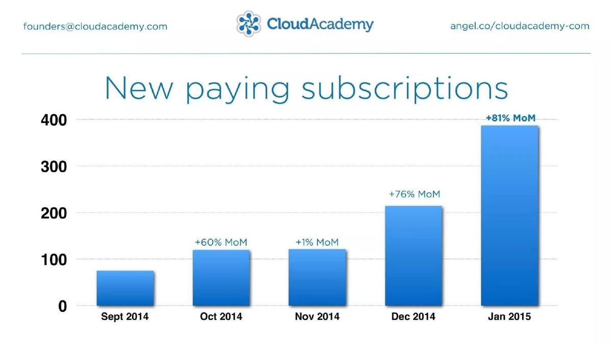
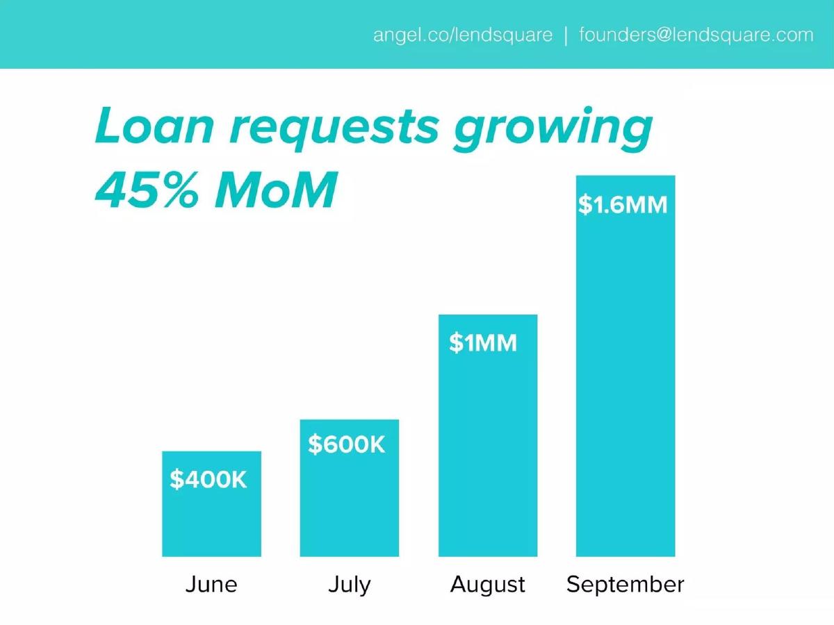
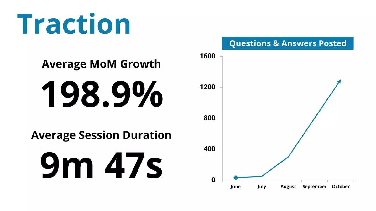
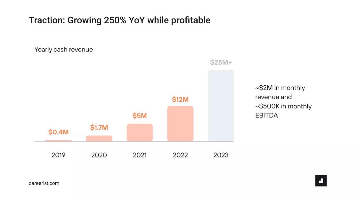
Name the metric, the window and the method, and show the points the rate was calculated from. CloudAcademy labels each month's change on its new-subscriptions chart (+60%, +1%, +76%, +81%), so a reader can see both the strong months and the flat one; those four labels compound to about 51% a month. Lendsquare prints every monthly value ($400K to $1.6MM of loan requests), and the compound rate from them is about 59%, above its 45% headline, which the slide doesn't explain. CareerDean's "Average MoM Growth 198.9%" is close to the arithmetic mean of four monthly changes on our approximate chart reading, one of them about +500%; the compound rate over the same months is nearer 156%. Careerist's "250% YoY" matches no adjacent pair of years on its own chart. Fanatiz is the one slide that says which periods its rate leaves out.
Growth-rate claims on real pitch deck slides
Each example shows the exact stored slide above its analysis and links to the full teardown. Clearest examples first. Figures are quoted as shown; calculations are ours and chart readings are approximate.
CloudAcademy traction slide — slide 4
Cloud skills training. A single bar chart of new paying subscriptions per month.
CloudAcademy deck, slide 4. Exact stored slide matched to this analysis.
Our analysis: The slide shows every period instead of one summary rate, including the flat November.
Evidence and limitation: Each month's change is printed. Compounding the labels: 1.60 × 1.01 × 1.76 × 1.81 ≈ 5.15x over four steps, about 51% a month. The simple average of the four labels is about 55%. The bars (≈75 in Sept to ≈385 in Jan) give the same ≈5.1x.
What a founder can adapt: If you headline one rate, show the monthly points it came from and say whether it is compound or an average.
Supporting analysis
What the deck claims: "New paying subscriptions." Bars for Sept 2014 to Jan 2015, y-axis 0–400; labels "+60% MoM" (Oct), "+1% MoM" (Nov), "+76% MoM" (Dec), "+81% MoM" (Jan). The Jan bar is just under 400.
Presentation choice: Labelling each step lets a reader see that growth was uneven, rather than inferring a steady rate. The metric is also specific: new paying subscriptions per month, a flow, not total subscribers or revenue.
When it does not fit: New subscriptions per month is not revenue. Don't let a reader assume revenue grew at the same rate.
Small business lending. A headline and four labelled monthly bars.
Lendsquare deck, slide 2. Exact stored slide matched to this analysis.
Our analysis: Exact values make the rate checkable, and the check shows a gap the slide doesn't explain.
Evidence and limitation: Monthly changes from the printed values: +50%, +67%, +60%. Compound over three steps: (1.6 ÷ 0.4)^(1/3) − 1 ≈ 59%. The 45% headline is below every visible month; the slide doesn't say which window or method produced it (it may cover a longer period than the four months shown).
What a founder can adapt: If your headline covers a different window from the chart, say so ("45% MoM average since launch").
Supporting analysis
What the deck claims: "Loan requests growing 45% MoM." Bars: June $400K, July $600K, August $1MM, September $1.6MM.
Presentation choice: Printed values are the easiest thing for a reader to verify. The metric is loan requests, the demand side, not loans funded or revenue.
When it does not fit: Don't leave a headline rate that the visible values don't reproduce without a note on how it was calculated.
Career advice community. Two large figures beside a line chart.
CareerDean deck, slide 5. Exact stored slide matched to this analysis.
Our analysis: The headline is consistent with an arithmetic average of monthly changes, which one large jump dominates. We can't confirm the method from the slide.
Evidence and limitation: Approximate readings: June ≈ 30, July ≈ 50, August ≈ 300, September ≈ 800, October ≈ 1,300. Monthly changes ≈ +67%, +500%, +167%, +63%; their simple average ≈ 199%, close to the headline. The compound rate over the same four steps is (1,300 ÷ 30)^(1/4) − 1 ≈ 157%. Because the June value is small, these readings are rough.
What a founder can adapt: Headline the compound rate, or show the monthly values so readers can see the spread.
Supporting analysis
What the deck claims: "Average MoM Growth 198.9%." "Average Session Duration 9m 47s." Chart "Questions & Answers Posted", June to October, y-axis 0–1,600; the line rises from near 0 to about 1,300 with an arrow.
Presentation choice: "Average" is honest labelling, but an average of monthly percentages overstates the constant rate that would reproduce the end point. The chart has no year and the metric is content posted, not users or revenue.
When it does not fit: Averaging percentages from a very small starting month.
Career training. Yearly bars with a headline growth rate.
Careerist deck, slide 6. Exact stored slide matched to this analysis.
Our analysis: The headline rate is not tied to a stated pair of years, and no visible pair reproduces it.
Evidence and limitation: Year-on-year from the printed values: 2020 +325%, 2021 +194%, 2022 +140%, 2023 at least +108% ("$25M+" is a lower bound). Compound 2019–2022: (12 ÷ 0.4)^(1/3) − 1 ≈ 211% a year. None equals 250%. "~$2M" × 12 ≈ $24M, in line with the grey 2023 bar; the grey colour is not labelled as a forecast or year to date.
What a founder can adapt: Write the rate as "2022 vs 2021: +140%" or state the multi-year window for a compound figure. Label a current or projected year.
Supporting analysis
What the deck claims: "Traction: Growing 250% YoY while profitable." "Yearly cash revenue": 2019 $0.4M, 2020 $1.7M, 2021 $5M, 2022 $12M, 2023 $25M+ (grey bar). "~$2M in monthly revenue and ~$500K in monthly EBITDA."
Presentation choice: Printing every year is useful; the headline then invites the reader to check it and find no match. The measure (cash revenue) is named, which is good.
When it does not fit: A headline percentage with no stated window, and an unlabelled differently-coloured bar.
B2B marketing software. An MRR area chart with a highlighted point.
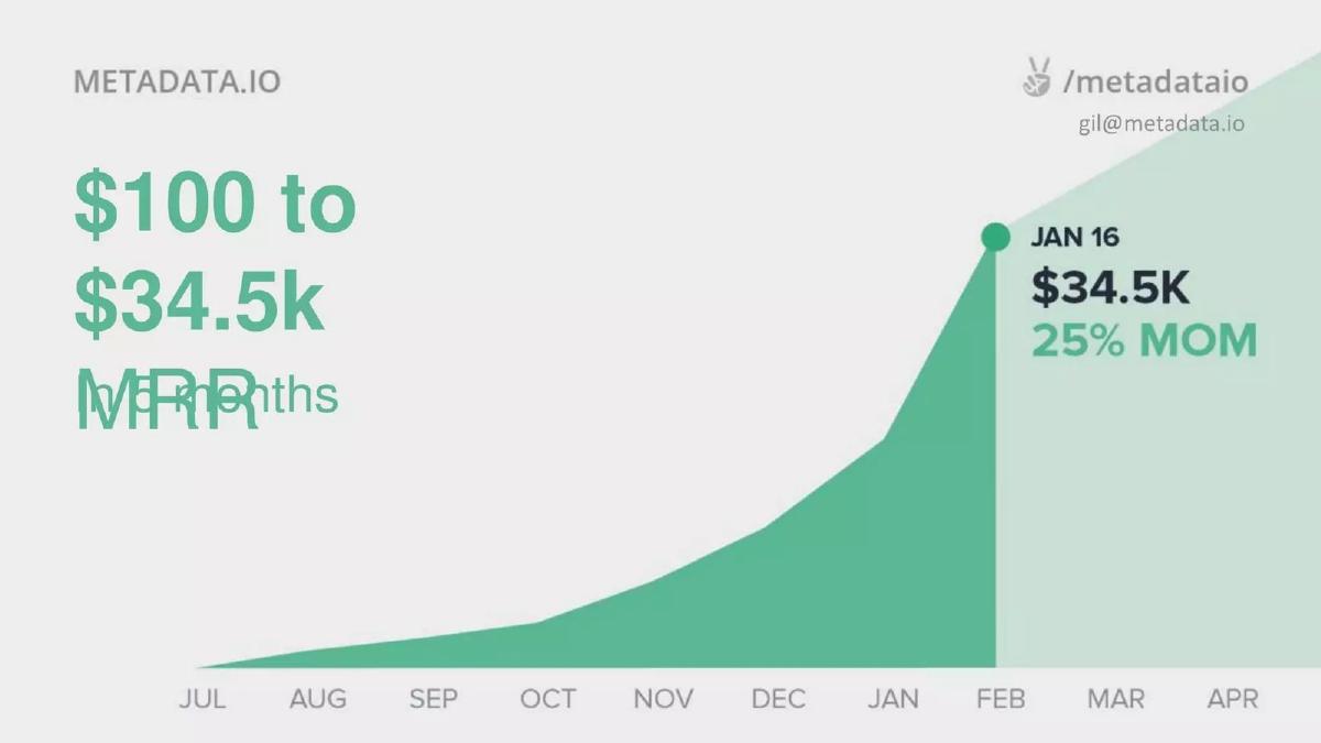
Metadata.io deck, slide 4. Exact stored slide matched to this analysis.
Our analysis: Two growth claims on one slide describe different windows, and only one window is stated.
Evidence and limitation: From $100 to $34.5K is about 345x. Over six monthly steps (Jul to Jan) that is a compound rate of about 165% a month, so the "25% MOM" beside Jan 16 cannot be the average over that period. It likely describes a recent month or shorter window, but the slide doesn't say which.
What a founder can adapt: Label each rate with its window: "25% MoM, Dec to Jan". Mark projected periods.
Supporting analysis
What the deck claims: "$100 to $34.5k MRR" with an overlapping line that appears to read "in 6 months" (partly unreadable in the stored image). A marker at "JAN 16": "$34.5K", "25% MOM". The x-axis runs Jul to Apr; the area after Feb is lighter.
Presentation choice: Starting from $100 makes the multiple dramatic but not very informative; the recent rate is more useful and is the one with no stated window. The lighter area after February is not labelled as a projection.
When it does not fit: Overlapping text in the headline, and very small starting values used as the base of a multiple.
E-commerce marketing apps. A monthly MRR chart with a range headline.
Beeketing deck, slide 5. Exact stored slide matched to this analysis.
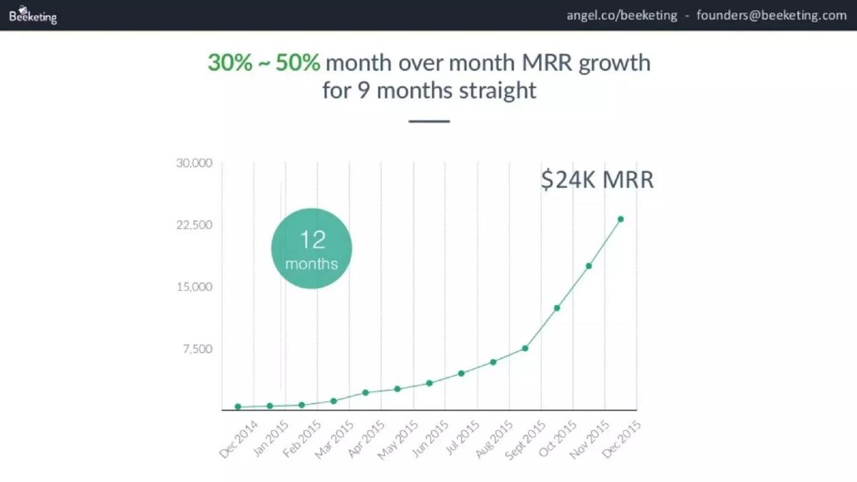
Our analysis: A stated range with a stated window is more honest than one number, and the chart roughly supports it.
Evidence and limitation: Rough readings: Mar 2015 ≈ 1,500, Dec 2015 ≈ 23,000. Compound over those nine steps: (23,000 ÷ 1,500)^(1/9) − 1 ≈ 35%, inside the stated range. Individual early months are too small to read reliably, so we can't check that every month was at least 30%. The "12 months" badge presumably refers to the whole chart; the headline refers to nine.
What a founder can adapt: A range plus a window ("30–50% MoM, Mar–Dec 2015") is a good format. Date the $24K MRR.
Supporting analysis
What the deck claims: "30% ~ 50% month over month MRR growth for 9 months straight." "$24K MRR." A badge reading "12 months". Chart Dec 2014 to Dec 2015, y-axis 0–30,000, last point about 23,000.
Presentation choice: The range shows variation instead of hiding it, and naming the metric (MRR) removes doubt about what grew.
When it does not fit: Two different period badges (9 and 12 months) without saying what each covers.
Visual collaboration software. Quarterly bars with two headline figures.
Mural deck, slide 2. Exact stored slide matched to this analysis.
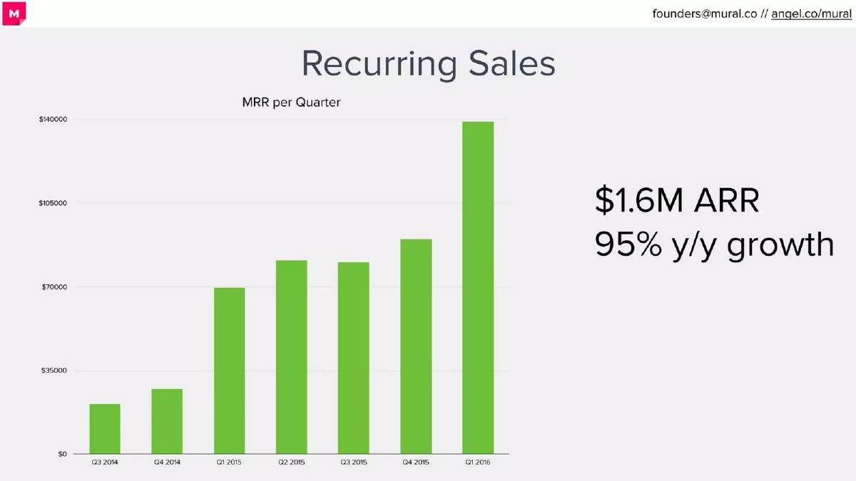
Our analysis: A year-on-year rate that the chart lets a reader approximately confirm.
Evidence and limitation: Q1 2016 vs Q1 2015 ≈ $139K ÷ $70K − 1 ≈ 99%, close to 95% on our reading. If the bars show MRR at quarter end, $139K × 12 ≈ $1.67M, consistent with $1.6M ARR. "MRR per quarter" could also mean a quarterly total; the slide doesn't say.
What a founder can adapt: Say which two periods the y/y compares, and define the chart's measure ("MRR at quarter end").
Supporting analysis
What the deck claims: "Recurring Sales." Chart "MRR per Quarter", Q3 2014 to Q1 2016, y-axis $0–$140,000; Q1 2015 about $70K, Q1 2016 about $139K. "$1.6M ARR." "95% y/y growth."
Presentation choice: Comparing the same quarter a year apart avoids seasonality. The chart also shows a flat Q3 2015, which a single percentage would hide.
When it does not fit: Ambiguous axis titles such as "MRR per quarter".
College admissions coaching. A monthly sales line and two circles.
Empowerly deck, slide 2. Exact stored slide matched to this analysis.
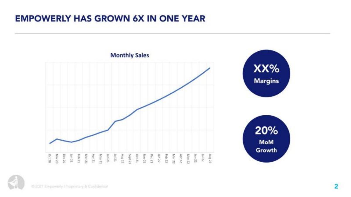
Our analysis: Two growth claims about the same business that don't reconcile as written.
Evidence and limitation: 6x in twelve months implies about 16% a month compounded (6^(1/12) − 1). 20% a month for twelve months would be about 8.9x. The two claims agree only if they cover different windows or are rounded; neither window is stated. With no y-axis values, the chart can't be used to check either figure.
What a founder can adapt: Give both the window and the metric ("monthly sales, Aug 2022 vs Aug 2021: 6x") and label the axis.
Supporting analysis
What the deck claims: "Empowerly has grown 6X in one year." Chart "Monthly Sales", Oct 20 to Aug 22, no y-axis values. "XX% Margins" (placeholder in the stored deck). "20% MoM Growth."
Presentation choice: A multiple and a monthly rate on one slide invite the reader to compare them.
When it does not fit: A chart without values under a growth headline, and placeholders left in a shared deck.
Home improvement referrals. A monthly bar chart with two figures.
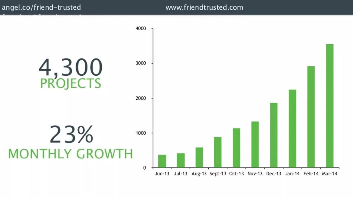
Friend Trusted deck, slide 3. Exact stored slide matched to this analysis.
Our analysis: The rate's metric is unclear because the chart is untitled.
Evidence and limitation: Compound over nine steps: (3,550 ÷ 370)^(1/9) − 1 ≈ 29% on our reading, above the 23% shown. The bars add up to far more than 4,300 if they are monthly new projects, so they may be cumulative or a different measure; the slide doesn't say. If the bars are cumulative, a rising total grows more slowly than new projects per month, and the rate means something different.
What a founder can adapt: Title the chart ("New projects per month" or "Total projects to date") and say which series the rate uses.
Supporting analysis
What the deck claims: "4,300 Projects." "23% Monthly Growth." Bars Jun-13 to Mar-14, y-axis 0–4,000; June about 370, March about 3,550. The chart has no title.
Presentation choice: Whether a chart is cumulative or per month changes what a growth rate means. A cumulative total almost always rises, so its growth rate says less about momentum.
When it does not fit: Growth rates on cumulative totals presented as momentum.
Consumer product. A revenue line chart by quarter.
Grom deck, slide 4. Exact stored slide matched to this analysis.
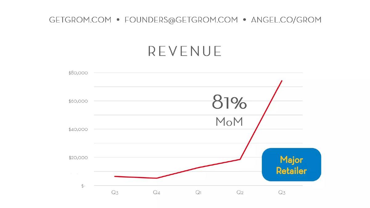
Our analysis: A monthly rate headlined over a chart that doesn't show months.
Evidence and limitation: The chart is quarterly, so a monthly rate can't be checked from it. Quarter on quarter, ≈ $75K ÷ $18K − 1 ≈ 315%. Quarterly totals don't convert directly to monthly rates without monthly data.
What a founder can adapt: Use the chart's own period ("+315% QoQ") or show the months. If one customer drove the jump, say how much.
Supporting analysis
What the deck claims: "Revenue", quarters Q3 to Q3 (no years), y-axis to $80,000. Last quarter about $75K, previous about $18K. "81% MoM." A "Major Retailer" callout by the final rise.
Presentation choice: The reader sees a steep quarter but can't connect it to "81% MoM". The callout suggests a cause for the jump; the slide doesn't show how much of the growth came from that retailer.
When it does not fit: Mixing monthly rates with quarterly charts, and quarters without years.
Sports streaming. A subscriber chart and two boxes.
Fanatiz deck, slide 5. Exact stored slide matched to this analysis.
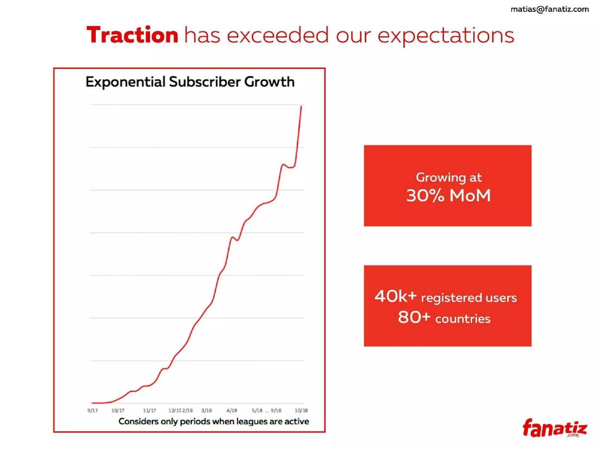
Our analysis: A seasonal business that discloses its exclusion rule, but gives no values to check the rate.
Evidence and limitation: The footnote states which periods are excluded, which the other slides don't do. With no y-axis values, the 30% can't be checked. The chart plots subscribers; the 40k+ figure is registered users, a different measure.
What a founder can adapt: Keep the exclusion note and add axis values plus the window for the 30%.
Supporting analysis
What the deck claims: "Traction has exceeded our expectations." Chart "Exponential Subscriber Growth", 9/17 to 10/18, no y-axis values. Footnote: "Considers only periods when leagues are active." "Growing at 30% MoM." "40k+ registered users, 80+ countries."
Presentation choice: For seasonal businesses, off-season months can make monthly growth look worse or better. Saying what was excluded lets a reader judge the rate.
When it does not fit: Placing a subscriber rate beside a registered-user count without distinguishing them.
Career accelerator. Bullet points beside a monthly enrolment chart.
Pathrise deck, slide 6. Exact stored slide matched to this analysis.
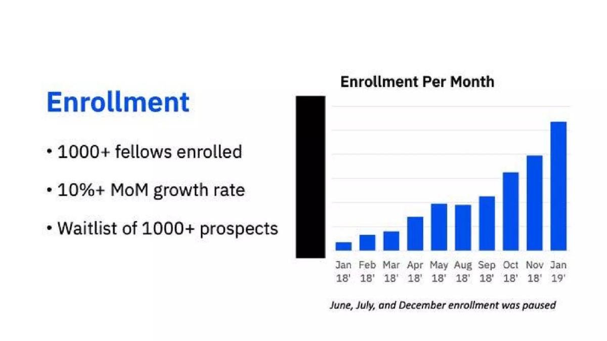
Our analysis: A conservative lower-bound claim with an honest note on gaps.
Evidence and limitation: "10%+" is a lower bound, not an exact rate. The paused months are disclosed, but the slide doesn't say how they were treated in the rate (skipped, or counted as steps). Without axis values the rate can't be checked.
What a founder can adapt: Say how gaps were handled ("MoM across active months") and label the axis and the black bar.
Supporting analysis
What the deck claims: "1000+ fellows enrolled." "10%+ MoM growth rate." "Waitlist of 1000+ prospects." Chart "Enrollment Per Month", Jan 18' to Jan 19', skipping June, July and December; note "June, July, and December enrollment was paused." No y-axis values; an unlabelled black bar at the left.
Presentation choice: Disclosing paused months prevents a reader from reading the gaps as drops. A lower bound is safer than an inflated point estimate.
When it does not fit: Leaving an unlabelled series on the chart.
Whether the rate names its metric and window, states its method, and matches the visible data on our approximate reading.
Example
Claim
Metric named
Window stated
Method
Matches visible data (our reading)
CloudAcademy
+60/+1/+76/+81% MoM
New paying subscriptions
Each month
Single-period labels
Yes (≈51% compound)
Lendsquare
45% MoM
Loan requests
No
Not stated
No: visible months ≈59% compound
CareerDean
Average MoM 198.9%
Q&A posted
Months, no year
"Average"
≈ arithmetic mean; compound ≈157%
Careerist
250% YoY
Cash revenue
No
Not stated
No visible pair gives 250%
Metadata.io
25% MoM; $100 → $34.5K
MRR
Multiple only
Not stated
25% not the period average (≈165%)
Beeketing
30–50% MoM, 9 months
MRR
Yes (9 months)
Range
Roughly (≈35% compound)
Mural
95% y/y
Recurring sales (MRR)
Implied by chart
Year on year
Roughly (≈99%)
Empowerly
6x in one year; 20% MoM
Monthly sales
No
Not stated
Claims don't reconcile (6x ≈16%/mo)
Friend Trusted
23% monthly
Unclear (projects?)
Chart months
Not stated
≈29% on bars; series unclear
Grom
81% MoM
Revenue
No
Not stated
Can't check: quarterly chart
Fanatiz
30% MoM
Subscribers
Exclusions stated
Not stated
Can't check: no values
Pathrise
10%+ MoM
Enrolment
Paused months noted
Lower bound
Can't check: no values
Key Takeaways
Say what grew: revenue, MRR, new subscriptions, requests or users are different metrics.
Give the window: "MoM" needs the months; "YoY" needs the two periods compared.
Say whether the rate is one period, an average of monthly changes, or a compound rate. They can differ a lot.
Keep "250%" (growth) and "2.5x" (multiple) distinct: 2.5x is 150% growth.
If the chart is quarterly or yearly, don't headline a monthly rate the reader cannot check from it.
Disclose paused, seasonal or excluded periods.
Write your growth-rate line
Fill in each line before putting a growth rate on a slide.
Metric. Exactly what grew: revenue, MRR, new customers per month, total users. Use the same metric as the chart.
Window. First and last period ("Mar–Sep 2025" or "FY2024 vs FY2023").
Method. Compound: (last ÷ first)^(1 ÷ steps) − 1. Or state "average of monthly changes" or "latest month".
Check. Recompute the rate from the values on your chart. If it differs, change the headline or add a note.
Multiple vs percentage. 3x = +200%. If you show both a multiple and a monthly rate, confirm they agree over the same window.
Gaps. Note seasonal, paused or excluded periods and how they were treated.
Copyable framework: [Metric] grew [X]% a month compounded, [first month] to [last month] ([first value] → [last value]). [Note on excluded periods, if any.]
Illustrative example 1 — written by us
Before: Loan requests growing 45% MoM
After: Loan requests grew about [X]% a month compounded, [first month]–[last month] ($[A] → $[B]).
What improved: Our illustrative rewrite; not Lendsquare's wording. Bracketed values are placeholders. It states the method and window, so the headline can be checked against the bars.
What this guide adds
The main traction guide and the seed vs Series A guide show MoM figures as one metric among many. The run-rate guide covers the headline annualised revenue figure, and the net revenue retention guide covers retention. None explains how a growth rate itself is calculated and labelled, or how a reader can check it against the chart. This page covers that question.
Three ways to express one growth rate
Single-period change: (this period ÷ previous period) − 1. "+81% MoM" on CloudAcademy's January bar is one month's change.
Average of monthly changes: add each month's percentage and divide by the number of months. This is easy to compute but is pulled up by any single large jump, especially from a small base.
Compound monthly rate: (last value ÷ first value)^(1 ÷ number of monthly steps) − 1. This is the constant monthly rate that would take the first value to the last. It is the figure that reproduces the actual end point, so it is usually the safer headline. For a year: (this year ÷ last year) − 1, or over several years (last ÷ first)^(1 ÷ years) − 1.
Multiples and percentages: "3x" means the value tripled, which is +200%, not +300%. "Grown 6x in one year" and "20% MoM" are two claims about the same year and should agree: 1.2 compounded for 12 months is about 8.9x.
How we checked each rate
Where a slide prints values, we used them. Where it only shows a chart, we read approximate values against the printed axis and mark them with "about" or ≈; percentages from small early values are sensitive to reading error, so those checks are rough. We counted monthly steps between plotted points, not months on the axis. A gap between our calculation and a headline does not mean the headline is wrong: the company may have used a different window, a later month or a different metric. It means the slide doesn't show the reader which.
Common mistakes
No window. "30% MoM" without months can't be checked or compared.
Averaging percentages. An average of monthly changes is pulled up by one big jump; the compound rate reproduces the end point.
Multiple read as percentage. "4x" is +300%; "250% growth" is 3.5x.
Rate and chart use different periods. A monthly rate over a quarterly or yearly chart can't be checked.
Cumulative totals. A running total nearly always grows; say if the rate is on a cumulative series.
Tiny starting base. "From $100" makes any rate or multiple huge; start from a meaningful month.
Diagnostic checklist
Metric named and the same as the chart's.
Window stated (first and last period).
Method stated: latest period, average or compound.
Rate reproducible from the values shown.
Multiples and percentages consistent.
Axis values shown; projected, paused or excluded periods labelled.
Frequently asked questions
How we chose these examples
Corpus: published pitch deck teardowns on StartupFundraising.com. Founder-uploaded private decks are excluded.
Selection (2026-09-25): we searched stored slide text on slides 2–8 for MoM, month-over-month, monthly growth, YoY and y/y wording, excluding market-size and CAGR slides, kept only slides with a stored slide image, and inspected sixteen candidate images. We kept slides where a company growth rate is a headline and each shows a different labelling or calculation choice. Considered but not used: Barn & Willow p6 (no axis values beyond one point; overlaps Fanatiz and Pathrise), Meya p5 (overlaps Beeketing), ThankUCash (already analysed in the seed vs Series A guide), and a duplicate Careerist upload (arkive slug).
Figures are quoted as shown in the stored slide images. Chart values are our approximate readings against the printed axis. Calculations are ours: single-period change = current ÷ previous − 1; compound rate = (last ÷ first)^(1 ÷ steps) − 1; average = mean of single-period changes. A difference between our calculation and a headline is not a claim that the headline is wrong; the slide may use a window or method it does not show.
Dates: deck years in our library index are not used; periods are quoted from the slides.
Review: stored slide text and images were checked on 2026-09-25 and matched to company, deck and slide number (editorial model review). No person has yet completed an editorial review of this page. We make no claim that any slide caused a fundraising outcome.