How to label ARR, MRR and revenue run rate on a pitch deck traction slide so the headline matches the chart: base period, multiplier.
ARR, MRR and Run Rate in a Pitch Deck: How to Label the Headline Revenue Figure
Many early traction slides lead with one annualised number: "ARR", "run rate" or "annualized sales". Those labels describe different calculations, and a reader can only check the number if the slide shows which period was multiplied, by how much, when, and whether it is revenue or gross volume. This guide compares ten real slides and checks each headline against the chart beside it.
TL;DR
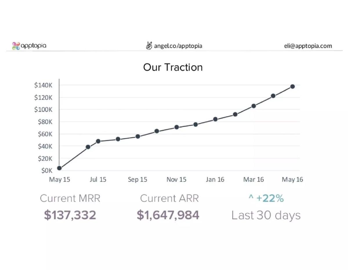
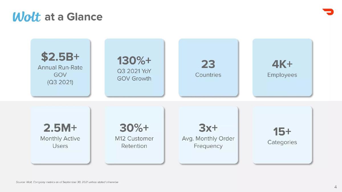
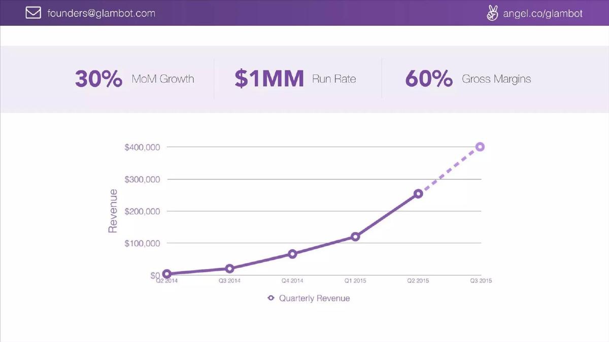
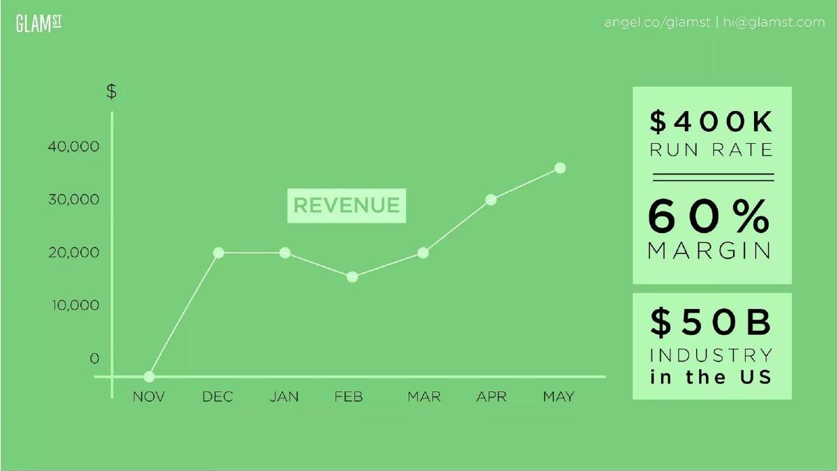
State the base period, the multiplier, the date and what is being counted. Apptopia shows current MRR ($137,332) next to current ARR ($1,647,984), and the second is exactly twelve times the first, so the reader can see how the annual figure was built. Wolt labels its $2.5B+ annual run rate as gross order value (GOV) for Q3 2021, which tells the reader it is not revenue. On our approximate chart reading, Glambot's $1MM run rate is close to its last solid quarterly point (about $250K) times four, while the dashed next point is unlabelled. GlamST, Kollecto and Copy.ai plot monthly figures whose last point, times twelve, is roughly the headline. Contactually already plots ARR, so its $3.68M headline is compared with the last bar directly, not multiplied; the headline is undated. Angelcam's and Chiper's headlines sit above what the plotted latest point times twelve or four would give (if those charts show monthly or quarterly flows), and neither slide says what base was used. Friend Trusted's "$2,900,000 run rate" of "projects we make money on" doesn't say whether it is revenue at all.
Run rate and ARR on real pitch deck slides
Each example shows the exact stored slide above its analysis and links to the full teardown. Clearer examples first. Figures are quoted as shown on the slides; calculations are ours and chart readings are approximate.
Apptopia traction slide — slide 3
Mobile app analytics. A traction slide with a monthly chart and three figures underneath.
Apptopia deck, slide 3. Exact stored slide matched to this analysis.
Our analysis: The annual figure is shown with the monthly figure it came from.
Evidence and limitation: $137,332 × 12 = $1,647,984 exactly, and the chart's last point matches the MRR. The chart itself has no axis title, and "current" is dated only by the chart's last label (May 16).
What a founder can adapt: Show the monthly figure next to the annualised one, and label the chart axis ("MRR, $").
Supporting analysis
What the deck claims: "Our Traction." Line chart from May 15 to May 16, y-axis $0K–$140K, last point just under $140K. "Current MRR $137,332." "Current ARR $1,647,984." "+22% Last 30 days."
Presentation choice: Putting MRR and ARR side by side lets the reader confirm the multiplier in seconds, and the chart ties the MRR to a month.
When it does not fit: "+22% last 30 days" doesn't say which measure grew; name it.
Food and retail delivery. "Wolt at a Glance", a grid of eight figures from the DoorDash acquisition materials.
Wolt deck, slide 4. Exact stored slide matched to this analysis.
Our analysis: A gross volume run rate, clearly labelled as volume rather than revenue.
Evidence and limitation: The run rate names its measure (gross order value), its base period (Q3 2021) and an as-of date. It does not state the multiplier, though a quarter annualised is conventionally × 4.
What a founder can adapt: If your headline is GMV, GOV or bookings, say so on the slide and, if you can, give net revenue beside it.
Supporting analysis
What the deck claims: "$2.5B+ Annual Run-Rate GOV (Q3 2021)." "130%+ Q3 2021 YoY GOV Growth." Also countries, employees, monthly active users, M12 customer retention, order frequency, categories. Footnote: company metrics as of September 30, 2021 unless stated otherwise.
Presentation choice: Gross order value includes what customers paid for food and delivery, most of which goes to merchants and couriers. Labelling it GOV stops a reader mistaking it for revenue.
When it does not fit: Don't show a gross volume figure under a plain "revenue" or "run rate" label.
Online beauty retailer. Three headline figures above a quarterly revenue chart.
Glambot deck, slide 6. Exact stored slide matched to this analysis.
Our analysis: The headline appears to annualise the last solid quarter; the dashed point looks like a projection or partial quarter but isn't labelled.
Evidence and limitation: The chart plots quarterly revenue, a flow, so × 4 applies: about $250K × 4 ≈ $1.0M, which matches the headline if it is based on Q2 2015. The dashed Q3 point, about $400K, times four would be about $1.6M. The slide doesn't label the dashed segment or state the base quarter.
What a founder can adapt: Label projected or partial periods ("Q3 forecast" or "Q3 to date") and state "run rate = Q2 revenue × 4".
Supporting analysis
What the deck claims: "30% MoM Growth." "$1MM Run Rate." "60% Gross Margins." Chart "Quarterly Revenue", Q2 2014 to Q3 2015: solid line to about $250K in Q2 2015, then a dashed segment to about $400K in Q3 2015.
Presentation choice: Anchoring the run rate to the last complete quarter is the cautious choice. An unlabelled dashed point leaves the reader to guess whether it is actual, partial or forecast.
When it does not fit: "30% MoM growth" on a quarterly chart needs its period; say over which months.
Virtual beauty try-on. A monthly revenue chart with three figures on the right.
GlamST deck, slide 5. Exact stored slide matched to this analysis.
Our analysis: A headline that the reader can roughly derive from the chart, including the uneven months.
Evidence and limitation: The chart is labelled "Revenue" with monthly points, a flow, so × 12 applies: about $36K × 12 ≈ $430K, so the $400K headline is at or slightly below the latest month annualised on our reading. The year of the chart and the kind of margin are not stated.
What a founder can adapt: Add the year to the chart and write "run rate = May revenue × 12" in a footnote.
Supporting analysis
What the deck claims: Chart labelled "Revenue", November to May, y-axis $0–$40,000; the May point is about $36K, with a dip in February. "$400K run rate." "60% margin." "$50B industry in the US."
Presentation choice: Showing the actual monthly series, dip included, lets the reader see how volatile the base month is before trusting the annualised figure.
When it does not fit: "60% margin" needs a type (gross or contribution).
Online art advisory and sales. One chart with a single callout.
Kollecto deck, slide 3. Exact stored slide matched to this analysis.
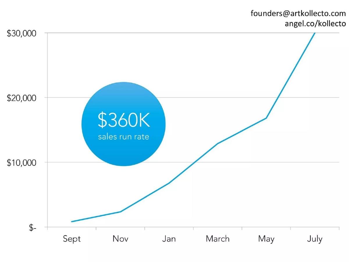
Our analysis: A run rate that roughly matches the latest plotted month on our reading, but whose measure is unclear.
Evidence and limitation: The last point reaches the top of the axis, read as about $30,000; if the chart plots monthly sales, about $30,000 × 12 ≈ $360,000, matching the callout. The chart has no title or year, so whether it plots monthly flow is inferred from the month labels, and "sales" could mean the full price of art sold or the company's revenue share.
What a founder can adapt: Label "gross sales" or "revenue", and if gross, give your take rate or net revenue too.
Supporting analysis
What the deck claims: Monthly line chart, Sept to July, y-axis $0–$30,000, the July point at the top of the axis ($30,000). Callout: "$360K sales run rate."
Presentation choice: For a marketplace or advisory model, the difference between gross sales and revenue can be large, and the slide doesn't say which this is.
When it does not fit: Don't let the line run into the top of the axis; the reader can't see the exact last value.
AI writing tool. An early traction slide with one chart.
Copy.ai deck, slide 4. Exact stored slide matched to this analysis.
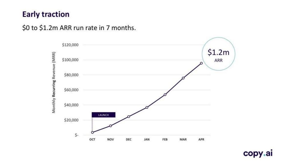
Our analysis: A clearly labelled monthly base with a rounded annualised callout.
Evidence and limitation: The axis is labelled MRR, a monthly flow, so × 12 applies. About $95K × 12 ≈ $1.14M; the $1.2M callout needs roughly $100K MRR, which could reflect rounding or a later date than the April point. The year is not shown. The same slide appears in our seed vs Series A guide for a different point.
What a founder can adapt: Put the exact MRR and its date next to the rounded ARR.
Supporting analysis
What the deck claims: "Early traction. $0 to $1.2m ARR run rate in 7 months." Chart with y-axis titled "Monthly Recurring Revenue (MRR)", October (launch) to April, last point about $95K, callout "$1.2m ARR".
Presentation choice: Titling the axis MRR tells the reader exactly what was multiplied. Stating the MRR at the date of the callout would remove the small gap.
When it does not fit: "ARR run rate" mixes two labels; pick one and define it.
Relationship management software. A monthly ARR bar chart with side metrics.
Contactually deck, slide 6. Exact stored slide matched to this analysis.
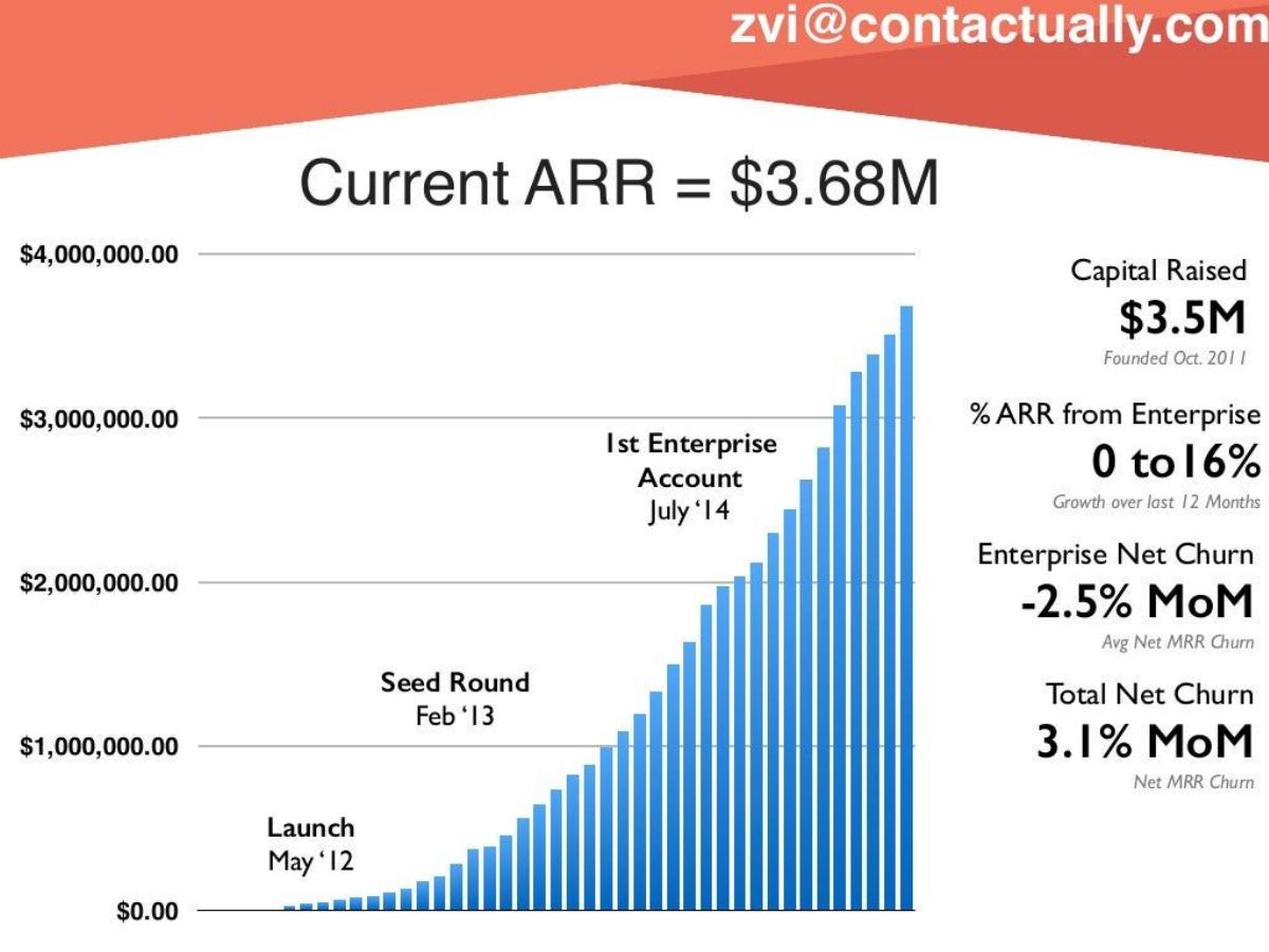
Our analysis: An ARR history whose last bar is consistent with the headline, with the date left implicit.
Evidence and limitation: The bars already show ARR, an annualised figure, so we compare the last bar with the headline directly rather than multiplying it. On our reading the last bar is about $3.65M on the $4M axis, consistent with $3.68M. "Current" isn't dated; the reader has to count bars from May 2012 to estimate the month. The churn figures are monthly and net of expansion.
What a founder can adapt: Write "ARR $3.68M (month, year)" and label the x-axis with dates.
Supporting analysis
What the deck claims: "Current ARR = $3.68M." Monthly bars from launch (May '12) with milestones: seed round (Feb '13), first enterprise account (July '14). Side: capital raised $3.5M; % ARR from enterprise 0 to 16% (growth over last 12 months); enterprise net churn -2.5% MoM (avg net MRR churn); total net churn 3.1% MoM (net MRR churn).
Presentation choice: The monthly series shows how ARR changed over time. It does not show how many customers or contracts make up that ARR, so the slide supports the level of the headline, not its composition. A date on the headline would make it checkable against the chart and the churn figures.
When it does not fit: Dollar axis labels with cents ($4,000,000.00) add clutter; round them.
B2B ordering platform for corner stores in Latin America. Two headline figures beside a quarterly sales chart.
Chiper deck, slide 4. Exact stored slide matched to this analysis.
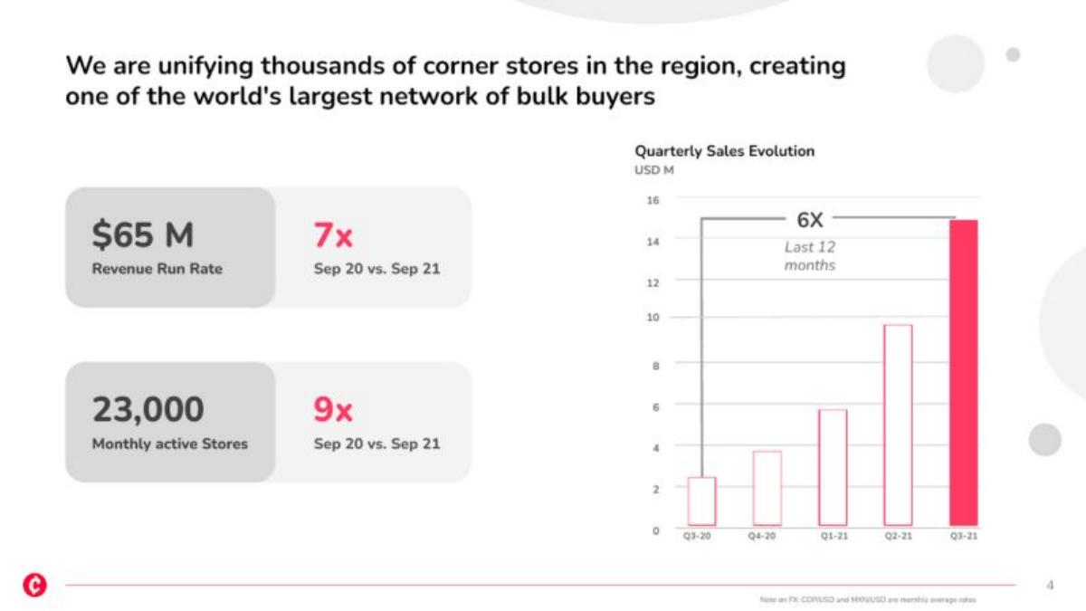
Our analysis: A headline whose base is unstated and does not match the quarterly chart on our reading; a monthly base is one possibility, not a confirmed one.
Evidence and limitation: The chart plots quarterly sales, a flow, so annualising by four applies: the last bar reads about $15M, and about $15M × 4 ≈ $60M, below the $65M headline. The 7x compares September to September while the chart's 6x compares quarters. One possible explanation is a headline annualising September alone (about $5.4M × 12 would give $65M), but that is our hypothesis: the slide shows no monthly figure and does not state the base. "Sales" in the chart and "revenue" in the headline may also be different measures.
What a founder can adapt: If your run rate uses the latest month, say "September revenue × 12" and show that month in the chart or a footnote.
Supporting analysis
What the deck claims: "$65 M Revenue Run Rate." "7x Sep 20 vs. Sep 21." "23,000 Monthly active stores." "9x Sep 20 vs. Sep 21." Chart "Quarterly Sales Evolution, USD M", Q3-20 to Q3-21, last bar about 15, labelled "6X Last 12 months". Footnote on FX: monthly average rates.
Presentation choice: When the headline and the chart use different periods, the reader can't reconcile them without being told. One line naming the base month would do it.
When it does not fit: Use one word, revenue or sales, for the same measure throughout the slide.
Cloud video surveillance. A slide that is only a headline and a chart.
Angelcam deck, slide 2. Exact stored slide matched to this analysis.
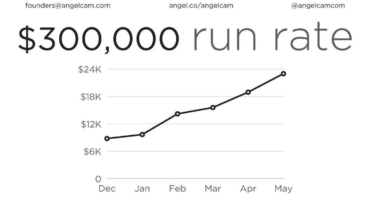
Our analysis: A large headline whose derivation isn't visible from the chart below it.
Evidence and limitation: The chart doesn't say what it measures (revenue, MRR, bookings or an annualised value) or the year. If it plots a monthly flow, the last point, about $22.5K, × 12 ≈ $270K, and a $300K run rate would need about $25K a month, above that point. The company may have used a later figure or a different base; the slide doesn't show which.
What a founder can adapt: Title the chart's measure, add the year, and make the headline equal the plotted latest month times twelve, or say what else it is based on.
Supporting analysis
What the deck claims: "$300,000 run rate." Monthly line chart, December to May, y-axis $0–$24K, last point about $22.5K.
Presentation choice: A reader who multiplies the last point will get a smaller number and has to ask where the difference comes from.
When it does not fit: Don't round a run rate up past what the chart shows.
Home-services referral marketplace. A single-figure slide.
Friend Trusted deck, slide 2. Exact stored slide matched to this analysis.
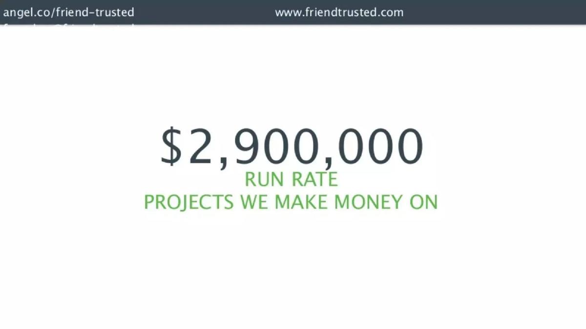
Our analysis: Contrast: a run rate label on what appears to be gross project value.
Evidence and limitation: No base period, date, chart or revenue measure. "Projects we make money on" suggests the value of projects on which the company earns a fee, not the company's own revenue, but the slide doesn't say.
What a founder can adapt: Say "gross project value, annualised from [month] × 12" and give your fee or revenue beside it.
Supporting analysis
What the deck claims: "$2,900,000 run rate. Projects we make money on."
Presentation choice: Without the measure and base, the reader can't tell whether this is revenue, gross transaction value or something else, or what the company earns from it.
When it does not fit: Don't use "run rate" for anything other than an annualised figure with a stated base.
Whether the headline names its measure, shows its base period and date, and matches the chart's latest point on our approximate reading.
Example
Headline
Measure named
Base period / multiplier shown
Dated
Matches chart (our reading)
Apptopia
$1,647,984 ARR
Recurring revenue (MRR/ARR)
Yes: MRR × 12 shown
Chart ends May 16
Yes, exactly
Wolt
$2.5B+ run rate
Yes: gross order value
Q3 2021 (multiplier not stated)
Yes
No chart
Glambot
$1MM run rate
"Quarterly revenue" chart
Not stated; ≈ last solid quarter × 4
Quarters labelled
Roughly (Q2 2015 ≈ $250K); dashed Q3 unlabelled
GlamST
$400K run rate
"Revenue"
Not stated; ≈ May × 12
No year
Roughly (≈ $430K)
Kollecto
$360K sales run rate
"Sales" (gross or net unclear)
Not stated; ≈ July × 12 if monthly flow
No year
Roughly (last point at axis top)
Copy.ai
$1.2m ARR
Yes: MRR axis
MRR base; × 12 implied
Months only
Close (≈ $1.14M)
Contactually
$3.68M ARR
ARR
Already annualised; compared directly (no multiplier)
"Current" undated
Yes (≈ $3.65M last bar)
Chiper
$65M revenue run rate
Revenue vs "sales" chart
Not stated (quarter × 4 ≈ $60M)
Sep 21 comparisons
No; base unstated
Angelcam
$300K run rate
Not stated
Not stated (if monthly flow, ≈ $270K)
No year
No; measure and base unclear
Friend Trusted
$2.9M run rate
No (project value?)
No
No
No chart
Key Takeaways
ARR usually means annualised recurring (subscription) revenue; "run rate" can annualise any revenue. Use the label that matches what you counted.
Show the base: which month or quarter, and whether you multiplied by 12 or 4.
Date the headline, and make the chart's latest point the same period.
Say whether the figure is revenue or gross volume (GMV, GOV, bookings, project value).
Mark projected or partial periods on the chart so they are not read as actuals.
Write your headline revenue line
Fill in each line before putting an annualised figure on a slide. The headline and the chart should use the same measure and period.
Measure. Recurring revenue, all revenue, or gross volume (GMV, GOV, bookings)? Use ARR only for recurring revenue.
Base period. The month or quarter you annualise, with its dates, and whether it is complete.
Multiplier. × 12 for a month, × 4 for a quarter, or "annual value of active contracts" for ARR from contracts.
Date. The as-of date for the headline. Make it the same as the chart's latest point.
Reconciliation. If the chart plots a monthly or quarterly flow, check that its latest point times 12 or 4 equals the headline; if it already plots ARR, compare the latest value directly. If they differ, explain why in a footnote.
Net of gross. If the headline is gross volume, give net revenue or your take rate beside it.
Copyable framework: [Measure] run rate $[X] ([base month/quarter, year] × [12/4]; as of [date]). Chart: monthly [measure], [start]–[end]. [If gross volume: net revenue $[Y] on the same basis.]
What improved: Our illustrative rewrite; not Angelcam's wording. It names the measure, the base month and the multiplier so the headline can be checked against the chart. Bracketed values are placeholders, not Angelcam's figures.
What this guide adds
The seed vs Series A, marketplace and SaaS traction guides mention run rate as one metric among many, and the net revenue retention guide notes that revenue figures on one slide need dates to be reconciled. None covers how to label and derive the headline annualised figure itself. This page covers that one question.
ARR, MRR, run rate and revenue: what each label says
MRR (monthly recurring revenue) is recurring revenue in one month. ARR is commonly MRR times twelve, or the annual value of active subscriptions, and normally excludes one-off fees. Companies define both differently, so a one-line definition helps.
A revenue run rate annualises any revenue from a recent period: the latest month times twelve or the latest quarter times four. It assumes that period repeats. For seasonal, one-off or fast-changing revenue the result can differ a lot from what the next twelve months deliver, which is why the base period matters.
Annual or trailing revenue (for example, the last twelve months) is what was actually earned over a year. It is usually lower than a run rate for a growing company. Gross volume measures such as GMV or gross order value count the full amount customers paid through the platform, not the company's share.
How we checked each headline
Where a slide shows a chart beside its headline, we first decided what the chart plots. Only when it plots a flow for one period (revenue or MRR in a month, sales in a quarter) did we multiply the latest value by 12 (monthly) or 4 (quarterly). When a chart already plots an annualised value, such as monthly ARR bars, we compared its latest value with the headline directly; multiplying ARR again would overstate it. Where a chart does not say what it plots, the multiplication is conditional on it being a monthly or quarterly flow, and we say so. Chart readings are approximate and marked with "about" or ≈. A gap between the result and the headline does not mean the headline is wrong: the company may have used a later month, a different revenue measure or rounding. It means the slide doesn't show the reader which.
Common mistakes
Headline doesn't match the chart. If a monthly or quarterly flow times 12 or 4 (or an ARR chart's latest value) isn't the headline, say what the headline is based on.
ARR for non-recurring revenue. One-off, services or transaction revenue annualised is a run rate, not ARR.
Gross volume shown as revenue. GMV, GOV or project value must be labelled as such, ideally with net revenue beside it.
Undated "current". "Current ARR" needs a month and year.
Unlabelled projections. Dashed or partial periods need a label; otherwise they read as actuals.
Mixed words for one measure. Using "sales" in the chart and "revenue" in the headline makes the reader wonder whether they differ.
Diagnostic checklist
Measure named: recurring revenue, revenue or gross volume.
Base period and multiplier stated.
Headline dated and matching the chart's latest point.
Chart axis titled and year shown.
Projected or partial periods labelled.
Net revenue beside any gross volume figure.
Frequently asked questions
How we chose these examples
Corpus: published pitch deck teardowns on StartupFundraising.com. Founder-uploaded private decks are excluded.
Selection (2026-09-25): we searched stored slide text on slides 2–8 for "run rate", "annualized revenue/sales", "ARR" with "MRR" or "run", and "MRR" with a currency figure, kept only slides with a stored slide image (about 50), and inspected twelve candidate images. We kept slides where the annualised figure is the headline and each shows a different labelling choice. Excluded: Canix (a clear MRR chart that repeats points made by Apptopia and Copy.ai), Bliss (text-only run rate with no base; covered by Friend Trusted as the contrast), Buffer (already analysed in the seed vs Series A guide), a slide whose text duplicates Buffer's with different figures, and public-company and holding-company decks.
Figures are quoted as shown in the stored slide images. Chart values are our approximate readings against the printed axis; calculations (× 12, × 4) are ours and are applied only to charts that plot, or appear to plot, a monthly or quarterly flow. Already-annualised values (ARR) are compared directly. v2 (2026-09-25) corrected the calculation method and removed two unsupported conclusions (Contactually's customer/contract composition; Chiper's monthly base stated as probable) after editorial model review. We do not infer definitions, dates or revenue measures that a slide does not state, and a difference between our calculation and a headline is not a claim that the headline is wrong.
Dates: deck years in our library index are not used; periods are quoted from the slides.
Review: stored slide text and images were checked on 2026-09-25 and matched to company, deck and slide number (editorial model review). No person has yet completed an editorial review of this page. We make no claim that any slide caused a fundraising outcome.