Marketplace Traction Slides: Real Pitch Deck Examples
How marketplace startups show traction in their pitch decks: GMV charts, take rate, repeat orders, supply growth and liquidity.
Marketplace Traction Slides: Real Pitch Deck Examples
Eight marketplace traction slides, shown in full, compare how founders prove that buyers and sellers are transacting: gross merchandise value (GMV), take rate, repeat orders, supply growth and the story of building liquidity.
TL;DR
A marketplace traction slide has to show more than growth in GMV. Investors also want to know how much of that GMV the company keeps (take rate or revenue), whether buyers come back, and whether both sides are growing. The strongest examples below pair a GMV chart with one of those numbers. Charts with hidden axes or GMV alone leave the key questions open.
Marketplace traction slides from real pitch decks
Each example shows the exact stored slide above its analysis and links to the full teardown. Figures are the companies' own and have not been verified. Stage and year are not recorded in our collection for these decks; where a slide shows dates, we say so.
Prolific traction slide — slide 4
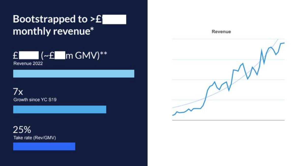
Online research-participant marketplace. The slide refers to Y Combinator's Summer 2019 batch and to 2022 revenue; the published deck redacts the revenue figures.
Prolific deck, slide 4. Exact stored slide matched to this analysis.
Our analysis: It is the only slide in this set that states how GMV becomes revenue. A stated take rate lets an investor check revenue against GMV and compare with other marketplaces. "Bootstrapped" adds that growth was not bought with outside capital.
Evidence and limitation: The revenue chart has no axis labels, and the 7x figure does not say which metric grew. In your own deck, show the numbers even if the public version is redacted.
What a founder can adapt: Put GMV, revenue and take rate on the same slide, and define take rate as revenue divided by GMV.
Supporting analysis
What the deck claims: "Bootstrapped to >£[redacted] monthly revenue". Bars show 2022 revenue (with GMV in brackets, both redacted), "7x growth since YC S19" and "25% take rate (Rev/GMV)"; a revenue line chart sits alongside.
Presentation choice: It is the only slide in this set that states how GMV becomes revenue. A stated take rate lets an investor check revenue against GMV and compare with other marketplaces. "Bootstrapped" adds that growth was not bought with outside capital.
When it does not fit: The revenue chart has no axis labels, and the 7x figure does not say which metric grew. In your own deck, show the numbers even if the public version is redacted.
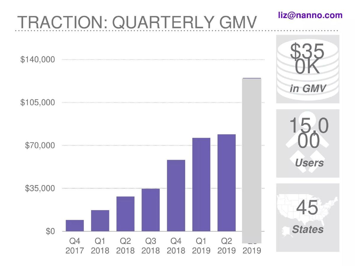
Childcare marketplace. The chart runs from Q4 2017 to Q3 2019.
Nanno deck, slide 4. Exact stored slide matched to this analysis.
Our analysis: Real axis values and a quarter-by-quarter series let an investor read the growth rate themselves. Users and states give a sense of reach on the demand side.
Evidence and limitation: The grey final bar is not explained; if it is a projection or a partial quarter, say so. "Users" does not say whether they are parents, caregivers or both.
What a founder can adapt: Chart GMV by quarter with a labelled axis, and add one tile per side of the marketplace.
Supporting analysis
What the deck claims: "Traction: quarterly GMV". A bar chart with a labelled dollar axis up to $140,000, rising each quarter; the last bar (Q3 2019) is grey. Side tiles: $350K in GMV, 15,000 users, 45 states.
Presentation choice: Real axis values and a quarter-by-quarter series let an investor read the growth rate themselves. Users and states give a sense of reach on the demand side.
When it does not fit: The grey final bar is not explained; if it is a projection or a partial quarter, say so. "Users" does not say whether they are parents, caregivers or both.
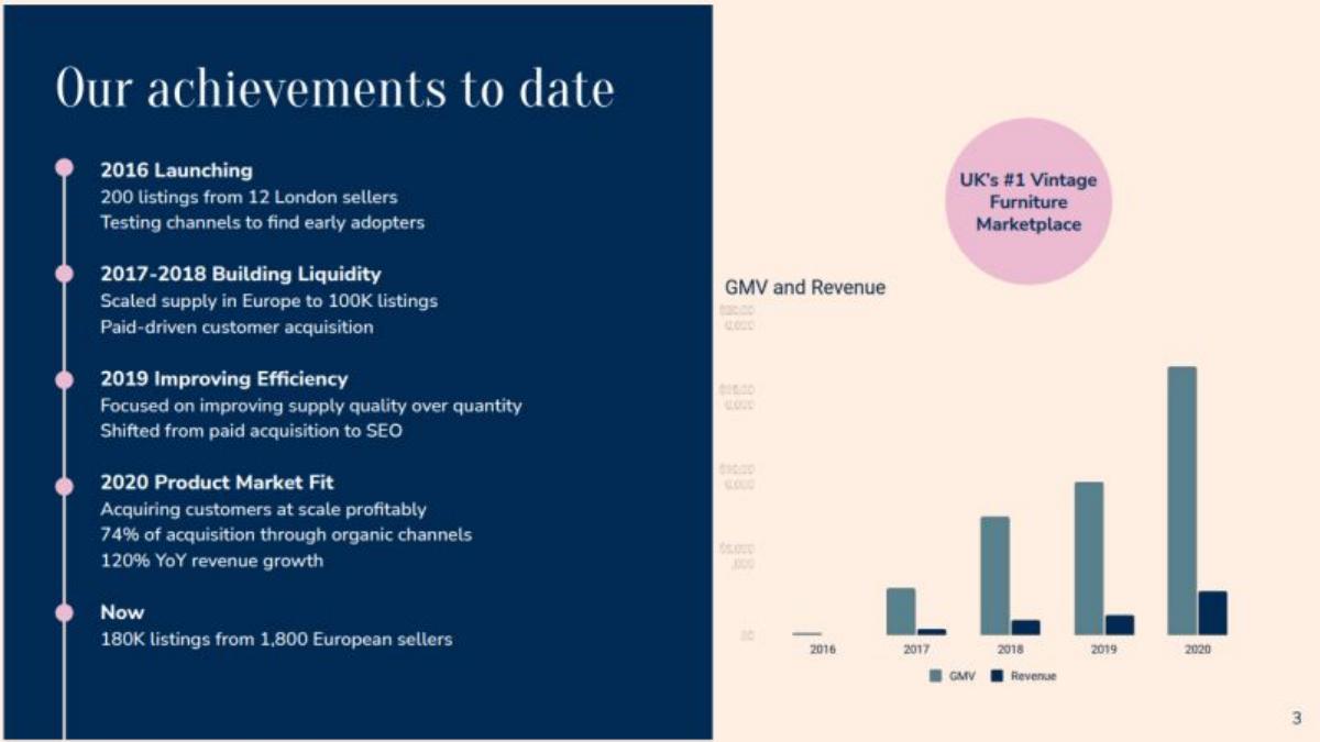
Vintage furniture marketplace. The timeline runs from 2016 to "now" (the deck's date is not recorded).
Vinterior deck, slide 3. Exact stored slide matched to this analysis.
Our analysis: It tells the order in which the marketplace was built: supply first, then efficiency, then profitable demand. That answers a question investors often ask about marketplaces, which side the company solved first and how.
Evidence and limitation: The chart's axis values are too small to read in the stored image, and "UK's #1 vintage furniture marketplace" is a company claim without a stated basis.
What a founder can adapt: If your marketplace has gone through distinct phases, show them as a short timeline with one supply metric and one demand metric per phase.
Supporting analysis
What the deck claims: "Our achievements to date": 2016 launching (200 listings from 12 London sellers); 2017–2018 building liquidity (scaled supply in Europe to 100K listings, paid customer acquisition); 2019 improving efficiency (supply quality over quantity, shift from paid to SEO); 2020 product-market fit (acquiring customers profitably, 74% organic acquisition, 120% YoY revenue growth); now 180K listings from 1,800 European sellers. A GMV and revenue chart by year sits alongside.
Presentation choice: It tells the order in which the marketplace was built: supply first, then efficiency, then profitable demand. That answers a question investors often ask about marketplaces, which side the company solved first and how.
When it does not fit: The chart's axis values are too small to read in the stored image, and "UK's #1 vintage furniture marketplace" is a company claim without a stated basis.
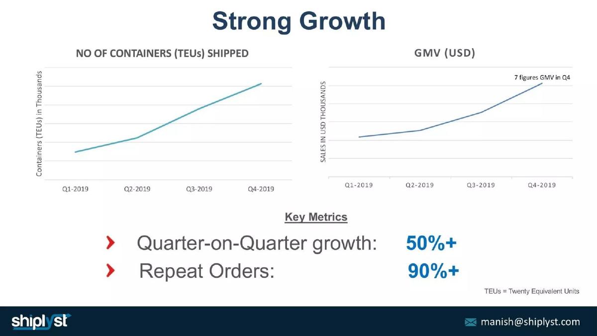
Freight shipping marketplace. The charts cover Q1 to Q4 2019.
Shiplyst deck, slide 4. Exact stored slide matched to this analysis.
Our analysis: Pairing volume (containers) with value (GMV) shows that growth is not just price, and the repeat-order figure speaks to whether customers come back.
Evidence and limitation: Neither chart shows numbers on its axis, and "7 figures" covers anything from $1M to $9.9M. "Repeat orders" should be defined (share of orders from returning customers, or share of customers who reorder).
What a founder can adapt: Add one retention measure (repeat orders, repeat buyers or cohort retention) under your GMV chart.
Supporting analysis
What the deck claims: "Strong growth": two line charts, containers (TEUs) shipped and GMV (USD), each rising over four quarters, with "7 figures GMV in Q4". Key metrics: quarter-on-quarter growth 50%+; repeat orders 90%+.
Presentation choice: Pairing volume (containers) with value (GMV) shows that growth is not just price, and the repeat-order figure speaks to whether customers come back.
When it does not fit: Neither chart shows numbers on its axis, and "7 figures" covers anything from $1M to $9.9M. "Repeat orders" should be defined (share of orders from returning customers, or share of customers who reorder).
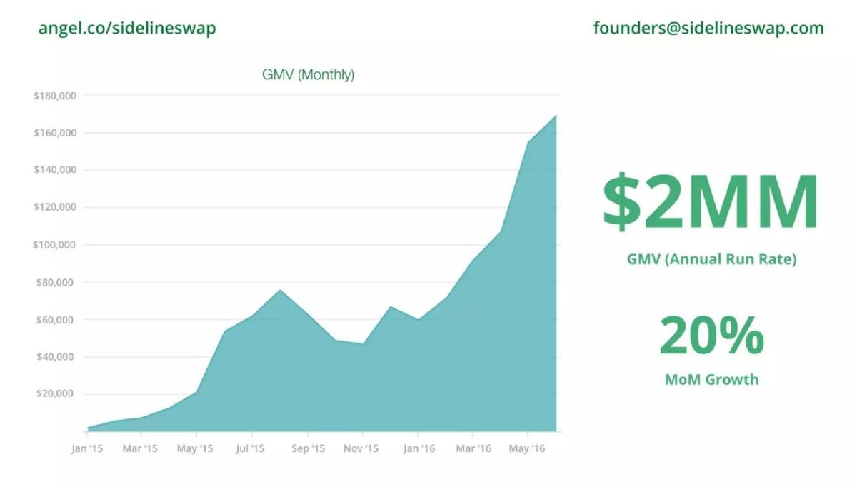
Used sports equipment marketplace. The chart runs from January 2015 to around May 2016.
Sideline Swap deck, slide 5. Exact stored slide matched to this analysis.
Our analysis: Showing the uneven monthly line, dips included, is more credible than a smoothed curve, and the run-rate figure translates the latest month into an annual number.
Evidence and limitation: Sports equipment is likely seasonal; the slide does not say whether the final rise is seasonal. There is no revenue or take rate.
What a founder can adapt: Show the real monthly series; if you quote a run rate, make sure it is the latest month times twelve and say so.
Supporting analysis
What the deck claims: An area chart of monthly GMV with a labelled axis up to $180,000, with visible dips and a steep rise at the end; beside it, "$2MM GMV (annual run rate)" and "20% MoM growth".
Presentation choice: Showing the uneven monthly line, dips included, is more credible than a smoothed curve, and the run-rate figure translates the latest month into an annual number.
When it does not fit: Sports equipment is likely seasonal; the slide does not say whether the final rise is seasonal. There is no revenue or take rate.
On-demand logistics marketplace matching shippers and drivers. The figures refer to 2019.
Smatbeba deck, slide 6. Exact stored slide matched to this analysis.
Our analysis: It is the clearest supply-side view in this set: vehicles registered and money paid out to drivers show that the supply side is earning, which matters for keeping drivers.
Evidence and limitation: Totals for a year hide the trend; a monthly chart would show whether trips are growing. Revenue and take rate are absent, and the coin image adds nothing.
What a founder can adapt: For early marketplaces, report supply earnings (paid out to sellers or providers) alongside completed transactions.
Supporting analysis
What the deck claims: "Traction; 1,000+ trips completed": ~200+ vehicles registered in 2019; 1,000+ completed trips in 2019; over $40,000 paid out to drivers; partnerships with Mzuri Sweets, Sunveat and Victory Farms. A decorative image of rising coins sits on the right.
Presentation choice: It is the clearest supply-side view in this set: vehicles registered and money paid out to drivers show that the supply side is earning, which matters for keeping drivers.
When it does not fit: Totals for a year hide the trend; a monthly chart would show whether trips are growing. Revenue and take rate are absent, and the coin image adds nothing.
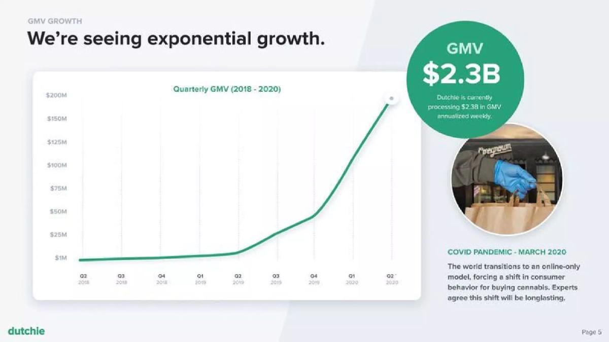
Cannabis ordering platform for dispensaries. The chart covers 2018 to Q2 2020.
Dutchie deck, slide 6. Exact stored slide matched to this analysis.
Our analysis: It names the event behind the inflection, which answers the obvious question and shows awareness of the market shift.
Evidence and limitation: Crediting growth to a one-time event invites the question of whether it will last; show post-event retention if you can. "Annualized weekly" is an unusual measure; define how you annualise. Dutchie's model may differ from a classic take-rate marketplace; the slide doesn't show revenue.
What a founder can adapt: If an outside event drove a jump, say so and show what happened after it.
Supporting analysis
What the deck claims: "We're seeing exponential growth." A quarterly GMV line (2018–2020) that jumps sharply at the end; a callout reads "GMV $2.3B — Dutchie is currently processing $2.3B in GMV annualized weekly"; a note links the shift to the COVID-19 pandemic in March 2020.
Presentation choice: It names the event behind the inflection, which answers the obvious question and shows awareness of the market shift.
When it does not fit: Crediting growth to a one-time event invites the question of whether it will last; show post-event retention if you can. "Annualized weekly" is an unusual measure; define how you annualise. Dutchie's model may differ from a classic take-rate marketplace; the slide doesn't show revenue.
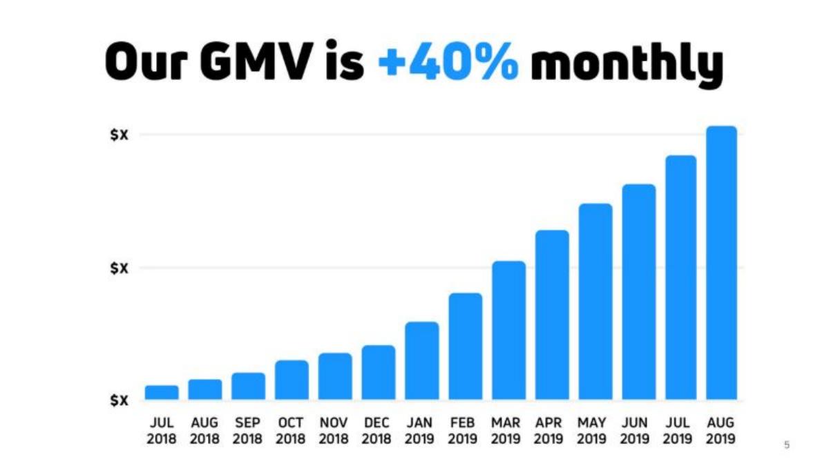
Mobile ordering for independent coffee shops. The chart runs from July 2018 to August 2019.
Cloosiv deck, slide 5. Exact stored slide matched to this analysis.
Our analysis: Included as a contrast. The headline states the growth rate in plain words and the bars show consistent growth.
Evidence and limitation: With "$X" on the axis (possibly redacted for publication), the base is unknown, so 40% monthly could mean very little. Show the latest GMV and at least one other metric.
What a founder can adapt: Keep the plain headline, but label the axis with real values.
Supporting analysis
What the deck claims: "Our GMV is +40% monthly". A monthly bar chart rising each month, with every axis line labelled "$X".
Presentation choice: Included as a contrast. The headline states the growth rate in plain words and the bars show consistent growth.
When it does not fit: With "$X" on the axis (possibly redacted for publication), the base is unknown, so 40% monthly could mean very little. Show the latest GMV and at least one other metric.
GMV shows scale; the other metrics show whether that scale turns into a business. Use GMV plus the one metric that answers your weakest question.
Metric
What it answers
Shown well by
Watch out for
GMV over time
Are transactions growing?
Nanno; Sideline Swap
Unlabelled axes; unexplained final bars
Take rate / revenue
How much of GMV do you keep?
Prolific; Vinterior
Missing definition
Repeat orders
Do buyers come back?
Shiplyst
Undefined "repeat"
Supply metrics
Is the other side growing and earning?
Smatbeba; Vinterior
Annual totals hiding trend
Inflection context
Why did growth change?
Dutchie
Growth tied to a one-off event
Key Takeaways
Pair GMV with what you keep. Prolific states a 25% take rate beside its GMV, which tells an investor how GMV becomes revenue; Vinterior charts GMV and revenue side by side.
Show repeat behaviour. Shiplyst puts "repeat orders: 90%+" under its GMV chart, which speaks to whether demand holds, not just whether it grew.
Show both sides. Nanno reports users and states next to GMV; Smatbeba reports vehicles registered and money paid out to drivers, the supply side's view of traction.
Label the axis. Nanno and Sideline Swap print dollar values; Cloosiv's chart reads "$X" on every axis line, so "+40% monthly" cannot be checked against a base.
Explain inflections honestly. Dutchie links its GMV jump to the COVID-19 shift to online ordering, which is candid but also tells investors part of the growth may be circumstantial.
Check your marketplace traction slide
Answer each line with a number from your data. If a line is blank, that is the question an investor will ask.
Scale. Monthly or quarterly GMV for the last 6–12 periods, with a labelled axis.
Revenue. Take rate (revenue ÷ GMV) and current revenue.
Repeat. Share of GMV or orders from returning buyers.
Supply. Active sellers or providers, and what they earn.
Copyable framework: GMV [amount] in [latest period], up [x]% over [period]. Take rate [y]% → revenue [amount]. [z]% of orders from returning buyers. [n] active sellers earning [amount].
Illustrative example 1 — written by us
Before: Our GMV is growing fast. [Chart with no axis values.]
After: GMV [amount] in [month], up [x]% month on month for [n] months. [y]% take rate. [z]% of orders from repeat buyers. [n] active sellers.
What improved: Our illustrative rewrite, not any company's text. It adds a base, revenue, retention and supply; bracketed values are placeholders.
What investors look for in marketplace traction
A marketplace earns a share of transactions between two groups. GMV (the total value of those transactions) shows scale, but revenue depends on take rate, and durability depends on repeat use and on both sides growing together.
The examples below show different ways to answer those questions on one slide. Where the general traction guide covers any type of company, this page focuses on the metrics specific to marketplaces.
Common mistakes
GMV presented as revenue. State both, and the take rate linking them.
Hidden axis values. Growth percentages mean little without a base.
One side only. Show that both buyers and sellers are growing.
No retention. Add repeat orders or cohort data.
Unexplained jumps. Say what caused an inflection and whether it has held.
Diagnostic checklist
GMV chart with real axis values and dates.
Take rate or revenue stated alongside GMV.
At least one retention or repeat-use metric.
At least one supply-side metric.
Projections or partial periods labelled.
Definitions for any unusual measure (run rate, annualised, repeat).
Frequently asked questions
How we chose these examples
Corpus: published pitch deck teardowns on StartupFundraising.com. Founder-uploaded private decks are excluded.
Selection (2026-09-24): we searched extracted text of slides 2–6 for traction or growth language combined with marketplace terms (GMV, bookings, sellers, drivers, listings, take rate, repeat) where a stored slide image exists, inspected ten candidates, and chose eight. SweepSouth slide 4 and Lolli slide 3 were not selected (SweepSouth adds little beyond Cloosiv; Lolli is a rewards product rather than a two-sided marketplace).
Review: all eight stored slide images were inspected on 2026-09-24 and matched to company, deck and slide number (editorial model review). No person has yet completed an editorial review of this page.
Figures are shown as printed on the slides and have not been independently verified. We make no claim that any slide caused a fundraising outcome.