COVID and Other Shocks on a Traction Slide: Separate
When a pandemic, lockdown or other outside event bent your numbers, investors want to know what was the event and what was you.
COVID and Other Outside Shocks on a Traction Slide: Mark the Event, Show a Baseline, Show What Lasted
Sometimes an event outside your control bends your numbers: a pandemic, a lockdown, a regulation, a supply crisis. Your chart then has a dip or a spike that has little to do with how good your company is. Investors will notice it and ask two questions. If the shock hurt you, has the business recovered, and would it have grown without it? If the shock helped you, how much of the growth will last once the event is over? This guide shows how four founders presented a COVID-era shock on a traction slide, what each slide lets a reader conclude, and what it leaves open.
TL;DR
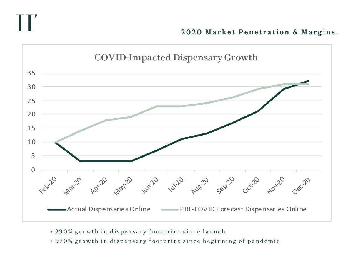
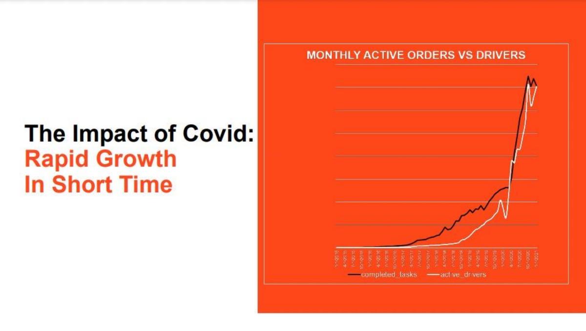
Name the event on the chart at the month it happened, show a baseline the reader can compare against (your pre-shock forecast, your pre-shock trend or an outside benchmark), show where the metric is now relative to that baseline, and say whether the effect has lasted. Hervé does most of this on one chart: actual dispensaries against its 'PRE-COVID Forecast', falling from 10 to 3 in March 2020 and passing the forecast in December. If the shock helped you, as Bringg's 'The Impact of Covid: Rapid Growth In Short Time' says it did, show what happened after the peak, because that is the part investors cannot see.
Four slides that present an outside shock
Each slide is read at full size. Quotes are exact.
Hervé deck, slide 17. Exact stored slide matched to this analysis.
Our analysis: Sizes the hit and the recovery against a pre-shock plan.
Evidence and limitation: Actual falls 10 → 3 (Mar–May 2020), reaches 32 by Dec vs forecast ~31. 970% matches growth from the March low; from February it is 220% (our calculation).
What a founder can adapt: Quote growth from February, not the low point; mark the lockdown month.
Supporting analysis
What the deck claims: "COVID-Impacted Dispensary Growth"; "PRE-COVID Forecast Dispensaries Online"; "+ 970% growth in dispensary footprint since beginning of pandemic".
Presentation choice: The clearest baseline among the four.
When it does not fit: Growth rates that start at the trough.
June Homes deck, slide 20. Exact stored slide matched to this analysis.
Our analysis: Judges performance against others facing the same shock.
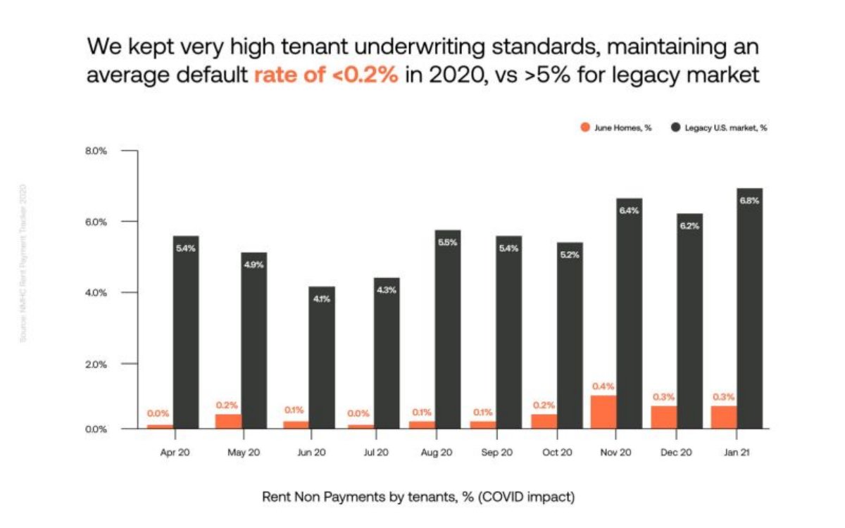
Evidence and limitation: Monthly Apr 2020–Jan 2021: June Homes 0.0–0.4% vs market 4.1–6.8%; averages about 0.17% and 5.4% (our calculation). Headline says 2020 but chart includes Jan 2021; orange bars drawn taller than labels.
What a founder can adapt: Match the headline period to the chart; draw bars to scale.
Supporting analysis
What the deck claims: "Rent Non Payments by tenants, % (COVID impact)"; source "NMHC Rent Payment Tracker 2020".
Presentation choice: The only example with a sourced outside benchmark.
When it does not fit: A benchmark with a different period from the claim.
Event marker, baseline, recovery and consistent growth base.
Example
Event named
Baseline
After the shock
Growth base
Hervé
Chart title
Pre-COVID forecast
Passes forecast in Dec
Trough (970%)
Bringg
Headline
None
Not shown
No values
Convious
Bullet
None
Claimed, number hidden
7x, period not stated
June Homes
Axis title
Market benchmark (sourced)
Monthly to Jan 2021
Not applicable
Key Takeaways
Mark the event on the chart at the month it hit.
Give a baseline: pre-shock forecast, trend or benchmark.
Show the recovery or the post-peak level, not just the shock.
If the shock helped, show what stayed after it ended.
Keep growth rates on one consistent starting point.
Never let 'despite COVID' replace the number it qualifies.
Prepare your shock
Answer these before writing the slide.
Event. What happened, and in which month did it hit your numbers?
Baseline. What will you compare against: forecast, trend or benchmark?
Now. Where is the metric today relative to that baseline?
Lasting. What stayed after the event eased, or how far have you recovered?
Base. Does every growth rate start from a normal pre-event period?
Copyable framework: "[Metric] fell from [a] to [b] at [event, month]; [c] by [month] vs pre-[event] forecast of [d]."
Illustrative example 1 — written by us
Before: "+ 970% growth in dispensary footprint since beginning of pandemic"
After: "From 10 dispensaries pre-COVID to 32 in December 2020 (+220%), ahead of our pre-COVID forecast of 31."
What improved: Our illustrative rewrite of Hervé's line. The 220% is our calculation from the chart; the forecast value is read from its gridlines.
The question this guide answers
This guide answers one founder question: an outside event pushed my numbers sharply down or up. How do I show it so that investors can see the underlying business?
Our growth rate guide covers how to state growth and its period. Our actuals vs forecast guide covers comparing results with a plan. Our ahead-of-plan guide notes that a plan written before the pandemic changes what 'beating plan' means, and our pivot guide covers decks that changed direction because of COVID. None of them explains how to separate a one-off outside event from the trend on the traction slide itself, which is the decision this guide covers.
The examples are all from 2020 and 2021 because COVID is the shock that left the clearest traces in the library. The same approach applies to any outside event: a change in regulation, a platform policy change, a supply shortage or a sudden boom in demand.
How we chose and read the examples
We searched extracted text across the library for 'COVID impact', 'impact of COVID', 'despite COVID' and similar phrases. Most of the 26 matches were risk disclaimers in listed-company decks or market-timing claims on a 'why now' slide. We set aside listed companies and SPAC decks, including a lender whose cohort chart notes 'Includes impact of COVID-19', and kept four private-company slides that present a shock to their own numbers in different ways: a chart against a pre-shock forecast, a chart showing a COVID surge, a headline growth claim 'despite COVID', and a chart against an outside benchmark.
Each slide was rendered from the source deck and read at full size. Combined figures, such as Hervé's growth from its low point and June Homes' averages, are our calculations from the slides' own numbers. All four companies were private when these decks were made. We did not check any figure against outside sources.
Why investors probe a shock
It distorts every growth rate. A year-over-year figure that starts at a lockdown low looks spectacular; one that starts at a lockdown peak looks weak. Investors will recalculate from a normal period, so it is better if you do it first.
It hides the trend. A dip followed by recovery can mean the business is fine or that it is still below where it should be. Without a baseline, the reader cannot tell which.
Tailwinds fade. A company whose demand jumped because people stayed home has to show the demand stayed when they went out again. Investors pay for the lasting part, not the spike.
It tests judgment. How founders describe an event they did not cause tells investors something about how candidly they will report later. A clear, specific account builds trust; a vague 'despite COVID' does not.
A shock against a pre-shock forecast: Hervé
Hervé, a cannabis edibles brand, has a slide headed '2020 Market Penetration & Margins.' with a line chart titled 'COVID-Impacted Dispensary Growth'. Two lines run from Feb-20 to Dec-20: 'Actual Dispensaries Online' and 'PRE-COVID Forecast Dispensaries Online'. Both start at 10 in February. The actual line falls to 3 in March and stays there through May, then climbs to about 21 in October, 29 in November and 32 in December. The forecast line rises steadily from 10 to about 31. Below the chart: '+ 290% growth in dispensary footprint since launch' and '+ 970% growth in dispensary footprint since beginning of pandemic'.
The forecast line is the lesson. By drawing what the company expected before the shock, Hervé lets a reader see the size of the hit (about 15 dispensaries below plan by May), how long recovery took (the gap closes in November) and where the business ended up (slightly above the forecast in December). A reader does not have to take the founders' word that COVID was to blame or that the business recovered; the chart shows both against a plan that existed before the event.
The weakness is in the two growth lines underneath. '970% since beginning of pandemic' matches growth from the March low of 3 to 32 (about 967%, our calculation), not from February's 10, which would be 220%. Starting at the trough makes the shock itself part of the growth figure. '290% since launch' uses a different starting point that the chart doesn't show. Two percentages with two different bases, one of them the worst month, invite exactly the recalculation the chart was built to avoid. A cleaner line would be: 'From 10 dispensaries pre-COVID to 32 in December 2020 (+220%), ahead of our pre-COVID forecast of 31.'
One more caution: the forecast is the company's own and its basis isn't shown. A reader should treat it as the founders' expectation, not as proof of what would have happened.
A shock that helped: Bringg
Bringg, a delivery-management software company, has a slide headed 'The Impact of Covid: Rapid Growth In Short Time' beside a line chart titled 'MONTHLY ACTIVE ORDERS VS DRIVERS'. Two lines, labelled 'completed_tasks' and 'active_drivers', rise slowly for several years, then turn nearly vertical in 2020. The axis labels are monthly dates too small to read at full size in our copy, and the vertical axis has gridlines but no values. Just before the surge, the drivers line dips sharply while the orders line flattens. At the right edge both lines fall back slightly from their peak.
Naming the tailwind openly is the lesson. Bringg doesn't present the jump as the result of its own sales effort; the headline credits the pandemic. That candour helps, because an investor would make the connection anyway, and a founder who says it first looks more credible. The two lines also show that drivers grew with orders, which suggests the platform handled the surge rather than just recording it.
What the slide can't show is the question every investor will ask about a tailwind: what happens when it ends? With no values on the axis and dates too small to read, a reader can't measure the jump, compare it with the pre-COVID trend, or tell whether the small fall at the end is the start of a decline. The pre-surge dip in drivers is also unexplained. Two additions would turn the claim into evidence: values on the axis, and a line such as '[x]% of the orders added in 2020 were still active in [month] after restrictions eased.'
Growth 'despite COVID': Convious
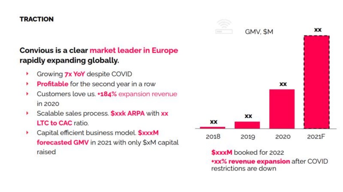
Convious, a booking and ticketing software company for attractions, has a slide headed 'TRACTION' with the claim 'Convious is a clear market leader in Europe rapidly expanding globally.' Bullets include 'Growing 7x YoY despite COVID', 'Profitable for the second year in a row' and 'Customers love us. +184% expansion revenue in 2020'. A bar chart of 'GMV, $M' covers 2018, 2019, 2020 and a dashed '2021F', with every value shown as 'xx'. Below the chart: '$xxxM booked for 2022' and '+xx% revenue expansion after COVID restrictions are down'.
The slide is useful for its last line. '+xx% revenue expansion after COVID restrictions are down' is the right kind of claim: it separates what happens during the restrictions from what happens after, which is exactly what an investor in a business serving attractions wants to know. Convious appears to have been hit, not helped, and it points to recovery as a separate source of growth.
The weakness is 'despite COVID'. The phrase asks the reader to give extra credit for growth during a difficult period, but the slide gives no way to judge how difficult it was: no before-and-after split, no indication of which months were closed, and in our copy every value is hidden. The chart's bars also don't make the 7x visible; the 2020 bar is roughly five times the 2019 bar by eye, and we can't tell which period the 7x covers. A more useful line would say what the shock did and what the company did anyway: 'Venues closed [n] months in 2020; GMV still grew 7x ([period]).'
A shock measured against an outside benchmark: June Homes
June Homes, a rental housing company, has a slide headed 'We kept very high tenant underwriting standards, maintaining an average default rate of under 0.2% in 2020, vs over 5% for legacy market' (the slide uses less-than and greater-than symbols where we write 'under' and 'over'). A paired bar chart titled 'Rent Non Payments by tenants, % (COVID impact)' runs from Apr 20 to Jan 21, with June Homes' monthly rate (0.0% to 0.4%) beside the 'Legacy U.S. market' (4.1% to 6.8%). A faint vertical note gives the source: 'NMHC Rent Payment Tracker 2020'.
Comparing with an outside benchmark is the lesson. A pandemic raised non-payment for every landlord, so June Homes' own rate alone would be hard to judge. Setting it beside a published market series, month by month, shows the company's performance relative to everyone facing the same shock. The source note is what makes the benchmark usable.
The figures check out on the slide's own numbers, with one detail. Averaging the ten June Homes values gives about 0.17% and the ten market values about 5.4% (our calculations), consistent with the headline. But the chart runs to January 2021 while the headline says '2020'; the nine 2020 months alone average about 0.16%. The orange bars are also drawn taller than their labels: the 0.4% bar reaches about the 1% gridline, so the June Homes series looks worse than it is, an unusual error in the company's disfavour. A reader should also note that the comparison is between one company's tenants and the whole market, which may differ in income, location and lease type, so the gap can't be credited entirely to underwriting.
What to put on the slide
The event marker. A label at the month the shock hit ('Lockdown, Mar 2020'). Hervé's chart title and June Homes' axis title name COVID; neither marks the exact month on the chart.
The baseline. Something to compare against: your pre-shock forecast (Hervé), your pre-shock trend line, or an outside benchmark that faced the same event (June Homes). Without one, the reader can't size the effect.
The current position. Where the metric is now relative to that baseline. Hervé shows it passing the forecast; Bringg shows a peak with no values.
The lasting part. For a tailwind, what remained after the event eased; for a headwind, whether you have fully recovered. Convious points to post-restriction expansion; it should give the number.
A consistent base. If you quote growth, start it from a normal pre-shock period and say which. Don't measure from the trough.
Where the shock goes in the deck
On the traction slide, as part of the main chart, not on a separate 'COVID' slide. The reader is looking at the chart already; the marker and baseline belong there.
In the financials, if the forecast assumes the shock's effect continues or reverses. If your plan assumes 2020's surge persists, say so; if it assumes recovery, say when.
In the 'why now' slide only if the event changed customer behaviour for good. Bringg's headline would be stronger with evidence that the change lasted; that evidence then supports a 'why now' argument too.
Templates
Headwind: '[Metric] fell from [a] to [b] when [event] hit in [month]; back to [c] by [month], against our pre-[event] forecast of [d].'
Tailwind: '[Metric] rose [x]% during [event]; [y]% of that gain retained [n] months after [event] eased.'
Benchmark: 'Our [metric] was [a]% during [event] vs [b]% for [benchmark, source], [period].'
Growth base: 'Up [x]% from [pre-event month] to [month]', never from the low point.
What these examples can and cannot show
These four slides show how founders presented an outside shock. They can't show what would have happened without the shock, whether the effects lasted after the decks were made, or how these companies compare with their peers. Hervé's forecast is the company's own estimate; June Homes' benchmark covers a different population of tenants. Our calculations depend on reading values from the charts, which for Hervé are read from gridlines rather than labels.
Treat them as patterns. Hervé gives a pre-shock baseline and shows recovery but quotes growth from the trough. Bringg names a tailwind honestly but gives no scale or post-peak view. Convious separates during and after restrictions but hides the numbers and leans on 'despite'. June Homes compares with a sourced benchmark but mislabels its period and draws its own bars too tall.
Common mistakes
Growth from the trough. A rate that starts at the lowest month counts the shock as growth.
No baseline. A dip or spike with nothing to compare it against.
Tailwind with no after. A surge shown without what remained once the event ended.
'Despite' as evidence. Credit claimed for a hard period without showing how hard it was.
Mismatched periods. A headline period that differs from the chart's.
Diagnostic checklist
Event marked at the month it hit.
Baseline shown: forecast, trend or sourced benchmark.
Current position relative to the baseline.
What lasted after the event eased.
Growth quoted from a normal pre-event period.
Frequently asked questions
Should I still mention COVID if it was years ago?
Only if it still shapes the chart investors are reading. If your multi-year history includes the dip or spike, label it; if not, leave it out.
Can I remove the shock period from my numbers?
Show the real figures and mark the period. You can add an adjusted line beside them, labelled as adjusted, but don't replace the actuals.
How we chose these examples
Corpus: published pitch deck teardowns on StartupFundraising.com. Founder-uploaded private decks are excluded.
Selection (2026-10-01): we searched extracted text for COVID and pandemic impact phrases, set aside risk disclaimers, listed-company and SPAC decks, and kept four private-company slides each presenting a shock to their own numbers differently.
Review: the four slides were rendered from the source decks on 2026-10-01 and read in full at full size against company, deck and slide number (editorial model review, with AI assistance in drafting; not human-reviewed). Combined figures were calculated from the slides' stated or charted numbers. No figure was checked against outside sources.