Actuals vs Forecast on a Pitch Deck: How to Mark Where Real
When one chart or table mixes achieved and projected figures, investors need to see the line between them at a glance.
Actuals vs Forecast on One Slide: Show Exactly Where Real Numbers End
Many pitch deck charts and tables combine two kinds of number: what the company has already achieved and what it expects to achieve. That is often the right choice, because the forecast only makes sense next to the history it extends. It also creates a risk. If the reader can't see where the actuals stop, projected figures borrow the credibility of real ones, and growth rates calculated across the boundary look like results. This guide looks at four real decks that put actuals and forecasts on the same slide and shows the specific ways to make the split impossible to miss.
TL;DR
Mark every period as actual or forecast in the label itself, make the two look different (colour, fill or line style), state the date the actuals run to, and keep summary figures such as growth rates or totals either on actuals only or clearly labelled as mixed. Flo shades achieved months in a darker colour than forecast months, with a legend reading 'Fact' and 'Forecast' and a note '**as of December 2020**'. Paramark puts 'Actuals' or 'Plan' above every quarter in its table header and colours the two groups differently. GoCoin writes '(Actual)' or '(Projected)' into each row label, but its 'Q/Q GROWTH Avg' row blends two actual quarters with two projected ones. Pave plots actual integrated employees against two plans, 'Revised Plan' and 'Start of Year Plan', which shows how actuals compared with what the company expected.
Four decks that combine actuals and forecasts
Each page is read at full size. Quotes are exact.
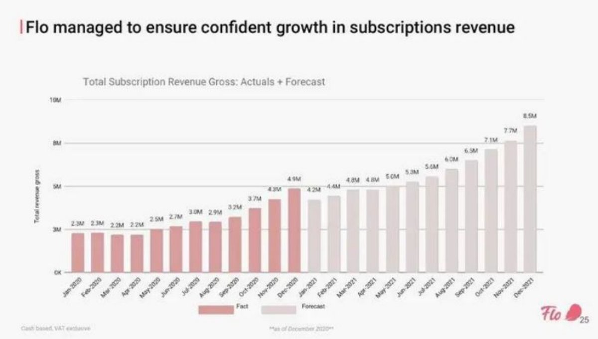
Flo financials slide — slide 25
Women's health app. Monthly subscription revenue chart.
Flo deck, slide 25. Exact stored slide matched to this analysis.
Our analysis: The clearest boundary of the four.
Evidence and limitation: Colour changes where actuals end; legend and date given; headline covers both halves.
What a founder can adapt: Keep the headline to the actual period.
Supporting analysis
What the deck claims: "Total Subscription Revenue Gross: Actuals + Forecast"; legend "Fact" / "Forecast"; "**as of December 2020**".
Presentation choice: Shows colour, legend and date working together.
When it does not fit: Two colours too close in tone to survive printing.
Label each period actual or forecast, not only the chart title.
Make actuals and forecasts look different.
Say the date the actuals run to.
Don't average growth across the boundary without saying so.
Totals that include forecast periods are forecasts.
Plotting actuals against an earlier plan shows forecasting record.
Check your mixed chart or table
Answer these before the slide goes in the deck.
Labels. Does every period say actual or forecast?
Style. Would the split still show in greyscale?
Date. Does the slide say when the actuals end?
Summaries. Do any totals, averages or growth rates include forecast periods?
Copyable framework: "[Metric]: actuals to [date] (solid), forecast from [date] (outlined). Growth, actuals only: [x]%."
Illustrative example 1 — written by us
Before: "Q/Q GROWTH Avg 340%"
After: "Q1 to Q2 growth (actual): 328% merchants. Q2 to Q4 growth (projected): [x]%."
What improved: Our illustrative rewrite of GoCoin's row. The 328% is calculated from the slide's 150 and 642; the bracketed figure is not stated.
The question this guide answers
This guide answers one founder question: when a single chart or table on my deck shows both actual and projected numbers, how do I make the boundary clear?
Our financials guide tells founders to keep actuals and forecasts visually distinct, and our gross margin guide flags a table that mixes them. Our forecast growth rates draft covers whether projected growth is believable. Our metric dates draft covers putting an as-of date on traction figures. None of these is about the boundary itself: which labelling, styling and summary choices make the split clear, and which quietly blur it. The advice here is specific to slides that combine both kinds of figure.
How we chose and read the examples
We searched extracted text across the library for phrases pairing 'actual' or 'actuals' with 'forecast', 'projected', 'projection' or 'plan'. There were 37 matches. We set aside legal disclaimers about forward-looking statements, listed companies' filings, and pages where the words appear but the slide does not show both kinds of figure. From the rest we chose four that mark the boundary in different ways: by colour on a bar chart, by column headers in a table, by row labels in a table, and by plotting actuals against plans.
Each page was rendered from the source document and read at full size. In the copy of Paramark's deck we have, a grey box covers most of the table's figures; only the header and the burn multiple row are visible, and we quote only those. We did not check any figure against outside sources.
Why the boundary matters
Forecasts borrow credibility. A bar chart where the last twelve bars are forecasts looks, at a glance, like two years of growth. A reader who skims sees the shape, not the legend.
Summary figures hide the mix. A growth rate, average or total calculated across actual and forecast periods is partly a forecast. If the slide doesn't say so, it reads as a result.
Decks age. A forecast quarter in a deck written in June may be over by the time an investor reads it in September. Without a date for the last actual, the reader can't tell which periods should now be real.
Investors check. The first question on a mixed chart is usually 'which of these are real?'. A slide that answers it in advance saves that question and signals care.
Colour and a dated legend: Flo
Flo, a women's health app, has a slide headed 'Flo managed to ensure confident growth in subscriptions revenue'. The chart is titled 'Total Subscription Revenue Gross: Actuals + Forecast' and shows 24 monthly bars from January 2020 to December 2021. The first twelve are a darker pink; the last twelve are a pale grey-pink. The legend reads 'Fact' and 'Forecast'. Values are printed above each bar, from '2.3M' in January 2020 to '4.9M' in December 2020, then '4.2M' in January 2021, rising to '8.5M' in December 2021. Footnotes read 'Cash based, VAT exclusive' and '**as of December 2020**'.
This is the clearest boundary of the four. The title says the chart mixes both, the colours change exactly where actuals end, the legend names the two kinds of bar, and the date note tells the reader when the split was drawn. The forecast also starts below the last actual month, at 4.2M after 4.9M, which suggests the company modelled a January dip rather than drawing a straight line upward; an honest forecast that a reader can see is a forecast.
The headline, 'managed to ensure confident growth', refers to both halves, so it describes a projection as if it were achieved. Keeping the headline to the actual period, for example 'Subscription revenue doubled in 2020', and letting the chart carry the forecast would match the care taken in the chart. The two colours are also close in tone; in a printed or projected deck a pattern or outline on forecast bars would hold up better.
Column headers in a plan table: Paramark
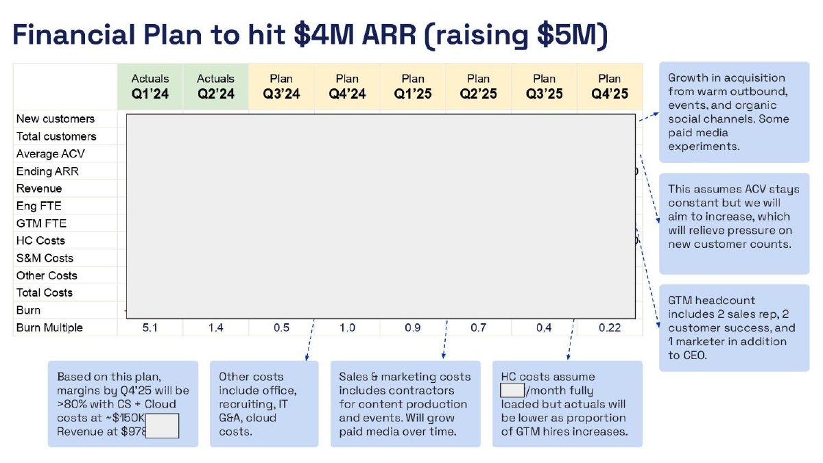
Paramark, a marketing measurement company, has a slide headed 'Financial Plan to hit $4M ARR (raising $5M)'. A table runs across eight quarters. Above Q1'24 and Q2'24 the header reads 'Actuals', shaded green; above Q3'24 through Q4'25 it reads 'Plan', shaded yellow. Rows include new customers, total customers, average ACV, ending ARR, revenue, headcount and costs, burn and 'Burn Multiple'. In the copy we have, a grey box covers most of the figures; the burn multiple row is visible: '5.1' and '1.4' under the two actual quarters, then '0.5', '1.0', '0.9', '0.7', '0.4' and '0.22' under the plan quarters. Callout boxes explain assumptions, such as 'This assumes ACV stays constant' and that headcount costs 'will be lower as proportion of GTM hires increases'.
Labelling every column, not only the table, means a reader can't misread any single figure; each sits under a word that says what it is. The colour blocks reinforce the split, and the callouts tie each forecast line to a stated assumption, which is what makes a plan table credible.
The visible row shows why the boundary matters. Burn multiple goes from 5.1 and 1.4 in the two actual quarters to 0.5 in the first plan quarter, a sharp change at exactly the point where actuals end. An investor will want to know what changes in Q3'24 to cause it. A callout tied to that jump, rather than only to the general assumptions, would answer the question the boundary raises. The slide also doesn't say on what date Q2'24 closed or whether it is a full quarter.
Row labels and a blended average: GoCoin
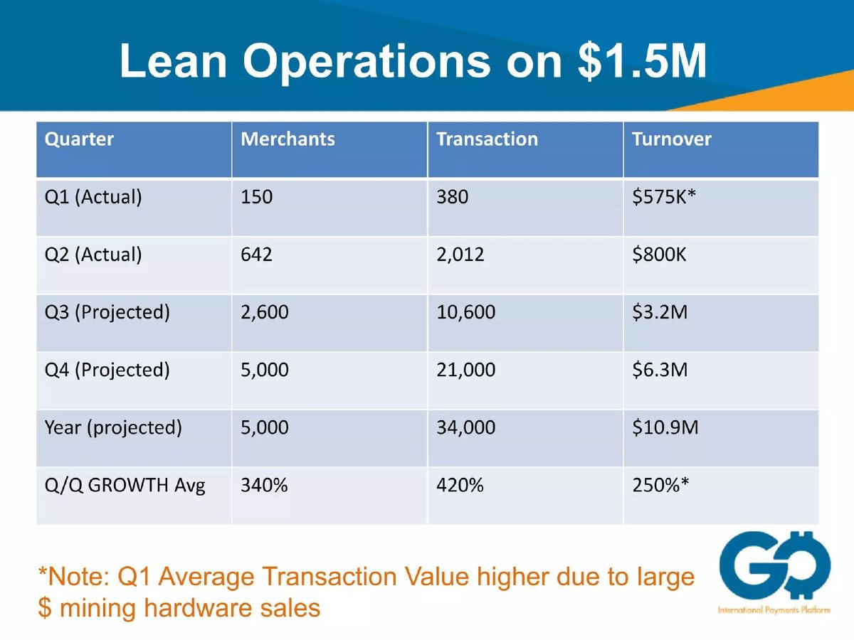
GoCoin, a payments company, has a slide headed 'Lean Operations on $1.5M'. A table lists quarters in rows: 'Q1 (Actual)', 'Q2 (Actual)', 'Q3 (Projected)', 'Q4 (Projected)', 'Year (projected)' and 'Q/Q GROWTH Avg'. Columns show merchants, transactions and turnover. Q1: 150 merchants, 380 transactions, '$575K*'. Q2: 642, 2,012, '$800K'. Q3: 2,600, 10,600, '$3.2M'. Q4: 5,000, 21,000, '$6.3M'. Year: 5,000, 34,000, '$10.9M'. Q/Q growth average: '340%', '420%', '250%*'. A note reads '*Note: Q1 Average Transaction Value higher due to large $ mining hardware sales'.
Writing '(Actual)' and '(Projected)' into each row label is a simple, robust way to mark the split; it survives printing, screenshots and colour-blind readers. The 'Year (projected)' row is also labelled correctly: its turnover equals the four quarters added together (about $10.9M), so a figure that includes forecast quarters is called a forecast.
The 'Q/Q GROWTH Avg' row is not labelled the same way. It averages growth across actual and projected quarters, so its 340%, 420% and 250% are partly forecasts but read like results. The slide also leaves out the year the quarters belong to. Splitting the row, for example 'Q1 to Q2 growth (actual): 328% merchants; Q2 to Q4 (projected): [x]%', and adding the year would keep the table's careful labelling consistent.
Actuals plotted against plans: Pave
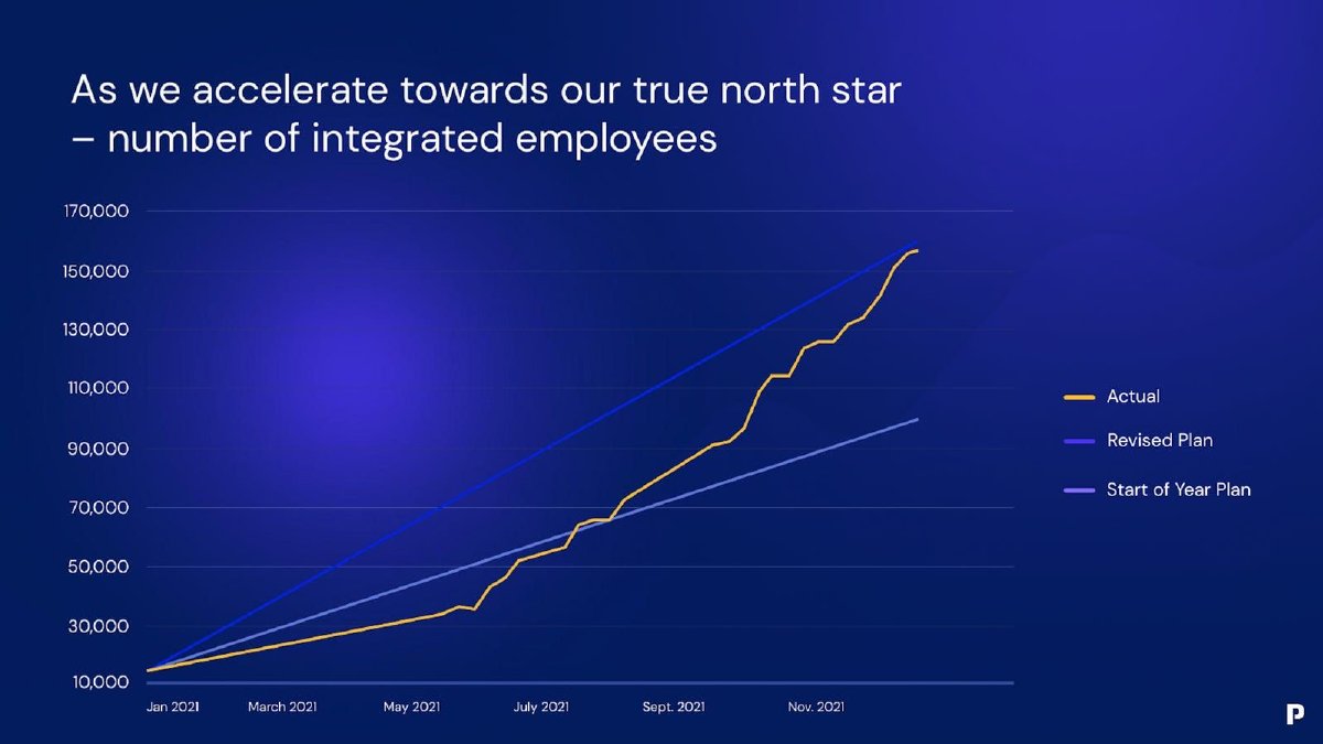
Pave, a compensation data company, has a slide headed 'As we accelerate towards our true north star – number of integrated employees'. A line chart runs from January 2021 to around December 2021 on a scale from 10,000 to 170,000. Three lines are shown: 'Actual' in yellow, 'Revised Plan' in dark blue and 'Start of Year Plan' in light blue. The actual line starts near the bottom, runs below the start-of-year plan until about July 2021, crosses above it, and ends close to the revised plan line at roughly 157,000 (our reading of the chart; no value is printed).
This is a different use of actuals and forecasts on one chart: not to extend history into the future, but to compare history with what the company expected. It shows an investor how well the company forecasts and whether it beat its own plan, which is useful evidence when the next slide is a forecast. Naming both plans, rather than only the more flattering one, is the honest choice.
The chart doesn't say when the plan was revised, so the reader can't tell whether the revised plan was set before or after most of the growth had happened. No values are printed, so readings depend on the gridlines. Adding the revision date as a marker on the chart, and printing the final actual figure, would make the comparison checkable.
What to put on the slide
Label every period. Put 'A' or 'F', 'Actual' or 'Plan', in each column header or row label, as Paramark and GoCoin do. A legend alone is easy to miss.
Style the two differently. Solid against hatched or outlined bars, solid against dashed lines, or two clearly different colours. Check the difference survives printing in greyscale.
Date the boundary. 'Actuals to 31 December 2020', as Flo's note does. If the deck may be read months later, this tells the reader which forecasts should now be results.
Keep summaries honest. Calculate growth rates, averages and totals on actuals only, or label them 'includes forecast'. GoCoin's year row does this; its growth row doesn't.
Keep the headline on the actuals. Describe what has happened in the title and let the chart show the forecast.
Show your forecasting record if it helps. Plotting actuals against an earlier plan, as Pave does, tells investors how much weight to give your next forecast.
Templates
Chart title: '[Metric], [period]: actuals to [date], forecast from [date].'
Table header: 'Q1'24 A | Q2'24 A | Q3'24 F | Q4'24 F.'
Summary row: 'Growth, actual quarters: [x]%. Growth, forecast quarters: [y]%.'
Plan comparison: 'Actual vs plan set [date]; plan revised [date].'
What these examples can and cannot show
These four pages show how founders have marked the line between actual and projected figures. They can't show whether the actuals were accurate, whether the forecasts were met, or how investors read the slides. We did not check any figure against outside sources.
Treat them as patterns. Flo uses colour, a legend and a date. Paramark labels every column and ties forecasts to assumptions. GoCoin labels every row but blends its growth average. Pave plots actuals against two plans to show its forecasting record.
Common mistakes
Legend only. Actual and forecast told apart only in a small legend.
Blended summary. A growth rate or average across both, labelled as a result.
No boundary date. No date for the last actual period.
Headline overreach. A title describing forecast growth as achieved.
Weak contrast. Styles too similar to tell apart in print.
Diagnostic checklist
Every period labelled actual or forecast.
Actuals and forecasts styled differently.
Date of last actual stated.
Summary figures on actuals only, or labelled mixed.
Headline describes only what has happened.
Frequently asked questions
Should I put actuals and forecasts on separate slides instead?
Not necessarily. A forecast is easier to judge next to the history it extends. Combine them, and mark the split clearly.
What if the current period is only half over?
Label it as partial, for example 'Q3 to date (8 weeks)', or leave it out. Don't show a part-period as a full actual or as a forecast.
How we chose these examples
Corpus: published pitch deck teardowns on StartupFundraising.com. Founder-uploaded private decks are excluded.
Selection (2026-10-01): we searched extracted text for 'actual(s)' near 'forecast', 'projected', 'projection' or 'plan', set aside legal disclaimers, listed-company filings and pages not showing both kinds of figure, and kept four private-company pages each marking the split differently.
Review: the four pages were rendered from the source documents on 2026-10-01 and read in full at full size against company, document and page number (editorial model review, with AI assistance in drafting; not human-reviewed). Calculated figures use only numbers printed on the slides. No figure was checked against outside sources.