Tallyfy’s 2013 pitch deck is a notable example of 'less is more.' With only 10 slides and almost no body text, the company successfully raised $1.4 million. The deck relies heavily on social proof and hard traction, leading with $600k in pilots from massive enterprise names like Nestlé and Emerson. It identifies a specific pain point—the 30% of time wasted on manual approvals—and positions itself as the accessible alternative to the $10 billion enterprise Business Process Management (BPM) market dominated by legacy players like IBM and SAP. While it lacks traditional slides for unit economics…
Key takeaways
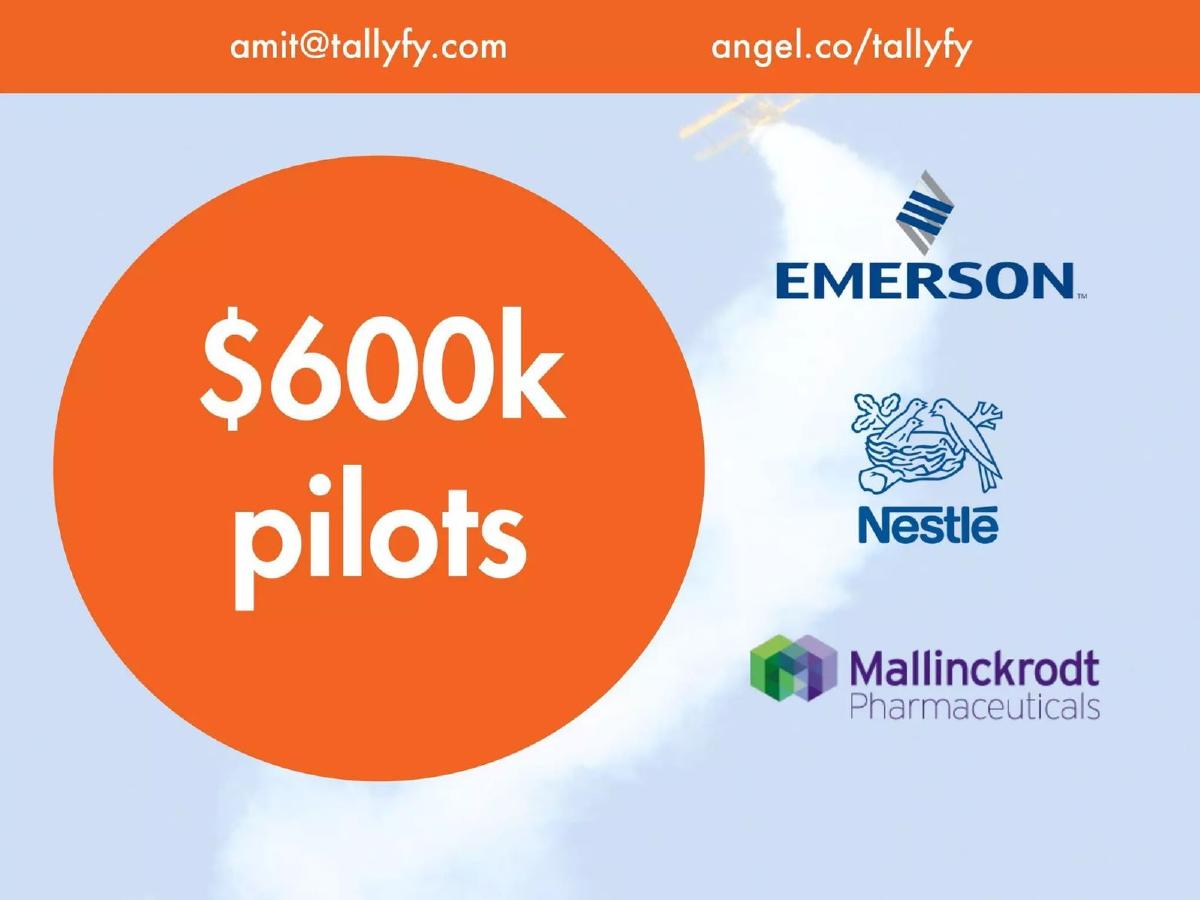
- The deck leads with a massive traction signal, citing $600k in pilots on slide 3.
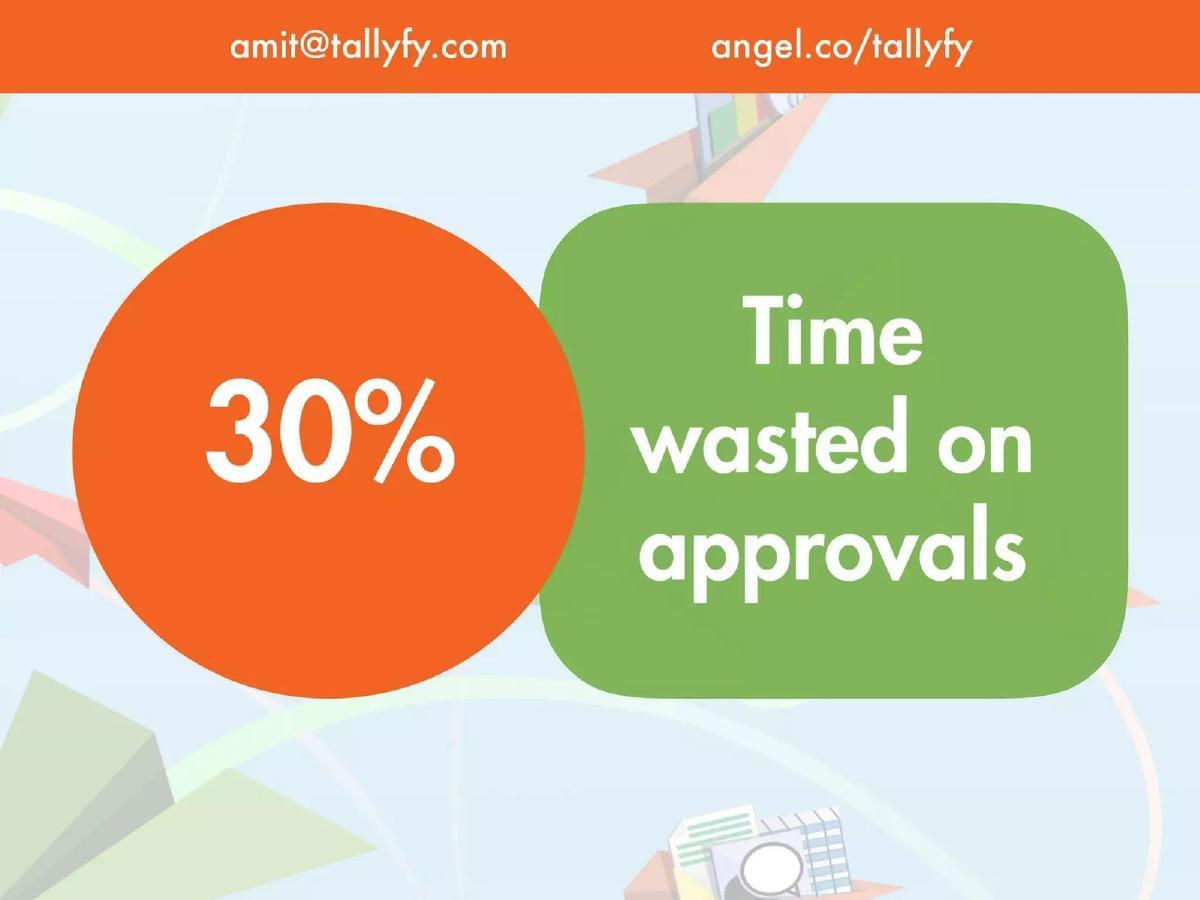
- It identifies a specific, quantifiable problem: 30% of time is wasted on approvals (slide 5).
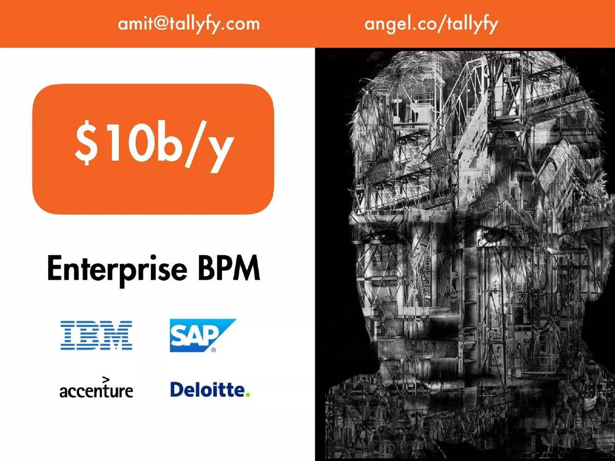
- Tallyfy positions itself against a $10b/y Enterprise BPM market including IBM and SAP (slide 6).
- The product is framed as the solution for 'the rest of us,' implying a focus on usability over legacy complexity (slide 7).
- Social proof is the deck's primary engine, featuring logos from Nestlé, Emerson, Coca-Cola, and the NHS (slides 3 and 9).
- The team slide includes four members but omits their professional backgrounds or specific prior achievements (slide 9).
- There is no financial projection, go-to-market strategy, or specific funding ask included in the 10 slides.
- The final slide reinforces the two strongest metrics: $600k from pilots and 30% time saved (slide 10).
The Power of Minimalist Traction
Tallyfy’s 10-slide deck from 2013 is a case study in using traction to silence skepticism. In an era where SaaS decks were becoming increasingly bloated with complex feature lists and five-year projections, Tallyfy opted for a high-impact, low-word-count approach. The deck functions more like a visual aid for a verbal pitch than a standalone document, yet it manages to convey the three most important things an investor needs to know: someone is buying this, the market is huge, and the current solutions are broken.
Slides 1-3: The Hook and the Proof
Slide 1: Title The deck opens with a clean logo and contact information. Notably, the header includes a direct link to their AngelList profile (angel.co/tallyfy), signaling that this deck was likely used as a primary asset for an online syndicate or platform-based fundraise.
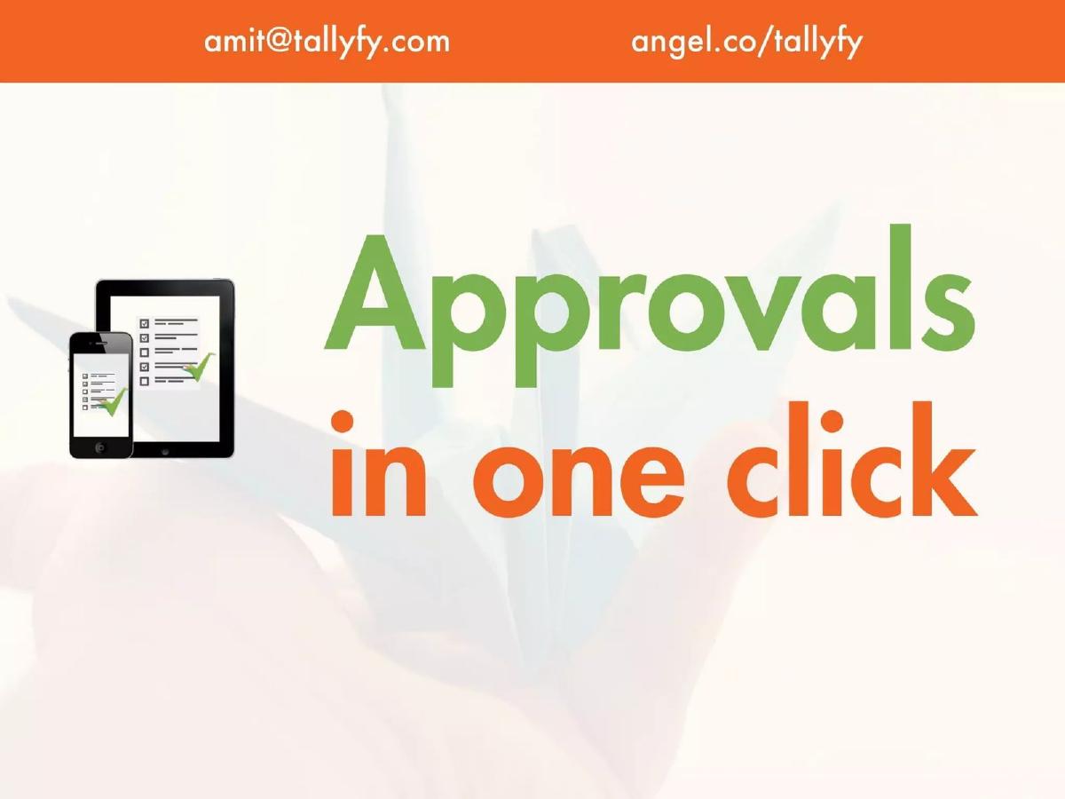
Slide 2: The Value Prop Instead of a complex mission statement, Tallyfy uses four words: "Approvals in one click." This immediately identifies the core function of the product. The visual of a smartphone and tablet running the software reinforces that this is a modern, cross-platform solution.
Slide 3: Traction This is the most important slide in the deck. By slide three, Tallyfy has already stated they have "$600k pilots" and displays the logos of Emerson, Nestlé, and Mallinckrodt Pharmaceuticals. For a 2013-era startup, having six-figure pilot revenue from Fortune 500 companies is an incredibly strong signal that overcomes almost any other deficiency in the deck. It proves product-market fit at the enterprise level before the founder even explains how the product works.
Slides 4-5: The Problem and the Metric
Slide 4: The Scaling Pain "Scaling growth requires consistent processes." This slide sets the stage for why their software is a 'must-have' rather than a 'nice-to-have.' It targets the specific pain point of growing companies where manual intervention becomes a bottleneck.
Slide 5: The Quantified Problem Tallyfy claims "30% Time wasted on approvals." This is a brilliant move because it gives investors a metric to anchor their ROI calculations. If a company can save 30% of its management's time, the software pays for itself almost instantly. The slide is visually loud, using a large orange circle to ensure the number sticks in the viewer's mind.
Slides 6-7: Market Opportunity and Positioning
Slide 6: The Legacy Market The deck identifies a "$10b/y" market for Enterprise BPM. By listing IBM, SAP, Accenture, and Deloitte, Tallyfy isn't just showing market size; they are identifying the 'villains' of their story. These are the expensive, slow, and complex incumbents that Tallyfy intends to disrupt.
Slide 7: The 'Rest of Us' Strategy Slide 7 literally crosses out the legacy players and asks, "The rest of us?" accompanied by a frustrated cartoon character. This positions Tallyfy as the 'consumerized enterprise' solution—software that is powerful enough for big business but simple enough for a regular employee to use without a Deloitte consultant standing over their shoulder.
Slides 8-10: Product, Team, and Summary
Slide 8: Product UI This is the only slide showing the actual interface. It focuses on a "Client onboarding process" with simple progress bars for various clients (Lizzie's Salon, Joe's Pizza, etc.). It demonstrates that the software provides a high-level dashboard view of process health, answering the "Is it done yet?" question mentioned in their catalogue description.
Slide 9: The Team and Social Proof The team slide features Amit (CEO), Pravina (Marketing), Walker (CTO), and Edgar (Sales). Interestingly, the slide prioritizes more customer logos (Coca-Cola, Vodafone, Gainsight, NHS) over team bios. This suggests the founders believed their customer list was more impressive than their individual resumes at that stage. While it lacks the 'pedigree' (Ex-Google, Stanford, etc.) often seen in decks, the logos above their heads act as a proxy for competence.
Slide 10: The Closing Statement The final slide repeats the two most compelling facts: "$600k from pilots" and "30% time saved." It provides the contact email and AngelList link one last time. There is no 'Ask' slide, no mention of the $1.4M target, and no valuation. This is a 'teaser' style deck designed to get a meeting, not to close the deal on the spot.
What Works in the Tallyfy Deck
1. Extreme Clarity: You can read this entire deck in 30 seconds and understand exactly what they do, who they sell to, and why it matters. In a sea of over-explained startups, this brevity is a competitive advantage.
2. Leading with Revenue: Most startups put their traction at the end. Tallyfy puts it at the beginning. By the time you get to the 'Problem' slide, you already know that Nestlé and Emerson have validated the solution. This changes the investor's mindset from "Does this work?" to "How big can this get?"
3. The 30% Metric: Having a single, repeatable efficiency metric (30% time saved) makes the pitch viral. It is easy for an associate to repeat to a partner: "They save enterprise managers 30% of their time on approvals."
What is Missing from the Tallyfy Deck
1. The Business Model: There is no mention of how much Tallyfy costs, whether it is a per-seat license or a flat enterprise fee, or what the margins look like. Investors are left to guess the unit economics.
2. The 'How': The deck explains what it does (approvals) but not how it does it. Is there an AI component? Is it a no-code builder? The technical defensibility of the product is completely absent.
3. The Ask and Use of Funds: A standard pitch deck usually ends with a slide detailing how much money is being raised and what milestones that money will buy (e.g., "Raising $1.5M to hire 5 engineers and hit $2M ARR"). Tallyfy omits this entirely, likely because they were using the deck on a platform where those details were listed in a separate text field.
4. Competitive Landscape: While they mention legacy BPM players, they don't mention modern competitors like Asana, Trello, or Pipefy, which were all active or emerging around 2013. A sophisticated investor would want to know why Tallyfy wins against other 'simple' tools, not just why they win against IBM.
What a Founder Should Copy
1. The 'Traction First' Layout: If you have impressive pilot revenue or big-name logos, do not hide them on slide 12. Move them to the front. It earns you the right to be heard for the rest of the presentation.
2. Minimalist Design: Tallyfy uses large fonts, high-contrast colors, and very few words. This forces the presenter to actually talk and prevents the audience from squinting at small text instead of listening.
3. The 'Villain' Slide: Explicitly crossing out the old way of doing things (Slide 7) is a powerful psychological tool. It creates a clear 'Before and After' narrative that makes the startup's existence feel inevitable.
4. Consistent Branding: The use of the orange and green color palette throughout the deck, matching the logo, creates a professional and cohesive feel that belies the deck's simplicity.
Frequently asked questions
- How much did Tallyfy raise with this deck?
- According to catalogue facts from pitchdeckhunt.com, Tallyfy raised $1,400,000 in 2013. The deck itself does not state the amount being raised, which is common for decks intended for public platforms like AngelList where specific terms might be restricted by solicitation laws.
- Who were Tallyfy's early pilot customers?
- Slide 3 prominently displays the logos of Emerson, Nestlé, and Mallinckrodt Pharmaceuticals. Slide 9 adds further social proof by including logos for Coca-Cola, Vodafone, Gainsight, and the NHS, suggesting a broad enterprise and public sector appeal for their workflow software.
- What is the core value proposition of the software?
- The deck focuses on efficiency and simplicity. Slide 2 summarizes the product as 'Approvals in one click,' while slide 5 and slide 10 quantify the impact as a '30% time saved' on manual approval processes that otherwise hinder scaling growth.
- How does Tallyfy define its market opportunity?
- Slide 6 identifies the 'Enterprise BPM' (Business Process Management) market as being worth $10 billion per year. It lists legacy competitors like IBM, SAP, Accenture, and Deloitte, positioning Tallyfy as a modern alternative for companies that find those solutions too complex.
- What is missing from this pitch deck?
- The deck is extremely minimalist and omits several standard sections. There are no financial forecasts, no detailed breakdown of the business model (pricing), no competitive matrix, no product roadmap, and no specific 'Ask' slide detailing how the $1.4M would be spent.