The deck opens with a powerful, relatable problem statement, framing traditional banking as an emotional pain point, not just an inefficient market. N26 leans heavily on a 'show, don't tell' strategy, dedicating a large portion of the deck to product screenshots that demonstrate a superior user experience. The core strategic narrative is built on the elegant 'unbundling to rebundling' thesis, positioning N26 as the essential platform in a fragmented fintech landscape. Traction metrics are presented at a high level—user count and total transaction volume—sacrificing financial granularity for a…
Key takeaways
- The deck opens with a powerful, relatable problem statement, framing traditional banking as an emotional pain point, not just an inefficient market.
- N26 leans heavily on a 'show, don't tell' strategy, dedicating a large portion of the deck to product screenshots that demonstrate a superior user experience.
- The core strategic narrative is built on the elegant 'unbundling to rebundling' thesis, positioning N26 as the essential platform in a fragmented fintech landscape.
- Traction metrics are presented at a high level—user count and total transaction volume—sacrificing financial granularity for a simple, compelling growth story.
- Social proof is a primary tool for building credibility, with slides dedicated to press quotes from top-tier publications and logos of prominent VC backers.
- The deck is exceptionally light on text and omits key details like unit economics, financial projections, and a specific fundraising 'ask', suggesting it was optimized for a conference presentation, not a VC partner meeting.
- The vision is expansive and stated simply: 'European reach to be globalized', communicating massive ambition without getting bogged down in implementation details.
Introduction
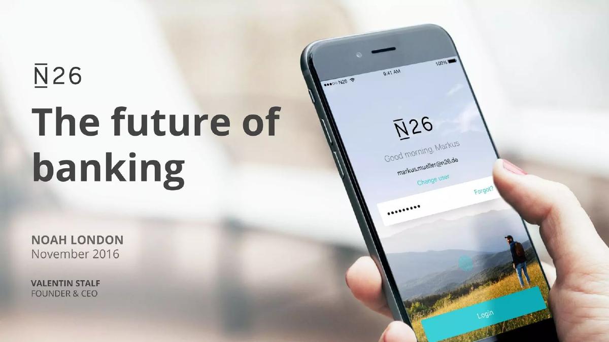
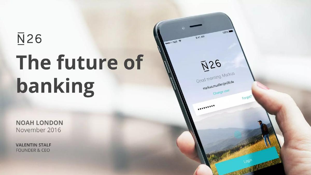
This November 2016 pitch deck from N26 (then transitioning from its original name, NUMBER26) is for its Series C round. Presented at the NOAH London conference, it offers a fascinating glimpse into how a future fintech giant framed its story at a critical growth stage. The deck is a masterclass in minimalism and narrative control. It eschews the dense financial models and KPI spreadsheets common in later-stage decks, opting instead for a visually-driven story about product elegance and market inevitability. This teardown will analyze, section by section, how N26 sold its vision for the 'future of banking' using a powerful combination of product demonstration, strategic positioning, and social proof, all while remaining pointedly silent on the granular metrics an investor might typically demand.
The Opening: Framing the Frustration
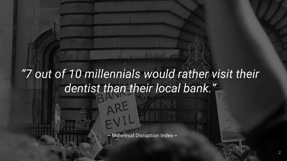
The deck opens not with market size or TAM, but with a feeling. After a title slide and some conference housekeeping, Slide 2 hits with a single, powerful quote: “7 out of 10 millennials would rather visit their dentist than their local bank.”
This is a brilliant framing device. It immediately establishes the problem as a universal, visceral experience of dread and inconvenience. It doesn't need data on branch operating costs or customer service wait times; it connects with the audience on an emotional level. By focusing on millennials, it also signals a clear target demographic that represents the future of consumer finance. This single sentence makes the entire legacy banking industry feel archaic and out of touch, creating the perfect vacuum for N26's solution.
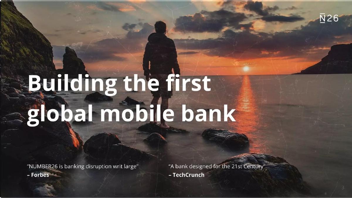
Slide 3 follows up by stating the mission in bold terms: “Building the first global mobile bank.” This is not a niche product or an incremental improvement. The ambition is global from the outset. Supporting this bold claim are two powerful press quotes from Forbes (“banking disruption writ large”) and TechCrunch (“A bank designed for the 21st Century”). Before a single product feature has been shown, N26 has established the problem, defined its grand vision, and supplied third-party validation from respected sources.
The Solution: Banking Reimagined as an App
The deck then pivots to what N26 believes is its core differentiator: the product itself. This section is notable for its 'show, don't tell' approach.
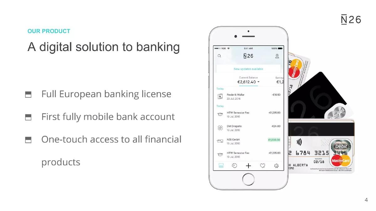
Slide 4: The Core Premise
This slide, titled “OUR PRODUCT,” lays out the value proposition in just three bullet points:
Full European banking license: This is a crucial point of credibility and defensibility. It separates N26 from the myriad of financial apps that sit on top of other banks. It signals they are building foundational infrastructure, not just a slick user interface. · First fully mobile bank account: This defines the product category and claims leadership. It’s a simple, powerful statement of innovation. · One-touch access to all financial products: This hints at the platform strategy that will be detailed later. It promises simplicity and a central hub for a user’s financial life.
Slides 5-10: Product Highlights in Action
What follows is a series of six slides, each showcasing a single feature via a clean, compelling product screenshot. This section is the heart of the pitch. It visually walks the investor through the user experience, making the benefits tangible.
Paperless account opening in 8 minutes: This directly attacks a primary pain point of traditional banking—the slow, bureaucratic onboarding process. The slide visualizes a seamless, modern experience. · Real time overdraft: This slide shows a simple toggle switch to activate an overdraft. It communicates control and instant access to credit, contrasting sharply with the applications and waiting periods of incumbent banks. · Retail stores replacing bank branches: Here, a map interface shows partner retail locations for cash deposits or withdrawals. This brilliantly reframes a potential weakness (no physical branches) as a strength (thousands of convenient partner locations). · Hassle free International transfers: This slide shows a simple, clean interface for sending money abroad, explicitly noting it is “Powered by: TransferWise” (now Wise). This is smart positioning; N26 isn't trying to beat the best-in-class provider, it's integrating them. · Invest money on the go: Similarly, this slide highlights an investment feature “Powered by: Vaamo.” It reinforces the platform strategy: N26 provides the core account and user relationship, then integrates other leading fintechs to offer a comprehensive suite of services. · Everything in real-time with full control: The final product slide shows a transaction feed and card control options (like locking the card or enabling online payments). It hammers home the core themes of transparency, immediacy, and user empowerment.
This extended product showcase does more work than a dozen slides of text could. It demonstrates a beautiful, intuitive, and powerful user experience that stands in stark contrast to the 'visit to the dentist' described in the opening.
The Strategic Core: From Unbundling to Rebundling
After establishing product superiority, the deck zooms out to explain N26’s strategic place in the market with a simple but profound narrative across slides 12, 13, and 14.
Slides 12 & 13: Unbundling... to Rebundling
These two slides present a powerful thesis. Slide 12, “From unbundling,” shows a large, monolithic block labeled “BANK” being broken apart into smaller, specialized fintech services (e.g., TransferWise for transfers, Robinhood for trading, etc.). This visual acknowledges the first wave of fintech innovation.
Slide 13, “...to rebundling,” is the strategic reversal. It shows all those specialized services now plugging into a central platform: the N26 app. This is N26’s core argument for long-term dominance. They aren’t just another piece of the unbundled puzzle; they are the new platform, the rebundler, the central financial hub for the modern consumer. It’s a narrative that positions them as the aggregator of the entire fintech ecosystem.
Slide 14: Competitive Advantage
This slide visualizes the “rebundling” thesis. An image of the N26 app on a phone is at the center, surrounded by the logos of dozens of single-purpose competitors. The message is clear and requires no text: why use all of these different apps when you can have the best of their functionality integrated into one seamless experience? N26’s competitive advantage isn't a single feature; it's the aggregation and user experience layer on top of all necessary financial services. This is a platform play, not a product play.
Traction and Vision: The Proof and the Promise
Having established the problem, solution, and strategy, the deck moves to validation through traction and a glimpse of the future.
Slide 15: What's Next
This incredibly simple slide, titled “European reach to be globalized,” shows a map of Europe highlighted in N26 branding, with arrows pointing out towards the rest of the world. It communicates a straightforward and ambitious expansion plan without getting mired in the specifics of market entry strategy. For a conference pitch, this is perfect—it conveys massive ambition and a clear directional path.
Slide 16: The Hockey Stick
This is the deck's primary metrics slide, titled “Fastest growing mobile bank.” It presents a classic hockey-stick chart of user growth from 2015 into late 2016. What's on this slide is as important as what isn't.
A user growth curve from near zero to over 200,000 users in about 18 months. · A callout box with two key metrics: “> 200k User within 1 ½ year” and “> € 2 bn Total transaction volume.”
Revenue or Average Revenue Per User (ARPU) · Customer Acquisition Cost (CAC) or Lifetime Value (LTV) · Active users vs. registered users (e.g., DAU/MAU) · Churn or retention rates · Average deposit balance per user
This is a deliberate choice. For a Series C round, the absence of unit economics is glaring. However, in the context of a high-level conference pitch, the story is clear: exponential user adoption and significant capital flowing through the platform. The two metrics provided—users and transaction volume—are vanity metrics, but they are powerful ones for telling a story of momentum and scale. They scream “market validation” and “product-market fit” without inviting scrutiny of the underlying business model’s profitability.
Slides 17 & 18: Social Proof
The deck closes its case with a heavy dose of social proof. Slide 17, “Press,” features glowing quotes that reinforce N26's position as a leader and innovator. The sources are broad, establishing credibility across Europe.
Slide 18, “Investors,” displays the logos of their existing backers, including Earlybird, Valar Ventures, and Li Ka-shing’s Horizon Ventures. The slide also states “> $ 50 M Total funds raised.” This serves two purposes: it signals that smart money has already vetted and backed this team, and it sets a high bar for the current valuation, justifying a significant Series C round.
Team and Closing
Slide 19: Team
The team slide is shockingly minimal. It contains only a photo of a large group of employees and the text “150 employees based in berlin.” There are no headshots of the founders, no bios detailing their impressive backgrounds at McKinsey or other startups. At this stage, with Founder & CEO Valentin Stalf presenting, the assumption is that the founders' credibility is already established. The focus is on the scale of the operation—150 people—which signals a mature, functioning organization capable of executing the ambitious vision.
The Missing 'Ask'
Conspicuously absent is an 'Ask' slide. The deck does not state how much money N26 is raising or how they plan to use the funds. This is the clearest indication that this deck was designed for a public presentation at the NOAH conference, not for a private meeting with investors. The goal here was to generate inbound interest, project market leadership, and set the narrative for the fundraise happening behind the scenes.
Honest Critique: Vision Over Visibility
The N26 Series C deck is a masterwork of narrative minimalism. Its strengths are undeniable: a crystal-clear problem statement, a beautifully demonstrated product, and a powerful strategic vision of “rebundling” finance. The use of social proof through press and investor logos is textbook-perfect for building credibility.
However, its weaknesses are equally apparent. The deck provides almost no insight into the financial health or underlying unit economics of the business. An investor viewing this in a diligence process would have a long list of follow-up questions about CAC, LTV, revenue Gini coefficients from their user base, gross margins on interchange vs. premium accounts, and the cost of maintaining a full banking license. The traction slide is all sizzle, no steak.
Ultimately, the deck made a strategic bet. It gambled that the power of its vision, the elegance of its product, and the momentum of its user growth were compelling enough to win over investors at this stage. It aimed to sell the dream of owning the central consumer financial relationship of the future. Judging by their subsequent success, it was a bet that paid off handsomely.
Frequently asked questions
- My deck has weak or early metrics. How can I still make a strong case like N26 did?
- Focus on what you can prove. N26 leaned heavily into product screenshots to demonstrate a superior user experience. Frame the problem in a powerful, emotional way and present a compelling vision. If your quantitative data is thin, your qualitative story and product demonstration must be exceptional.
- N26's team slide is very minimal. Is that a good idea for my deck?
- It depends on the context. For a public conference pitch by a well-known CEO at a well-known company, it works. For a first-time founder sending a deck to a cold investor contact, it's a mistake. In most cases, you need a dedicated team slide detailing the founders' relevant experience to build trust and prove you can execute.
- How did N26 frame their competitive advantage without using a typical feature-comparison matrix?
- They elevated the conversation from features to strategy. Instead of a checklist, they used the 'unbundling to rebundling' narrative and a visual slide showing N26 as the central hub in a fragmented market. This framed their advantage as fundamental to the user experience and market structure, making feature-level comparisons seem trivial.
- This deck doesn't have an 'Ask' slide. Should I leave it out of my deck?
- No, you should almost always include one. This deck was created for a conference stage, where the goal is to generate interest, not close a deal on the spot. When you send a deck to an investor for a fundraising meeting, it must have a clear slide stating how much you are raising and a summary of how you will use the capital.
- What can I learn from N26's 'rebundling' narrative to create a powerful strategy story for my startup?
- Find a simple, memorable phrase that captures a major industry shift. First, describe the past ('unbundling'). Then, show how your company is leading the next logical evolution ('rebundling'). This narrative structure positions you not just as a participant in the market, but as the architect of its future.