The deck's power comes from its relentless focus on a single theme: simplicity for the user and transparency in pricing. Credibility is established on slide 3 with a world-class management team, including founders of Twitter and early executives from PayPal and Google. The market opportunity is framed not just by its massive size ($214B by 2015) but by the specific pain point of an underserved customer: small merchants. The product's value is brilliantly communicated through a simple side-by-side comparison, making the advantages over incumbents immediately obvious. Explosive traction metrics…
Key takeaways
- The deck's power comes from its relentless focus on a single theme: simplicity for the user and transparency in pricing.
- Credibility is established on slide 3 with a world-class management team, including founders of Twitter and early executives from PayPal and Google.
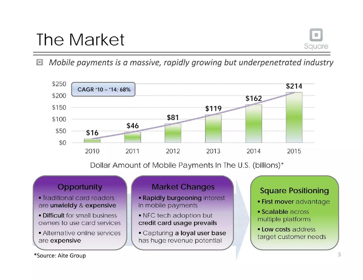
- The market opportunity is framed not just by its massive size ($214B by 2015) but by the specific pain point of an underserved customer: small merchants.
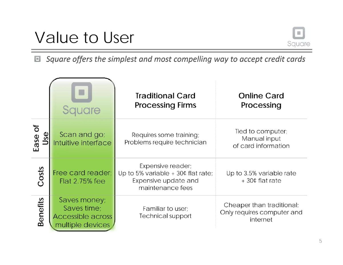
- The product's value is brilliantly communicated through a simple side-by-side comparison, making the advantages over incumbents immediately obvious.
- Explosive traction metrics, buried in the appendix but cited on the acquisition slide, are the ultimate proof point: '100,000 merchants per month' and '$1 million in payments per day'.
- The financial 'ask' and valuation story contain significant inconsistencies, a critical flaw in an otherwise stellar presentation.
- This deck reads as a third-party analysis or case study, not a primary founder-led pitch, explaining its analytical tone and some structural oddities.
Introduction: Deconstructing a Classic
The early Square pitch deck is a canonical document in startup fundraising lore. It represents a pivotal moment in fintech, where a simple piece of hardware and a transparent business model cracked open a market previously dominated by sclerotic incumbents. This teardown will analyze the deck text provided, slide by slide, to understand how the story was constructed, what made it so compelling, and where it shows potential weaknesses.
It is critical to note that the provided text reads less like a primary document authored by Jack Dorsey and Jim McKelvey and more like a university case study or a third-party analysis. The third-person phrasing (“The team has the background… to succeed”) and analytical summaries of Square’s position are strong indicators. Therefore, this teardown will analyze the deck as presented , evaluating the strategic narrative and data while also pointing out where this analytical framing might differ from a founder’s live pitch.
The One-Slide Pitch: The Square Proposition
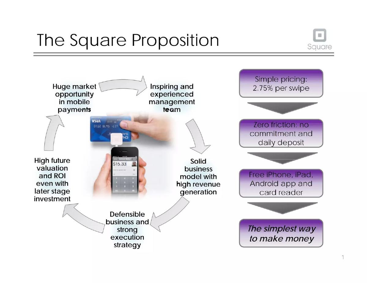
Like many effective decks, this one opens with an executive summary disguised as a “Proposition” slide. It’s a classic hub-and-spoke diagram that attempts to put the entire investment thesis on a single page. It immediately communicates the core pillars of the argument:
Market: “Huge market opportunity in mobile payments.” · Team: “Inspiring and experienced management team.” · Model: “Solid business model with high revenue generation.” · Execution: “Defensible business and strong execution strategy.”
Circling the core, the slide provides the proof points. We see the simple pricing (2.75% per swipe), the frictionless setup (free hardware, daily deposit), and the ultimate tagline: “The simplest way to make money.” While visually a bit busy for a modern deck, its function is perfect. It gives an investor a complete mental map of the business in 60 seconds. Any question they have for the rest of the presentation will likely fit into one of these categories.
The Unfair Advantage: An All-Star Team
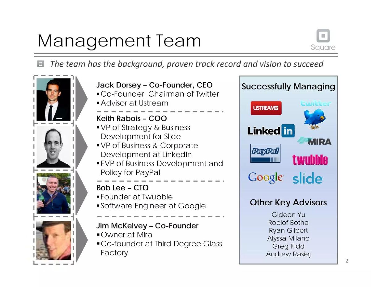
The deck moves immediately to its most powerful asset: the team. For an early-stage company, the management slide is often about potential. For Square, it was about an overwhelming track record of success in directly relevant domains.
Jack Dorsey: Co-Founder, Chairman of Twitter. This brings consumer product genius and scaling vision. · Keith Rabois: Experience at PayPal, LinkedIn, and Slide. This is the operator, the “adult supervision” with deep, specific expertise in payments (PayPal) and business development (LinkedIn). · Bob Lee: Google engineer. This signals technical credibility and the ability to build robust, scalable infrastructure. · Jim McKelvey: The co-founder and practicing artist/small business owner who experienced the core problem firsthand.
The list of advisors—Gideon Yu, Roelof Botha, Ryan Gilbert—is a who’s who of Silicon Valley finance and fintech. This slide does more than just list names; it screams “pattern recognition.” For an investor, this team composition de-risks the execution question significantly. They have built and scaled massive platforms before, including the original digital payments giant, PayPal. It’s an A+ team slide that creates an immediate halo effect over the entire presentation.
Defining the Battlefield: Market Size and Customer Pain
The “Market” slide attacks on two fronts. First, it establishes scale with a massive Total Addressable Market (TAM) graph. The projection of the U.S. mobile payments market growing from $16 billion in 2010 to over $214 billion by 2015 is the hook. The 68% CAGR screams that this is not just a big market, but a tidal wave that is just beginning to form.
Second, and more importantly, it defines the opportunity within that market. The deck doesn't just say “mobile payments is big.” It specifies the entry point:
The Problem (Opportunity): Traditional card readers are “unwieldy & expensive,” and alternatives are difficult for small businesses to access. This is the specific pain Square is solving. · The Inflection Point (Market Changes): There is “rapidly burgeoning interest in mobile payments,” but credit card usage still prevails over nascent tech like NFC. This is the “why now.” The timing is perfect. · The Strategy (Square Positioning): The company leverages this with a “first mover advantage,” a platform that is “scalable across multiple platforms,” and “low costs” that directly address the target customer’s pain.
This is a brilliant piece of storytelling. It moves from a giant, abstract number ($214B) to a concrete, relatable problem (a small business owner wanting to accept a credit card) and presents Square as the logical, timely solution.
The ‘It Just Works’ Product & Value Prop
The Product
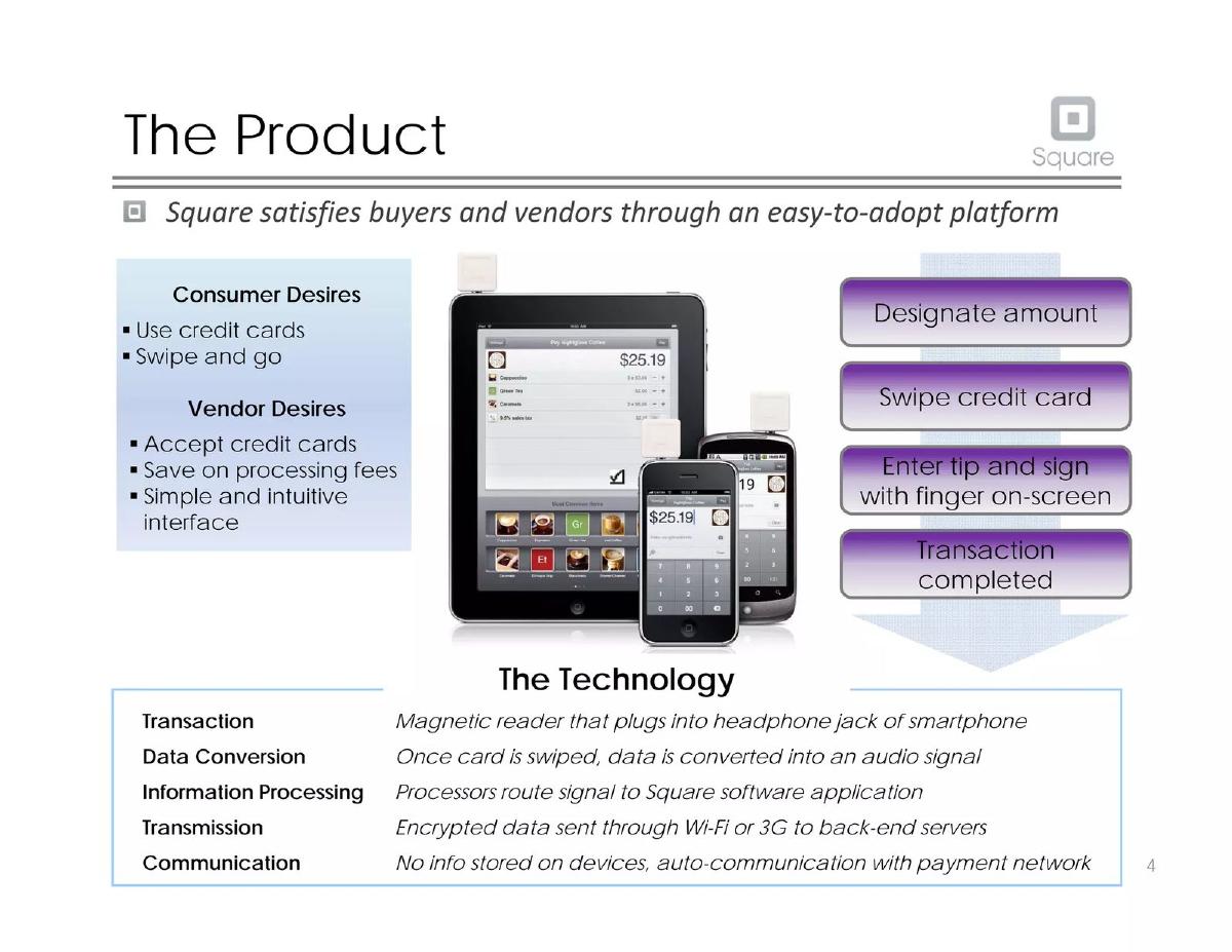
The “Product” slide (Slide 5) is a masterclass in simplicity. It avoids dense feature lists and technical jargon. Instead, it shows a simple three-step user flow: designate amount, swipe card, sign with finger. This demystifies the process and makes it feel intuitive and fast.
It also briefly explains the technology, focusing on the key benefit: security. The text highlights that data is encrypted and, crucially, “No info stored on devices.” In an era of rising concern about data privacy, this was a critical point to address upfront. By breaking down the desires of both consumers (“Use credit cards,” “Swipe and go”) and vendors (“Accept credit cards,” “Save on processing fees”), the slide shows how Square creates a win-win scenario, lubricating the transaction for both parties.
Value to User
Slide 6, “Value to User,” is arguably the most effective slide in the entire deck. It’s a simple three-column chart comparing Square to “Traditional Card Processing Firms” and “Online Card Processing.” The axes of comparison are simple and powerful: Ease of Use and Costs .
This is where Square’s disruptive model shines. Under “Costs,” the contrast is stark:
Square: “Free card reader; Flat 2.75% fee” · Traditional: “Expensive reader; Up to 5% variable + 30¢ flat rate; Expensive update and maintenance fees” · Online: “Up to 3.5% variable rate + 30¢ flat rate”
In one glance, any investor can see the revolution. Square replaces opaque, complex, and high fees with a single, transparent number. It replaces expensive hardware with a free reader. This is not an incremental improvement; it’s a fundamental change in the business model. This slide alone could convince an investor that Square understands its customers and has a killer value proposition.
The Growth Engine: Acquisition & Overwhelming Traction
The “Customer Acquisition” slide (Slide 7) outlines the go-to-market strategy. It defines the target customer as “Small businesses, independent workers, individuals selling goods,” which it then expands to “anyone who accepts payments.” This demonstrates a vision that starts with a niche but aims for ubiquity.
The strategy is a classic “razor and blade” model: give away the reader (“razor”) to lock in transaction fees (“blades”). The acquisition channels mentioned are standard—social media, retail via Apple stores—but the critical piece of information is a single, bolded line at the bottom: “ Acquiring 100,000+ customers per month. ”
This is an atomic bomb of a traction metric. While this slide presents it, the “Financial Assumptions” slide in the appendix provides the context: this is an acceleration from 30,000 monthly signups the previous fall. The appendix also provides the other killer metric: the company is processing “ $1 million in payments per day. ”
For a Series C pitch, this is everything. The story is no longer about a good idea or a great team; it's about a rocket ship that has already achieved liftoff. The numbers prove that the product, pricing, and go-to-market strategy are working at a massive scale. The investment is no longer a bet on a concept, but fuel for a proven engine.
Building the Moat: Competition & Defensibility
A common mistake in pitch decks is to downplay competition. This deck does the opposite: it confronts competitors head-on and uses the comparison to strengthen Square’s position. The analysis is sophisticated, splitting the landscape into two categories:
Direct Competitors: This includes products like Intuit’s GoPayment and Verifone’s PAYware. Against them, Square claims advantages like being the “first mover,” having “no credit check,” “no monthly fees,” and a key “Apple partnership.” These are tangible differentiators that directly address user friction. · Emerging Market (NFC): This shows foresight. Instead of ignoring the next wave of technology, the deck addresses it. It acknowledges NFC’s potential but positions Square as having a “POS experience,” being hardware-agnostic, and, most importantly, having the ability to “integrate NFC technology” when the time is right.
This two-pronged analysis shows investors that the team is not just focused on the current battle but is also prepared for the next war. It frames Square not as a dongle company, but as a payments platform with a defensible market focus and the agility to adapt.
The Ask and the ROI: A Confusing Financial Narrative
Here, the deck’s otherwise crisp and compelling narrative hits a major snag. The financial story, spread across several slides, is confusing and contains a glaring contradiction.
The “Financial Model and Projections” slide (Slide 9) lays out a forecast showing revenue growing from $10.6M to $476M in five years. It also explicitly states the assumptions for the current round: a “ $20m ” investment for a “ 20% ” stake. This implies a $80M pre-money and $100M post-money valuation.
However, the “Financial Assumptions” slide in the appendix states that Square was “ Valued at $240m after last round of funding in January 2011 ($27.5m). ” The “Why Invest Now” slide identifies this as a Series B. The current pitch is for a Series C.
This means the deck is proposing a $20M Series C round at a $100M post-money valuation right after closing a Series B at a $240M valuation. This would be a massive down round . There is no explanation for this. Is it a typo? Is it a misunderstanding by the third-party authors of this deck? Or was Square actually proposing a down round? Without a clear explanation, this inconsistency would halt any investment discussion. It undermines the story of exponential growth and success. An investor’s immediate question would be, “What went so wrong between the Series B and now that you lost over half your valuation?”
While the projections, IRR calculation (55%), and exit analysis are designed to show a strong ROI, they are built on the foundation of this confusing ask. For founders, this is the ultimate lesson: your financial story must be airtight. Any ambiguity or contradiction in your valuation or ask will overshadow even the best traction and team slides.
Conclusion: A Compelling Story with a Critical Flaw
This representation of Square’s pitch deck is a masterclass in narrative construction. It weaves a simple, powerful story of disrupting a complex industry through elegant product design and a transparent business model. The logical flow from team, to market, to product, to traction is impeccable. The use of simple comparison charts and the focus on a single core message—simplicity—make the argument incredibly persuasive.
The traction numbers are the knockout blow, proving the model works at scale. However, the entire presentation is undermined by the inexplicable financial ask. That glaring confusion serves as a critical lesson for all founders: your story is only as strong as its weakest link, and a confusing ask is a deal-killer. Despite this flaw, the deck remains a vital case study in how to frame a world-changing idea.
Frequently asked questions
- My team isn't as famous as Square's. How can I build a strong 'Team' slide?
- Focus on relevant experience, not just fame. Highlight specific, quantifiable achievements from your past roles that prove you can solve the problem you're tackling. If you have a former Google engineer, specify that they built a system that scaled to millions of users. If your marketing lead grew a user base 10x, show that. It's about demonstrating relevant execution capability, not just brand names.
- Square's traction was incredible. What if I'm pre-traction or have very early numbers?
- If you don't have revenue or user numbers, you must show momentum through leading indicators. This could be pilot program results with glowing customer testimonials, a rapidly growing waitlist for your product, or strong engagement metrics from a beta version. The goal is to prove that when people see your product, they want it. This de-risks the market-demand question even before you have large-scale traction.
- How did Square make its 'Value to User' slide so effective?
- They used a simple, direct comparison chart against the known alternatives. Founders should do the same by clearly identifying 2-3 key dimensions of competition (e.g., Cost, Speed, Ease of Use) and showing, not just telling, how their solution is 10x better on at least one critical dimension. Quantify your advantages wherever possible—'2.75% flat fee' is infinitely more powerful than 'cheaper fees'.
- The financial section in this deck is confusing. What's the core lesson for founders?
- The lesson is that your financial narrative must be simple and perfectly consistent. Any confusion about your valuation, previous rounds, or the specifics of your current ask will derail an investor meeting and destroy your credibility. Double- and triple-check your numbers to ensure the story they tell aligns perfectly with the rest of your pitch. If there is something unusual, like a down round, it must be addressed head-on with a clear explanation, not ignored.
- Square's problem and solution feel so clear and simple. How can I achieve that clarity in my own pitch?
- Start by articulating your core value proposition in a single sentence: 'We help X (your customer) do Y (the job-to-be-done) by doing Z (your magic).' For Square, it's 'We help small businesses (X) accept credit cards (Y) with a simple dongle and a flat fee (Z).' Practice this one-liner on people outside your industry. If they don't get it immediately, your narrative is too complex.