Exeq's 18-slide 2017 VC deck pitched a New York consumer fintech app that brought online-style personalisation to offline spending, backed by 25,000 waitlist signups and 550+ founder-run millennial surveys. The front half is genuinely well crafted — a three-line problem slide, real product screens and a named beachhead city. The back half is where it loses the round: no competition slide, no unit economics, a market size measured in transactions rather than dollars, monetisation deferred to a separate B2B deck, and a final slide with an email address instead of an ask.
Key takeaways
- Exeq's deck is a real 18-slide VC pitch deck exported from Keynote on 5 June 2017, raised pre-revenue and pre-launch on 25,000 waitlist signups.
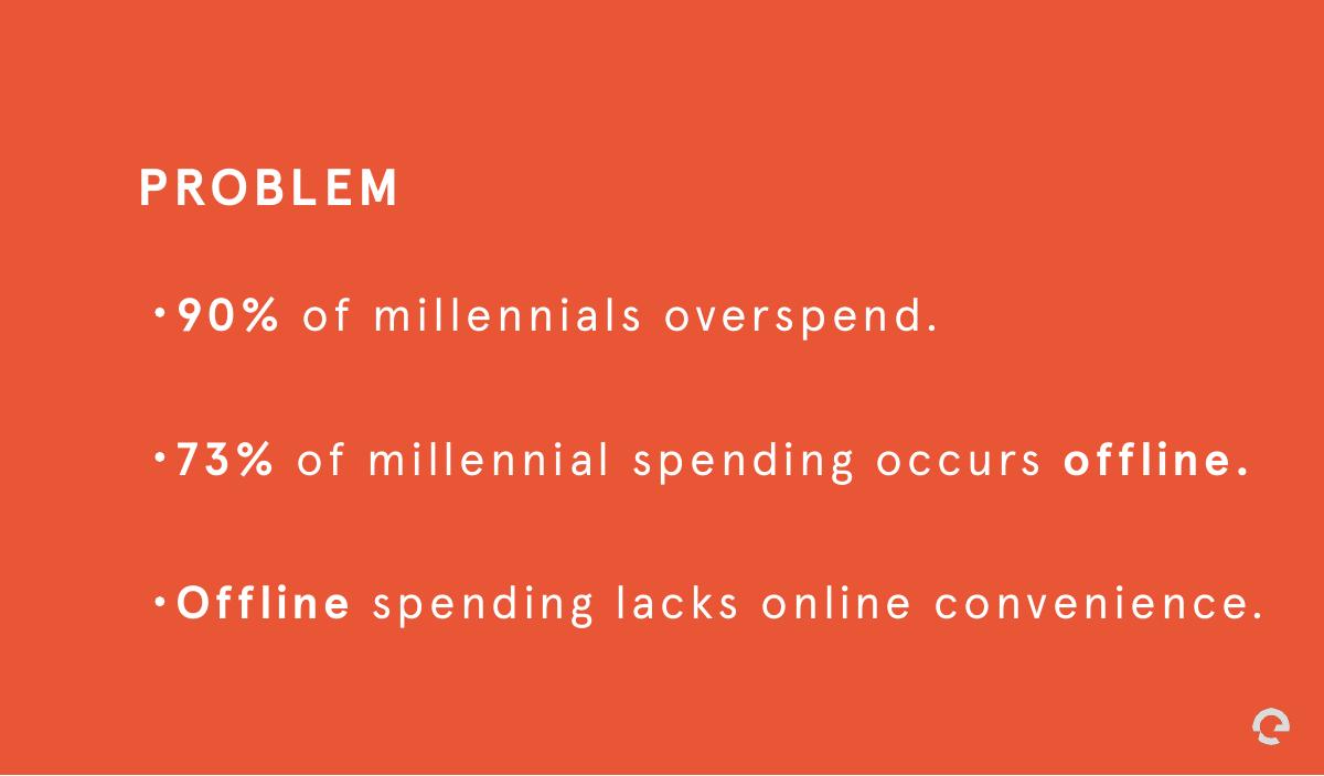
- The problem slide works because it argues in three steps: 90% of millennials overspend, 73% of that spending is offline, and offline spending lacks online convenience.
- Naming New York City as the initial target market is the deck's strongest go-to-market decision; a named beachhead city reads as executable in a way that a national market never does.
- The 2B+ figure on the market slide counts annual transactions, not dollars, so the biggest number in the deck has no revenue attached to it.
- Deferring monetisation to a separate B2B deck means the investor has the revenue conversation without the founder's materials in front of them.
- A deck that never names its competitors in a crowded 2017 PFM market reads as either unaware or evasive, and both readings kill the round.
- Listing 13 team members with titles but no prior experience turns a large pre-launch team from evidence of capability into a burn-rate question.
- The deck ends on a contact email with no raise amount, no use of funds and no milestones, so an excited investor has nothing specific to say yes to.
What this deck actually is
This is an 18-slide VC pitch deck built in Keynote and exported on 5 June 2017 under the file name Exeq VC Deck.key . It is a real fundraising deck — not a company overview, not a recreation, not a template. Exeq was a New York consumer fintech app with the tagline “Spend less, live more,” built around the idea that millennials get a rich, personalised, data-driven experience when they spend online and almost nothing when they spend offline.
The timing matters for how you read it. June 2017 was the peak of the personal finance management (PFM) app wave: Mint had been acquired years earlier, Plaid had made bank-account aggregation a commodity, and dozens of teams were building “Mint but beautiful, for millennials.” Exeq’s deck is a product of exactly that moment, and its strengths and weaknesses are the strengths and weaknesses of that entire cohort.
The most important structural fact about this deck: it is a pre-revenue, pre-launch deck . At the time of the raise Exeq had 25,000 waitlist signups, a closed beta scheduled for July 2017 and a public iOS launch scheduled for August 2017. No live users, no revenue, no retention curve. Everything the deck asks an investor to believe is a claim about the future. Recognising that is the key to the teardown, because a pre-launch deck has to do a job that a post-traction deck does not: it has to make the thesis so tight that the absence of numbers stops being the main topic of conversation.
It also ends with a slide that most founders never think to include and that quietly reveals the fundraising strategy: a single contact card for the COO, not the CEO.
Slide-by-slide walkthrough
Slide 1 — “Spend less, live more.”
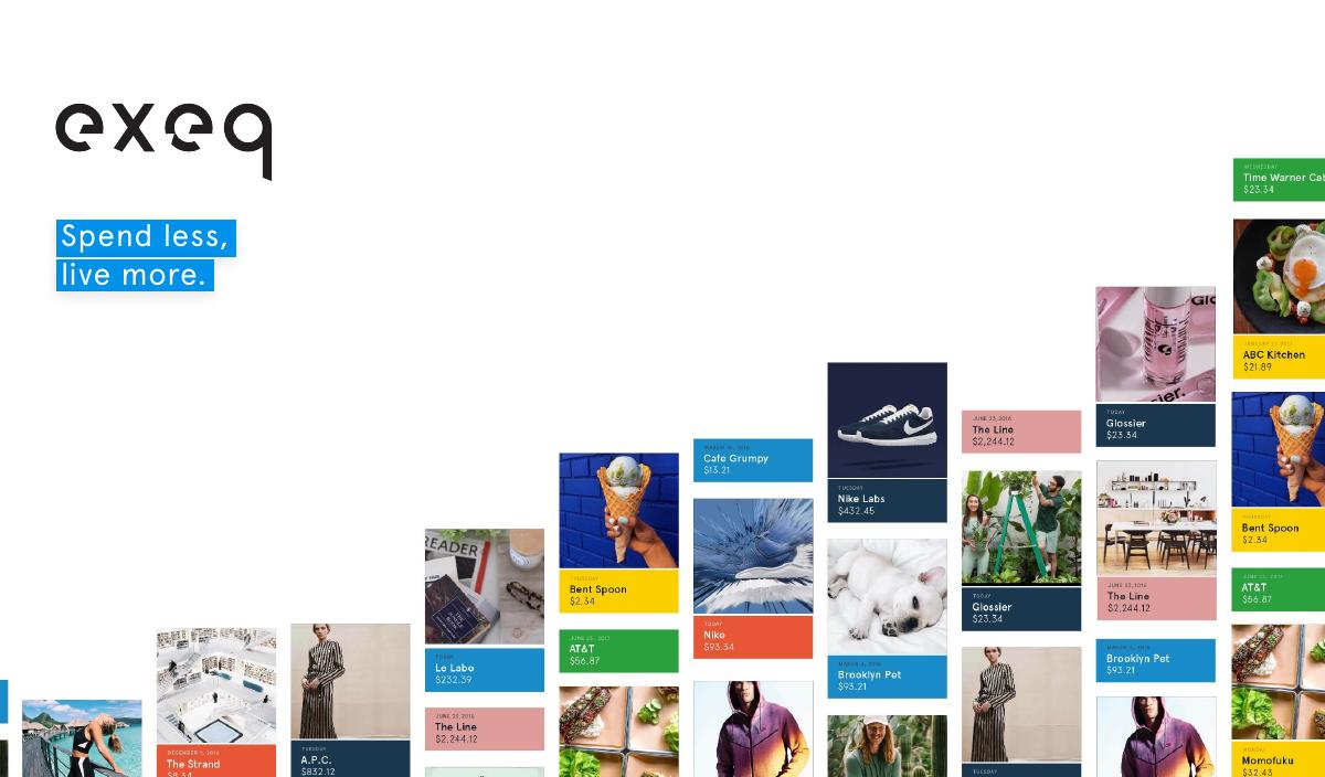
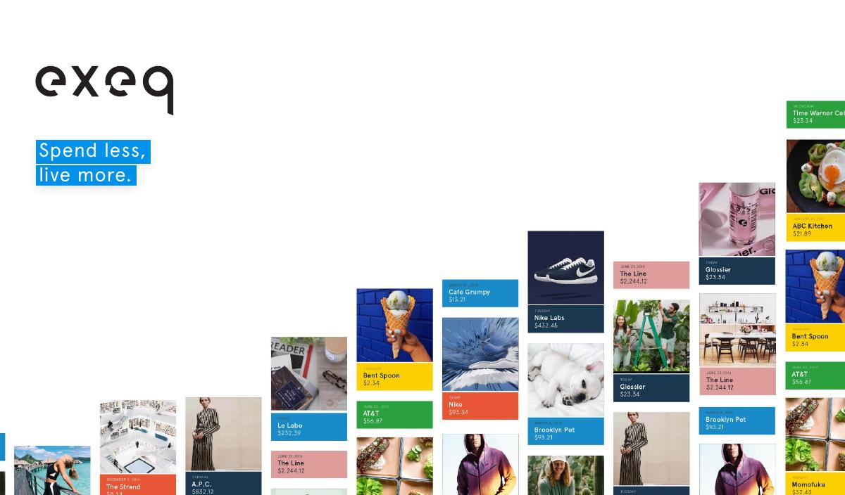
A full-bleed title slide with four words and no company description. It is a lifestyle promise, not a product statement. This works on a stage and it works on a screen share where the founder is talking over it; it works less well when the deck is forwarded to a partner who has never heard of the company, because nothing on slide 1 tells them what Exeq is. The fix is not to abandon the tagline — it is genuinely good — but to put a one-line descriptor underneath it (“Exeq is a spending app that makes offline purchases as personalised as online ones”) so the deck survives being emailed.
Slide 2 — Problem
Three stacked statistics: 90% of millennials overspend; 73% of millennial spending happens offline; offline spending lacks online convenience. This is the cleanest slide in the deck. It moves in exactly the right sequence — there is a behaviour problem, most of that behaviour is offline, and offline is where the tooling does not exist. Three claims, one conclusion, no clutter.
The weakness is sourcing. Two hard percentages appear with no citation on the slide. In 2017 you could get away with that; in a 2026 diligence process, an uncited market statistic is the fastest way to have a partner start pulling on a thread you did not want pulled. Cite everything numeric, on the slide, in six-point type.
Slide 3 — Solution
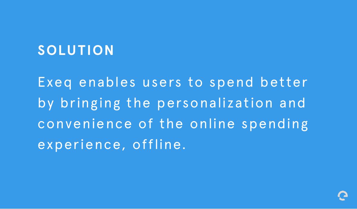
One sentence: Exeq enables users to spend better by bringing the personalisation and convenience of the online spending experience offline. It is a good sentence and it is the exact inverse of the problem slide, which is what a solution slide should be. It is also entirely abstract — there is no mechanism in it. A reader at this point still does not know whether Exeq is a card, an app, a browser extension or a loyalty network.
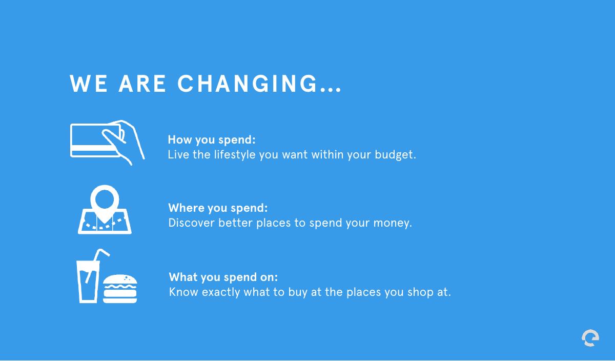
Slide 4 — “We are changing…”
Three parallel statements: how you spend (live the lifestyle you want within your budget), where you spend (discover better places), what you spend on (know exactly what to buy where you shop). This slide is doing the job of a value-proposition slide and it does it with real rhetorical discipline — how / where / what is memorable and each line has a concrete payoff.
The problem is that it arrives before the product does, so it reads as three more promises stacked on top of the promise in slide 3. In a rebuild this slide is stronger after the product screens, as a summary of what the reader has just seen.
Slide 5 — Our mission
“To build one ecosystem for consumers and merchants, connecting the disconnected world of offline retail.” This is the first appearance of the two-sided ambition that the deck returns to on slides 11–13, and it is the most important sentence in the whole document, because it converts Exeq from “another budgeting app” into “a marketplace with a consumer wedge.” Burying it in a mission slide at position five, in small centred type, undersells it badly.
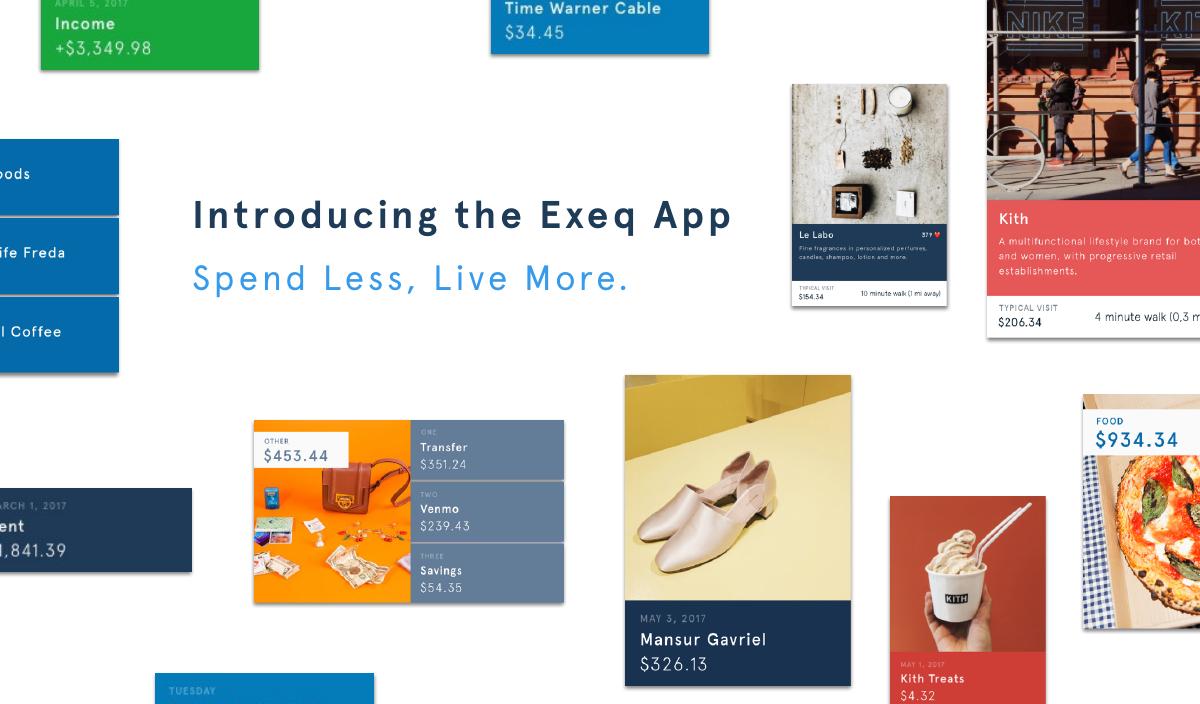
Slide 6 — Introducing the Exeq app
A transition slide that repeats the tagline. In an 18-slide deck, a pure transition slide costs about 5% of your total surface area. It earns its place in a live pitch as a beat change; it does not earn its place in a deck that will mostly be read alone.
Slide 7 — Feed
The first product screen, and the deck jumps a level in quality here. A single iPhone mock in-hand shows a spending feed: a large “$958.90” weekly total at the top, then card-based transaction tiles with merchant photography — a diner, a pizza place, a bar. The copy: see your spending accurately, beautifully and in real time.
What is smart is that the design argument is made visually rather than claimed in text. The feed genuinely does not look like a bank statement; it looks like Instagram for transactions. That is a differentiated product insight and the screenshot carries it without a single adjective needing to be believed on trust.
Slide 8 — Recap
“The numbers that matter” — income, cash flow and spending patterns. This is the table-stakes PFM view, and the deck presents it as a co-equal feature with Feed and Discover. It is the weakest of the three product slides because it is the one every competitor also has. In a rebuild it should be compressed into a strip of small screens labelled “parity features” so the room’s attention stays on what is actually new.
Slide 9 — Discover
“Your lifestyle meets your budget.” Exeq analyses past spending data to recommend new places and experiences you can afford. This is the real company. Feed is the hook, Recap is parity, and Discover is where the spending data turns into a recommendation engine and, eventually, into a merchant-paid distribution channel.
The deck knows this — slides 10 to 13 all build on Discover — but it never says it. Discover is presented as feature three of three, on the same visual footing as the other two. Ordering communicates priority whether you intend it to or not.
Slide 10 — “Our secret? Perfecting spending data.”
A three-column pipeline: Aggregate (live and historical spending data), Normalize (machine-learning algorithms filter and categorise), Analyze (on-demand spending recommendations). This is the technology slide and it is honest about the actual hard problem in this category, which is not aggregation — that was already a commodity in 2017 — but normalisation. Turning “SQ THE VINTAGE TW 9145” into a merchant, a category and a location is the genuinely difficult work.
What is missing is any evidence of an edge. There is no accuracy figure, no comparison against off-the-shelf categorisation, no note about proprietary merchant data, no defensibility claim. A technical investor reads this slide and asks “so does everyone — what is yours?” and the deck has no answer prepared.
Slide 11 — “Behind the scenes: platform monetization”
The pivot slide. Spending data helps users spend better, but it also lets businesses understand consumer behaviour, competitive insights and industry trends. This is where a consumer app becomes a data business, and the deck handles the turn well — it is set up as a reveal rather than bolted on.
Slide 12 — The Exeq SaaS platform
Three B2B pillars: consumer behaviour (where your customer base spends, local trends in real time), competitive insights (benchmark against competitors, see market share), and tailor & target (use spending data to target demographics and push promotions through the Exeq app). At the bottom, in small type: “For more info on our monetization strategy please see our B2B deck.”
That footnote is the single most consequential line in the deck. The company’s entire revenue model has been deferred to a document that is not in front of the investor. Whatever the internal reason — and there is usually a good one, like not wanting to derail the consumer story — the effect in the room is that the monetisation conversation happens without the founder’s materials. If the business model needs a second deck, the first deck needs at least one slide of pricing, one contract, or one letter of intent.
Slide 13 — The platform play
An equation: the Exeq app (consumers spend better) + the Exeq SaaS platform (businesses make data-driven decisions) = the Exeq ecosystem (both ends of the transaction on one platform). Underneath: “One ecosystem, endless opportunities — mobile payments, promotions, tailored ads, loyalty programs.”
This is the most ambitious slide and the most dangerous one. The equation itself is a legitimate strategy statement and worth keeping. The four-item expansion list underneath is where a pre-launch company with zero users claims four additional business lines. Every item on that list is a company someone else has spent a decade failing to build. Listing them all signals appetite where the reader wants to see focus.
Slide 14 — Initial target market: New York City
A simple multiplication: 1M NYC millennials × 5 daily transactions = 2B+ annual transactions. The beachhead choice is excellent — naming one city rather than claiming the US consumer market is exactly the discipline most seed decks lack, and it makes the go-to-market credible.
The arithmetic, though, is a transaction count, not a market size. Two billion transactions is not two billion dollars and it is not revenue. Without a take rate, a subscription price or a merchant ACV attached, the biggest number in the deck is a number the company cannot monetise on the slide it appears. This is the classic TAM error: it makes the market look large and the business model look absent at the same time.
Slide 15 — Why millennials?
Primary research. The top three features requested in a new finance app are spending alerts, smart spending data and budgeting recommendations. Then two findings: 15 out of 15 asked said they are not spending within their means, and 73% said they do not budget their spending. The source line reads: Exeq surveys and focus groups with 550+ millennials .
Doing 550 person primary research pre-launch is genuinely above average and it deserves more prominence than slide 15. The presentation, however, mixes a 15-person focus group result with a percentage from a much larger sample on the same slide, without saying which n produced which number. Any investor who reads carefully will spot it, and the moment they do, they discount the entire research programme — which is a shame, because it is real work.
Slide 16 — Where are we now?
The traction slide, in four quadrants: Traction — 25,000 waitlist signups, targeting 35K by July 2017. Product — closed beta launching July 2017 to 250 millennials, used to seed the public beta. Marketing channels — Facebook advertising, email marketing, affiliate marketing, influencer marketing. Launch — public iOS launch August 2017 in the US, targeting NYC millennials.
The dated commitments are the best thing here: a specific month, a specific cohort size, a specific platform. That is a founder giving investors a scoreboard to check them against, which builds more trust than any adjective. The gap is cost and quality of the waitlist. 25,000 signups acquired through paid Facebook is a completely different asset from 25,000 acquired organically, and the deck does not say which, does not give a cost per signup, and does not show the email open rate on the waitlist. A waitlist is only evidence of demand if you show what it cost and how alive it is.
Slide 17 — “Chefs in the kitchen”
Thirteen named team members: CEO Dan Schwartz, COO Eli Kraiem, CTO Derek Brown, a growth lead, marketing, business operations, a creative director, six engineers and a data scientist. The framing line says the team is designers, developers and thinkers set on changing the status quo.
Thirteen people pre-launch and pre-revenue is a striking number and the deck presents it as a strength. Names and titles alone, with no background, no prior company, no photograph, means the reader cannot tell whether this is a team of senior operators or a team of friends. A team slide with no credentials converts headcount from an asset into a burn-rate question.
Slide 18 — Contact
“Eli Kraiem, COO — eli@exeq.com.” A close slide with a name and an address, which is more than many decks manage. Two things are missing: the ask, and the CEO. There is no raise amount, no use of funds, no runway and no milestone the round is meant to buy. An investor who finishes this deck excited has no idea what to say yes to.
What this deck does better than most startup pitch decks
The problem slide is three lines and it argues. Overspending, offline majority, offline tooling gap. Each line sets up the next, and by the end of slide 2 the reader has already agreed with the premise. Most seed decks spend four slides doing worse. · It names a beachhead city. “Initial target market: New York City” is a phrase that instantly makes a go-to-market plan sound executable. Naming one city beats claiming a continent every time. · It shows the product instead of describing it. Three real screens with real merchant content. Feed does not need an adjective because you can see that it does not look like a bank app. · It has genuine primary research. 550+ millennials surveyed pre-launch, with the source stated on the slide. Very few pre-seed decks put in that work. · It commits to dates in public. Closed beta in July, public iOS launch in August, 35K waitlist by July. Specific, checkable and brave. · The two-sided strategy is built up rather than asserted. Slides 11, 12 and 13 walk the reader from consumer data to business value to ecosystem in three steps. Structurally, that is a well-built argument.
Where this deck would fail in an investor meeting
There is no ask. No amount, no use of funds, no runway, no milestone the round buys. The final slide is an email address. · The business model is in a different document. “Please see our B2B deck” hands the most important conversation to the investor’s imagination. · No competition slide. In June 2017 this category contained Mint, Clarity Money, Dave, Digit, Qapital, Level Money and a dozen others. A deck that does not name them looks either unaware or evasive, and either reading is fatal. · The 2B+ number is transactions, not dollars. The market sizing has no revenue attached, so the biggest figure in the deck cannot be converted into a business. · No unit economics of any kind. No CAC on 25,000 waitlist signups, no expected ARPU, no merchant ACV, no payback period — despite four paid acquisition channels being listed by name. · No defensibility. Slide 10 describes a pipeline that any team with a bank-aggregation vendor could describe. The word “secret” is used; the secret is not disclosed. · 13 people, no credentials. Names and titles with no backgrounds make a large pre-launch team read as cost rather than capability. · Mixed sample sizes on the research slide. “15/15 responded no” next to “73% responded no” under a 550+ header invites the reader to distrust both. · Two of 18 slides are pure transitions. Slides 6 and 11 carry no information in a read-alone context, which is 11% of the deck spent on beats.
2017 consumer fintech deck vs. what the same round needs today
Traction proof 25,000 waitlist signups Activated users, week-4 retention, cost per activated user
Business model Deferred to a separate B2B deck One slide: pricing, take rate, and a signed pilot or LOI
Market sizing 1M × 5 = 2B+ transactions Bottoms-up revenue: users × ARPU, plus merchant ACV × reachable merchants
Competition Not shown Named incumbents plus an explicit wedge and a “why we win” line
Defensibility “Our secret? Perfecting spending data.” Categorisation accuracy vs. baseline, proprietary data loop, switching cost
Team 13 names and titles 4–6 names with the specific prior experience that predicts this outcome
The ask Absent Amount, runway in months, three milestones the round buys
Research 550+ surveys, mixed n on one slide Same research, one n per claim, methodology in the appendix
How you would rebuild this deck into a fundable 14 slides
Add the descriptor to slide 1. Keep “Spend less, live more,” add one line saying what Exeq is, so the deck works when it is forwarded without you. · Keep the problem slide exactly as it is — and add a source line under each of the two percentages. · Merge slides 3, 4 and 6 into one solution slide. The abstract solution sentence, the how/where/what triad and the transition slide are all making the same promise three times. One slide, then straight into product. · Lead the product section with Discover, not Feed. Discover is the differentiated engine and the bridge to revenue; Feed is the beautiful hook. Show the engine first, then the hook, and compress Recap into a parity strip. · Turn slide 10 into a defensibility slide. Publish a categorisation accuracy number against an off-the-shelf baseline. “94% merchant resolution vs. 71% from raw bank feeds” is a moat claim; “our machine-learning algorithms filter and categorize” is not. · Pull the business model back into the deck. One slide: what a merchant pays, per what, and how many merchants are needed for the first million in revenue. Delete the reference to the B2B deck. · Rebuild market sizing bottoms-up. Keep the NYC beachhead, then show NYC millennials × realistic penetration × ARPU, next to reachable NYC merchants × merchant ACV. Move the 2B+ transaction figure to a supporting line about data volume, which is what it actually proves. · Add a competition slide naming the 2017 field with one axis Exeq wins on: offline personalisation, not budgeting. · Upgrade the traction slide with cost and quality. 25,000 signups, cost per signup, channel split, waitlist email open rate, and the beta conversion rate as soon as it exists. · Cut the team slide to the five people with relevant credentials and put one line of prior experience under each name. The other eight go in an appendix org chart. · Delete the “endless opportunities” list. Keep the app + platform = ecosystem equation; drop mobile payments, ads and loyalty programmes until one of them has a customer. · Replace the contact slide with an ask slide. Amount, runway, the three milestones the money buys, and then the email address at the bottom.
The transferable lesson
Exeq’s deck fails in the way that talented consumer teams almost always fail: the craft is all in the front half and all of the investor’s questions live in the back half. Slides 1 to 9 are confident, well designed and well argued. Slides 10 to 18 — defensibility, monetisation, market maths, competition, team credibility, the ask — are either abstract, deferred, missing or arithmetically loose. An investor forms an opinion about the founder’s taste in the first half and an opinion about the business in the second half, and only the second one gets funded.
The diagnostic is simple. Take your own deck and mark every slide that would survive being read by a stranger with no voiceover, and every slide where the strongest claim has a number and a source attached. If the marked slides cluster in the first half, you have an Exeq deck: a beautiful, persuasive artefact that quietly asks the investor to fill in the parts that decide the outcome. Fixing it usually does not require new traction. It requires moving the strongest asset earlier, attaching a number to every claim that has one, and ending on an ask instead of an email address.
Frequently asked questions
- What is the Exeq pitch deck?
- It is the 18-slide VC fundraising deck Exeq used in June 2017 to raise for its consumer fintech app. Exeq was a New York startup building a spending app that brought the personalisation and convenience of online shopping to offline purchases, with a secondary SaaS product selling anonymised spending insights to merchants.
- What did Exeq do?
- Exeq was a millennial-focused personal spending app with three core features: Feed, a real-time visual transaction stream; Recap, an income and cash-flow summary; and Discover, a recommendation engine that suggested places to spend based on your past spending and current budget. The company also planned a merchant-facing SaaS platform built on the same spending data.
- How much traction did Exeq have when it pitched?
- None in the live-user sense. At the time of the deck Exeq had 25,000 waitlist signups with a stated goal of 35,000 by July 2017, a closed beta planned for 250 users in July 2017, and a public iOS launch planned for August 2017 targeting New York City millennials. It was pre-revenue and pre-launch.
- Which Exeq slides should founders copy?
- Three. The problem slide, because it makes three linked claims and stops. The market slide's beachhead framing, because naming one city makes go-to-market credible. And the traction slide's dated commitments — a specific beta month, cohort size and launch platform give investors a scoreboard, which builds more trust than adjectives.
- What is the biggest mistake in the Exeq pitch deck?
- Deferring the business model to a separate document. Slide 12 ends with a footnote pointing to a B2B deck for the monetisation strategy, which means the most important conversation in the meeting happens without the founder's slides. Close behind it: ending on a contact email with no raise amount or use of funds.
- Does a pre-launch startup still need unit economics in its deck?
- Yes, in expected form. You cannot show realised CAC or LTV before launch, but you can show cost per waitlist signup, channel split, planned pricing and the merchant contract value you are underwriting. Exeq named four paid acquisition channels without a single cost figure, which leaves the investor to assume the worst number.