BakeSale's 2013 deck is a 24-page product walkthrough from Stupil Inc., not a fundraising deck: an embeddable campaign player that carries video, campaign info and a working card checkout inside every Facebook or blog share. The product insight is real and the compliance detail is unusually thorough. But seventeen of twenty-four slides are product screens, there is no market, model, team, competition or ask, and the only pricing signal is a 10% fee the deck immediately disclaims.
Key takeaways
- BakeSale's deck is a 24-page product deck exported from Keynote on 17 December 2013 and labelled "Product Deck | '13-'14" on its own cover.
- The core product idea was that the payment form travels with every share, so a donor could contribute inside a Facebook feed or a blog post without being redirected to a hosted donation page.
- The strongest line in the deck is "measure ROI in dollars instead of click-thrus" — share-to-dollar attribution was the one thing a non-profit could not assemble from a redirect-based flow.
- Three named non-profits appear on the customer slide — Habitat for Humanity of Washington D.C., Warrior Aviation and the Richard Dawkins Foundation — with no dollars raised or campaign counts attached.
- Slide 16 covers 501c3 receipts, IRS-address fund transfers and contributor lists, the unglamorous compliance detail that decides whether a serious charity will adopt a giving tool.
- Showing a 10% fee and then footnoting it as "for example purposes only" plants a price the company refuses to own, which is worse than publishing no price at all.
- Twenty-four slides contain no market size, no business model, no team page, no competitors and no ask, so the reader finishes knowing the product intimately and the company not at all.
- The checkout flow is walked twice and the sample campaign takes six slides, meaning roughly a third of the deck is repetition that could fund the four missing business slides.
What this deck actually is
Classify the document before you judge it, because most of the damage founders do to themselves comes from copying the wrong kind of deck.
This is a 24-page product deck , built in Keynote and exported on 17 December 2013 under the title BakeSale Product Deck Final . The cover says so explicitly: "Product Deck | ’13-’14". It is not a venture fundraising deck. There is no raise amount, no market sizing, no revenue model slide, no team page, no competitive landscape and no ask. What it has instead is a walkthrough — what BakeSale does, how the flow works, what the dashboard looks like, and what a live campaign looks like end to end.
BakeSale was a product of Stupil Inc., contactable at teamstupil@stupil.com and reachable at BakeSaleLabs.com, with sister properties Stupil.com and PitchDreams.com. The tagline on the cover is "Liberate Your Fundraising", and the core idea is genuinely interesting for 2013: an embeddable campaign player that carries video, campaign information and a working credit-card payment form inside a single unit that can be dropped into Facebook, a blog, or any website. Donors contribute in-stream, without ever leaving the page they are already on.
That is a real insight, and it was early. The deck's problem is not the idea. It is that a document with 24 pages of product and zero pages of business is asked to do a job it was never built for. Product decks get sent to investors constantly — usually because they are the deck the team already had — and this one is a clean case study in exactly what a reader can and cannot conclude from a pure product walkthrough.
Slide-by-slide walkthrough
Slide 1 — Cover: "Liberate Your Fundraising"
Header bar reads "Powered by Stupil Inc." on the left and "BakeSaleLabs.com" on the right; the footer carries the contact email and the deck label. The tagline is centred and alone.
"Liberate Your Fundraising" is a promise, not a description. A reader arriving cold does not learn on page one that BakeSale is an embeddable donation player. The label "Product Deck | ’13-’14" is honest and useful — it dates the document and sets expectations — but the cover spends its only line on rhetoric when it could have spent it on the claim: "Collect donations inside Facebook, blogs and your own site — without sending supporters anywhere."
Slide 2 — Overview
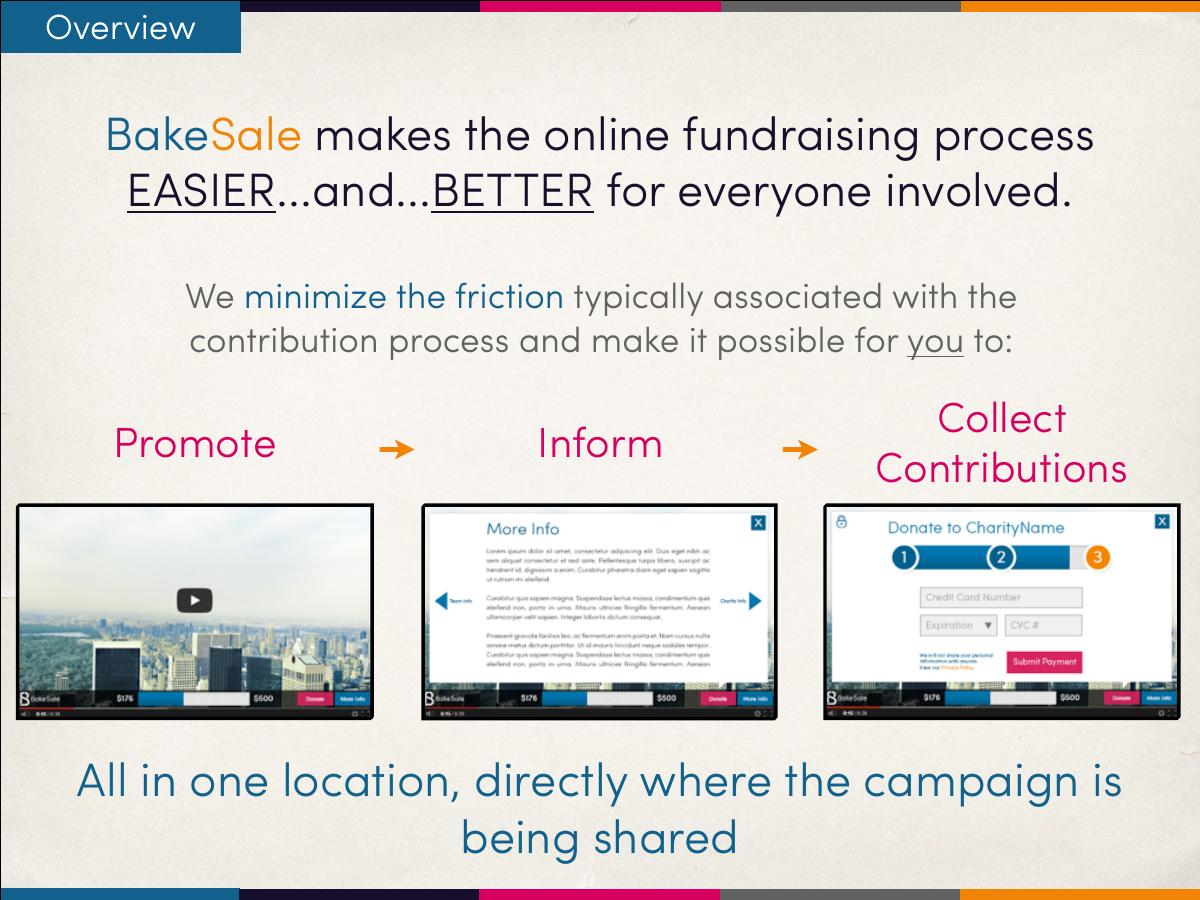
"BakeSale makes the online fundraising process EASIER…and…BETTER for everyone involved." Then a three-part diagram: Promote, Inform, Collect Contributions — "All in one location, directly where the campaign is being shared."
This slide does the work the cover should have done. Promote / Inform / Collect is a strong, memorable triad, and "directly where the campaign is being shared" is the actual differentiator stated plainly. It should be the first thing in the deck. The typographic shouting — EASIER, BETTER in caps with ellipses — undercuts a claim that is already strong enough in lowercase.
Slide 3 — Benefits: join the future of social fundraising
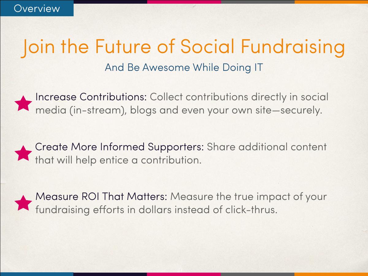
Three benefits, each with a bold lead-in: increase contributions (collect in-stream, securely), create more informed supporters (share content that entices a contribution), measure ROI that matters (measure impact "in dollars instead of click-thrus").
The third one is the sharpest line in the deck. "Dollars instead of click-thrus" is how a non-profit marketing director actually talks about their frustration, and it reframes a product feature as a category argument. The subtitle — "And Be Awesome While Doing IT" — is the kind of 2013 startup voice that ages badly and adds nothing.
Slide 4 — How it works: bring your campaign to supporters (on Facebook)
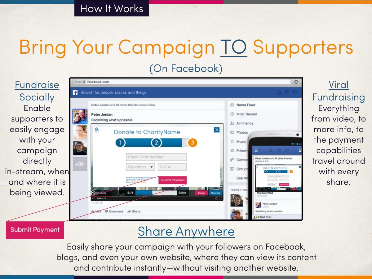
The mechanic slide. Two columns — "Fundraise Socially" (supporters engage with the campaign in-stream, when and where it is being viewed) and "Viral Fundraising" (everything from video to more info to the payment capabilities travels around with every share) — over a screenshot of the player embedded in a Facebook feed.
"The payment capabilities travel with every share" is the whole company in one clause. In 2013, virtually every donation flow ended with a redirect to a hosted donation page, and every redirect leaked donors. Keeping the checkout inside the shared object was a legitimate structural improvement, not a cosmetic one. The deck states it once, in a column of body copy, at 20-point type, and never quantifies it.
Slide 5 — Easily embed in blogs
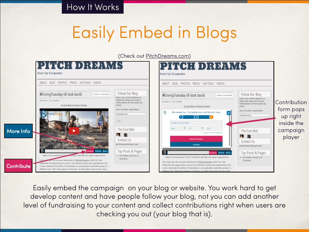
A live example: "Check out PitchDreams.com". The screenshot shows the contribution form popping up inside the campaign player, on a blog page.
Pointing at a real, visitable URL is worth more than three screenshots. It converts a claim into something the reader can verify in ten seconds. What is missing is any result from that live deployment — how many campaigns, how much raised, what conversion rate against a redirect baseline.
Slide 6 — "Don’t worry it’s mobile"
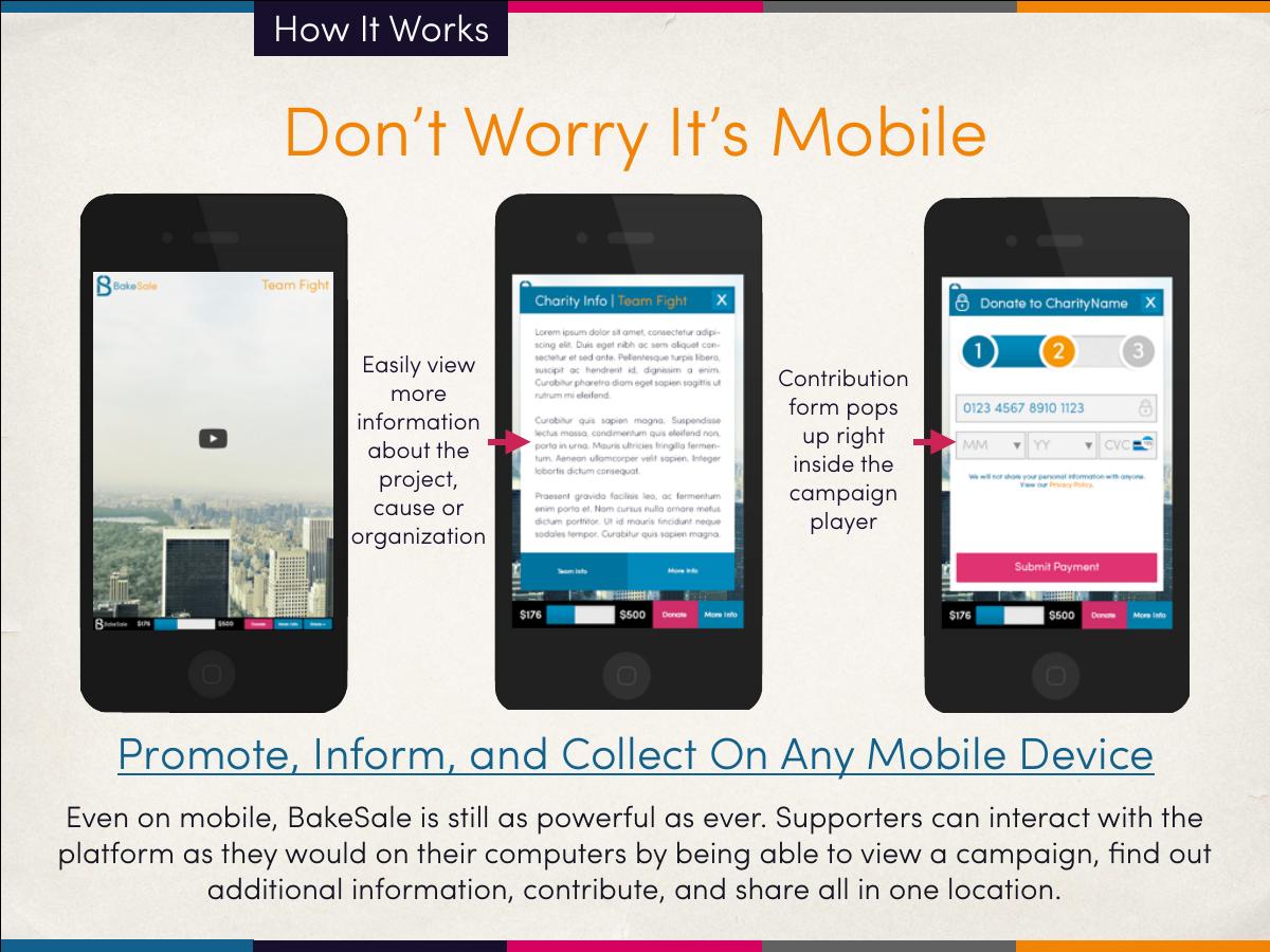
Two annotated phone mocks: view more information about the project, and the contribution form popping up inside the player on mobile.
In December 2013 this slide was necessary; mobile checkout was still a real objection. The framing — "don’t worry" — is defensive, and the copy concedes the point by saying BakeSale is "still as powerful as ever" on mobile rather than claiming mobile is where it wins. That was, in hindsight, exactly the wrong instinct: social sharing was going mobile-first, and mobile-in-stream giving was the strongest available version of this pitch.
Slides 7–9 — The three-step contribution flow
Three consecutive slides walk the donor flow: Step 1 — contribution amount (enter an amount; supporter can opt to cover the processing fee, with a footnote that "10% fee is for example purposes only"); Step 2 — donor information ("require minimum information from donor", plus a note that additional donor fields will be added as the product expands); Step 3 — payment information (credit card capture, a progress meter, and a security note that data is protected by bank-grade 256-bit encryption meeting card merchant requirements).
The reminder printed on step 2 is the most sophisticated sentence in the deck: "Keeping data collection to a minimum is key to limiting the friction in the contribution process — leading to more contributions." That is a conversion-rate argument, and it demonstrates that the team understood the actual physics of donation checkout.
But three full slides on a three-field checkout is 12.5% of the deck spent on a flow that could be one slide with three small screens. And the fee footnote is a self-inflicted wound: showing a 10% fee, then disclaiming it as illustrative, plants a number in the reader’s head that the company then refuses to own. If you do not want to publish pricing, do not show a price.
Slide 10 — Create better informed supporters
Scrollable information pages inside the player, populated automatically from the text entered during campaign creation. "No more redirecting viewers to another site to find out more information."
The product logic is consistent: everything that would have caused a redirect is pulled inside the unit. Consistency of principle across a product is a real signal of quality thinking, and this deck has it.
Slide 11 — Measure ROI that matters
An analytics view: social impact per campaign on one side, direct monetary return by marketing channel on the other. "No more tracking click-thrus."
Attribution from share to dollar is the most defensible thing in the whole product, because it is the piece a non-profit cannot assemble on its own from a redirect-based flow. It appears once, at slide 11, framed as a benefit rather than as a moat. In a rebuild this is a headline, not a bullet.
Slides 12–15 — The platform: dashboard, campaign creation, video
Slide 12 shows the dashboard — manage existing campaigns, create new ones, monitor progress in real time. Slides 13 and 14 walk "Create a campaign in seconds" in three steps: upload video and content, enter campaign and organisation information, set and display the goal, then share. Slide 15 argues for video: it increases engagement and brand exposure and makes the message clearer and more shareable, with campaign progress and goal displayed alongside the player.
"In seconds" is the right promise for the buyer — small non-profits abandon fundraising tools during setup, not during use. But the claim is never evidenced. No median setup time, no completion rate, no quote from an organisation that did it. A time-to-first-campaign metric would have made this section the strongest in the deck.
Slide 16 — Receipts and payments
Dense operational detail, and the most under-appreciated slide here: contributions come with a receipt carrying the information needed for a tax deduction (registered 501c3 only); registered 501c3 organisations receive funds at the address listed in the IRS database, with direct transfers available after further verification; funds transfer net of the BakeSale fee and card processing fees; contributor information is sent in list form with each transfer.
This is the compliance and trust slide, and for a product that touches other people’s charitable money it is the one that decides whether a serious organisation will proceed. Most consumer-facing decks omit this material entirely. Including it shows the team had done the unglamorous work.
Slide 17 — Who uses BakeSale?
Three logos: Habitat for Humanity of Washington D.C., Warrior Aviation, and the Richard Dawkins Foundation for Reason and Science. Beneath them: "You Know You Want to Join This Growing List!"
Three recognisable non-profits in a 2013 seed-stage product is real, earned credibility. It is also the only evidence slide in 24 pages, and it carries no numbers — no dollars raised, no campaigns run, no donor counts, no dates. A logo answers "did anyone say yes?" A number answers "did it work?" Only the second question determines whether a partner or an investor keeps reading.
Slides 18–23 — Sample campaign: DC Habitat for Humanity
Six slides walk one real campaign end to end: the video plays as it would on YouTube; users can view more information or contribute instantly; a "Verified Charity" seal appears for registered 501c3 organisations; information pages toggle between charity, team and campaign; then the three checkout steps again, in situ; and finally a share prompt encouraging the contributor to pass the campaign to their followers.
Two things stand out. The "Verified Charity" seal is a trust primitive the deck never sells — donor fraud anxiety was and is the biggest brake on in-feed giving, and BakeSale had a visible answer to it sitting on slide 19 as an annotation. And the share-after-giving prompt on slide 23 closes the viral loop the deck opened on slide 4: contribution becomes distribution. That loop is the most investable thing in the product and it is presented as the last annotation of a demo sequence.
The cost is repetition. Slides 20 through 22 re-walk the checkout already covered on slides 7 through 9. Six slides on one sample campaign, after eleven slides of feature walkthrough, is a document that has stopped arguing and started demoing.
Slide 24 — "Thanks for checking us out!"
Contact email, a phone number, and five handles: /teambakesale, Bakesalelabs.com, @teambakesale, Pitchdreams.com, @teamstupil.
The close is warm and reachable — a phone number in 2013 signalled a team that wanted to talk. But it has no ask. There is no next step, no pilot offer, no raise, no "book a 20-minute setup call". The reader who is convinced has to invent their own next action, and most will not.
The structural problem: a demo is not an argument
Count the pages by function. Roughly seventeen of twenty-four slides show the product working. One slide shows customers. Zero slides address market size, business model, pricing, competition, team, traction or the ask.
That balance is defensible in a sales conversation where the buyer already has the problem and only needs to see the solution. It falls apart everywhere else. A product deck answers "how does it work?" An investor asks "how big can this get, why you, and why now?" A non-profit executive director asks "what does it cost, who else like me uses it, and what will it raise for me?" This deck answers none of those five questions, and the fee footnote actively muddies the pricing one.
The deeper issue is that BakeSale had the ingredients for the missing argument and buried them inside product annotations. Dollar-level attribution, the verified-charity seal, the share-after-give loop, and the fee-cover toggle are all strategy, not features. Presented as strategy they describe a company with a distribution loop, a trust layer and a measurable ROI story. Presented as annotations on a screenshot they read as a nice tool.
What this deck does better than most startup pitch decks
It states the differentiator in the reader’s language. "Dollars instead of click-thrus" and "no more redirecting viewers to another site" are how the buyer describes the pain, not how the engineer describes the fix. · It shows real customers by name. Three recognisable non-profits, not a wall of grey placeholder logos. Named proof at seed stage is rarer than founders think. · It points at a live deployment. "Check out PitchDreams.com" invites verification instead of asking for trust. · It handles the boring, decisive objections. Receipts, 501c3 verification, fund transfer mechanics, encryption. This is the material that unblocks a real organisation and most decks skip it. · It walks one complete real campaign. A single end-to-end example beats scattered feature screenshots, because it proves the pieces connect. · It understands conversion friction. The note about minimising data collection to increase contributions shows a team reasoning about funnels, not just features.
Where this deck would fail in an investor meeting
No market sizing. US charitable giving was a well-documented multi-hundred-billion-dollar market with public data available in 2013. Not one figure appears. · No business model slide. The only pricing signal is a 10% figure that the deck immediately disowns as illustrative. · No traction numbers. Three logos and no dollars raised, campaigns launched, or conversion lift versus a redirect flow — the one comparison the product is built to win. · No team slide. Twenty-four pages and not a single person is named. The reader learns the product intimately and the company not at all. · No competition. Crowdrise, Razoo, FirstGiving, Causes and Indiegogo all existed. Silence here reads as unaware. · No ask. No raise, no use of funds, no pilot, no next step of any kind. · Repetition costs a third of the deck. The checkout flow is walked twice and the sample campaign takes six pages. · The strategy is hidden in annotations. Attribution, the verified-charity seal and the share loop are moats presented as captions.
Product deck vs investor deck: what actually changes
Dimension This deck (product walkthrough) What an investor deck must add
Length 24 slides, mostly screens 12–16 slides, mostly argument
Core evidence Screenshots and three logos Dollars raised, conversion lift, retention
Business model A disclaimed 10% footnote Take rate, ACV, gross margin, payback
Competition Never mentioned Named, with a defensibility claim
Distribution Implied by the share loop Stated as the growth engine, with a coefficient
Closing slide Contact details and handles Amount, milestones, specific next step
How you would rebuild this deck today
Lead with the mechanic, not the mood. Replace "Liberate Your Fundraising" with the claim: donations collected inside the share, with no redirect. Slide 2 becomes slide 1. · Compress the checkout to one slide. Three small screens in a row with a single caption about friction. That recovers two pages immediately. · Cut the sample campaign from six slides to two. One page showing the embedded player in a real feed, one page showing the outcome in dollars. · Put a number under every logo. Amount raised, campaigns run, average gift, and the date. A named non-profit with a dollar figure is worth ten logos without one. · Make attribution the headline, not a benefit. "We are the only fundraising tool that can tell you which share produced which dollar" is a category claim, and it belongs in the first three slides. · Publish the pricing. State the actual take rate and what it includes. A disclaimed example fee is worse than no fee at all. · Add the four missing slides. Market, model, team, ask. That is what turns a 24-page demo into a 16-page pitch. · Sell the trust layer. The verified-charity seal and the receipt and transfer mechanics answer the single biggest objection to in-feed giving. Give them a slide with a header, not a caption.
The transferable lesson
BakeSale’s deck fails in the most common way a competent team fails: it demonstrates instead of arguing. Twenty-four pages prove that the product exists, that it works on mobile, that the checkout has three steps, and that three real non-profits adopted it. Not one page tells the reader how large the opportunity is, how the company makes money, who is building it, or what to do next. The reader finishes the deck knowing the product well and the business not at all — and it is the business that gets funded, partnered with, or bought.
The trap is that product decks feel more honest than pitch decks. They are made of real screens and real flows rather than projections, so they feel like evidence. But a screenshot only proves that something was built. It says nothing about whether it should have been, whether anyone will pay for it, or whether this team can get it to enough people. Those are argument questions, and arguments need numbers, comparisons and a stated conclusion.
So the useful test on your own deck is not "does it explain the product clearly?" — this one does, better than most. It is: if a stranger read only your slide headlines, in order, would they arrive at a conclusion, or just at a description? Most decks describe. The ones that raise conclude — and they tell the reader exactly what to do next.
Frequently asked questions
- What is the BakeSale pitch deck?
- It is a 24-slide product deck from December 2013, produced by Stupil Inc. for BakeSale, an online fundraising platform. The deck walks through an embeddable campaign player that combined video, campaign information and a credit-card contribution form so supporters could donate directly inside Facebook, blogs or any website without being redirected.
- Is the BakeSale deck a pitch deck for investors?
- No. Its own cover labels it "Product Deck | '13-'14". There is no raise amount, no market sizing, no revenue model slide, no team page, no competitive landscape and no ask. It is a sales and product walkthrough aimed at non-profits and campaign organisers, which is why it is a useful contrast with a true fundraising deck.
- What did BakeSale do?
- BakeSale let charities and campaign organisers create a fundraising campaign in three steps — upload video, enter campaign details, share — and then collect donations inside the shared unit itself. It handled 501c3 receipts, verified-charity badging, encrypted card capture, fund transfers net of fees, and per-channel reporting of dollars raised rather than click-throughs.
- Which slides should founders copy from this deck?
- Two. The overview slide, because Promote / Inform / Collect states the whole product in three words and one sentence about where it happens. And the receipts-and-payments slide, because handling refunds, receipts, verification and transfer mechanics head-on removes the objections that quietly kill adoption in regulated or money-touching categories.
- What is the biggest mistake in the BakeSale pitch deck?
- Spending roughly seventeen of twenty-four slides demonstrating the product while never arguing the business. There is no market size, no pricing the company will stand behind, no team and no ask. The strategy that would have made it investable — share-to-dollar attribution, the verified-charity trust layer, the contribute-then-share loop — sits inside screenshot annotations.
- Can I send a product deck to investors?
- Only as a follow-up. A product deck answers how something works; an investor is deciding how big it gets, why this team, and why now. Send a 12–16 slide pitch deck with market, model, traction, team and ask, and keep the product walkthrough as a separate appendix you offer after the first meeting.