POPAPP’s pitch deck is a study in minimalist communication, using large-scale imagery and iconography to explain a technical workflow. By identifying a clear friction point—the 'question mark' between a creative idea and a finished app—the founders position their tool as the essential bridge. The deck highlights significant early traction with over 500,000 mockups already created and leverages a high-profile advisor list featuring leads from Facebook, Google, and LinkedIn. While the deck is light on traditional financial modeling and market sizing in the provided slides, it excels at demonstr…
Key takeaways
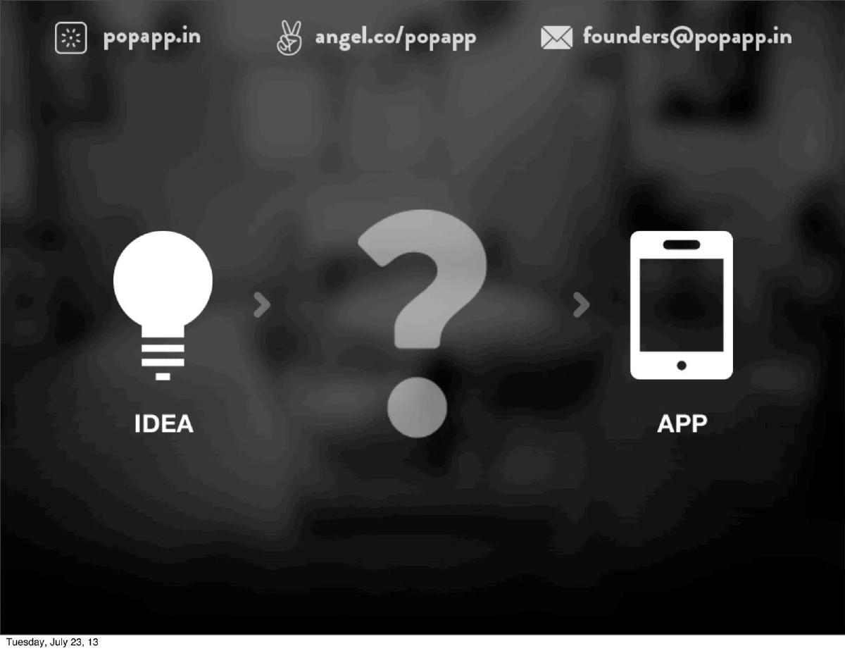
- The deck uses a simple three-step visual metaphor (Idea -> ? -> App) to define the market problem on Slide 2.
- POPAPP positions itself against complex alternatives like raw code and Photoshop, shown as high-friction barriers on Slide 3.
- The core product value is distilled into three verbs: Draw, Link, and Share, spanning Slides 6 through 8.
- Traction is the deck's strongest metric, citing 500,000+ mockups created by the user base on Slide 9.
- The company leverages social proof through an 'Advisers' slide featuring employees from Facebook, LinkedIn, and Google on Slide 10.
- The fundraising ask is clearly stated as $1,000,000 on Slide 12.
- The deck hints at a product roadmap by showing the POPAPP logo across various device silhouettes, including laptops and monitors, on Slide 13.
- Contact information is persistent, appearing in the header of nearly every slide and as a dedicated final slide.
The Visual Narrative of POPAPP
The POPAPP pitch deck, dated July 2013, is a quintessential example of 'show, don't tell.' In an era where mobile app development was exploding but design tools were still largely desktop-bound and complex, POPAPP (Prototyping on Paper) offered a bridge. The deck is remarkably light on text, choosing instead to use high-resolution photography and simple iconography to communicate its value proposition. This teardown examines the 14 available slides from their 27-slide presentation.
Slides 1-2: The Hook and the Gap
Slide 1 serves as the title card, establishing the brand identity. The logo—a stylized sunburst or 'pop' icon—is centered over a blurred background that suggests a workspace. Notably, the slide includes three points of contact: the website (popapp.in), the AngelList profile, and the founders' email. This transparency is maintained throughout the deck.
Slide 2 introduces the problem through a simple linear progression: Idea -> ? -> App. By placing a large, grey question mark in the center, the founders immediately tap into the frustration of their target audience: the difficulty of moving from a mental concept to a testable digital product. It is a universal 'pain point' slide that requires no explanation.
Slides 3-5: The Competitive Friction
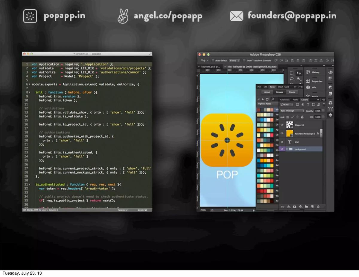
Slide 3 provides the 'Why Now' or 'The Alternative.' It shows two screens: one filled with complex JavaScript code and another showing the dense UI of Adobe Photoshop CS6. The implication is clear: existing methods of prototyping are either too technical (coding) or too cumbersome (professional design software). This slide successfully frames POPAPP not just as a tool, but as a simpler alternative to the status quo.
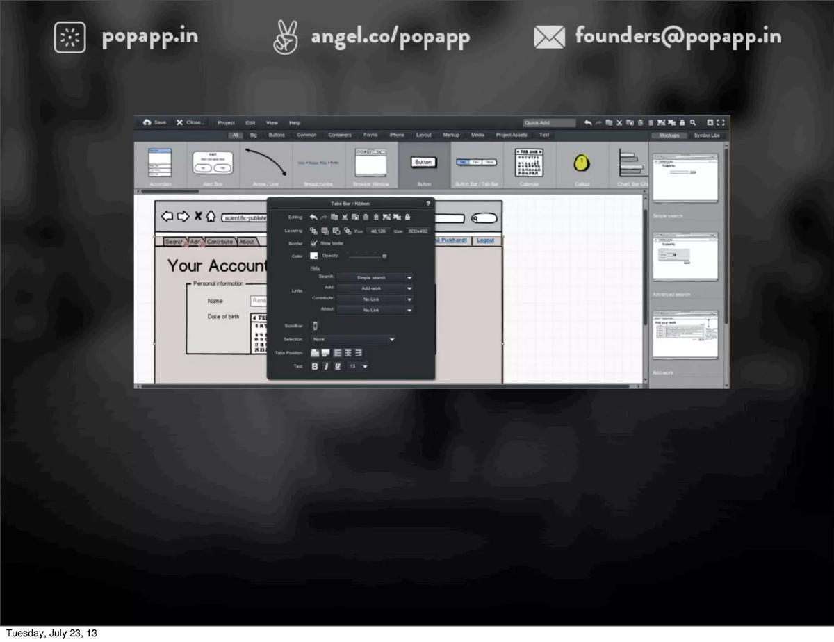
Slide 4 expands on this by showing a collage of various wireframing and mockup tools. These are presented as a cluttered, overwhelming landscape. By placing four empty white squares over the center, the deck suggests that POPAPP is the clean, simple solution that will emerge from this noise.
Slide 5 repeats the 'Idea -> ? -> App' graphic from Slide 2. In a live presentation, this likely served as a transition point to introduce the solution. It reinforces the central thesis of the deck before moving into the product demonstration.
Slides 6-8: The Three-Step Solution
The core of the product is explained in a 'how it works' sequence using three action verbs. Slide 6 ('Draw') shows a close-up photo of a hand sketching a mobile UI on a piece of paper. This grounds the digital product in a physical, tactile reality that every designer understands.
Slide 7 ('Link') demonstrates the 'magic' of the app. A finger is shown on a smartphone screen, drawing a red bounding box around a hand-drawn button. This is the 'linking' phase where static sketches become interactive. This is the most important slide for understanding the product's unique functionality.
Slide 8 ('Share + Feedback') completes the loop. It shows a user typing a comment on a mobile device, with the text 'See a demo at popapp.in/500 right now!' This is a strong call to action, inviting investors to experience the product immediately rather than just looking at slides.
Slide 9: Proof of Traction
Slide 9 is the 'Traction' slide, and it is the most data-heavy slide in the deck. It features the number '500,000+' in large blue text above the word 'MOCKUPS.' This is a massive figure for a startup at this stage, indicating that the 'Draw-Link-Share' workflow has already achieved significant adoption. Below the number are three hand-drawn sketches. One explicitly mentions 'POP x 500 Startups,' signaling their participation in a top-tier accelerator, while another shows a stack of money with the words 'I AM INTERESTED,' likely a playful nod to their current fundraising status.
Slide 10: The Pedigree of Advice
Slide 10 focuses on 'ADVISERS.' Rather than listing a long team of juniors, POPAPP highlights four heavy hitters from the tech world: David Wei (Facebook), David Breger (LinkedIn), Zal Bilimoria (LinkedIn), and Niket Desai (Google). By associating themselves with leaders from the world's most successful social and professional networks, the founders borrow institutional credibility. This slide answers the 'Who is backing this?' question with significant authority.
Slides 11-14: The Ask and the Vision
Slide 11 uses a 'progress bar' metaphor. It shows the journey from 'Idea' to 'Prototype' (where they are now) and points toward a future 'Tool' or 'Platform' (represented by a wrench and the POP logo). The slider is positioned at the 'Prototype' stage, indicating that while the product works, there is a roadmap for further development.
Slide 12 delivers the 'Ask.' The text 'RAISING $1,000,000' is displayed in the same blue used for the traction slide. The background shows dark silhouettes of various devices—a laptop, a desktop monitor, a tablet, and two smartphones. Only one smartphone is highlighted in color, suggesting that the current product is mobile-focused but the funding will enable expansion.
Slide 13 is a visual 'future state' slide. It mirrors Slide 12, but now all devices—the laptop, monitor, tablet, and phones—are illuminated with the POPAPP logo and bright colors. This is a wordless way of saying, 'We are going to be the prototyping standard for every screen size.'
Slide 14 is the closing slide, featuring a large version of the logo and the founders' email address. It is a clean, professional conclusion that keeps the focus on the brand.
What Works in This Deck
Extreme Clarity: The 'Draw, Link, Share' framework is impossible to misunderstand. By distilling the product into three simple actions, they make the investment opportunity feel accessible. · Traction as the Lead: 500,000 mockups is a 'hard' number that validates the product's utility. It proves that people aren't just downloading the app, but actually using it to create content. · Visual Consistency: The use of real photography mixed with clean icons creates a professional, design-forward aesthetic that is appropriate for an 'Art' and 'Software' company. · Advisor Social Proof: In the absence of a detailed founder bio slide in this set, the advisor slide does heavy lifting to prove that the company is taken seriously by industry veterans.
What Is Missing
Business Model: The provided slides do not explain how POPAPP makes money. There is no mention of subscription tiers, enterprise pricing, or 'freemium' hooks. · Market Size (TAM/SAM/SOM): While the deck shows a clear problem, it doesn't quantify how many designers or developers exist who would pay for this solution. · Unit Economics: There is no mention of Customer Acquisition Cost (CAC) or Lifetime Value (LTV). While perhaps less critical for a crowdfunding/early VC round, these are standard expectations for a $1M raise. · Competitor Matrix: Slide 4 hints at competition, but a formal comparison of features or pricing is absent.
What a Founder Should Copy
The 'Verb' Strategy: If your product is a tool, define it using 3-4 simple verbs. It makes the workflow memorable. · Persistent Contact Info: Putting your email and website in the header of every slide ensures that if an investor screenshots a single slide to share, your contact info goes with it. · The Progress Bar: Using a slider to show where you are in your development journey (Slide 11) is an honest and effective way to show both current achievement and future potential. · Visual Roadmaps: Instead of a list of bullet points for 'Future Features,' use device silhouettes or icons to show where your product is going next (Slide 13).
Frequently asked questions
- What problem does POPAPP solve according to the deck?
- POPAPP addresses the 'missing link' between having an initial idea and producing a functional application. Slide 2 and Slide 5 use a large question mark to illustrate the confusion or difficulty founders and designers face when trying to translate a concept into a prototype. It specifically contrasts its simplicity against the complexity of writing code or using professional design software like Photoshop, which are shown on Slide 3.
- How does the product actually work?
- The deck breaks the workflow into three distinct phases. First, 'Draw' (Slide 6), where users sketch interfaces on physical paper. Second, 'Link' (Slide 7), where the mobile app is used to take photos of these sketches and assign interactive 'hotspots' to them. Third, 'Share + Feedback' (Slide 8), where the resulting interactive prototype is sent to others for testing and comments.
- What evidence of traction is provided?
- The primary traction metric provided is the volume of content created on the platform. Slide 9 prominently displays '500,000+ MOCKUPS,' suggesting a high level of user engagement and product-market fit. Additionally, the slide features a sketch of 'POP x 500 Startups,' indicating the company's participation in the 500 Startups accelerator program.
- Who is involved in the project besides the founders?
- While the specific founders are not detailed in the provided slides, Slide 10 lists four prominent 'Advisers': David Wei (Director @ Facebook), David Breger (Tablet Mobile Product Lead @ LinkedIn), Zal Bilimoria (Senior Product Manager @ LinkedIn), and Niket Desai (Product Manager @ Google). This provides significant institutional credibility to the venture.
- What is the company's fundraising goal and intended use of funds?
- The company is raising $1,000,000, as stated on Slide 12. While a detailed budget breakdown is missing from the provided slides, Slide 13 implies that the capital will be used to expand the product's reach from mobile-only to a full suite of devices, including tablets, laptops, and desktop computers.