Focus on one core, emotional human problem. The deck’s power comes from identifying a universal pain point: 'FEAR OF REJECTION!' Your solution should be a direct antidote to the problem. The double opt-in mechanic ('get connected if they like you too') is the star of the show because it directly eliminates the fear of rejection. Use a simple narrative to make the problem and solution relatable. The story of 'Matt' is a classic and effective storytelling device that frames the entire pitch. Even with just mockups, demonstrate a clear and intuitive user experience. The deck walks the viewer thr…
Key takeaways
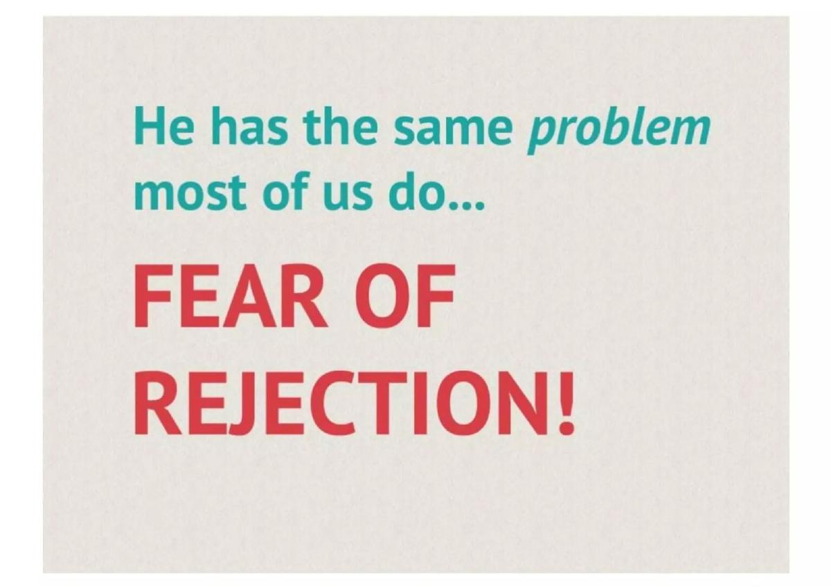
- Focus on one core, emotional human problem. The deck’s power comes from identifying a universal pain point: 'FEAR OF REJECTION!'
- Your solution should be a direct antidote to the problem. The double opt-in mechanic ('get connected if they like you too') is the star of the show because it directly eliminates the fear of rejection.
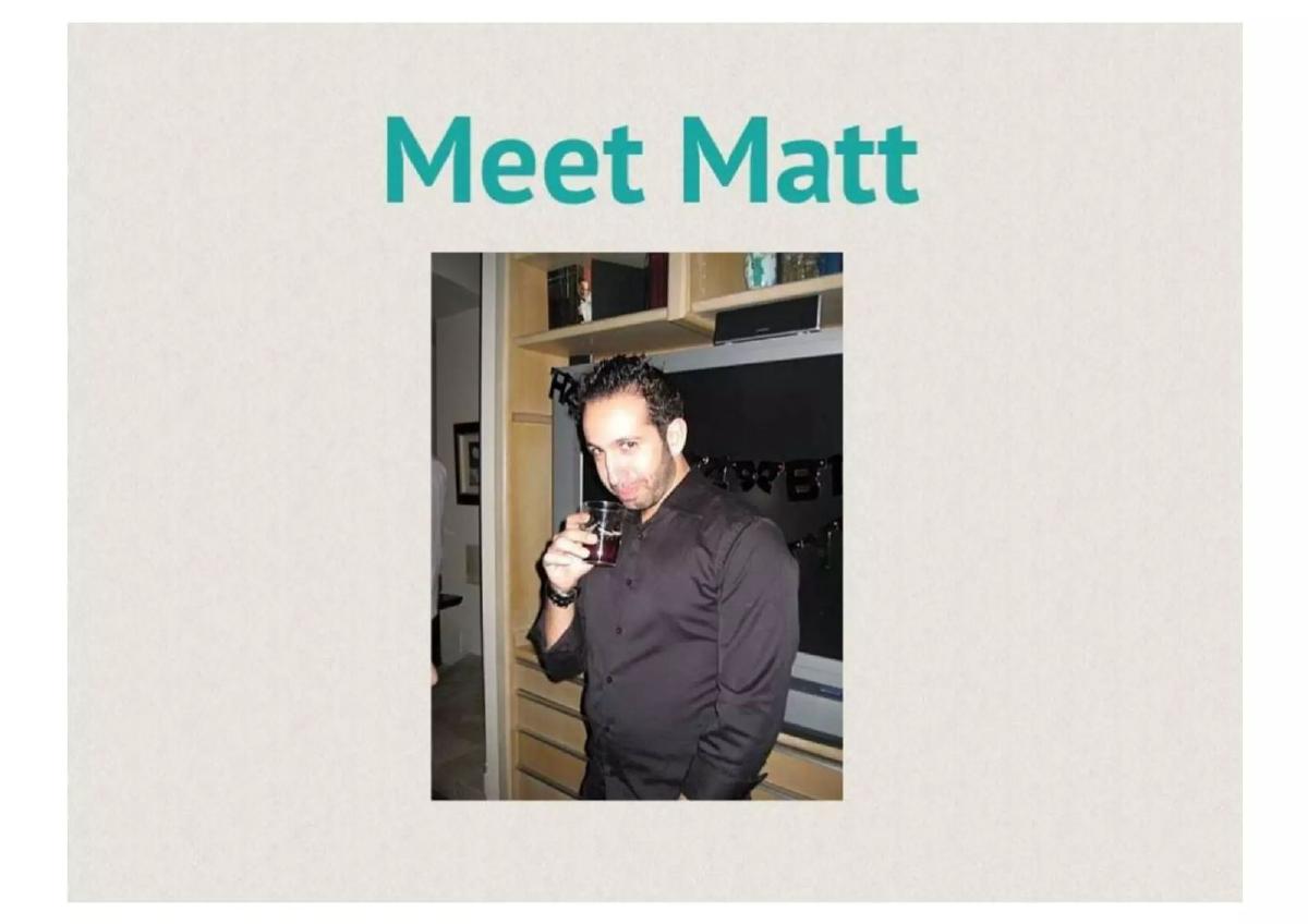
- Use a simple narrative to make the problem and solution relatable. The story of 'Matt' is a classic and effective storytelling device that frames the entire pitch.
- Even with just mockups, demonstrate a clear and intuitive user experience. The deck walks the viewer through the core loop: seeing a profile, the 'Like or Not' choice, the match, and the chat.
- Clearly articulate your revenue model, even at the concept stage. Match Box outlines three specific, plausible monetization strategies, showing they’ve thought beyond just user acquisition.
- Leverage existing platforms to build trust and gather data. 'Sign In With Facebook' is not just a feature; it's a foundational strategy for social proof and relevance.
- A powerful concept can sometimes forgive a lack of detail. This deck is missing team, market size, and traction slides, but succeeds by making the core idea feel inevitable.
Introduction
This is a look at the original concept deck for the app that would become Tinder, initially named 'Match Box.' This deck is a raw, early-stage artifact. It is not a Series A deck from an operating company; it’s a concept pitch, likely used internally at the startup incubator Hatch Labs. As such, it is exceptionally sparse. There is no team slide, no market analysis, no traction, and no financial ask. Yet, it led to the creation of a category-defining company.
Our analysis will focus on what the deck does show and how it accomplishes its goal with such minimal information. We will treat it as a masterclass in conceptual selling, dissecting how it frames a powerful human problem and presents an elegant, game-changing solution. For founders building a pre-product, pre-launch company, this deck is a powerful lesson in focus and narrative efficiency.
The Problem
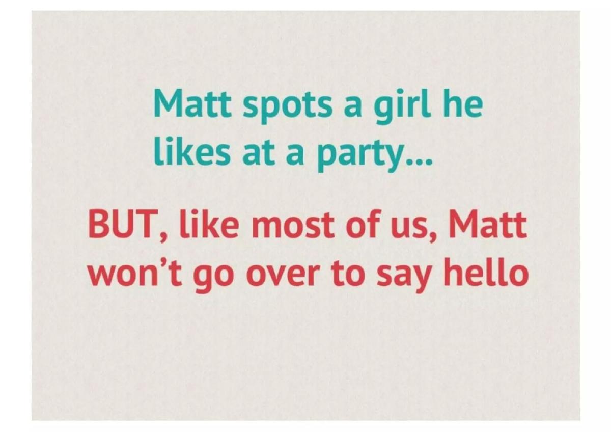
The deck opens not with statistics or market trends, but with a person: 'Meet Matt.' It immediately grounds the pitch in a relatable human story. Over the next two slides, it lays out a simple, universal scenario: Matt sees someone he's interested in at a party but is paralyzed by the 'FEAR OF REJECTION!'
What the Deck Does Well
Universality and Emotion: The choice of 'fear of rejection' as the core problem is brilliant. It’s a deep-seated, emotional pain point that nearly everyone has experienced. It sidesteps the more transactional framing of 'online dating is inefficient' and goes straight for the psychological barrier that prevents connections in the real world. · Simple Narrative: The three-slide sequence ('Meet Matt,' 'Matt spots a girl,' 'FEAR OF REJECTION!') is storytelling at its most efficient. It creates a character, a desire, and a conflict in fewer than 20 words. An investor or stakeholder immediately understands and empathizes with the problem on a personal level. · Visual Simplicity: The minimalist design—stick figures and stark, bold text—ensures there are no distractions. The entire focus is on the emotional core of the problem. When the words 'FEAR OF REJECTION!' appear in a large font, they have maximum impact.
What Founders Can Learn
Your problem slide doesn't need to be dense with data to be effective. The most powerful problems are rooted in relatable human emotions. If you can make your audience nod and say, 'I’ve felt that,' you have won half the battle. Match Box doesn't try to prove that rejection is a problem with market studies; it asserts it as a fundamental human truth, and the audience instinctively agrees. The lesson is to find the emotional core of the problem you are solving and lead with that.
The Solution
Immediately following the problem, the deck presents 'the cure... Match Box.' The solution is described in a single, elegant sentence: 'Like people around you and get connected if they like you too.'
This is the heroic moment of the pitch. The solution directly and completely solves the stated problem. The fear of rejection is surgically removed from the equation because you only find out about a connection if it's mutual. There is no possibility of unrequited liking, and thus, no rejection.
What the Deck Does Well
Direct Antidote: The solution isn't just a feature; it's a perfect counterpoint to the problem. Problem: Fear of Rejection. Solution: Rejection-proof connections. This 1:1 mapping makes the concept incredibly sticky and easy to understand. · The Double Opt-In: The 'if they like you too' clause is the most important part of the entire deck. This is the core innovation—the double opt-in that would later define the industry. The deck does not belabor the point. It states the mechanic with quiet confidence and lets the brilliance of the idea speak for itself. · Immediate Call to Action and Trust Signal: The 'Sign In With Facebook' button on the solution slide is a crucial strategic detail. It’s not just a login method; it implies a strategy. It tells the reader that the app will leverage the social graph for identity, photos, and social context (friends, interests), which adds a layer of safety and relevance missing from anonymous dating sites of the era.
What Founders Can Learn
Your solution should be presented as the simplest, most elegant answer to the problem you've just defined. If your problem is a knot, your solution should be the sharpest sword to cut through it. Match Box doesn't list a dozen features. It presents one core mechanic that changes the game. Furthermore, if your product relies on an existing platform (like Facebook), state it upfront. It's a key part of the 'how' and provides an immediate answer to questions about identity verification and data sourcing.
The Product: How It Works
The deck then transitions into a series of three mockups that visualize the user journey. These slides give form and function to the conept described on the previous page.
The Core Interaction: The first mockup shows a profile card for 'Brittany Michaels.' Critically, it displays social context: '20 friends & 50 interests in common.' This reinforces the value of the Facebook integration. Below the photo are the iconic 'Like or Not' buttons. This is the central game mechanic, presented simply. · The Match List: The next screen shows a 'Matches' list, implying the successful outcome of the 'Like or Not' game. It’s the user’s reward for playing. · The Conversation: The final mockup shows a chat between 'Matt' and 'Brittany.' The dialogue is a bit on-the-nose ('Wow this MatchBox thing mazing! Surprised it works.'), but its purpose is clear: to demonstrate that the app doesn't just create matches, it sparks conversations. It completes the loop from discovery to connection.
What the Deck Does Well
Visualizes the Core Loop: The mockups walk the audience through the entire user experience in seconds: Discover -> Decide -> Match -> Connect. It makes the abstract concept of the double opt-in feel tangible and real. · Highlights Social Context: By placing 'Friends In Common' and 'Things In Common' directly on the profile card, the design emphasizes relevance and trust. This isn't just about a photo; it's about finding real-world connections, which ties back to the initial 'party' scenario. · Shows the Payoff: The chat screen is essential. It proves the concept by showing two people happily interacting who might otherwise never have met. It's the 'happily ever after' to Matt's story.
What Founders Can Learn
You don't need a polished, live app to pitch an idea effectively. Well-designed mockups that clearly illustrate the core user journey can be just as powerful, if not more so. Focus your mockups on the 'magic moments' of your product. For Match Box, that's the moment of decision, the mutual match, and the first conversation. Don't crowd the screens with every possible feature. Tell a story with your UI.
'Under the Hood': Technology and Signals
This single slide provides a glimpse into the technology and data signals that power the Match Box experience. It lists four key components:
Hyper-location (Using WIFI, not GPS): This is a surprisingly specific technical detail. It suggests a focus on immediate, close-proximity matching (like a bar or a party, per Matt's story) and points to a consideration for battery life, as GPS is more draining than Wi-Fi triangulation. · Mutual liking: This reiterates the core double opt-in mechanic, framing it here as a technical 'signal'. · Social interests in common: This is the data-driven output of the Facebook integration, used to increase match relevance. · Friends in common: This is the social proof element, also powered by Facebook, designed to build trust and context.
What the Deck Does Well
Provides Substance: After a series of high-level concepts and mockups, this slide adds a layer of technical credibility. It shows the founders have thought about the 'how' behind the 'what.' · Highlights Key Differentiators: The combination of hyper-location and deep social graph integration implies a product that is fundamentally different from the desktop-based, profile-heavy dating websites of the time. It’s mobile-first, context-aware, and socially integrated.
What Founders Can Learn
Even in a conceptual pitch, including a slide on your 'secret sauce' or 'unfair advantage' is crucial. You don't need to reveal your entire algorithm, but you should articulate the key inputs and signals that make your product unique and effective. For Match Box, it’s the blend of location, explicit intent (liking), and social graph data. Calling out a specific technical choice like 'Using WIFI, not GPS' can also signal a deeper level of product thinking.
The Business Model: Revenue Opportunity
The final slide of the deck is dedicated to monetization. For such a light deck, the revenue slide is remarkably concrete, outlining a clear freemium model with three distinct in-app purchase opportunities:
Pay for Access: Users get '2 matches exposed for free' and then must pay '$1 to see each new match thereafter.' This creates a metered paywall after the user has experienced the 'magic moment' of a match. · Pay for Expression: The ability to 'Pay to send virtual flirt gifts (drink, rose, etc)' introduces a social, expressive component to monetization. · Pay for Visibility: The option to 'Pay to show up higher in Like or Not list' is a classic 'power user' feature, allowing users to pay to increase their odds of matching.
What the Deck Does Well
Clarity and Specificity: The deck provides clear, specific ways the app will make money. It names price points ('$1') and tangible actions. This answers the 'how will you make money?' question head-on. · Multiple Revenue Streams: Presenting three different types of in-app purchases (access, virtual goods, and self-promotion) shows a flexible and robust approach to monetization. It suggests that if one model doesn't work, others might. · Aligns with User Motivation: Each revenue stream is tied to a core user desire: the desire for more matches, the desire to stand out, and the desire to be more visible.
What Founders Can Learn
Think about your business model from day one. Even if your initial focus is user growth, demonstrating a clear path to revenue builds investor confidence. This slide proves that even at the earliest conceptual stage, you can and should articulate specific, plausible monetization strategies. A freemium model that allows users to experience the core value for free before asking them to pay is a proven strategy, and Match Box lays it out perfectly.
What's Missing? The Gaping Holes
While the deck excels at selling a concept, it is a profoundly incomplete document by traditional VC standards. An external investor would find it lacking in several critical areas.
Team: There is no team slide. We don't know who 'Matt' or the founders are, what their background is, or why they are the right people to build this. For most investors, the team is the single most important factor, making this omission glaring. · Market Size (TAM, SAM, SOM): The deck makes no attempt to quantify the market for dating, relationships, or social discovery. How big is this opportunity? Is it a niche product or a billion-dollar market? The deck doesn't say. · Competition: Who are the current players? (e.g., Match.com, OkCupid, etc. at the time). How is Match Box defensibly different from them? While the product's differentiation is implied , it is never explicitly stated, and no competitive landscape is provided. · Traction / Go-to-Market Strategy: This is a pre-product deck, so there are no user metrics. However, there is also no go-to-market plan. How will Match Box acquire its first users? A network-effect business like this faces a significant cold-start problem. The deck offers no solution. · The Ask & Use of Funds: The deck doesn't state how much money it's seeking or how that capital would be used (e.g., engineering hires, marketing spend).
It is crucial to consider the context: this was likely an internal pitch within an incubator (IAC/Hatch Labs) where the team was known, the market was understood, and the immediate 'ask' was for resources and a green light, not external capital. However, for a founder pitching to VCs today, a deck this sparse would likely fail. You must include a strong team slide, a credible market sizing, a clear-eyed view of the competition, and a thoughtful go-to-market plan. This deck is a model for conceptual clarity, not for comprehensive due diligence.
Frequently asked questions
- How much detail is enough for a problem slide?
- Focus on a single, emotionally resonant pain point that is easily understood. Match Box's 'FEAR OF REJECTION!' is perfect because it's universal and requires no data to prove its validity. If you can make your audience feel the problem, you've succeeded.
- Do I need a live product to pitch for seed funding?
- Not always. Match Box used simple, clear mockups to powerfully illustrate the core product concept and user journey. If you don't have a live product, your mockups must be exceptional at telling the story and making the user experience feel tangible and inevitable.
- My deck is missing a team slide. Is that a dealbreaker?
- For an external pitch to investors, yes, it almost always is. The Match Box deck was likely internal, where the team was a known quantity. For your deck, the team slide is one of the most important. Investors bet on people first, ideas second. You must show who you are and why you are the right team to win.
- How important is the business model slide in a pre-product deck?
- It's very important. It shows you are thinking like a business owner, not just a product builder. Match Box, despite being light on other details, presents three specific, plausible revenue streams. It answers the 'how will you make money?' question directly and demonstrates commercial foresight.
- This deck doesn't have a market size or competition slide. Should I leave them out too?
- No. The Match Box deck is an exception that proves the rule, and its context as an internal pitch is key. For a standard VC pitch, you absolutely must include a thoughtfully researched market size (TAM/SAM/SOM) and a competitive analysis that shows you understand the landscape and your unique place within it.