Evntr's 2015 deck is a 13-slide InDesign file for a location-based app that turns local conversations into spontaneous events, positioned as "Meetup, but instant, free, and for a younger demographic". Its strengths are a one-line comparable positioning statement, an explicit $200K ask, a bootstrapping story with under $20K raised from friends and family, and a marketing plan with a real unit cost attached. Its defining flaw is that the words "good traction" appear with no number behind them — no downloads, no events created, no weekly actives — in a deck whose entire thesis is network density.
Key takeaways
- Evntr's deck is 13 slides built in Adobe InDesign in September 2015 for a location-based app that turns local conversations into spontaneous events.
- The positioning line — Meetup, but instant, free, and for a younger demographic — appears on both the elevator pitch and the overview slide and does the work of a full competitive slide in twelve words.
- The deck states an explicit ask of $200K and discloses that under $20K was raised from friends and family, which puts it ahead of most pre-seed decks that never name a number.
- The only traction claim is a successful launch with good traction in under 60 days and no marketing, with no downloads, events created, or retention figures anywhere in the file.
- The market slide counts 20 million US college students and 40 million events created online each year, but never converts either number into a serviceable market or revenue per user.
- The business model is freemium plus in-app point purchases, explicitly modelled on Tinder Plus, but the deck contains no price, no conversion assumption and no revenue projection.
- The marketing plan is the strongest operational slide: the college ambassador program carries a real unit cost of $50 per 100 student signups, implying $0.50 per acquired user.
- The team slide lists five people including a president, a marketing director and a PR intern, but gives no prior companies, no technical background and no equity or full-time status.
What this deck actually is
This is a 13-slide investor deck built in Adobe InDesign on 28 September 2015 by Evntr, a location-based mobile app founded by Michael Fisher and Khuram Javed. Every page carries the same footer — “Evntr Pitch Deck / Michael Fisher, Khuram Javed” — and the file closes on a single line of type: e v n t r . c o .
The document is a seed deck in the most literal sense. The app was already live, the team had bootstrapped for eight months on under $20,000 from family and friends, and the second-to-last slide names an explicit target: $200,000. It is not a demo-day script, not a product one-pager, and not a company overview. It is a founder-written fundraising document from the 2015 consumer-social era, when “X for millennials” and “Tinder but for Y” were still viable pitch structures.
That era matters for reading it fairly. In 2015, a launched consumer app with an engaged campus and no revenue could raise on story alone. In 2026 it cannot. What makes this deck useful to study is that it does several things better than most decks written today — and fails on the one thing that no consumer deck can survive failing on. The walkthrough below covers all 13 pages in order.
Slide-by-slide walkthrough
Slide 1 — Title
The cover carries the word “Pitch Deck” and the two founders’ names. That is all.
This is the weakest page in the file, and it is weak in a way that is trivially fixable. A cover slide has exactly one job: to make the reader want to turn the page, and to survive being screenshotted and forwarded. “Pitch Deck” is a file type, not a company. If an investor forwards this to a partner, the first thing that partner sees says nothing about what Evntr is or why anyone would care.
The material for a strong cover already exists inside the deck — the elevator pitch on the very next page is one line away from being a perfect title. Putting “Evntr — Meetup, but instant, free, and for a younger demographic” on slide 1 would have cost nothing and would have made the deck self-explanatory from the first frame.
Slide 2 — Elevator pitch
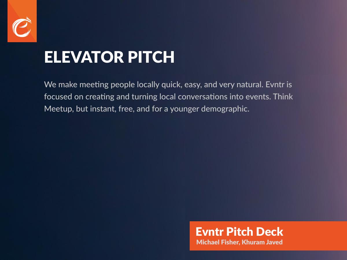
Three sentences: making meeting people locally quick, easy and natural; Evntr turns local conversations into events; “Think Meetup, but instant, free, and for a younger demographic.”
This is the best writing in the deck. The comparable-based positioning line does an enormous amount of work in twelve words: it names the category (event organising), the incumbent (Meetup), the wedge (instant and free where Meetup is scheduled and paid), and the audience (younger). An investor who reads only this slide can already argue for or against the company, which is the actual test of a good positioning line.
The construction is worth copying verbatim as a template: “Think [known incumbent], but [the two axes on which you differ], for [audience].” The risk of comparable-based positioning is that you inherit the incumbent’s ceiling, and Evntr does inherit Meetup’s — but at seed, being instantly understood beats being uniquely framed.
Slide 3 — What Evntr is
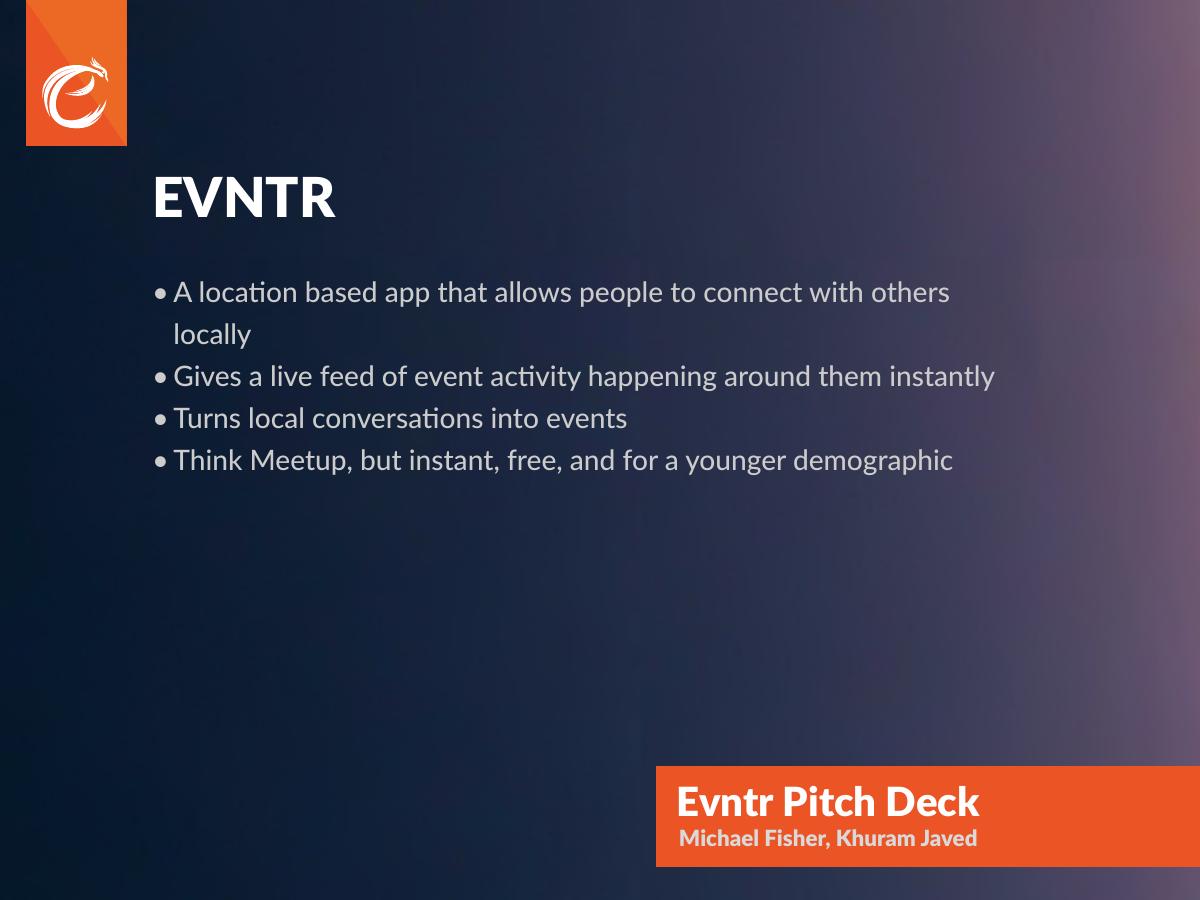
Four bullets: a location-based app for connecting with people locally, a live feed of nearby event activity, turning local conversations into events, and the Meetup comparison again.
Repeating the positioning line is deliberate and correct — a reader skimming at speed should hit the same sentence twice. But three of these four bullets restate slide 2 rather than advance it. This page should have been the product page: two phone screenshots, the live-feed view and the event-creation view, with the ten-word caption each needs. The deck does eventually show interface art, but it appears on the business model slide where it competes with pricing copy instead of here where it would explain the product.
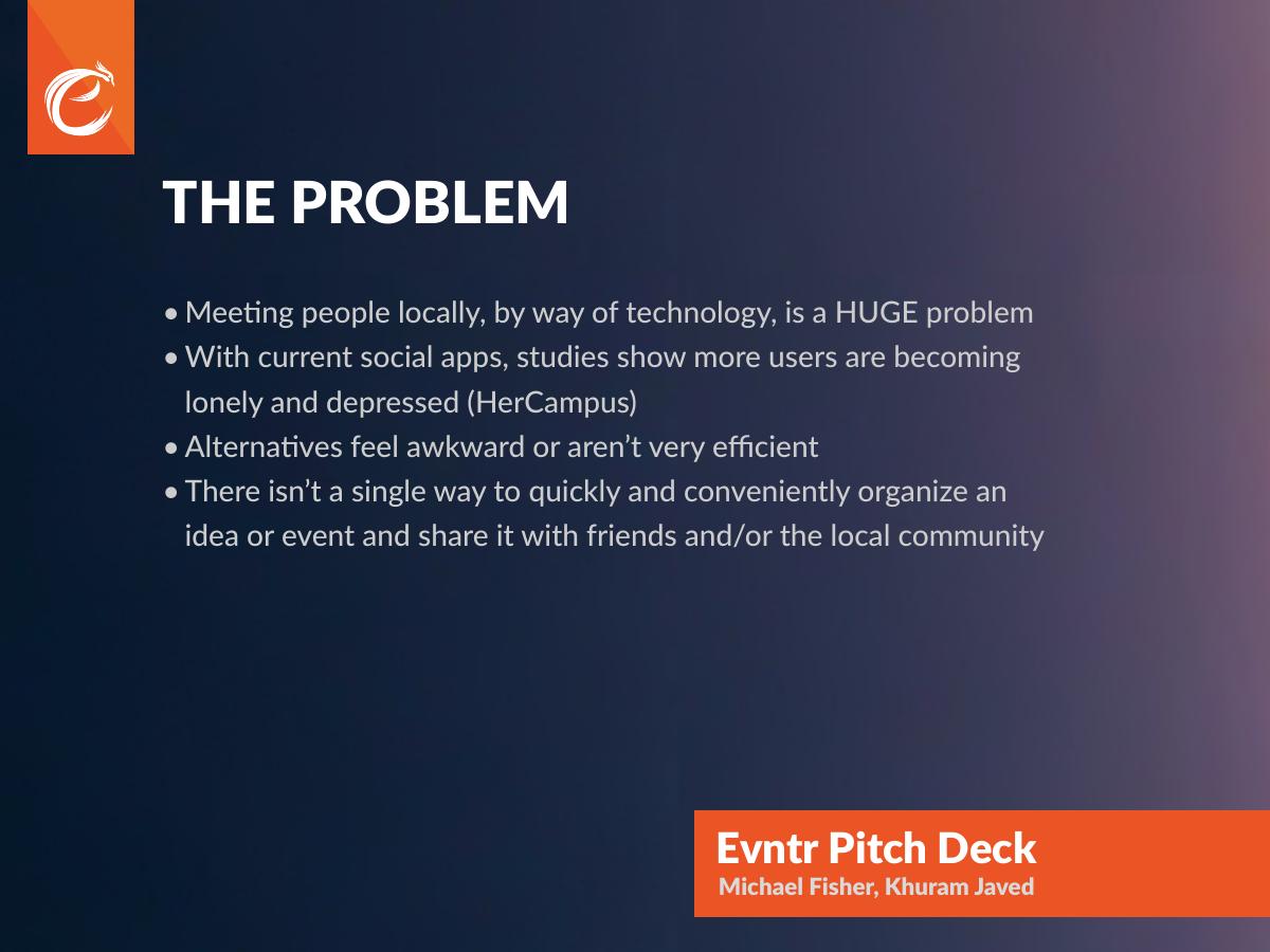
Slide 4 — The problem
Four bullets: meeting people locally through technology is a “HUGE problem”; studies show social apps are making users lonelier and more depressed, attributed to HerCampus; alternatives feel awkward or inefficient; there is no single quick way to organise an idea or event and share it locally.
The fourth bullet is the real problem statement and it is specific enough to build a company on. The first is filler — capitalising HUGE is emphasis substituting for evidence. The second is the interesting one, because it cites a source, which almost no 2015 consumer deck bothered to do. But the citation is a college lifestyle publication, and the finding it carries (social apps increase loneliness) is an argument against building another social app unless you explain precisely why yours inverts the mechanism. Evntr does have that answer — it pushes people toward offline meetings rather than infinite feed scrolling — but the deck never states it. The strongest version of this slide makes that inversion the headline: “Social apps got better at showing you people and worse at getting you to meet them.”
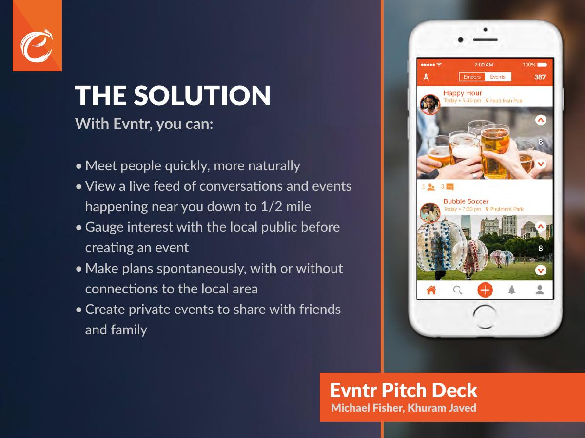
Slide 5 — The solution
Five capabilities: meet people quickly and naturally; view a live feed of conversations and events within half a mile; gauge public interest before creating an event; make plans spontaneously with or without local connections; create private events for friends and family.
Two of these are genuinely differentiated. The half-mile radius is the only hard number in the product section of the entire deck, and it is the right number to lead with because it defines the density problem the whole business rests on. “Gauge interest before creating an event” is the sharpest product idea in the file — it removes the social risk of proposing something nobody shows up to, which is the exact failure mode that kills casual event apps. It deserved its own slide with a screenshot.
The weakness is ordering. The list runs from the vaguest capability to the most distinctive, when it should run the other way. And “private events for friends and family” contradicts the deck’s own positioning — the pitch is about meeting strangers nearby, and closed friend-group events are a different product with different mechanics. At seed, a capability that dilutes the wedge should be cut from the deck even if it stays in the app.
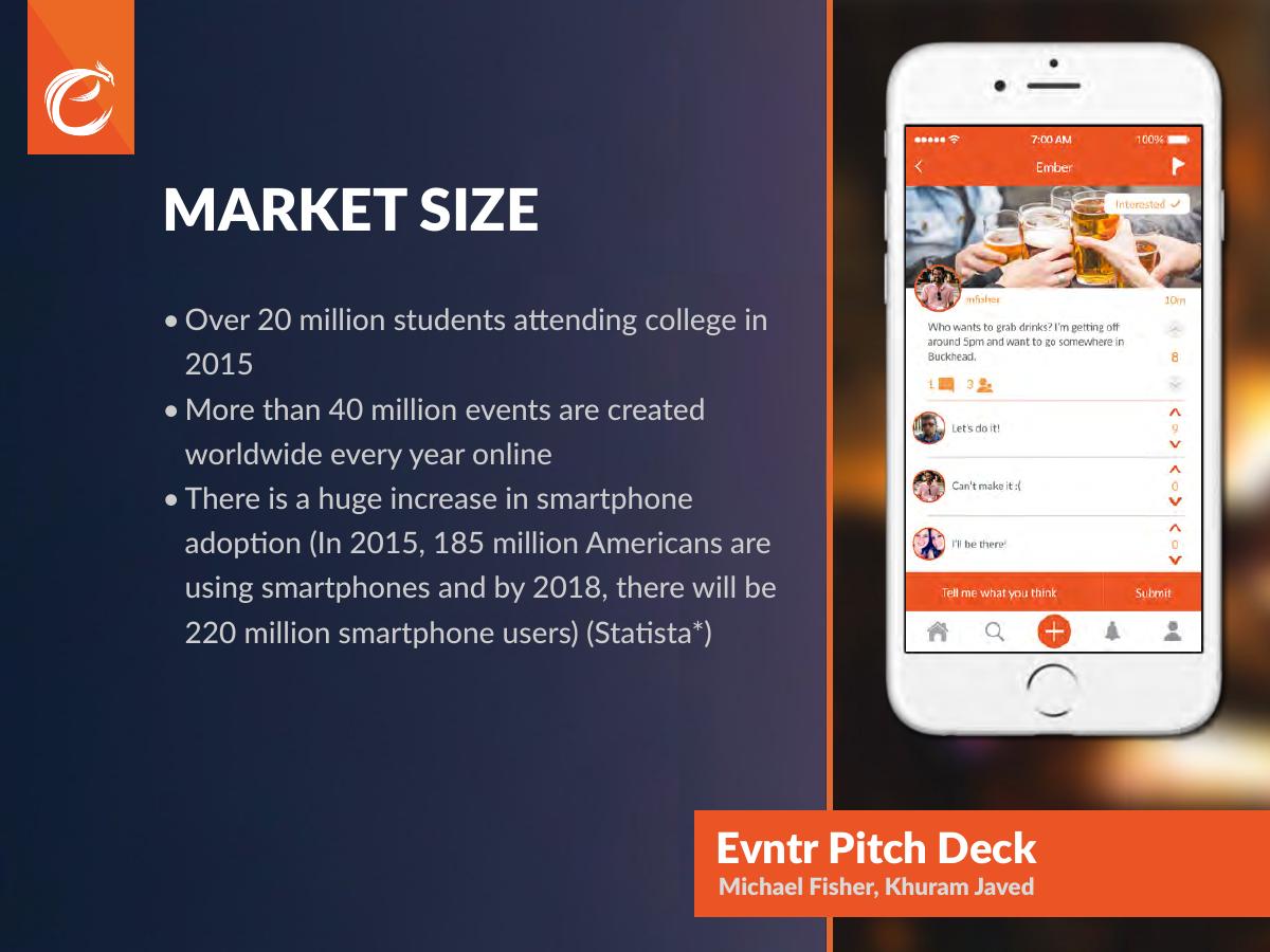
Slide 6 — Market size
Three statistics: over 20 million students attending college in 2015; more than 40 million events created worldwide online each year; and smartphone adoption rising from 185 million US users in 2015 to a projected 220 million by 2018, cited to Statista.
This is the classic 2015 market slide and it fails the way they all fail. Three big numbers are presented, none is converted into a market Evntr could actually serve, and none is tied to revenue. Twenty million college students is a population, not a market — the deck never says what a student is worth or how many it needs. Forty million events per year is a global figure across every platform including corporate ticketing; the free spontaneous meetups Evntr enables are largely not in it. The smartphone growth number is context, not opportunity.
The bottom-up version is stronger and was fully available to this team. A US campus averages roughly 8,000 students. If Evntr reached 15% weekly active on a single campus, that is 1,200 people; at the deck’s own premium model of a few dollars a month at a 3% conversion, one campus is worth a small but computable annual figure — and 500 campuses gives you a serviceable market that an investor can argue with. A number an investor can argue with beats a number they can only nod at.
Slide 7 — Business model
Two lines of monetisation set against an interface mock showing a distance filter, a range slider from 0.5 to 30 miles, and event cards for “Lunch Meeting”, “BBQ at the Park” and “Fireworks at the Beach”: premium membership on a freemium model where the core stays free forever (“think Tinder vs. Tinder Plus”), and in-app purchases where users earn points through app interaction or buy points to unlock special features.
The Tinder Plus comparable is smart shorthand — in 2015 it was the reference case that proved consumers would pay for convenience features in a free social app, and it tells the investor exactly what shape the revenue takes without a table.
But this slide has no numbers at all. No price for premium. No conversion assumption. No point pack pricing. No revenue projection at any horizon. A business model slide that names two mechanisms and zero figures leaves the investor to build the model themselves, and most will not. Even a single line — “$2.99/month premium, assuming 2% conversion at 10,000 campus MAU” — converts this page from a category label into a testable claim. The mock also fights the copy for attention; the interface art belonged on slide 3 or 5.
Slide 8 — Our competitors
Two entries: Meetup, described as requiring more commitment, being non-spontaneous, and charging a membership fee to start a meetup; and Skout, MeetMe and other “meeting people” apps, described as focusing on connecting users through pictures and feeling more like dating.
The analysis is correct and honestly framed — both critiques identify a real structural constraint rather than dismissing the competitor as bad. The dating adjacency point in particular is the single most important strategic observation in the deck: every location-based “meet people” app of that era drifted into dating, which capped its usable audience and poisoned it for group activity. Evntr recognised the trap.
What is missing is Facebook Events, which in 2015 was where the overwhelming majority of casual social events actually lived. Omitting the dominant incumbent from a competition slide reads as either blind spot or evasion, and an investor will raise it in the first two minutes of the meeting. Name it, then explain why an events tab attached to a global social graph is bad at spontaneous, half-mile, stranger-inclusive gatherings. The answer is defensible; leaving it out is not.
Slide 9 — Key differentiators
Five bullets: a real-time feed of crowdsourced conversations and events; meeting people via turning conversations into events; versatility across all event types anywhere; a simple local platform built with privacy in mind; and instantly promoting an idea or event to the local public.
Placing differentiators immediately after competitors is good structure — the reader has the alternatives in mind and can score each claim against them. The problem is that four of the five bullets restate slides 3 and 5 in different words, and one of them actively undercuts the pitch. “Versatile solution for all types of events, anywhere” is the opposite of a differentiator; the deck’s power comes from being narrow (young, local, spontaneous, free). Breadth claims at seed dilute a wedge.
The privacy bullet is the interesting one and it gets four words. In an app that broadcasts your approximate location to strangers within half a mile, privacy is not a feature line — it is the objection that will stop the deal, particularly for a product aimed at college students. It needed its own page explaining what is shown, to whom, at what granularity.
Slide 10 — Marketing plan
Three channels. A college ambassador program hiring influential students, paid $50 per 100 students signed up at their school. Social media and PR, targeting users who are “bored and often lonely, stuck on websites looking at other people having fun”, with PR aimed at college-audience blogs and tech publications for early adopters. And email marketing, described as the most effective tool for attracting and retaining users.
This is the strongest operational slide in the deck, entirely because of one number. “$50 per 100 students” is a $0.50 customer acquisition cost, stated plainly, and it turns growth from an intention into a claim an investor can test, benchmark and fund. It also fits the density problem correctly: recruiting one campus at a time is exactly how a half-mile-radius product should be seeded.
The audience description is unusually sharp for a 2015 deck — “bored, lonely, watching other people have fun” is a real person, not a demographic bracket. Two things are missing. Nothing states what a user is worth, so the $0.50 CAC has no payback period attached, and CAC without LTV is only half an argument. And the claim that email will be the most effective retention channel for a spontaneous, location-based mobile app aimed at 19-year-olds is asserted without support; push notifications are the obvious mechanism and go unmentioned.
Slide 11 — Our team
Five names: founders Michael Fisher and Khuram Javed; Tara Urso as President and Creative Director; Neal Moseley as Marketing and Operations Director; Maria Guilbault as Social Media and PR Intern.
Titles only. No prior employers, no schools, no shipped products, no links, no photos, and no indication of who writes the code. For a mobile app that had already launched on a bootstrapped budget, the fact that someone on this team built and shipped a working product in eight months is a fundable fact — and the deck does not say who did it or what they had built before.
The composition also invites a question the deck does not pre-empt. A five-person team with a President, a Creative Director, a Marketing Director and a PR intern, at a company with under $20,000 raised, is top-heavy on titles and light on engineering. An investor will assume most of these people are part-time and will discount the slide accordingly. Stating who is full-time, and naming the builder, defuses that in one line.
Slide 12 — Money and milestones
The ask slide. Raised under $20,000 from family and friends. Bootstrapping for eight months, during which the team designed, built and launched the first version of the app, assembled a team focused on delivering a market-fit product, achieved a “successful launch with good traction in under 60 days and no marketing”, and received “tremendous feedback” for the next version. Interested in raising: $200K .
Naming a number puts this deck ahead of most pre-seed decks, which end on a contact slide and force the investor to guess the round. The bootstrapping frame is also correct: eight months, under $20,000, and a shipped product is a genuine capital-efficiency signal, and “no marketing” makes any organic growth more impressive, not less.
But this is where the deck breaks. “Good traction” is an adjective standing where the most important number in the entire document should be. There are no downloads, no registered users, no events created, no weekly actives, no week-four retention, no campus count. For a product whose entire thesis is that a live feed within half a mile is useful, density is the business, and an unquantified traction claim reads to an experienced investor as a signal that the number is small. “Tremendous feedback” has the same problem — from whom, how many, saying what.
The ask itself is also incomplete. $200K with no instrument (SAFE, note, priced), no runway length, no use of funds and no milestone that the money buys. The fix is one line: “$200K on a SAFE, 12 months of runway, funding 3 campus launches and the v2 build, to reach X weekly actives.”
Slide 13 — Closing
Restrained and visually confident, but it wastes the last frame — the one an investor is looking at while deciding whether to reply. No email, no phone, no founder name, no call to action. In a deck that will be forwarded as a PDF and read without a founder in the room, the closing slide must carry a way to make contact.
What this deck does better than most startup pitch decks
A twelve-word positioning line that survives forwarding. “Meetup, but instant, free, and for a younger demographic” establishes category, wedge and audience faster than most decks manage in five slides — and it is repeated for consistency instead of being rephrased. · A real acquisition cost. $50 per 100 student signups is $0.50 per user, stated on the page. Almost no pre-seed consumer deck attaches a unit cost to its growth plan. · An explicit ask. $200K appears in large type. A large share of decks at this stage never name a number. · An honest starting position. Disclosing under $20,000 raised from family and friends, and eight months of bootstrapping, reads as capital efficiency rather than weakness. · Competitor analysis that identifies structure, not sentiment. Meetup’s commitment overhead and the dating-drift of Skout-style apps are the two correct critiques of the category. · A specific product constraint. The half-mile radius is a real design decision, and naming it shows the team has thought about density rather than reach. · Length discipline. Thirteen slides, one idea per page, no appendix, no filler mission statement.
Where this deck would fail in an investor meeting
No traction number, anywhere. “Good traction” and “tremendous feedback” are the only performance claims in a deck for a launched product. This alone ends most meetings. · A market slide with no market. Three population statistics, no serviceable market, no revenue per user, no bottom-up model. · A business model with no prices. Freemium and in-app points are named; no price, conversion rate or projection appears. · Facebook Events is absent. Omitting the dominant incumbent from the competition slide will be the first question asked. · The team slide is titles only. No employers, no track record, no named builder, and a title structure that implies part-time contributors. · Privacy gets four words. For a location-broadcasting app aimed at students, this is the deal-stopping objection and it is treated as a bullet. · The ask has no shape. $200K with no instrument, runway, use of funds or milestone. · The cover says “Pitch Deck”. The first and last frames — the two most forwarded pages — carry no argument and no contact route.
2015 consumer deck vs a 2026 consumer deck
Opening claim Comparable positioning (“Meetup, but instant”) Comparable positioning plus one metric on the cover
Market 20M students, 40M events, smartphone growth Bottom-up: one campus modelled, multiplied by reachable campuses
Traction “Good traction in under 60 days” Weekly actives, week-4 retention, events created per active user
Business model Freemium, “think Tinder Plus” Price, conversion assumption, revenue per active user
Growth $0.50 CAC via campus ambassadors Same CAC plus payback period and LTV:CAC ratio
Team Five names and titles Named builder, prior companies, full-time status
Ask $200K Amount, instrument, runway, use of funds, milestone bought
Privacy Four words in a bullet A dedicated slide on data shown, granularity and controls
How you would rebuild this deck in 13 slides
Cover. “Evntr — Meetup, but instant, free, and for a younger demographic”, plus the single best metric the company has. · Problem. Lead with the inversion: social apps got better at showing you people and worse at getting you to meet them. Keep the cited loneliness research; drop the capitalised adjectives. · Product. Two screenshots — the live feed and event creation — with one caption each. Move the interface art off the business model slide. · The wedge. One page on gauging interest before creating an event, with a screenshot. This is the most distinctive idea in the product and it currently sits inside a bullet list. · Density. Explain the half-mile radius as a strategy: why one campus at a time, and what “full” looks like on a campus. · Traction. The slide the original deck does not have. Downloads, weekly actives, events created, week-four retention, campuses live. Whatever the real numbers were, they belong here. · Market, bottom-up. One campus modelled to revenue, then multiplied by reachable campuses. Delete the 40-million-events statistic. · Business model. Price the premium tier, state a conversion assumption, show revenue per active user. Keep the Tinder Plus comparable as a one-line shorthand. · Competition. Add Facebook Events and answer it directly, then keep the existing Meetup and dating-drift critiques. · Privacy and safety. What is broadcast, at what granularity, with what controls, and what happens on a report. · Growth. Keep the $0.50 CAC. Add payback period and the campus rollout plan the money funds. · Team. Name the builder, name prior companies, state who is full-time. · Ask and close. $200K, instrument, runway, use of funds, the milestone it buys — and an email address.
The transferable lesson
Evntr’s deck is not a bad deck. It is well-structured, honestly argued, admirably short, and it contains two lines — the Meetup comparable and the $0.50 ambassador cost — that are better than anything on most decks circulating today. It fails on one thing, and it is the thing most founder-written decks fail on: at the exact moment where the reader is ready to be convinced, it substitutes an adjective for a number.
“Good traction” costs a founder nothing to write and costs them the meeting. An investor reading a launched consumer product’s deck has one question — how many people use this, and do they come back — and every page before the answer is preamble. If the number is small, say the small number with the growth rate attached. A specific weak number is fundable. A vague strong claim is not, because the reader assumes the worst and is usually right.
Read your own deck the way an investor does: find every sentence that makes a claim about performance, and check whether a number follows it. Then check whether the market slide describes a population or a market, whether the ask names what the money buys, and whether the first and last pages — the ones that get forwarded — can stand alone. That is the same pass an investor makes in their first ninety seconds with your file, and it is the pass most decks have never been through before they are sent.
Frequently asked questions
- What is Evntr?
- Evntr was a location-based mobile app pitched in 2015 by founders Michael Fisher and Khuram Javed. It showed users a live feed of conversations and events happening within half a mile of them, and let anyone turn a local conversation into a real event. The deck positioned it as Meetup, but instant, free, and aimed at a younger, mostly college-age demographic.
- Is the Evntr deck a real pitch deck for investors?
- Yes. It is a 13-slide investor deck created in Adobe InDesign in September 2015. It follows the standard seed sequence — elevator pitch, problem, solution, market, business model, competitors, differentiators, marketing, team, money and milestones — and closes with an explicit ask of $200,000, which is the clearest signal that it was written for external funding rather than internal use.
- How much was Evntr raising?
- The final content slide states the company had raised less than $20,000 from family and friends, had bootstrapped for eight months, and was interested in raising $200,000. The deck does not name an instrument, a valuation, a runway length, or a use of funds, which is the single biggest gap in an otherwise complete ask slide.
- What is the biggest weakness in the Evntr pitch deck?
- The absence of traction numbers. The deck claims a successful launch with good traction in under 60 days and no marketing, but never states how many people downloaded the app, how many events were created, or how many users came back. For a product whose value depends entirely on local density, an unquantified traction claim reads as an admission that the number is small.
- Which slides should founders copy from this deck?
- Two. The comparable positioning line — Meetup, but instant, free, and for a younger demographic — communicates category, wedge and audience in twelve words and is repeated for consistency. And the marketing slide, which attaches a real unit cost of $50 per 100 student signups to the ambassador program, giving an investor a testable $0.50 customer acquisition cost instead of an adjective.
- How would this deck be different if it were pitched today?
- A 2026 version would lead with retention and density rather than market size: weekly active users per campus, events created per active user, and the percentage of users who return in week four. It would replace the 20-million-college-students slide with a bottom-up model of one campus, and it would show the ambassador program's payback period rather than only its cost per signup.