EvidenceCare's 22-slide deck, exported on 8 December 2015 and posted to Crowdfunder that month, pitched bedside clinical decision support built by a practising emergency physician. Its problem framing is excellent - evidence-based care reaches only 20% of practice because it is hard to access, cumbersome and hard to apply - and three slides show real, clinically specific working software across desktop, tablet and phone. But the deck contains no funding ask, no valuation, no use of funds, no contact details, and not one user, hospital or dollar of revenue. Market size is national healthcare w…
Key takeaways
- EvidenceCare's 22-slide deck, exported 8 December 2015 and posted to the Crowdfunder equity platform on 14 December 2015, contains no funding ask - no amount, no instrument, no valuation and no use of funds.
- The deck ends on the team slide with no contact slide: no email address, phone number, website or calendar link, on a file published to a platform where strangers read it without a founder present.
- The text layer of slide 7 still contains the unremoved production placeholder 'Put another picture here', hidden underneath the stock photograph but extractable from the PDF.
- There is no traction anywhere in the deck: no hospitals live, no clinicians registered, no sessions, no pipeline and no revenue, despite three slides of finished, clinically specific product screenshots.
- The 'three year financial model' has no years, no dollars and no user counts - only two donut charts showing mix, with no revenue total, no costs, no burn and no runway.
- The financial mix does not reconcile: subscription at 3% of users and $12/user/month against licensed at 17% and $10/user/month implies a 4.7:1 revenue ratio, but the chart shows 46% versus 8%, a 5.75:1 ratio.
- Market size is presented as $1.2 trillion of national healthcare waste rather than a bottom-up TAM, even though the deck's own $10-12 per user per month pricing would have produced a credible number.
- Every headline statistic - 20% of care, 7-10 year translation lag, $2.2T and $1.2T, 1,451 hospitals - is uncited, on a deck whose product sells evidence-based practice.
What this deck actually is
Twenty-two landscape slides, built in PowerPoint and exported to PDF on 8 December 2015 through Mac OS X 10.10.5's Quartz renderer. The file's internal document title is "EvidenceCare 10-10-15 Print.pptx" and the author field reads Sloane Trezevant. The file name it circulated under — crowdfunderdeck-151214143137.pdf — dates its posting to the Crowdfunder equity platform on 14 December 2015. So this is a deck that was drafted on 10 October, exported for print in early December, and then published to a semi-public fundraising marketplace where any accredited investor could open it cold.
That last detail matters more than anything else in this teardown, because a deck posted to a platform is read without a founder in the room. There is no one to answer "how much are you raising?" It has to be on the page. It is not.
The company is EvidenceCare: clinical decision support delivered at the bedside. The thesis is strong and clearly argued. Evidence-based medicine exists, it works, and roughly 20% of care actually follows it, because the evidence is difficult to access, cumbersome, and hard to apply in the seven minutes a clinician has with a patient. It takes seven to ten years for proven therapies to reach practice. The US spends $2.2 trillion a year on care and about $1.2 trillion of it is unnecessary, wrong or wasted. Everyone — government, payers, health systems, EMR vendors, quality organisations — is attacking this, and all of them are attacking it from outside the exam room. EvidenceCare's answer: put the guideline into the workflow at the moment of decision, with the patient watching the same screen.
The product slides back that up. This is not vapourware. Slides 8 through 10 show a working interface across desktop, tablet and phone: a Pulmonary Embolism pathway with recommendation, medication, quality-measure and nursing-order tabs; a Sepsis pathway with time-boxed steps; a New Orleans CT Head Rule calculator that walks the criteria and returns "No CT Imaging Necessary — 99% sensitivity for significant brain injury"; and a mobile contraindication prompt. There is a real, shippable product in this deck, and most 2015 healthcare seed decks did not have one.
What there is not, across twenty-two slides: a funding ask, a valuation, an instrument, a use of funds, a single user or customer count, a single dollar of revenue, a market-size slide, a go-to-market plan, a milestone timeline, and any contact information. The deck ends on the team slide. And in the text layer of slide 7, hidden underneath the stock photograph, sits an unremoved production placeholder that reads "Put another picture here" .
Slide-by-slide walkthrough
Slide 1 — Cover
The EvidenceCare logo — a cross built from two offset squares — with the tagline "Our Evidence. Your Care."
The tagline is the best single line in the deck. Five words that carry the whole positioning: the evidence is ours to curate and maintain, the care decision remains yours. For a product selling into physicians, who are institutionally allergic to being told what to do by software, that is exactly the right rhetorical posture.
What the cover does not carry: a date, a round name, a one-line description of the category, a city, or a founder name. For a file uploaded to a crowdfunding platform in December 2015 with "10-10-15" baked into its internal title, an investor cannot tell from the cover whether they are looking at current material or something recycled from two quarters earlier. Nine words — "Clinical decision support at the bedside · Seed · Nashville · December 2015" — would have closed that gap.
Slide 2 — Gap in Care
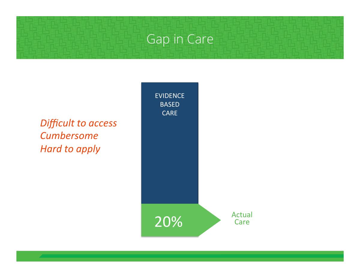
A funnel graphic: EVIDENCE BASED CARE at the top, three friction labels down the side — "Difficult to access", "Cumbersome", "Hard to apply" — and 20% arriving at the bottom as "Actual Care".
This is the strongest problem slide in the deck and one of the better ones you will see in health IT generally. It does not just state a number; it states a mechanism . The 80% loss is attributed to three specific, fixable frictions, and each of those three frictions is something a software product can plausibly attack. A reader finishes this slide already half-constructing the solution, which is precisely what a problem slide should do.
The flaw is the one that runs through the entire deck: 20% has no source under it. There is a well-known body of research here — the Institute of Medicine's work, McGlynn's 2003 NEJM study finding Americans receive about 55% of recommended care, Balas and Boren's 17-year translation lag — and the number could have been footnoted in six-point type without disturbing the design. On a slide selling evidence-based practice, an unsourced statistic is not a minor omission. It is a performative contradiction, and a physician investor will notice it before a generalist does.
Slide 3 — The translation lag
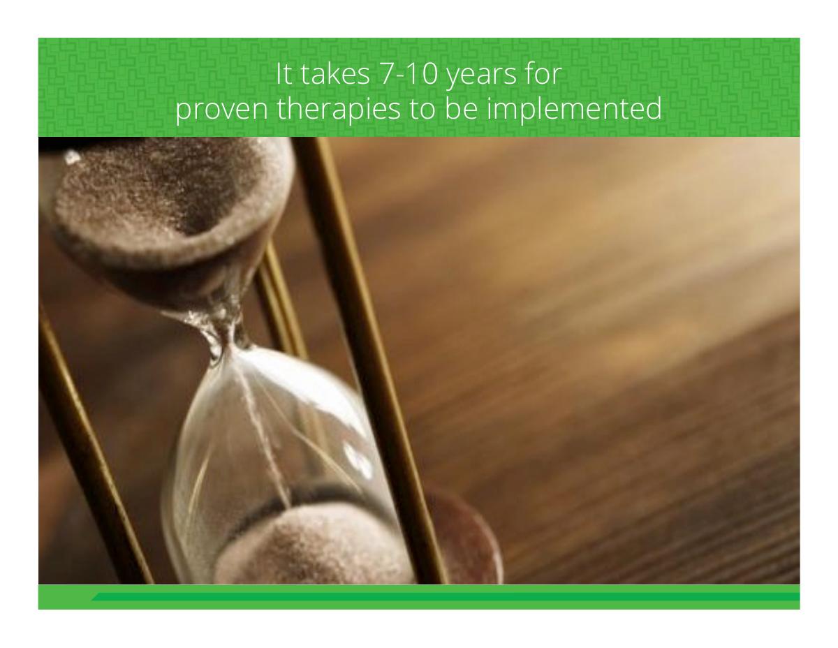
"It takes 7-10 years for proven therapies to be implemented."
One sentence, full page. This is the correct treatment for a statistic that does all its work on its own, and the pacing is right — problem mechanism, then urgency, then cost.
Again uncited. The figure descends from Balas and Boren's widely-quoted 17-year estimate, later refined downward by others, and the range shown here is defensible. But "7-10 years" without an attribution invites the reader to wonder whether it is research or rhetoric, and the deck gives them no way to check.
Slide 4 — Wasted Care
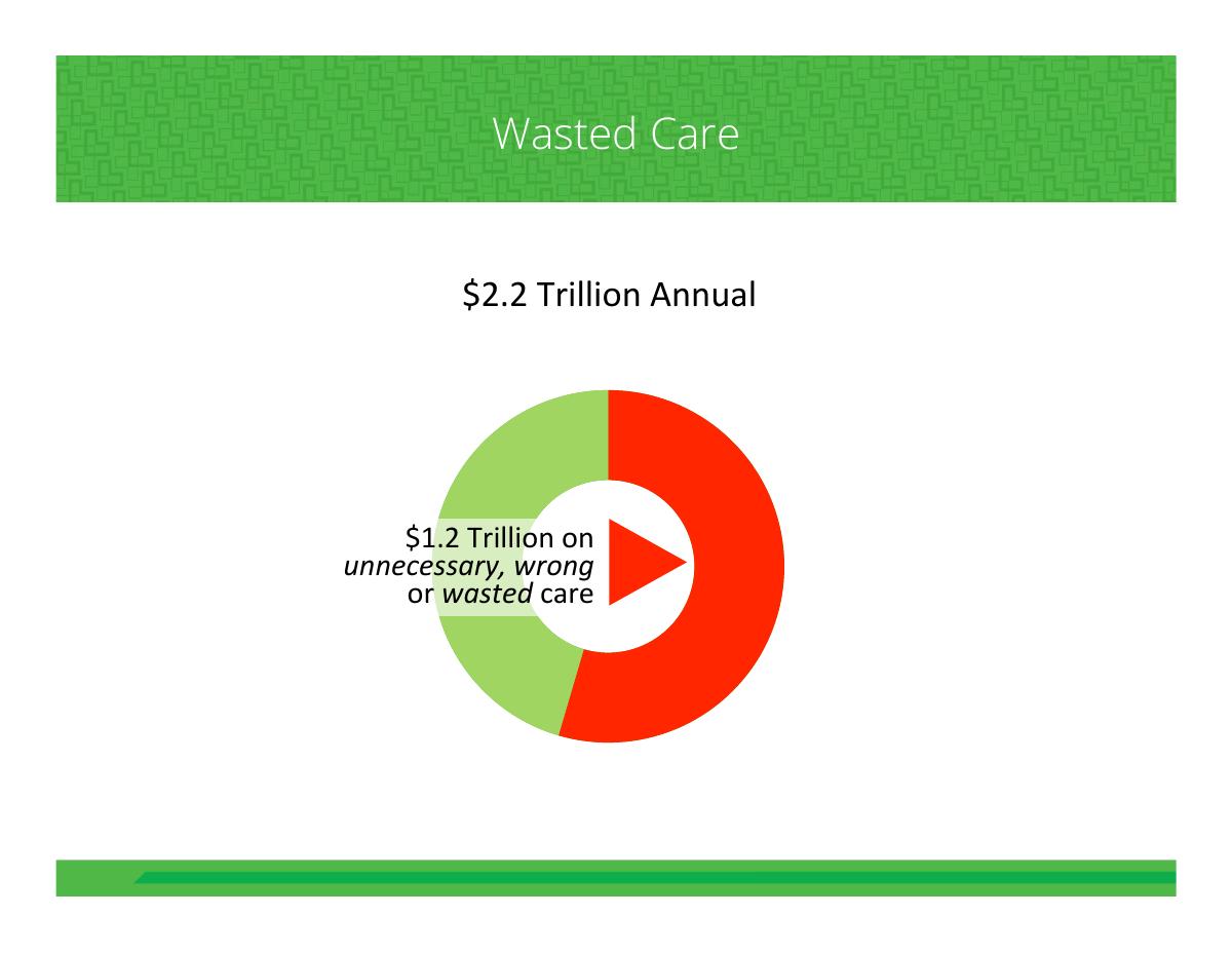
"$2.2 Trillion Annual" against "$1.2 Trillion on unnecessary, wrong or wasted care".
Here is where the deck starts substituting a problem for a market. $1.2 trillion of waste is a headline, not a TAM. No investor believes EvidenceCare captures a percentage of national healthcare waste; the number an investor needs is the one this deck never computes — roughly 950,000 practising US physicians, times a subscription price, times an addressable share, giving a serviceable market in the low billions. That is a smaller number, and a far more credible one.
The deck actually has all the inputs. Slide 21 prices subscription at $12 per user per month and licensed at $10 per user per month. Two multiplications would have produced a real market slide. It never does them, and instead leans on the trillion-dollar figure, which reads to an experienced reader as the tell of a founder who has not yet sized their own business.
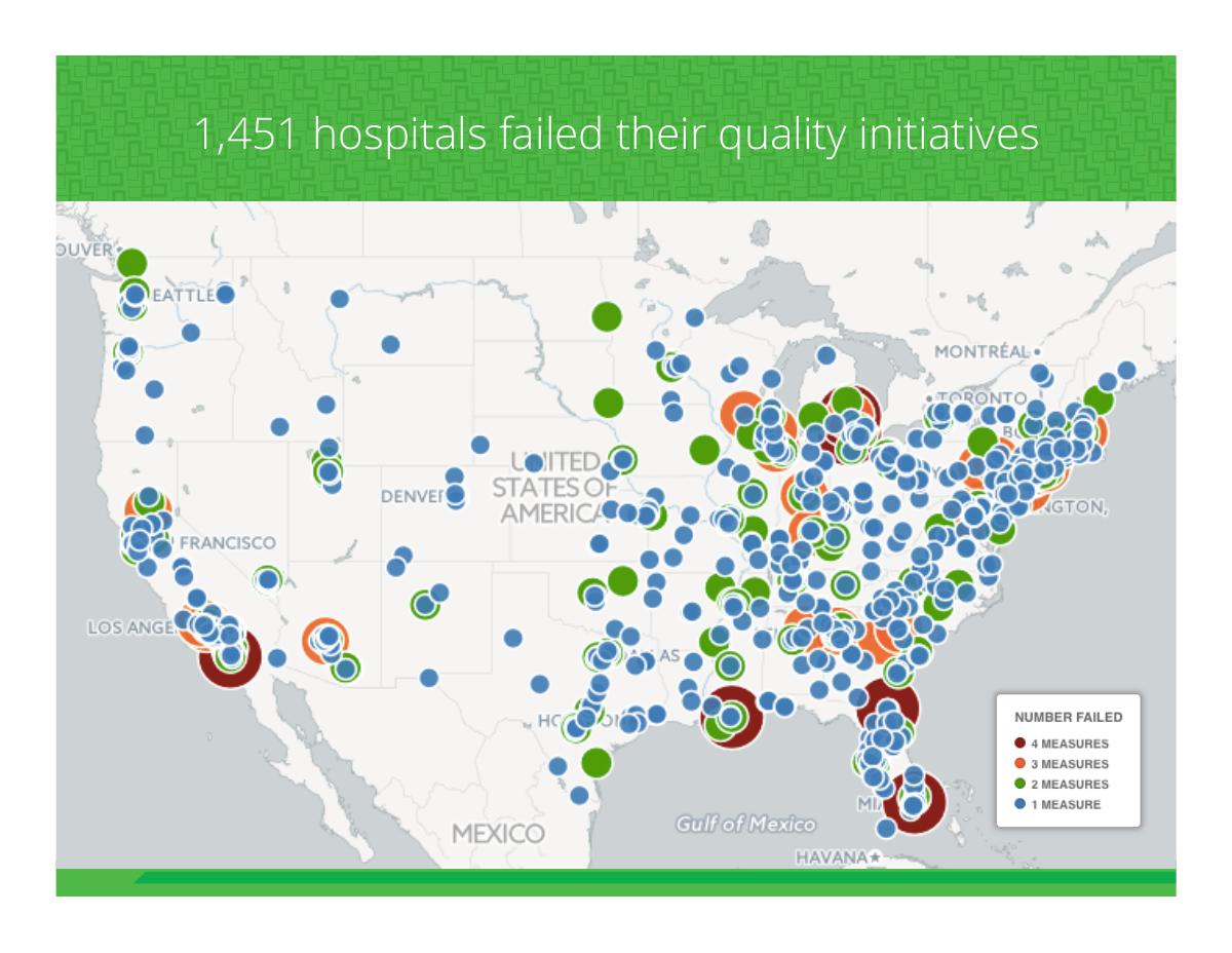
Slide 5 — "1,451 hospitals failed their quality initiatives"
Strategically this is the smartest slide in the first act, because it converts an abstract clinical problem into a budget . Hospitals that miss quality measures lose reimbursement under value-based purchasing and readmissions programmes. That is a line item with an owner, and it tells you who signs the cheque.
The slide does not do the second half of the job. It never says which programme, which year, out of how many hospitals, or what the penalty was worth in dollars per hospital. "1,451 hospitals were penalised under CMS's Hospital Readmissions Reduction Program in FY2015, forfeiting up to 3% of Medicare reimbursement" is the same slide with a buyer, a mechanism and a dollar figure attached. As written, the number is precise but weightless.
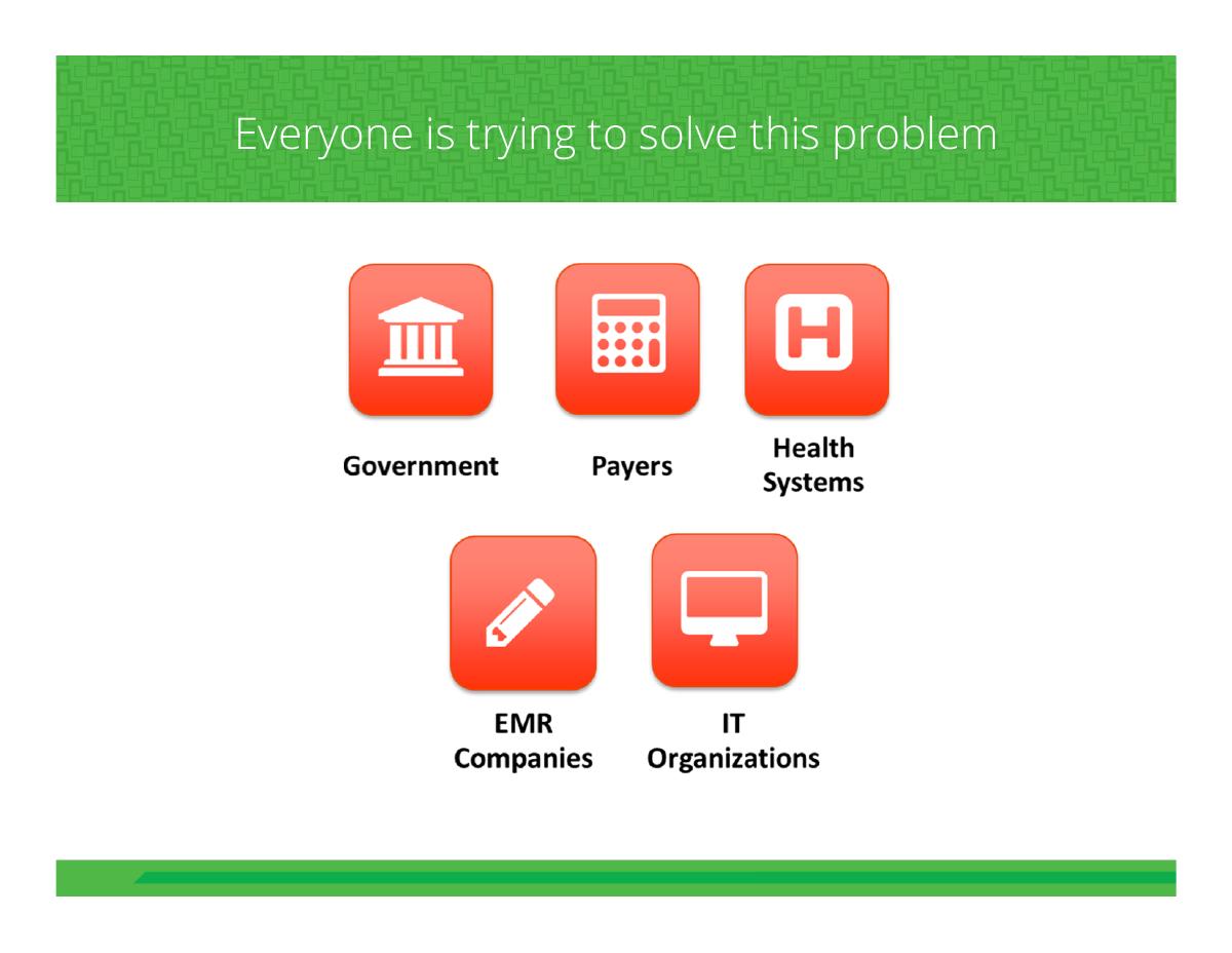
Slide 6 — "Everyone is trying to solve this problem"
Five actors arranged around the problem: Government, Payers, Health Systems, EMR Companies, Quality Organizations.
This is a genuinely sophisticated framing and it is under-used by founders. Rather than claiming empty space, the deck argues that the space is crowded with well-funded actors who are all attacking from the wrong angle — top-down, retrospectively, away from the bedside — which sets up "the solution starts at the bedside" as the differentiated position.
The risk it creates and never manages: four of those five actors are also EvidenceCare's distribution. EMR companies in particular are simultaneously the incumbent threat and the only realistic route into clinical workflow. A deck that names Epic and Cerner as the reason the problem persists needs a follow-up slide explaining whether the plan is to integrate with them, sell around them, or be bought by them. There is no integration slide anywhere in these twenty-two pages, which for a bedside clinical tool in 2015 is the single largest unanswered commercial question.
Slide 7 — "The solution starts at the bedside" (and the placeholder)
A full-bleed stock photograph of a smiling clinician holding a tablet at a patient's bedside, with the logo bottom-right.
Underneath that photograph, in the PDF's text layer, is the string "Put another picture here" . It is invisible on screen — the image covers it — but it is in the file, extractable by anyone who copies text out of the PDF, and it is the fossil of a slide that was never finished. Somebody wrote a note to themselves in the template, dropped a placeholder image over it, and shipped.
This is a small thing that says a large thing. The deck was posted to a public equity platform where it would be read by strangers, and nobody did a final pass with the text layer or the speaker notes visible. Investors do copy text out of decks — to paste into notes, to check numbers, to run a search. Before you send a PDF anywhere, run pdftotext over it, or simply select-all and paste into a plain text editor, and read what comes out. Placeholder copy, old pricing, tracked-change residue and stale company names all live down there.
Slides 8–10 — Product
Three slides of screenshots. A desktop, tablet and phone triptych showing the Pulmonary Embolism pathway — thrombolytic therapy recommendation with a Level A evidence tag, side-by-side Benefits and Risks panels, and outcome comparisons rendered as paired figures for Mortality (19% versus 9.2%), Length of Stay, and Loss of Pregnancy (2% versus 5.8%), with confidence intervals and NNH/NNT annotations beneath. Then a Sepsis pathway with time-boxed steps. Then the New Orleans CT Head Rule as an interactive checklist resolving to "No CT Imaging Necessary".
This is the best material in the deck and it is buried at position eight through ten with no commentary. The screenshots demonstrate three things a claim slide could never establish: the content is real and clinically specific, the evidence grading is exposed rather than hidden, and the numbers are rendered in a form a clinician can show a frightened patient across a bed. That last property is the actual product insight, and the deck states it nowhere in words.
Two problems. First, there is no caption on any of the three slides — no "here is what a clinician sees in the eight seconds they have", no arrow, no annotation. A reader has to zoom into a screenshot to discover the differentiator. Second, and more importantly, none of these slides carries a shred of usage evidence. Is this in production? In how many hospitals? Used how many times last month? By how many clinicians? For a product this finished, the absence of a single usage number is the loudest silence in the file.
Slide 11 — Patient testimonial
Madia Cooper, "African Dance Professor, First-Time Parent — July 2015": "After going to 3 doctors with no improvement, I thought I was going to die. Dr. Fengler knew what was wrong and showed me the risks to me and my baby. Once I saw the numbers, I knew I could live through this. It put me at ease."
As a piece of writing this is excellent, and the line "once I saw the numbers, I knew I could live through this" is the entire shared-decision-making thesis expressed better than any slide in the deck manages. Named, dated, specific, human.
But it is the wrong testimonial for this audience. It credits Dr. Fengler — the founder — not the software. An investor reads it as evidence that a very good physician is a very good physician. The quote a fundraising deck needs is from a paying customer: a hospital CMO explaining what changed in their imaging utilisation or readmission rate after deploying the product, with a name and a date attached. One patient quote is colour. Zero customer quotes, on a deck with a live product, is a gap.
Slides 12–13 — Content and content partners
"Supports content in all facets of healthcare" with four categories — Outpatient, Inpatient, HAC (hospital-acquired conditions) and Antibiotic Guide — under the header "Guideline Experts". Then a partner slide whose most legible mark is the US Preventive Services Task Force.
Content is the correct thing to emphasise, because in clinical decision support the moat is not the interface, it is the maintained, attributed, continuously-updated guideline library and the medico-legal defensibility that comes with it. UpToDate's business is that library. Naming USPSTF as a source is a real credibility signal.
What is missing is the operating question underneath: who maintains this content, at what cost, and how fast? Guidelines change constantly, and a decision-support tool that drifts out of date is worse than nothing — it is a liability. The deck shows no editorial headcount, no update cadence, no medical review board, and no content cost line. It also never distinguishes between guidelines it licenses and guidelines it authors, which is the difference between a content business and a distribution business.
Slides 14–16 — Business model, ad tiers, revenue partners
A three-channel model: LICENSED to hospitals and clinics, SUBSCRIPTION users, and FREEMIUM users, plus a job board. Then an "Ad Fulfillment Tiers" table: Tier 1 direct advertisers at $0.25–2.00 per ad, Tier 2 partner networks at $1+ per ad, Tier 3 society advertisers — medical societies, conferences, educational institutions — at $250–1,000 per month, Tier 4 syndicated networks at $0.05–0.20 per ad, with the note that ads get filled top-down. Then a revenue-partner logo wall: PDR Health, GoodRx, Octovis, Konnarock Healthcare, EquityHealth.
The tier table is, mechanically, the most rigorous slide in the deck. It has real rates, a named waterfall, and a fill logic. Somebody who has actually run an ad network built it, and it is the kind of specificity most decks never reach.
It is also the slide that would end the meeting with a healthcare investor, for a reason the deck never acknowledges. This is a product that tells a physician what to prescribe at the bedside, and the monetisation model is selling advertising inside that recommendation. That is the Epocrates model, so there is precedent — but Epocrates served reference lookups, not a prescriptive pathway with a "Level A" evidence badge on it. The moment a paid impression sits next to a therapy recommendation, the product's central asset, its perceived neutrality, is the thing being sold. The deck needs an explicit firewall slide: ads never appear on recommendation surfaces, ad inventory is separated from clinical content, disclosure is visible, and a clinical governance body signs off. There is no such slide, and the omission reads as not having thought about it.
The partner wall has the standard logo-wall problem. Five marks, no relationship type, no dates, no contract values, no volumes. PDR and GoodRx are meaningful names in this space; presented as bare logos, they could be signed revenue-share agreements or they could be two calls and an emailed term sheet, and the reader cannot tell which.
Slide 17 — Scalable Technology
A hexagon labelled "Integrated, Modular Platform" surrounded by six capability nodes: Demand Gen, Revenue Capture, Identity Mgmt, User Experience, Advertising Platform, Interface.
This is the weakest slide in the deck and it is the one most commonly found in decks of this era. Six abstract nouns in a wheel assert an architecture without describing one. It contains no information about how the system works, what is built versus planned, what it integrates with, where the data lives, or how it scales.
For a clinical product in 2015 the technical slide had to answer three specific questions: does it integrate with Epic and Cerner and through what interface, is it HIPAA-compliant and how, and where does patient data sit at rest. All three are absent. Notably, the phrase HIPAA does not appear anywhere in the deck's text.
Slides 18–20 — Competition
A comparison matrix — EvidenceCare, Epocrates, UpToDate, DynaMed, Zynx — across Evidence-Based, Peer Developed, Patient-Specific, Easy to Use, Easily Accessible and Free. Then two full slides of context: "Epocrates: sold to AthenaHealth in 2013 for $293 Million" and "UpToDate: $200 Million in annual revenue".
Using competitor outcomes as the competition section is a good move, and rarer than it should be. It reframes rivals as proof that the category produces nine-figure exits and nine-figure revenue lines, which is the argument a venture investor is actually running in their head.
Then the matrix undoes it. EvidenceCare's column is, as always, a complete row of filled circles, and every competitor is missing something. Nobody has ever believed an all-green self-scored matrix. Worse, the chosen axes are self-serving: "Patient-Specific" and "Free" are the two columns where the incumbents fail, and they are columns EvidenceCare defined. The axes an investor would pick — installed base, EMR integration depth, content depth, medico-legal defensibility, physician mindshare — are exactly the ones where UpToDate and Zynx would win, and none of them appear.
The honest version of this slide concedes something. "UpToDate has deeper content and universal recognition; Zynx owns order-set integration; we win at the moment of the decision with the patient in the room, and here is the one hospital where that changed a metric." A matrix with one red mark in your own column is more persuasive than a matrix with none.
Slide 21 — "3 year financial model"
Two donut charts. USERS split 80% freemium, 3% subscription, 17% licensed. REVENUE split 46% freemium, 8% subscription, 46% licensed. A key: freemium at $0.20–0.60 per use, subscription at $12 per user per month, licensed at $10 per user per month.
This is a three-year financial model with no years in it, no dollars in it, and no users in it. It is a mix chart. There is no revenue total, no growth curve, no cost line, no gross margin, no burn, no runway and no headcount. Nothing on this page tells an investor whether year three is $400,000 or $40 million, which means the page cannot be used to make a decision.
The internal arithmetic also does not reconcile. Take the two paid tiers, which are directly comparable because both are priced per user per month: subscription is 3% of users at $12, licensed is 17% of users at $10. Revenue from those two should therefore stand in a ratio of (17 × 10) to (3 × 12) — about 4.7 to 1. The chart shows 46% against 8%, a ratio of 5.75 to 1. Those cannot both be true unless licensed users pay more than the stated $10, or the mix is not what the left-hand chart says. It is roughly a 20% discrepancy, invisible at a glance and fatal in diligence, and it lives on the only quantitative slide in the deck.
The freemium line is a third problem. 80% of users generating 46% of revenue at $0.20–0.60 per use requires an assumption about how many times a free user hits the product per month, and that assumption — the single most important number in the model — is never stated.
Slide 22 — Team, and the end
Three principals with photographs: Brian Fengler, MD, Founder/CEO; Jim Jamieson, Chief Operating Officer; Deb Miller, Chief Marketing Officer. Beneath them, a panel of eight corporate advisors: Rodney Hamilton MD, Hal Andrews, Geof Vickers, Howard Bright, David Swenson, Jim Lackey, Richard Flores, Michael Montijo MD.
The founder is the right founder. A practising emergency physician building decision support for the bedside is a credibility asset no amount of slide design substitutes for, and the patient testimonial on slide 11 quietly confirms he practises. The advisor bench is deep and Nashville-heavy, which for a health IT company is the correct geography.
But eight advisors against three operators inverts the ratio an investor wants to see, and not one of the eleven people on this page has a line of biography. No prior companies, no exits, no clinical appointments, no years of experience, no equity or time commitment for the advisors. Eleven headshots and eleven names is a slide that looks substantial and conveys almost nothing.
And then the deck stops. No ask slide. No use of funds. No milestones. No email address, phone number, website or calendar link. On a file uploaded to an equity crowdfunding platform, where the entire point is that a stranger reads it and decides to act, the last page gives them nothing to act on.
What EvidenceCare got right
A problem slide with a mechanism, not just a number. Slide 2 explains why 80% of care misses the evidence — access, burden, applicability — so the solution feels inevitable rather than asserted. · A real product, shown working. Three slides of live interface across three form factors, with clinically specific pathways and exposed evidence grading. Most 2015 seed decks in this category had a mockup. · The founder is the customer. A practising emergency physician building for the bedside is the strongest possible answer to "why you". · Competitor outcomes as category proof. Epocrates at $293M and UpToDate at $200M in revenue tell an investor the category clears the return bar, which no market-size slide can do as convincingly. · An unusually concrete ad model. Four named tiers with real rates and a top-down fill logic is more rigour than most revenue slides ever show. · A tagline that carries the positioning. "Our Evidence. Your Care." tells physicians they keep authority — exactly the objection this category has to clear. · One idea per slide. The first six slides pace like a talk instead of a document, which is why the narrative lands even though the numbers do not.
What would have to change before this deck raises
Add an ask slide. Amount, instrument, valuation or cap, use of funds in three buckets, and the milestones the money buys. On a crowdfunding platform this is not optional, it is the product. · Add a traction slide. Hospitals live, clinicians registered, sessions per month, retention, pipeline, revenue to date. If the answer is zero, say so and show the pilot instead — silence reads worse than a small number. · Replace the waste figure with a real TAM. Addressable clinicians times price times capture, built from the deck's own $10–12 per user per month. · Put dollars and years on the financial model. Three columns, revenue by line, costs, headcount, burn, runway. And fix the mix arithmetic before anyone else finds it. · Answer the EMR question. One slide on Epic/Cerner integration, HIPAA posture and where PHI lives. Its absence is the reason a health IT investor passes. · Add a conflict-of-interest firewall slide. If advertising funds a prescribing recommendation, show explicitly where ads can and cannot appear and who governs it. · Source every statistic. 20%, 7–10 years, $2.2T, $1.2T, 1,451 hospitals — five footnotes, six-point type. On a deck selling evidence-based practice, this is a matter of consistency, not tidiness. · Swap the testimonial. Keep the patient quote as colour, lead with a named hospital customer and a metric that moved. · Give the team page bios and cut the advisor grid. Three operators with two lines each beats eleven headshots with none. · Clean the text layer and add a contact slide. Remove "Put another picture here", and end on a name, an email and a link.
The transferable lesson
EvidenceCare's deck is the opposite of the usual seed failure. The common pattern is a beautiful story with no product behind it. This is a real product, built by the right founder, addressing a genuine and enormous problem — with no business case attached. The company had shipped software that renders mortality risk at the bedside, and it could not tell a reader how much money it wanted.
The mechanism behind that is worth naming, because it is specific to domain experts. A clinician-founder knows the clinical problem so completely that the clinical problem feels like the pitch. Twenty-two slides go by and nineteen of them are about medicine: the evidence gap, the translation lag, the waste, the pathways, the guidelines, the patient. Three are about the business, and those three are a mix chart with no dollars, a logo wall with no terms, and a headshot grid with no bios. The founder was pitching the thing they are expert in, and deferring the thing they are not.
The fix is unglamorous and takes about a day. Write the ask. Write the traction, even when it is small. Build the market number from your own pricing. Put dollars and years on the model and check the arithmetic. Put your email on the last page. None of that requires a designer or a new narrative — and until it exists, every strength in the first nineteen slides is unreachable, because the reader has nowhere to go with it.
Then do the last thing: open your own PDF, select all, paste it into a text editor, and read what falls out. That is where you will find your own "Put another picture here".
Frequently asked questions
- What is EvidenceCare?
- EvidenceCare is a clinical decision support company founded by emergency physician Brian Fengler, MD. The product puts evidence-based care pathways into the clinical workflow at the point of decision - the deck shows Pulmonary Embolism and Sepsis pathways, an antibiotic guide, and calculators such as the New Orleans CT Head Rule - and renders benefits, risks and outcome probabilities in a form a clinician can show the patient on screen. The tagline is 'Our Evidence. Your Care.'
- Is this a real EvidenceCare investor pitch deck?
- Yes. The 22-slide PDF was exported on 8 December 2015 from a PowerPoint file whose internal title is 'EvidenceCare 10-10-15 Print.pptx', and it circulated as a Crowdfunder platform deck dated 14 December 2015. It follows a standard seed structure of problem, solution, product, business model, competition, financial model and team - but with no ask slide and no contact slide.
- What is the biggest problem with the EvidenceCare pitch deck?
- It never asks for money. Across 22 slides there is no amount, no instrument, no valuation, no use of funds and no contact details, and the deck ends on the team page. That is unusual in any investor deck and close to disqualifying in one posted to an equity crowdfunding platform, where the reader has no founder in the room to ask. Close behind it is the total absence of traction: not one user, hospital, session or dollar of revenue appears anywhere, despite three slides of finished product.
- Which slides should founders copy from this deck?
- Slide 2 and the competition context slides. Slide 2 shows the evidence-to-care gap as a funnel with three named frictions - difficult to access, cumbersome, hard to apply - so the problem carries a mechanism rather than just a number, and the solution feels inevitable. Slides 19 and 20 use Epocrates' $293M sale to AthenaHealth and UpToDate's $200M in annual revenue as proof that the category produces venture-scale outcomes, which persuades a fund far better than a trillion-dollar waste figure.
- Why is a 'three year financial model' with only percentages a problem?
- Because percentages describe mix, not size. The chart tells an investor that licensed and freemium each contribute about 46% of revenue, but nothing on the page says whether total revenue in year three is $400,000 or $40 million, and there is no cost line, no burn and no runway. A model has to be numbers over time: revenue by line per year, costs, headcount, cash out. Mix charts belong beside that table, never instead of it.
- What should a clinical decision support deck say about advertising revenue?
- It has to address the conflict of interest explicitly. EvidenceCare's ad tiers run from $0.05 to $2.00 per impression alongside sponsorships at $250-1,000 per month, inside a product that recommends therapies at the bedside. The deck needs one slide stating where ads can and cannot appear, that recommendation surfaces are never sold, how sponsorship is disclosed to the clinician, and who on the clinical side governs it. Epocrates made an ad-funded model work, but it served reference lookups rather than a graded prescriptive pathway, and the distinction is the whole argument.
- How do you check a pitch deck PDF for hidden placeholder text?
- Open the file, select all and paste into a plain text editor, or run a command-line extractor such as pdftotext. Anything sitting in the text layer beneath images will fall out - EvidenceCare's slide 7 still carries 'Put another picture here' underneath the bedside photograph. The same pass catches stale pricing, old company names, speaker notes and tracked-change residue, and it takes under a minute before you send a deck anywhere.