Oscar Health's pitch deck succeeded by masterfully timing the ACA's market shift and prioritizing a consumer-first narrative over traditional metrics. While it brilliantly visualized a 'simple' insurance experience through high-fidelity mockups, the company's later struggles highlight the difficulty of disrupting actuarial realities. It remains a masterclass in product storytelling and brand positioning.
Key takeaways
- Make the abstract concrete by using high-fidelity mockups and visual evidence to show, not just tell, your product vision.
- Name a clear villain to create an emotional anchor and frame your startup as the hero against a frustrated status quo.
- Anchor your pitch to a tectonic shift or external wave, like a major regulatory change, to make success feel inevitable.
- Frame simplicity as a feat of deep engineering, proving you handle back-end complexity so the user doesn't have to.
- Sell a narrative rather than a feature list by using personas to make the user journey memorable and persuasive.
The Moment in Time: A Tectonic Shift in US Healthcare
To understand the genius of Oscar's pitch, you have to transport yourself back to 2013-2014. The United States was in the midst of the single biggest shakeup to its healthcare system in a generation: the implementation of the Patient Protection and Affordable Care Act (ACA). For the first time, a federal law mandated that nearly all Americans have health insurance, and it created state-run marketplaces where individuals could purchase plans directly.
Before the ACA, the individual insurance market was a niche, often predatory backwater. Most insured Americans got their coverage through their employer. The big players—UnitedHealth, Anthem, Aetna, Cigna—were B2B behemoths. Their customers were HR departments, not individual people. Their technology, branding, and customer service reflected this reality; it was archaic, opaque, and utterly user-unfriendly.
Suddenly, the ACA was set to create an estimated 40 million new individual shoppers. These people weren't benefits experts; they were normal consumers who were used to buying everything else in their lives—from plane tickets to books—through simple, intuitive online interfaces. Oscar's founders, Josh Kushner, Mario Schlosser, and Kevin Nazemi, saw this disconnect as a once-in-a-lifetime opportunity. They realized that the game was changing from B2B to B2C, and the legacy giants were culturally and technologically unprepared to compete on this new turf.
This deck, likely used around their 2014 Series A fundraise, is a pitch for a company built from the ground up for this new world. It argues that in a market where consumers finally have a choice, the winner won't be the company with the largest legacy network, but the one with the best product, the best brand, and the best user experience.
Slide-by-Slide Analysis
Oscar's deck doesn't follow a traditional 10-slide template. Instead, it's a narrative deep dive into their product philosophy. It's designed to convince you of one thing: they are the only ones who truly understand how to build health insurance for the internet age.
The Hook: "Health Insurance was the worst"
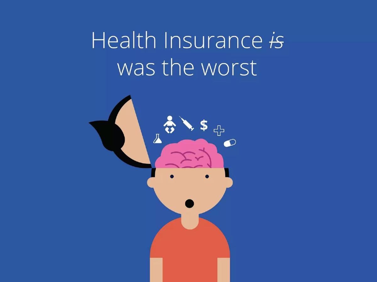
The deck opens with a stark, five-word slide. It’s not just a problem statement; it's a shared frustration, a universal truth. Every investor has likely had a miserable experience with their insurance company. This immediately establishes an emotional connection and frames Oscar as the protagonist against a clear villain: the entire incumbent industry. Following this with "simple, friendly, smart" creates a powerful and immediate contrast that defines the entire pitch.
The Opportunity: "Health insurance is changing (fast)"
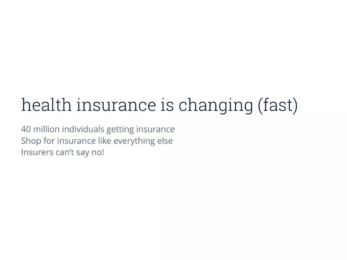
This is Oscar's market slide, but it’s framed as an urgent, unmissable shift. They distill the complex ACA legislation into three simple bullets: "40 million individuals getting insurance," "Shop for insurance like everything else," and "Insurers can't say no!" The key insight is the conclusion: "customer is the consumer." This single line re-frames the entire industry. It argues that all the old rules of B2B competition are now obsolete. The winners will be those who "Focus on branding, technology, customer service." This slide perfectly sets the stage for Oscar's solution.
The Solution: The Four Pillars of "Simple"
The bulk of the deck is dedicated to deconstructing their core value proposition: simplicity. They don't just state it; they prove it by breaking it down into four tangible 'ingredients' and providing overwhelming visual evidence for each. This structure is a brilliant rhetorical device that makes their claims feel well-researched and substantial.
Ingredient 1: Simple by Design
Here, Oscar lets its product do the talking. The deck is flooded with high-fidelity mockups of their web and mobile experience. We see clean interfaces with friendly language ("Hi Kristina!"), limited calls-to-action, and a visual identity that feels more like a modern consumer tech company (like Airbnb or Square) than an insurer. The inclusion of a subway ad mockup ("Health insurance that works like the rest of the Internet") is a power move. It shows they are thinking holistically about brand and marketing from day one, not just building an app. They are building a consumer brand that people can trust and even like—a radical concept in health insurance.
Ingredient 2: Simple by "Getting" Complexity
This section is a crucial counterpoint to the first. It assures investors that Oscar isn't just a pretty UI slapped on top of a broken system. They explicitly state they have "Backgrounds as analysts and data scientists" and "In-house insurance experts." They are tackling the complex backend, so the user doesn't have to. The most powerful evidence is the side-by-side comparison of a traditional, nightmarish insurance bill with Oscar's redesigned, consumer-friendly version. This single visual communicates more than pages of text ever could. It proves they understand the user's pain points at a granular level and have the design and domain expertise to solve them. It's a masterstroke of showing, not telling.
Ingredient 3: Simple by Being "Data Smart"
Oscar demonstrates that their tech is more than just good design; it's intelligent. They showcase a search bar that can interpret natural language queries like "my tummy hurts" or "i can't stop wheezing" and translate them into actionable care options. This is a quantum leap from the typical insurer's website, which forces users to navigate by obscure medical codes and specialty types. They also heavily feature their integration with Teladoc, offering free, on-demand calls with a doctor. This turns the product from a passive payment system into an active, helpful care navigation tool. The historical timeline of health events—from payments to doctor calls to prescriptions—transforms the confusing, fragmented journey of healthcare into a single, cohesive, and understandable narrative for the user.
Ingredient 4: Simple by Focus
The final ingredient is perhaps the most impressive to a seasoned investor or product person: "Learn to say no." By stating they deliberately "Cut functionality along the way," Oscar signals product discipline. Startups often die from trying to do too much. Oscar communicates that they have a clear vision and are executing on the highest-priority use cases first. This builds confidence in their ability to manage resources and ship a high-quality, focused product. The final mockups show a clean dashboard with "Next Steps," guiding the user and reducing cognitive load. It reinforces the core message: we handle the complexity so you can focus on getting better.
What Worked and Why Investors Said Yes
This deck is light on the slides VCs typically demand, yet it was wildly successful. Here's why:
Impeccable Timing: The pitch was perfectly aligned with the ACA's market creation event. It wasn't a solution in search of a problem; it was the right solution at the exact right time. · A Vision Made Tangible: The deck is a masterclass in product storytelling. By using dozens of beautiful, detailed mockups, Oscar made their vision for a better health insurance experience feel real and achievable. Investors could see and feel the product, and it was undeniably superior to the status quo. · A Compelling Narrative: The story was simple and powerful: health insurance is broken, it's finally becoming a consumer product, and only a tech-first company built for the consumer can win. This narrative was easy to grasp, remember, and retell. · Founder-Market Fit (Implied): While not in these specific slides, the founding team's background was stellar. Josh Kushner (Thrive Capital), Mario Schlosser (McKinsey, Bridgewater), and Kevin Nazemi (Microsoft) brought the perfect blend of capital access, strategic thinking, data science, and tech expertise. Investors were betting on a world-class team as much as the idea. · Massive Market Size: The problem wasn't a niche; it was a multi-trillion dollar industry being fundamentally restructured. The potential for a massive outcome was clear, justifying the immense risk.
What Was Weak or Missing
Hard Metrics: The deck is devoid of numbers. There's no data on members acquired, customer acquisition cost (CAC), revenue, medical loss ratio (MLR), or any of the key performance indicators for an insurance business. It's a pure vision and product pitch. · The "Hard Stuff": It glosses over the brutal operational realities of running an insurance company. Building a provider network, negotiating reimbursement rates with hospitals, managing claims processing at scale, and navigating the labyrinth of state-by-state regulation are monumental, capital-intensive tasks. The deck addresses this with a hand-wave: "we have experts." · Competitive Moat: While the UI/UX was a great initial advantage, it's not permanently defensible. The deck doesn't deeply explore how Oscar would build a lasting moat against incumbents who could eventually improve their tech or against other well-funded startups. · Dedicated Team Slide: A formal team slide is a standard part of any pitch. Its absence here suggests that the founders' reputations preceded them, and these conversations happened outside the deck itself. For a less-connected team, this would be a major omission.
5 Lessons for Founders Raising Today
Make the Abstract Concrete: Oscar didn't just say "user-friendly," they showed you 20+ screens of what that meant. Today, this means going beyond static mockups. Use an interactive Figma prototype or a live product demo to let investors see, touch, and feel your vision. · Name a Clear Villain: Oscar's enemy was "bad health insurance." This creates an immediate, emotional anchor and frames your startup as the hero. Define what you're fighting against to make it clear what you're fighting for. · Anchor Your Pitch to a Tectonic Shift: What massive, external wave are you riding? The rise of AI? The shift to remote work? A new regulatory landscape? Oscar had the ACA. Showing that you have powerful tailwinds makes your success feel more inevitable. · Frame Simplicity as a Feat of Deep Engineering: Oscar didn't just present a simple UI. They explained that this simplicity was only possible because they deeply understood the underlying complexity and built smart systems to manage it. Simplicity isn't a design choice; it's a technical and strategic advantage. · Sell a Narrative, Not a Feature List: The deck tells the story of "Kristina" and "Edward" navigating their health. This narrative structure is far more memorable and persuasive than a bulleted list of features. Craft a story that your investors can emotionally connect with and easily retell.
Where Oscar is Now vs. The Promise
So, did Oscar deliver on the deck's promise? The answer is a qualified yes.
The Promise Fulfilled: Oscar absolutely succeeded in building a tech-forward, consumer-centric health insurance brand. They went public on the NYSE (ticker: OSCR) in 2021. Their mobile app, telemedicine integration, and customer service are consistently rated far higher than those of legacy competitors. The product vision laid out in this deck was largely brought to life, and it did force incumbents to start taking their own technology and user experience more seriously.
The Harsh Reality: The deck's primary weakness—its glossing over of the 'hard stuff' of insurance—proved prophetic. While Oscar nailed the user experience, it has consistently struggled with the fundamental, less glamorous business of managing insurance risk. The company has faced years of unprofitability due to high medical loss ratios (meaning the cost of member care was too high relative to the premiums collected). Disrupting a user interface is one thing; disrupting the actuarial science and provider network economics of a heavily regulated industry is another thing entirely.
Strategic Evolution: In response to these challenges, Oscar has shown its tech-company DNA by evolving its strategy. Recognizing the value of its technology stack, it launched +Oscar, a platform-as-a-service business to sell its tech and operational expertise to other health systems and insurers. This pivot acknowledges that perhaps their most defensible asset wasn't the insurance business itself, but the technology they built to run it. They also expanded beyond the individual market into Medicare Advantage and small group plans to diversify their risk pool.
In the end, the Oscar deck is a monument to a specific moment in time. It perfectly captured a bold vision for what healthcare could be and was brilliantly executed to secure the capital needed to pursue it. The company's subsequent journey is a sobering, valuable lesson for all founders: a revolutionary product is a necessary, but not always sufficient, condition for disrupting a deeply entrenched industry.
Frequently asked questions
- Why did this deck focus so much on product mockups instead of financials?
- To make their abstract vision of 'better health insurance' tangible and believable. At the pre-launch stage, they had no financials to show. Instead, they de-risked the investment by proving they had thought deeply about the user journey and had the world-class design and product talent to execute it. It was a bet on product vision over historical performance.
- Was the lack of a dedicated 'Team' slide a major flaw?
- For this specific team, no. The founders (Josh Kushner of Thrive Capital, Mario Schlosser from McKinsey) were well-known in the investment community. Their credibility was established through backchannels and personal reputation. For an unknown founding team, omitting a detailed team slide would be a critical error.
- What was Oscar's single most important insight?
- That the Affordable Care Act (ACA) was fundamentally changing health insurance from a B2B industry (selling to employers) to a B2C one (selling to individuals on an open market). This meant that for the first time, brand, technology, and user experience would become the primary drivers of customer choice, a game the incumbents were unprepared to play.
- How did Oscar's pitch address the immense complexity of the insurance industry?
- Subtly and by building trust. Rather than detailing regulatory hurdles, they simply stated they had 'in-house insurance experts' and 'data scientists.' They then used product visuals, like the simplified bill, to prove they could master that complexity and shield the user from it. It was a 'trust us, we've hired the smart people to handle the hard stuff' strategy.
- Could a founder use this product-heavy, metric-light approach to raise capital today?
- Yes, but the bar is much higher. A deck like this would need to be accompanied by a stunningly realistic, interactive Figma prototype or a functional demo. For a post-seed round, investors would also demand evidence of early traction (waitlist signups, user interviews, engagement metrics) to validate the product vision, something this deck lacks.
- What is the core lesson from Oscar's journey since this pitch deck?
- A superior user experience and a strong brand can win customers, but in a highly regulated and capital-intensive industry like insurance, it doesn't guarantee profitability. Disrupting the 'front-end' is often much easier than disrupting the 'back-end' fundamentals of the business model (like risk management and network pricing).