The Oscar Health deck is a masterclass in product-led storytelling. Rather than overwhelming investors with the dense regulatory and financial complexities of the insurance market, the founders focused on the 'human' element of healthcare. By highlighting four 'key ingredients' for simplicity—data intelligence, focus, design, and technical expertise—Oscar positioned itself as a technology company that happened to sell insurance. The deck relies heavily on high-fidelity UI mockups and marketing assets to prove that a traditionally opaque industry could be made transparent through better softwa…
Key takeaways
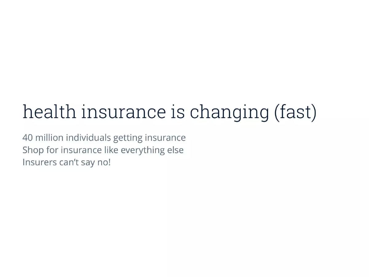
- The deck identifies a massive market shift: 40 million individuals entering the insurance market who 'shop for insurance like everything else' (Slide 2).
- Oscar defines its value proposition through three core adjectives: 'simple, friendly, smart' (Slide 1).
- The product vision is built on four 'key ingredients' aimed at reducing industry complexity (Slide 3).
- The company leverages natural language processing to map colloquial terms like 'my tummy hurts' to clinical diagnoses like 'indigestion' (Slide 12).
- Oscar emphasizes a 'Doctor on Call' feature, promising a tele-health connection within one hour for free (Slide 7).
- The deck showcases a radical redesign of the standard insurance bill, focusing on readability and clear payment calls-to-action (Slide 9).
- Design is cited as a core pillar that 'keeps pace with our thinking rather than our doing' (Slide 16).
- The team highlights their background as 'analysts and data scientists' as the reason they can simplify complex systems (Slide 8).
The Vision: Simple, Friendly, Smart
Oscar Health’s pitch deck is a departure from the data-heavy, chart-dense presentations typical of the healthcare and insurance sectors. Founded in 2012, the company set out to disrupt one of the most regulated and complex industries in the United States. The deck’s opening (Slide 1) establishes a brand identity centered on three words: simple, friendly, smart . This sets the tone for a narrative that prioritizes the user experience over actuarial tables.
Market Dynamics and the Core Thesis
Slide 2, titled 'health insurance is changing (fast),' provides the macro-economic justification for Oscar's existence. It cites 40 million individuals getting insurance and notes that these consumers now 'shop for insurance like everything else.' This is a reference to the impact of the Affordable Care Act (ACA), which shifted the market toward individual exchanges. By stating 'Insurers can’t say no!', Oscar highlights the removal of pre-existing condition exclusions, which leveled the playing field for new entrants. The slide effectively argues that the market has shifted from a B2B (employer-led) model to a B2C (consumer-led) model, creating a massive opening for a brand that speaks directly to people.
The Product Philosophy: Four Key Ingredients
Slide 3 introduces the framework for the rest of the deck: 'what makes us simple? 4 key ingredients.' This is a classic structural technique that allows the founders to bucket their innovations into digestible themes. The deck then transitions into a high-level mission statement on Slide 4: 'A new kind of health insurance company that is using technology to make insurance simple, intuitive, and human.' The phrase 'the kind of healthcare we want for ourselves' is a powerful emotional hook that positions the founders as users of their own product.
Visualizing the User Experience
Slides 5, 6, and 7 are dedicated to showing, not just telling. Slide 5 uses whimsical illustrations to show how a user might interact with Oscar: typing 'sore throat,' 'cat allergy,' or 'rabies' into a search bar. The tagline 'Health insurance that works like the rest of the Internet' is perhaps the most important sentence in the deck. It frames the competition not as Aetna or Cigna, but as the friction-filled 'old' internet.
Slide 6 and 7 provide a deep dive into the interface. Slide 6 shows a 'Find your level of care' screen with clear options for Minor, General, Specialist, or Urgent care, integrated with a map of the Bronx. Slide 7 demonstrates a pulmonologist search in Manhattan, emphasizing a 'Doctor on call' feature that is 'Free' and promises a call within 1 hour. These slides prove that the team has already built (or at least deeply designed) the technical infrastructure to handle geographic provider data and tele-health integration.
Ingredient 1 & 2: Expertise and Complexity
Slide 8 addresses the 'how' behind the simplicity. The founders point to their 'Backgrounds as analysts and data scientists' and their 'In-house insurance experts.' This is a crucial credibility builder. It suggests that the simplicity of the front-end is supported by a deep understanding of the back-end complexity. Slide 9 reinforces this by showing a redesigned insurance bill. In an industry where bills are notoriously difficult to read, Oscar’s version looks like a modern SaaS invoice, with a clear 'Remaining amount due' of $50.00 and a breakdown of what the government pays versus the individual.
Ingredient 3: Data Intelligence and Natural Language
Slides 10 through 13 focus on the 'smart' aspect of the brand. Slide 10 argues for 'Search instead of menus' and 'Natural language instead of medical terminology.' Slide 12 provides the best evidence of this: a search for 'my tummy hurts' suggests 'Indigestion' and 'Abdominal Pain,' while 'i'm really sad' suggests 'Depression.' This is a clear application of data science to improve the patient journey. Slide 13 shows the result of this journey: a simple modal stating 'A doctor will call you soon at (555) 867-5309.' By reducing the entire healthcare experience to a single 'OK' button, Oscar demonstrates a radical reduction in friction.
Ingredient 4: Focus and Design
Slide 14 and 15 emphasize the company's discipline. Slide 14 notes the importance of 'Learn to say no' and 'Cut functionality along the way.' This is a common tech startup trope, but in the context of insurance—where companies usually try to be everything to everyone—it is a bold stance. Slide 15 shows a 'Health Events' timeline, which tracks a user's history from registration on Dec 13 to a doctor call on Mar 15. This timeline view (Slide 15) is a significant departure from the fragmented records of traditional insurers.
Slide 16 explicitly states the 'importance of design,' claiming it 'Helped build the company' and is 'Crucial to customer growth and engagement.' This slide serves as a final reminder that Oscar views itself as a design-led technology firm.
What Works in the Oscar Health Deck
1. The 'Internet' Comparison: By comparing health insurance to 'the rest of the Internet,' Oscar immediately makes the incumbent players look obsolete. It sets a standard for UX that investors already understand from their experience with companies like Google or Amazon.
2. High-Fidelity Mockups: The deck relies heavily on actual product screens (Slides 6, 7, 9, 11, 12, 15). This reduces the perceived risk of the 'tech' part of the business. It shows that the team isn't just dreaming; they have a clear vision of the interface.
3. Natural Language Examples: The 'my tummy hurts' example on Slide 12 is the strongest slide in the deck. It takes a complex medical coding problem (ICD-10 codes, etc.) and turns it into a relatable, human interaction. It perfectly illustrates the 'simple' and 'smart' pillars.
What is Missing from the Oscar Health Deck
1. Financial and Actuarial Data: There is a total absence of financial metrics. In the insurance business, the 'Medical Loss Ratio' (MLR) is the most important number. The deck does not explain how they will manage risk, set premiums, or achieve profitability. It assumes that better UX will lead to better health outcomes and lower costs, but it doesn't prove it with numbers.
2. Regulatory Strategy: Insurance is a heavily regulated, state-by-state business. The deck mentions New York, but it doesn't detail the hurdles of obtaining a carrier license or the capital requirements (reserves) mandated by law. For a $1.6B raise, these details are usually paramount.
3. The 'Ask' and Use of Funds: The final slide (Slide 17) is just a list of names and an email address. There is no slide detailing how much money is being raised, the valuation, or what the capital will be used for (e.g., geographic expansion, marketing, or regulatory reserves).
What a Founder Should Copy
1. The 'Key Ingredients' Framework: Using a small number of 'ingredients' or 'pillars' to organize a deck makes it much easier for an investor to remember the core value proposition after the meeting is over.
2. Redesigning the Mundane: Oscar’s focus on the bill (Slide 9) is brilliant. Founders should look for the most painful, boring part of their industry’s user experience and show a radical redesign of it. It proves you understand the customer's daily frustrations.
3. Humanizing the Problem: Use colloquial language. Instead of saying 'We provide a tele-health interface for symptomatic triage,' say 'Health insurance that works like the rest of the Internet.' It is punchier, clearer, and more memorable.
Conclusion
The Oscar Health deck is a product-led manifesto. It ignores the traditional 'boring' parts of insurance to focus entirely on the 'exciting' parts of technology and design. While it leaves many business and regulatory questions unanswered, it succeeds in framing Oscar as a modern tech company entering a stagnant market. For a 2012-era startup, this focus on 'humanizing' a cold industry was a powerful and ultimately successful narrative strategy.
Frequently asked questions
- What is the primary problem Oscar Health aims to solve?
- According to Slide 2, the problem is the changing landscape of health insurance where 40 million individuals are now required to shop for plans independently. The deck argues that traditional insurers are not built for this consumer-centric model. Oscar aims to solve the friction and opacity of the current system by using technology to make insurance 'simple, intuitive, and human' (Slide 4).
- How does Oscar Health plan to differentiate itself from legacy insurers?
- Differentiation is achieved through superior user experience and data intelligence. Slide 10 and 11 show a search-based interface that replaces complex menus with natural language. By allowing users to search for 'sore throat' or 'cat allergy' (Slide 5) and providing a map-based provider search (Slide 7), Oscar positions itself as a modern tech platform rather than a legacy financial institution.
- What specific technology features are highlighted in the deck?
- The deck highlights several key features: a natural language search engine for symptoms and doctors (Slides 11-12), a 'Doctor on Call' tele-health service (Slide 13), a simplified billing statement (Slide 9), and a personalized 'Health Events' timeline that tracks payments, doctor calls, and plan tours (Slide 15).
- Does the deck include financial projections or unit economics?
- No. In the 17 slides provided, there are no mentions of Loss Ratios, Customer Acquisition Costs (CAC), Lifetime Value (LTV), or revenue targets. The deck is almost entirely focused on product philosophy, design, and the user interface. This suggests the presentation was intended to sell the vision of a 'new kind of health insurance company' rather than a detailed actuarial model.
- Who is the intended customer for Oscar Health according to this deck?
- The deck specifically targets the '40 million individuals' who are now shopping for insurance (Slide 2). The marketing mockups specifically address residents of New York (Slide 4). The focus is on the individual consumer who expects their insurance to 'work like the rest of the Internet' (Slide 5), rather than large enterprise B2B accounts.