VCCEdge, the data arm of India's VCCircle network, exported a 16-slide PowerPoint 2007 file on 11 April 2013 titled '2012 Private Equity Reporting Deck' and used it as a sales asset, with a 'for a free demo' contact line on the cover. Slide 2 is the only product slide — nine overlapping screenshots and eight feature buttons including the content-free 'Intelligence' and 'Proprietary Data' — and the product never appears again. Slides 3 to 16 are fourteen pages of Indian private equity charts covering 2007-2012 with not one sentence of commentary. The underlying data is exceptionally clean: ful…
Key takeaways
- VCCEdge's 2012 deck is a sales deck disguised as a research report: one product slide, fourteen pages of Indian private equity data, and not one sentence of commentary on any of them.
- The data is unusually clean — 2012 reconciles four separate ways ($8,726mm across 619 deals) across quarterly, stage, sector and exit charts — which makes the absence of interpretation the whole problem.
- Slide 9's $21mm average deal size cannot be reconciled with the deck's own totals ($14.1mm implied) until you work out that averages exclude undisclosed deals — a methodology footnote that appears nowhere.
- The deck plots but never mentions its own biggest findings: angel/seed volume overtook VC volume for the first time in 2012, open-market sales were 57% of exit value, and average fund size halved from $134mm to $62mm.
- Slides 5, 7 and 8 share the identical title 'Private Equity – Deal Type' for three different cuts, slide 6 has no year label and a 'Utilites' typo, and slide 3 is still stamped © 2010.
- The file ends on a bar chart: no summary, no pricing, no trial offer and no repeat of the contact details, which appear only once, on slide 1.
What this deck actually is
Sixteen slides, 10 x 7.5 inches — 4:3 , built in Microsoft Office PowerPoint 2007 and exported on 11 April 2013 at 06:15 UTC . No author, no title and no subject in the metadata. The filename is vccedge-2012presentationdeck , and the cover reads "2012 PRIVATE EQUITY REPORTING DECK" .
This one is different from every other deck in this series, and that is exactly why it is worth taking apart. VCCEdge is not raising money. It is the data arm of VCCircle, India's private-market news and information network, and this file is a sales deck disguised as a research report — or a research report doing duty as a sales deck, depending on which slide you are looking at. The cover carries a phone number and sales@vccedge.com , under the line "For a free demo, contact: Shashank Randev I BDM I VCCEdge". Slide 2 is a product screenshot montage. Slides 3 to 16 are fourteen pages of Indian private equity data for 2007-2012, with not one sentence of commentary anywhere on any of them.
Founders should read this deck for two reasons. First, it is the single best demonstration in this whole library of what happens when you show your data instead of your product — the mirror image of the usual failure. Second, the underlying data is unusually clean. When I reconciled the charts against each other, slide after slide tied out to the dollar. That makes the places where it doesn't tie out — and there is one significant one — much more interesting than the usual pitch-deck arithmetic accident.
The core problem is structural and it can be stated in one line: this deck spends one slide on why you should buy and fourteen on what you would see if you did — and then never closes. There is no pricing, no second call to action, no repeat of the contact details, no back cover. The file ends on a bar chart.
Slide-by-slide walkthrough
Slide 1 — Cover
Navy top band with THE VCCIRCLE NETWORK logo in the corner and the VCCEDGE wordmark in green and blue with a reflection effect, over a grey lower half carrying "2012 / PRIVATE EQUITY REPORTING DECK" . Bottom left, the "A data service by VCCircle" mark. Bottom right: "For a free demo, contact: Shashank Randev I BDM I VCCEdge, +91-22-61214000 | sales@vccedge.com" .
The parent-brand endorsement is well done. In 2013 in India, VCCircle was the name every fund and law firm knew, and leading with the network mark before the product mark borrows that trust immediately. Naming a real human being with a real direct line — rather than a generic info@ — is also correct, and more decks should do it.
But look at what the cover promises. It says "reporting deck" . It does not say "the fastest way to source Indian private-market deals" or "the database behind these numbers". A cover is a positioning statement, and this one positions the file as a report, which means the reader opens it expecting to consume data, not to evaluate a product. Everything that follows honours that expectation, including the fourteen slides where the product disappears entirely. The deck's biggest strategic mistake is made in its own title.
The date is also worth noting: a deck labelled 2012, published in April 2013, using data through Q4 2012. That is a fast turnaround for a full-year dataset and it is a real proof point about the product's timeliness — and the deck never once says so.
Slide 2 — The product (the only product slide)
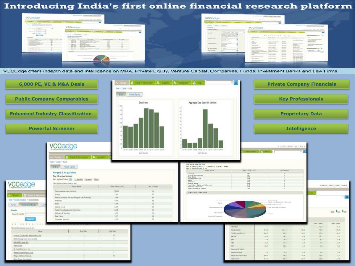
A dense, busy page. Banner headline: "Introducing India's first online financial research platform" . Under it, a strip of screenshots against a world-map background, then a one-line description: "VCCEdge offers indepth data and intelligence on M&A, Private Equity, Venture Capital, Companies, Funds, Investment Banks and Law Firms" . Then eight green feature buttons flanking more screenshots: 6,000 PE, VC & M&A Deals; Public Company Comparables; Enhanced Industry Classification; Powerful Screener; Private Company Financials; Key Professionals; Proprietary Data; Intelligence .
Everything the reader will ever learn about the product is on this one page, and it is presented at the density of a trade-show banner. There are roughly nine screenshots on a single slide , overlapping each other at angles, most of them too small to read a column header in. The eight feature buttons range from concrete ("6,000 PE, VC & M&A Deals", "Private Company Financials") to content-free ("Intelligence", "Proprietary Data"). "Intelligence" as a standalone feature label tells a buyer nothing; it is the software equivalent of listing "value" as a benefit.
The claim doing the heaviest lifting is "India's first online financial research platform" , and it is unsourced and undated. First-mover claims are load-bearing when they are true and radioactive when they cannot be checked; a single qualifier — first launched in year X, or first covering private company financials — would have made it defensible.
The deeper failure is that the product slide does not connect to the fourteen slides that follow it . The obvious move — the one that would have made this deck genuinely persuasive — is to caption every subsequent chart with the query that produced it: "generated in the screener in 11 seconds", "exportable to Excel", "drill through to the 619 underlying deals". The deck never does this. It shows you the output of a product and never tells you that the product is what made it, so the buyer has no reason to connect the quality of the data to the thing being sold.
Slide 3 — Section divider: Private Equity Investments
Plain navy page, green heading. Footer: "COPYRIGHT © 2010 All rights reserved" .
Every other slide in this deck says © 2013 . This one says © 2010 — a divider slide carried over from an older version of the file and never updated. It is a two-second fix and a small thing, but in a document whose entire value proposition is our data is current and accurate , a three-year-stale date stamp on the page introducing the data section is an unfortunate place for the one inconsistency to land.
Slide 4 — Private Equity Investments Overview
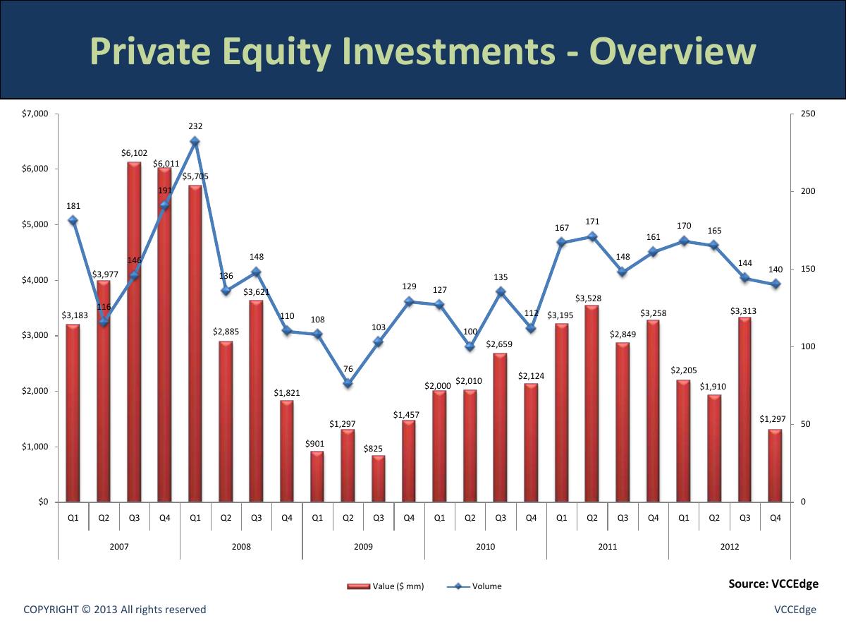
The workhorse chart: 24 quarters, Q1 2007 to Q4 2012 , deal value in $mm as red columns against deal volume as a blue line. Peak: Q3 2007 at $6,102mm . Trough: Q3 2009 at $825mm . The 2012 quarters run $2,205mm, $1,910mm, $3,313mm, $1,297mm on volumes of 170, 165, 144, 140 .
As a chart this is competent — 48 data points, every one labelled, dual axis correctly used because value and volume genuinely move differently. The story it tells is a real one: the crash from 2007, the 2009 floor, and a volume recovery that never brought the money back.
Two problems. The first is presentational: at the left edge, the value labels and the volume labels collide — the "116" for Q2 2007 sits on top of the bar labels around it, and Q3/Q4 2007 are similarly cramped. When your product is a data platform, a chart your own tool produced with overlapping labels is an argument against you.
The second is the one that matters. Q4 2012 came in at $1,297mm, the weakest quarter in the entire post-2009 recovery — the year the deck is named after ends on the floor. Full-year 2012 is $8,726mm across 619 deals , down roughly 32% in value from 2011. The chart shows this clearly and the deck says nothing about it. A reader who already understands the Indian market fills in the interpretation themselves; a reader who doesn't — which is the buyer this deck needs — sees a wall of numbers and moves on.
Slide 5 — Deal type: angel/seed vs VC vs PE
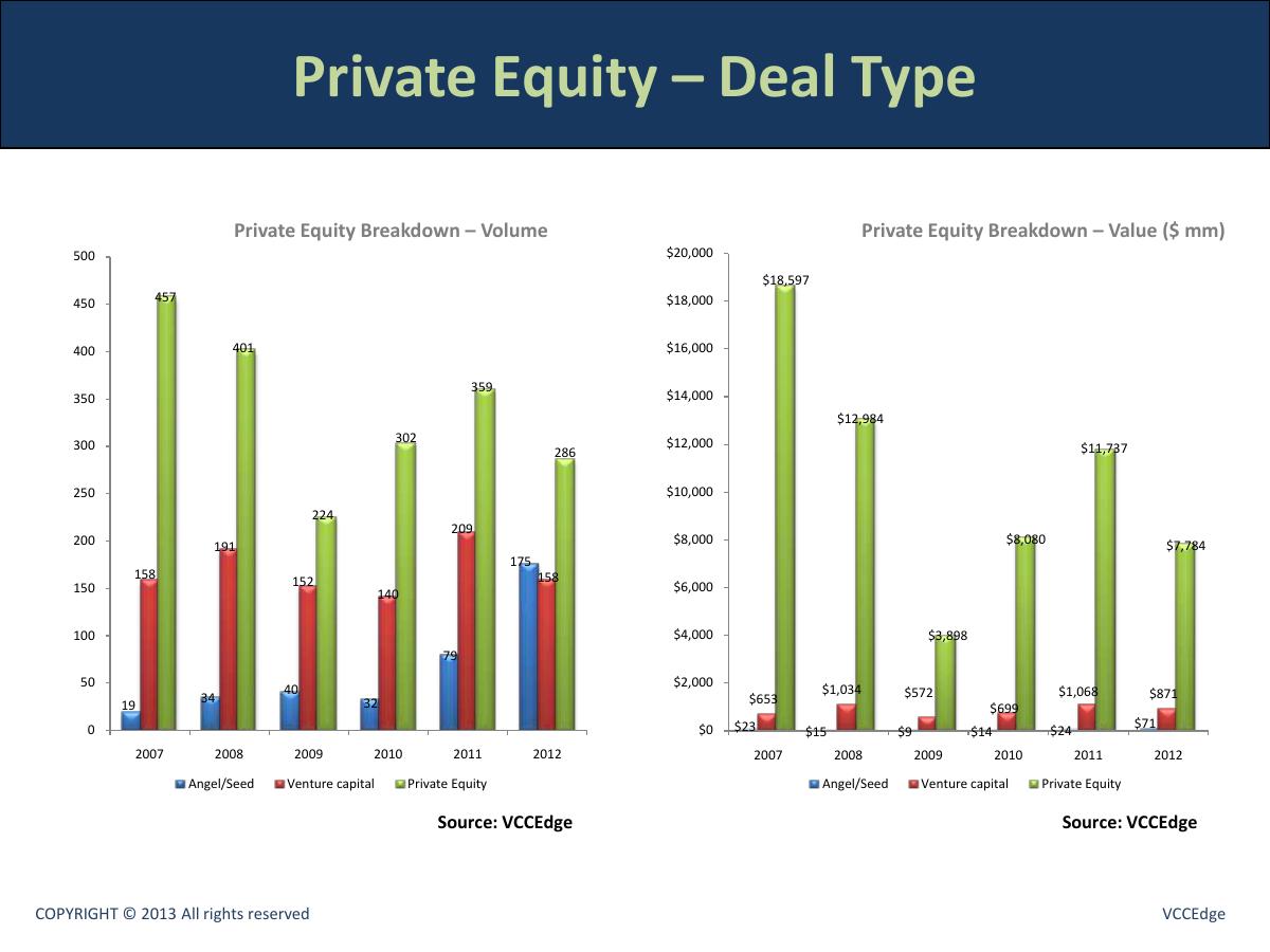
Two charts. Volume by stage 2007-2012: angel/seed climbs 19 → 34 → 40 → 32 → 79 → 175 , venture capital sits flat at 158 → 191 → 152 → 140 → 209 → 158 , and private equity falls from 457 to 286 . Value by stage: angel/seed $23m → $71m , VC $653m → $871m , PE $18,597m → $7,784m .
This is the most interesting slide in the deck and the deck does not know it. In 2012, for the first time in the series, angel and seed deal volume (175) overtook venture capital volume (158) . That is the birth of the Indian seed ecosystem, visible in a chart in April 2013, and it is presented with the same neutrality as every other bar. Run the arithmetic and it gets sharper still: the average angel/seed cheque was $0.41mm in 2012 versus $1.21mm in 2007 — three times as many deals at a third of the size. Meanwhile the average PE cheque was $27.2mm and the average VC cheque $5.5mm .
None of those three numbers appears anywhere. They are all derivable from the two charts on this page in about ninety seconds with a calculator, which is precisely the work a data vendor is supposed to save its customer. Selling a research platform by making the reader do the research is the central irony of this file.
There is also a labelling problem that runs across the deck: slides 5, 7 and 8 all carry the identical title "Private Equity – Deal Type" while showing three completely different cuts — stage breakdown, volume by cheque-size band, and value by cheque-size band. Slide 5 is not about deal type at all; it is about deal stage . Three pages sharing one title in a sixteen-page document is a navigation failure in a file that a buyer is expected to forward internally.
Slide 6 — Sectoral analysis
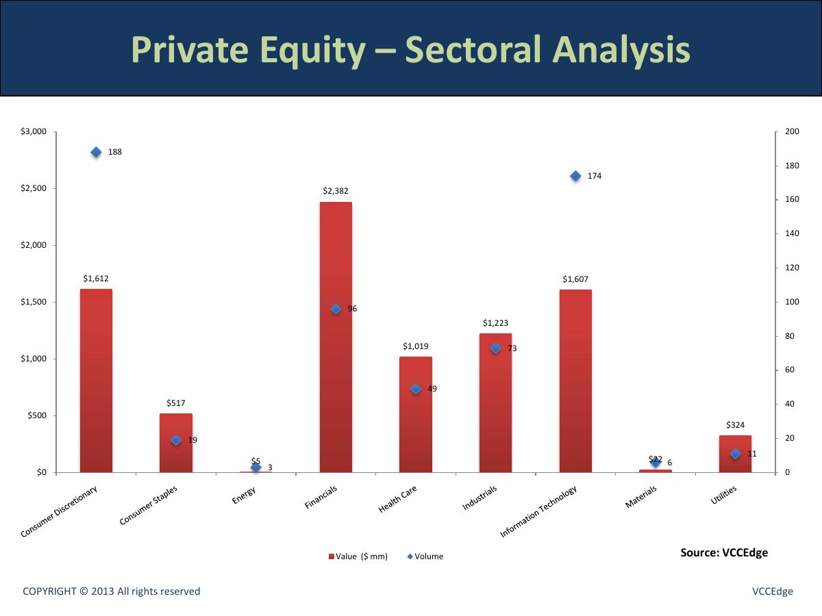
Nine sectors, value bars against volume diamonds: Consumer Discretionary $1,612mm / 188 deals; Consumer Staples $517mm / 19; Energy $5mm / 3; Financials $2,382mm / 96; Health Care $1,019mm / 49; Industrials $1,223mm / 73; Information Technology $1,607mm / 174; Materials $22mm / 6; Utilites $324mm / 11 .
The totals reconcile exactly to full-year 2012 — $8,711mm and 619 deals , matching slides 4 and 5 to within rounding. That is a genuinely good sign about the underlying database, and it is the kind of internal consistency most decks in this series fail at.
Three things go wrong on the page anyway. The chart carries no year label. Nothing in the title, the axis or the legend says 2012; the only way to establish which period you are looking at is to add up the bars and compare them to slide 4. Every other data slide in the deck has a year axis. This one asks you to infer it.
Second, the axis label reads "Utilites" — a straightforward typo, sitting on a chart sold as an artefact of a professional data product.
Third, the sector taxonomy is GICS — Consumer Discretionary, Consumer Staples, Materials — while slide 2 advertises "Enhanced Industry Classification" as a headline feature. The deck names its proprietary classification as a selling point and then shows a standard global taxonomy without ever demonstrating what the enhancement is. The single most valuable thing this slide could have done was show the same data cut two ways: the generic GICS view and the enhanced view underneath it. That comparison is the entire product argument, and it is missing.
Slides 7 and 8 — Deal size distribution
Two 100% stacked bar charts, 2007-2012. Slide 7 is volume share by cheque-size band with six bands including Undisclosed ; slide 8 is value share by band with five bands and no Undisclosed . In 2012, undisclosed deals run at roughly 31% of volume , up from about 17% in 2011 and 13% in 2010.
These are the right charts to draw — cheque-size distribution is exactly what a fund partner wants when calibrating where they sit in a market. And the omission of the undisclosed band on slide 8 is technically correct: you cannot allocate value you do not have.
But that correctness is never explained, and it creates the deck's one real reconciliation problem. On slide 9, the average 2012 deal size is given as $21mm . The deck's own totals say $8,726mm across 619 deals, which is $14.1mm . For 2007, the deck shows $38mm against an implied $30.4mm . The gap is not an error — it is the undisclosed deals, which sit in the volume denominator on slides 4, 5 and 6 but contribute no value, so the true average is computed over disclosed deals only. That reconciles almost perfectly: $8,726mm ÷ $21mm implies roughly 415 disclosed deals out of 619, i.e. 67% disclosed, against the ~69% shown on slide 7.
The methodology is sound. The disclosure is absent. Nowhere does a footnote say "average and median computed on disclosed deals only". So a sophisticated reader — the only kind that buys a $10,000-a-year data subscription — reconciles two of your slides, finds a 49% discrepancy, and has to reverse-engineer your methodology to discover you were right all along. For a company selling data integrity, that is the most expensive missing footnote in the deck.
Slide 9 — Median and average deal amount
Two charts. Median: $11m, $10m, $5m, $8m, $6m, $6m for 2007-2012. Average: $38m, $29m, $13m, $21m, $24m, $21m .
Showing median next to average is the correct call and most people would not have made it. The gap between them is the insight: a $6mm median against a $21mm average means the 2012 market was a large mass of small cheques with a thin tail of very big ones dragging the mean up by 3.5x. That single ratio is more useful to a fund partner than any other number in the deck.
It is never stated. Two charts sit side by side and the relationship between them — the whole point of putting them side by side — is left as an exercise. A ten-word caption ("the mean is 3.5x the median: a small-cheque market with a fat tail") converts this page from data into an argument.
Slides 10 to 13 — Exits
A divider, then three charts. Exit value and volume by quarter for 24 quarters, peaking at $1,609mm in Q4 2010 . Then exit type by volume : in 2012, buyback 18, IPO 4, M&A 50, open market 50, secondary sales 21 — 143 exits . Then exit type by value : buyback $109m, IPO $49m, M&A $481m, open market $2,446m, secondary $1,236m — $4,321mm .
Again the reconciliation is clean: the four 2012 quarters on slide 11 sum to $4,321mm and 143 deals, matching slides 12 and 13 exactly. The database behind this deck is good.
And again the story is left on the table, and here it is a big one. Open-market sales were 57% of all Indian PE exit value in 2012 — $2,446mm, the largest single exit-type figure anywhere in the six-year series — while IPOs delivered four exits worth $49mm in total . The Indian IPO window was shut, and funds were exiting by selling listed stock into the market instead. Meanwhile total exit value of $4,321mm against $8,726mm invested puts the exit-to-investment ratio at roughly 50% in 2012, versus 23% in 2011 — the return of liquidity to Indian private equity, plotted and unremarked.
Those are three genuine, defensible, newsworthy findings sitting in four charts, produced by the data arm of a company that publishes financial news for a living . Not one of them is written down.
Slides 14 to 16 — Fund raising
A divider, then Funds Raised 2005-2012 : amount raised falls $12,089mm (54 funds) in 2007 → $5,210mm (39 funds) in 2011 → $2,999mm (48 funds) in 2012 . Then Funds Launched : total targeted capital $15,868mm (56 funds) in 2007 → $10,577mm (66) in 2011 → $3,906mm (26) in 2012 .
Put the last two slides side by side and 2012 does something no other year in the series does: the number of funds that closed went up (39 to 48) while the money they raised went down by 42% . Average fund size collapsed from $134mm in 2011 to $62mm in 2012 . At the same time, new launches halved to 26 funds. More funds closing, each half the size, with far fewer new ones starting — that is a market fragmenting and contracting at the same moment, and it is arguably the most important chart pair in the deck for anyone trying to raise in India in 2013.
One more number the deck leaves alone: the industry deployed $8,726mm in 2012 while raising $2,999mm , spending roughly 2.9x its intake out of pre-existing dry powder.
There is also a quiet inconsistency in the time base. The investment and exit sections run 2007-2012 ; the fund sections run 2005-2012 . There is no reason given, and the reader is left wondering whether 2005-06 was excluded from the deal charts for a data-availability reason — which, for a database vendor, is exactly the question you do not want raised.
And then the file stops. Slide 16 is the last page. No summary, no "what you just saw was produced in the VCCEdge screener", no pricing, no trial offer, no repeat of Shashank's phone number, no thank-you page. A prospect who has just spent ten minutes with fourteen pages of your data has to scroll all the way back to slide 1 to find out how to contact you.
What VCCEdge got right
The data is internally consistent to a degree that is genuinely rare. I reconciled 2012 four separate ways — quarterly totals, stage breakdown, sector breakdown, and exits by type — and every one tied out. The single apparent discrepancy (average deal size) resolves cleanly once you work out that averages are disclosed-only. Most decks in this library contradict themselves within three slides. This one does not contradict itself at all.
Every chart is sourced. "Source: VCCEdge" appears on all fourteen data pages. It is self-referential, but it is consistent, and it does the branding job: the numbers and the vendor name travel together when a slide gets screenshotted into someone else's memo.
The dual-axis charts are used correctly — value and volume plotted together because they diverge, which is the actual story of 2009-2012. And the median-vs-average pairing on slide 9 shows real statistical literacy.
A named human with a direct line is on the cover. Not info@, not a contact form.
What a founder should take from this
VCCEdge's deck fails at the opposite end from most decks in this series. The usual failure is a founder who asserts a lot and proves nothing. This is a company with an enormous evidence base and no argument — fourteen pages of clean proof in search of a claim.
1. Data is not an argument until someone says what it means. A chart shows; a sentence persuades. Every one of these fourteen slides needed a one-line takeaway in the same place on the page. Angel volume passed VC volume. Open-market sales were 57% of exit value. The mean is 3.5x the median. Average fund size halved. Those four sentences would have transformed this file, and all four were already in the data.
2. If you are selling a tool, keep the tool visible. The product appears on slide 2 and never returns. A caption on each chart tying it back to a feature — this took one query, this is exportable, this drills through to 619 deals — would have made the whole deck a fourteen-slide product demo instead of a report with a sales page stapled to the front.
3. Show your methodology before someone else finds it. The missing "disclosed deals only" footnote makes a correct number look like a 49% error to the exact reader who is most qualified to check. When your product is credibility, footnote everything.
4. Never end on a chart. The last slide is where a reader is closest to acting, and this deck spends it on fund launch volumes for 2005-2012. Put the ask, the next step and the contact details on the final page — always, in a sales deck and in a fundraising deck alike.
The irony is complete: a company whose entire business is helping investors find the signal in private-market data produced a document with all of the data and none of the signal.
Frequently asked questions
- What is VCCEdge?
- VCCEdge is the private-market data and research platform of VCCircle, India's private equity and venture capital news network. It sells subscription access to deal, company, fund, investment bank and law firm data on the Indian market. This 2012 'Private Equity Reporting Deck' was a free sales-and-marketing asset, published in April 2013 with data through Q4 2012.
- Is the VCCEdge deck a pitch deck for fundraising?
- No — and that is why it is instructive. It is a B2B sales deck for a data subscription, with a 'for a free demo' contact line on the cover. It is included in this teardown series because it fails at the exact opposite end from a typical startup deck: it has an enormous, clean evidence base and no argument built on top of it.
- What does the VCCEdge deck say about Indian private equity in 2012?
- Its charts show $8,726mm invested across 619 deals in 2012, down roughly 32% in value from 2011, with a $6mm median and $21mm average deal size. Angel and seed volume reached 175 deals, overtaking venture capital's 158 for the first time. Exits totalled $4,321mm across 143 deals, 57% of it via open-market sales, with only four IPO exits. Funds raised $2,999mm across 48 vehicles, an average fund size of $62mm versus $134mm in 2011.
- What is the biggest mistake in the VCCEdge deck?
- Fourteen consecutive data slides with zero interpretation. Every chart shows a number and none of them states what it means, so the reader has to do the analysis the product is supposed to do for them. The second biggest is that the product disappears after slide 2 and never reconnects to the data it produced.
- Why do the average deal size numbers not reconcile?
- Slide 9 shows a $21mm average deal size for 2012, but the deck's own totals imply $14.1mm ($8,726mm over 619 deals). The averages are computed on disclosed deals only, while the volume charts include undisclosed deals — which reconciles almost exactly against the ~31% undisclosed share on slide 7. The methodology is correct; the footnote explaining it is missing.
- What should founders copy from a data-heavy deck like this?
- The internal consistency and the sourcing — every chart is labelled and every 2012 total ties out across four different cuts. What to avoid is presenting evidence without a claim: give every chart a one-line takeaway in the same position on the page, tie each one back to the product that generated it, footnote your methodology, and never end the file on a chart instead of a call to action.