This teardown analyzes Dropbox's iconic 2007 pitch deck, highlighting its masterclass in narrative structure and radical simplicity. By framing digital storage as a universal mess and positioning the solution as a 'search pre-Google' opportunity, the founders secured seed funding from Sequoia. Despite light financials and soft traction data, the deck's focus on a product that 'just works' and its visionary platform strategy transformed a simple utility into a multi-billion dollar public company.
Key takeaways
- Fall in love with the problem: Spend the first 25% of your pitch making the investor feel the pain before offering relief.
- Write your deck for a 5-second scan: Use powerful, declarative titles for every slide that tell the story on their own.
- Sell the platform, not just the product: Articulate a vision for how your tool becomes a defensible ecosystem.
- Frame the market to your advantage: Use competitor weaknesses to create a narrative where you are the only logical choice.
- Explain 'Why Now?' with irrefutable trends: Anchor your idea in specific technological, cultural, or economic shifts.
The Moment in Time: A Pre-Cloud World in 2007
To truly understand the genius of the Dropbox pitch, you have to rewind your mind to 2007. The iPhone had just launched, but smartphones were not yet ubiquitous. The 'cloud' was a nebulous term for tech insiders, not a utility for the masses. The daily life of a student or knowledge worker was a digital nightmare of incompatibility and data loss. Files lived in silos: a desktop at work, a laptop at home, and maybe a shared drive on a server you could only access via a clunky VPN. Sharing a file larger than a few megabytes meant one of three painful options: burning a CD, dealing with painfully slow FTP uploads, or the ubiquitous 'sneakernet'—copying it to a USB flash drive and physically walking it over. Email attachment limits were a constant source of frustration. Collaboration meant emailing 'finalreportv2drewseditsfinalFINAL.doc' back and forth, creating a nightmare of version control. Backing up data was an active, manual process that most people neglected, leading to tragic losses of photos, documents, and work. This wasn't a minor inconvenience; it was a constant, low-grade technological friction that everyone silently endured. It was into this world of digital chaos that Drew Houston and Arash Ferdowsi presented their elegantly simple solution.
Slide-by-Slide Walkthrough
Slide 1: Title
The deck opens with stark simplicity: the logo, a name, and a tagline: "Moving the world’s files." This isn't just a tagline; it's a mission statement. It’s ambitious, global, and immediately understandable. It frames the company not as a feature or a tool, but as fundamental infrastructure. Including the URL, was also a classic YC move, making it actionable for anyone seeing the deck. The use of 'get' in the domain reinforced that this was a product to be downloaded and used immediately.
Slide 2: The Problem
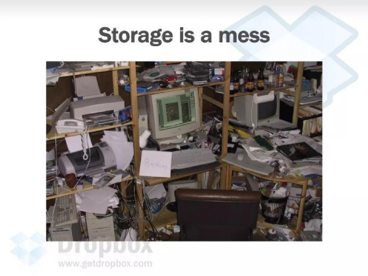
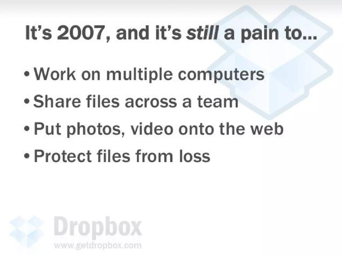
This is the most important slide in the deck. With a single, visceral headline, "Storage is a mess," Dropbox connects with a universal pain point. It doesn't use jargon or talk about market sizes. It speaks directly to the lived experience of the audience. The bullet points that follow are a litany of shared frustrations: working on multiple computers, sharing files, putting media online, and the fear of data loss. Each point is a 'nod-along' moment for any investor in 2007. They've all experienced this. By spending a full slide just on the problem, Drew forces the audience to marinate in the pain, making them desperate for a solution.
Slide 3: Existing 'Solutions' (The Status Quo)
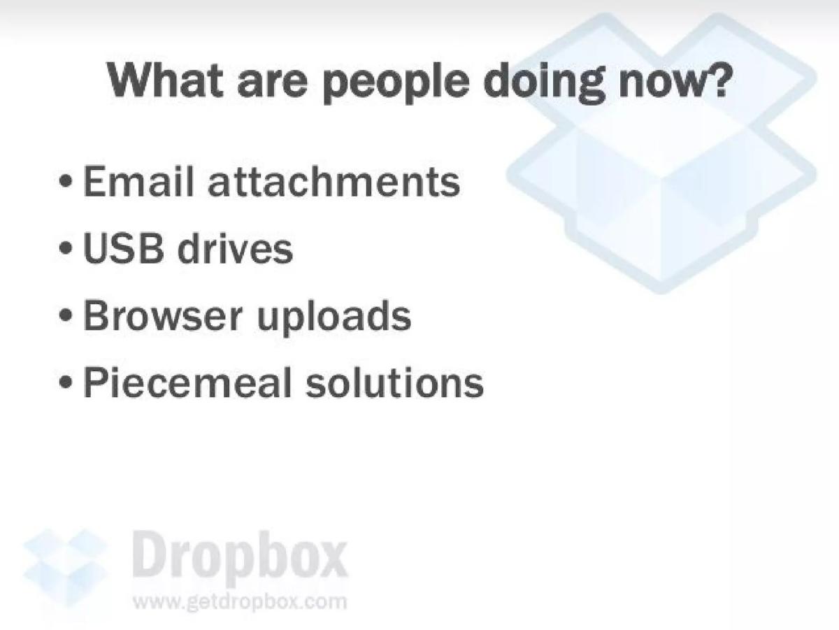
This slide brilliantly positions the 'competition' not as other startups, but as the clumsy workarounds people were already using: email attachments, USB drives, and clunky browser uploads. This is a powerful rhetorical move. It implies that the real competitor is user inertia and that the existing 'solutions' are so bad that a demonstrably better product can win. It preemptively dismisses any notion that the problem is already solved. These aren't true solutions; they are symptoms of the underlying disease that Dropbox is about to cure.
Slide 4: The Vision ('In a perfect world...')
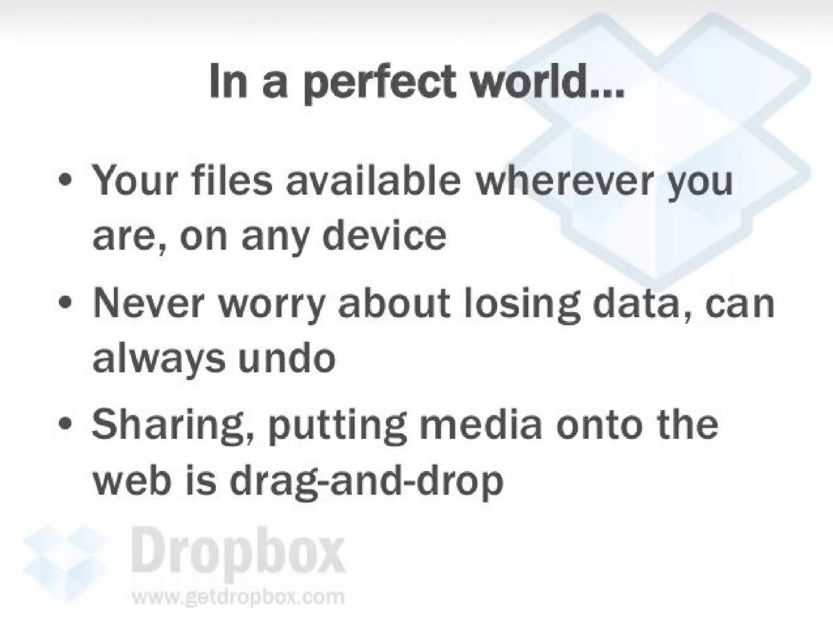
Before introducing the product, the deck inserts a 'dream' slide. It paints a picture of technological utopia. What if your files were just... available? What if you never had to worry about backups? What if sharing was as simple as dragging a file? This is a crucial step in the narrative. It aligns the investor with the founder's vision. By describing the 'perfect world,' they are co-creating the desire for the solution. The investor is already sold on the destination before they've even seen the vehicle that will take them there.
Slide 5: The Solution (Dropbox)
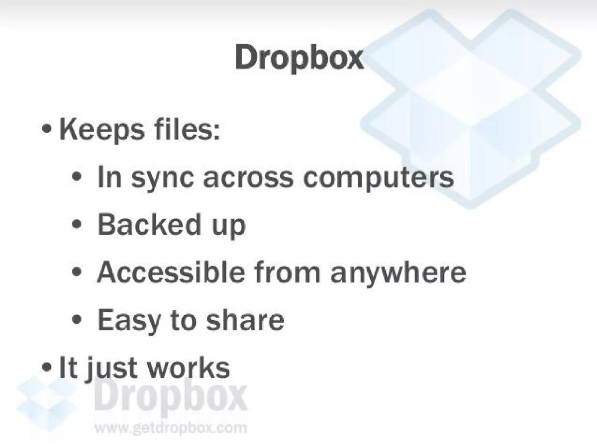
Only now, on slide 5, is the product finally revealed. After the masterful setup of problem, failed solutions, and vision, the name 'Dropbox' lands with the force of an answer to a prayer. The features listed—in sync, backed up, accessible, easy to share—map directly back to the pains from the problem slide and the dreams from the vision slide. And then, the killer line: "It just works." This became the company's ethos. It promised an end to configuration, manuals, and technical headaches. It promised magic.
Slide 6: Why Now?
A great idea is often just a matter of timing. This slide tackles that head-on. It articulates the macro tailwinds making Dropbox possible and necessary in 2007. They cite the proliferation of devices, the explosion in file sizes (digital cameras, videos), and the shift to remote/distributed work. Crucially, they point to the falling costs of bandwidth and storage, which makes their business model economically viable. The mic-drop moment is the comparison to "search pre-Google." This is an audacious, brilliant claim. It reframes the venture from a 'nice utility' to a foundational play for an entire, unmonetized territory of the internet. It's a signal to VCs that this is a fund-returner, not just a lifestyle business.
Slide 7: Why Better?
This slide outlines the product's unique value proposition. It claims to solve the entire genre of problems, unlike piecemeal competitors. The key differentiator highlighted is the "deep OS integration." This wasn't a web app; it was a utility that lived inside your file system (Windows Explorer or Mac Finder). It didn't force you to change your behavior. You just save a file to a folder, and the magic happens in the background. This focus on seamless user experience was, and remains, a powerful moat.
Slide 8: The Competition
While many founders fear the competition slide, Dropbox uses it as a weapon. Instead of a 2x2 matrix plotting abstract concepts, they use a simple feature checklist. It's designed to show one thing: only Dropbox does it all. Competitors like Carbonite and Mozy are framed as being focused only on backup. Foldershare and Box.net are acknowledged but visually positioned as incomplete. It's a simple, effective way to communicate competitive dominance without getting lost in the weeds.
Slide 9: What Did They Screw Up?
This slide is a fantastic addition, adding another layer of confidence. It doesn't just show what competitors lack, but why they are fundamentally flawed. It attacks their strategy ("only tackle small pieces"), their execution ("poor technical execution"), and their user experience ("clumsy, verbose & technical UIs"). This shows that the Dropbox team has a deep understanding of the market and a clear point of view on product philosophy. It builds trust that they're not just building another feature, but are approaching the problem from a superior first principle.
Slide 10: Technical Advantages
This slide is for the geeks in the room. It gives a peek under the hood to prove they have the engineering chops to pull this off. They mention using Python for faster development, which was a smart choice for a startup needing to iterate quickly. The mention of leveraging Amazon S3 and EC2 is particularly prescient. In 2007, using AWS was a novel and highly scalable architectural choice that allowed a tiny team to play like a giant. It showed capital efficiency and technical foresight. Finally, the "obsession with performance" and name-dropping concepts like binary diffing proved that their "it just works" tagline was backed by serious engineering.
Slide 11: Team
No pitch is complete without a team slide, and this one is textbook perfect. Two founders, both from MIT, one of the world's top engineering schools. It establishes their technical credibility instantly. Drew Houston's bio highlights his lifelong passion for coding and prior entrepreneurial experience (an SAT prep company). Arash Ferdowsi's credentials include running MIT's programming competition and experience at Google. They are presented as the ideal archetypes: the visionary CEO and the brilliant CTO. The photo of them in their first office adds a human touch of authenticity and hustle.
Slide 12: Business Model
The model is presented as a three-tiered strategy. First, "freemium" for individuals. This is the growth engine, using a free product to acquire a massive user base. Second, a per-seat license for small-to-medium businesses (SMBs). This is the monetization engine, positioning Dropbox as a replacement for multiple IT tools. Third, the long-term vision: "Platform." This is the big bet, where Dropbox becomes the broker for all user-generated content (UGC) moving from the desktop to the web. This multi-layered model showed investors both a clear path to initial revenue and a massive, venture-scale endgame.
Slide 13: The Platform Vision
This slide expands on the grand vision. It's about making Dropbox the universal onramp for content. Instead of every web app building its own clunky file uploader, they could just integrate Dropbox. This is beneficial for users (drag-and-drop ease) and for web apps (more content, less friction). The bigger picture painted is one where Dropbox holds all user files and delegates access to other applications. It's a vision of becoming essential, invisible plumbing for the entire internet—a massively valuable position.
Slide 14: Customer Acquisition
How will they get users? This slide wisely focuses on organic, product-led growth, which is music to an investor's ears. It highlights the love from early adopters, who are natural influencers. It points to the viral elements built directly into the product: sharing files and collaborating on folders are inherently social actions that spread the product. The platform partnerships are positioned as a free customer acquisition channel. To cap it all off, they include a glowing quote from VentureBeat, providing crucial third-party validation and social proof right at the close of the deck.
Slide 15: The (Implicit) Ask
Conspicuously missing is a slide that says "We are raising $X for Y% of the company." This is typical for a YC Demo Day pitch. The goal of the presentation isn't to close the deal on the spot, but to create a frenzy of interest and pack the schedule with follow-up meetings where those details will be discussed. The entire deck is the ask. The story, the team, and the vision are so compelling that the desired action—write us a check—is powerfully implied.
What Worked and Why
The Narrative Is King: The deck is a masterclass in storytelling. It follows the classic problem -> solution structure but perfects it with the 'vision' slide in between. It takes the investor on an emotional journey, making them feel the pain before offering the relief. · Radical Simplicity: The deck is incredibly easy to understand. The language is plain English. Each slide has a clear header and a few supporting bullets. It passes the 'flick test' with flying colors—you can grasp the entire story by just reading the slide titles. · Visionary Framing: Comparing the opportunity to "search pre-Google" was a stroke of genius. It instantly elevated the pitch from a useful tool to a category-defining company. This kind of audacious framing is what gets VCs excited about 100x returns. · Product-Centric DNA: The pitch is saturated with a deep love and understanding of product design and user experience. The "It just works" philosophy and the focus on "deep OS integration" showed a commitment to user delight that was a powerful differentiator.
What Was Weak
Thin Financials: By today's standards, the business model section is incredibly light. "Freemium" is a tactic, not a model. A 2024 version of this deck would need to include projected conversion rates, customer acquisition cost (CAC), lifetime value (LTV), and pricing tiers. · Soft Traction: The traction slide relies on a press clipping. While social proof is good, modern investors demand hard data: week-over-week user growth charts, daily active user counts, retention cohorts, and engagement metrics (e.g., files synced per user per day). · Dismissal of Giants: The deck does a great job of dismissing other startups, but it doesn't really have a strong answer for the inevitable question: "What happens when Google or Microsoft builds this?" While the 'focus on UX' is a valid answer, the deck could have been stronger by framing it as a more explicit moat.
5 Lessons for Founders Today
Fall in Love with the Problem, Not Your Solution: Spend the first 25% of your pitch making the investor feel the pain. Your solution will be 100x more impactful if it arrives as the clear answer to a well-defined, deeply felt problem. · Write Your Deck for a 5-Second Scan: Assume your investor is distracted. Use a powerful, declarative title for every slide that tells the story on its own. The rest of the content is just there to support that one key message. · Sell the Platform, Not Just the Product: Even if your MVP is a simple tool, you must articulate a vision for how it becomes a platform. Platforms command massive valuations because they create ecosystems and defensible moats. Show the path from tool to platform. · Frame the Market to Your Advantage: Don't just show a list of competitors. Define the playing field. Use a 2x2 matrix or a feature checklist to create a narrative where you are the only logical choice. Use your competitors' weaknesses to highlight your strengths. · Explain 'Why Now?' with Irrefutable Trends: Your idea needs to be anchored in the present. Point to specific, undeniable technological, cultural, or economic shifts that create the tailwind for your company's success. This turns your pitch from a hopeful idea into an inevitable outcome.
Where is Dropbox Now?
The 2007 pitch deck was spectacularly successful. Dropbox raised a $1.2M seed round from Sequoia Capital and went on to become one of Y Combinator's most iconic alumni. The company executed on its vision, growing virally through its freemium model and becoming a household name for file syncing.
Dropbox went public in March 2018 (NASDAQ: DBX) with a valuation of over $9 billion. Today, it's a mature public company with a market capitalization that fluctuates, but has remained in the multi-billion dollar range. It has successfully navigated the competitive threat from Google Drive, Microsoft OneDrive, and Apple iCloud by leaning into its core values: a clean user experience, cross-platform neutrality, and a focus on the professional user.
True to its 'platform' vision, Dropbox has expanded far beyond simple file storage. It has become a suite of tools for the modern knowledge worker. It acquired HelloSign (rebranded to Dropbox Sign) for e-signatures and DocSend for secure document sharing and analytics, moving up the value chain from simple storage to complex workflows. Products like Dropbox Paper and Capture aim to compete in the broader collaboration market. The core challenge articulated in the pitch deck—competition—remains its biggest challenge today, but its journey from a simple idea on a pitch deck to a pillar of the modern internet is a testament to the power of solving a messy problem with a solution that 'just works'.
Frequently asked questions
- Why is this 2007 Dropbox deck still considered one of the all-time best?
- Its narrative clarity is almost perfect. It wastes no time on fluff and focuses entirely on telling a simple, compelling story: there is a universal, painful problem, and we have the elegant solution. Its simplicity and storytelling discipline are timeless lessons for any founder.
- What was the actual funding outcome from this pitch deck?
- This deck, used for YC's Demo Day, was instrumental in helping Dropbox secure a $1.2 million seed round led by Sequoia Capital. This was a significant seed round for 2007 and set the company on its path to hyper-growth.
- How did the 'freemium' model, which was light on detail in the deck, actually work out?
- It was arguably the most successful freemium strategy of its era. The free tier with limited storage, combined with viral sharing features (e.g., 'get more free space by inviting a friend'), created a massive, low-cost user acquisition funnel. They became experts at converting free users to paid plans once storage limits were hit, proving the model's viability.
- Would this exact pitch deck be successful if presented to investors today?
- The narrative structure and storytelling would still be highly effective. However, it would likely fail to secure funding without significant additions. Today's seed-stage investors demand hard data: user metrics (DAU/MAU/WAU), growth charts, retention cohorts, and a much more detailed financial model, even if it's based on projections.
- The deck doesn't mention the famous demo video. Where did that fit in?
- The demo video was a core part of the *strategy*, but not the deck itself. The pitch deck was for investors. The video, which was a simple screencast filled with in-jokes for the Digg community, was for users. It went viral and drove hundreds of thousands of signups for the beta, providing the initial traction that validated the investor pitch.