Qeep, a Brooklyn AI startup building speech-driven interactive technical documentation for industrial maintenance, exported an 11-slide PowerPoint deck on 28 April 2017 whose PDF title metadata reads 'QeeP Business Plan'. It contains no market size, no business model, no pricing, no revenue, no projections and no funding ask — the final slide says 'Thank you!'. What it does contain is one of the best problem constructions in this series: slides 3 and 4 run the identical question over the identical factory photograph, and the second answers it with a stack of paper and a PDF icon. The deck the…
Key takeaways
- Qeep's 2017 deck is 11 PowerPoint slides created on 28 April 2017 by co-founder and CEO Yu Seo, with PDF title metadata reading 'QeeP Business Plan' — despite the deck containing no market size, no business model, no pricing, no financials and no funding ask.
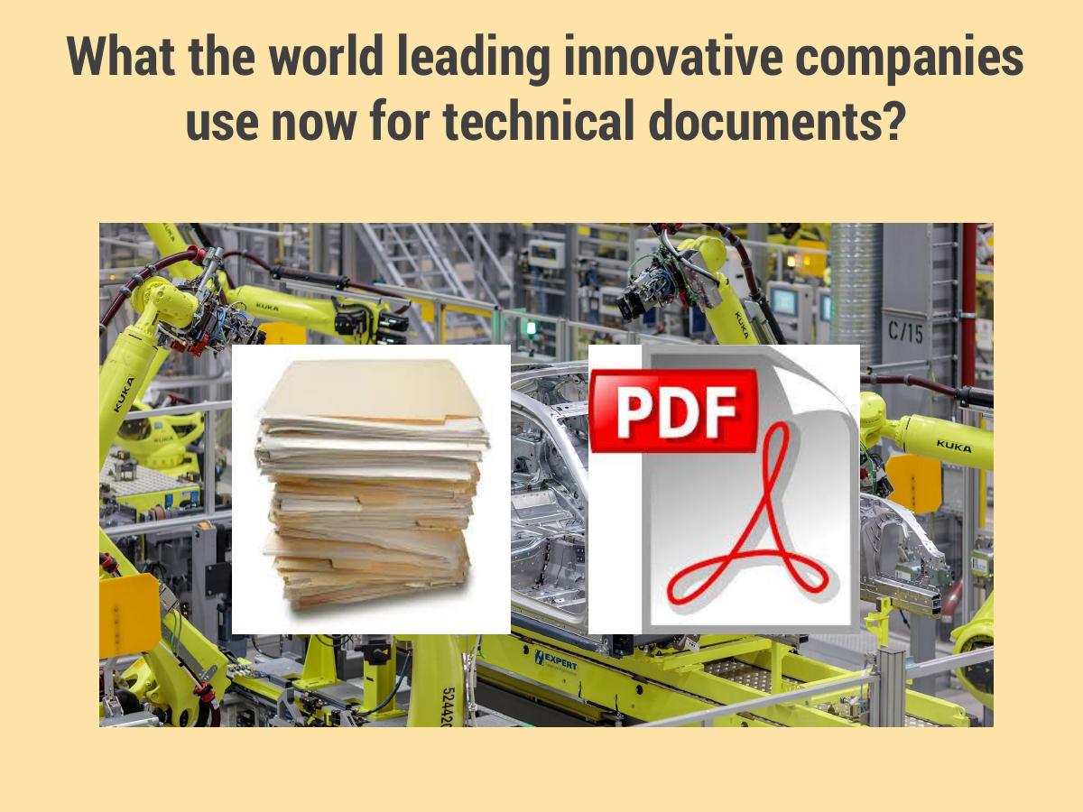
- Slides 3 and 4 are the strongest problem construction in this teardown series: the identical question over the identical style of factory photograph, answered on the second slide by a composited stack of paper and a PDF icon, letting the gap between expectation and reality carry the argument withou…
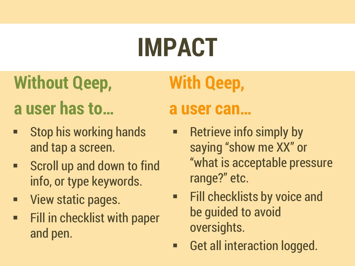
- The slide titled IMPACT contains no impact — every line describes behaviour ('stop his working hands and tap a screen') and not one carries a quantity, so a deck for a productivity product never states how much productivity it creates.
- The most commercially valuable line in the deck, 'get all interaction logged', sits last and smallest on slide 6; in regulated aviation and rail maintenance, an auditable record of who checked what and when is frequently the line that unlocks the budget, and Qeep buried it in a bullet list.
- The competition slide compares Qeep to Siri and Alexa, three slides before slide 10 argues 'Qeep is not a personal assistant' — so the deck benchmarks itself against two products it then disowns, and never names the IETM and technical-publications incumbents it would actually lose deals to.
- 'Qeep is not a personal assistant. It is a professional assistant.' is the deck's thesis and it is filed at slide 10 of 11, meaning any reader who stopped earlier left with exactly the Alexa framing the sentence exists to prevent.
- The team slide claims a second startup by the same founders with 'market proven technologies' but never names the prior company, so the single strongest asset a pre-revenue AI team has — verifiable repeat-founder credibility — gets discounted to zero by every reader who cannot check it.
- 'Market Reactions' lists six ticked buyer categories including 'MTA Emergency Response' with no status, date or counterparty; ambiguous traction claims always resolve downward in an investor's head, so a possibly-real pilot reads as a conference conversation.
What this deck actually is
Eleven slides, built in Microsoft PowerPoint 2016 and exported on 28 April 2017 at 20:23 Eastern time by an author the metadata names as Yu Seo , Qeep's co-founder and CEO. The PDF's title field is the first tell in the file: it does not read "Qeep deck" or "Qeep seed round". It reads "QeeP Business Plan" .
That title is doing something the slides never do. A business plan is a document about how a company makes money — units, prices, costs, customers, a path to profit. What follows the cover is a product demonstration narrative : here is a bad status quo, here is our interface, here is why it is not Siri, here is our team, here is a list of industries that reacted well. There is no market size, no business model, no pricing, no revenue, no customer count, no financial projection, no use of funds and no funding ask anywhere in the eleven pages. The file is named for a document it is not.
So classify it honestly before analysing it. This is a concept and product-positioning deck for an early-stage AI company — the kind of deck that works as a leave-behind after a demo at an industrial trade show, or as a first-contact email attachment to a maintenance director at a rail operator. It is a competent version of that document. As an investor deck it is incomplete in a way that no amount of good design would rescue, because the missing parts are not decoration; they are the entire second half of the argument.
What makes Qeep worth tearing down is that the half it does have is genuinely good. Slides 3 and 4 contain the single best two-slide problem construction we have seen in this series , and it is built out of two photographs and one repeated sentence. A founder who copies nothing else from this file should copy that.
Slide-by-slide walkthrough
Slide 1 — Cover
The Qeep wordmark, a single positioning line — "Interactive Technical Documentations with Smart Speech Interface" — and a copyright footer, "Copyright © 2017 QeeP, inc. All Rights Reserved."
The line is trying to do the right job and is defeated by its own grammar. "Documentations" is not a plural English speakers use; "technical documentation" is already a mass noun. It is a small thing and it is the first thing on the page, which is exactly where small things are expensive. A reader forms a competence judgement in the first two seconds of a cover slide, and for a company selling a natural language product to English-speaking industrial buyers, a grammatical slip in the natural-language positioning statement is the worst possible place to spend that credibility.
The substance underneath is sound, though. The line names the object being replaced (technical documentation), the mechanism (speech interface) and the change of state (interactive rather than static). Compare it to how an AI company in 2017 would more typically have introduced itself — "AI-powered enterprise knowledge platform" — and Qeep's version is markedly more concrete. It tells you what physical thing in the world becomes different.
What the cover lacks is the thing almost every cover lacks: a stage marker . There is no date, no round name, no "Seed — April 2017". A deck that circulates by email needs to date itself on page one, because a year-old deck that does not say it is a year old reads as current and then gets caught out.
Slide 2 — We are Qeep
"We are Qeep", the logo again, and one sentence: "We build interactive technical documentations with an AI-powered conversational interface that answers any possible questions."
This slide restates slide 1 with more words. Two consecutive slides carrying the same claim in an eleven-slide deck spends 18% of the document on the same sentence , and in a deck that has no room for a business model, that is the most costly redundancy in the file.
It also introduces the deck's first credibility problem: "answers any possible questions." In 2017, no dialogue system on earth answered any possible question, and the audience Qeep is targeting — aviation maintenance, rail, MTA emergency response — is composed of people who have spent careers watching software promise completeness and deliver 70% coverage. In safety-critical maintenance, the answer the system cannot give is the one that matters, because a technician who has learned the tool sometimes fails stops trusting it entirely.
The fix is not modesty for its own sake; it is specificity. "Answers the maintenance questions contained in the manual you already have" is a smaller claim, an obviously true one, and a far more impressive one to a buyer who understands how hard even that is. An overclaim to a domain expert reads as inexperience, not ambition.
Slide 3 — "What the world leading innovative companies use now for technical documents?"
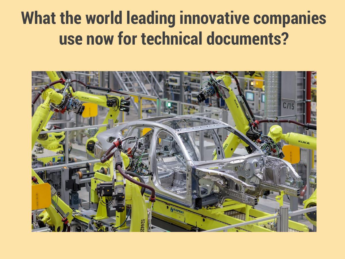
The full-bleed photograph of orange industrial robot arms welding a car chassis on a production line. The question sits over the image. Nothing else.
This is a setup slide and it is beautifully judged. The photograph does one job: it establishes that the customer is technologically sophisticated and heavily capitalised . These are companies that spent millions on automation. The question — what do they use for their documents? — plants an expectation in the reader's head, and the reader will supply an answer before the presenter does. Most will assume something modern.
The question has a grammatical flaw of its own ("What ... use now" should be "do ... use"), which again matters more for a language company than it would for anyone else. But the rhetorical structure is right, and the next slide is the payoff.
Slide 4 — The same question, answered
The identical headline, on the identical style of photograph — KUKA robots on a line — with two objects composited on top: a stack of printed paper and a PDF icon .
This is the best slide in the deck and one of the best problem slides in this entire teardown series. The technique is worth naming because it is copyable: ask the question on one slide, answer it on the next with the same question still on the page. The repetition is what does the work. The reader has just spent three seconds forming an expectation; the second slide does not argue against that expectation, it simply shows the answer and lets the gap between the two do the persuading. Paper and PDF, next to a robot cell.
Note what is absent: no statistics, no "the average technician spends 47 minutes per shift searching documentation", no market-research citation. And here the absence is a strength, because the claim is one the audience can verify from their own memory . Every maintenance director has watched an engineer put down a torque wrench to scroll a PDF on a tablet with gloves on. You do not need a statistic for something the buyer has personally seen.
The one thing that would have made it stronger is a photograph of the actual moment rather than a composite — the greasy hands, the tablet propped on the chassis, the paper manual with the spine broken. Qeep uses stock imagery to describe a scene its own customers would have let it photograph.
Slide 5 — Multimodal Interface
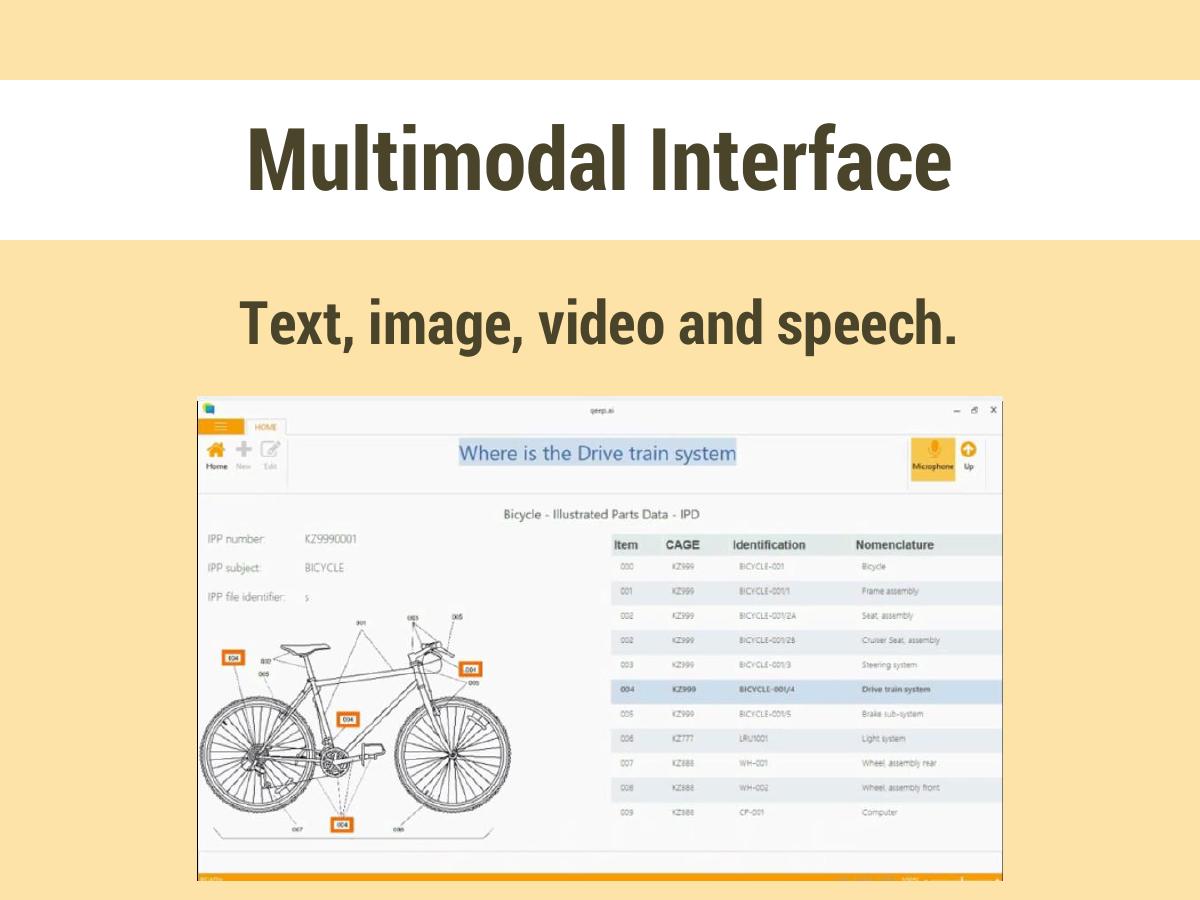
The subhead "Text, image, video and speech" , and a screenshot of the product showing a bicycle Illustrated Parts Data (IPD) table — the S1000D-style parts breakdown with columns for Item, CAGE code, Identification and Nomenclature, running from 000 BICYCLE-001 (Bicycle) through frame assembly, two seat variants, steering, drive train, brake sub-system, light system, two wheel assemblies and a computer.
Using a bicycle as the demo asset is a deliberate and clever choice. It is the standard teaching example in the technical-publications world — an object simple enough that everyone understands the parts hierarchy, structured exactly like an aircraft's. It signals to a specialist reader, without saying so, that Qeep knows the S1000D and IPD conventions its buyers live inside. To a non-specialist investor, however, it signals that the only thing the product has been pointed at is a bicycle.
That is the tension this slide never resolves. It is the deck's only product evidence, and it shows a parts table — a static artefact — on a slide whose entire promise is that the interface is conversational and multimodal. The four modalities named in the subhead are not demonstrated: there is no image, no video frame, no transcript of a spoken exchange. A deck about a speech interface has no speech in it.
Two fixes cost nothing. First, print an actual dialogue on the slide: the technician's spoken question, the system's spoken answer, the diagram it pushed to the screen. Second, replace the bicycle with a real customer's asset, redacted if necessary. If no customer asset exists yet, say so — "demo corpus" is an honest label and far better than letting the reader wonder.
Slide 6 — IMPACT
A two-column comparison. Without Qeep : stop his working hands and tap a screen; scroll up and down to find info, or type keywords; view static pages; fill in checklist with paper and pen. With Qeep : retrieve info simply by saying "show me XX" or "what is acceptable pressure range?"; fill checklists by voice and be guided to avoid oversights; get all interaction logged.
Structurally this is the right slide in the right place, and three details in it are excellent.
First, "stop his working hands" . That phrase — despite the pronoun problem — identifies the actual unit of value with more precision than any metric on the slide could. The cost of bad documentation in a maintenance context is not reading time; it is the interruption of a physical task , tools down, gloves off, context lost, task resumed. Qeep has correctly located where the money leaks.
Second, the example question "what is acceptable pressure range?" is domain-real. It is not "tell me about the product"; it is the kind of parameter lookup that occupies a working technician a dozen times a shift.
Third — and this is the most commercially important line in the entire deck, sitting last and smallest — "get all interaction logged." In regulated maintenance, the logged, timestamped, auditable record of who checked what and when is not a feature; it is frequently the thing the buyer is legally required to produce and currently produces on paper. Qeep buried its compliance wedge at the bottom of a bullet list on slide 6 of 11. That line, expanded into its own slide with an auditor's perspective, is a stronger reason to buy than the speech interface itself.
What sinks the slide as investor material is that the impact section contains no impact . Every item is a description of behaviour, and not one carries a quantity. No minutes saved per task, no error rate before and after, no percentage of checklist oversights caught, no pilot result. The word IMPACT is set in the largest type on the page above a list that measures nothing. If Qeep had run the product against ten real work orders and printed the two timings, this slide would carry the deck.
One more thing: the male pronoun. "Stop his working hands" in a 2017 deck shown to institutional investors and to enterprise buyers with diversity requirements is an unnecessary, free own-goal.
Slide 7 — How different?
The Siri icon and the Amazon Alexa wordmark and ring on one side; on the other, three capability labels — "New AI: Dialogue Management" , Natural Language Understanding , Machine Learning .
This is the competition slide, and it makes two errors that between them cost the deck its defensibility argument.
The first is choosing the wrong competitors . Siri and Alexa are consumer assistants, and slide 10 will explicitly argue that Qeep is not a personal assistant. Comparing yourself against two products you are about to say you are not is a self-cancelling move. The real competitive set for Qeep in 2017 was the technical-publications industry — the S1000D content-management vendors, the interactive electronic technical manual (IETM) suppliers, the enterprise search products already sold into aviation MRO — plus the internal-IT default of "we will put the PDFs on SharePoint". Naming Siri means the deck never names anyone it will actually lose a deal to , which tells an experienced investor either that the founders have not met the incumbents or that they would rather not discuss them.
The second is that the answer to "how different?" is a list of technology categories, not a difference . Natural Language Understanding and Machine Learning were, by April 2017, available as cloud APIs to any competitor with a credit card. Listing them as your differentiation in the year AWS, Google and Microsoft were all shipping NLU services is the opposite of a moat. Only "Dialogue Management" gestures at something specific — multi-turn state, the ability to hold a task across several exchanges, which genuinely was the hard part and genuinely was what consumer assistants did worst. It gets three words and no explanation.
The slide needed one concrete example: a five-turn exchange a technician has with Qeep that Alexa demonstrably cannot complete, with the reason it cannot. That is a difference. A logo comparison is a claim.
Slide 8 — TEAM
Three photographs and three names: Yu Seo, Co-founder and CEO; Matthias Denecke, Co-founder and CTO; Matthew Nacier, Strategy Director. Beneath them, one sentence: "Qeep is the second startup company by the founding team with market proven technologies and over 10 years of industry experience."
That sentence is the most valuable asset in the deck and it is deployed as a caption.
Unpack what it is asserting. These founders have built a company together before . That company shipped technologies that reached a market . They have ten-plus years in the industry . For a pre-revenue AI company with no traction slide, repeat-founder status is very often the whole investment case — it is the single strongest predictor an early-stage investor has, and the reason a deck with no numbers can still get funded.
And the deck does not name the previous company. It does not say what it built, who bought it, how it ended, or which of the three founders did what. "Market proven technologies" is an adjective phrase where a proper noun belongs. An unnamed prior startup is worth nearly nothing, because the reader cannot verify it and therefore discounts it to zero ; a named one — even a modest exit, even an acqui-hire — is checkable in ninety seconds and converts directly into trust.
There is also no indication of what makes this specific team right for industrial documentation . Denecke's dialogue-systems background is exactly the credential this deck needs and it is invisible; the reader gets a photograph and a job title. Three lines of substance under three faces would have doubled the slide's value at zero cost in space.
Slide 9 — Market Reactions
Six ticked lines: Rail car producers. Train maintenance, repair. MTA Emergency Response. Aviation maintenance. Airline companies. Auto mechanics.
The instinct here is right — an early company with no revenue should show demand signal — and the execution turns that signal into noise, because of one word in the title and a missing column of evidence.
"Reactions" is undefined. A tick next to "MTA Emergency Response" could mean the New York MTA has run a paid pilot; it could mean someone from the MTA nodded at a conference booth. Those two facts are separated by roughly two orders of magnitude of value, and the slide presents them identically. An investor faced with an ambiguous claim resolves it downward , always — so an unqualified tick list converts a possibly-real MTA conversation into a assumed-worthless one.
Naming MTA Emergency Response specifically, while every other line is a generic category, makes the ambiguity worse rather than better. It is the only proper noun on the page, which tells the reader it is the strongest item, which invites exactly the question the slide cannot answer.
The repair is mechanical. Replace the tick with a status and a date: "Rail car producer, EU — technical evaluation, March 2017" ; "MTA Emergency Response — introductory meeting, February 2017" . Six honest statuses, several of them weak, are worth more than six ticks, because the weak ones make the strong one believable. And a company with six categories of interested buyer should say which one it has chosen — six verticals at once, from rail cars to auto mechanics, from a three-person team, reads as a company that has not yet picked a beachhead.
Slide 10 — "Qeep is not a personal assistant. It is a professional assistant."
A single positioning statement with a tagline: "To improve productivity."
The line itself is the sharpest sentence in the deck. Personal versus professional assistant is a genuine, memorable, repeatable distinction, and it does what a good positioning line must: it tells the listener what to stop thinking. Anyone who has been in the room for a demo of a voice product knows the first thing the audience does is map it onto Alexa, and this sentence unmaps it in seven words.
Its problem is location. It is slide 10 of 11, three slides after the competition slide it exists to resolve. This is the deck's thesis, and it is filed just before the contact page — meaning any reader who stopped at slide 7 (as many do) left the deck with "it's like Alexa but for factories" as their takeaway, which is precisely the framing Qeep spent this slide trying to kill. Move it to slide 2 , delete the duplicate "We are Qeep" slide it would replace, and the whole document reorders around a real argument.
"To improve productivity" is the weak half. It is the most generic benefit statement in enterprise software and it is unmeasurable as written. Productivity of whom, by how much, measured how? The specific version was already available three slides earlier: the technician does not stop working with their hands.
Slide 11 — Thank you
Contact details: www.qeep.ai, Twitter @PRQeeP, Facebook @qeep.llc, blog qeepblog.com, info@qeep.ai, based in Brooklyn, NY.
A well-populated contact slide, and one of the very few 2017 decks in this series to secure a .ai domain — in April 2017 that was a genuinely good signal of technical seriousness rather than the cliché it later became. Listing a blog is also a good instinct: for a deep-tech company with no traction numbers, published technical writing is the cheapest available proof of expertise.
Three problems. info@ is the wrong address on a fundraising document — it routes the most valuable inbound email a startup can receive into a shared inbox, when the CEO's direct address costs nothing and signals accessibility. There is no LinkedIn , which for an enterprise-industrial sale is the one network that matters, while Facebook, which does not matter here at all, is listed. And the entity naming is inconsistent across the file: the cover says "QeeP, inc." while the Facebook handle says qeep.llc . An investor reading a deck for signs of carelessness will register that a company cannot state its own corporate form consistently across eleven slides.
Above all, the final slide of a document titled "Business Plan" says thank you rather than making an ask. No amount, no round, no use of funds, no milestone the money buys, not even "we are raising a seed round — let's talk."
What this deck does better than most startup pitch decks
The two-slide question-and-answer problem setup. Slides 3 and 4 use the identical headline over the identical style of photograph, and let the composited paper stack deliver the punchline. It is more persuasive than a statistic because the audience verifies it from memory, and it can be rebuilt for almost any industry in an afternoon. · It located the real unit of pain. "Stop his working hands and tap a screen" is a sharper articulation of the cost of bad documentation than any time-wasted metric, because interruption — not reading — is what actually costs money on a maintenance floor. · The positioning line on slide 10 is genuinely excellent. "Not a personal assistant — a professional assistant" pre-empts the audience's default misreading in seven words. Every voice or AI company should have a sentence that does this job. · Domain-native demo material. Choosing an Illustrated Parts Data table with CAGE codes as the product screenshot tells specialist readers that the founders understand the document standards their buyers work inside. Speaking the customer's file format is a credibility shortcut. · Concrete example queries. "What is acceptable pressure range?" is a question a real technician asks. Most AI decks demo with questions no working person would ever type. · Discipline of length. Eleven slides, one idea per slide, no wall of text, no eight-point footnotes. The problem is what is missing, not what is crammed in — a far easier deck to fix than a forty-slide one.
Where this deck would fail in an investor meeting
No ask. No amount, no round, no valuation, no runway, no use of funds — in a file whose own metadata title is "QeeP Business Plan". The meeting ends without the reader knowing what was wanted. · No business model. No pricing, no unit of sale, no seat-versus-site-versus-usage decision, nothing about whether this is a per-technician licence or an enterprise deployment fee. For an industrial software company, how it is sold is half the investment question. · No market size. Six buyer categories are named on slide 9 and none is sized. There is no TAM, no count of aviation MRO facilities, no annual spend on technical publications — all of which were publicly available figures in 2017. · No numbers of any kind. Zero quantities appear in the deck other than "over 10 years of industry experience". No users, no pilots, no revenue, no accuracy rate, no time saved, no burn. · The prior startup is unnamed. The team's strongest asset — a second-time founding team with market-proven technology — is unverifiable as stated and therefore gets discounted to zero. · "Answers any possible questions." An overclaim that a domain-expert buyer in safety-critical maintenance will immediately disbelieve, and which undercuts every accurate claim near it. · The wrong competitors. Siri and Alexa, on a slide three pages before the deck argues it is not a consumer assistant. The IETM and technical-publications incumbents Qeep would actually compete against are never mentioned. · Ambiguous traction. Six ticks under "Market Reactions" with no status, date or counterparty. Ambiguity always resolves downward in the reader's head. · The thesis is filed at slide 10. The professional-assistant line, which should organise the whole document, arrives after the reader has already formed the wrong frame. · Avoidable polish errors. "Documentations", "What ... use now", "his working hands", "QeeP, inc." against "qeep.llc" — small individually, and collectively they read as a document nobody proofread, from a company selling language technology.
Product deck versus investor deck: what Qeep shipped and what the meeting needed
Question the reader asks What Qeep's 11 slides answer What an investor deck must answer
What is it? Answered twice — slides 1 and 2 carry the same sentence Once, on the cover
Why does it matter? Answered very well — slides 3, 4 and 6 Same, plus one quantity
Who buys it? Six categories listed, none prioritised or sized One beachhead, sized, with the buyer's job title
What does it cost / how do you earn? Not addressed anywhere Price, unit of sale, gross margin
How big is the market? Not addressed anywhere TAM built bottom-up from facility or technician counts
What is the evidence it works? A bicycle parts table and six unqualified ticks A pilot result: task, before, after, customer
Why can't Alexa do this? Three technology category names A multi-turn exchange a consumer assistant fails
Why this team? "Second startup", company unnamed The prior company named, with the outcome
What do you want? "Thank you!" Amount, runway, milestone the money buys
How you would rebuild this deck in 2026
Delete slide 2 and promote slide 10 into its place. "Qeep is not a personal assistant. It is a professional assistant." becomes the second thing the reader sees, and the whole document reads as an argument instead of a tour. Costs nothing, changes everything. · Keep slides 3 and 4 exactly as they are. Only swap the composited stock photo for a real photograph taken in a real customer's facility. The technique is already right. · Put a number on IMPACT. Run the product against ten real work orders, time them with and without, print the two numbers and the sample size. Even "n=10, internal test" is infinitely more than nothing, and the honesty of the label is itself a signal. · Give the audit log its own slide. "Get all interaction logged" is the compliance wedge — every check timestamped, attributable and exportable for the regulator. Show a sample audit export. In regulated maintenance this is often the line that unlocks the budget. · Replace the Siri/Alexa slide with a printed dialogue. Five turns of a real technician exchange, annotated with where a consumer assistant breaks: no domain vocabulary, no task state across turns, no access to the customer's manual corpus, no audit trail. · Name the prior company on the team slide. What it built, who it sold to, how it ended, and one line each on why Seo, Denecke and Nacier are the right three people for industrial documentation specifically. · Convert "Market Reactions" into a pipeline table. Counterparty type, stage of conversation, date, next step. Six honest rows, weakest included. Reserve the tick for things that actually happened. · Add the three missing slides. Market: number of MRO facilities and technicians in the beachhead vertical times an annual price. Business model: unit of sale, price, what a first deployment costs a customer. Ask: amount, runway in months, the two or three milestones the money buys. · Pick one vertical for the cover. Aviation maintenance and rail are the two with the strongest regulatory documentation burden; auto mechanics is a different company. A deck aimed at one buyer beats a deck aimed at six. · Proofread it, then have someone else proofread it. "Documentations", the pronoun, the inc./LLC mismatch. For a natural-language company these are not typos; they are product claims.
The transferable lesson
Qeep's deck fails in the most common way an early technical founder's deck fails: it is a complete document about the product and an empty document about the company. Every slide answers a question the founders find interesting — what it does, how the interface works, why it is architecturally different — and no slide answers the questions the person on the other side of the table is required to answer to their own partners. What does it cost, who pays, how many of them are there, what proof exists, and how much do you want.
The tell is right there in the metadata. The file is titled "QeeP Business Plan" and contains no business plan. That gap is almost never deliberate deception; it is what happens when a team that has built something genuinely good exports the deck they use to explain the product and attaches it to a fundraising email, because it is the deck they have.
The encouraging part is that this is the cheap kind of broken. Qeep's hardest work is done and it is good: the problem setup on slides 3 and 4 is better than most funded companies manage, the positioning line on slide 10 is better than most, and the audit-log insight buried on slide 6 is a real commercial wedge. Three added slides, one reordering, one deleted duplicate and one number on the impact page would turn this into a credible seed deck. Nothing about the product would change.
So the question to put to your own deck is not whether it explains your product well. Qeep's does. The question is whether a reader who finishes it can state, without asking you, what you sell, to whom, at what price, with what proof, and what you are asking for . If any one of those five is missing, the meeting ends where Qeep's deck ends — on a slide that says thank you.
Frequently asked questions
- What is Qeep?
- Qeep was a Brooklyn, New York startup building interactive technical documentation with an AI-powered speech interface, so that maintenance technicians could ask spoken questions of a manual instead of scrolling a PDF. Its 2017 deck targeted rail car producers, train and aviation maintenance, airlines, MTA emergency response and auto mechanics. The founding team was Yu Seo (CEO), Matthias Denecke (CTO) and Matthew Nacier (Strategy Director).
- Is the Qeep deck a pitch deck for investors?
- Not really. The PDF metadata titles it 'QeeP Business Plan', but the 11 slides contain no market size, no business model, no pricing, no revenue, no financial projection and no funding ask. It functions as a product-positioning and concept deck — effective as a leave-behind after an industrial demo, incomplete as fundraising material, because the missing sections are the ones an investor is required to answer to their own partners.
- Which slides from the Qeep deck should founders copy?
- Slides 3 and 4. The same question — what do the world's most advanced manufacturers use for technical documents? — runs over the same style of factory robot photograph twice, and the second slide answers it with a stack of printed paper and a PDF icon composited on top. The repetition makes the reader answer first, then shows the real answer. No statistic required, because the audience verifies it from memory.
- What is the biggest mistake in the Qeep pitch deck?
- That a document titled 'Business Plan' contains no business. There is no price, no unit of sale, no market size, no traction number and no ask — the deck ends on 'Thank you!' rather than a figure. The second-biggest is ordering: the positioning line that organises the entire argument, 'not a personal assistant, a professional assistant', appears on slide 10 of 11 instead of slide 2.
- How should an AI startup handle the 'why can't Alexa do this?' question in a deck?
- Not with a logo comparison and a list of technology names. Qeep's slide 7 answers with the Siri and Alexa logos against 'Dialogue Management, Natural Language Understanding, Machine Learning' — all of which were purchasable cloud APIs by 2017. The persuasive version is a printed multi-turn exchange a consumer assistant demonstrably cannot complete, annotated with why: no domain vocabulary, no task state across turns, no access to the customer's manual corpus, no audit trail.
- What would make an investor reject the Qeep deck?
- The complete absence of quantities — no users, pilots, revenue, accuracy rate, time saved or burn appear anywhere in 11 slides. Add an unnamed prior startup carrying the team's whole credibility claim, six unqualified ticks standing in for traction, an 'answers any possible questions' overclaim aimed at safety-critical buyers who know better, a competition slide naming the wrong competitors, and no funding ask at all. An investor cannot write a memo from this document.