Vango, originally launched as ARTtwo50, presents a highly visual 11-slide deck that emphasizes the emotional and aesthetic value of original art. The deck successfully identifies a massive $30B market opportunity while addressing the 'intimidating' nature of traditional galleries. Key traction metrics are sparse but impactful, specifically noting a 70% repeat buyer rate and 65% increased spend on return visits. While the deck excels at establishing a brand identity and showcasing the mobile-first user experience, it lacks traditional financial projections, a detailed competitive analysis, and…
Key takeaways
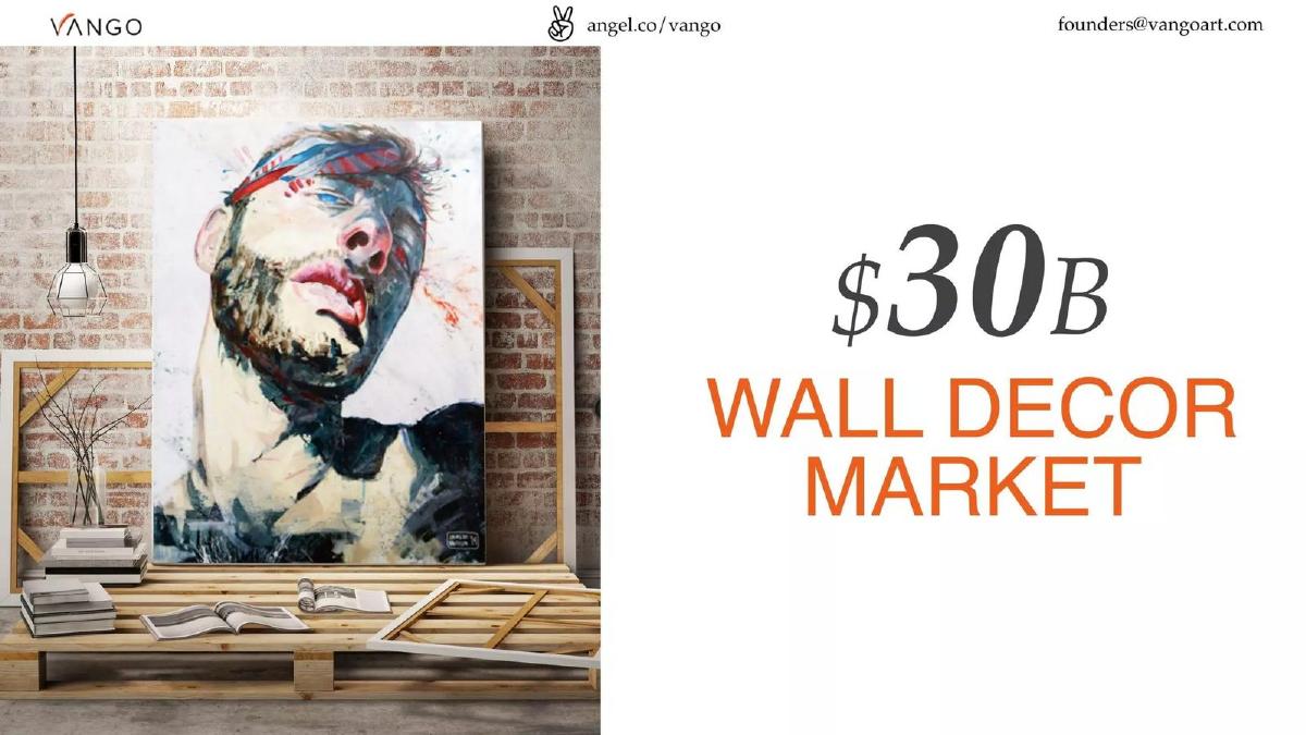
- The deck identifies a $30B wall decor market opportunity on slide 4.
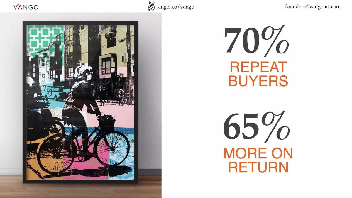
- Vango reports a high engagement level with 70% repeat buyers stated on slide 3.
- Returning customers spend 65% more on their subsequent purchases according to slide 3.
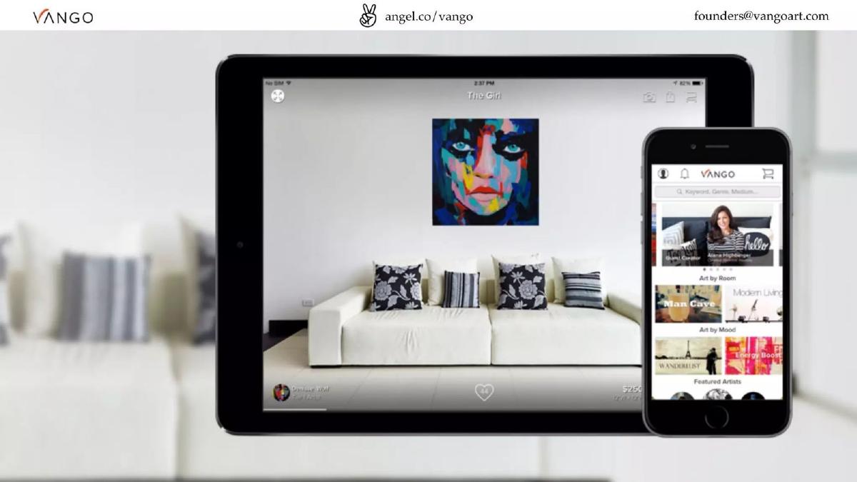
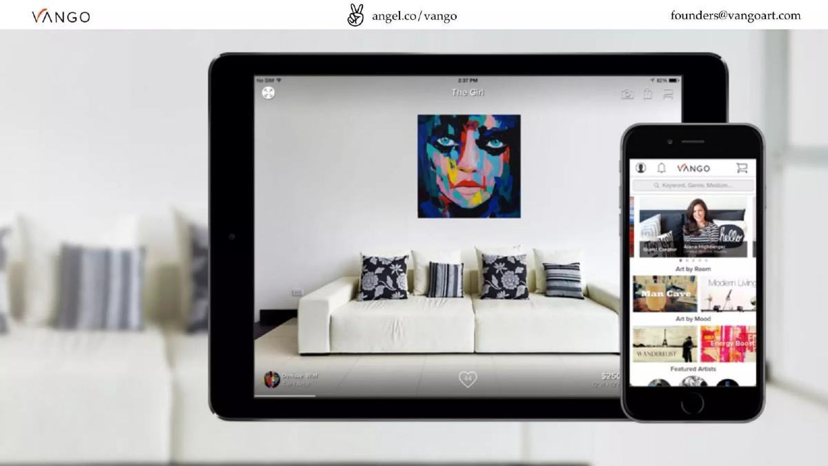
- The product is positioned as a mobile-first marketplace, showcased via iPad and iPhone mockups on slide 1.
- The team consists of six core members with defined roles in Business, Design, Development, Community, Content, and Growth on slide 6.
- The deck uses a 'show, don't tell' approach, using slides 9, 10, and 11 to visually represent the problem of generic or intimidating art environments.
- There is a total absence of a financial 'ask' or use of funds slide within the 11-slide presentation.
- The company emphasizes its 'Be Original' branding, positioning itself against 'cookie-cutter posters' shown on slide 11.
The Visual Narrative of Vango
Vango’s pitch deck is an exercise in minimalism. In an industry defined by aesthetics, the company chose to let high-resolution imagery do the heavy lifting. The deck consists of only 11 slides, many of which contain fewer than ten words. This approach suggests a confidence in the brand's visual identity and the inherent clarity of the marketplace model they are building. By focusing on the emotional disconnect between consumers and the art world, Vango positions itself not just as a utility, but as a cultural bridge.
Slide 1: The Product Interface
The deck opens with a hardware-centric view of the product. An iPad and an iPhone are displayed, showing the Vango interface. The iPad screen is particularly important as it demonstrates the 'visualization' feature—showing a piece of art titled 'The Girl' hanging above a white sofa in a real-world setting. This immediately answers the 'how it works' question: Vango helps users see art in their own space before buying. The iPhone screen shows a discovery feed with categories like 'Man Cave,' 'Modern Living,' and 'Wanderlust,' signaling a lifestyle-led curation strategy. Contact information and the AngelList URL are present in the header, a standard but necessary inclusion for investor decks.
Slide 2: The Lifestyle Connection
Slide 2 is a full-bleed lifestyle photograph of a woman sitting on the floor of a loft filled with art. There is no text on this slide. The purpose is purely atmospheric—it defines the target demographic: young, urban, and interested in an 'authentic' or 'bohemian' aesthetic. It serves to ground the digital product shown on Slide 1 in a physical, aspirational reality.
Slide 3: High-Impact Traction
This is arguably the most important slide in the deck. Slide 3 moves away from imagery to present two critical data points: 70% Repeat Buyers and 65% More on Return . For a marketplace, these numbers are exceptional. They indicate that once a user overcomes the friction of buying their first piece of original art, they are highly likely to return and increase their investment. This slide effectively counters the argument that art is a one-time, infrequent purchase.
Slide 4: The Market Opportunity
Vango quantifies the opportunity on Slide 4 with a single figure: $30B Wall Decor Market . By using the term 'Wall Decor' rather than 'Fine Art,' the company signals that it is chasing a much larger, more accessible segment of the economy. The background image shows a large-scale portrait on a wooden pallet, reinforcing the idea of 'original' but 'accessible' art that hasn't yet reached the sterile environment of a gallery.
Slide 5: The Creator Side
Slide 5 focuses on the artist. It shows a man at a desk working on sketches. Like Slide 2, it contains no text. This slide represents the supply side of the marketplace. It humanizes the 'original art' claim, reminding investors that behind every listing on the app is a real person creating work. It addresses the 'why' of the company: supporting independent creators who struggle to find a platform.
Slide 6: The Team
The team slide uses a playful 'framed' aesthetic for the headshots. Ethan James Appleby is listed for Business, Brandon Flayler for Design, and Win Raguini for Development. The secondary tier includes Monique Ritter (Community), Stephanie Long (Content), and Tim Dalrymple (Growth). The roles are clearly defined, covering the essential pillars of a marketplace: supply (Community/Content), demand (Growth), and the platform (Design/Development).
Slide 7: The Closing Brand Statement
Slide 7 serves as a 'Thank You' and contact slide, repeating the founders@vangoart.com email. It features another visualization mockup on an iPad, reinforcing the core value proposition of the app one last time. Curiously, this is only the seventh slide, but the deck continues into what appears to be an appendix or a 'problem' section that was perhaps intended to be shown earlier or used as a leave-behind.
Slides 8-11: The Problem and Vision
Slide 8 introduces the tagline: 'The fastest growing marketplace for original art.' It also features the 'Be Original' slogan. Slide 9 is a black-and-white portrait of a founder, likely Ethan James Appleby, in a studio setting. Slide 10 uses a black-and-white photo of people in a formal gallery to represent the 'intimidating' traditional art world. Slide 11 shows a drab dormitory or bedroom with mass-produced posters (The Beatles, Flight of the Conchords), representing the 'cookie-cutter' alternative that Vango aims to replace. These slides provide the 'Why Now' and the emotional hook that justifies the marketplace's existence.
What Works in the Vango Deck
The most successful element of this deck is its visual consistency . Vango is an art company, and their deck looks like it. The use of high-quality photography and minimalist text creates a premium feel that aligns with the product. Furthermore, the traction metrics on Slide 3 are perfectly chosen. In a seed or 'later' stage round, investors are looking for signs of retention. Proving that 70% of customers return is a powerful way to demonstrate that the 'confusing black box' of art pricing and discovery has been solved by their interface.
The market sizing is also handled well. By claiming the $30B 'Wall Decor' market, they move the conversation away from the niche world of high-end art collectors and into the realm of general consumer e-commerce. This makes the business appear much more scalable to a generalist VC.
What is Missing from the Vango Deck
Despite its visual appeal, the deck is missing several structural components that are standard in modern fundraising. There is no competitive landscape slide. While the 'problem' slides hint at galleries and posters, there is no mention of other online art marketplaces like Saatchi Art or Etsy, which were active in 2012. An investor would want to know how Vango's mobile-first visualization specifically beats these incumbents.
There is also no financial data beyond the two retention percentages. We don't see Gross Merchandise Volume (GMV), average order value (AOV), or take rate. While the catalogue listing mentions a $4.7M raise, the deck itself contains no 'Ask' slide . It does not specify how much money is being raised, what the valuation is, or how the capital will be deployed (e.g., hiring more developers vs. marketing spend). Finally, the unit economics are absent; we don't know the Customer Acquisition Cost (CAC) relative to the Lifetime Value (LTV), which is a critical metric for a marketplace showing high repeat purchase rates.
What a Founder Should Copy
Founders should emulate Vango's 'Show, Don't Tell' philosophy regarding product features. Instead of listing 'Augmented Reality' or 'Visualization' as a bullet point, they showed the app in action on Slide 1. This is far more effective for helping an investor visualize the user journey.
Another takeaway is the segmentation of the team slide . By grouping the team into 'Business, Design, Development' and 'Community, Content, Growth,' they show a balanced organization that understands both the technical requirements of the app and the operational requirements of a two-sided marketplace. Lastly, the bold use of a single, powerful metric (Slide 3) is a great tactic. If you have one or two 'world-class' numbers, give them their own slide. Don't bury a 70% retention rate in a crowded table of other, less impressive figures.
Frequently asked questions
- How much did Vango raise with this deck?
- According to the catalogue listing, Vango raised a total of $4,700,000. This funding supported their transition from the original 'ARTtwo50' brand to the Vango marketplace, which focused on a broader price range and a mobile-first visualization experience for art buyers.
- What are the key traction metrics mentioned?
- Vango focuses on retention and wallet share rather than raw user growth in this deck. Slide 3 highlights that 70% of their customers are repeat buyers and that these customers spend 65% more on their return visits, suggesting strong product-market fit and customer loyalty.
- Who is on the Vango founding team?
- The team slide (Slide 6) lists Ethan James Appleby (Business), Brandon Flayler (Design), and Win Raguini (Development) as the primary leads. They are supported by Monique Ritter (Community), Stephanie Long (Content), and Tim Dalrymple (Growth).
- What problem does the deck aim to solve?
- The deck uses visual cues to illustrate two problems: the intimidating, elitist nature of traditional art galleries (Slide 10) and the bland, generic nature of mass-produced posters (Slide 11). Vango positions itself as the middle ground for 'original' art.
- Is there a clear exit strategy or financial projection in the deck?
- No. The 11-slide deck is purely focused on the brand, the market size, and the current customer behavior. It omits revenue projections, burn rate, and any mention of potential acquirers or an IPO path.