Vbet10's 'Single-Deck Blackjack Strategy Guide' is a 15-slide, 16:9 Canva document saved on 18 November 2024 and distributed through document-sharing platforms. It is not an investor pitch deck — there is no company, product, traction, team, financials or ask — it is a top-of-funnel content-marketing asset for an online casino brand, and it fails in a way founders repeat constantly. The brand appears on the cover, vanishes for eleven slides of category education, and returns on slides 13 to 15 with three claims — fair gameplay, great bonuses, smooth user experience — that carry no numbers, no…
Key takeaways
- The Vbet10 'Single-Deck Blackjack Strategy Guide' is not a startup pitch deck — it is a 15-slide Canva content-marketing PDF published in November 2024 by an online casino brand, with no company, product, traction, team, financials or funding ask anywhere in the file.
- The argument for the advertiser occupies only slides 13, 14 and 15 of 15: the brand appears on the cover, disappears for eleven slides, then returns at 87% depth with three unevidenced claims.
- Its three differentiators — fair gameplay, great bonuses, smooth user experience — are adjectives that would survive a find-and-replace of the brand name, and the fair-play claim is hedged in the brand's own copy as 'Vbet10 seems to have clear terms'.
- A document titled 'Strategy Guide' contains no basic-strategy chart, and slide 10 states 'the hand should stop hitting when you are below 12', which is the opposite of correct play as written.
- All four quantified claims — a 0.15% versus 0.5% house edge, an insurance edge 'higher than 6%', 2:1 insurance payouts and 3:2 versus 6:5 blackjack payouts — are presented with no source, date or rule set.
- The deck raises objections it never answers: it concedes that most casinos alter single-deck rules to erase the player edge, tells the reader to insist on 3:2 tables, and never states what the advertiser's own tables pay.
- Slide 9 carries the heading 'Easier Card Counting' twice on the same page, and the avoid-side-bets point is duplicated across slides 5 and 11 — padding plus an unproofed final pass in a 15-slide file.
- The closing slide says 'always play with the proper Vbet10' with no URL, QR code, bonus code or tracked link, and the file carries no licence, regulator, 18+ mark or responsible-gambling helpline anywhere in fifteen slides.
What this deck actually is
Fifteen slides, 16:9 widescreen at 1440 x 810 points, built in Canva , authored under the name "Socio Greek" , and saved on 18 November 2024 . The document title is "Single-Deck Blackjack Strategy Guide" . The cover carries the vbet wordmark alongside the AS Monaco club crest, and the file weighs 16.9 MB — almost all of it photography.
Say the important thing first: this is not a pitch deck. There is no company, no problem, no solution, no market size, no product, no traction, no team, no competition, no financials, no ask and no next step. Nobody is being asked for money. This is a content-marketing / affiliate acquisition asset — a top-of-funnel PDF published by the online casino brand Vbet10, distributed on document-sharing platforms (the filename carries a SlideShare-style upload stamp), designed to rank for and intercept searches like "single deck blackjack strategy" and hand the reader to a gambling site at the end.
It is included in this teardown series deliberately, because it is the single clearest example of a pattern that costs founders real money: a deck built to be found, not to be persuasive. Enormous numbers of startup decks are built the same way — assembled out of generic category explainers, padded to a slide count, with the actual argument for the company compressed into the last two slides. Vbet's guide does it so purely that the mechanics are impossible to miss. Learning to see it here makes it easy to see in your own deck.
Judged as what it is — a lead-generation content asset — it is competently produced and strategically coherent. Judged by whether it earns the action it asks for, it fails on evidence, on structure, and on the one thing a strategy guide has to do: contain the strategy.
The pitch is three slides out of fifteen, and it arrives after the reader has left
The brand appears on the cover, then disappears for eleven slides, then returns on slides 13, 14 and 15. Slides 13 and 14 are the actual pitch — a section headed "Where to Play Single Deck Blackjack Online?" making three claims for Vbet10: fair gameplay, great bonuses, smooth user experience. Slide 15 closes with "always play with the proper Vbet10."
That is 80% preamble before any argument for the advertiser. The bet being placed is that a reader who wants blackjack strategy will absorb twelve slides of explanation and still be present, and still be persuadable, at slide 13. Anyone who has watched a document-viewer drop-off curve knows how that resolves. The persuasion arrives after the audience has thinned to a fraction, and it arrives in its weakest possible form.
Read the three claims as an investor would read a traction slide:
"Fair Gameplay" — the actual sentence is "there are often complaints from players that online casinos and other gambling sites have unfair terms and conditions but Vbet10 seems to have clear terms and a simple policy on fair play." The verb is seems . The brand's own marketing document hedges its central trust claim. There is no licence number, no regulator named, no RTP figure, no independent audit body, no link to the terms it says are clear. · "Great Bonuses" — no offer, no amount, no wagering requirement, no expiry. The slide says new entrants "can also use various bonuses and promotions that make their games interesting." That is a sentence that could be printed in any competitor's deck without changing a word. · "Smooth User Experience" — "slick and simple so as to allow players to concentrate on the game and not on colors and bright lights." No screenshot. In fifteen slides of a document about where to play, the product is never shown once.
Three differentiators, zero of them differentiating, zero of them evidenced, none of them demonstrated visually. This is exactly the failure mode of the startup "Why us" slide that lists better technology, better team, better UX with no artefact attached.
A strategy guide that does not contain the strategy
The document's title promises a strategy guide. Basic strategy in blackjack is a known, finite, published object: a decision matrix of your hand total against the dealer's up-card. It fits on one slide. That slide is not in this deck.
Instead, slides 4, 5, 10, 11 and 12 describe strategy in prose, and the prose is loose enough to be actively harmful. Slide 10 reads: "The hand should stop hitting when you are below 12, and the hand should stop drawing when it is 17 or above." Taken literally the first clause says the opposite of correct play — with a hard total below 12 you cannot bust, so you always draw. Whatever was meant, a reader following the words on the slide would play the hand wrong.
The same slide is right about splitting ( always split aces and 8s; never split 10s or 5s ) and broadly right about doubling on 11 and on 9–10 against a weak dealer card. The knowledge exists behind the document. It just was not organised into the one artefact the title promises, and it is not internally checked.
The startup translation is exact. A deck titled "How it works" that never shows the product working. A deck promising unit economics that gestures at margin in a paragraph. If your title makes a specific promise, the corresponding slide must be the most concrete page in the file, not the vaguest.
The numbers: four claims, none sourced, one arguing against the advertiser
"the house edge can vary between a low of 0.15% as opposed to at least 0.5% in the six-shoal game" (slide 8). No source, no rule set, and the figures are only meaningful under stated conditions — 3:2 payouts, dealer stands on soft 17, doubling permitted. "Six-shoal" is a typo for six-shoe, and it survived to publication. · "insurance typically offers a payout of 2:1 but has a house edge higher than 6%" (slide 11). Unsourced, and the true figure swings widely with deck count and composition. · "3:2 versus 6:5 payouts" (slide 7). Correctly explained, and the strongest factual content in the deck — but not tied to which payout the advertiser's own tables use. · "one deck of 52 cards" (slide 3). True, and one of the few claims that needs no source.
Then there is the self-inflicted wound. Slide 3 concedes that "the majority of the casinos modify the rules to negate this edge" , and slide 7 tells the reader to always insist on 3:2 tables. Both are honest. Both are also arguments the reader will immediately apply to Vbet10 — and the deck never says what Vbet10's single-deck rules actually are. Slide 4 goes further, telling the reader to count cards "cautiously" because "a lot of casinos do not approve it," which stages the operator as an adversary six slides before asking the reader to sign up with one.
Founders do this constantly. They include an honest risk or a market caveat, and then fail to answer it for their own company. Raising an objection you do not resolve is worse than never raising it , because you have taught the reader the exact question to ask.
Slide-by-slide walkthrough
Slide 1 — Cover
"SINGLE-DECK BLACKJACK STRATEGY GUIDE" set large in navy on white, vbet wordmark and AS Monaco crest top-left, two hexagonal photo insets of blackjack tables on the right. Clean, high-contrast and legible at thumbnail size — genuinely well made. Missing: a date, an author, a licence marker, and any age or responsible-gambling notice on the page most likely to be seen in isolation.
Slide 2 — Opening paragraph
A single block of body copy asserting that single-deck blackjack is known for "its acceleration and master strategy" and that a good strategy lets anybody "beat the house more often." No heading, no hierarchy, no callout. Slide 2 is the highest-attention page after the cover and it is spent on undifferentiated prose that a reader could have written themselves.
Slide 3 — What is single deck blackjack?
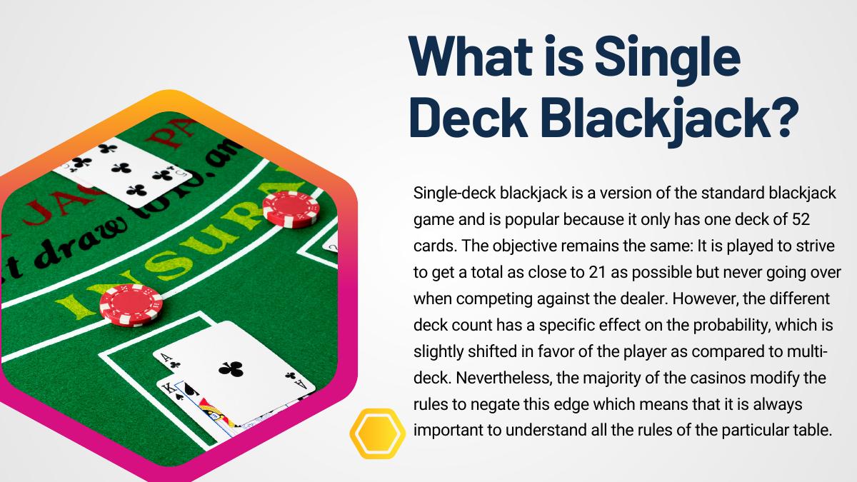
The definition slide: one 52-card deck, get as close to 21 without going over, probability shifts slightly toward the player versus multi-deck — followed by the admission that most casinos alter rules to claw the edge back. The most intellectually honest slide in the file, and the one that most damages the pitch, because the caveat is never closed.
Slide 4 — Strategy: basic strategy and card counting
Two columns. Left: follow basic strategy because it is "mathematically correct." Right: counting is easier with one deck, "not impermissible but a lot of casinos do not approve it, so do it cautiously." The two-column layout is the right structure; the content is a description of a method rather than the method.
Slide 5 — Avoid costly side bets
Insurance and "perfect pairs" have higher house edges; skip them. Correct advice, one point on a slide — and it is repeated almost verbatim on slide 11, this time with a number attached.
Slide 6 — Rules and regulations (1 of 2)
Numbered: dealer hits or stands on soft 17; doubling down permissions vary. Concise, useful, correctly framed as "check before you sit down." This is the deck's best structural pattern: numbered, scannable, one idea per line.
Slide 7 — Rules and regulations (2 of 2)
Resplitting rules vary; 3:2 versus 6:5 payouts and why 6:5 raises the house edge. The single most actionable page in the deck. It should have been slide 2.
Slide 8 — Benefits: lower house edge
The 0.15% versus 0.5% comparison, unsourced, with the "six-shoal" typo. One claim, one slide — reasonable pacing, but the load-bearing number of the whole document is left to stand on nothing.
Slide 9 — Easier card counting (twice)
The clearest production error in the file: the heading "Easier Card Counting" appears twice on the same slide , once over a paragraph about counting and once over a paragraph that actually begins "Simpler Game Dynamics." A heading was duplicated and never corrected. In a startup deck this is the mislabelled axis or the placeholder that ships — the small thing that makes a reader wonder how carefully the numbers were checked.
Slide 10 — Basic blackjack strategy
Three blocks: hitting and standing, doubling down, splitting pairs. Contains the deck's densest real value (split aces and 8s, never 10s or 5s, double on 11 and on 9–10 against dealer 2–6) and its clearest error (the "stop hitting when you are below 12" sentence). The layout also runs the splitting column at a different vertical offset from the other two, so the reading order is ambiguous.
Slide 11 — Avoid costly side wagers
The slide-5 point restated with the 2:1 insurance payout and a "higher than 6%" edge. Duplicated content in a 15-slide document is a padding signal — the same instinct that stretches a founder's ten slides of substance into twenty.
Slide 12 — Stick to your bankroll
Set a limit, do not chase, know when to stop. The closest the document comes to responsible-gambling messaging, framed as strategy advice rather than as a duty-of-care notice. No deposit limits, no self-exclusion, no helpline, no 18+ mark anywhere in fifteen slides.
Slide 13 — Where to play (1 of 2)
Fair gameplay ("Vbet10 seems to have clear terms") and great bonuses (unspecified). The pitch begins on slide 13 of 15 and opens on a hedge.
Slide 14 — Where to play (2 of 2)
Point three: smooth user experience. No screenshot, no device shot, no interface detail. A single product image here would outperform every adjective on the slide.
Slide 15 — Conclusion
Restates the guide and closes with "always play with the proper Vbet10." No URL, no QR code, no bonus code, no button, no tracked link — the call to action does not tell the reader where to go. A lead-generation asset that ends without a destination has failed at the only job it had.
What this deck does better than most startup pitch decks
One idea per slide. Slides 5, 8, 11, 12 and 14 each carry a single point. Most founder decks stack four arguments on a page and lose all four. · Numbered lists that force scannability. Slides 6, 7, 13 and 14 use "1 / 2 / 3" framing, so the reader knows how much is left and what the units of the argument are. · Consistent, restrained visual system. Navy on white, one accent palette, one typeface family, generous margins, hexagonal photo masks used consistently throughout. It looks like one document made by one person — which is more than can be said for many decks assembled from three template packs. · Correct format discipline. 16:9 at 1440 x 810, sized for a screen rather than a printer. Headlines are legible at thumbnail scale, which matters when the first impression is a preview tile. · It picks a lane and stays in it. The document never wanders into roulette, slots or sportsbook. Narrow scope is a strength most decks abandon by slide 6.
Where this deck would fail in an investor meeting
No ask, no next step, no destination. Not even a URL on the closing slide. · The argument for the advertiser occupies 3 of 15 slides and starts at 87% depth. In deck terms: your differentiation cannot live behind twelve slides of category education. · Every differentiator is an adjective. Fair, great, slick, smooth. Zero numbers, zero screenshots, zero named third parties. · The core trust claim is hedged by the brand's own copy ("seems to have clear terms"). Hedging your strongest claim tells the reader you cannot back it. · The title's promise is not delivered. A strategy guide with no strategy chart, containing at least one instruction that is wrong as written. · Objections raised and left open. "Most casinos modify the rules"; "insist on 3:2 tables"; "casinos do not approve counting" — all applied to the advertiser by any alert reader, all unanswered. · Duplicated content and a duplicated heading in a 15-slide file, which reads as padding plus an unproofed final pass. · No credentials of any kind. No author bio, no licence, no regulator, no audit, no date on the page, no compliance or age-gate marks in a regulated category.
Content-marketing deck vs investor deck
Dimension Vbet10 guide (this file) What an investor deck requires
Reader A stranger searching a category term A named partner who has agreed to read it
Job of slide 1–3 Confirm the search intent, hold attention State what the company does and why now
Position of the argument Slides 13–15 of 15 Slides 1–3, restated throughout
Evidence standard Category truisms, no citations Sourced metrics, dated, with methodology
Proof of product None — never shown Screenshots, demo, live usage data
Differentiation Adjectives (fair, great, smooth) A claim a competitor cannot copy verbatim
Close "Play with the proper Vbet10" — no link A specific ask, use of funds, and a next meeting
How you would rebuild this as fifteen slides that actually convert
Move the payoff to slide 2. The 3:2 versus 6:5 rule from slide 7 is the most valuable thing in the file. Lead with it: "One table rule changes your house edge more than every strategy in this guide." · Build the one artefact the title promises. A full basic-strategy matrix — hand total against dealer up-card — on a single slide, and make every other slide reference it. That is the page people screenshot, and screenshots are distribution. · Attribute every number. 0.15%, 0.5%, 6% and 2:1 each need a source and the rule set they assume, printed on the slide. One line of small type per figure removes the entire credibility problem. · Answer your own objection. After "most casinos modify the rules," add the slide that states the operator's actual single-deck rules: payout ratio, soft-17 behaviour, double and resplit permissions. Turning the caveat into the differentiator is the whole pitch, and it is currently missing. · Show the product. One screenshot of the live table beats "slick and simple" every time. The document about where to play never shows the place. · Make the bonus specific. An amount, a wagering requirement and an expiry. Vague generosity converts worse than a small, precise offer. · Cut the duplicate. Merge slides 5 and 11, and fix the double "Easier Card Counting" heading on slide 9. That frees two slides for evidence. · Put a destination on the close. URL, QR code, tracked link, bonus code. Right now the funnel has no exit. · Add the compliance furniture. Licence and regulator on the cover, 18+ and a responsible-gambling helpline on the closing slide. In a regulated category this is not decoration — its absence is the fastest way for a serious reader to disqualify the operator. · Date and sign it. An author, a role and a publication date convert an anonymous file into a citable source.
The transferable lesson
Strip the category away and this deck is a mirror held up to a very common founder failure: fourteen slides of context and one slide of you. The Vbet10 guide spends twelve pages explaining a subject the reader already searched for, then makes its case in three adjectives and closes without a destination. The startup version is a deck that opens with market size and industry trends, explains the problem space for eight slides, and reaches "here is what we built and how it is going" at slide eleven — by which point the partner is checking their phone.
The corrective is the same in both cases and it is uncomfortable: your differentiation belongs on slide 2, and it has to be a claim your competitor cannot copy word for word. "Fair, great, smooth" survives a find-and-replace of the company name. So does "AI-powered platform for modern teams." If the sentence works for a rival, it is not a differentiator, it is filler — and filler placed early is why decks die early.
The second lesson is smaller and sharper: never raise an objection you are not about to answer. This deck tells you the rules are usually rigged against the player and then asks you to play, without saying what its own rules are. Founders do the identical thing when they list a risk on a slide and move on, or concede a competitor's strength with no follow-up. An unanswered objection is a question you have handed the reader, and they will ask it after you have left the room.
And the last one: proof the thing. A duplicated heading, a typo in the load-bearing statistic and an instruction that says the opposite of what was meant would each take thirty seconds to fix. Together they tell the reader nobody read this document end to end before publishing it — and if nobody read it, why should they?
Frequently asked questions
- Is the Vbet deck a pitch deck for investors?
- No. The file is a 15-slide content-marketing PDF titled 'Single-Deck Blackjack Strategy Guide', built in Canva and saved in November 2024 for the online casino brand Vbet10. It has no problem statement, product, market size, traction, team, financials or funding ask. Its purpose is search-and-share acquisition: educate a reader on blackjack, then point them at a gambling site on the final three slides.
- What is Vbet10?
- Vbet10 is the online casino and betting brand promoted throughout this document. The deck presents it as an operator offering single-deck blackjack with clear terms, new-player bonuses and a simple interface, but names no licence, regulator, payout ratio or bonus amount. The cover pairs the vbet wordmark with the AS Monaco football club crest, referencing the brand's sports sponsorship.
- Which slides should founders copy?
- Three patterns. The numbered-list structure on slides 6 and 7, which forces one idea per line and tells the reader how much is left. The single-point pacing on slides 5, 8 and 12, where one slide carries one claim. And the visual discipline throughout — one palette, one type family, consistent photo treatment, headlines legible at thumbnail size in 16:9.
- What is the biggest weakness in the Vbet deck?
- Placement. Twelve slides of category education run before any argument for the advertiser, and the argument that finally arrives on slide 13 is three adjectives with no numbers, no screenshot and no licence. The single worst detail is the close: slide 15 tells the reader to play with Vbet10 but gives no URL, QR code or link, so a lead-generation asset ends without a destination.
- How many slides is the Vbet deck?
- Fifteen slides in 16:9 widescreen at 1440 x 810 points, produced in Canva under the author name 'Socio Greek' and saved on 18 November 2024. The file is 16.9 MB, almost entirely photography, and was distributed through document-sharing platforms — the filename carries a SlideShare-style upload timestamp.
- What is the difference between a content-marketing deck and a pitch deck?
- A content-marketing deck is written for a stranger who arrived from a search; it must confirm the reader's intent first and can only ask for a small action at the end. A pitch deck is written for a named investor who already agreed to read it, so the argument belongs on slide one and every claim needs a sourced number. Using one as the other is why decks stall — you spend the reader's attention on context they did not need.