ExtraaEdge's 31-slide July 2020 deck is not an investor pitch — it is a sales-enablement guide from an Indian admissions CRM company teaching a six-step sales presentation framework, illustrated with its own real customer slides. It applies its rules well: the product does not appear until slide 19 of 31, and social proof carries a hard number (175+ institutions). But it contains no revenue, no market size, no competition and no ask, and three of its example slides are unattributed Badger Maps material.
Key takeaways
- ExtraaEdge's 2020 deck is a 31-slide sales-enablement guide titled 'Guide to building a great Sales Deck', not an investor pitch deck, produced by a Pune-based admissions CRM company for Indian universities.
- The deck teaches six steps: state an industry transformation, give two options (sink or swim), show a glimpse of a better future, present the deal-winner, offer compelling social proof, and have a clear call to action.
- Each step is illustrated with a DO slide taken from ExtraaEdge's real customer deck and a deliberately terrible DON'T slide, which makes the abstract advice immediately concrete.
- The product does not appear until slide 19 of 31 — about sixty per cent through the deck — which is the discipline most founder decks fail by showing the product on slide four.
- The strongest rule in the deck is 'demo only 20% of your features - the killer 20%', paired with the instruction not to pitch the product while describing the better future.
- The only self-reported metric in the entire file is 'We power admissions for 175+ university leaders in education', attached to a wall of around fifteen institutional logos including Symbiosis and Jain University.
- Three slides carry a visible badgermapping.com watermark, including a full Danaher case study with named quotes, and the deck never attributes them to Badger Maps.
- As an investor document it would fail immediately: no revenue, no market sizing, no competition, no unit economics, no team slide and no funding ask across all 31 slides.
What this deck actually is
This is not an investor pitch deck. The file is titled Guide to building a great Sales Deck , it was exported from Microsoft PowerPoint 2013 on 6 July 2020, and it runs 31 slides at 720x405 points. It was produced by ExtraaEdge, a Pune-based admissions CRM and marketing automation company that sells to Indian universities and colleges, and it is signed off on the last slide by Supreetha Gonsalves, AVP Sales, and Abhishek Ballabh, Co-founder.
So it is a sales-enablement deck about sales decks. The subtitle on slide one reads "Identify Problem -> Articulate Needs -> Pitch Value Prop -> Win Deals", and the body is a six-step framework, each step illustrated with a DO slide pulled from ExtraaEdge's own customer-facing deck and a DON'T slide showing a deliberately terrible alternative.
That structure makes it unusually useful to tear down, because it does something almost no deck does: it shows you the company's real sales slides and the reasoning behind each one. You get the artefact and the intent side by side. It also exposes ExtraaEdge to a test most decks escape — whether its own slides pass the rules it just wrote.
One thing to flag up front: several of the illustrative slides are not ExtraaEdge's. Slides 19, 24 and 27 carry a visible badgermapping.com watermark, meaning they are lifted from Badger Maps' sales material, including a full Danaher case study slide. The deck never says so.
Slide-by-slide walkthrough
Slide 1 — Cover
ExtraaEdge logo with the tagline "predict admissions!", the deck title Guide to building a great Sales Deck , and the four-stage line "Identify Problem -> Articulate Needs -> Pitch Value Prop -> Win Deals". The cover states the promise as a process, not as a topic. That is the correct instinct: a reader knows in one line what sequence they are about to be taught.
Slide 2 — Section title: "Anatomy of a Persuasive Sales Deck"
A pure divider. In a 31-slide deck, two title slides in the first four pages is one too many.
Slide 3 — The premise
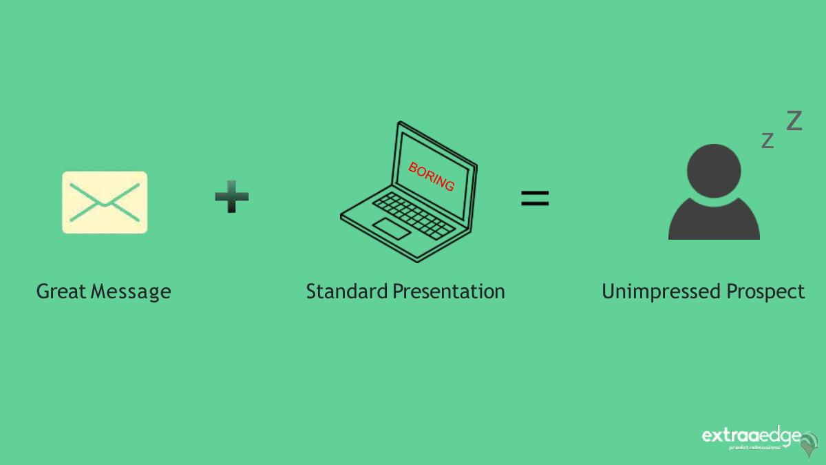
Three items in a row: "Great Message" + "Standard Presentation" = "Unimpressed Prospect". This is the entire argument of the deck compressed into one line, and it appears on slide three. Founders routinely bury their thesis on slide nine; here it is stated before any framework arrives.
Slide 4 — "Steps to a brilliant sales presentation"
The agenda slide, and the point where the deck introduces its navigation device: a numbered 1-to-6 progress bar that reappears on every step slide. Small design decision, large comprehension effect — the reader always knows where they are in the argument.
Slide 5 — Step 1: State an industry transformation
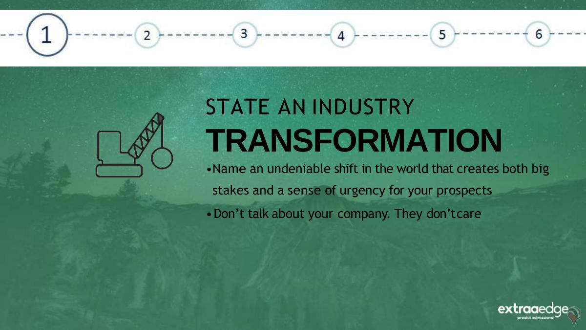
Two rules: "Name an undeniable shift in the world that creates both big stakes and a sense of urgency for your prospects" and "Don't talk about your company. They don't care." The second line is the most valuable sentence in the deck, and it is delivered as an instruction rather than a platitude.
Slide 6 — Reinforcement: the matchstick image
One burning match at the head of a line of unlit matches, with two lines of copy: "Highlight how the shift affects everyone in the industry" and "Since it's a common threat, they'll be less defensive". This is a rare piece of stated psychology — the deck explains why the technique works, not just that it works.
Slide 7 — DO: the ExtraaEdge market shift slide
The real slide from ExtraaEdge's customer deck. Left side: "The way admissions happen in universities will need a strategy change" and "Students & Parents will have new expectations". Right side: three stacked bands — DISCOVERY (Online, Digital & Social), ADMISSIONS (CRM, Automation & Tools), ENGAGEMENT (Nurture, Engage & Counsel).
Note what it does not contain: no market size, no ExtraaEdge product name, no logo-heavy framing. It maps the buyer's own funnel into three phases, which happen to be the three phases the product covers. The categorisation is the positioning.
Slide 8 — DON'T: "Introduction – About Us"
A parody slide of generic corporate boilerplate: "Our mission is to become a transnational XXX company through the development and introduction of a wide portfolio of branded and generic products in key markets", plus "We operate a globally integrated network of 11 manufacturing facilities". It reads like a pharma annual report, and that is the joke. The lesson lands because the bad example is specific rather than abstract.
Slide 9 — Step 2: Give them two options — sink or swim
"Demonstrate how because of the changes cited above, only companies that adapt will survive, everyone else will lose" and "Avoid industry jargon that doesn't add value".
Slide 10 — Reinforcement: even the mighty can fall
"Reference once-successful companies who failed to adapt" / "Show that even the mighty can fall". The advice is sound but the slide is the deck's weakest instructional moment: it tells you to name a fallen incumbent and then names none. In an admissions context there are obvious candidates — institutions that lost enrolment share to digital-first competitors — and the deck skips the chance to model its own instruction.
Slide 11 — DO: two core areas
"The best institutes are reinventing in 2 core areas: HOW THEY ACQUIRE STUDENTS / HOW THEY SKILL STUDENTS". Two boxes, eleven words. This is the sink-or-swim slide rendered without the melodrama the step title implies, and it is better for it: the pressure is carried by the phrase "the best institutes", which implies a peer group the buyer is being measured against.
Slide 12 — DON'T: "Client's Industry Analysis"
Three bullets that contradict each other: "Your industry is expected to witness a 300% rise in demand", "Your industry YTD is expected to fall down to 34% (approx)", "On an average, churn rate is expected to be around 5%". Demand up 300% and down to 34% on consecutive lines. The satire is that nobody in the room reads closely enough to notice — which is exactly what happens in real decks, including investor decks.
Slide 13 — Step 3: Show a glimpse of a better future
"Demonstrate a desirable solution is attainable, but difficult to achieve without outside help (that's why you exist)" and "Fight the urge to pitch your product at this stage". The parenthetical is the sharpest strategic line in the deck: your existence has to be justified by the difficulty of the alternative.
Slide 14 — Reinforcement: status quo versus end state
A man climbing stairs beside a man climbing a ladder, with the instruction to "describe the status-quo and contrast it with the desired end state their business processes can attain with your technology".
Slide 15 — DO: New Age admission trends and tools
Eight labelled icons under the heading "#New Age admission trends & tools driven by smartphone": CRM & Online Applications, One-click Payments, Video Counseling, AI Bots for counseling, CRM on Smartphones, Drip Communication, WhatsApp Engagement.
This is the sharpest piece of positioning in the file. It is a category slide, not a product slide — every item is presented as an industry trend the buyer should already be planning for. ExtraaEdge happens to ship most of them, so by the time the product appears four slides later, the buyer has already agreed the checklist matters. In July 2020, with Indian campuses closed and admissions moving online overnight, the timing was not subtle and did not need to be.
Slide 16 — DON'T: "About Our Technology"
"We can help you capture more market share by: Boring feature 1 / Incredibly Boring feature 2 / Please- stop- talking feature 3." Blunt, and it makes the point that a feature list framed as a benefit is still a feature list.
Slide 17 — Step 4: Present the deal-winner
"Introduce the product feature that instantly connects your prospect to the promised future state" and "Demo only 20% of your features - The killer 20%". The 20% rule is the single most actionable constraint in the deck and it is stated in eight words.
Slide 18 — Reinforcement: the key
A photograph of an antique key with "Show the key feature that clearly addresses your prospect's identified pain point". Metaphor-as-slide, and the only slide where the imagery carries more weight than the copy.
Slide 19 — DO: the product screenshot
"The new age Admission Platform for education institutes", with an ExtraaEdge dashboard showing leads and counsellor activity. This is the first appearance of the product, on slide 19 of 31 — roughly 60% of the way in, exactly as the framework prescribed. It also carries the badgermapping.com watermark in the layout, which suggests the slide template was rebuilt from Badger Maps' deck rather than designed fresh.
Slide 20 — DON'T: "Feature Set- Complete"
Twelve numbered features in a grid under "Our product is revolutionary. It will change the way you do things". The joke is the word "Complete" — completeness is presented as the failure mode, which is the correct diagnosis and the exact opposite of what most product teams believe about their own deck.
Slide 21 — Step 5: Offer compelling social proof
"Convince your prospects that you: (a) understand their problem (b) have the capability to solve it, effortlessly, for them." Splitting proof into comprehension and capability is a better framing than the usual "show logos".
Slide 22 — Reinforcement: solved problems and value proposition
"Showcase how you solved similar problems for others in the past" plus "Express a clear value proposition", over a tangram image.
Slide 23 — DO: the customer logo wall
Around fifteen institutional logos — Symbiosis Centre for Distance Learning, Jain University, Parul University, Zeal Education Society, MIT Institute of Design, Baroda-area universities and others — under the line "We power admissions for 175+ university leaders in education".
This is the strongest evidence slide in the deck and the only hard number ExtraaEdge puts on itself: 175+ institutions as of mid-2020. A logo wall attached to a count is proof; a logo wall alone is decoration.
Slide 24 — DO: a case study slide that is not ExtraaEdge's
A full Badger Maps case study on Danaher, with three named quotes (a Regional Sales Manager, a Global Sales Trainer and a Director of Sales Operations), an efficiency claim, a 30% increase in CRM usage, links to a webinar and two case studies, and the footnote that Danaher is a Fortune 500 reference customer of eight and a half years.
As a teaching example it is excellent — named people, named metrics, next-step assets. As a slide inside an ExtraaEdge deck it is a problem: there is no attribution line, and a reader skimming will assume Danaher is an ExtraaEdge customer. If you are going to borrow a competitor's or vendor's slide as an exemplar, label it.
Slide 25 — DON'T: "Awards & Recognition"
"Voted Best Small Agency in the World", "Won Global leader Award 2014", "Entire staff has been to the Moon. Multiple times. In the past year." The lesson underneath the comedy is real: awards are self-referential proof, and a six-year-old award is negative proof.
Slide 26 — Step 6: Have a clear call to action
"End by asking your prospect to take the next steps with you" and "If you don't ask for the sale, it won't happen." The second line is the deck's version of an ask slide, and it is the one instruction most startup decks — sales and investor alike — fail.
Slide 27 — Reinforcement: next-step assets
"Product Videos, Case Studies, etc. are excellent assets that propel prospects to take the 'Next-steps'", again over a badgermapping.com-watermarked layout.
Slide 28 — DO: the closing ask
"Let's empower the admission teams win in 2020" with a single button-style CTA: "Sign up for Demo". One verb, one action, no menu of options. The grammar is off, the structure is right.
Slide 29 — DON'T: "THANK YOU"
A blank thank-you slide, presented as the worst possible final slide because it ends the meeting on a courtesy rather than a commitment.
Slide 30 — The concession
"Sales presentations won't close deals for you. But great presentations certainly help." Undercutting your own product's importance one slide before the contact details is a confidence move, and it buys credibility for everything before it.
Slide 31 — Contacts
Supreetha Gonsalves, AVP Sales, and Abhishek Ballabh, Co-founder, with an email address and an Indian mobile number. Two named humans and a direct line — more than most decks close with.
What this deck does better than most startup pitch decks
It delays the product to slide 19 of 31. Roughly sixty per cent of the deck runs before the platform appears, and the delay is deliberate rather than accidental. Most founder decks show the product by slide four, before the audience has agreed there is a problem worth solving. · Every abstract rule is immediately paired with a concrete artefact. Step, reinforcement, DO, DON'T — the pattern repeats six times. The reader never has to translate advice into a slide, because the slide is right there. · The DON'T slides are specific, not generic. "Boring feature 1" and the contradictory 300%/34% industry stats are funnier and more memorable than any bullet reading "avoid vague claims". · It carries a persistent progress indicator. The 1-to-6 bar on every step slide means a reader who joins late or skims still knows the shape of the argument. · Its social proof has a number attached. "175+ university leaders" converts a logo wall into a claim you could verify or challenge. · It states the "why" behind at least two techniques. The common-threat framing and the "that's why you exist" parenthetical give the reader a model, not just a rule. · It ends on an ask. "Sign up for Demo" is a single action, and the deck explicitly mocks the thank-you slide alternative.
Where this deck would fail in an investor meeting
There is no company in it. No revenue, no ARR, no growth rate, no retention, no headcount, no funding history. The only self-reported metric across 31 slides is "175+ university leaders". · No market sizing. The deck argues Indian admissions are digitising in 2020 and never quantifies the addressable institution count, the spend per institution or the segment split between universities, colleges and coaching institutes. · No competition. ExtraaEdge sells into a crowded education CRM category and the deck names no alternative, including the default one: spreadsheets plus a general-purpose CRM. · Borrowed slides with no attribution. Three slides carry badgermapping.com branding, one of them a complete Danaher case study. In an investor context, unattributed third-party proof next to your own logo wall is a diligence problem, not a design one. · The teaching slides break their own rules. Slide 10 tells you to reference a fallen incumbent and references none. Slide 12 mocks contradictory stats and the deck itself never presents any of its own. · Its own product slide shows one screenshot. The "killer 20%" rule is applied so aggressively that a buyer cannot tell what the platform actually does beyond lead and counsellor tracking. · Structural drag at the front. Four slides pass before the first piece of content, including two title cards.
Sales deck versus investor deck: what actually changes
Opening move Industry shift affecting the buyer Industry shift affecting the market, with a number
Problem owner The prospect in the room A segment, sized and named
Product depth The "killer 20%", one screenshot Enough to judge defensibility and roadmap
Proof Logo wall + "175+ institutions" Revenue, retention, cohort growth, payback
Team Two names on the last slide Founder-market fit, prior outcomes
Ask "Sign up for Demo" Round size, instrument, use of funds, milestones
Length 31 slides, six repeats of one pattern 12-16 slides, no repeated pattern
How you would rebuild this as an investor deck
Keep slide 7 as your slide 2. The Discovery / Admissions / Engagement band is a category map. Add the number of institutions in each band and the annual spend, and it becomes a market slide instead of a framing slide. · Turn slide 15 into a wedge argument. Eight new-age admission tools is a checklist; say which two you win on today, which three you will own in eighteen months, and which three you will never build. That is a strategy slide. · Put 175+ institutions on its own slide with a time series. Institutions by quarter, net revenue retention, average contract value, and the share renewing. The logo wall becomes the supporting image, not the claim. · Replace the borrowed Danaher case study with your own. One named institution, the admissions volume before and after, the counsellor headcount it saved, and a quote from a named registrar. Same slide structure, your evidence. · Add the three missing slides. Competition with an honest position, unit economics with the sales cycle, and team with founder-market fit for a company selling to Indian higher education. · Cut to sixteen slides. The six-step DO/DON'T rhythm is a teaching device; in an investor deck it reads as padding. One idea per slide, no reinforcement slides. · End with an actual ask. Round size, instrument, use of funds against named milestones. "Sign up for Demo" works on a registrar; it does nothing to a partner.
The transferable lesson
The most useful thing about this deck is that it accidentally proves its own thesis in reverse. ExtraaEdge wrote six rules for persuasion, applied them to its sales conversation with real discipline — problem first, product at 60%, one CTA — and still produced a document that could not raise a rupee, because it contains no evidence about the company itself.
That is the split most founders get wrong in the other direction. They build a deck that is all evidence and no argument: market size, feature grid, traction chart, team, ask, with nothing in between that makes an investor feel the shift is happening now. A great deck needs the sales deck's narrative spine and the investor deck's numbers. Either one alone reads as incomplete to the person sitting across from you.
Read your own deck the way this one reads its bad examples. Is your first content slide about the world, or about you? Does your product appear before the problem is agreed? Is your proof a count or a collage? Is your last slide an ask or a thank-you? Four questions, and most decks fail at least two.
Frequently asked questions
- Is the ExtraaEdge deck a pitch deck for investors?
- No. It is a sales-enablement deck titled 'Guide to building a great Sales Deck', created in July 2020 and signed by ExtraaEdge's AVP Sales and a co-founder. It teaches a six-step sales presentation framework using the company's own customer-facing slides as examples. It contains no revenue, market size, competition, team or funding ask, so it could not function as an investor deck.
- What is ExtraaEdge?
- ExtraaEdge is an education-focused CRM and marketing automation company based in Pune, India, with the tagline 'predict admissions!'. It sells admissions software to universities, colleges and coaching institutes, covering student discovery, application and enrolment workflows plus counsellor engagement. In this July 2020 deck it claims to power admissions for more than 175 education institutions.
- How many slides is the ExtraaEdge sales deck?
- Thirty-one slides at 720x405 points, exported from Microsoft PowerPoint 2013 on 6 July 2020. The structure is a cover, two title slides, six framework steps each with a reinforcement slide plus a DO and a DON'T example, a logo wall, a borrowed case study slide, a closing call to action and a contact slide.
- What are the six steps in ExtraaEdge's sales deck framework?
- State an industry transformation, give them two options (sink or swim), show a glimpse of a better future, present the deal-winner, offer compelling social proof, and have a clear call to action. Each step carries a one-line rule — for example 'Don't talk about your company. They don't care' and 'Demo only 20% of your features - the killer 20%'.
- Which slides should founders copy from this deck?
- Two. The market shift slide that splits university admissions into Discovery, Admissions and Engagement, which maps the buyer's funnel instead of describing the product, and the 'New Age admission trends and tools' slide, which frames eight product capabilities as industry trends the buyer should already be planning for, so the product feels inevitable when it finally appears.
- What is the biggest weakness in the ExtraaEdge deck?
- It contains almost no evidence about ExtraaEdge itself. The only company metric across 31 slides is '175+ university leaders'. There is no revenue, retention, contract value, market sizing or competitive position, and three example slides — including a full Danaher case study — are unattributed Badger Maps material carrying a visible badgermapping.com watermark.