Stockmeister's nine-slide 2015 deck pitched a mobile stock-portfolio app for amateur investors in India, built around an avatar-based interface that makes expert functionality legible to beginners. The design is disciplined and the competition slide is unusually fair, but the deck is a concept summary rather than a fundraising document: 2009 market data with no source, a market sized for the wrong segment, one named competitor, no traction, no price, no named founders and no ask. Its strongest idea appears once, in four words, buried in a feature list.
Key takeaways
- Stockmeister's deck is nine pages, built in PowerPoint 2013 and dated 24 August 2015, pitching a mobile stock-portfolio app for amateur investors in India.
- It is a concept deck rather than a fundraising deck: there is no traction, no business model, no financials, no roadmap, no ask and no contact details anywhere in the file.
- The market slide uses 2009 HNWI figures in a 2015 deck, with no source named and no unit on the leading number, and sizes high-net-worth individuals rather than the amateur investors the problem slide targets.
- The second market statistic — 65% of financial-asset investment going to fixed investments — argues that most Indian money was not in equities, which works against the pitch it is meant to support.
- Only one competitor is named, 'stock ideal', in a 2015 Indian market that also contained Moneycontrol, ET Markets, broker-native apps and Google and Yahoo Finance.
- The single original idea in the deck, an 'avatar based interface', is bullet one of eight on the product slide and is never explained, despite being the only answer to the beginner-versus-expert tension the solution slide raises.
- The 'why is it better' slide promises every existing feature plus advanced ones at a lower price, and closes with 'it would definitely be a hit' — an assertion of outcome standing in for evidence.
- The team slide says 'DESIGNERS + CODERS' with no names, roles, photographs or prior companies, at the stage where the founders are the only asset an investor can underwrite.
What this deck actually is
Stockmeister's deck is nine pages long, was produced in Microsoft PowerPoint 2013 and carries a file timestamp of 24 August 2015. It is a concept deck for a mobile stock-portfolio app aimed at Indian retail investors, and the honest classification matters before any analysis begins: this is not a fundraising document. It is an idea summary.
The distinction is not pedantic. A fundraising deck exists to move a specific investor toward a specific decision — a cheque of a stated size, at a stated stage, against a stated use of funds. A concept deck exists to explain an idea to someone who has not heard it. Stockmeister does the second job in nine slides and never attempts the first. There is no traction slide, no business model slide, no financials, no roadmap, no ask, no contact details and no named founder anywhere in the file.
What is left is the skeleton every founder recognises: title, problem, solution, why now, market size, competition, product, why we win, team. That skeleton is the reason this deck is worth tearing down. It is a clean, uncontaminated example of the most common failure mode in early pitching — a deck that answers every question except the ones that decide the outcome.
It is also visually disciplined in a way that flatters the content. Grey condensed headline type, a single yellow accent, one idea per slide, almost no clutter. A deck that looks this considered creates an expectation of substance that the nine slides do not meet, and that gap is the whole lesson.
Slide-by-slide walkthrough
Slide 1 — Title: stockmeister
A wordmark in the centre of an otherwise empty white slide: "stock" in charcoal, "meister" in yellow, with a thin rule underneath and the tagline "Easier way to manage your stock portfolio on the Go."
The tagline does real work. In eleven words it names the category (stock portfolio management), the form factor (mobile) and the promise (easier). An investor who reads only this slide can already place the company in a mental bucket. That is more than many title slides achieve.
What is missing is everything an opening slide is supposed to carry beyond the name: no date, no stage, no company entity, no founder name, no email, no city. A deck that circulates as a PDF — as this one did, on SlideShare — has to survive being separated from the person who sent it. This title slide cannot be traced back to a human being.
Slide 2 — Problem
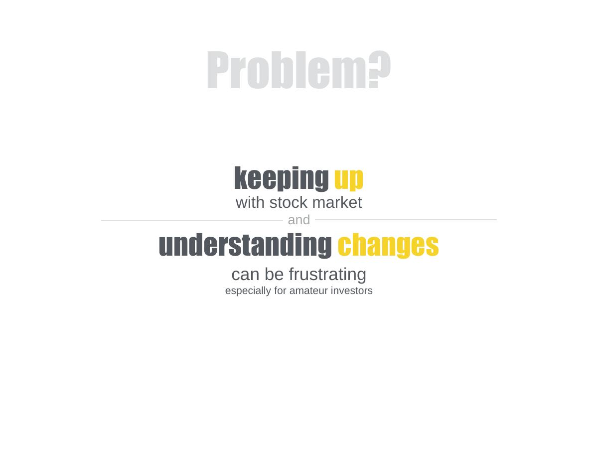
The slide reads, across several lines of centred type: "keeping up with stock market and understanding changes can be frustrating especially for amateur investors."
The framing is a feeling, not a cost. "Frustrating" is the operative word, and frustration is the weakest category of problem statement because it cannot be measured, cannot be priced and cannot be falsified. Every investor has heard a hundred decks claim that an existing behaviour is frustrating.
The slide does contain a genuinely useful narrowing — "especially for amateur investors" — which identifies a segment. But it arrives as a qualifier at the end rather than as the subject of the sentence. The stronger version of this slide names the amateur investor first, then describes what that specific person does today (checks four apps, misreads a candlestick chart, misses an earnings date, sells at the wrong moment) and what it costs them.
There is no evidence of any kind here. No user interviews, no survey, no quote, no count of people who described the problem. In a deck with no traction, the problem slide is the only place to demonstrate that the founders have talked to anyone, and it is left empty.
Slide 3 — Solution
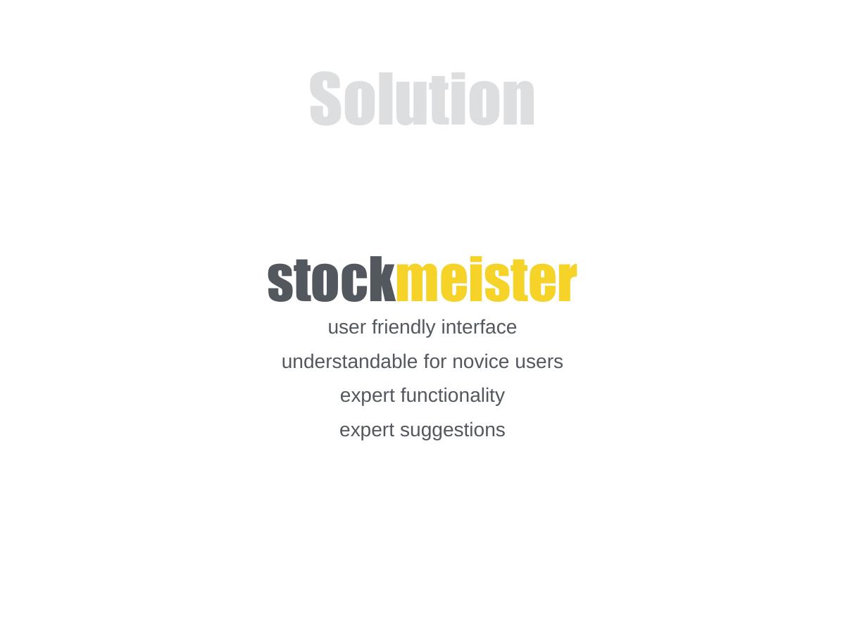
The wordmark again, with four lines beneath it: "user friendly interface", "understandable for novice users", "expert functionality", "expert suggestions."
Three of those four lines are the same claim. "User friendly interface" and "understandable for novice users" describe one property, and "expert functionality" and "expert suggestions" are adjacent enough that the slide effectively contains two ideas stretched into four bullets.
The real proposition buried here is interesting and the deck never states it plainly: a product that is legible to a beginner but does not sacrifice the depth an experienced investor expects. That is a genuine positioning tension worth a slide. Written as four adjectives, it reads as aspiration.
And this is a mobile app deck with no screenshot. Nine slides pass without a single image of the product, a wireframe, a mock-up or even a diagram of the interface being described as the core differentiator. When the pitch is "our interface is better", the interface has to be on the page.
Slide 4 — Why now?
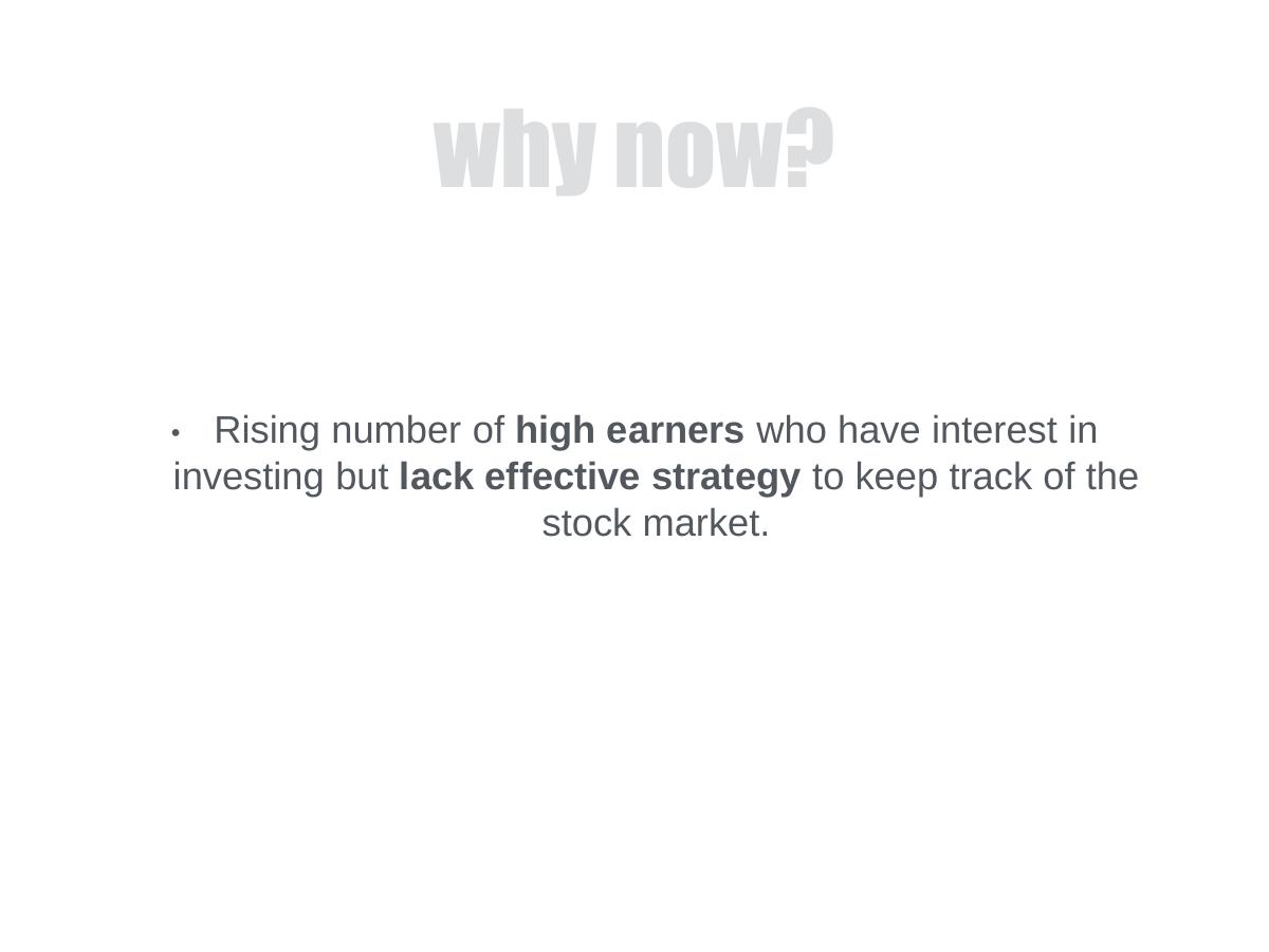
One bullet: "Rising number of high earners who have interest in investing but lack effective strategy to keep track of the stock market."
This is the slide that could have carried the deck and instead carries a sentence. A "why now" slide has to identify a change in the world that makes the company possible today and impossible three years ago — a regulatory shift, a cost curve, a platform change, a behavioural break.
In India in 2015, the honest answers were sitting there unused: smartphone penetration and the collapse in mobile data costs, the arrival of discount brokerages, the digitisation of demat account opening, a demographic of first-time market participants. Any one of those, with a source and a number, turns this slide into an argument. "Rising number of high earners" is a demographic observation, not a catalyst, and it does not explain why the product had to be built in 2015.
Slide 5 — Market Size
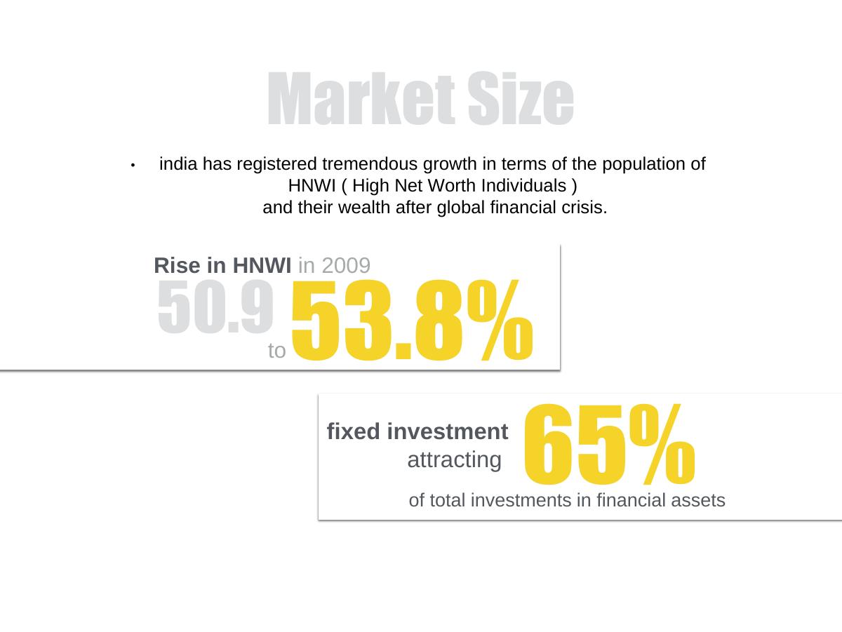
The most visually confident slide in the deck, and the most quietly damaging. A headline bullet states that "india has registered tremendous growth in terms of the population of HNWI (High Net Worth Individuals) and their wealth after global financial crisis." Two boxed statistics follow in oversized yellow numerals: "Rise in HNWI in 2009 — 50.9 to 53.8%", and "fixed investment attracting 65% of total investments in financial assets."
Three problems compound here. First, the numbers are from 2009 in a deck dated 2015 — six-year-old data presented as the market case, with no attempt to bring it forward. Second, neither figure carries a source; there is no report name, no publisher, no footnote, nothing an investor could check in the thirty seconds they would spend checking. Third, the "50.9 to 53.8%" construction is ambiguous on its face: 50.9 has no unit, and it is not clear whether the reader is looking at a growth rate, a share, or a count in thousands.
The deeper failure is that none of it is a market size. High-net-worth individuals in India are not the segment this product serves — the problem slide explicitly named amateur investors. The market slide sizes a different, wealthier population than the one the product is for, and then sizes it with a percentage rather than a number of people or an amount of money. There is no TAM, no SAM, no serviceable segment, no revenue per user, and therefore no way to arrive at what this company could ever be worth.
The second statistic actively works against the pitch. If 65% of financial-asset investment in India was going into fixed investments, that is a statement that most of the money is not in equities — an argument that the addressable pool of stock-portfolio users is smaller than assumed. The deck presents it as supporting evidence.
Slide 6 — Competition
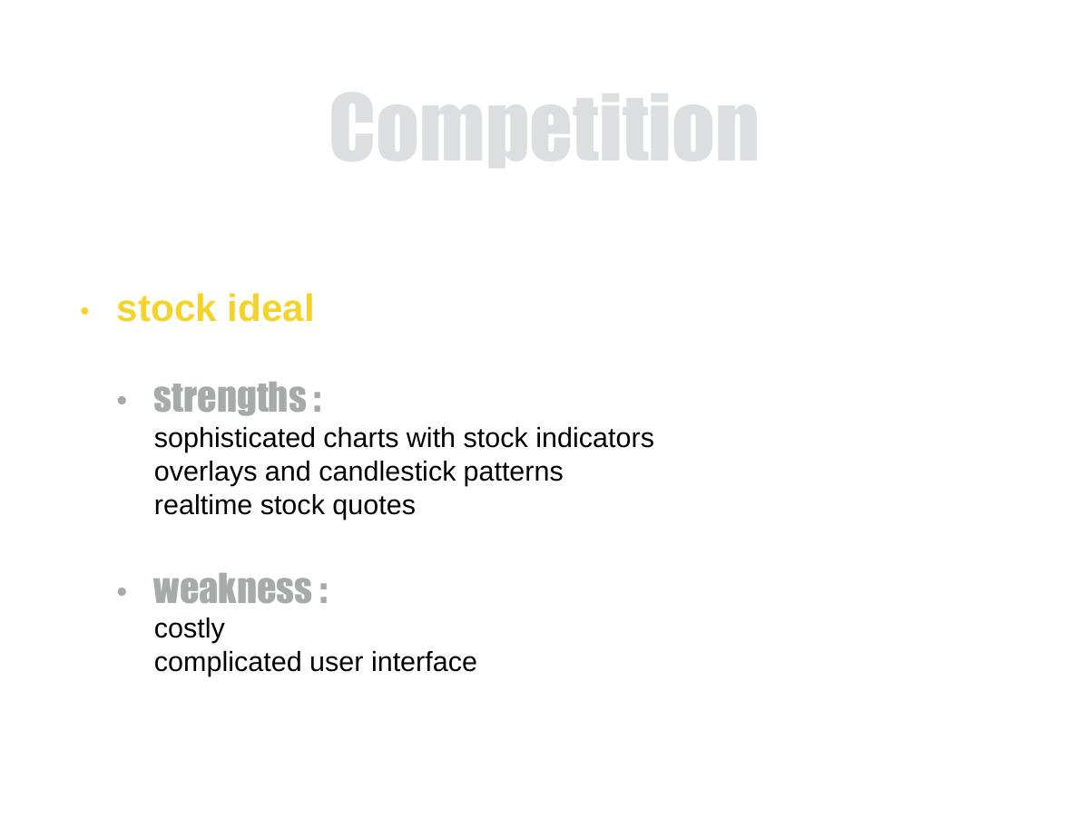
A single competitor: "stock ideal". Its strengths are listed as "sophisticated charts with stock indicators, overlays and candlestick patterns" and "realtime stock quotes". Its weaknesses: "costly" and "complicated user interface".
Crediting a competitor with real strengths is the right instinct and rarer than it should be. Most decks list rivals only to dismiss them; this one concedes that the incumbent has better charting and real-time data before attacking price and usability. That intellectual honesty is the best thing on the slide.
Everything else is a gap. One competitor in a category that in 2015 contained Moneycontrol, Economic Times Markets, broker-native apps from ICICI Direct and Sharekhan, Yahoo Finance, Google Finance and Bloomberg's mobile app — plus the spreadsheet that most retail investors actually used. Naming a single small rival tells an investor either that the founders did not survey the market or that they chose the opponent they could beat. Both readings are bad, and the second is worse.
There is also no number attached to "costly". If price is the wedge, the incumbent's price has to be on the slide, and so does yours.
Slide 7 — Product
Eight bullets: avatar based interface, realtime stock info, earnings report calendar, end of day stock scan, watchlist, grouping of stock portfolios, custom price alerts to warn when a stock passes a threshold, and a number of representation graphs to choose from.
This is a feature list, undifferentiated and unranked. Six of the eight items are table stakes that every competitor already shipped in 2015 — a watchlist, price alerts, real-time quotes and chart options were not reasons to switch apps. Only one item is genuinely unusual: "avatar based interface", which is the single most distinctive idea in the entire deck and receives four words and no explanation.
An avatar-based interface for novice stock investors is a real product thesis. It suggests guidance, personification, maybe a coaching layer that translates market movement into plain language. That is the answer to "how do you make expert functionality understandable to a beginner", which is the tension the solution slide raised and dropped. Buried at the top of an alphabet-soup bullet list, it reads like a UI preference.
The ranking failure is the transferable one: the deck sorts its features by nothing, so the reader has no way to tell which one is the company.
Slide 8 — Why is it better?
A paragraph: alternatives are too costly and have complicated, not-user-friendly interfaces; providing all existing functionality plus advanced features at a cheaper rate with a user-friendly design, and considering the market potential, "it would definitely be a hit".
The strategy stated here is to match every existing feature, add more, and charge less. That is a claim about resources, not about advantage, and it invites the obvious question the deck never answers: with what team, what capital and what time? A cheaper superset of the incumbent is the most expensive product strategy there is.
"It would definitely be a hit" is the sentence that costs the deck its credibility. It is an assertion of outcome in place of evidence, and it appears on the slide whose entire job is to supply the evidence. In a deck with no users, no revenue, no pilot and no waitlist, confidence is the only thing being offered — and confidence is exactly what an investor discounts to zero.
There is also no defensibility anywhere on this slide. Cheaper and prettier are both copyable by any funded incumbent inside a quarter. Nothing here describes what stops "stock ideal" from simplifying its interface and cutting its price the month after Stockmeister launches.
Slide 9 — Team
"DESIGNERS + CODERS. Perfect blend of Designers and coders. A perfect match to create a user friendly and functionally rich product like this. And with a good experience in marketing."
No names. No photographs. No roles. No prior companies, no universities, no LinkedIn, no GitHub, no years of experience, no count of people. The team slide of a pre-product, pre-revenue, pre-traction startup describes its founders by job category.
At the concept stage, the team slide is not one input among many — it is the primary asset being underwritten. With nothing shipped, the investor is buying the people. This slide makes that impossible, and it also removes any answer to the domain question that this specific idea demands: does anyone here understand capital markets? "Designers + coders" says explicitly that nobody does, or at least that nobody thought it worth claiming.
The deck ends here. There is no ask slide, no use of funds, no milestones, no contact page. A reader who wanted to invest after nine slides would have no name to reply to.
What this deck does better than most startup pitch decks
One idea per slide. Nine slides, nine distinct arguments, no slide trying to do two jobs. Most concept decks at this stage are three slides of dense text; this one respects the reader's attention. · A tagline that classifies the company instantly. "Easier way to manage your stock portfolio on the Go" places the product in a category, a form factor and a promise before slide two. · It names a segment. "Amateur investors" is a real, targetable population, and it is more specific than the "everyone who invests" framing that most consumer fintech decks default to. · It credits its competitor honestly. Listing "stock ideal" with genuine strengths — sophisticated charting, real-time quotes — before attacking price and usability is a level of fairness that reads as confidence rather than weakness. · Visual restraint. Two colours, one typeface family, enormous whitespace, no stock photography, no gradients. The deck looks like a product with taste, which for a company whose entire pitch is interface quality is a form of evidence in itself. · It leads with the problem, not the product. The wordmark appears on slide one, then the deck spends slide two on the user before returning to itself. That ordering is correct and many founders get it backwards.
Where this deck would fail in an investor meeting
No ask. Nine slides, no round size, no valuation, no use of funds, no runway, no stage. The meeting ends without a decision to make. · No contact details and no names. The PDF cannot be forwarded usefully. A partner who liked it could not route it to a colleague with a name attached. · No traction of any kind. No users, no waitlist, no beta, no interviews, no letters of intent, not even a count of people who said they wanted it. · No business model. The pitch rests on being "cheaper" than an incumbent whose price is never stated, and Stockmeister's own price is never stated either. Free? Freemium? Subscription? The deck does not say, so unit economics cannot exist. · Six-year-old, unsourced market data. 2009 HNWI figures in a 2015 deck, with no publisher named and no unit on the leading number. · The market is sized for the wrong segment. The problem slide targets amateur investors; the market slide sizes high-net-worth individuals. Those are different people with different products. · One competitor. In a category with a dozen live products in India alone, naming a single rival reads as either incomplete research or a chosen weak opponent. · No product visuals. A mobile app whose differentiator is interface quality, shown entirely in bullet points. · The differentiator is buried. "Avatar based interface" — the only original idea in the file — is bullet one of eight on a features slide, with no explanation. · Assertion in place of evidence. "It would definitely be a hit" is the deck's own conclusion about its outcome, offered where proof belongs. · No defensibility. Cheaper and simpler are both copyable within a quarter by any funded incumbent. · Anonymous team. "Designers + coders" at the stage where the team is the only asset being underwritten.
Concept deck vs investor deck
Dimension Stockmeister (2015 concept deck) What a seed investor deck carries
Problem "Frustrating" for amateur investors A named user, a measured cost, evidence from real conversations
Market 2009 HNWI percentages, unsourced Current TAM/SAM with a named source and a bottom-up build
Segment consistency Problem targets amateurs; market sizes HNWIs The same user across problem, market, product and pricing
Product Eight unranked feature bullets, no visuals Screenshots of the two flows that make the product different
Competition One rival, qualitative The full live set plus the status quo, on axes that matter to the user
Traction None Users, retention, waitlist, pilots or interview counts — something countable
Business model Absent; "cheaper" with no price Price point, revenue per user, acquisition cost, gross margin
Team "Designers + coders", no names Named founders, roles, domain proof, prior shipping record
How you would rebuild this deck today
Put the avatar interface on slide one. The distinctive idea leads. "A stock app that explains the market to you like a person" is a positioning line; "easier way to manage your portfolio" is a category description. Lead with the thing nobody else is doing. · Replace the feeling with a cost. Rewrite the problem slide around one named person — a first-time investor with a small portfolio — and what their confusion actually costs them in missed earnings dates, mistimed exits or abandoned accounts. Add the number of people you interviewed to reach that conclusion. · Rebuild "why now" around a real catalyst. One change in the world, with a date and a source: data costs, smartphone penetration, discount brokerage entry, digital account opening. If no such change exists, the honest conclusion is that the timing argument does not exist either. · Size the market bottom-up, for the right user. Retail demat accounts in your geography, times the share who are new investors, times a realistic annual price. Show the arithmetic on the slide and cite the source for the account number. Delete every percentage that is not attached to a population. · Show the product. Three screenshots: the avatar explaining a price move, the portfolio grouping view, and an alert firing. A mobile app deck without a screen is a description of a document, not a product. · Rank the features and cut five. Keep the avatar layer, the alerts and the portfolio grouping. Watchlists and chart options belong in an appendix, not in the eight-bullet list that dilutes your one original idea. · Widen the competition slide and pick real axes. Every live app in the category plus the spreadsheet, scored on beginner legibility and price. Put both prices on the slide, including yours. · Add the business model that "cheaper" implies. Your price, their price, revenue per user, and what acquisition costs in this category. "Cheaper" without a number is not a strategy. · Add any countable evidence. A hundred waitlist emails, twenty user interviews, a prototype with fifteen weekly testers. At concept stage, the smallest real number outperforms the largest projection. · Name the team and prove the domain. Faces, names, roles, what each person shipped before, and one sentence on who among you understands capital markets. If nobody does, say who your advisor is. · Add the ask and the contact. The amount, the four milestones it funds, the months of runway it buys, and an email address on the last slide.
The transferable lesson
Stockmeister's deck is not badly made. It is well-spaced, consistently styled, sensibly ordered and easy to read in ninety seconds. It fails for a reason that has nothing to do with design: every slide states a position and no slide supports one. The problem is asserted, the market is asserted with borrowed and stale numbers, the advantage is asserted, the outcome is asserted — "it would definitely be a hit" — and the team is asserted by job title.
That is the shape of most first decks, and it is invisible from the inside. When you have lived with an idea for months, the evidence feels present because it exists in your head. On the page, an investor sees only what you wrote down, and what Stockmeister wrote down was nine confident sentences with nothing underneath them.
The test is mechanical and you can run it on your own deck this afternoon. Go slide by slide and ask, for each claim: what on this page would let a stranger check it? A source, a screenshot, a number of users, a price, a name. Every slide that survives is load-bearing. Every slide that does not is a sentence you believe and the reader has no reason to.
Nine slides is not the problem here — plenty of companies have raised on less. The problem is nine slides in which the strongest idea in the company, an avatar interface that translates the market for beginners, appears once, in four words, in the middle of a bullet list. Find the equivalent line in your own deck and put it on slide one.
Frequently asked questions
- What is Stockmeister?
- Stockmeister was a proposed mobile app for managing a stock portfolio, pitched in a nine-slide deck dated August 2015 and aimed at amateur investors in India. The concept combined a beginner-friendly, avatar-based interface with expert features such as real-time quotes, an earnings calendar, end-of-day scans, watchlists, portfolio grouping and custom price alerts. The deck describes a concept only; it contains no product screenshots, users or revenue.
- Is the Stockmeister deck a real investor pitch deck?
- It follows the standard pitch structure — problem, solution, why now, market, competition, product, differentiation, team — but it is better described as a concept deck than a fundraising deck. There is no traction, no business model, no financials, no round size, no use of funds and no contact details, so nothing in it asks an investor to make a decision. It explains an idea rather than closing a raise.
- What is wrong with the Stockmeister market size slide?
- Three things. The data is from 2009 in a deck dated 2015, no source is named for either statistic, and the leading figure — '50.9 to 53.8%' — carries no unit. More fundamentally, it sizes high-net-worth individuals while the problem slide targets amateur investors, so it measures a different population than the product serves, and it gives a percentage rather than a number of users or an amount of money.
- What does the Stockmeister deck do well?
- It keeps one idea per slide across nine clean, well-spaced pages, and its tagline classifies the company in eleven words. It names a specific segment in amateur investors, and its competition slide credits the rival with genuine strengths — sophisticated charting and real-time quotes — before attacking price and usability. That fairness is rarer than it should be in early decks and reads as confidence.
- Which slides should founders copy from this deck?
- Two. The title slide, for a tagline that names category, form factor and promise in one line. And the competition slide's structure, which lists a rival's real strengths before its weaknesses instead of dismissing it. Copy neither the market slide nor the team slide: one uses stale unsourced data for the wrong segment, and the other describes the founders as 'designers + coders' with no names.
- What is missing from the Stockmeister pitch deck?
- The ask, above everything: no amount, no valuation, no use of funds, no runway. Also missing are any traction or user evidence, a business model or price point, product screenshots for an app whose pitch is interface quality, founder names and domain proof, a full competitive set, and an email address. Nine slides end with no name to reply to.