Stitch’s 2014 seed deck is a study in minimalist, high-impact storytelling. By leading with a single word—Loneliness—and backing it with a statistic that 35% of the population is affected (Slide 2), the founders immediately established a massive, underserved market. The deck successfully pivots from a generic social tool to a targeted platform for a demographic holding 70% of all wealth (Slide 2). While the deck is light on technical architecture and specific unit economics, it compensates with strong social proof through a dense press logo wall (Slide 7) and a clear growth trajectory showing…
Key takeaways
- The deck uses a minimalist 'one big idea per slide' format to maintain narrative momentum.
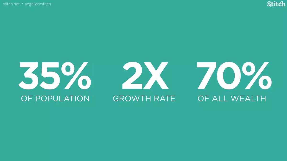
- Slide 2 establishes the market size through three key levers: 35% population impact, 2X growth rate, and 70% of all wealth ownership.
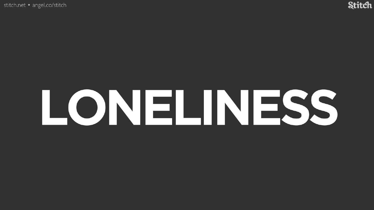
- The problem is framed emotionally on Slide 3 with the single word 'LONELINESS' in high-contrast typography.
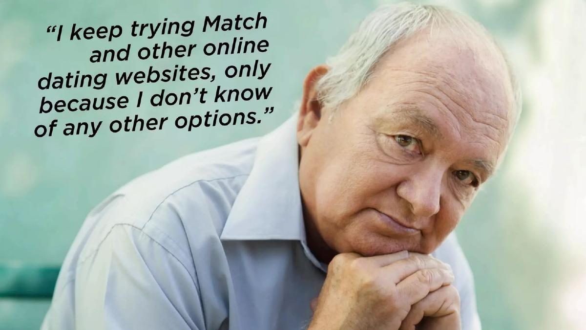
- User validation is provided via a direct quote on Slide 5, highlighting the failure of existing platforms like Match.com for this demographic.
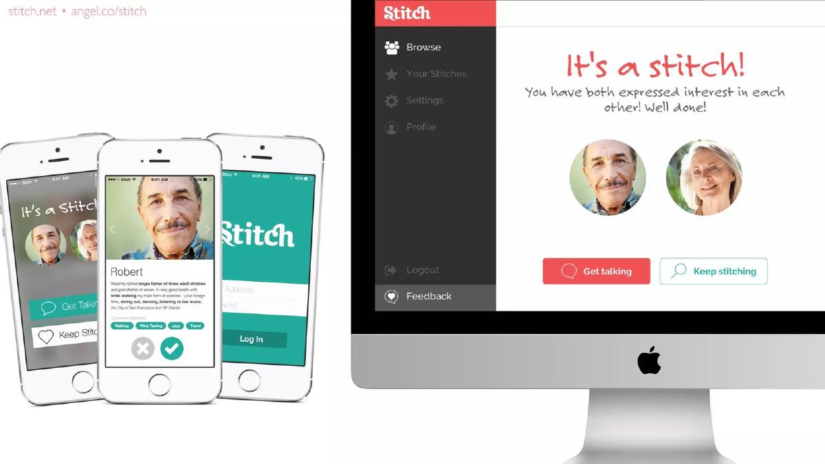
- Product screenshots on Slide 6 demonstrate a multi-device strategy (mobile and desktop) with a simple 'Get talking' call to action.
- Slide 7 features 18 major media logos, including NPR, Forbes, and The New Yorker, to establish immediate institutional credibility.
- Traction is visualized on Slide 8 with a steep growth curve reaching 4,000 users by July, alongside a claim of 1/2 the typical cost of acquisition.
- The team slide (Slide 11) uses logos from IBM, Honeywell, and Spark Networks to signal deep industry and technical experience.
The Power of Emotional Minimalism
The Stitch pitch deck from 2014 is a quintessential example of the 'less is more' philosophy in early-stage fundraising. At just 12 slides, it avoids the common pitfall of over-explaining technical features, choosing instead to focus on the psychological state of its target user and the massive economic power of the aging demographic. By framing the company around a universal human struggle—loneliness—Stitch transforms a niche dating app into a social mission with significant market potential.
Slides 1-3: The Emotional Hook and Macro Metrics
Slide 1 is a simple title card featuring the Stitch logo in white against a coral-red background. It is clean and establishes the brand's visual identity immediately. There are no taglines here, forcing the viewer to move to the next slide for context.
Slide 2 is arguably the most important slide in the deck. It presents three massive figures: 35% of Population , 2X Growth Rate , and 70% of All Wealth . This slide does the heavy lifting of market validation. It tells investors that the problem is widespread, the demographic is growing rapidly, and most importantly, the target customers have the disposable income to pay for a solution. It is a masterclass in using 'top-down' metrics to create a sense of inevitability.
Slide 3 delivers the emotional core of the pitch with one word: LONELINESS . By placing this in bold, white text on a dark grey background, the founders create a stark, somber moment in the presentation. It defines the 'Problem' slide not through a list of grievances, but through a single, relatable pain point.
Slides 4-5: Humanizing the Problem
Slide 4 features a full-bleed photograph of a middle-aged woman practicing yoga. This serves to define the 'new elderly'—active, healthy, and engaged. It subverts the stereotype of the frail senior, showing the 'aspirational' version of their target user.
Slide 5 provides the 'Voice of the Customer.' It shows an older man looking pensive with the quote: "I keep trying Match and other online dating websites, only because I don't know of any other options." This is a strategic strike at the incumbent. It suggests that while competitors like Match.com have the users, they do not have the affinity or the trust of this specific demographic. It highlights a 'pull' market where users are desperate for a better alternative.
Slides 6-7: The Solution and Social Proof
Slide 6 introduces the product interface. We see the app on three iPhones and a desktop Mac. The UI is clean, featuring 'Robert,' a "recently retired single father of three adult children and grandfather of seven." The slide emphasizes 'Common Interests' such as Walking, Wine Tasting, Jazz, and Travel . The 'It's a stitch!' notification replaces the 'It's a Match!' trope, reinforcing the idea of companionship over just dating.
Slide 7 is a 'Logo Wall' of press coverage. It is exceptionally dense, featuring 18 outlets including NPR, Forbes, The New Yorker, Bloomberg Television, The Atlantic, and Mashable . For a Seed-stage company, this level of earned media is a powerful validator. it tells investors that the 'loneliness epidemic' is a trending cultural topic and that Stitch is already the face of that conversation.
Slides 8-10: Traction and Community
Slide 8 focuses on growth. A simple line graph shows a trajectory from 0 users in April to 4,000 users in July . To the right, a large 1/2 fraction is labeled COST OF ACQUISITION . This implies that their organic or viral growth is significantly more efficient than competitors, though the deck omits the actual CAC and LTV (Lifetime Value) figures.
Slide 9 and Slide 10 are visual montages of the community. Slide 9 shows a grid of diverse, smiling seniors. Slide 10 uses the same grid but fades most of the images to black and white, perhaps to emphasize the individuals the platform has already 'stitched' together. These slides are intended to prove that the platform is already 'alive' and populated by real people, moving the pitch from theory to reality.
Slide 11: The 'Awesome Team'
The team slide features four key figures. Andrew Dowling (Founder & CEO) and Marcie Rogo (Founder & CMO) are positioned alongside Phil Reither (CTO) and Ken Solin . Solin is specifically noted for his work with HuffPost50 and Boomer Dating , providing the domain expertise necessary for this niche. The bottom of the slide features a strong corporate pedigree with logos from IBM, Honeywell, Aon, and Spark Networks (the parent company of JDate). This mix of big-tech experience and dating-industry specific knowledge is a strong signal for Seed investors.
Slide 12: The Closing
The final slide features a photo of "Our First Stitch" —an older couple embracing. The tagline "BECAUSE EVERYONE NEEDS COMPANY" brings the narrative back to the emotional hook of Slide 3. It provides contact info and an AngelList URL, but notably lacks a specific financial 'Ask.'
What Stitch Omitted
While the deck is narratively strong, it leaves several critical questions unanswered for a professional investor. First, there is no business model slide . We do not know if Stitch intends to charge users a monthly fee, sell advertising, or partner with travel and healthcare providers. Second, there is no 'Ask' . The deck doesn't specify how much capital they are seeking or what the milestones for that capital will be. Third, the Unit Economics are missing; while they claim 1/2 the CAC of competitors, they don't provide the baseline or the actual cost, making it difficult to model the company's scalability.
What Founders Should Copy
Founders should emulate Stitch's ability to frame a market through wealth rather than just headcount . By pointing out that their demographic holds 70% of all wealth, they immediately answer the 'Can they pay?' question. Additionally, the use of a single-word problem slide (Slide 3) is a powerful way to command a room and ensure the audience is focused on the 'Why' before being inundated with the 'How.' Finally, the competitor quote on Slide 5 is a brilliant way to show market dissatisfaction without using a standard, often-ignored 'Feature Checklist' comparison grid.
Final Analysis
Stitch successfully raised $100K because they sold a vision of a social utility for the wealthiest demographic in the world. They didn't pitch a 'dating app for old people'; they pitched a solution to a public health crisis (loneliness) for a demographic that the rest of Silicon Valley was largely ignoring in 2014. The deck's reliance on high-quality imagery and minimal text ensures that the founder's spoken pitch remains the center of attention, with the slides serving as emotional and statistical punctuation.
Frequently asked questions
- How much did Stitch raise with this deck?
- According to catalogue facts from failory.com, Stitch raised $100,000 in a Seed round in 2014. The deck itself does not state the amount being raised or the valuation, which is common for decks shared publicly after the round or used as a teaser.
- What is the primary business model for Stitch?
- The deck does not explicitly detail its revenue streams or pricing tiers. While the catalogue listing classifies the business model as 'Other,' the product screenshots on Slide 6 suggest a subscription or freemium community model similar to other social networking and companionship platforms.
- Who is the target audience for Stitch?
- Stitch targets the elderly and 'Boomer' demographic. Slide 2 notes this group holds 70% of all wealth, and Slide 11 features Ken Solin, an expert in 'Boomer Dating,' confirming the platform's focus on older adults seeking companionship rather than just traditional dating.
- How does Stitch differentiate itself from Match.com?
- Stitch uses Slide 5 to position itself as the only viable alternative for seniors who feel forced to use Match.com due to a lack of options. It frames the solution on Slide 6 as a 'Stitch'—a connection based on shared interests like walking, wine tasting, and jazz, rather than the high-pressure environment of standard dating sites.
- What traction did the company have at the time of the pitch?
- Slide 8 shows rapid early growth over a four-month period. Starting at 0 users in April, the company grew to 300 in May, 2,000 in June, and 4,000 in July. The slide also claims their cost of acquisition is '1/2' of the industry standard, though it doesn't provide the specific dollar amount.