The 2011 Poshmark deck (then branded as GoshPosh) is a foundational document for mobile-first marketplaces. At a time when eBay dominated resale through search-based web interfaces, Poshmark proposed a 'discovery-based' model centered on the smartphone. The deck successfully argues that the friction of listing items was the primary barrier to supply, which they solved via mobile photo filters—a direct nod to the then-nascent Instagram. With a clear 20% transaction fee model and a roadmap to $1B in Gross Merchandise Value (GMV), the founders presented a highly scalable vision. While the deck l…
Key takeaways
- The company originally pitched under the name GoshPosh in January 2011 (Slide 1).
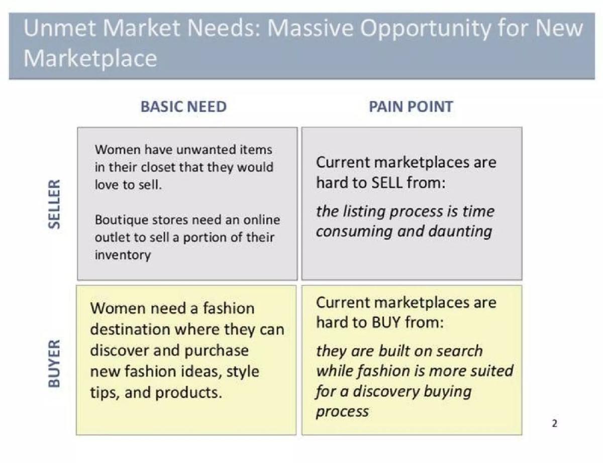
- The core problem identified was that current marketplaces were 'built on search' while fashion requires a 'discovery buying process' (Slide 2).
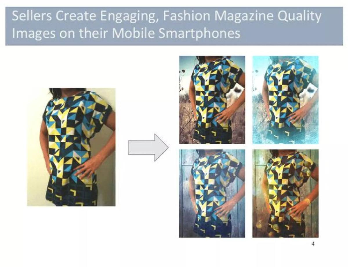
- Poshmark aimed to solve listing friction by allowing users to convert mobile photos into 'fashion quality' images using filters (Slide 4).
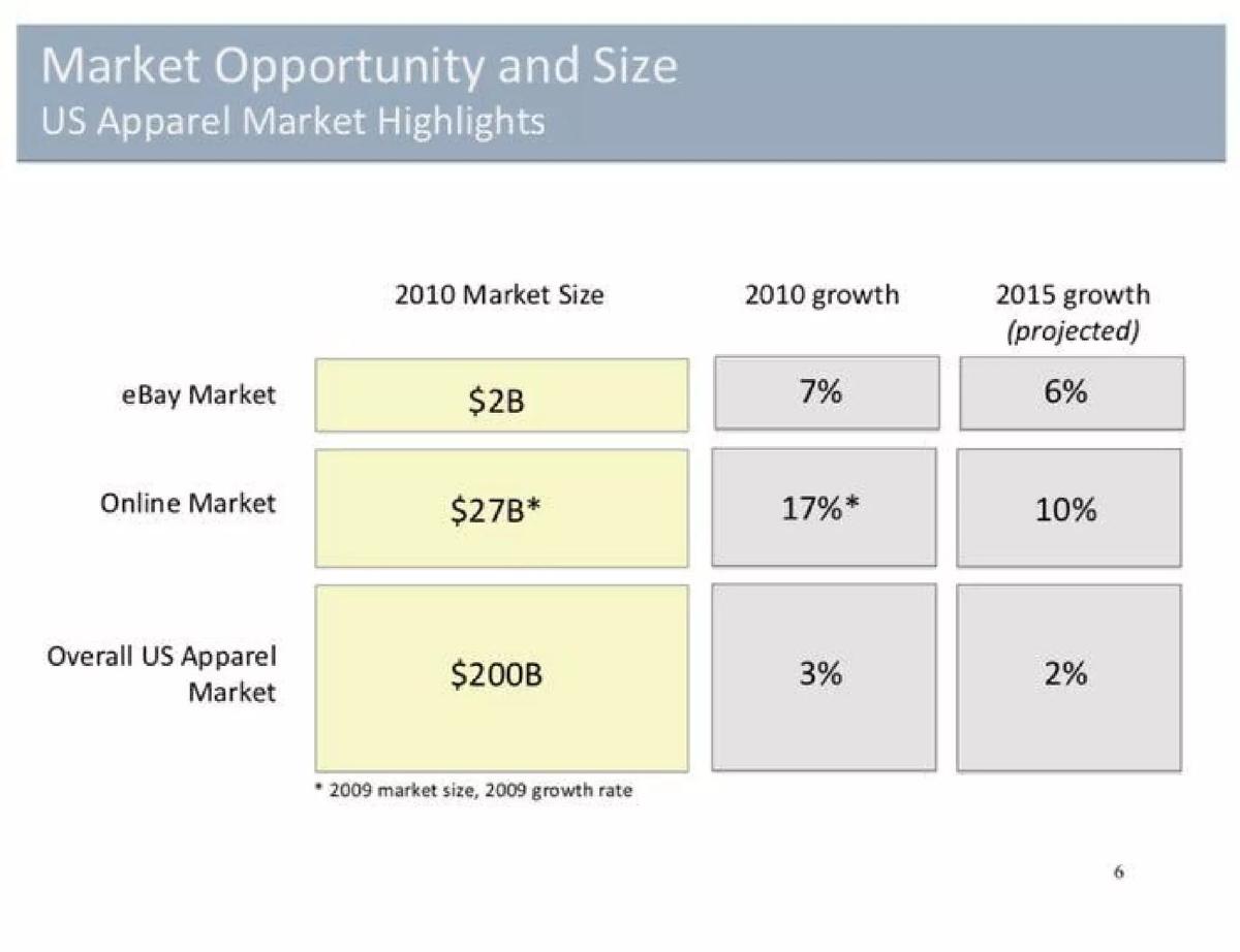
- The deck cites a $200B overall US apparel market with a $2B niche specifically within eBay (Slide 6).
- A key growth strategy involved 'seeding' the marketplace with fashion bloggers and independent boutiques to ensure high-quality inventory (Slide 9).
- The business model was built on a 20% transaction fee and a flat $9.95 shipping fee (Slide 13).
- The founders projected that 2-3 million active users could lead to a $1B GMV business (Slide 15).
- The deck completely omits a dedicated team slide featuring specific names, bios, or past successes (Slide 16).
The GoshPosh Era: Poshmark's 2011 Vision
In January 2011, the company we now know as Poshmark was pitching under the name GoshPosh . This 16-slide deck, prepared for Mayfield Fund, represents a pivotal moment in e-commerce history. It captures the transition from web-based, search-driven shopping to mobile-first, social discovery. The deck is remarkably focused on the 'how' of marketplace mechanics, emphasizing the removal of friction for sellers and the creation of a social loop for buyers.
Slides 1-3: The Core Thesis
Slide 1 introduces the brand as GoshPosh, described as a 'simple discovery-based marketplace' for fashion via mobile phones. The date, January 2011, is critical; the iPhone 4 had recently launched, and the concept of high-quality mobile photography was just becoming a reality for the average consumer.
Slide 2 breaks down the 'Unmet Market Needs.' The founders categorize these into Seller and Buyer pain points. For sellers, the listing process on current marketplaces (implicitly eBay) is 'time consuming and daunting.' For buyers, the problem is that existing platforms are 'built on search,' whereas fashion is better suited for a 'discovery buying process.' This slide sets the stage for the entire product strategy: simplify the supply side and socialize the demand side.
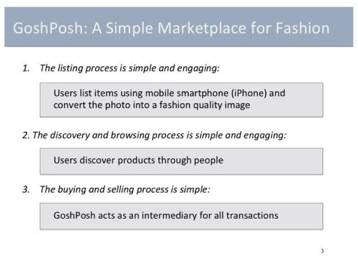
Slide 3 outlines the three-pronged solution: a simple listing process via smartphone, discovery through people, and an intermediary model where GoshPosh handles the transaction. This is a classic 'Problem/Solution' setup that clearly articulates the value proposition before diving into the details.
Slides 4-5: The Product Experience
Slide 4 is perhaps the most important slide for the 2011 context. It shows a 'before and after' of a dress photo. By using mobile filters, a standard snapshot is transformed into what the deck calls 'Fashion Magazine Quality Images.' This was a direct response to the 'ugly' photos that plagued eBay listings at the time. It proved that the smartphone could be a production tool, not just a consumption tool.
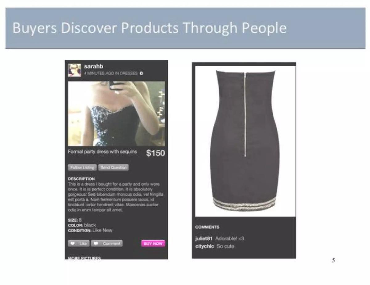
Slide 5 showcases the buyer experience. It features a mobile UI with social elements: a 'Follow Listing' button, a 'Send Question' button, and a comments section where users say 'Adorable!' and 'So cute.' This confirmed that GoshPosh wasn't just a shop; it was a social network. The 'Buy Now' button is prominent, indicating a frictionless path to purchase.
Slides 6-8: Market Validation
Slide 6 provides the macro view of the US Apparel Market. It cites a $200B total market, a $27B online market, and a $2B specific market within eBay. By showing that the online market was growing at 17% while the overall market grew at 3%, the founders highlighted the tailwinds they were riding.
Slide 7 drills down into the 'Fashion Resale and Boutique Market.' It notes that 10 million buyers purchased $2B of fashion on eBay in 2010 and that 13 pieces of clothing are sold every minute through eBay's mobile apps. This slide is crucial because it proves the behavior (buying used clothes) already exists; GoshPosh just intends to provide a better interface for it.
Slide 8 uses 'Customer Feedback' to add a human element. Quotes from a 'User Experience Designer' and a 'Fashion Designer' validate the need for an easier way to 'trim my closet.' One quote specifically mentions losing faith in the 'whole eBay thing,' which reinforces the competitive gap identified earlier.
Slides 9-11: Growth and Roadmap
Slide 9 addresses the 'Cold Start' problem. To seed the marketplace, they identified three key seller groups: Power Sellers, Independent Boutiques, and Fashion Bloggers. This was a sophisticated approach to supply-side acquisition, recognizing that high-quality inventory attracts buyers.
Slide 10 illustrates the 'Virtuous Cycle of Marketplace Growth.' It shows a loop: Recruit Seed Users -> Engage Users -> Create Listings -> Share Listings (via Twitter and Facebook) -> Recruit New Users. This social flywheel was the engine of Poshmark's eventual massive scale.
Slide 11 provides the 'Key Milestones by Quarter 2011-2012.' It shows a clear path from 'Financing Complete' in Q1 2011 to 'Hit Critical Usage & Trans. Milestones' by Q1 2012. This timeline gave investors a sense of the founders' urgency and operational discipline.
Slides 12-13: Logistics and Business Model
Slide 12 focuses on the 'Intermediary' role. A comparison table shows how GoshPosh compares to Chegg, ThredUp, and StubHub. By providing labels and centralizing shipping costs, GoshPosh aimed to remove the 'shipping friction' that often kills peer-to-peer deals. This was a strategic move to own the end-to-end experience.
Slide 13 is the 'Business Model Highlights.' It is refreshingly simple: No Listing Fees , 20% Transaction Fees , and a $9.95 Shipping Fee . The slide projects that $100M of GMV would lead to $20M-$30M in Gross Revenue . This clear math is exactly what investors want to see in a marketplace pitch.
Slides 14-16: Technology and Conclusion
Slide 14 shows the 'Technology behind GoshPosh.' It’s a standard stack diagram featuring Amazon CloudFront, PHP, Java, and various sub-systems (Feed, Commerce, User, Image). It notes that an Android app and 3rd Party APIs are 'Future' goals, keeping the initial focus strictly on the iPhone.
Slide 15 presents the 'Scale' vision. It posits that with 2-3 million 'xacting' users (likely a typo for 'acting' or 'active'), the business could achieve $1B GMV . It breaks down the user base into Occasional Buyers (65%), Casual Buyers (30%), and Power Buyers (5%), showing a deep understanding of user segments.
Slide 16 is the 'Summary.' It reiterates the three pillars: Innovative product (mobile/camera), Well-rounded team, and Large/Growing market. Interestingly, this is the only mention of the team, and it remains entirely generic.
What Works in This Deck
The deck’s greatest strength is its clarity of purpose . The founders didn't try to be everything to everyone; they focused strictly on the intersection of mobile, fashion, and social. The use of Slide 4 to show how filters solve the 'ugly photo' problem is a masterclass in demonstrating a product-led solution to a marketplace supply problem. Furthermore, the business model on Slide 13 is unambiguous. There are no complex 'freemium' tiers or advertising models—just a straight 20% cut of a massive and growing market.
What Is Missing
The most significant omission is a Team Slide . In 2011, Poshmark was a pre-launch or very early-stage venture. At that stage, investors are betting on the people. While the summary slide claims a 'well rounded team,' the deck provides no evidence of who these people are. Additionally, there is no 'The Ask' slide . The deck doesn't specify how much money they are looking for or how they plan to allocate the capital. While this information might have been delivered verbally or in a separate document, its absence in the deck leaves a gap in the narrative.
What a Founder Should Copy
Founders should emulate the 'Virtuous Cycle' (Slide 10) and the 'Seeding' strategy (Slide 9) . Many marketplace decks fail because they don't explain how they will solve the chicken-and-egg problem. Poshmark explicitly stated they would target bloggers and boutiques to ensure the platform looked good on Day 1. Another takeaway is the competitive positioning on Slide 2 . Instead of just listing features, they identified a fundamental architectural flaw in their biggest competitor (eBay's search-based UI) and built their entire value proposition around the opposite approach (discovery-based UI).
Company: Poshmark (pitched as GoshPosh) · Sector: E-Commerce / Social Commerce · Stage: Early (2011) · Year: 2011 · Slides: 16 · Deck Type: Investor Pitch Deck · Outcome: Raised $153M total across multiple rounds (Catalogue Fact) · HQ: Redwood City, CA (Catalogue Fact)
Frequently asked questions
- What was Poshmark's original name and why does it matter?
- Poshmark originally pitched as 'GoshPosh' in 2011. This is a common occurrence in early-stage fundraising where the brand identity is still fluid. The name change to Poshmark later helped elevate the brand's perceived value, moving away from a 'cutesy' startup name to one that suggests luxury and curation, which aligned better with their 'fashion magazine quality' image goal.
- How did Poshmark plan to compete with eBay in 2011?
- Poshmark identified that eBay was built for search, which works for commodities but fails for fashion discovery. According to slide 2, they focused on the 'daunting' listing process on eBay. By making listing as simple as taking a photo on an iPhone and applying a filter, they lowered the barrier to entry for supply, effectively unlocking 'closet' inventory that was previously dormant.
- What were the specific unit economics proposed in the deck?
- The deck outlined a very clear revenue model on slide 13: zero listing fees to encourage volume, a 20% transaction fee on sales, and a $9.95 shipping fee. They projected that $100M in Gross Merchandise Value (GMV) would yield $20M to $30M in gross revenue, suggesting they expected to capture significant value from both commissions and shipping margins.
- How did the deck address the 'cold start' problem of marketplaces?
- Slide 9 and 10 detail a 'virtuous cycle' strategy. They planned to 'seed' the marketplace by identifying power sellers, independent boutiques, and fashion bloggers. By recruiting these high-influence users first, they ensured the platform had 'magazine quality' content immediately, which then attracted buyers who would share listings on Facebook and Twitter to recruit more users.
- What is the biggest weakness of this specific pitch deck?
- The most glaring omission is the lack of a team slide. While slide 16 mentions a 'well rounded team,' it provides no names, photos, or credentials. In early-stage venture capital, the team is often the most important factor. Investors in 2011 likely knew the founders (Manish Chandra had previously founded Kaboodle), but for a standalone deck, this is a significant missing piece.