SpineZone’s 2014 Series A deck is a study in extreme brevity, consisting of only seven slides. Despite the short length, the company successfully raised $12 million by targeting the massive $100 billion annual spend on musculoskeletal (MSK) care. The deck relies heavily on visual metaphors—comparing the current 'fragmented' care path to a maze and their own solution to a clear, stepped progression. By highlighting significant clinical outcomes, such as an 80% reduction in opioid use and a halving of surgery rates, SpineZone made a compelling case for their hybrid online/in-clinic model. While…
Key takeaways
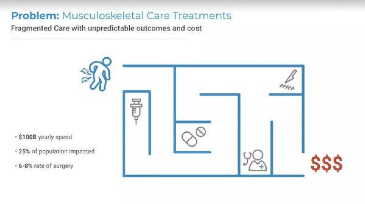
- The deck identifies a $100B yearly spend in the musculoskeletal sector on slide 2.
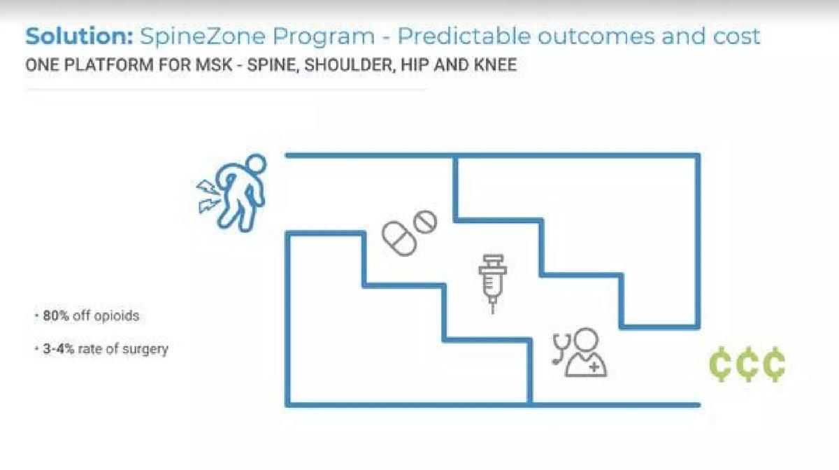
- SpineZone claims to reduce surgery rates from a market average of 6-8% down to 3-4% on slide 3.
- The solution boasts an 80% reduction in opioid use according to slide 3.
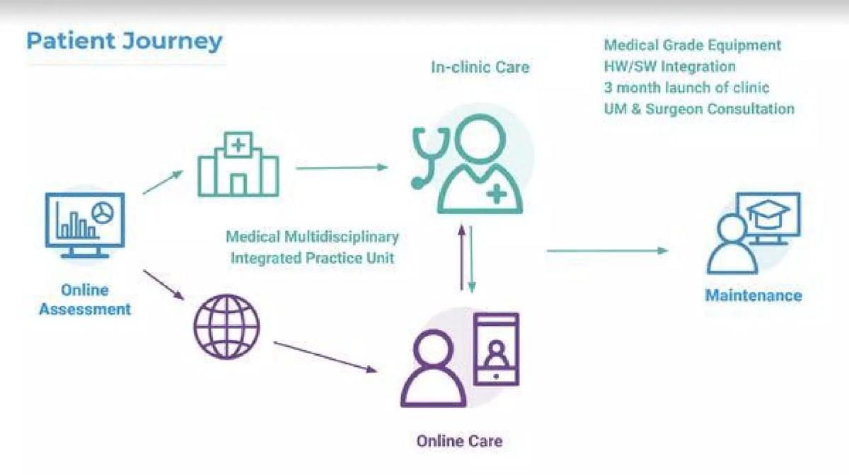
- The business model utilizes a hybrid approach, integrating online assessments with in-clinic care and medical-grade equipment as shown on slide 4.
- The company demonstrates a fast deployment capability, citing a 3-month launch time for new clinics on slide 4.
- Slide 6 displays significant enterprise and healthcare traction with logos from Qualcomm, Anthem BlueCross BlueShield, and Scripps.
- The deck completely omits a team slide, financial history, and the specific terms of the investment round.
- The presentation relies on a 'maze vs. stairs' visual metaphor to contrast fragmented care with their integrated platform on slides 2 and 3.
The Minimalist Path to a $12M Series A
SpineZone’s pitch deck from 2014 is an anomaly in the world of Series A fundraising. At just seven slides, it ignores almost every standard convention of the 'perfect' pitch deck. There is no team slide, no competitive landscape, no financial projections, and no clear 'ask.' However, the company successfully raised $12 million. This teardown examines how a lean narrative focused on massive market pain and high-tier traction can sometimes outweigh a comprehensive slide count.
Slide 1: Title and Positioning
The cover slide introduces 'The SpineZone Approach to Musculoskeletal Health.' It immediately identifies the target customers: Health Systems, Health Plans, and Employers. The imagery of a woman performing a core exercise reinforces the 'non-operative' and 'personalized treatment' nature of the business mentioned in the catalogue listing. It sets a tone of wellness and active recovery rather than clinical intervention.
Slide 2: The $100 Billion Maze
The problem slide is highly effective in its simplicity. It uses a maze graphic to represent 'Fragmented Care with unpredictable outcomes and cost.' The slide lists three critical data points: $100B yearly spend , 25% of population impacted , and a 6-8% rate of surgery . The use of a red '$$$' at the end of the maze visually communicates that the current system is a financial drain for payers. By framing the problem through the lens of the payer rather than just the patient, SpineZone aligns itself with the entities that actually write the checks in healthcare.
Slide 3: The Structured Solution
Slide 3 mirrors the layout of the problem slide but replaces the maze with a set of stairs. This visual metaphor suggests a guided, predictable path. The headline explicitly promises 'Predictable outcomes and cost' and defines the scope as 'ONE PLATFORM FOR MSK - SPINE, SHOULDER, HIP AND KNEE.' The most compelling parts of this slide are the clinical outcomes: 80% off opioids and a 3-4% rate of surgery . By showing a 50% reduction in surgery rates compared to the previous slide, SpineZone presents a massive cost-saving opportunity for insurance companies.
Slide 4: The Hybrid Patient Journey
This slide explains the operational flow of the business. It starts with an 'Online Assessment' which then branches into 'In-clinic Care' or 'Online Care.' This is a critical distinction for a Series A company; it shows they aren't just a brick-and-mortar physical therapy chain, nor are they a pure telehealth app. They are an integrated platform. The slide also notes 'Medical Grade Equipment,' 'HW/SW Integration,' and a '3 month launch of clinic.' The three-month launch metric is particularly important for investors as it speaks to the company's ability to scale its physical footprint rapidly.
Slide 5: Physical Proof
Slide 5 is a full-bleed photograph of a SpineZone facility. It shows patients using specialized medical equipment with clinicians nearby. In a deck that is otherwise very abstract and icon-heavy, this slide serves as 'proof of life.' It confirms that the 'Integrated Practice Unit' mentioned on the previous slide is a functioning reality, not just a theoretical concept. The branding is prominent on the wall, reinforcing the company's identity.
Slide 6: Enterprise Traction
For a 7-slide deck, the 'Clients' slide does the heavy lifting. It features logos from major healthcare players like Scripps , Sharp Community Medical Group , and Providence St. Joseph Health . Even more impressive for a Series A startup are the employer and payer logos: Anthem BlueCross BlueShield , Qualcomm , and CalPERS . Having Qualcomm as a client suggests that SpineZone has successfully sold into the self-insured employer market, which is a high-margin, high-growth segment for MSK startups.
Slide 7: The Conclusion
The deck ends abruptly with a 'Thank You' slide containing the company logo and website. There is no summary of the investment opportunity, no breakdown of how the $12 million will be spent, and no contact information for the founders. This reinforces the idea that this deck was likely a 'teaser' or a visual accompaniment to a much deeper due diligence process.
What Works in the SpineZone Deck
The most successful element of this deck is the outcome-driven narrative . In healthcare, investors care about two things: clinical efficacy and cost reduction. SpineZone hits both hard on Slide 3 by citing specific percentages for surgery and opioid reduction. By quantifying the 'Solution,' they move beyond vague promises of 'better care' and into the realm of 'financial ROI.'
The visual consistency between the Problem (Slide 2) and Solution (Slide 3) is also a masterclass in slide design. By using the same icons and layout but changing the 'path' from a maze to stairs, they make the transition from the 'old way' to the 'new way' feel intuitive and inevitable.
Finally, the traction slide (Slide 6) is undeniable. In the mid-2010s, getting a contract with a giant like Anthem or a tech leader like Qualcomm was a significant signal of product-market fit. For many investors, those logos alone would justify the $12M valuation, regardless of how many slides were in the deck.
What is Missing
The omissions in this deck are glaring. The most significant is the Team Slide . In a Series A round, the pedigree of the founders and the medical advisory board is usually a top-three concern for VCs. Investors want to know if the founders have the clinical authority to navigate the complex regulatory environment of healthcare.
There is also a total lack of Financials and Unit Economics . While the deck mentions a '3 month launch of clinic,' it doesn't say how much it costs to open a clinic, what the payback period is, or what the average revenue per patient looks like. Without these numbers, it is impossible to judge the scalability of the business model from the deck alone.
Lastly, there is no Competitive Analysis . The MSK space is crowded with both traditional physical therapy and digital-only competitors (like Hinge Health or Omada). SpineZone doesn't explain why their specific hardware/software integration is superior to existing alternatives.
What a Founder Should Copy
Founders should emulate SpineZone’s focus on 'The Big Number.' By starting with a $100 billion market problem, they immediately establish that this is a venture-scale opportunity. If your market is smaller, you need more slides to justify the investment; if your market is this large, you can afford to be brief.
The outcome-first approach is also worth copying. Don't just describe what your product does; describe the measurable change it creates in the world. SpineZone didn't just say they offer 'physical therapy'; they said they 'reduce surgery rates by 50%.' That is a much more investable statement.
Finally, use visual metaphors . The maze vs. stairs comparison is far more memorable than a bulleted list of pain points. If you can represent your industry's inefficiency with a single simple graphic, you will win the investor's attention much faster than with a wall of text.
Frequently asked questions
- How did SpineZone raise $12M with only 7 slides?
- The brevity of the deck suggests it was likely used as a visual aid for a presentation rather than a standalone document. The strength of the $12M round was likely driven by the massive market size ($100B spend) and the high-caliber client list shown on slide 6, which includes major payers and employers like Anthem and Qualcomm. Investors at the Series A stage prioritize proof of concept and traction, both of which are implied by these partnerships.
- What is the core value proposition of SpineZone?
- SpineZone positions itself as a 'One Platform for MSK' (Musculoskeletal) that provides predictable outcomes and costs. Their primary value is the avoidance of expensive and invasive interventions. By reducing surgery rates by 50% and opioid use by 80% (slide 3), they offer a clear ROI to health plans and employers who are currently navigating a 'fragmented' and expensive care maze.
- What are the biggest risks in this pitch deck?
- The lack of a team slide is a significant omission for a Series A deck, as investors typically want to see the medical and operational expertise behind a healthcare startup. Additionally, the deck does not address competition or the unit economics of their 'in-clinic' model. Because they require physical clinics and medical-grade equipment (slide 4), the business is more capital-intensive than a pure software play, yet the deck doesn't explain how they scale profitably.
- Is the hybrid online/in-person model clearly explained?
- Slide 4 provides a high-level 'Patient Journey' flowchart. It shows an online assessment leading to either a 'Medical Multidisciplinary Integrated Practice Unit' (in-clinic) or 'Online Care.' This illustrates a triage system where only necessary cases go to physical clinics, while others are managed digitally. This hybrid approach is a common strategy to maintain clinical efficacy while attempting to control overhead costs.
- What can founders learn from the 'Problem' and 'Solution' slides?
- SpineZone uses a very effective visual contrast. Slide 2 shows a 'maze' representing the current healthcare system, which is confusing and expensive. Slide 3 shows the 'Solution' as a set of stairs, representing a clear, guided path to recovery. This simple visual storytelling helps investors immediately grasp the 'before and after' state of the industry without needing to read dense paragraphs of text.