The myTips pitch deck is a masterclass in narrative simplicity, focusing almost entirely on the 'leaky bucket' problem of SaaS onboarding. By positioning their product as the 'Optimizely for onboarding,' the founders created a clear mental model for investors. The deck utilizes a progressive disclosure strategy, starting with a broad problem (low conversion) and narrowing down to a specific, no-code technical solution. While the deck lacks traditional slides like market sizing, competition, and a specific financial ask, its focus on product-led growth and a high-pedigree team (with experience…
Key takeaways
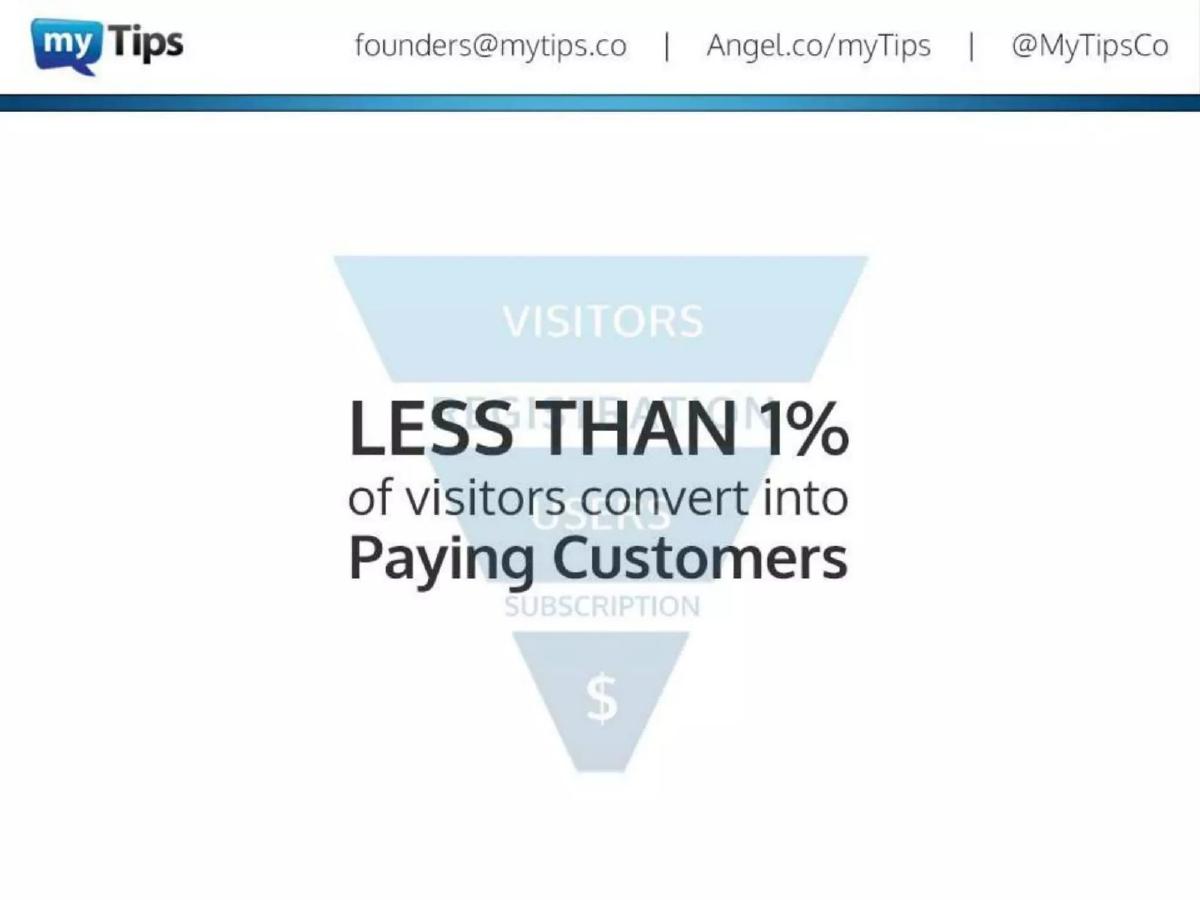
- The deck identifies a specific pain point: less than 1% of visitors convert into paying customers (Slide 5).
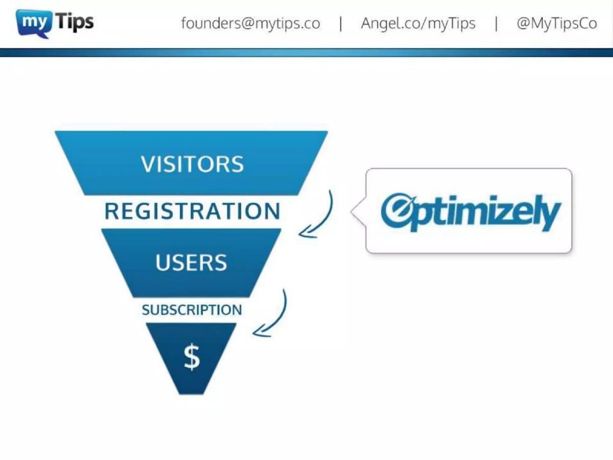
- It uses a competitive analogy by positioning itself alongside Optimizely in the conversion funnel (Slide 7).
- The product is defined as a 'Self-Service Platform to Build, Publish and A/B Test User Onboarding Experiences' (Slide 8).
- A key performance claim is made that the tool leads to 21% better user activation (Slide 11).
- The solution emphasizes a 'no-coding' requirement for deployment (Slide 14).
- The team slide highlights serial entrepreneurship, noting this is the third startup for two of the three founders (Slide 15).
- The deck completely omits a market size (TAM) slide and a specific financial ask.
- The visual design relies heavily on full-screen product mockups to demonstrate the 'Rich Feature SaaS Product' (Slide 9).
The Narrative of the Leaky Funnel
The myTips pitch deck, used for their 2013 seed round, is a focused 16-slide presentation that prioritizes problem-solution alignment over broad market statistics. At a time when SaaS was exploding, the founders identified that getting a user to sign up was only half the battle. The real challenge was the 'empty state' problem—users registering for a service but never reaching the 'aha moment' required to convert to a paid subscription. The deck uses a minimalist aesthetic and a clear funnel metaphor to argue that onboarding is the most underserved part of the sales process.
Slides 1-5: Defining the Conversion Crisis
Slide 1 opens with a direct mission statement: 'Convert Free-Trial Users into Paying Customers.' This is a high-intent opening that immediately tells an investor what business outcome the startup facilitates. Slide 2 is a transition slide featuring a photo of a person working at a laptop, likely intended to humanize the struggle of a user trying to navigate a new software product.
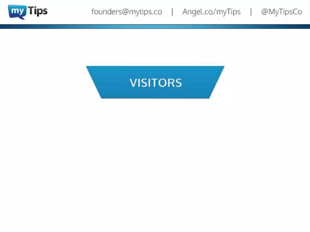
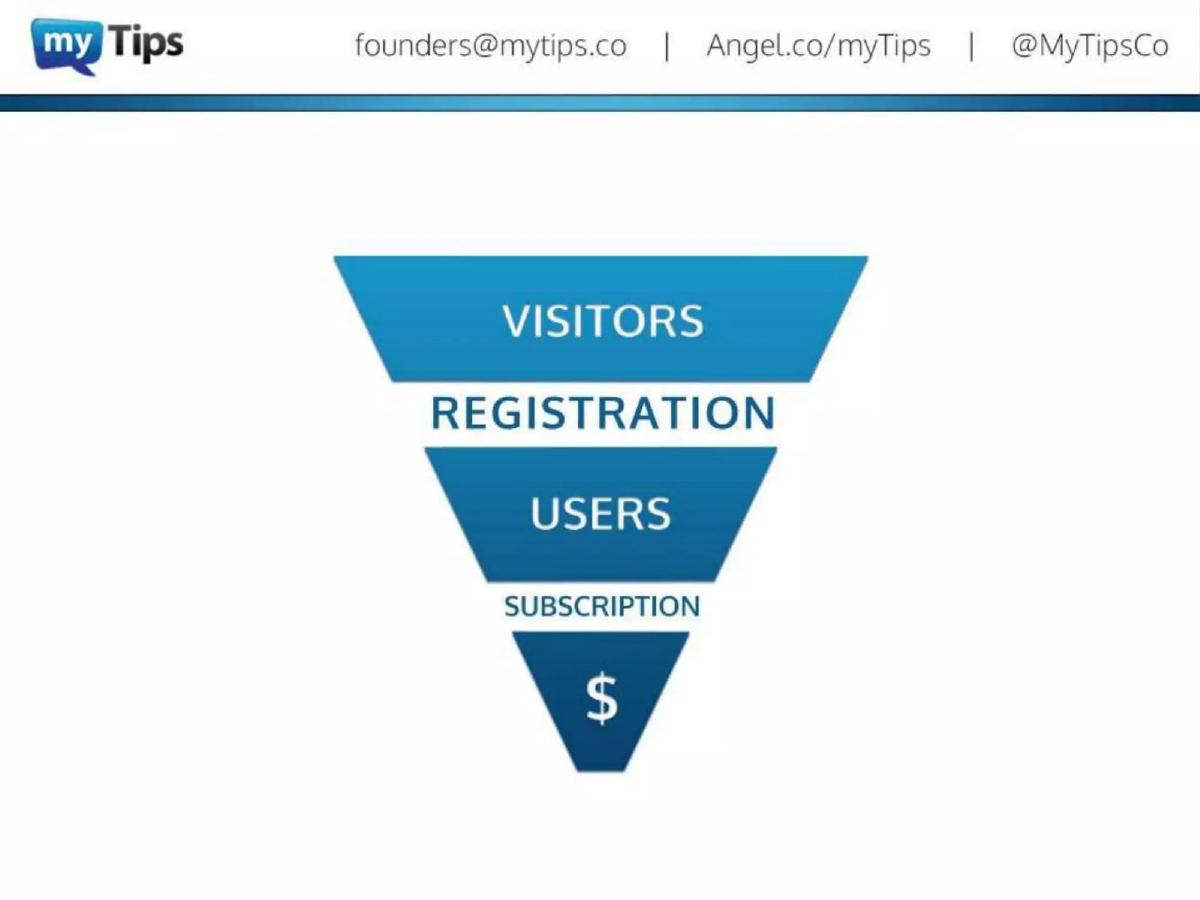
Slide 3, 4, and 5 build a progressive narrative using a sales funnel graphic. Slide 3 shows only the 'Visitors' stage. Slide 4 completes the funnel: Visitors, Registration, Users, Subscription, and finally, the dollar sign. Slide 5 delivers the 'villain' of the story, stating that 'LESS THAN 1% of visitors convert into Paying Customers.' By highlighting such a low conversion rate, the deck establishes a massive opportunity for improvement. If a tool can move that needle even slightly, the ROI for the customer is obvious.
Slides 6-7: The Optimizely Analogy
One of the most effective tactics in this deck appears on Slide 6 and 7 . Instead of listing competitors, the founders show where they fit in the existing tech stack. They place the Optimizely logo next to the 'Registration' phase of the funnel, acknowledging that tools already exist to get people to sign up. On Slide 7 , they place the myTips logo next to the 'Subscription' phase. This positioning is brilliant because it piggybacks on the success of Optimizely (which was a high-growth darling in 2013) and defines myTips as the 'Optimizely for the rest of the funnel.'
Slides 8-11: The Product and the Promise
Slide 8 introduces the solution: a 'Self-Service Platform to Build, Publish and A/B Test User Onboarding Experiences.' Crucially, it adds the phrase 'Right on Your Site & Without Coding.' In 2013, the 'no-code' movement was in its infancy, and the promise of allowing marketing or product managers to change the user experience without bothering the engineering team was a significant selling point.
Slide 9 and 10 show the product in action. The deck uses a mockup of a complex SaaS dashboard (Samanage) to demonstrate how myTips overlays interactive tutorials. Slide 10 specifically labels these as 'Product Tutorials.' Slide 11 provides the primary 'hook' for the investment: '21% Better User Activation.' This specific percentage gives investors a concrete metric to model the potential impact of the software.
Slides 12-14: Features and Ease of Use
Slide 12 highlights the 'Easy-to-Use Visual Builder,' reinforcing the no-code value proposition. Slide 13 shows the 'A/B Testing and Analytics Suite,' which includes a dashboard showing metrics like 'Tutorials created,' 'Tutorials played,' 'Tutorials completed,' and 'Tutorials abandoned.' The specific numbers shown in the mockup (e.g., 1023 tutorials played, 722 completed) suggest a product that is already functional and data-rich. Slide 14 reiterates the speed of implementation: 'User Onboarding in Minutes Without Coding.'
Slide 15: The Team
The Team Slide (Slide 15) is a strong closer for a seed round. It features three founders: Bogdan Suchyk, Igor Pashynnyk, and Roman Zadyrako. The deck emphasizes their experience by noting that this is the '3rd Startup' for two of them and the '2nd Startup' for the third. Furthermore, it displays logos for Magento, eBay, ING, and VTB Capital. For a $199,000 seed round, having a team with experience at a platform like Magento (which is entirely focused on e-commerce conversion) provides significant credibility for a conversion-optimization tool.
Slide 16: The Vision
The deck concludes on Slide 16 with the tagline 'User Onboarding as a Service.' This final slide includes the company URL, AngelList profile, and contact information, maintaining the clean, blue-gradient branding found throughout the presentation.
What Works in the myTips Deck
The most successful element of this deck is its singular focus . It does not try to be an all-in-one marketing suite; it focuses entirely on the transition from 'User' to 'Subscriber.' By using the funnel visualization, the founders make the problem feel tangible and the solution feel like a logical extension of existing workflows.
The competitive positioning is also a highlight. By aligning themselves with Optimizely, they avoid the 'we have no competitors' trap while simultaneously explaining their value proposition through a well-known industry proxy. This reduces the cognitive load on the investor.
Finally, the emphasis on 'No-Code' (Slides 8, 12, and 14) addresses a common objection in SaaS sales: the implementation bottleneck. By repeatedly stating that the tool works without coding, they signal a shorter sales cycle and higher user adoption rates.
What is Missing
Despite raising $199,000, the deck is missing several components that would be considered mandatory for a larger Series A round or even a modern seed deck:
Market Size (TAM): There is no mention of how many SaaS companies exist or the total addressable market for onboarding tools. Investors are left to assume the market is large based on the general growth of the software industry. · Business Model: The deck never explains how myTips makes money. Is it a monthly subscription? Is it based on the number of tutorials or the number of users? This is a significant omission. · Competition: While the Optimizely comparison is clever, it doesn't address direct competitors in the 'walkthrough' space (like WalkMe, which was founded in 2011). · The Ask: The deck ends without a call to action regarding funding. It does not state the amount being raised, the valuation, or the milestones the team intends to hit with the new capital.
What a Founder Should Copy
Founders should emulate the progressive disclosure of the problem seen in Slides 3 through 5. Starting with a blank funnel and filling it in helps the audience follow the logic of the business without being overwhelmed by data upfront.
The use of product mockups (Slides 9-13) is also exemplary. Rather than just listing features, the deck shows the product living inside a real-world application. This makes the 'Self-Service' and 'Visual Builder' claims feel real rather than theoretical.
Lastly, the Team Slide structure is excellent. Highlighting '2nd Startup' or '3rd Startup' is a quick way to signal 'founder-market fit' and resilience, which are often more important to seed investors than the specific details of the current product's code base.
Conclusion
The myTips deck is a product of its time—a 2013 Seed deck that relies on a strong 'why now' (the SaaS explosion) and a clear 'what' (onboarding optimization). While it lacks the financial rigor expected in today's more crowded market, its ability to distill a complex technical product into a simple funnel narrative remains a powerful lesson for any founder pitching a B2B utility tool. It successfully argues that in the world of SaaS, the product experience doesn't end at registration—it begins there.
Frequently asked questions
- What was the primary value proposition of myTips?
- The primary value proposition was increasing the conversion rate of free-trial users to paying customers. According to Slide 1, the goal was to 'Convert Free-Trial Users into Paying Customers' by solving the onboarding gap. They claimed to achieve 21% better user activation (Slide 11) by allowing companies to build and A/B test interactive tutorials without needing to write code.
- How did myTips position itself against competitors?
- The deck does not include a traditional competitor matrix. Instead, it uses an association strategy. On Slide 6 and 7, it shows a sales funnel where Optimizely handles the top-of-funnel (Visitors to Registration) and myTips handles the bottom-of-funnel (Users to Subscription). This framed the product as a necessary companion to established optimization tools rather than a direct rival.
- What evidence of traction did the deck provide?
- The deck is light on specific company-wide traction metrics like MRR or total customer count. The most significant data point provided is a performance metric on Slide 11, stating their solution provides '21% Better User Activation.' The rest of the 'traction' is implied through the team's pedigree and the maturity of the product screenshots shown in Slides 9 through 13.
- Who were the founders and what was their background?
- The team consisted of three members: Bogdan Suchyk (Design), Igor Pashynnyk (Development), and Roman Zadyrako (Distribution). Slide 15 highlights their experience, noting that this was the third startup for Suchyk and Zadyrako. The slide also displays logos for Magento, eBay, ING, and VTB Capital, suggesting prior professional experience at these major firms.
- What is missing from this pitch deck?
- This deck is missing several standard venture capital slides. There is no Market Size (TAM/SAM/SOM) slide, no Business Model/Pricing slide, no Competition slide, and no 'The Ask' slide detailing how much money they were raising or how they would spend it. According to catalogue facts, they raised $199,000, but that figure is not mentioned in the slides.