The myNurse (formerly Salusive Health) pitch deck is an outlier in the healthcare space, eschewing the typical dense medical jargon for a ultra-minimalist, high-impact visual style. Used during their 500 Startups Batch 23 demo day period in 2019, the 11-slide deck focuses heavily on the financial incentives for physicians and the regulatory tailwinds of Medicare licensing. By highlighting a $13B market opportunity and a specific $11k/month revenue figure per physician, the deck makes a compelling case for a scalable B2B2C model. While it lacks a formal 'Ask' slide or detailed competitive anal…
Key takeaways
- The deck identifies a $13B market opportunity on Slide 2, setting a large scale for the Seed stage.
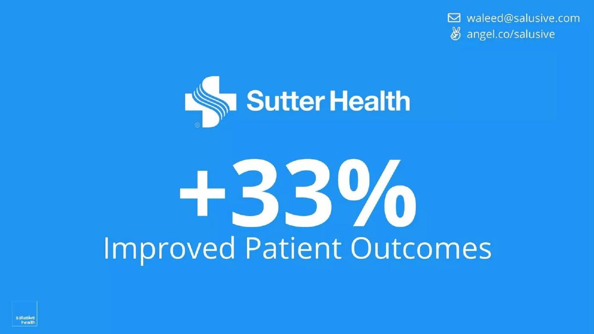
- A 33% improvement in patient outcomes is attributed to a partnership with Sutter Health on Slide 6.
- The business model is anchored by a specific $11k per month payment from Medicare to Salusive per physician, as stated on Slide 8.
- Physicians using the platform reportedly see a revenue increase of $65k per year according to Slide 7.
- The company reached $77k in signed MRR by the time of the deck's creation in 2019, shown on Slide 9.
- The team slide (Slide 10) leverages high-authority logos including Stanford Medicine, Siemens Healthcare, and Microsoft.
- The deck omits a formal 'Ask' slide, leaving the specific funding requirements and valuation unstated.
- Regulatory milestones are highlighted, specifically a patent filing in November 2015 and Medicare licensing in February 2018 on Slide 9.
The Ultra-Minimalist Approach to Healthcare Fundraising
The pitch deck for myNurse (formerly Salusive Health) is a fascinating example of the 'less is more' philosophy. In an industry often bogged down by complex clinical data and multi-layered insurance reimbursement schemes, Salusive Health opted for a deck that feels more like a consumer app pitch. With only 11 slides and a total word count that likely falls under 200, the deck relies on massive typography and high-contrast visuals to drive home a few key numbers. This teardown examines how they used this 500 Startups-style deck to signal massive traction in the Seed stage.
Slides 1-2: The Hook and the Prize
Slide 1: Title Slide The deck opens with a high-resolution image of a smiling physician and the tagline: "Helping physicians improve patient outcomes." It is a standard, safe opening that establishes the target user (physicians) and the ultimate goal (outcomes). The 500 Startups Batch 23 logo in the corner provides immediate institutional credibility.
Slide 2: Market Opportunity Immediately following the title, the founders present a $13B Market Opportunity . There is no breakdown of TAM, SAM, or SOM here. It is a singular, bold claim designed to anchor the investor's mind on a large number. While analysts might prefer a bottom-up calculation, for a demo day deck, this serves to establish that the ceiling is high enough to justify venture investment.
Slides 3-5: The Problem and the Product
Slide 3: The Physician's Burden This slide uses iconography to illustrate the problem without using a single word of text. A central physician figure is flanked by patients with 15-minute timers and phone call icons. It visually represents the time-constrained, high-volume nature of modern primary care. It is an effective way to communicate 'physician burnout' and 'inefficient monitoring' without cluttering the slide.
Slide 4: The Patient Interface We see the first glimpse of the product here. A mobile app dashboard shows a Glucose Meter reading of 105 mg/dL and a Blood Pressure Monitor. The imagery of elderly patients using a tablet suggests that the interface is simple enough for the target demographic. This slide establishes the 'Remote Patient Monitoring' (RPM) nature of the business.
Slide 5: The Clinical Dashboard The counterpart to the patient app is the physician/nurse dashboard. It shows a "Patient Chart" for a sample patient, Linda Evanston, featuring a longitudinal graph of vitals. The presence of a "New Encounter" button and "Physicians Order" section implies a workflow integration that goes beyond simple data collection. It suggests a professional tool for clinical decision support.
Slides 6-8: The Value Proposition and Unit Economics
Slide 6: Clinical Validation This is a high-signal slide. By placing the Sutter Health logo next to a +33% Improved Patient Outcomes metric, the company proves it has moved past the 'idea' phase. Partnering with a major health system like Sutter provides massive validation for a Seed-stage startup. The metric itself is broad, but in a pitch, it serves as a powerful headline.
Slide 7: Physician Incentive Healthcare startups often fail because they forget to answer "What's in it for the doctor?" Salusive answers this with +$65k/yr Revenue per Physician . This is a clear, quantifiable ROI that makes the sales process significantly easier. It transforms the product from a 'nice-to-have' clinical tool into a 'must-have' revenue generator.
Slide 8: The Business Model This slide clarifies the source of the revenue: Medicare Pays Salusive $11k/mo per Physician . This is the most important slide in the deck for a financial analyst. It identifies the payer (Medicare) and the specific unit of revenue. By tying their income to Medicare reimbursement codes, Salusive demonstrates a scalable, predictable revenue model that isn't dependent on patient out-of-pocket spending.
Slides 9-11: Traction, Team, and Summary
Slide 9: The Timeline of De-Risking The timeline highlights three critical milestones:
November 2015: Patent filed with the USPTO. · February 2018: Medicare Licensed. · Current (2019): $77K Signed MRR .
This slide is designed to show that the company has spent years building a moat (patent) and navigating the regulatory landscape (Medicare licensing) before hitting a significant revenue run rate. $77k MRR is nearly a $1M ARR pace, which is very strong for a Seed round.
Slide 10: The Team The team slide features Waleed (Founder & CEO), LaTesha (Clinical Lead), Jose (Technical Lead), and Cory (Product Lead). The strength of this slide comes from the logos at the bottom: Stanford Medicine, Siemens Healthcare, USC, Cisco, and Microsoft . This tells the investor that the team has the necessary pedigree in both clinical medicine and enterprise technology to execute the plan.
Slide 11: The Summary The deck ends by restating the three most powerful numbers: +33% Improved Patient Outcomes, $77K Signed MRR, and $13B Market Opportunity . It is a classic 'leave them with the highlights' closing.
What Works in This Deck
Clarity of Revenue: Most healthcare decks are vague about who pays and how much. Salusive is explicit: Medicare pays $11k per month per doctor. This removes a massive layer of uncertainty for investors who may not be experts in CPT codes.
Focus on ROI: By highlighting the $65k/year increase for physicians, the deck focuses on the primary driver of adoption in the B2B healthcare space. It frames the software as a profit center rather than a cost center.
Visual Brevity: The deck is designed to be spoken over. It doesn't compete with the presenter for the audience's attention. The large fonts ensure that even in a crowded demo day room, the key metrics are unmissable.
What is Missing
The Ask: There is no slide indicating how much money the company is raising or what they intend to do with it. While common in demo day decks, a standalone pitch deck usually requires a clear funding goal and a 18-24 month milestone plan.
Competition: The Remote Patient Monitoring space is crowded. The deck does not address how Salusive differs from incumbents or other well-funded startups in the RPM space. Investors would likely ask about their moat beyond the 2015 patent filing.
Churn and Retention: While $77k in signed MRR is impressive, there is no data on how many physicians have stayed on the platform or the 'stickiness' of the patient engagement. In healthcare, pilot programs often fail to convert to long-term contracts; evidence of retention would strengthen the case.
What a Founder Should Copy
The 'One Number Per Slide' Rule: If you have a truly impressive metric (like $77k MRR at Seed), don't bury it in a bulleted list. Give it its own slide. Make it huge. Salusive does this four times, and it creates a rhythmic sense of momentum.
Logo Authority: If you have worked at a prestigious institution or partnered with a major brand, use the logo. The Sutter Health and Stanford Medicine logos do more work in this deck than any paragraph of text could.
Regulatory as a Milestone: If your business requires licensing or compliance, frame it as a completed achievement rather than a future hurdle. Showing that you are already "Medicare Licensed" tells investors that the biggest binary risk has already been cleared.
Conclusion The Salusive Health deck is a high-conviction document. It assumes that the numbers are strong enough to speak for themselves. While it leaves many questions unanswered regarding the 'how' of the technology, it answers the 'why' and the 'how much' with startling clarity. For founders with genuine traction, this minimalist approach is a powerful way to signal confidence and focus.
Frequently asked questions
- What is the core value proposition for physicians in this deck?
- The deck positions Salusive Health as a significant revenue generator for medical practices. Slide 7 explicitly states that physicians can expect an additional $65,000 in revenue per year by using the service. This addresses the primary pain point of physician burnout and declining margins by offering a financial incentive tied to better patient monitoring.
- How does the company handle the complex regulatory environment of healthcare?
- Rather than explaining regulatory hurdles, the deck presents them as completed milestones. Slide 9 shows a timeline where the company filed a patent in November 2015 and achieved Medicare licensing in February 2018. This signals to investors that the 'heavy lifting' of compliance and reimbursement eligibility has already been handled.
- What evidence of product-market fit is provided?
- The deck provides three distinct signals of fit: clinical validation, financial validation, and commercial traction. Slide 6 cites a 33% improvement in patient outcomes with Sutter Health; Slide 8 highlights the $11k/month Medicare reimbursement; and Slide 9 confirms $77k in signed Monthly Recurring Revenue (MRR).
- Is there a clear explanation of how the technology works?
- The deck is very light on technical architecture. Slide 4 shows a patient-facing mobile app interface with glucose and blood pressure monitoring, while Slide 5 shows a clinical dashboard with patient charts and activity history. It suggests a remote patient monitoring (RPM) platform but does not detail the underlying AI or data processing.
- What is missing from this pitch deck that a typical VC would expect?
- This is a 'teaser' or 'demo day' style deck. It lacks a competitive landscape slide, a detailed go-to-market strategy, a breakdown of unit economics (CAC/LTV), and a specific use-of-funds slide. Founders using this style must be prepared to provide a much deeper data room to follow up on these high-level claims.