The myTips pitch deck (catalogued as Nancy) is a highly visual, product-centric presentation that addresses a specific pain point in the SaaS industry: low conversion rates from free trials to paid subscriptions. The deck uses a progressive funnel visualization to illustrate that less than 1% of visitors typically convert to paying customers. It positions myTips as a 'Self-Service Platform' to build and A/B test onboarding experiences without coding. While the deck excels at demonstrating the product interface and the team's serial entrepreneur background, it notably omits critical financial…
Key takeaways
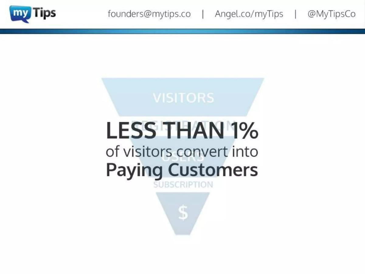
- The deck identifies a stark conversion problem, stating that 'LESS THAN 1%' of visitors convert into paying customers on slide 5.
- It positions the product as a no-code solution for building, publishing, and A/B testing user onboarding experiences (slide 8).
- The company claims a significant impact on user engagement, citing '21% Better User Activation' on slide 11.
- The team slide (slide 15) highlights serial entrepreneurship, with founders on their 2nd and 3rd startups.
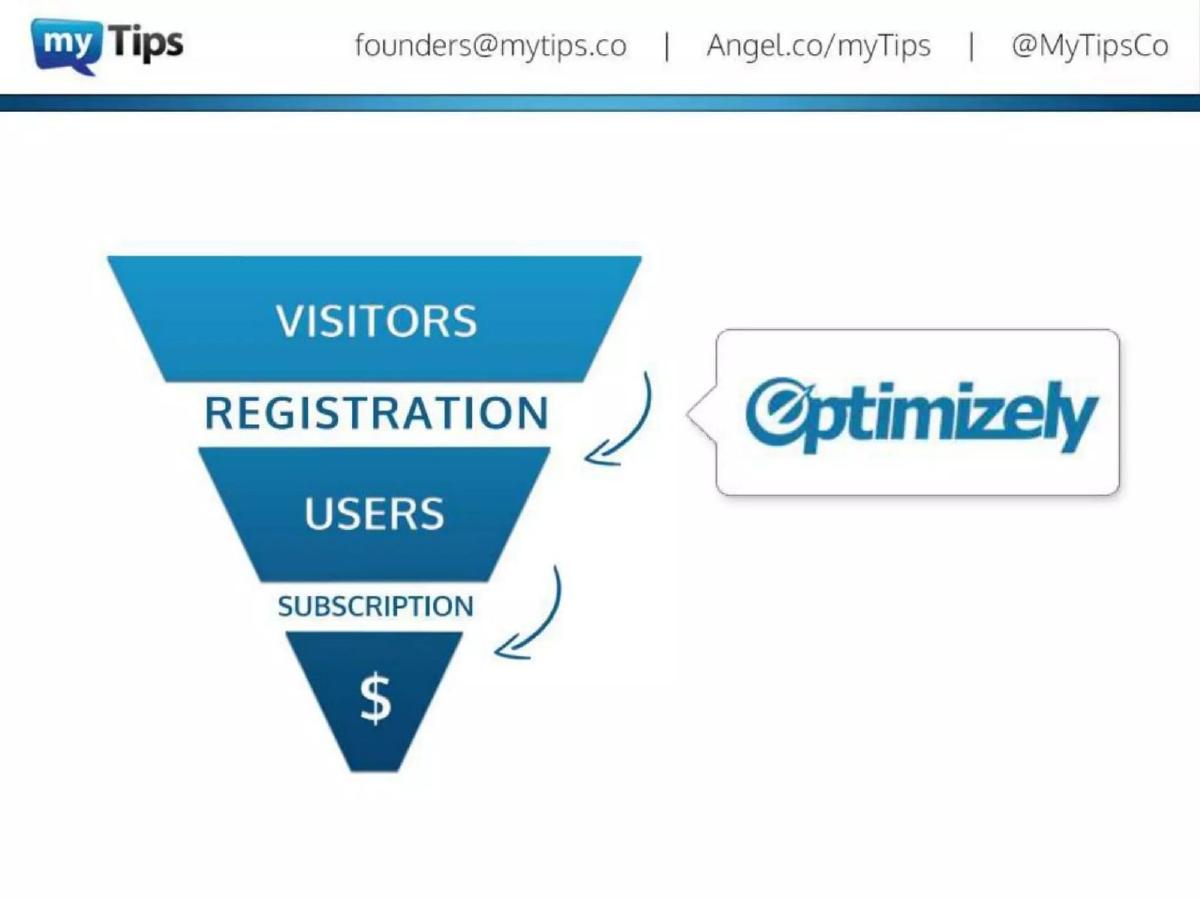
- The deck uses a comparative funnel strategy, placing myTips at the bottom of the funnel to drive subscriptions, while Optimizely is placed higher for registration (slide 7).
- There is a complete absence of financial projections, current revenue, or customer count metrics.
- The deck does not include a 'The Ask' slide, leaving the desired funding amount and valuation unknown.
- Visual product walkthroughs (slides 9, 10, 12, 13) serve as the primary evidence of product readiness and UI/UX quality.
Introduction: The No-Code Onboarding Teaser
The pitch deck for myTips (catalogued under the name Nancy) is a 16-slide presentation that focuses heavily on product utility and user experience. The company describes itself as 'User Onboarding as a Service,' targeting the specific gap in the SaaS sales funnel where registered users fail to transition into paying customers. The deck is characterized by a clean, blue-themed aesthetic and a narrative that moves quickly from problem identification to product demonstration.
Slide 1-2: The Hook and the Human Element
Slide 1 sets the stage with the company logo and a clear value proposition: 'Convert Free-Trial Users into Paying Customers.' This is a strong start because it identifies the end result (revenue) rather than just the feature (tutorials). Slide 2 is an unusual choice for an early slide, featuring a full-page photo of a man at a laptop. While it puts a face to the brand, it doesn't provide data or context, acting more as a visual breather before the data-heavy slides begin.
Slides 3-7: The Funnel Logic
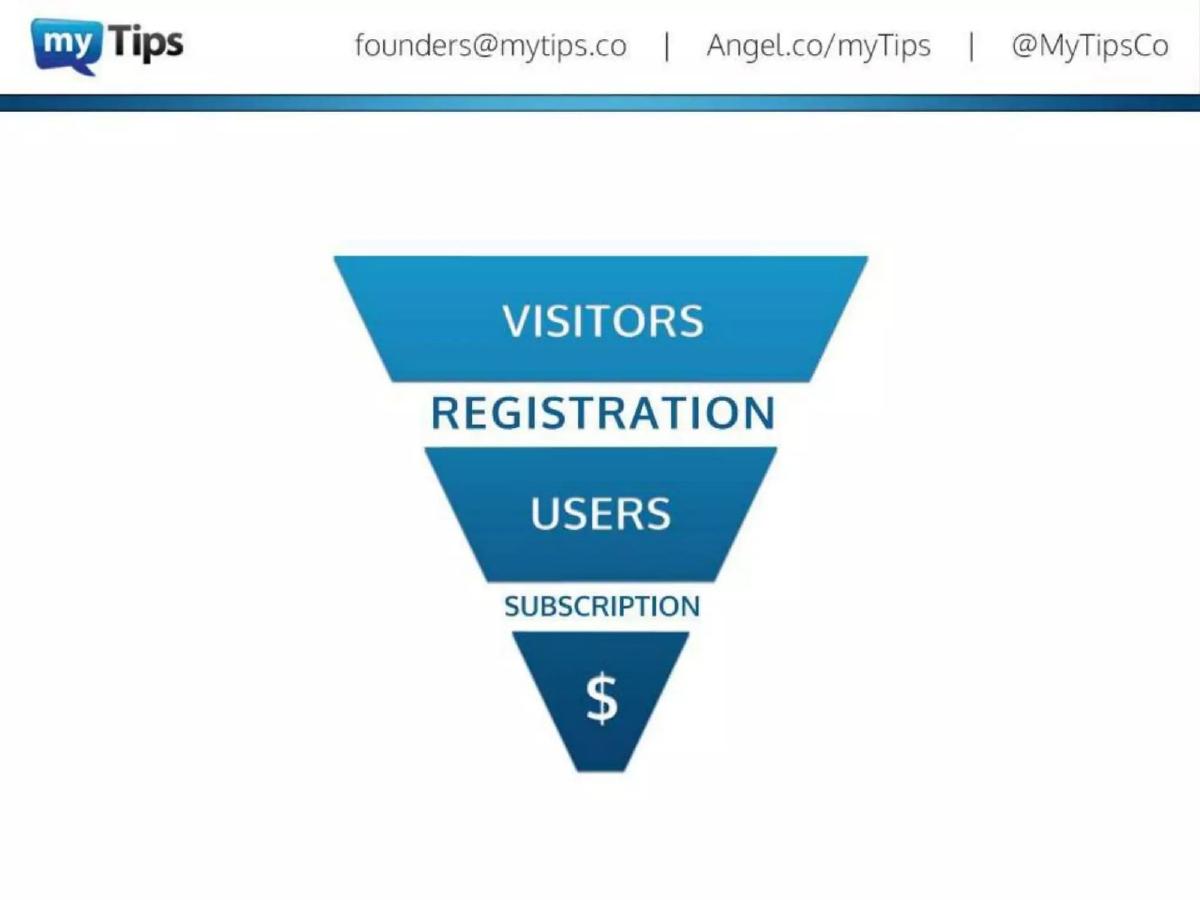
This section of the deck is the most strategically sound. Slide 3 introduces the concept of 'VISITORS.' Slide 4 expands this into a full funnel: Visitors -> Registration -> Users -> Subscription -> $. Slide 5 delivers the 'villain' of the story, stating that 'LESS THAN 1% of visitors convert into Paying Customers.' By highlighting this inefficiency, the founders create an immediate need for their solution.
Slide 6 and 7 are clever positioning moves. Slide 6 shows Optimizely as the solution for the top of the funnel (Visitors to Registration). Slide 7 then places myTips at the bottom of the funnel (Users to Subscription). This tells investors that myTips isn't necessarily competing with established A/B testing giants but is instead a complementary tool that solves a different, perhaps more lucrative, part of the conversion puzzle.
Slides 8-11: Product and Value Proposition
Slide 8 defines the product as a 'Self-Service Platform to Build, Publish and A/B Test User Onboarding Experiences,' emphasizing that this happens 'Right on Your Site & Without Coding.' The 'no-code' aspect is a major selling point for SaaS companies where engineering resources are often a bottleneck.
Slides 9 and 10 show the product in action. They use a laptop mockup to display a 'Rich Feature SaaS Product' (using Samanage as an example) and then overlay 'Product Tutorials.' This visual proof is essential for a product-led growth company. Slide 11 provides the only real 'result' metric in the deck: '21% Better User Activation.' While impressive, the lack of a source or context for this number (e.g., 'Average across 50 beta testers') makes it feel more like a marketing claim than a verified metric.
Slides 12-14: Features and Ease of Use
Slide 12 highlights the 'Easy-to-Use Visual Builder,' and Slide 13 shows the 'A/B Testing and Analytics Suite.' The analytics dashboard shown on Slide 13 is detailed, displaying metrics like 'Tutorials created,' 'Tutorials played,' 'Tutorials completed,' and 'Tutorials abandoned.' This demonstrates that the team has thought through the feedback loop necessary for optimization. Slide 14 reiterates the speed of implementation: 'User Onboarding in Minutes Without Coding.'
Slide 15: The Team
The team slide is strong on pedigree but light on specific roles beyond broad categories. Bogdan Suchyk (Design), Igor Pashynnyk (Development), and Roman Zadyrako (Distribution) are presented as an 'Experienced Team with All Necessary Skills.' The most important information here is the '3rd Startup' and '2nd Startup' labels, which signal to investors that these are not first-time founders. The inclusion of logos like Magento and eBay adds significant credibility, though it is unclear if these were former employers or former clients of their previous startups.
Slide 16: The Conclusion
The final slide returns to the core branding, 'User Onboarding as a Service,' and provides contact information. Notably, it includes an AngelList URL and a Twitter handle, which dates the deck to an era where these were primary social proof signals for startups.
What Works in the myTips Deck
The Funnel Visualization: The way the deck builds the funnel slide-by-slide is an excellent example of narrative pacing. It forces the viewer to agree with the problem (low conversion) before presenting the solution.
Clear Positioning: By explicitly mentioning Optimizely, the founders avoid the 'we have no competitors' trap. Instead, they define their territory relative to a known market leader, which helps investors categorize the startup quickly.
Product-First Approach: For a tool meant to improve UI/UX, the deck itself is well-designed. The screenshots are clean, and the value proposition is never buried in jargon.
What is Missing from the myTips Deck
The Ask: This is the most glaring omission. There is no mention of how much money the company is looking to raise, what the valuation expectations are, or how the funds will be allocated (e.g., 50% to sales, 50% to engineering).
Market Size (TAM/SAM/SOM): The deck assumes the investor already knows that the SaaS market is huge. However, failing to quantify the specific addressable market for onboarding tools makes it harder to judge the potential scale of the business.
Business Model: There is no mention of pricing. Is it a per-user fee? A flat monthly SaaS subscription? A percentage of the 'lift' in conversion? Investors need to know how the company plans to capture the value it creates.
Traction and Revenue: While the '21% activation' stat is nice, it doesn't tell the story of a growing business. There are no charts showing month-over-month growth, churn rates, or current Annual Recurring Revenue (ARR).
What a Founder Should Copy
The 'No-Code' Emphasis: If your product saves time for developers, make that a central theme. The phrase 'Without Coding' appears multiple times in this deck because the founders know that 'developer time' is the most expensive resource in their target customer's company.
Comparative Funneling: If you are entering a crowded market, don't just list competitors. Show a diagram of the workflow or funnel and point to the specific 'gap' you fill that others ignore. This is much more effective than a standard checkmark comparison grid.
Founder Pedigree: If you are a serial founder, highlight it. The '2nd Startup' or '3rd Startup' tag is a shorthand for 'I have already made the rookie mistakes on someone else's dime.'
Final Thoughts
The myTips deck is a highly effective 'hook.' It is designed to be read in under two minutes and leave the reader with a clear understanding of what the product does and why it matters. However, as a standalone fundraising document, it is incomplete. It relies heavily on the strength of the product idea and the founders' history, skipping the rigorous financial and market analysis that most institutional investors require for a Seed or Series A round. It is best viewed as a template for a first-touch deck intended to secure a meeting, rather than a final pitch to a partnership.
Frequently asked questions
- What is the core problem myTips aims to solve?
- The core problem is the 'leaky funnel' in SaaS businesses. Specifically, slide 5 points out that less than 1% of visitors to a website eventually become paying customers. The deck suggests that the drop-off between becoming a 'user' and a 'subscriber' is the critical area where myTips intervenes to improve conversion rates through better onboarding.
- How does myTips differentiate itself from other analytics or A/B testing tools?
- On slides 6 and 7, the deck uses a funnel diagram to differentiate myTips from Optimizely. It suggests that while Optimizely helps convert visitors into registered users, myTips focuses on the next step: converting those registered users into paying subscribers. It also emphasizes a 'no-code' approach, allowing non-technical teams to deploy tutorials directly on their sites.
- What evidence of traction does the deck provide?
- The deck is light on hard traction metrics. The primary performance claim is found on slide 11, which states the product leads to '21% Better User Activation.' However, it does not specify if this is an average across all clients, a single case study, or a projected goal. There are no mentions of total users, MRR, or logos of existing customers.
- Who are the founders and what is their background?
- Slide 15 introduces three founders: Bogdan Suchyk (Design), Igor Pashynnyk (Development), and Roman Zadyrako (Distribution). The deck emphasizes their experience by noting they are on their 2nd or 3rd startups and includes logos of prominent companies like Magento, eBay, ING, and VTB Capital, presumably where they gained prior experience.
- Is this a complete investment deck?
- No. This functions more as a product teaser or a sales deck adapted for investors. It lacks several standard sections required for a full due diligence process, including market size analysis, a competitive landscape matrix, detailed business model/pricing, and a clear statement of how much capital is being raised and for what purpose.