This isn't a pitch deck for funding; it's a research report designed to establish DocSend's authority and market its product. The average successful seed round contacts 58 investors, holds 40 meetings, and takes 12.5 weeks to raise $1.3M. Your pitch deck will be viewed for an average of 3 minutes and 44 seconds, so make every second count. Investors spend the most time on your Financials and Team slides; invest your own time in making them exceptional. More investor outreach does not correlate with more money raised; focus on quality introductions over sheer quantity. The optimal deck length…
Key takeaways
- This isn't a pitch deck for funding; it's a research report designed to establish DocSend's authority and market its product.
- The average successful seed round contacts 58 investors, holds 40 meetings, and takes 12.5 weeks to raise $1.3M.
- Your pitch deck will be viewed for an average of 3 minutes and 44 seconds, so make every second count.
- Investors spend the most time on your Financials and Team slides; invest your own time in making them exceptional.
- More investor outreach does not correlate with more money raised; focus on quality introductions over sheer quantity.
- The optimal deck length is around 19 pages, and the structure generally follows a standard narrative arc, but the team slide can be placed first or last.
- Data shows that failing to raise may be a matter of giving up too soon; the average successful round takes twice as long as the point where unsuccessful founders stopped.
Introduction: The Deck About Decks
What we have here is not a conventional startup pitch deck. It’s not a company asking for capital. Instead, this is a piece of high-value content marketing from DocSend, a research report built from its own proprietary data. It’s a pitch, but not for funding; it’s a pitch for DocSend’s authority, credibility, and ultimately, its product. By analyzing 200 successful fundraising processes, DocSend positions itself as an indispensable guide in the opaque world of venture capital. The company is selling insights to sell software.
This teardown will analyze the report as a strategic document. We will dissect the data it presents, evaluate the strength of its conclusions, and highlight how it uses information to build trust with its target audience: you, the founder. While the format is a report, the lessons in communication, authority-building, and data-driven storytelling are directly applicable to any founder crafting their own pitch.
Section 1: The Setup (Slides 1-2)
What the Deck Shows
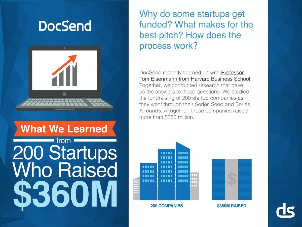
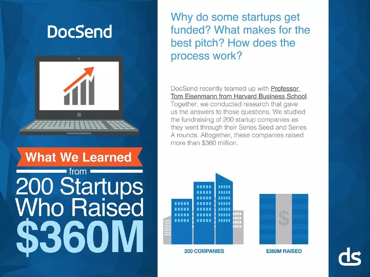
The report opens with the core questions every founder has: Why do some get funded? What makes a great pitch? It immediately establishes its authority by citing a collaboration with Harvard Business School Professor Tom Eisenmann. The scale of the study is framed with bold, simple numbers: 200 companies , $360 million raised . This isn't anecdotal advice; it's presented as data.
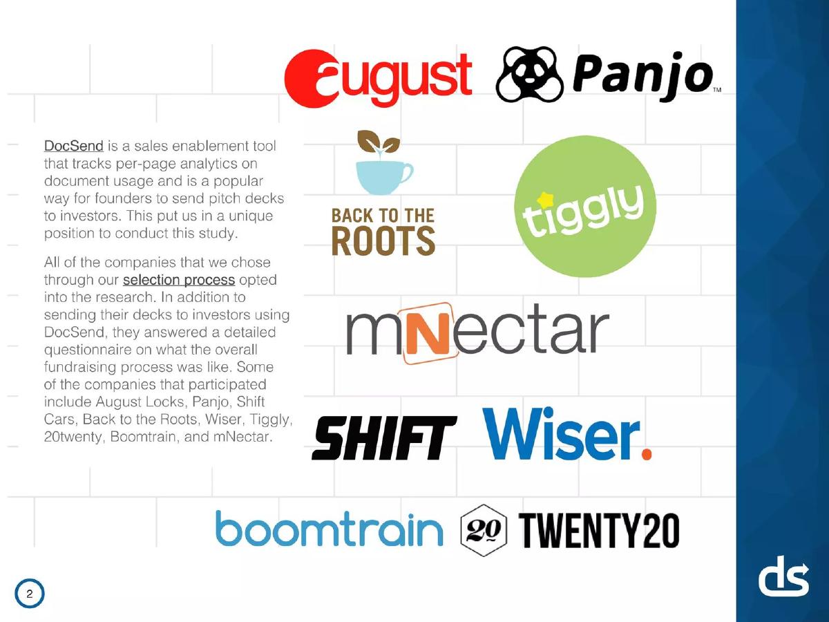
The second page explains DocSend’s unique position to conduct this study. It defines the product—a sales enablement tool with per-page analytics—and explicitly states this is how founders send decks to investors. It reinforces the study's credibility by noting that all companies opted in and answered a detailed questionnaire. Logos or names of participating companies like August Locks, Shift Cars, and Boomtrain lend social proof and a tangible sense of quality to the dataset.
Analysis and Critique
This is a powerful opening. It uses the principle of authority (HBS) and large numbers ($360M) to demand attention. By explaining how they got the data, DocSend is transparently marketing its core value proposition. The message is simple: “We have the data because founders use us to fundraise. If you want to fundraise successfully, you should use us too.”
The selection of well-known participating startups serves as a powerful form of borrowed credibility. A founder sees those names and thinks, “If it was good enough for them, it's good enough for me.” The framing is expert-level marketing. The only missing piece of context is the timeframe of the study, a crucial detail for assessing the data's current relevance.
Section 2: The Executive Summary (Slides 3-4)
What the Deck Shows
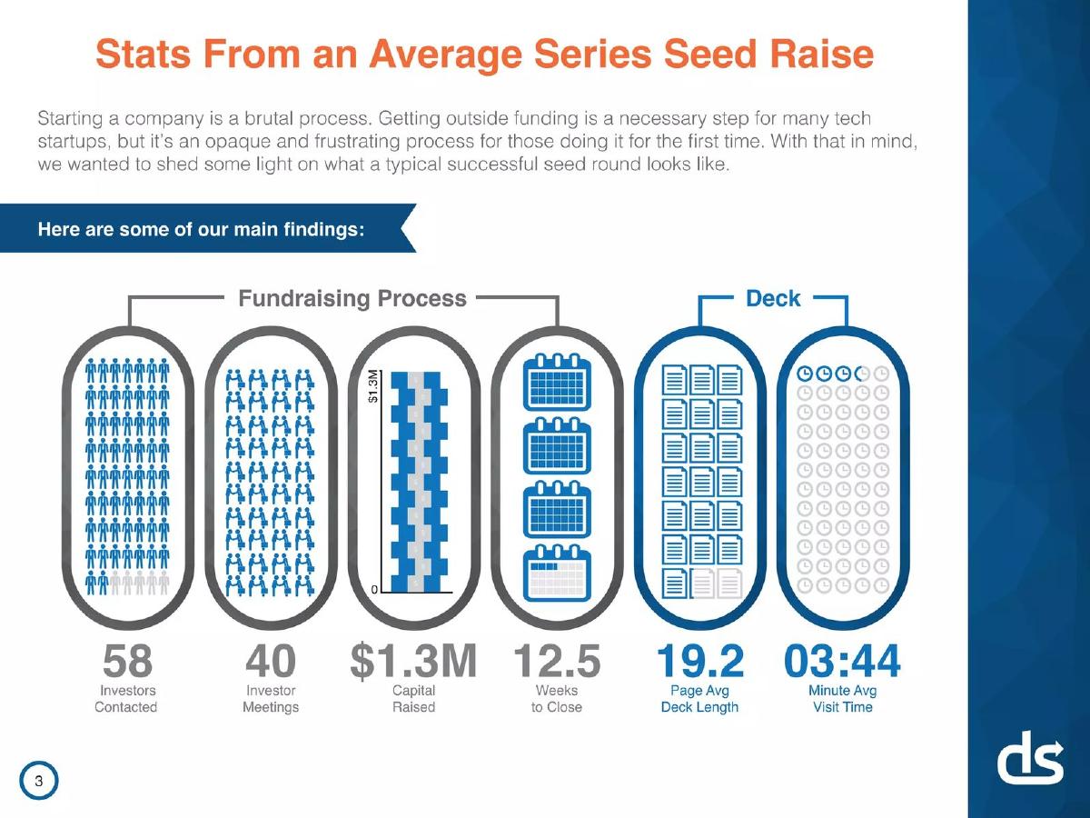
Slide 3, “Stats From an Average Series Seed Raise,” is the money slide. It distills a complex, emotional process into a dashboard of clear metrics:
Fundraising Process: 58 investors contacted, 40 investor meetings, 12.5 weeks to close. · Outcome: $1.3M in capital raised. · The Deck: 19.2 pages average length, 03:44 minute average visit time.
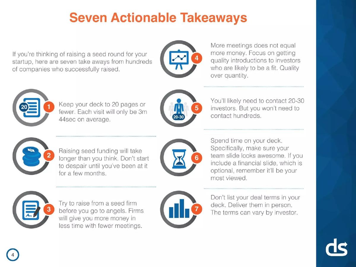
Slide 4, “Seven Actionable Takeaways,” translates these stats into direct advice. It’s a cheat sheet for founders. Key points include keeping the deck under 20 pages, anticipating a long process, prioritizing seed firms over angels, focusing on quality over quantity of investor outreach, and spending extra time on the Team and Financials slides. It also offers specific tactical advice: Don't list deal terms in the deck.
Analysis and Critique
This section is the heart of the report's value. For a first-time founder, these numbers are gold. They replace anxiety and guesswork with a concrete set of expectations. Knowing the average process involves contacting nearly 60 investors is both daunting and reassuring; it normalizes the rejection and persistence required. The 3 minute, 44 second view time is a stark reality check that forces founders to be concise and impactful.
The seven takeaways are excellent. They are specific, grounded in the preceding data, and directly address common founder mistakes. For example, the advice “More meetings does not equal more money” is a powerful, counterintuitive insight that saves founders from the trap of a vanity-metric-driven fundraise. The directive to “make sure your team slide looks awesome” is directly linked to subsequent data on which slides get the most attention. This connection between data and advice is what makes the report so compelling.
Section 3: Deconstructing the Pitch Deck (Slides 5-10)
What the Deck Shows
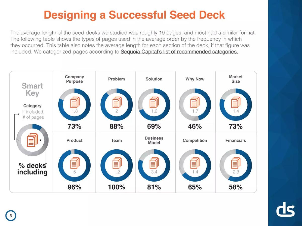
This section dives into the anatomy of a successful seed deck. After a simple Table of Contents, the report presents a table of the 10 most common slide categories, using Sequoia Capital's recommended list as a framework. For each category (e.g., Problem, Solution, Team), it shows:
The percentage of decks that included the slide. · The average number of pages dedicated to it, if included.
Key observations are that Team (100%), Product (96%), and Problem (88%) slides are nearly universal. Financials , however, only appear in 58% of successful seed decks.
Next, the report compares the observed slide order from its data against Sequoia's recommended order. The primary difference noted is the placement of the Team slide, which founders tend to place at the beginning or end, but rarely in the middle. The report aligns this finding with Reid Hoffman's advice to lead with the investment thesis.
The analysis then zeroes in on investor engagement. We see the average deck is viewed for 3 minutes, 44 seconds , and that 12% of views are on mobile —a crucial tactical insight. The most important chart in the entire report follows: “Which Pages Matter the Most.” It ranks slide categories by the average time an investor spends viewing them. Financials (23.2s) and Team (22.8s) are the clear winners, commanding significantly more attention than any other section. The report astutely points out the paradox: the most scrutinized slide (Financials) is also one of the least common.
The section concludes by showcasing logos of companies that agreed to share their decks, providing tangible examples for founders to study.
Analysis and Critique
This is where DocSend flexes its unique data advantage. The slide frequency and ordering analysis is useful for establishing a baseline structure. Comparing their observed order to Sequoia's is a savvy move; it's a dialogue with an established authority, positioning DocSend's data as a new, more empirical source of truth.
The view-time data is the report's killer feature. It's direct, proprietary, and profoundly actionable. Any founder reading this immediately knows where to focus their efforts. The insight that Financials and Team slides receive the most scrutiny is a game-changer. It tells you that if you include financials, they must be rock-solid, and that your team slide is not just a list of names—it's a critical part of the investment thesis that will be heavily judged.
The weakness here, if any, is the lack of granularity. The data is aggregated across 200 companies. Does view time on the 'Competition' slide change for a B2B SaaS company versus a CPG brand? The report doesn't say. However, for a high-level guide, the broad strokes are powerful enough. The 12% mobile view stat is a simple but vital reminder to ensure your deck is legible on a small screen, a detail many founders overlook.
Section 4: Navigating the Fundraising Grind (Slides 11-14)
What the Deck Shows
This section shifts from the deck itself to the human experience of fundraising. It begins by dissecting the 12.5-week average timeline , showing significant variation. A key insight is presented: companies that failed to raise gave up after an average of 6.7 weeks, while a fifth of successful companies took 20 weeks or more. The report explicitly suggests that some failures may simply be a “lack of patience.” It backs this up with survey data where successful founders rated the process a 3.6 out of 5 for being “longer than expected.”
Next, it tackles the “quality versus quantity” of investor outreach. Two charts are presented side-by-side. The first shows a positive correlation between investors contacted and meetings secured. The second, more important chart shows no correlation between investors contacted and money raised, with the author noting the trend is “a bit negative.”
The report synthesizes this into a clear directive: create a target list of 20-30 investors. If you strike out, take feedback and revise your pitch before contacting more. It suggests that approaching 100 investors without success is a sign to “seriously rethink” the project or timing.
Finally, it briefly breaks down the difference between raising from Angels and Seed Firms, providing typical check sizes ($25k-$100k vs. $250k-$1M) and a simple pros-and-cons table. Firms offer more money and professional support, while angels are often operators who can offer relatable advice.
Analysis and Critique
This section provides immense psychological value. The data on fundraising length versus giving up is a powerful pep talk. It tells founders to trust the process and not to despair after a few weeks of silence. This is empathetic and builds a strong connection with the reader.
The “Contacted vs. money” chart is brutally effective. It visually demolishes the common misconception that fundraising is a pure numbers game of blasting as many inboxes as possible. This is one of the most valuable pieces of advice in the whole report, saving founders countless hours of wasted effort on low-quality outreach.
The Angels vs. Seed Firms section is the weakest part of the report. The information is generic and lacks the data-driven depth of the preceding slides. It feels like a standard blog post summary rather than a unique insight from their dataset. The report could have strengthened this by providing data on how the process differs—e.g., “Rounds with seed firms took an average of X weeks and Y meetings, while angel-led rounds took...” The absence of their proprietary data here makes the section feel like an afterthought.
Overall Assessment
As a piece of strategic content, the DocSend report is a masterpiece. It uses proprietary data to provide genuine, actionable value to its target market. It establishes expertise, builds trust, and subtly embeds its product as a necessary tool for the journey. For founders, it is a foundational text that demystifies the chaotic seed fundraising process with concrete benchmarks and clear advice.
However, it must be read with a critical eye. The data is based on successful outcomes, creating a significant survivorship bias. It tells you what worked for 200 companies, but it cannot tell you why thousands of others failed. Furthermore, the lack of a date for the study is a major omission. The fundraising landscape changes rapidly, and metrics from several years ago may not perfectly reflect today's environment. Despite these limitations, the core principles about storytelling, investor psychology, and strategic focus remain timeless and incredibly valuable.
Frequently asked questions
- Based on this report, what is the single most important slide to get right?
- According to the data, investors spend the most time on the Financials and Team slides. If you include a financials slide, it will be heavily scrutinized, so it must be thoughtful and defensible. The Team slide is viewed almost as long and is included in 100% of successful decks, making it equally critical to perfect.
- The report suggests contacting 20-30 investors. Is that really enough?
- The data shows that contacting more investors doesn't lead to raising more money. The advice is to focus on a high-quality, well-researched list of 20-30 investors who are a genuine fit for your company. A warm introduction to 20 relevant investors is far more valuable than a cold email to 200.
- Should I include a financials slide in my seed deck?
- The report notes that only 58% of successful seed decks included one, making it optional. However, it was also the most viewed slide category. If you have early traction or well-reasoned projections, a financials slide can build credibility. If you don't, a weak or purely speculative slide could do more harm than good, so it might be better to omit it and discuss finances in person.
- How relevant is this data today, since the report doesn't specify a date?
- This is a critical weakness. While the core principles—the importance of the team, the need for a clear narrative, the value of quality over quantity—are timeless, the specific numbers may have changed. For example, average round sizes and valuations fluctuate with the market. Use these numbers as a general benchmark, not as an immutable rule for today's environment.
- The report says the average view time is under 4 minutes. How should that affect my deck design?
- It means you need to be brutally efficient. Your deck is a 'trailer,' not the full movie. Use clear headlines, compelling visuals, and concise text. Assume the reader is skimming, so make your key points impossible to miss. The 12% mobile viewership also means you must ensure your deck is perfectly readable on a phone screen, with large fonts and simple charts.