ZootRock’s 10-slide pitch deck from 2013 is a lean, traction-focused presentation that successfully secured $110,000 in seed funding. The deck avoids dense technical explanations of its curation algorithms, instead opting for bold, single-metric slides that highlight user growth and engagement. With a clear value proposition—'More social. Less effort'—the founders utilized social proof through case studies and aggregate data, such as reaching 2.7 million people. While the deck lacks traditional financial projections, a competitive landscape, and a specific 'ask' slide, its visual clarity and…
Key takeaways
- The deck leads with a clear, two-part value proposition: 'More social. Less effort' (Slide 1).
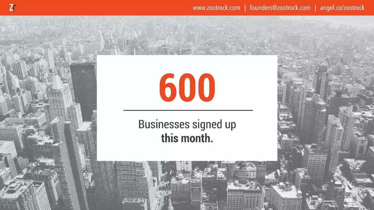
- Traction is prioritized early, claiming 600 business sign-ups within a single month (Slide 3).
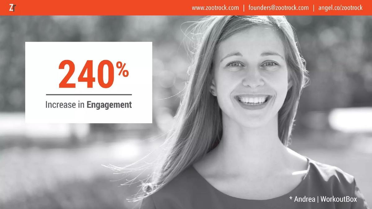
- The platform demonstrates a 240% increase in engagement for specific users like Andrea at WorkoutBox (Slide 4).
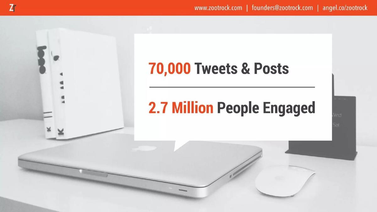
- Scale is established by citing 70,000 total tweets/posts and 2.7 million people engaged (Slide 6).
- The product UI is showcased through a simple interest-selection onboarding screen (Slide 7).
- The dashboard view reveals integrations with Facebook, Twitter, LinkedIn, Scoop.it, and RSS (Slide 8).
- The team slide highlights a 'Serial Entrepreneur' and 'Social Media Experts' but lacks specific past company names (Slide 10).
- The deck completely omits a financial 'ask,' use of funds, or revenue projections.
The Minimalist Seed Deck: ZootRock’s 10-Slide Narrative
ZootRock’s 2013 pitch deck is a relic of an era where social media automation was transitioning from a luxury to a necessity for small businesses. With only 10 slides, the deck is remarkably brief, relying on large typography and full-bleed background images to convey a sense of modern simplicity. It follows a 'show, don't tell' philosophy, focusing on the results of the software rather than the mechanics of the code. This teardown examines how the company used high-level metrics to validate its existence in a crowded SaaS market.
The Hook and the Value Proposition (Slides 1-2)
Slide 1: Title Slide The deck opens with the logo and the tagline: 'More social. Less effort.' This is a classic 'benefit-driven' headline. It immediately addresses the pain point of the target customer: social media is a lot of work. The contact information is clearly displayed in the header, including the AngelList profile, which was a standard practice for startups in 2013.
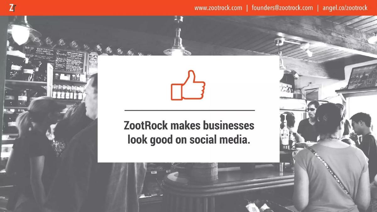
Slide 2: The Mission Slide 2 uses a simple thumbs-up icon over a blurred background of a busy cafe. The text reads: 'ZootRock makes businesses look good on social media.' This slide serves as the 'Purpose' or 'Mission' slide. It defines the customer (businesses) and the outcome (looking good). It avoids technical jargon about 'curation algorithms' or 'API integrations' in favor of a relatable emotional outcome.
Traction and Social Proof (Slides 3-4)
Slide 3: Growth Metric The deck moves immediately into traction. Slide 3 features a large '600' in orange. The subtext is 'Businesses signed up this month.' By placing this so early, the founders are signaling that they have already achieved a level of product-market fit. They aren't asking for money to build a product; they are asking for money to scale a product that people are already signing up for.
Slide 4: Case Study To move from quantity to quality, Slide 4 introduces 'Andrea | WorkoutBox.' It claims a '240% Increase in Engagement.' This provides a specific face and a specific brand to the data. Investors often look for these 'hero' use cases to understand what the 'best-case scenario' looks like for a typical user. The use of a percentage rather than raw numbers is a common tactic to show growth velocity, though it lacks the context of the starting baseline.
Scale and Content Variety (Slides 5-6)
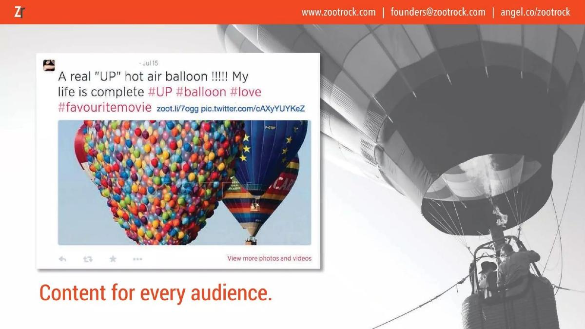
Slide 5: Content Example Slide 5 shows a sample 'Zoot' (the company's term for a curated post). It features a tweet about a hot air balloon with the caption 'Content for every audience.' This slide is intended to show that the curation isn't limited to a single niche like 'tech' or 'marketing.' It demonstrates the visual nature of the posts, which includes images and hashtags, essential for engagement in 2013.
Slide 6: Aggregate Impact Slide 6 returns to big-picture data: '70,000 Tweets & Posts' and '2.7 Million People Engaged.' This slide is crucial for showing the 'reach' of the platform. It suggests that ZootRock isn't just a tool for the 600 businesses mentioned earlier; it is a tool that is successfully interacting with millions of end-users. This helps justify the potential for a large-scale advertising or data play in the future, even if those aren't explicitly mentioned.
The Product Experience (Slides 7-8)
Slide 7: Onboarding and Personalization This slide shows the 'Interest' selection screen. Users can choose up to 5 interests, such as 'Adventure Quotes & Images' or 'Aviation.' The text 'Content suggestions based on who you follow' explains the 'how' of the product without getting into the weeds of the algorithm. It shows a clean, user-friendly interface that looks easy to navigate.
Slide 8: The Dashboard Slide 8 provides a screenshot of the 'Upcoming Zoots' dashboard. This is the most 'technical' slide in the deck. It shows the 'Autopilot Mode' toggle and the ability to 'Skip it,' 'Post it Later,' or 'Post it Now!' It also lists the integrations on the left sidebar: Facebook Profile, Facebook Page, Twitter, LinkedIn, Scoop.it, and RSS. This slide proves the product is built and functional, showing the actual workflow a business owner would use daily.
The Outcome and The Team (Slides 9-10)
Slide 9: Core Benefits Slide 9 acts as a summary of the value delivered: 'Engagement, Followers, Conversions.' These are the three 'holy grails' of social media marketing. By listing them here, the deck reinforces that the tool isn't just about 'posting content'—it's about driving business results. However, the deck does not provide specific data on 'Conversions,' which is usually the hardest metric to prove for social media tools.
Slide 10: The Team The final slide introduces the founders: Laina Reginelli (COO) and Audrey Melnik (CEO). The descriptions are brief: 'Serial Entrepreneur,' 'Design Fanatic,' and 'Social Media Experts.' While the photo is professional and the roles are clear, the slide lacks 'pedigree' markers such as previous successful exits, specific companies they worked for, or educational background. In a seed round, the team is often the most important factor, and this slide relies heavily on the 'Serial Entrepreneur' label to carry the weight of their credibility.
What Works in This Deck
Extreme Clarity: There is no ambiguity about what ZootRock does. Every slide has a single, focused message. · Traction-First: By putting the '600 sign-ups' and '2.7 million engaged' slides early, the founders immediately de-risk the investment. · Visual Consistency: The use of orange as an accent color and the clean, white-box-on-photo aesthetic makes the deck feel like a cohesive brand. · Focus on Outcomes: The deck emphasizes 'Engagement' and 'Looking Good' rather than 'Features.' This speaks to the business owner's mindset.
What is Missing
The Ask: There is no slide stating how much money they are raising or what they plan to do with it. While the catalogue facts state they raised $110,000, an investor viewing this deck in isolation wouldn't know the terms of the deal. · Market Size (TAM): There is no mention of how many small businesses exist or how large the social media management market is. Investors need to know if this can become a billion-dollar company. · Competition: In 2013, tools like Buffer, Hootsuite, and Edgar were already active or emerging. The deck fails to explain how ZootRock is different or better than these incumbents. · Business Model: There is no mention of pricing. While Slide 8 shows a 'Pricing' link in the navigation bar of the screenshot, the deck itself doesn't explain if this is a subscription model, a freemium model, or something else. · Financial Projections: There are no charts showing projected revenue or user growth over the next 12-24 months.
What a Founder Should Copy
The 'Hero Metric' Slide: Use a single, large number to represent your biggest achievement (Slide 3). It is much more impactful than a dense table of data. · The Integration Sidebar: If your product relies on an ecosystem, showing the logos of the platforms you integrate with (Slide 8) is a quick way to communicate utility and technical readiness. · The Tagline: 'More social. Less effort' is a perfect example of a 'Problem/Solution' tagline. It identifies the goal (More social) and the current friction (Effort). · User Testimonials/Case Studies: Even a simple call-out to a specific user (Slide 4) makes the product feel real and validated.
Frequently asked questions
- How much did ZootRock raise with this deck?
- According to the catalogue facts, ZootRock raised $110,000 in 2013 during its Seed stage. This amount is relatively modest for a seed round today but was consistent with early-stage angel or accelerator funding in the early 2010s social media SaaS space.
- What is the core problem ZootRock solves?
- The deck identifies the time-consuming nature of sourcing relevant content for social media. Slide 2 states that ZootRock 'makes businesses look good on social media,' implying that without automation, businesses struggle to maintain an active and high-quality social presence.
- Does the deck explain how the content curation works?
- Only at a high level. Slide 7 shows a user interface where users choose interests (e.g., 'Adventure Quotes & Images', 'Aviation'), and the text notes that suggestions are 'based on who you follow.' It does not detail the underlying technology or AI.
- What platforms does ZootRock support?
- Based on the product screenshot on Slide 8, the platform supports Facebook Profiles, Facebook Pages, Twitter, LinkedIn, Scoop.it, and RSS feeds. This wide range of integrations was a key selling point for multi-channel social management.
- Is there a clear exit strategy or financial goal in the deck?
- No. The 10-slide deck is entirely focused on product, traction, and team. It does not include any slides regarding financial forecasts, exit opportunities, or the specific terms of the investment they were seeking at the time.