Zolvers' 11-slide deck, exported from PowerPoint on 13 June 2014 as the eighth revision of the English investor version, pitched a trust-first household-services marketplace for Latin America on a 15% commission. It has genuine strengths: a clear one-line strategy, real product screenshots with verification badges, live markets in Argentina and Mexico, 500 Startups, NXTP Labs and Start-Up Chile on the team slide, and the CEO's direct email on both the first and last page. But the '40% GROWTH PER MONTH' headline matches neither segment of the chart under it - the measured period is about 108%…
Key takeaways
- Zolvers' 11-slide deck was exported from PowerPoint 2013 on 13 June 2014 under the filename 'zolversv8inving' - the eighth revision of the English-language investor version.
- The $300K funding ask appears only as a bare figure in the bottom-right corner of the roadmap slide, with no dedicated ask slide, no instrument, no valuation and no use of funds.
- The 'Our Focus is Trust' positioning sentence on slide 3 contains a typo - 'housedold pendings' - that survived all eight revisions, and 'pendings' is a direct carry-over of the Spanish 'pendientes'.
- The '40% GROWTH PER MONTH' headline contradicts the chart printed beneath it: 50 tasks to 4,000 in six months is roughly 108% per month, while the 4,000 to 15,000 forecast implies about 25% per month.
- The December 2014 forecast of 15,000 tasks is plotted on the same curve, in the same colour, as the two measured data points, separated only by a small '(est)'.
- Unit economics are shown as $13 acquisition cost against $15 revenue per user - a 13% margin drawn as a balanced arrow - with no repeat rate, lifetime value or payback period anywhere in the deck.
- Personal interviewing and background checking are named as the core moat but the deck never states how many workers are vetted, what vetting costs per worker, or how long a vetted worker stays active.
- The competition slide's three largest elements advertise competitors' funding - $30M for Homejoy, $38M for TaskRabbit, IPO for Care.com - against a $300K ask, with no explanation of why that capital cannot follow the model into Latin America.
What this deck actually is
Eleven slides, 4:3 landscape, built in Microsoft PowerPoint 2013 and exported to PDF on 13 June 2014 . The file circulated under the name zolversv8inving — which unpacks, once you read it the way the founder typed it, as Zolvers v8, inv, ing : the eighth revision of the investor version in English. That single filename tells you two useful things before you open the first slide. This deck had been through at least eight passes, and it was built for an audience outside Argentina.
Zolvers is a marketplace for household tasks in Latin America. A user posts a job, receives quotes from vetted workers — "Zolvers" — checks their profiles and community ratings, picks one, and the platform takes 15% of the transaction. It is the TaskRabbit and Handy pattern, pointed at a region where domestic help is culturally normal, informal, cash-based and almost entirely unbrokered. That is a genuinely good starting position, and the deck does not fully realise how good it is.
The founding team is real and credentialed: Cecilia Retegui as CEO, a systems engineer with an MBA, alongside a COO, a CTO and a commercial lead. The accelerator row on the team slide carries 500 Startups, NXTP Labs and Start-Up Chile — three of the most legible validation signals available to a Latin American startup in 2014, and the deck earns real credibility by putting them above the fold on that slide.
What the deck does not do is convert any of that into an investable proposition. Eleven slides contain: a $300K ask hidden in the bottom-right corner of a roadmap slide, a market size that is one unsourced number, a growth headline that contradicts the chart printed directly beneath it, unit economics that show a $2 margin per user presented as a triumph, a competition slide that spends its energy proving competitors are well funded, and no slide at all on the one thing that makes or breaks a vetted-supply marketplace: how you recruit and keep the supply.
There is also a typo in the single most important sentence in the deck. Slide 3 — the value proposition, the line an investor will quote back to a partner — reads "help them with their housedold pendings ". Eight revisions, and the misspelling survived all of them.
Slide-by-slide walkthrough
Slide 1 — Cover
A dark full-bleed image with the Zolvers shield logo, "Cecilia Retegui" and "cecilia@zolvers.com".
Putting the CEO's direct email on the cover is correct and unusually rare. Roughly a third of the decks in this teardown series never give an investor a way to reply at all; Zolvers gives one twice, on slide 1 and slide 11.
What the cover withholds is orientation. There is no date, no round name, no city, no one-line category descriptor. A reader who receives this file cold cannot tell whether "Zolvers" is a fintech, a logistics company or a game, and cannot tell whether the material is current. Eleven words would have solved it: "On-demand household services marketplace · Latin America · Seed · June 2014". For a deck built explicitly in English for foreign investors — that is what the ing in the filename means — the cover is the one slide that has to work without local context, and it is the slide doing the least work.
Slide 2 — "Have you ever felt this way?"
Two stock photographs: a frustrated woman on the phone at a sink, a resigned man washing dishes. Overlay text: "Have you ever felt this way? Household pendings are a problem to everyone."
The empathy framing is fine and the two-gender pairing is a deliberate, sensible choice — it pre-empts the reading that this is a product for women only. The problems are the images and the language.
The photographs are generic Anglo stock, in what looks like a North American kitchen, selling a product whose entire competitive advantage is that it understands the Latin American household. Zolvers had, by its own slide 3, a photo wall of real workers on the platform. Real Argentine and Mexican homes and real users on the problem slide would have made the same emotional point and simultaneously proved the company exists in the market it claims.
"Pendings" is a direct carry-over of the Spanish pendientes and is not English. It appears here and again on slide 3. In an English-language deck aimed at US investors, this is the kind of friction that costs nothing to fix and quietly signals that no native reader reviewed the file.
Slide 3 — "A solution for everyone"
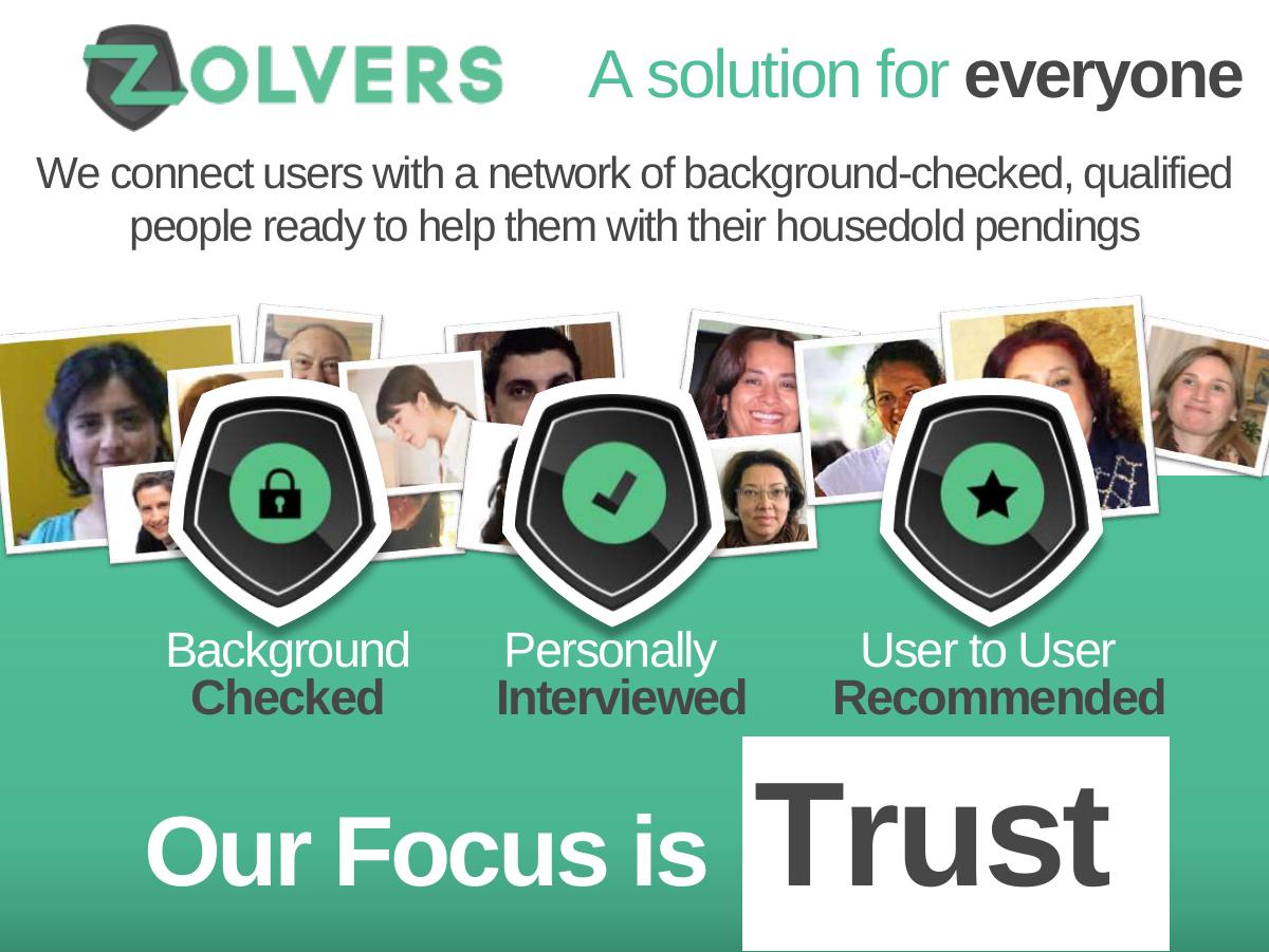
The logo, the one-line description, a photo collage of actual Zolvers, and three shield badges: Background Checked · Personally Interviewed · User to User Recommended , under the headline "Our Focus is Trust".
This is the best slide in the deck and the reason the company is interesting. In a region where the alternative is a phone number passed between neighbours and no recourse if something goes wrong, "we background-check and personally interview every worker" is not a feature — it is the entire product. The three-badge structure is clean, the photo wall makes the supply side feel real rather than theoretical, and "Our Focus is Trust" is the right one-line strategy.
Two things undercut it. First, the typo — "housedold pendings" — lands in the middle of the positioning sentence. Second, and far more consequentially, the deck asserts personal interviewing as the moat and then never returns to it. Personally interviewing every worker is an operating cost that scales linearly with supply . An investor reading this slide immediately wants three numbers: how many Zolvers are vetted today, what it costs to vet one, and how long a vetted Zolver stays active. The deck supplies none of them, anywhere, across eleven slides. The most defensible thing about the business is also the most expensive, and its economics are absent.
Slide 4 — "So Simple. So Useful"
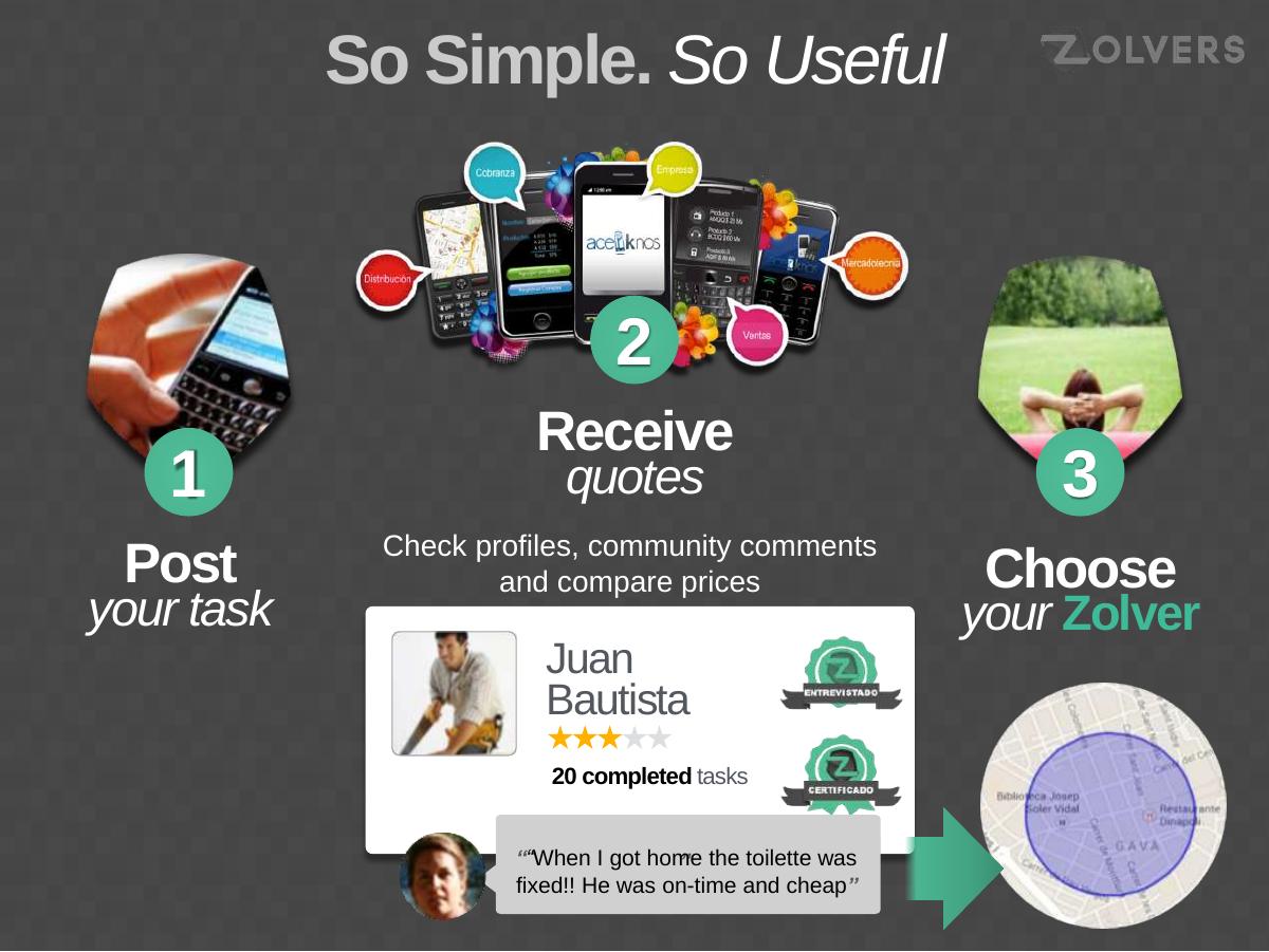
The three-step flow: 1 Post your task → 2 Receive quotes → 3 Choose your Zolver, wrapped around a real product screenshot of a worker profile ("Juan Bautista, 20 completed tasks", star rating, ENTREVISTADO and CERTIFICADO badges, a review reading "When I got home the toilette was fixed!! He was on-time and cheap") and a map showing service radius.
Structurally excellent. Three steps is the right number, the numbered circles are unambiguous, and embedding a real profile card inside the flow proves the product exists rather than describing it. The verification badges reappear here, which reinforces the trust thesis at the moment a user would actually rely on it.
Three details cost the slide marks. The featured profile shows a three-out-of-five star rating — the hero example of the marketplace's quality is a mediocre provider, and no one caught it. "Toilette" is a misspelling in a quote presented as a real user testimonial, which raises the question of whether the testimonial was translated, paraphrased or invented. And "he was cheap" is a strange thing to headline for a business whose thesis is trust, not price; cheapness is the axis on which an informal cash market already wins, and it is the one Zolvers cannot compete on while paying for background checks and taking 15%.
Slide 5 — "How do we Earn Money?"
A single figure: 15% COMMISSION , with the line "Win – Win relationship with our Zolvers. We ensure them a constant flow of work."
Clear, honest, immediately understood. Naming the take rate outright — rather than hiding behind "multiple monetisation vectors" — is a mark in the company's favour, and the justification offered to the supply side (constant flow of work in exchange for the cut) is the correct argument.
What is missing is everything that makes a take rate believable. Who pays it — is the 15% deducted from the worker or added to the customer? What is the average task value, so a reader can convert 15% into a dollar figure? Is payment processed on-platform, and if not, what stops a customer and a vetted worker from doing the second job in cash and cutting the platform out entirely? That last question is the central risk in every home-services marketplace ever built, it is sharpest in a cash-dominant economy, and this deck does not acknowledge it exists. A single line — "62% of tasks are repeat bookings made through the platform" — would have answered it. There is no such line.
Slides 6 and 7 — Competition
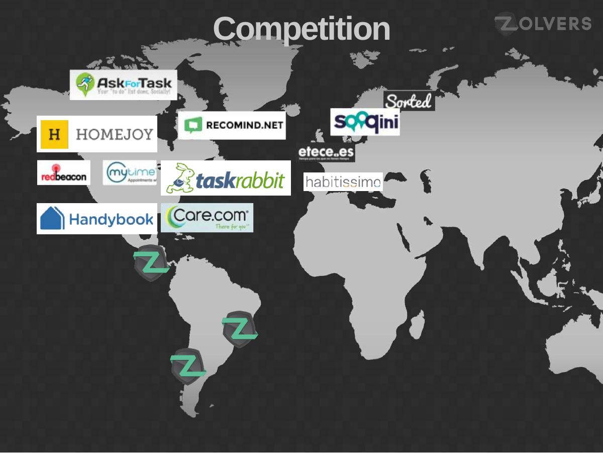
A world map with competitor logos placed by geography: AskForTask, Homejoy, RedBeacon, MyTime, TaskRabbit, Handybook and Care.com in North America; Recomind.net, Sorted, Soqini, etece.es and habitissimo in Europe; three Zolvers pins in South America. Slide 7 is the same map animated forward, with orange callouts: "$30M RAISED" over Homejoy, "$38M RAISED" over TaskRabbit, "IPO" over Care.com, a panel reading "We are developing this business in Latin America", and a box reading "Latin America $3.4B".
The build across two slides is a nice piece of deck craft — establish the landscape, then reveal the argument on top of it — and the geographic framing does make the whitespace visually obvious. The strategy being argued is sound: a proven model, unbuilt in a large region, run by a local team.
The execution inverts its own message. Slide 7 devotes its three largest, brightest elements to how well capitalised the competition is : $30M, $38M, IPO. The intended reading is "this category attracts serious money, so the LatAm version is valuable". The reading an investor actually takes is "these companies have thirty to forty million dollars and an exit, and you are asking for three hundred thousand". Validation framing only works when the deck immediately answers why capital cannot simply follow the model south — local trust networks, informal-labour dynamics, payment rails, regulatory treatment of domestic work. Zolvers had those answers. None of them are on the slide.
Then there is the $3.4B. One number, no derivation, no year, no source, no distinction between total market and addressable market. It is doing the work of an entire market-size slide, and it is the sort of figure a partner will ask you to reconstruct live. Build it up instead: households in Argentina, Mexico, Chile and Colombia, share paying for household help, average annual spend, 15% take rate. That produces a smaller headline and a defensible one.
A separate note on how this slide aged. Homejoy — the largest logo on the map and the anchor of the $30M callout — shut down in July 2015, roughly thirteen months after this deck was exported. A competition slide that treats "raised a lot" as equivalent to "won" is fragile precisely because funding is not traction, and this one demonstrates that within a year of its own export date.
Slide 8 — Status
The traction slide, and the one a serious investor will spend the most time on. A rising green curve with three plotted points: 50 tasks posted (Argentina, Dec '13), 4,000 tasks posted (Mexico, Mar–Jun '14), 15,000 tasks posted "(est)" (Chile, Dec '14). A headline block: 40% GROWTH PER MONTH . And two grey circles joined by an arrow: Acquisition Cost $13 ↔ Revenue per user $15 .
Real, growing numbers on a real chart, with country flags marking market entries — that is a legitimate traction story, and going 50 → 4,000 tasks in six months is a genuinely strong result. The company should have been prouder of it than it is.
Instead the slide undersells its own history and oversells its future, in three separate ways.
The 40% headline matches neither half of the chart. Going from 50 tasks in December 2013 to 4,000 in June 2014 is a factor of 80 over six months, which is compound growth of roughly 108% per month — nearly three times the headline. Going from 4,000 to the forecast 15,000 by December is a factor of 3.75 over six months, or about 25% per month . The company's actual, historical, defensible number is far better than the headline it chose, and the headline it chose is far better than the forecast it drew. Worse, if 40% per month were applied honestly to 4,000 for six months, the December figure would be over 30,000 — double what the deck projects. The headline and the forecast on the same slide contradict each other in the reader's favour of neither.
The forecast is plotted as though it were data. The 15,000 point sits on the same curve, in the same orange circle, in the same visual language as the two measured points, separated only by a small "(est)" in parentheses. Any projection on a traction chart must be visually severed from actuals — dashed line, different colour, a labelled boundary at "today". Blurring the two is the single fastest way to make a diligent investor distrust every other number in the file, and in a deck where nothing else is sourced, that suspicion has nowhere to be contained.
The unit economics show a $2 margin and celebrate it. $13 acquisition cost against $15 revenue per user is a 13% contribution margin, drawn as a balanced two-headed arrow as if it were an achievement. It is not: it is roughly break-even, and it leaves nothing to fund the background checks and personal interviews that slide 3 identified as the core of the product. The framing also hides the number that would rescue it. At a 15% take rate, $15 of revenue implies about $100 of gross task value per user — so the question is not whether $15 beats $13 once, but how many times a user comes back. Lifetime value, repeat rate and payback period are the metrics this business lives on, and a marketplace with a strong repeat rate could show $13 CAC against $60 or $80 of lifetime revenue. The deck shows a single-period figure that makes a potentially excellent business look marginal.
Slide 9 — Team
The Zolvers logo above a row of three accelerator marks — 500 Startups, NXTP Labs, Start-Up Chile — then four headshots: Cecilia Retegui (CEO, systems engineer, MBA), Mariana Sorribes (COO, economist and designer), Fernando Cammarota (CTO, systems engineer), Vera Sanchez (CR, sales). Footer: "+35 years of Technical Experience".
Strong slide, and the accelerator row is the strongest element in the entire deck. For a 2014 Latin American company pitching in English, 500 Startups plus NXTP Labs plus Start-Up Chile is a compressed, instantly legible statement that three independent selection processes have already diligenced this team. Placing it above the founders rather than buried in a footer is the right call.
The four-person structure is also correct: CEO, operations, engineering, commercial, with no gaps and no filler. Naming a functional role for each person, rather than four vague "co-founder" labels, tells an investor the company is already divided into owned areas.
"+35 years of Technical Experience" is the weak note. Aggregate-years claims are a well-worn vanity format — they tell you nothing about relevance, seniority or whether any of that experience is in marketplaces, and four people averaging under nine years each is not the number the slide implies. Replace it with proof: what each founder built before, whether anyone has run a two-sided marketplace, and which of them has operated in Mexico or Chile — a question the very next slide makes urgent. The role abbreviation "CR" is also never expanded; a foreign reader cannot decode it.
Slide 10 — Next Steps (and the ask)
A road stretching across four countries: Argentina ✓, Mexico ✓, Chile, Colombia, with a 2015 arrow at the end, a website screenshot over Argentina, a phone handset over Chile, and a black bar at the bottom reading 25% IN BANK and $300K .
The road metaphor works and the two green ticks are a good, honest device: they distinguish markets already entered from markets planned, which is exactly the discipline the traction chart failed to apply. The small website screenshot also quietly carries press logos — Apertura, Forbes, La Nación — which is real third-party validation.
But this is where the deck's largest structural failure sits. The funding ask is a $300K figure in the bottom-right corner of a roadmap slide, with no title, no context and no explanation. A reader can miss it entirely on a first pass. The ask deserves its own slide, and that slide needs four things this deck never provides: the amount, the instrument and valuation, the use of funds broken into buckets, and the specific milestone the money buys.
The "25% IN BANK" tag is a genuinely smart signal — a quarter of the round already committed, which is the strongest momentum lever a seed founder has — but it is presented as a bare fragment. It never says who committed the $75K, on what terms, or when the round closes. Named existing investors and a closing date convert that tag from decoration into scarcity.
The expansion plan has a related gap. The deck proposes entering Chile and Colombia, having reached roughly 4,000 tasks per period in two markets, on $300K — while also, judging by the handset icon, building a mobile app. Nowhere does it state what one market launch costs, how long it took to get Mexico live, or how the $300K divides between the two new countries, the app and the vetting operation. Investors do not fund a map; they fund a cost per market and a repeatable playbook.
Slide 11 — Thank you
Correct instinct — the CEO's direct email as the last thing on screen — and it should be the standard. It would be stronger with the website, a phone number, LinkedIn and a scheduling link, because a closing slide is the only page in a deck whose sole job is to reduce the cost of replying to zero.
What Zolvers got right
A single, defensible strategic idea. "Our Focus is Trust" is the entire company in three words, and it is the right wedge for informal labour markets where recourse does not exist. · A named take rate. 15%, stated plainly, with the value exchange to the supply side explained in one line. · Real product, not mockups. Slide 4 embeds an actual worker profile with badges, ratings and a review, inside the three-step flow. · Accelerator validation placed prominently. 500 Startups, NXTP Labs and Start-Up Chile above the team photos is high-signal and instantly readable to a foreign investor. · Honest market-entry marking. Ticks against markets already entered, no ticks against markets planned. · Contact details twice. The CEO's direct email opens and closes the deck. · Eleven slides. The deck respects the reader's time, which is more than most 2014 seed decks managed.
What an investor would ask in the first meeting
How many vetted Zolvers are on the platform today, what does it cost to background-check and interview one, and how many are still active after six months? · Your chart shows 50 tasks to 4,000 tasks in six months — that is over 100% per month. Why does the headline say 40%, and why does the December forecast imply only 25%? · Is the 15,000 figure a forecast or a measurement? What are the actuals as of today? · Is $15 revenue per user a single period or a lifetime figure? What is the repeat rate, and what is the payback period on $13 of acquisition cost? · What percentage of tasks are paid through the platform, and what stops a customer and a worker from transacting in cash on the second job? · Where does $3.4B come from, and what portion of it is actually addressable by a 15% commission on brokered household tasks? · What did the Mexico launch cost and how long did it take? How does $300K cover Chile, Colombia and a mobile app? · Who has committed the 25% already in the bank, on what instrument, at what valuation, and when does the round close?
The lesson for founders
Zolvers had the harder half of the job already done. It had a real product, real transactions growing eighty-fold in six months, a complete four-person team, three accelerator stamps, national press coverage and two live markets. Most seed decks are asking investors to believe in a plan; this one could point at a working business.
What it lacked was the easy half: a stated ask on its own slide, a market number that could be reconstructed, a growth headline that matched its own chart, a forecast visually separated from actuals, a lifetime-value figure instead of a single-period one, and a spelling pass on the sentence that defines the company.
The pattern is common and it is worth naming precisely. Founders spend eight revisions polishing the argument and none of them auditing whether the numbers on the page agree with each other. A reader who spots that the 40% headline contradicts both segments of the chart underneath it will not conclude the founder is bad at maths — they will conclude the numbers were chosen for effect, and then they will re-examine the $3.4B, the $15, and the 15,000, and find that none of those can be checked either.
Consistency is cheaper than persuasion. If your traction is genuinely 108% per month, print 108% and show the working. The deck that survives diligence is the one whose every number can be rebuilt by the person reading it.
Frequently asked questions
- What is Zolvers?
- Zolvers is a Latin American marketplace for household tasks, founded by Cecilia Retegui. Users post a task, receive quotes from background-checked and personally interviewed workers called 'Zolvers', compare profiles and community ratings, and choose one. The platform takes a 15% commission. The June 2014 deck shows the company live in Argentina and Mexico, with Chile and Colombia planned for 2015.
- Is this a real Zolvers investor pitch deck?
- Yes. The file is an 11-slide 4:3 deck built in Microsoft PowerPoint 2013 and exported to PDF on 13 June 2014. Its circulated filename, 'zolversv8inving', reads as Zolvers version 8, investor, English. It carries the CEO's direct email on the cover and closing slides and shows real product screenshots, live task counts and named accelerator backers.
- How much was Zolvers raising in this deck?
- $300K. The figure appears once, in a black bar in the bottom-right corner of the 'Next Steps' roadmap slide, alongside a '25% IN BANK' tag indicating roughly $75K already committed. There is no dedicated ask slide, no instrument, no valuation, no closing date and no use-of-funds breakdown, and the money is implicitly meant to cover launches in both Chile and Colombia plus a mobile app.
- What is the biggest problem with the Zolvers traction slide?
- The headline and the chart disagree. '40% GROWTH PER MONTH' sits above a curve showing 50 tasks in December 2013, 4,000 in mid-2014 and a forecast 15,000 by December 2014. The measured period is compound growth of about 108% per month - far better than the headline - while the forecast implies about 25% per month. Applying 40% per month honestly to 4,000 would give over 30,000 by December, double the projection. The forecast point is also drawn in the same visual style as the two real data points, marked only with '(est)'.
- Are the Zolvers unit economics good?
- As presented, no. The deck shows $13 acquisition cost against $15 revenue per user, a 13% contribution margin, drawn as a balanced arrow as though it were a win. It leaves nothing to fund the background checks and interviews the deck names as the core product. The missing number is lifetime value: at a 15% take rate, $15 of revenue implies about $100 of gross task value, so a marketplace with a decent repeat rate would show $13 CAC against a multiple of $15 in lifetime revenue. The deck reports no repeat rate, no cohort data and no payback period.
- What should Zolvers have added to this deck?
- A dedicated ask slide with amount, instrument, valuation, use of funds and milestone; a bottom-up market size built from households, paying share and average spend rather than a single unsourced $3.4B; supply-side metrics covering vetted worker count, cost per vetting and worker retention; lifetime value and repeat rate alongside CAC; on-platform payment share to address cash disintermediation; a corrected growth headline matching the chart with the forecast visually separated; and a spelling pass on 'housedold pendings' in the positioning sentence.