"Very Disappointed" Survey in a Pitch Deck: How to Show
Founders quote the share of users who would be very disappointed without their product.
Product-Market Fit Survey Slide: Report the Question, Who Answered and What They Do
Many early founders run the product-market fit survey that asks users how they would feel if they could no longer use the product, and then put the share who answered "very disappointed" in their deck. It is one of the few numbers a pre-revenue company can produce in a week, and investors know the benchmark that usually comes with it. That familiarity cuts both ways: a reader who knows the method will check whether you asked the right question, of the right people, and how many answered. This guide uses four slides from four startup decks to show how founders report the result, and what each one leaves an investor unable to judge.
TL;DR
Quote the exact answer you measured ("very disappointed", not just "disappointed"), say who was asked and how many replied, give the month, and put a behaviour figure beside it. Lunchclub comes closest: "In a recent survey, 42% of users would be very disappointed if Lunchclub went away", next to "The average user takes 10 meetings a year". RealFriend reports "More than 60%" very disappointed alongside an NPS "over 40" and 2,500 monthly users, but gives no sample or date. Trash Warrior puts "52% customers would be very disappointed" between star ratings and "1000+ happy transactions", which mixes a survey with review scores. Beelinguapp is the warning: "85% of users would be disappointed", citing the method's source while reporting a weaker answer than the one the method counts.
Four product-market fit survey slides, read in full
Each example shows how the slide reports the survey, what it gets right and what to change. Quotes are taken from the slide images at full size.
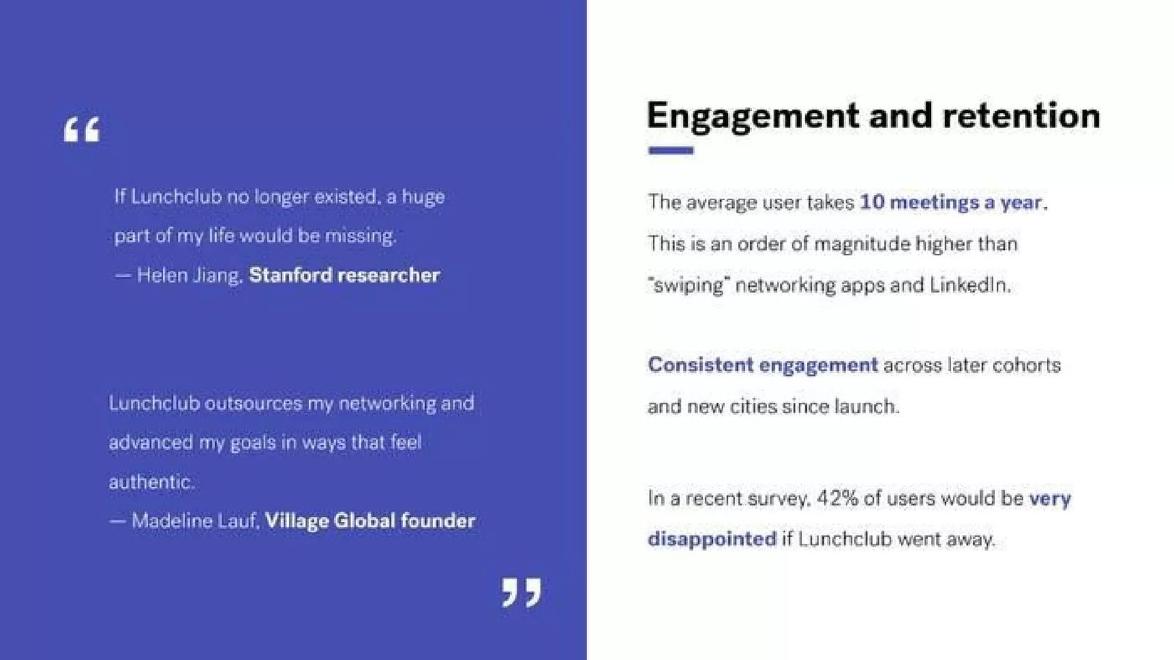
Lunchclub traction slide — slide 9
Professional meeting-matching service. Slide titled "Engagement and retention".
Lunchclub deck, slide 9. Exact stored slide matched to this analysis.
Our analysis: Exact wording, modest figure, backed by usage.
Evidence and limitation: Self-reported survey; no sample size or date shown.
What a founder can adapt: Add sample size, who was asked and the month.
Supporting analysis
What the deck claims: "The average user takes 10 meetings a year."; "Consistent engagement across later cohorts and new cities since launch."; "In a recent survey, 42% of users would be very disappointed if Lunchclub went away." Two user quotes on the left.
Presentation choice: The clearest pairing of survey and behaviour in the set.
When it does not fit: "A recent survey" with no further detail.
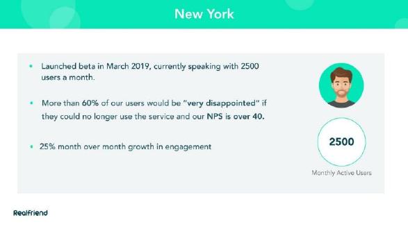
RealFriend deck, slide 9. Exact stored slide matched to this analysis.
Our analysis: Right wording and context, but no sample.
Evidence and limitation: Self-reported; figures given as floors.
What a founder can adapt: Give exact figures and the number surveyed.
Supporting analysis
What the deck claims: "Launched beta in March 2019, currently speaking with 2500 users a month."; "More than 60% of our users would be 'very disappointed' if they could no longer use the service and our NPS is over 40."; "25% month over month growth in engagement".
Presentation choice: Shows survey, NPS and usage together.
When it does not fit: "More than" and "over" in place of results.
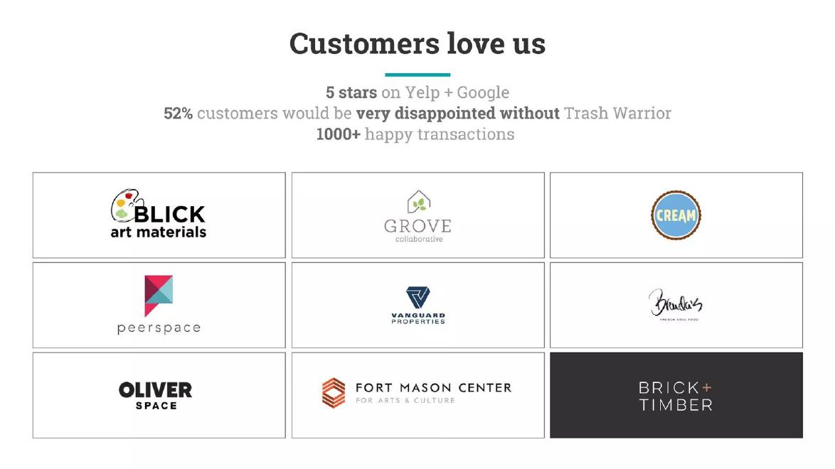
Waste and recycling pickup service. Slide titled "Customers love us".
Trash Warrior deck, slide 12. Exact stored slide matched to this analysis.
Our analysis: Good figure, mixed in with review scores.
Evidence and limitation: Survey and review ratings self-reported; logos shown.
What a founder can adapt: Give the survey its own line with group and count.
Supporting analysis
What the deck claims: "5 stars on Yelp + Google"; "52% customers would be very disappointed without Trash Warrior"; "1000+ happy transactions"; nine customer logos.
Presentation choice: Shows how weaker signals dilute a survey result.
When it does not fit: Stacking survey, stars and counts as one claim.
Language-learning app. Slide titled "Users love Beelinguapp".
Beelinguapp deck, slide 8. Exact stored slide matched to this analysis.
Our analysis: Cites the method but reports a looser answer.
Evidence and limitation: Self-reported; answer category differs from the cited method.
What a founder can adapt: Headline the very-disappointed share.
Supporting analysis
What the deck claims: "Product Market Fit Study: 85% of users would be disappointed if Beelinguapp didn't exist"; four five-star review quotes; "App of the Day"; footnote citing the Superhuman product-market fit write-up.
Presentation choice: A reader who follows the footnote will notice.
When it does not fit: Reporting "disappointed" against a very-disappointed benchmark.
Whether each slide uses the counted answer, gives the sample and date, and pairs the score with behaviour.
Example
Answer reported
Sample and date
Behaviour beside it
Lunchclub
Very disappointed, 42%
No sample; "recent"
Yes, 10 meetings a year
RealFriend
Very disappointed, more than 60%
No
Yes, 2,500 monthly users
Trash Warrior
Very disappointed, 52%
No
Transaction count only
Beelinguapp
Disappointed, 85%
No
No
Key Takeaways
Report "very disappointed" only, exactly as asked.
Say who was surveyed and how many answered.
Date the survey.
Pair the score with a usage or retention figure.
Don't merge survey results with review stars.
Write your survey line
Answer each prompt before putting the figure on a slide.
Answer. What share chose "very disappointed" exactly?
Sample. How many people answered, and who was invited?
Date. In which month was the survey run?
Behaviour. Which usage or retention figure supports the score?
Segment. Is there a group of users with a notably higher score?
Copyable framework: [x]% of [n] [group] surveyed in [month] said they would be very disappointed without [product]. [Usage figure].
Illustrative example 1 — written by us
Before: Product-market fit study: 80% of users would be disappointed without us.
After: 46% of 212 users active in the last 30 days, surveyed in May, said they would be very disappointed without us. Among clinic managers it was 61%. Average user opens the app 4 days a week.
What improved: Our illustrative rewrite; the figures are invented for the example. It reports the counted answer, the sample, the date, a stronger segment and a behaviour figure.
The question this guide answers
Founders ask whether a product-market fit survey result belongs in a pitch deck and how to present it so it counts as evidence. The traction guides in this library cover revenue, growth, retention and NPS; the customer research guide covers interviews and problem validation before a product exists; the testimonial guide covers quotes. None explains how to report this particular survey, which sits between them: it measures how much existing users depend on a product, and it has a well-known benchmark that an informed investor will hold you to.
The survey is usually attributed to Sean Ellis and was popularised by Superhuman's write-up of its own process. Users are asked how they would feel if they could no longer use the product, with answers such as very disappointed, somewhat disappointed and not disappointed. The share answering "very disappointed" is the figure that matters, and around 40% is commonly quoted as the sign of fit. We describe the method only so the examples make sense; this guide does not endorse the threshold as proof of anything.
How we chose and read the examples
We searched the extracted text of the slide library for "very disappointed", "disappointed if", "product-market fit survey" and similar phrases such as "can't live without", removed public companies, listed-company presentations and slides where the phrase was marketing copy rather than a survey result, and viewed the remaining candidates. Few decks report this survey at all. We kept four slides from four startup decks; a fifth candidate was dropped because its source deck could not be retrieved for a full-size read, and a duplicate upload of the Trash Warrior deck was not counted twice.
Every slide was rendered from the original deck at full size and read in full before we wrote about it. We quote what is visible on each slide. We have not seen any company's survey data, and we make no claim that the result affected its fundraising.
What a clean report looks like
Lunchclub, a service that matches professionals for one-to-one meetings, titles the slide "Engagement and retention". The right side carries three statements: "The average user takes 10 meetings a year. This is an order of magnitude higher than 'swiping' networking apps and LinkedIn.", "Consistent engagement across later cohorts and new cities since launch." and "In a recent survey, 42% of users would be very disappointed if Lunchclub went away." The left side has two user quotes, one from a Stanford researcher and one from the founder of Village Global.
Three things make this the strongest example. It uses the exact wording the method counts, "very disappointed", so an informed reader knows what was measured. It reports a figure just above the commonly quoted threshold rather than a dramatic one, which reads as honest. And it places the result beside a behaviour figure, ten meetings a year, so the claim of dependence is backed by what users actually do.
What it leaves out is the size and make-up of the sample and the date. "A recent survey" and "users" could mean everyone who ever signed up or only the most active members, and the answer differs a great deal between the two. The comparison with swiping apps and LinkedIn also has no source. One line such as "n = 300 active users, surveyed March" would close the gap.
Several measures on one slide
RealFriend's slide is headed "New York" and reports results for that city. Three bullets read: "Launched beta in March 2019, currently speaking with 2500 users a month.", "More than 60% of our users would be 'very disappointed' if they could no longer use the service and our NPS is over 40." and "25% month over month growth in engagement". A circle on the right repeats "2500 Monthly Active Users".
This slide gets the wording right, in quotation marks, and it dates the beta launch, so the reader knows the result comes from a product only months old. Pairing the survey with monthly active users and engagement growth is the right instinct: a high score from a large, growing user base means more than the same score from a handful of fans.
The weaknesses are about what each number covers. The survey has no sample size, and "our users" may not mean all 2,500. "More than 60%" and "over 40" are floors, not results; give the actual figures. And "25% month over month growth in engagement" does not say what engagement is or over how many months. NPS and the disappointment survey measure different things, recommendation and dependence, so it helps to say both were asked of the same group at the same time, if they were.
Keep the survey apart from reviews
Trash Warrior, a waste and recycling pickup service, titles its slide "Customers love us". Under the title are three lines: "5 stars on Yelp + Google", "52% customers would be very disappointed without Trash Warrior" and "1000+ happy transactions". Below sits a grid of nine customer logos, including Blick Art Materials, Grove Collaborative, Peerspace and Fort Mason Center.
The survey figure itself is reported with the right wording and is well above the usual threshold. The problem is the company it keeps. Star ratings are public and chosen by whoever leaves a review; "happy transactions" is an unexplained label on a count; and the survey is a private poll of unknown size. Stacked in one block under "Customers love us", they read as three versions of the same claim, and the weakest sets the tone.
The logos raise a further question the slide does not answer: whether the survey was of these business customers, of individual users, or both. For a service with business accounts, "52% of 40 business customers" says something quite different from 52% of one-off household pickups. Give the survey its own line with the group and the count, and let the logos stand as a separate customer list.
Report the answer the method counts
Beelinguapp, a language-learning app built around side-by-side texts and audiobooks, titles its slide "Users love Beelinguapp". The headline reads "Product Market Fit Study: 85% of users would be disappointed if Beelinguapp didn't exist". Four five-star review quotes sit below, an "App of the Day" image fills the right side, and a footnote reads "Source: https://coda.io/@rahulvohra/superhuman-product-market-fit-engine".
Citing the method is good practice, and it is exactly why the headline needs care. The method's benchmark counts only "very disappointed" answers. "Disappointed" as written here would normally combine very and somewhat disappointed, which makes 85% a different and much easier number to reach. An investor who follows the footnote will notice, and the slide then looks either careless or inflated, even if the very-disappointed share alone was strong.
The fix is simple: report the very-disappointed figure as the headline and, if you want, the combined figure beneath it with its label. Add the sample and date. The review quotes and the App of the Day feature are useful as colour, but they are selected praise, not part of the survey, and should be kept visually separate from it.
What the survey can and cannot show
Used carefully, the survey tells an investor that a meaningful share of current users would miss the product. That is useful early, before retention curves have enough months to read. It cannot show that the market is large, that users will pay, or that the result holds for new users who arrive through paid channels. It is also easy to bias: surveying only active users, sending it after a good experience or counting only the people who reply will all push the figure up.
That is why the strongest slides in this set put a behaviour figure beside the score. Lunchclub's meetings per user and RealFriend's monthly users give the survey something to agree with. If your retention or repeat-use data contradicts the survey, investors will believe the behaviour; it is better to show both and explain the difference than to show only the flattering one.
How to present the result
Put the exact question and answer in the slide text: the share who said "very disappointed". Give the number who answered and who was asked, for example active users in the last 30 days, and the month. If you surveyed a segment, name it, and consider showing the segment with the highest score, since that is often your best early market. Place one usage or retention figure next to the score. Keep review stars, testimonials and press features in a separate block or on the testimonial slide.
If your score is below the usual benchmark, you can still use it honestly: show it with the trend over two surveys and what you changed in between. A rising score with a clear explanation is more persuasive than a single high number with no context.
Common mistakes
Wrong answer category. Count only "very disappointed".
No sample size. Say how many answered and who was asked.
Undated. Give the month of the survey.
Floors instead of results. Write 63%, not "more than 60%".
Mixed with review stars. Keep public ratings separate from the survey.
Diagnostic checklist
"Very disappointed" share, exactly worded.
Number of respondents and who was invited.
Month of the survey.
One usage or retention figure beside it.
Reviews and quotes kept separate.
Frequently asked questions
Is a score below 40% worth showing?
It can be, if you show the trend across surveys and what you changed. A single low score with no context is better left out of the main deck.
Should I survey all users or only active ones?
Either is fine if you say which. Active users give a higher score, so label the group so investors can judge it.
Can the survey replace retention data?
No. It is useful before retention curves are long enough to read, but investors will trust behaviour over stated feelings once you have it.
How we chose these examples
Corpus: published pitch deck teardowns on StartupFundraising.com. Founder-uploaded private decks are excluded.
Selection (2026-10-01): we searched extracted slide text for "very disappointed", "disappointed if", product-market fit survey phrases and similar wording, excluded public companies, listed-company presentations, marketing copy and duplicate uploads, and kept four slides from four startup decks. One further candidate was dropped because its source deck could not be retrieved for a full-size read.
Review: all four slides were rendered from the source decks at full size on 2026-10-01 and read in full against company, deck and page number (editorial model review, with AI assistance in drafting). No person has yet completed an editorial review of this page. We did not see any company's survey data.