Retail Distribution in a Pitch Deck: Doors, Points
How consumer brands should show retail distribution to investors: what doors, points of distribution, %ACV and TDPs measure.
Doors, Points of Distribution, %ACV or TDPs: How to Show Retail Distribution in a Pitch Deck
When a food, beverage or personal-care brand gets into more stores, the traction slide usually shows a number going up. The trouble is that four different numbers get used for this, and they measure different things. A door is a store. A point of distribution is usually one product in one store. %ACV is the share of the market's grocery sales that happens in stores carrying you. TDPs (total distribution points) add up %ACV across all your products. Two real decks use these terms in different ways. KOS charts "over 34,000 Total Distribution Points" next to retail doors. Super Coffee reports %ACV and TDPs by region from SPINS data and compares its distribution change with Starbucks and Dunkin'. This guide explains what each measure tells an investor and how to label yours so it can't be misread.
TL;DR
Show the measure that matches your data and say which it is. If you only have your own records, show doors (stores selling at least one product) and points of distribution (store-product pairs), with a footnote defining both. If you buy syndicated retail data from a provider such as SPINS, NielsenIQ or Circana, show %ACV (how much of the channel you reach) and TDPs (reach times the number of products), with the channel, data source and period. In every case, pair distribution with a sales rate such as units per store per week, because buyers drop products that sit on the shelf. A rising count without a definition, period and sales rate tells an investor very little.
Two real decks, three ways to show retail distribution
Each slide below counts distribution differently. Read what each measures, what an investor can check, and what is missing.
KOS traction slide — slide 25
US plant-based nutrition brand that started online and moved into stores; page 25, "KOS Brick & Mortar Growth".
KOS deck, slide 25. Exact stored slide matched to this analysis.
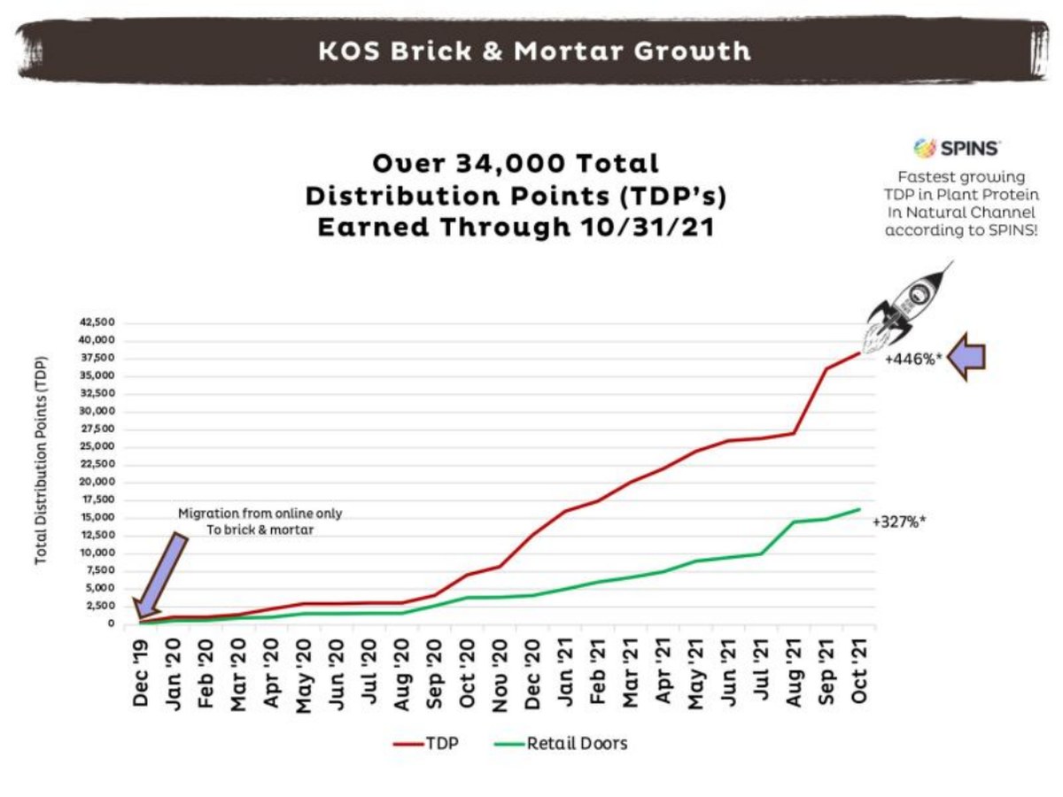
Our analysis: Plotting placements and doors together is useful: the gap between the lines shows range depth growing. The label is the problem. Calling a store-product count "TDP" next to a SPINS TDP claim invites a reader who knows retail data to doubt both.
Evidence and limitation: Our reading: by eye the TDP line ends at about 38,000 and doors at about 16,000, about 2.4 placements per door. A syndicated TDP is capped at 100 per product, so 34,000+ syndicated TDPs is implausible for a brand of this size; the figure is most likely a store-product count, while the SPINS claim uses the syndicated meaning. The asterisks have no visible footnote, so the base of the percentages is unclear. No sales figures appear on this page.
What a founder can adapt: "[n] points of distribution (stores × products, distributor data) in [n] doors, from [n] in [month year]. SPINS: [claim], [channel], [period]."
Supporting analysis
What the deck claims: "Over 34,000 Total Distribution Points (TDP's) Earned Through 10/31/21." Monthly line chart, Dec 2019 to Oct 2021, y-axis "Total Distribution Points (TDP)", two lines: "TDP" and "Retail Doors". Callouts: "Migration from online only to brick & mortar" (Dec 2019); "+446%*" on TDP and "+327%*" on retail doors; "Fastest growing TDP in Plant Protein In Natural Channel according to SPINS!"
Presentation choice: It shows how one term can carry two meanings on the same slide.
When it does not fit: Don't label a store-product count as TDPs, and don't leave growth percentages without a start date.
Super Coffee (Kitu Life) traction slide — slide 23
US ready-to-drink coffee brand; page 23, "L12 Weeks Super Coffee RTD Max ACV & TDP's".
Super Coffee deck, slide 23. Exact stored slide matched to this analysis.
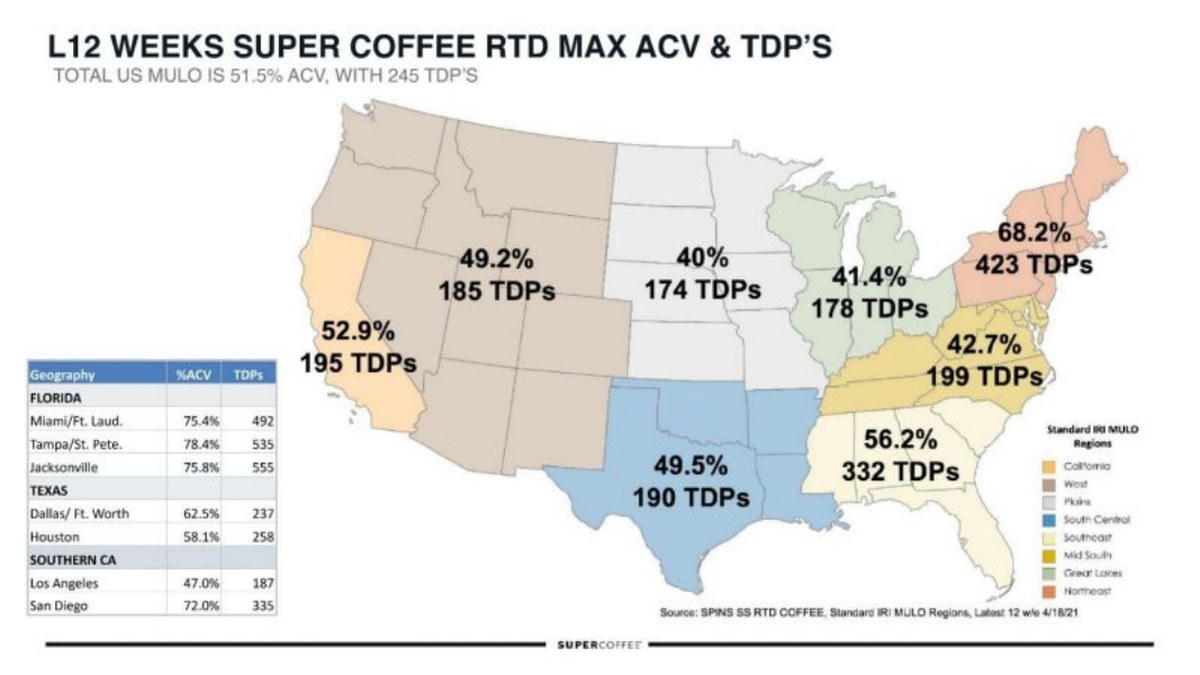
Our analysis: The most complete use of syndicated distribution data here: reach and depth for every region, with a source line an investor can check. It lets a reader see where the brand is strong and where distribution can still grow.
Evidence and limitation: Our arithmetic: 245 ÷ 51.5 ≈ 4.8 products per carrying store nationally; Miami 492 ÷ 75.4 ≈ 6.5; Dallas 237 ÷ 62.5 ≈ 3.8; Los Angeles 187 ÷ 47.0 ≈ 4.0. The measures, channel, data provider and period are all stated. The slide shows no sales rate and no comparison with competitors' ACV.
What a founder can adapt: Add velocity beside each region: "[units]/store/SKU/week, same source".
Supporting analysis
What the deck claims: "Total US MULO is 51.5% ACV, with 245 TDP's." US map by region: California 52.9% / 195 TDPs; West 49.2% / 185; Plains 40% / 174; Great Lakes 41.4% / 178; Northeast 68.2% / 423; Mid-South 42.7% / 199; South Central 49.5% / 190; Southeast 56.2% / 332. Table by market: Miami/Ft. Laud. 75.4% / 492; Tampa/St. Pete. 78.4% / 535; Jacksonville 75.8% / 555; Dallas/Ft. Worth 62.5% / 237; Houston 58.1% / 258; Los Angeles 47.0% / 187; San Diego 72.0% / 335. "Source: SPINS SS RTD COFFEE, Standard IRI MULO Regions, Latest 12 w/e 4/18/21."
Presentation choice: It shows %ACV and TDPs used correctly together, with a full source line.
When it does not fit: Don't show regional distribution without saying which channel and period it covers.
Super Coffee (Kitu Life) traction slide — slide 17
Same deck; page 17, "Which is why we are leading the category in distribution growth".
Super Coffee deck, slide 17. Exact stored slide matched to this analysis.
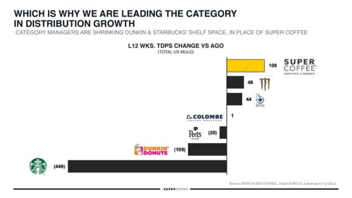
Our analysis: Comparing TDP change with named competitors is the right way to use a measure that means little on its own. It would be stronger with each brand's base and one consistent period.
Evidence and limitation: Our reading: changes only, with no starting TDPs, so the relative size of each move is unknown. The chart title says latest 12 weeks versus a year ago and the source line says latest 52 weeks. The headline's causal claim (shelf space taken from Dunkin' and Starbucks for Super Coffee) is the company's interpretation; the chart shows net changes, not the swap.
What a founder can adapt: "TDPs [start] → [end], [change] vs category leaders [change], [channel], [period]".
Supporting analysis
What the deck claims: "Category managers are shrinking Dunkin & Starbucks' shelf space, in place of Super Coffee." Bar chart "L12 wks. TDPs change vs ago (Total US MULO)": Super Coffee 108, Monster 48, a third brand 44, La Colombe 1, Peet's (20), Dunkin' Donuts (109), Starbucks (449). "Source: SPINS SS RTD COFFEE, Total US MULO, Latest 52 w/e 4/18/21."
Presentation choice: It shows distribution read against the category rather than in isolation.
When it does not fit: Don't present a change without its base, or imply cause from net changes.
Measure, definition, source and what is missing on each page.
Slide
Measure
Defined
Source and period
Reach vs depth
Missing
KOS p25
"TDP" (likely store × product) + doors
No
Through 10/31/21; SPINS for one claim
Visible from two lines
Definition, growth base, sales
Super Coffee p23
%ACV + TDPs
Standard terms
SPINS MULO, 12 weeks to 4/18/21
Yes, by region
Sales rate, competitors
Super Coffee p17
TDP change vs competitors
Standard terms
SPINS MULO (12 vs 52 weeks unclear)
No
Starting bases
Key Takeaways
Doors count stores; points of distribution count products in stores.
%ACV weights stores by their total sales; a large supermarket counts for more than a corner shop.
TDPs add %ACV across your products, so adding a flavour raises TDPs even with no new stores.
A syndicated-data TDP is not the same number as a store-times-product count. Don't use the name for both.
Name the channel, data source and period beside any distribution figure.
Pair distribution with sales per store, and with the trade spend it cost.
Build your retail distribution slide
Answer each prompt with a number, a definition and a source.
Measure. Which are you showing: doors, points of distribution, %ACV or TDPs? Use the name that matches how the number was calculated.
Source. Own distributor and retailer reports, or syndicated data (which provider, which channel)? State it on the slide.
Period. Latest month, latest 12 weeks or 52 weeks? Use one period consistently in the title and source line.
Reach vs depth. How much of the growth came from new stores and how much from more products per store?
Comparison. What is your start point, and how does your change compare with named competitors, with their bases?
Sales rate. Units or dollars per store per week (or per point), from the same source and period.
Copyable framework: [n] [measure: defined] in [n] doors ([source], [period]), up from [n] in [period]. Growth: [x]% new stores, [y]% more products per store. Selling [n] units/store/SKU/week vs [n] category.
Illustrative example 1 — written by us
Before: Over 34,000 Total Distribution Points (TDP's) earned through 10/31/21.
After: [n] points of distribution (stores × products, distributor data) in [n] doors at 10/31/21, up from [n] in Dec 2019.
What improved: Built from KOS's page 25. Exact counts and the start point are placeholders; our chart readings are by eye.
Illustrative example 2 — written by us
Before: L12 wks. TDPs change vs ago: Super Coffee 108 … Starbucks (449).
After: TDPs [start] → [end] (+108) vs Starbucks [start] → [end] (−449), SPINS total US MULO, 12 weeks to 4/18/21 vs year ago.
What improved: Built from Super Coffee's page 17. Starting and ending bases are placeholders the slide doesn't give.
Why distribution is not the same as traction
Getting on the shelf is an achievement, but investors know it is the start of the test, not the end. A retailer can take a product into hundreds of stores and drop it a few months later if it doesn't sell. Distribution growth bought with slotting fees and promotions can also cost more than it earns. So investors read a distribution chart with three questions: what exactly is being counted, how fast is the product selling where it is stocked, and what did the expansion cost?
Those questions only have clear answers if the slide uses the right unit and defines it. The four common units are below, with what each measures and where it comes from.
This guide explains how to present your own distribution data clearly. It is not legal, accounting or investment advice.
The four measures, in plain terms
Doors: the number of stores selling at least one of your products. Easy to understand and easy to get from your own distributor and retailer reports. Its weakness is that every store counts the same, whether it is a high-volume supermarket or a small independent.
Points of distribution: usually the number of store-product pairs, so five products in 100 stores is 500 points. This captures range depth (how many of your products each store carries) as well as reach. Brands that count from their own records often use this term; define it in a footnote as individual products available across all stores.
%ACV (all-commodity volume): the share of a channel's total sales made in stores that carry your product. NielsenIQ's explanation uses three stores with $50M, $70M and $80M of annual sales; if your product is in the second and third, your %ACV is 150 ÷ 200 = 75%, not the 67% a simple store count would give. %ACV runs from 0 to 100 and comes from syndicated scan data, not from your own records.
TDPs (total distribution points): the sum of %ACV across all your products. SPINS's glossary gives the example of three ice-cream flavours at 100, 100 and 50 %ACV, which add up to 250 TDPs, and states plainly that TDPs are not the number of locations selling a product. Each product can contribute at most 100, so TDPs grow when you add stores or add products. On their own they mean little; they are useful compared with your past self or your competitors. (NielsenIQ, SPINS)
The same name, two different numbers
The most common confusion is using "distribution points" or "TDPs" for a store-times-product count. In syndicated data, a single product can add at most 100 TDPs. KOS's page 25 headline, "Over 34,000 Total Distribution Points (TDP's) earned through 10/31/21", would, as a syndicated figure, need more than 340 products each in 100% of a channel. The chart plots retail doors on the same axis and attributes a separate claim ("Fastest growing TDP in Plant Protein in Natural Channel") to SPINS. Our reading: the 34,000 is most likely KOS's own count of store-product pairs, while the SPINS claim uses the syndicated meaning. The slide doesn't say which, so the reader has to guess.
Neither number is wrong, but they answer different questions. A store-product count tells an investor how many shelf placements you hold. A syndicated TDP tells them how much of the channel's sales those placements reach. Label yours: "points of distribution (stores × products, from distributor reports)" or "TDPs (sum of item %ACV, SPINS natural channel, latest 12 weeks)".
A quick check for readers: divide points of distribution by doors to get the average number of your products per store. From KOS's chart, by eye, roughly 38,000 points over about 16,000 doors is a little over two products per door; a brand at five per door would be growing mainly by range depth. That ratio tells an investor whether growth comes from new stores or from more products in existing ones, which have different costs and risks.
Reach versus depth: reading %ACV and TDPs together
%ACV tells you how much of the channel you reach; TDPs divided by %ACV gives the average number of your products in the stores that carry you. Super Coffee's page 23 prints both: 51.5% ACV and 245 TDPs across total US MULO (a combined channel of multi-outlet retailers). Our arithmetic: 245 ÷ 51.5 ≈ 4.8 products on average where it is stocked.
The regional table makes the trade-off visible. Miami/Ft. Lauderdale shows 75.4% ACV and 492 TDPs (about 6.5 products per carrying store), while Dallas/Ft. Worth shows 62.5% and 237 (about 3.8). Los Angeles is lowest at 47.0% and 187. An investor can see where the brand is established and where there is room to grow, without the slide claiming either.
When presenting TDPs, say whether growth came from reach or depth. Adding three flavours into existing stores can raise TDPs sharply with no new customers reached. That may be good business, but it is a different story from winning new retailers.
Compare against the category, and give the base
Because TDPs have no upper limit, a change is easier to read than an absolute number, and a change against named competitors is easier still. Super Coffee's page 17 charts the 12-week change in TDPs against a year ago: Super Coffee +108, against Starbucks −449 and Dunkin' −109, with Monster +48, another brand +44, La Colombe +1 and Peet's −20. The source line is SPINS, total US MULO, latest 52 weeks ending 4/18/21.
Two details make this kind of chart stronger. First, give each brand's starting TDPs. A gain of 108 means something different on a base of 137 than on a base of 2,000, and the slide shows changes only. Second, match the period labels: the chart title says latest 12 weeks versus a year ago, while the source line says latest 52 weeks. Investors notice that sort of mismatch, so say which period the numbers cover.
Percentages need the same care. KOS's +446% TDP and +327% retail-door growth carry asterisks, but no matching footnote is visible on the page, so the start date of the growth is unclear. Give the start point: "from [n] in [month year] to [n] in [month year]".
Split distribution growth by source
The clearest way to explain distribution growth is to split each period's total into three parts: placements you already had, placements from new accounts, and line extensions (new products) in existing accounts, with the ending door count printed under each bar. A footnote should define both measures: points of distribution are individual products across all stores; doors are stores carrying at least one product.
That split answers an investor's next question before it is asked: is growth coming from new retailers (which brings onboarding cost and slotting fees) or from more products in retailers that already trust you? It also exposes churn. If the "existing" part of this quarter's bar is smaller than last quarter's total, some placements were lost, and the slide should say how many and why.
Keep targets apart from results. If a retailer has agreed to test you in a region, or you are negotiating a national listing, put it in a separate, clearly labelled box rather than in the bars. Then add a sales rate, units or dollars per store per week, so an investor can tell whether the new placements are selling. The food traction guide covers velocity in more detail.
A worked example (hypothetical)
An invented sparkling-tea brand has 4 flavours. Its own distributor reports show 2,400 doors and 7,200 points of distribution, an average of 3 flavours per door. A year ago it had 900 doors and 1,800 points (2 per door). Growth in points: 7,200 ÷ 1,800 = 4x, of which reach (doors 2.7x) explains most and depth (2 to 3 per door, 1.5x) the rest.
It also buys SPINS natural-channel data: 38% ACV and 118 TDPs, so about 3.1 flavours on average where it is carried. It sells 2.1 units per store per SKU per week, against a category average of 1.8 from the same report.
Slide line: "7,200 points of distribution (stores × flavours, distributor reports, Sept 2026) in 2,400 doors, up from 1,800 in 900 doors a year ago. Natural channel: 38% ACV, 118 TDPs (SPINS, 12 weeks to Sept 2026). 2.1 units/store/SKU/week vs 1.8 category." All figures in this example are invented for illustration.
Make the rest of the deck agree
Distribution figures should connect to revenue. Points of distribution × units per point per week × weeks × net price per unit should come close to your retail revenue for the period. If it doesn't, something is mismatched: perhaps the distribution count is the latest month while revenue covers the year, or the price is the shelf price rather than what you receive after retailer margin and trade spend.
If your ask funds distribution growth, state the target in the same unit as the traction slide (for example, from 7,200 to 20,000 points of distribution), and show what it costs: slotting, promotion and field sales per new door. The trade spend guide covers how to show those costs against net margin.
Common mistakes
One name, two numbers. Don't call a store × product count "TDPs".
No definition. Footnote what each measure counts.
Undated growth. Give the start point for any growth percentage.
Change without base. Show starting values next to changes.
Mixed periods. Use the same period in the title and source line.
Distribution without sales. Add a sales rate per store or point.
Diagnostic checklist
The measure is named correctly and defined.
Channel, data source and period are stated.
Growth has a start point.
Reach and depth are separated.
Changes are shown with their bases, against named competitors where possible.
A sales rate sits beside the distribution figure.
Distribution, sales rate and revenue reconcile.
Frequently asked questions
What is the difference between %ACV and TDPs?
%ACV is the share of a channel's sales made in stores carrying a product, from 0 to 100. TDPs add %ACV across all of a brand's products, so they rise when you add products as well as stores and have no upper limit.
Are TDPs the number of stores selling my product?
No. SPINS's own glossary says TDPs are not the number of locations selling a product. Show doors for store count.
I don't buy syndicated data. What should I show?
Doors and points of distribution from your distributor and retailer reports, defined in a footnote, with units per store per week from retailer sales reports where you have them.
Is a big distribution number enough traction for investors?
Rarely on its own. Investors also want to know how fast the product sells where it is stocked and what the distribution cost in slotting fees and promotions.
How we chose these examples
Discovery (2026-10-04, run 86): read the unused KOS (30 pages) and Misha's Kind Foods (27 pages) decks end to end as page sheets, after runs 84–85 found measure-name searches thin. KOS page 25 led to a corpus search for TDPs, %ACV and points of distribution. Closest content read: the live food traction guide (one line on doors vs points of distribution) and the live consumer-product retail traction guide (store count vs velocity). Neither explains %ACV, TDPs or the two meanings of "distribution points".
Rendered and read at full size from the original deck files: KOS 25, Kitu Life (Super Coffee) 17 and 23, and Chobani 41. Chobani 41 was set aside because the page carries a "highly confidential, not for distribution" watermark. KOS 25 and Kitu Life 17 and 23 were prepared at 1200px wide and uploaded through the standing slide-image workflow. Repair (2026-10-07, v2): one example, and every figure taken from it, was removed because its deck is held under the whole-deck source rule; every page of the KOS and Kitu Life decks was reviewed visually and its top and bottom edges were read by text recognition at double size; neither carries a confidentiality or distribution notice. KOS marks some of its own figures "Redacted to protect the innocent"; those are the company's redactions, not a distribution restriction, and no redacted page is used.
Chart readings are by eye and described as such. Ratios are our arithmetic from printed values. Company figures are reported as printed and not verified. This guide explains presentation, not legal, accounting or investment advice. Slide readings and analysis are an AI editorial model review, not human-checked.