Utilization and Occupancy in a Pitch Deck: Define It, Show
If your revenue depends on how full your trucks, rooms, beds or machines are, show what utilization means, where you are today.
Utilization in Your Pitch Deck: How to Show How Full Your Assets Are and Why It Matters
Four slides from four real pitch decks rest on one assumption: how much of the available capacity gets sold. A mobile mechanic prices a service truck at two utilization rates, a rental fund shows the occupancy at which it breaks even, a flexible-housing company charts its actual occupancy through 2020, and a hostel developer forecasts occupancy and room price together. Each shows a different part of what an investor needs.
TL;DR
If your revenue depends on how full something is (trucks, rooms, beds, machines, seats, network capacity), investors will rebuild your numbers from one percentage. Give them four things: what the percentage measures (sold units divided by which available units, over what period), your actual rate with dates, the rate at which you break even, and how much of your forecast growth comes from utilization rather than price or added capacity.
None of the four slides below does all four. GH Mobil shows clearly how revenue moves with utilization but measures it against every day of the year and does not say whether 70% or 80% has ever been reached. InvestNet gives a break-even occupancy next to its base case. June Homes shows a dated actual occupancy series, including a deep drop and recovery, without saying what the measure counts. Nomuri's forecast lets you separate occupancy growth from price growth, and shows that price carries most of it.
Four real slides built on a utilization rate
Each slide is shown as it appears in the original deck, followed by what it says, what we checked and what a founder can take from it.
GH Mobil unit economics slide — slide 9
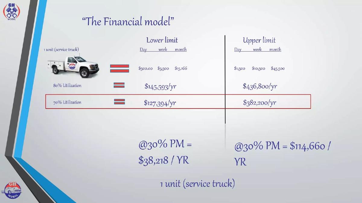
Mobile mechanics ("Gear Head Mobil") founded by a US Marine Corps veteran, serving used-car owners and commercial fleets from service trucks. Deck undated. A page headed "The Financial model".
GH Mobil deck, slide 9. Exact stored slide matched to this analysis.
Our analysis: A clear sensitivity of revenue to utilization for one asset, with every figure rebuildable. But 70% or 80% here means 70% or 80% of every day of the year, including weekends, and the slide gives no achieved rate.
Evidence and limitation: Our calculations: $500 × 7 × 52 ÷ 12 = $15,166.67, so the month assumes seven working days a week. $15,166 × 12 × 0.8 = $145,594 (slide $145,593, rounding); × 0.7 = $127,394. $45,500 × 12 × 0.8 = $436,800; × 0.7 = $382,200. 30% of $127,394 = $38,218 and 30% of $382,200 = $114,660, so the profit lines use the 70% row. Every figure matches. "PM" is not defined on the slide; we read it as profit margin, but the slide does not say which costs it is after.
What a founder can adapt: Keep the layout. State the denominator (working days or calendar days), add the rate you have actually achieved and over what period, and name the costs behind the profit margin.
Supporting analysis
What the deck claims: One service truck, "Lower limit" $500 a day, $3,500 a week, $15,166 a month; "Upper limit" $1,500, $10,500 and $45,500. At "80% Utilization" $145,593 a year (lower) and $436,800 (upper); at "70% Utilization" $127,394 and $382,200, with the 70% row boxed. Below: "@30% PM = $38,218 / YR" and "@30% PM = $114,660 / YR".
Presentation choice: Shows the mechanism in one glance: one truck, a day rate, a utilization rate, an annual result. Showing two rates and boxing the lower one signals which case the founders want judged.
When it does not fit: Don't apply a utilization rate to a seven-day, 52-week calendar unless the asset really works every day. Against a five-day week, 70% of calendar days is about 98% of working days.
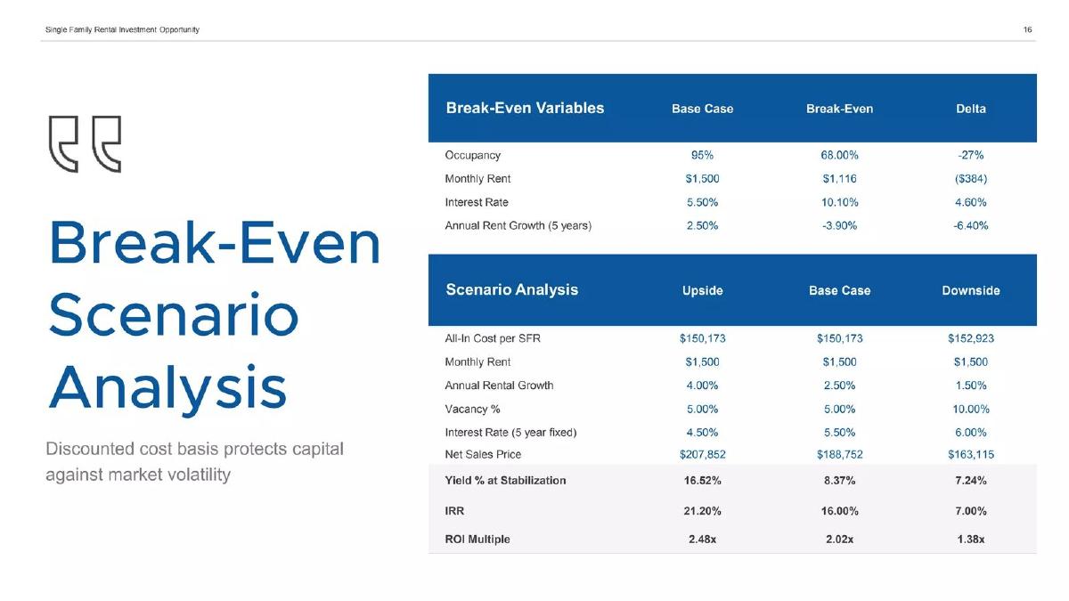
Real estate asset manager in Northwest Arkansas raising for a fund to buy distressed single-family homes and rent them out. Deck undated; marked as an informational brochure, not an offer of securities. A page headed "Break-Even Scenario Analysis".
InvestNet deck, slide 18. Exact stored slide matched to this analysis.
Our analysis: The only slide here that puts a break-even rate beside the base case, which makes the cushion visible at a glance. The break-even definition and an achieved rate are missing.
Evidence and limitation: The delta is 95 − 68 = 27 percentage points, written as −27%; in relative terms occupancy could fall by 28% (68 ÷ 95 = 0.716) before break-even. The downside case uses 10% vacancy, which is 90% occupancy, still 22 points above break-even. The slide does not say what "break-even" refers to (cash flow after debt service, or zero return on the fund), whether each break-even value is calculated with the other variables held at base, or what occupancy the firm has achieved on homes it already manages.
What a founder can adapt: Put your break-even utilization next to your actual or base rate and give the gap in percentage points. Say what break-even means and that each variable is moved one at a time, if that is how it was done.
Supporting analysis
What the deck claims: "Break-Even Variables": occupancy base case 95%, break-even 68.00%, delta −27%; monthly rent $1,500 vs $1,116 (−$384); interest rate 5.50% vs 10.10%; annual rent growth 2.50% vs −3.90%. "Scenario Analysis": vacancy 5.00% upside and base, 10.00% downside; yield at stabilization 16.52%, 8.37%, 7.24%; IRR 21.20%, 16.00%, 7.00%; ROI multiple 2.48x, 2.02x, 1.38x. Side text: "Discounted cost basis protects capital against market volatility".
Presentation choice: Turns a single assumed rate into a range with a floor, and shows the same test for rent, interest rate and rent growth.
When it does not fit: Don't write a change in a rate as a percent (−27%) when it is a difference in points; and don't present a 95% base case without the occupancy you have actually achieved.
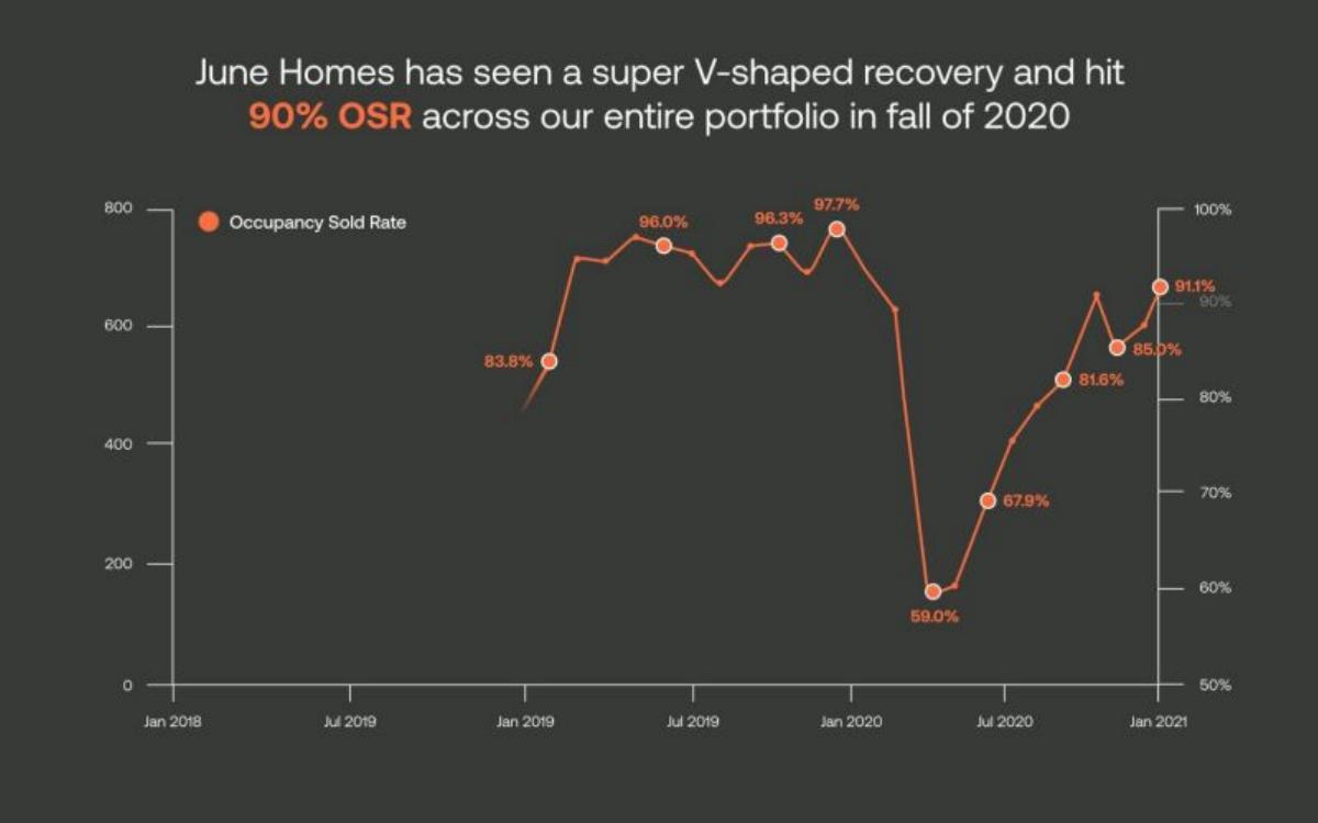
Flexible rental-housing company ("Building the world's largest housing company without owning a single property"), deck from early 2021.
June Homes deck, slide 18. Exact stored slide matched to this analysis.
Our analysis: An actual, dated utilization series that shows a fall from the high 90s to 59.0% and a recovery to 91.1%. It is the strongest evidence of achieved utilization among the four slides; the definition and the size of the portfolio are missing.
Evidence and limitation: Read from the chart image. The labelled autumn 2020 points are 81.6% and 85.0%; an unlabelled point between them appears close to 90% on the axis, which may be the month the headline refers to, but we cannot read its exact value. A left axis runs from 0 to 800 with no label and no second series is visible, so we do not interpret it. The slide does not define "occupancy sold rate" (for example, units let as a share of units available) or say how many units the portfolio held at each date.
What a founder can adapt: Chart your actual monthly utilization from the start, label the measure (sold units ÷ available units), and show the number of units beside it, since 90% of 20 units and 90% of 800 units are different evidence.
Supporting analysis
What the deck claims: Headline: "June Homes has seen a super V-shaped recovery and hit 90% OSR across our entire portfolio in fall of 2020". A monthly line, "Occupancy Sold Rate", from early 2019 to January 2021, right axis 50% to 100%. Labelled points: 83.8% (early 2019), 96.0%, 96.3% and 97.7% (through late 2019), 59.0% (spring 2020), 67.9%, 81.6%, 85.0% and 91.1% (January 2021).
Presentation choice: Investors trust a long, dated actual series far more than an assumed rate, and showing the bad months openly makes the recovery believable.
When it does not fit: Don't leave an unlabelled axis on the chart, and make the headline figure match a labelled point.
Nomuri (Baldaszti Group) unit economics slide — slide 18
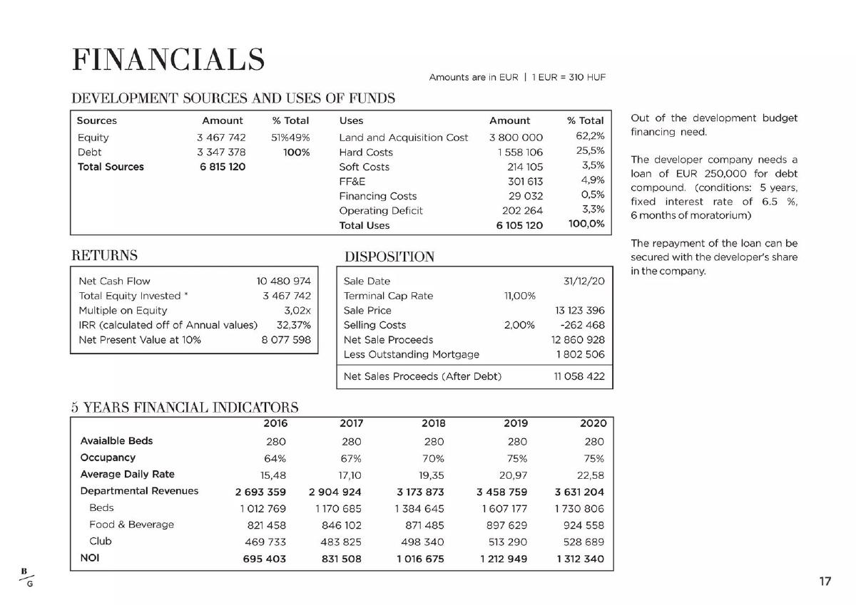
Budapest hostel development by Baldaszti Group. The deck's forecast starts in 2016, so it dates from about 2015; the hostel was a project, not an operating business. A page headed "Financials", amounts in EUR.
Nomuri (Baldaszti Group) deck, slide 18. Exact stored slide matched to this analysis.
Our analysis: A forecast that states its capacity, occupancy and price separately, so the reader can see that a 46% rise in nightly price, not occupancy, carries most of the projected bed-revenue growth.
Evidence and limitation: Our calculations: 280 beds × 365 nights × 64% × €15.48 = €1,012,516 against €1,012,769 shown for 2016 (0.02% apart); for 2020, 280 × 365 × 75% × €22.58 = €1,730,757 against €1,730,806. So bed revenue is beds × nights × occupancy × daily rate. From 2016 to 2020 bed revenue rises 70.9% (1,730,806 ÷ 1,012,769 = 1.709). Occupancy contributes a factor of 1.172 (75 ÷ 64, +11 percentage points) and daily rate a factor of 1.459 (22.58 ÷ 15.48); 1.172 × 1.459 = 1.709. All figures are forecasts. The development table's sources (6,815,120) exceed its uses (6,105,120) by 710,000, unexplained on the slide.
What a founder can adapt: Show capacity, utilization and price as separate rows, and add a line that splits revenue growth between them. Label the table as a forecast.
Supporting analysis
What the deck claims: "5 Years Financial Indicators" for 2016 to 2020: available beds 280 each year; occupancy 64%, 67%, 70%, 75%, 75%; average daily rate 15.48, 17.10, 19.35, 20.97, 22.58; bed revenues 1,012,769 rising to 1,730,806; departmental revenues 2,693,359 to 3,631,204; NOI 695,403 to 1,312,340. Above: development sources and uses (total sources 6,815,120) and returns (3.02x multiple on equity, 32.37% IRR).
Presentation choice: Gives every driver on its own line, which lets an investor test each one: is 75% occupancy realistic for a Budapest hostel, and is a 46% price rise in four years?
When it does not fit: Don't let a modest occupancy assumption distract from an aggressive price assumption; investors will find the larger driver.
After: One truck at $500/day: 70% of 364 days = $127,394 a year. Equivalent to about 98% of a five-day working year. Achieved to date: [x]% over [period].
What improved: Built from GH Mobil's page 9 figures; the achieved rate is a placeholder. States the denominator and shows what the assumption means on a working calendar.
Illustrative example 2 — written by us
Before: Bed revenue grows from €1.01M to €1.73M.
After: Forecast bed revenue +71% (2016–2020): occupancy 64% to 75% (+11 points, factor 1.17) and average nightly rate €15.48 to €22.58 (factor 1.46).
What improved: Built only from Nomuri's page 18 figures. Shows that price, not occupancy, carries most of the growth.
Why one percentage carries so much weight
Some businesses sell time on an asset: a hotel room per night, a truck per day, a bed per night, a machine per hour, a home per month. Their capacity is mostly fixed in the short run, and much of the cost is paid whether the asset is used or not. That makes revenue and profit unusually sensitive to how full the asset is. A few points of utilization can be the difference between a loss and a profit.
So investors tend to look for the utilization figure first and rebuild the rest from it. When a slide states revenue at an assumed rate without saying what the rate measures, whether it has been achieved, or what happens if it is lower, the investor has to guess the most important input in the model.
This guide is about presenting that input. Two neighbouring guides cover related ground: the location economics guide shows how to lay out one store, site or venue from opening cost to profit after rent; the scenarios guide covers base, upside and downside cases in general. Here the question is narrower: how to show the single rate those numbers depend on.
Four things to show about utilization
Our framework, used throughout this guide.
Definition. Utilization is a fraction. Say what goes on top (nights sold, days billed, hours run, units let) and what goes underneath (nights available, working days, hours the machine could run, units owned). The denominator matters most: 80% of 365 days is a different claim from 80% of 250 working days. Official statistics use the same structure: the Federal Reserve defines capacity utilization as output expressed as a percentage of capacity, an estimate of sustainable potential output. For a startup, the denominator should likewise be the capacity you could realistically sell, not a theoretical maximum.
Actual rate with dates. Show what you have achieved, by month or quarter, and on how many assets. If you have only a forecast, say so in the label.
Break-even rate. The rate at which revenue covers the costs you pay regardless of use. Shown next to your actual or base rate, the gap in percentage points tells the investor how much room there is.
Growth split. If your forecast revenue grows, show how much comes from higher utilization, how much from higher price per unit, and how much from more capacity. The three carry different risks, and investors weigh them differently. (Board of Governors of the Federal Reserve System)
Worked example: break-even utilization for one asset
Hypothetical example, invented for illustration; the numbers are not from any deck. A company runs one equipment-rental machine available 250 working days a year, rents it at $400 a day, pays $50 a day in variable costs when it is rented, and pays $45,000 a year in fixed costs (finance, insurance, storage, maintenance contract).
Contribution per rented day: $400 − $50 = $350. Days needed to cover fixed costs: $45,000 ÷ $350 = 128.6, so 129 days. Break-even utilization: 129 ÷ 250 = 51.6%, about 52%.
If the company has achieved 68% over the last twelve months, the slide can say: 68% actual utilization (170 of 250 working days, last 12 months), break-even 52%, a cushion of 16 percentage points. If the same 52% were calculated against 365 calendar days, the break-even would read 35% (129 ÷ 365) and look far safer than it is. Use the same denominator for every rate on the slide.
Percentage points versus percent
A move from 64% to 75% occupancy is 11 percentage points, and a 17.2% increase in occupancy (75 ÷ 64 = 1.172). Both are correct, but they describe different things, and a slide that writes "occupancy up 11%" or "up 17%" without saying which leaves the reader to work it out. Our recommendation: describe changes in a rate in percentage points, and use percent only for the effect on revenue.
When new capacity changes the rate
Utilization is an average across the assets you have, so it moves when you add assets as well as when demand changes. A new truck, building or batch of rooms usually starts nearly empty and pulls the average down for a few months, even if every older asset is as busy as before. A company growing fast can therefore show falling utilization while demand is rising, and a company that stops adding assets can show rising utilization without winning a single new customer.
Our recommendation: if you add capacity during the period you chart, show utilization for assets open a full year separately from newer ones, or at least show the number of assets on the same chart. An investor reading June Homes' line, for example, cannot tell whether the recovery after spring 2020 happened on the same portfolio or on a changed one, because the slide does not give the unit count.
The same logic applies to forecasts. If your plan doubles capacity and keeps utilization flat, say how the new assets fill: from existing demand you are turning away, from a new market, or from lower prices. Each answer leads to a different question from the investor, and the slide should answer the one it raises.
Utilization and price pull against each other
Raising price usually makes it harder to fill capacity, and filling capacity often means discounting. A forecast that raises both at once, as Nomuri's does (occupancy up 11 points while the nightly rate rises 46%), needs a reason: a renovation, a better location, a change in customer mix, or evidence from comparable operators. Hotels track the two together as revenue per available room (occupancy × average daily rate), which is a useful single number for any asset sold by the night or the day. If you show it, show its two parts beside it.
Common mistakes
No denominator. A utilization rate without saying what it is measured against.
Calendar-day inflation. Applying a rate to every day of the year for an asset that works weekdays.
Assumed rate as fact. Revenue at 80% utilization with no achieved rate beside it.
Points written as percent. Describing an 11-point rise in occupancy as a 17% rise, or the reverse, without saying which.
Hidden price driver. A forecast where rising price carries the growth while the slide talks about occupancy.
No break-even. No rate shown at which the asset stops covering its fixed costs.
Diagnostic checklist
The rate is defined: what is sold, divided by what is available, over which period.
The same denominator is used for every rate on the slide.
An achieved rate with dates and asset count appears before any assumed rate.
A break-even rate is shown with the gap in percentage points.
Changes in the rate are written in percentage points.
Forecast revenue growth is split between utilization, price and capacity.
Forecast columns are labelled as forecasts.
Frequently asked questions
Should I use calendar days or working days?
Use the days the asset can actually be sold. If your trucks or machines work weekdays only, measure against working days; if rooms or beds can be sold every night, use calendar nights. Say which on the slide.
I have no operating history. What utilization should I assume?
Label it as an assumption, give the source of the figure (a comparable operator, an industry survey, a pilot), and show the break-even rate so the investor can see how far below your assumption you could fall.
What if my utilization dropped during a bad period?
Show it. June Homes charts a fall to 59.0% and a recovery to 91.1%; seeing the drop is what makes the recovery credible.
Is higher utilization always better?
Not always. Near full capacity there may be no room for peak demand, maintenance or price increases. If you are close to 100%, explain whether growth will come from price or added capacity instead.
How we chose these examples
Search (2026-10-03): instead of a sector search, the durable corpus index was searched for utilization, occupancy, load-factor and similar rates that drive a revenue or profit figure on the same slide, across all industries. Decks from listed companies (Superloop and others), SPAC decks and slides already analysed for the same purpose in another guide (Carma p7) were set aside; Mint House p6 and Stay Ulo p7 gave a single headline rate without a definition or link to economics. GH Mobil, InvestNet, June Homes and Nomuri teardowns are live; no deletion or takedown request names these companies.
Four pages were rendered from the original public deck files at 1200px wide and read from the images: GH Mobil 9, InvestNet 18, June Homes 18 and Nomuri 18. All four are new uploads. Figures were checked by recalculation where the slide allows it; values not printed on a chart were not estimated.
Company figures are not verified. The worked example is invented and labelled. Classifications and recommendations are our editorial reading, not financial advice. Drafted with AI assistance and checked by an editorial model against the slide images; not reviewed by a person.