Accuracy Claims on a Pitch Deck: Say What Was Measured
An accuracy percentage means little until you say what was counted, on how many cases and compared with what.
Accuracy Claims on a Pitch Deck: Say What Was Measured, On What, Against What
AI products, diagnostic tests, forecasting tools and sensors all end up on a slide with one big percentage: '90% accuracy'. Investors have seen hundreds of these and know that the number alone says almost nothing. What makes it credible is the short line underneath it: what exactly was measured, on how many cases, under what conditions and against what alternative. This guide uses four real slides to show what that line needs to say.
TL;DR
An accuracy claim persuades only when it answers four questions: what was counted as correct, how many cases were tested and where they came from, what the number is compared with, and whether the test was run by you or by someone else. Oncocheck's slide gives a sample size, 'Validated on n=100', but its headline says 'sensitivity and specificity' while the body says 'accuracy', which are different measures. Genie AI's '92% and 94% accurate' is really the share of lawyers who gave a thumbs up, a satisfaction score rather than a measured error rate. Prelaunch's '86% accuracy of forecasting the product's demand' gives none of the four answers. Deepgram's 70% to 90% shows the most useful thing, a comparison, but not the test it was measured on. Name the measure, the test set and the baseline beside the number.
Four accuracy claims, from a stated sample to a bare number
Each slide is read at full size. Quotes are exact.
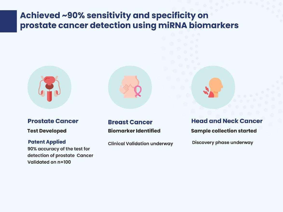
Oncocheck technology slide — slide 14
Cancer detection test using miRNA biomarkers. Programme-stage slide.
Oncocheck deck, slide 14. Exact stored slide matched to this analysis.
Our analysis: Honest about stage, but mixes sensitivity/specificity and accuracy, and gives no sample split or setting.
Evidence and limitation: Sample size of 100 stated; stage of each programme stated.
What a founder can adapt: Report sensitivity and specificity separately with the positive and negative sample counts.
Supporting analysis
What the deck claims: Headline: "Achieved ~90% sensitivity and specificity on prostate cancer detection using miRNA biomarkers". Body: "90% accuracy of the test for detection of prostate Cancer Validated on n=100". Breast cancer: "Clinical Validation underway". Head and neck: "Discovery phase underway".
Presentation choice: Shows a claim that is close to credible and what it still needs.
When it does not fit: Using a different measure in the headline from the one in the body.
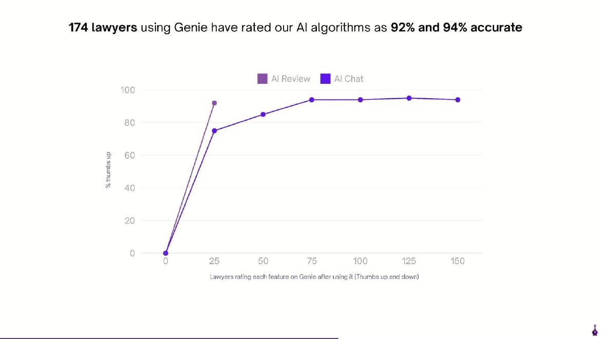
AI legal drafting tool. Line chart of user ratings.
Genie AI deck, slide 9. Exact stored slide matched to this analysis.
Our analysis: A satisfaction measure labelled as accuracy; rater counts on the chart don't match the headline total.
Evidence and limitation: Thumbs-up rates by number of raters, per feature.
What a founder can adapt: Call it a thumbs-up rate, give ratings per feature, and add a correctness check on a sample.
Supporting analysis
What the deck claims: "174 lawyers using Genie have rated our AI algorithms as 92% and 94% accurate". Axes: "% thumbs up" and "Lawyers rating each feature on Genie after using it (Thumbs up and down)". AI Chat rises from 75% at 25 raters to about 94% at 75 to 150; AI Review about 92% at 25.
Presentation choice: Shows the difference between users liking an output and the output being correct.
When it does not fit: Calling a user rating 'accuracy'.
Deepgram deck, slide 16. Exact stored slide matched to this analysis.
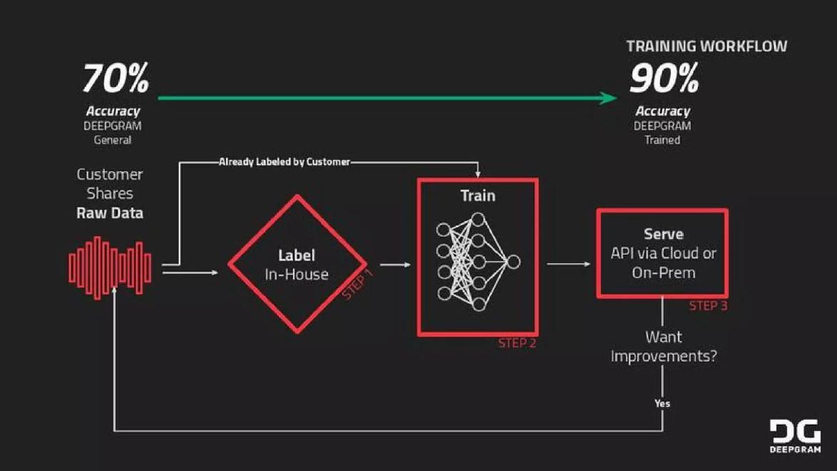
Our analysis: Baseline makes the figure meaningful; test data and measure are not named.
Evidence and limitation: Before-and-after comparison on the company's own models.
What a founder can adapt: Add the test audio, the measure (word error rate) and whether results are typical.
Supporting analysis
What the deck claims: "70% Accuracy DEEPGRAM General" to "90% Accuracy DEEPGRAM Trained". Steps: "Label In-House", "Train", "Serve API via Cloud or On-Prem"; "Want Improvements? Yes".
Presentation choice: Shows the value of a comparison beside an accuracy figure.
When it does not fit: Leaving open whether the model was tested on the data it was trained on.
Name the measure: accuracy, sensitivity, error rate or user rating are different things.
Give the number of cases and where they came from.
Compare with something: the current method, a competitor or your own earlier version.
Say who ran the test and when.
Use one measure consistently between headline and body.
Write your accuracy line
Fill this in before you put a percentage on a slide.
Measure. Which measure do your buyers use, and what exactly counts as correct?
Test set. How many cases, from where, over what period, and who chose them?
Baseline. What does the current method, a competitor or your earlier version score on the same test?
Tester. Who ran the test: you, a customer or an independent party?
Meaning. What does the difference mean for the customer in time, money or outcomes?
Copyable framework: "[Measure] of [X]% on [N] [cases] from [source], [period]; [baseline] scores [Y]% on the same test. Run by [tester]."
Illustrative example 1 — written by us
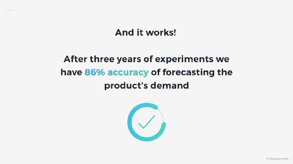
Before: "After three years of experiments we have 86% accuracy of forecasting the product's demand."
After: "Across [N] launches, our first-month sales forecast was within [X]% of actual sales 86% of the time; brands' own forecasts managed [Y]%. Run in-house, [years]."
What improved: Our illustrative rewrite. The bracketed details are left blank because the slide doesn't give them.
The question this guide answers
This guide answers one founder question: when your product's main claim is that it is accurate, how do you present that number so an investor believes it and understands what it means?
Our clinical evidence guide covers how medical companies present study stages and regulatory proof. Our AI solution and data moat guides mention accuracy figures as part of wider arguments about technology and data. None of them is about the accuracy figure itself: what has to sit beside it, which measure to pick, and how to avoid a number that sounds strong but can't be checked. That advice applies to any product whose value rests on being right more often, from transcription to demand forecasting.
How we chose and read the examples
We searched extracted slide text across the library for percentages followed by 'accuracy' or 'accurate'. There were 33 matches. Many were one-word bullets on feature lists. We excluded listed-company presentations and kept four slides from private companies where the accuracy figure is the main point of the slide and where each shows a different level of supporting detail: Oncocheck, Genie AI, Prelaunch and Deepgram.
Each slide was rendered from its source deck and read at full size, and also rendered at 300 dpi to confirm the small labels. Deepgram's slide also appears in our flywheel guide, where the lesson is about how customer data improves a product; here the lesson is about how the accuracy figure itself is presented. We did not check any accuracy figure against outside studies or company records. We judge only what each slide states and what it leaves out.
Why a bare percentage tells an investor so little
'Accuracy' sounds like a single, objective number. In practice it depends on choices the founder made, and each choice can move the number a long way.
First, the measure. Plain accuracy is the share of all cases the product got right. In a test where most cases are negative, a product that always says 'no' can score highly while being useless. That is why diagnostic tests report sensitivity (the share of true positives caught) and specificity (the share of true negatives correctly cleared) separately. Speech recognition is usually reported as word error rate. Forecasts are often reported as average percentage error. A user rating is not a measure of accuracy at all, but of how satisfied people are.
Second, the test set. A product tested on 100 hand-picked examples from one source can look far better than it will on messy real-world data. The number of cases also sets how much the figure could move by chance: on 100 cases, a couple of results either way shifts the percentage by two points.
Third, the baseline. '90%' is strong if the current method manages 60% and weak if it manages 95%. Without a comparison, an investor has no way to judge.
Fourth, who ran the test. Results from the company's own lab are normal at an early stage, but an investor will weigh them differently from results run by a customer, a hospital or an independent benchmark.
None of this needs a paragraph. One short line, such as 'Sensitivity 90%, specificity 88%; 100 patient samples from two clinics; 2023; run in-house', answers all four questions.
A sample size, but two measures mixed: Oncocheck
Oncocheck's slide is headed 'Achieved ~90% sensitivity and specificity on prostate cancer detection using miRNA biomarkers'. Below, three columns show the stage of each programme. Prostate cancer: 'Test Developed', 'Patent Applied', '90% accuracy of the test for detection of prostate Cancer Validated on n=100'. Breast cancer: 'Biomarker Identified', 'Clinical Validation underway'. Head and neck cancer: 'Sample collection started', 'Discovery phase underway'.
This slide does several things well. It gives a sample size, which most accuracy slides leave out. It names the biomarker approach. And it is honest about stage: only one of three cancers has a result, and the slide says so plainly rather than implying all three work.
The problem is the measure. The headline claims roughly 90% sensitivity and specificity. The body claims 90% accuracy. These are different numbers, and an investor with any medical background will notice. A test can have 90% accuracy with much lower sensitivity if most samples were cancer-free. The slide also doesn't say how the 100 samples split between patients with and without cancer, where they came from, or who ran the validation.
The fix is small: report sensitivity and specificity as two separate figures, give the split of the 100 samples, and add a few words on the setting, for example 'retrospective samples from one hospital biobank'. That turns a promising headline into a result an investor can weigh.
A user rating presented as accuracy: Genie AI
Genie AI's slide headline reads '174 lawyers using Genie have rated our AI algorithms as 92% and 94% accurate'. The chart below plots '% thumbs up' on the vertical axis against 'Lawyers rating each feature on Genie after using it (Thumbs up and down)' on the horizontal axis, for two features, AI Review and AI Chat. The AI Chat line rises from 75% at 25 raters to about 94% from 75 raters onward, running to 150. The AI Review line has a single point, at about 92% with 25 raters.
The chart is real evidence of something useful: lawyers who tried the features mostly liked the result, and the AI Chat rating held steady as more of them rated it. That is a reasonable early sign of product quality from demanding users.
But it is not accuracy. A thumbs up records whether a lawyer was satisfied, not whether the AI's output was correct when checked against a standard. A user can approve an answer that contains an error they didn't spot, or reject a correct answer that was badly phrased. Calling the rating 'accurate' invites an investor to ask how correctness was checked, and the slide has no answer.
The numbers also need a closer look. The headline says 174 lawyers, but the AI Chat line ends at 150 and the AI Review line at 25 raters, so it isn't clear who the other lawyers are or whether some rated both features. The 92% for AI Review rests on about 25 ratings. The fix is to call the measure what it is, 'thumbs-up rate', give the number of ratings for each feature, and, if possible, add a separate check of correctness on a sample of outputs.
A headline with nothing behind it: Prelaunch
Prelaunch's slide reads 'And it works! After three years of experiments we have 86% accuracy of forecasting the product's demand', beside a check-mark graphic. That is the whole slide.
The claim is central to the business: the company says it can predict demand for products before launch. But the slide answers none of the four questions. Forecasting demand to 86% accuracy could mean that 86% of forecasts fell within some error band, that the average error was 14%, or that the product correctly predicted which of two options would sell better in 86% of tests. Each would mean something very different to an investor. The slide also gives no count of products forecast, no comparison with how well brands forecast without the tool, and no hint of whether the forecasts were checked against actual sales.
'Three years of experiments' tells the reader effort went in, not what came out. An investor will treat this number as unproven until the founder explains it, which means the slide spends its space without moving the case forward.
A stronger version would say something like: 'Across [N] product launches, our forecast of first-month unit sales was within [X]% of actual sales in 86% of cases; brands' own forecasts were within [X]% in [Y]% of the same launches.' Even if the comparison figure isn't available, defining the measure and the number of launches would make the claim checkable.
A comparison, but no test named: Deepgram
Deepgram's slide shows a training workflow. At the top left, '70% Accuracy, DEEPGRAM General'; an arrow leads to the top right, 'TRAINING WORKFLOW, 90% Accuracy, DEEPGRAM Trained'. Below, a diagram: 'Customer Shares Raw Data', 'Label In-House' (step 1), 'Train' (step 2), 'Serve API via Cloud or On-Prem' (step 3), with a loop back labelled 'Want Improvements? Yes' and a shortcut 'Already Labeled by Customer'.
This slide does the most important thing the others don't: it gives a baseline. The 90% means something because it sits beside 70% for the same company's general model, and the difference, 20 percentage points, is the argument for the custom training the diagram explains. An investor can see why a customer would pay for training.
What's missing is the test. The slide doesn't say what audio the two figures were measured on, what 'accuracy' means for speech (usually one minus the word error rate), or whether the 90% is one customer's result or a typical one. A rival or a sceptical investor could reasonably ask whether the trained model was tested on the same kind of audio it was trained on, which would flatter the result. One line, such as 'Measured on [N] hours of held-out call audio from one customer, 2017', would answer that.
Still, of the four examples, Deepgram's is the easiest to defend in a meeting, because the comparison carries most of the meaning. A founder who can only add one thing to an accuracy figure should add a baseline.
How to present your accuracy figure
Pick the measure your buyers use. If hospitals judge tests by sensitivity and specificity, report those. If transcription buyers think in word error rate, use it. If your evidence is user ratings, call it a rating. Using the buyer's measure shows you know the market; inventing your own invites suspicion.
Put the test set beside the number. Number of cases, where they came from, and over what period. If the cases were chosen by you, say so; if they were a random sample or a customer's live data, say that instead, because it's stronger.
Add a baseline. The current method, a named competitor on the same test, or your own earlier model. Deepgram's slide shows that even an internal comparison makes the figure readable.
Say who ran it. 'In-house', 'by [customer]', 'independent benchmark'. Early-stage companies usually have only in-house results, and that's fine if stated.
Keep headline and body consistent. If the headline says one measure and the small text says another, an investor will assume the stronger-sounding one is spin.
Explain what the number means for the customer. '90% accurate' is abstract. 'Catches 9 of 10 cancers that the current blood test misses half the time' or 'cuts the time lawyers spend correcting drafts' links the figure to value. Only make that link if you have the data for it.
When an accuracy figure belongs in the appendix
If your product's value doesn't rest on accuracy, for example if buyers choose it for speed or price, a big accuracy number can distract from the real argument. Mention it in one line and put the details in the appendix.
Also hold back a figure you can't yet define. An unexplained '86%' does more harm than no number, because it suggests either that you don't know how it was measured or that you'd rather not say. It is better to describe the experiment honestly and promise the measured result when it exists.
What these examples can and cannot show
These four slides show how founders have presented accuracy claims and what each presentation leaves an investor unable to judge. They cannot show whether any of the products is in fact as accurate as stated, how the figures were calculated, or whether the slides helped the companies raise money. We did not check any figure against outside studies, benchmarks or company records.
Our reading of Genie AI's chart, including the gap between 174 lawyers and the 150 and 25 raters plotted, is based on the axes as drawn; the company may have an explanation the slide doesn't give. Treat the examples as patterns of presentation, not as verdicts on the products.
Common mistakes
Bare percentage. A number without measure, sample or baseline can't be judged.
Mixed measures. Headline and body must use the same measure.
Rating called accuracy. User approval is satisfaction, not correctness.
No baseline. 90% means nothing until you show what the alternative scores.
Effort as method. Years of work don't tell an investor how the figure was measured.
Diagnostic checklist
Measure named, in the buyer's terms.
Number of cases and their source.
Baseline on the same test.
Who ran the test and when.
Same measure in headline and body.
What the figure means for the customer.
Frequently asked questions
Is an in-house test good enough for a pitch deck?
At an early stage, usually yes, if you say it was in-house and describe the test set. Investors discount unexplained figures far more than honest in-house ones.
Should I show a competitor's accuracy?
Only if you measured both on the same test, or cite a public benchmark that did. Comparing your number with a competitor's marketing claim proves little.
How we chose these examples
Corpus: published pitch deck teardowns on StartupFundraising.com. Founder-uploaded private decks are excluded.
Selection (2026-10-01): we searched extracted slide text for a percentage followed by 'accuracy' or 'accurate' (33 matches), excluded listed-company presentations and passing mentions, and kept four slides where the accuracy figure is the main point and the supporting detail differs.
Review: the four slides were rendered from the source decks at full size on 2026-10-01, and at 300 dpi to confirm small labels, then read in full against company, deck and page number (editorial model review, with AI assistance in drafting; not human-reviewed). No accuracy figure was checked against outside studies, benchmarks or company records.