Where to Put the Traction Slide in a Pitch Deck: Early
Should traction come second in a pitch deck or after the problem and solution? Four real decks that put traction at slide 2 or 3 show when leading.
Traction Slide Placement: Lead With It Only When It Is Your Strongest Evidence
Most deck templates put traction after the problem, solution and market, around slide six or seven. Many founders with strong numbers move it to slide two or three, so investors see the result before the story. Moving it forward is a bet: the slot right after the cover is where a reader decides whether to keep reading, and whatever sits there is judged first and hardest. This guide uses four real decks that put traction at slide two or three to show when that bet pays and when it backfires.
TL;DR
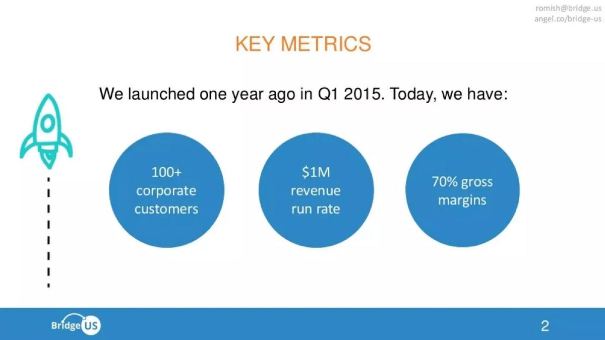
Put traction at slide two or three only when it is the most convincing thing you have and can be understood without context: a few dated, defined numbers a stranger can read in seconds, followed straight away by proof and then the problem. Bridge US does this: "We launched one year ago in Q1 2015. Today, we have:" 100+ corporate customers, a $1M revenue run rate and 70% gross margins, then a slide of customer logos, then the problem. If your traction is thin, or needs the problem explained first, keep it later. The DUI app deck shows the cost of getting this wrong: its slide-three "Traction" says "CONCEPT stage now".
Four decks that put traction at slide two or three, read in full
Each traction slide was rendered from the original deck at full size and read in full. Surrounding slides were read at preview size for titles and order only. We did not check any figure against the companies' records.
Bridge US traction slide — slide 2
Immigration software for employers. Slide 2, after the cover; followed by customer logos, then the problem.
Bridge US deck, slide 2. Exact stored slide matched to this analysis.
Our analysis: Early traction done well: result, then proof, then story.
Evidence and limitation: Three context-free numbers with a timeframe, backed on the next slide by named customers.
What a founder can adapt: Say which month the run rate is based on.
Supporting analysis
What the deck claims: "KEY METRICS"; "We launched one year ago in Q1 2015. Today, we have:"; "100+ corporate customers"; "$1M revenue run rate"; "70% gross margins".
Presentation choice: Shows what early traction needs to look like to hold the first slot.
When it does not fit: Following early numbers with anything other than proof or the problem.
AI software for housing and healthcare. Later-stage deck; slide 3 after cover and mission, followed by funding.
EliseAI deck, slide 3. Exact stored slide matched to this analysis.
Our analysis: The standard order at a later stage, with decoration that looks like data.
Evidence and limitation: Market share and dated growth up front; the arrow has no axis or values.
What a founder can adapt: Replace the decorative arrow with a real chart.
Supporting analysis
What the deck claims: "Traction"; "Serve 1 Out Of Every 12 Apartment Units In The US"; "Handled 70 Million Conversations To Date"; "2.5x ARR Growth Since Series C Last Year"; "150 People Doubled Since Last Year"; illustrative rising arrow.
Presentation choice: Shows that early traction is expected at later rounds.
When it does not fit: Listing headcount growth among traction figures without revenue in currency.
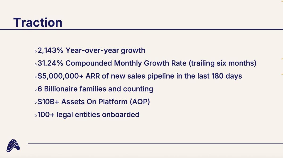
Software for family offices. Slide 3 after cover and a one-line mission, followed by the team.
Asseta AI deck, slide 3. Exact stored slide matched to this analysis.
Our analysis: Reasonable placement, content not built to be read cold.
Evidence and limitation: Growth rates with no base and pipeline listed first; concrete counts last; no problem slide before it, and the team slide follows.
What a founder can adapt: Lead with the concrete counts, give the growth base, move pipeline later.
Supporting analysis
What the deck claims: "Traction"; "2,143% Year-over-year growth"; "31.24% Compounded Monthly Growth Rate (trailing six months)"; "$5,000,000+ ARR of new sales pipeline in the last 180 days"; "6 Billionaire families and counting"; "$10B+ Assets On Platform (AOP)"; "100+ legal entities onboarded".
Presentation choice: Shows how early placement exposes undefined figures.
When it does not fit: Growth percentages without a starting figure in the first slots.
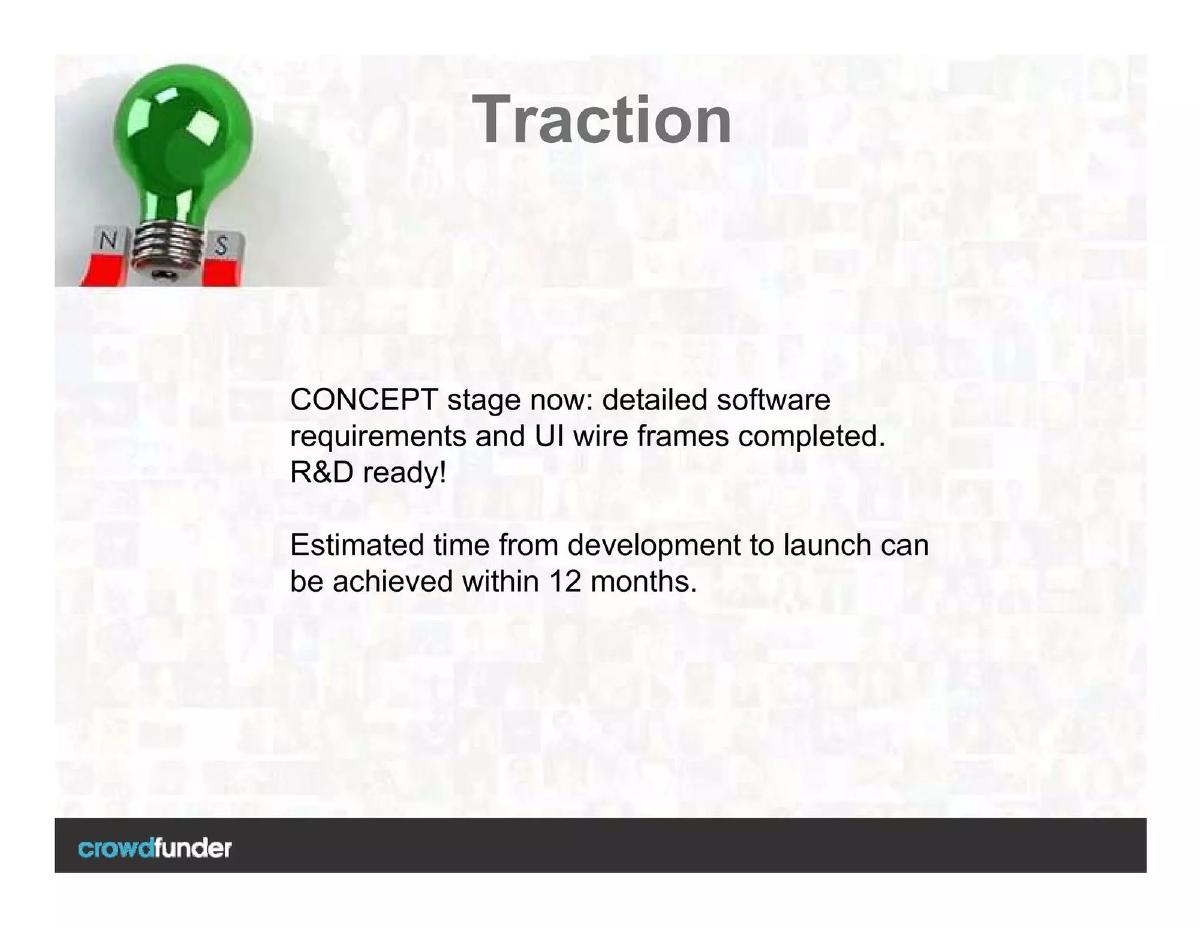
Smartphone breathalyser app concept. Slide 3 after cover and elevator pitch, followed by market opportunity.
DUI app concept deck, slide 3. Exact stored slide matched to this analysis.
Our analysis: The early slot used against the founder.
Evidence and limitation: A traction slot filled with a statement that there is no traction yet.
What a founder can adapt: Rename it "Milestones to launch" and move it after the solution.
Supporting analysis
What the deck claims: "Traction"; "CONCEPT stage now: detailed software requirements and UI wire frames completed. R&D ready!"; "Estimated time from development to launch can be achieved within 12 months."
Presentation choice: Shows when traction should not come first.
When it does not fit: Keeping a template's early traction slot when there is nothing to put in it.
After: Slide 2: "We started selling in March 2024. Today: 40 paying clinics, $480K ARR, 2% monthly churn." Slide 3: clinic logos with contract sizes. Pipeline moved to the sales slide.
What improved: Our illustrative rewrite; the figures are invented for the example. It leads with defined, dated results and backs them on the next slide.
The question this guide answers
Founders often ask where the traction slide should go. Templates give a default order, and advice online says both "lead with traction" and "tell the story first". Our traction guides cover what to put on the slide; our executive summary guides cover a one-page overview. None answers the placement decision itself: when to move traction to the front, what it must look like if it goes there, and what should follow it.
The answer matters because readers do not give every slide equal attention. Investors often skim a deck sent by email, and the first two or three slides decide whether they read the rest. A strong number in that position can carry the deck. A weak or confusing one in the same position can end it.
How we chose and read the examples
We searched saved slide text in the teardown library for slides titled traction or key metrics that appear on page two or three. We left out listed companies and investor presentations from listed firms, token and decentralised-finance projects, and slides where the traction content was redacted. We kept four decks that show different outcomes: two that make early traction work, one that weakens it, and one that should not have used the slot.
The examples are Bridge US (immigration software for employers), EliseAI (AI software for apartment operators and healthcare, a later-stage deck), Asseta AI (software for family offices) and a DUI breathalyser app concept. Each traction slide was rendered from the original deck at full size and read in full. The slides around it were read at preview size to record their titles and order only; we make no claims about their detailed content. We did not check any figure against the companies' records.
Early traction done well: Bridge US
Bridge US opens with its cover ("IMMIGRATION SIMPLIFIED"). Slide two is titled "KEY METRICS" and reads "We launched one year ago in Q1 2015. Today, we have:" above three circles: "100+ corporate customers", "$1M revenue run rate" and "70% gross margins". Slide three, "100+ CORPORATE CUSTOMERS", shows a grid of company logos. Slide four, "THE UNITED STATES HAS A SKILLS GAP", begins the problem.
This works for three reasons. First, the numbers need no context: anyone can understand customers, revenue and margin without first knowing what the product does. Second, the sentence gives a date and a timeframe, so the reader knows these results took one year. Third, the very next slide backs the biggest claim with names, so the reader does not have to take "100+" on trust before the story starts.
What it cannot establish: a run rate is a projection from recent revenue, and the slide does not say which month it is based on. The logo slide shows names, not spend. These are questions for later in the deck; they do not undercut the decision to lead with the numbers.
Early traction at a later stage: EliseAI
EliseAI's deck runs cover ("Transforming Housing & Healthcare"), then a mission slide, then "Traction" at slide three. The traction slide lists four lines: "Serve 1 Out Of Every 12 Apartment Units In The US", "Handled 70 Million Conversations To Date", "2.5x ARR Growth Since Series C Last Year" and "150 People Doubled Since Last Year", beside an illustrative rising arrow. The next slide is "Funding".
For a company raising a later round, this order is natural. Investors at that stage expect the business to exist and want the size and growth rate first. The first line is a share of a market anyone can picture, and the growth line is dated against the last round.
Two cautions. The arrow is decoration, not a chart: it has no axis or values, so it adds nothing a reader can check, and could be mistaken for data. And headcount doubling is a cost as well as a sign of growth; leading with it among traction figures works only if revenue grew faster, which the 2.5x line suggests but the slide does not show in currency. An early-stage founder copying this format should keep the order but replace the decoration with a real chart.
Early traction that raises more questions than it answers: Asseta AI
Asseta AI's deck runs cover ("The Intelligent Family Office Suite"), a one-line mission slide ("We are on a mission to radically modernize family offices"), then "Traction" at slide three. Six bullets follow: "2,143% Year-over-year growth", "31.24% Compounded Monthly Growth Rate (trailing six months)", "$5,000,000+ ARR of new sales pipeline in the last 180 days", "6 Billionaire families and counting", "$10B+ Assets On Platform (AOP)" and "100+ legal entities onboarded". The team slide comes next.
The placement is reasonable, but the content was not built for it. The first two lines are growth rates with no base: 2,143% growth of what, from what starting figure? A reader who has not yet been told the business model cannot tell whether the measure is revenue, users or assets. The third line is pipeline, which is hoped-for revenue, presented in the same list as results. Only the last three lines are counts a reader can picture, and they come last.
Read cold, in the slot where first impressions form, the slide invites scepticism rather than interest. The fix is to reorder and define: lead with the plainest facts ("6 billionaire families, $10B+ assets on the platform"), state the base for the growth rate ("ARR up from $X to $Y"), and move pipeline to a later sales slide where it can be labelled as pipeline.
When the slot is wasted: the DUI app concept
The DUI app deck runs cover ("DUI Mobile App Project Pitch Deck"), "Vision / Elevator Pitch", then "Traction" at slide three. The traction slide reads: "CONCEPT stage now: detailed software requirements and UI wire frames completed. R&D ready!" and "Estimated time from development to launch can be achieved within 12 months." Market opportunity follows.
This is the clearest case for not leading with traction. The template had a traction slot early, and the founder filled it honestly, but the slide now tells the reader at slide three that there is nothing to show yet. That is useful information, but in that position it frames everything after it.
A pre-product founder has better choices. Drop the traction slot and lead with the insight or the problem. Or rename the slide to what it is ("Where we are" or "Milestones to launch") and move it after the solution, where completed specifications and wireframes read as progress rather than an absence of results. Our pre-revenue traction guide covers what to show at that stage.
How to decide
Ask three questions about your traction before choosing where to put it. Is it the single most convincing thing in the deck, more than the team, the insight or the market? Can a stranger understand it in five seconds without knowing what the product does? Is every number dated and defined? If the answer to all three is yes, move it to slide two or three. If any answer is no, keep it after the solution, where the reader has the context to judge it.
Stage matters. At later rounds, investors expect traction first, and EliseAI's order is standard. At seed, it depends on the numbers: Bridge US could lead with a $1M run rate one year after launch; many seed companies cannot, and are better served by leading with the problem or a sharp insight. Before a product exists, traction should almost never come first.
Format matters too. A deck sent by email is skimmed, so the early slot carries more weight; a deck presented live lets the founder set context before the numbers. Some founders keep two versions: traction second for the emailed deck, traction after the solution for the live pitch.
What should follow early traction
Early numbers raise an immediate question: who are these customers, and what do they buy? Answer it on the next slide. Bridge US follows its metrics with a slide of customer logos, then explains the problem. That order (result, proof, story) lets the reader trust the numbers while learning what the business does.
Avoid putting early traction, then jumping to the team or funding, without ever explaining the problem. A reader who cannot place the numbers in a story may remember them but not the company. Asseta moves from traction straight to the team; adding one slide on the problem family offices face would give its numbers a reason to matter.
Finally, do not repeat the full traction slide later. If you lead with headline numbers, the later traction or metrics slide should add depth (a chart, cohorts, unit economics) rather than restate the same figures.
Writing an early traction slide
Keep it to three or four numbers, each with a unit and a date. Use a single sentence to frame them, as Bridge US does with "We launched one year ago in Q1 2015. Today, we have:". Lead with the most concrete figure: customers, revenue or a share of a market anyone can picture. Leave out growth rates without a base, pipeline, and headcount unless they are clearly the point.
Avoid decoration that looks like data. A stylised rising arrow or an unlabelled curve on the slide reads as a chart; if it is not one, remove it or replace it with a real chart. And check that each number would survive a single follow-up question from a sceptical reader, because in this position it will get one.
Common mistakes
Leading with thin traction. Keep it later and lead with the problem or insight.
Undefined growth rates first. Give the base or lead with plain counts.
Pipeline listed as results. Move it to a labelled sales slide.
Decoration that looks like data. Use a real chart or none.
No proof or story after. Follow with proof, then the problem.
Diagnostic checklist
Traction is the strongest evidence in the deck.
Each figure readable without context.
Units, dates and bases stated.
Next slide backs the biggest claim.
Problem explained soon after.
Frequently asked questions
Should traction be the second slide?
Only if it is your strongest evidence and readable without context. Otherwise put it after the solution.
What if I have no traction yet?
Don't keep an early traction slot. Lead with the problem or insight, and show progress later as milestones.
Does it differ for emailed and live decks?
Yes. Emailed decks are skimmed, so early traction carries more weight; live, you can set context first.
What comes after early traction?
Proof of the biggest claim, such as named customers, then the problem the product solves.
How we chose these examples
Corpus: published pitch deck teardowns on StartupFundraising.com. Founder-uploaded private decks are excluded.
Selection (2026-10-01): we searched extracted slide text for traction or key-metrics slides on page two or three, excluded listed-company presentations, token projects and redacted slides, and kept four decks with different outcomes.
Review: the four traction slides were rendered from the source decks at full size on 2026-10-01 and read in full against company, deck and page number; surrounding slides were read at preview size for titles and order only (editorial model review, with AI assistance in drafting). No person has yet completed a human editorial review of this draft.