Energy and CO2 Savings Claims in a Pitch Deck: Baseline
How to present an energy-savings or CO2-savings claim in a pitch deck: name the baseline, the scope of what is counted, the unit.
Energy and CO2 Savings Claims: Show the Baseline, the Scope and How You Know
"60% energy savings." "50% energy savings." Savings claims are among the most common figures on climate, building and industrial decks, and among the easiest for an investor to discount, because a percentage saving means nothing until you know what it is a percentage of. Three real decks show three different kinds of claim. Mojave's 50% rests on an efficiency chart against the federal minimum standard, and the chart supports it. Domatic's 60% sits beside component figures (LEDs, DC motors) that are available without its product. Intelen shows a live dashboard of kWh actually saved. This guide shows how to build a savings claim an investor can trust.
TL;DR
A savings claim needs four things beside the percentage. The baseline: what you are comparing with (the federal minimum, the customer's previous year, typical installed equipment, or a different way of doing the task). The scope: which loads, processes or emissions are counted, and which are not. The unit and period: kWh per year per building, per apartment, per item. And the evidence type: measured at customer sites, modelled from specifications, or borrowed from a general fact about the technology. Mojave's chart makes its baseline visible; Intelen's dashboard is measured but unlabelled; and Domatic's headline mixes its own product with general technology shifts. Measurement and verification protocols such as IPMVP and the US federal M&V guidelines exist precisely to pin down baseline and scope.
Three real savings claims
Each slide below is shown as it appears in the company's original deck, with what it says, what we checked and what an investor still cannot tell. They run from the clearest baseline to the claim with the most to fix.
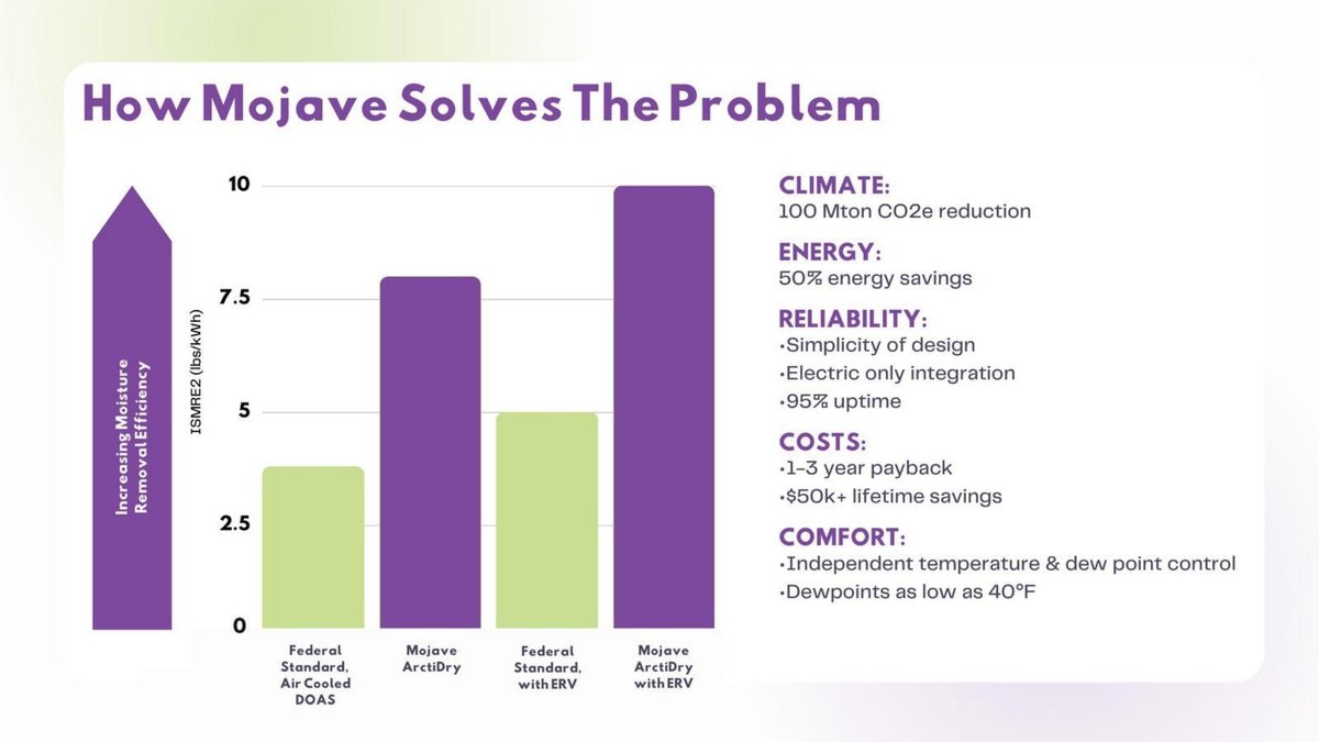
Mojave solution slide — slide 10
US air-conditioning company (ArctiDry, a dehumidifying system for buildings); page 10 of a 13-page deck, "How Mojave Solves The Problem".
Mojave deck, slide 10. Exact stored slide matched to this analysis.
Our analysis: The clearest savings claim in the set, because the chart shows the baseline and the efficiency metric the percentage comes from. Printing the bar values and saying whether the Mojave figures are tested or rated would make it complete. The climate figure needs its own basis; it is a market-scale projection, not a product measurement.
Evidence and limitation: No values are printed on the bars; reading them against the scale, the federal-standard units are about 3.8 and 5 lbs per kWh, Mojave about 8 and 10. Energy per pound of moisture is the inverse, so Mojave would use about 52% and 50% less electricity in each pair, consistent with the 50% claim. The baseline is the federal minimum, the cautious choice. Not stated: whether the ArctiDry figures are rated, tested or modelled; the basis of the 100 Mton CO2e (over what period, at what adoption); and what the payback and lifetime savings assume.
What a founder can adapt: Print the bar values, add "rated/tested by [lab]", and footnote the CO2 figure's period and adoption assumption.
Supporting analysis
What the deck claims: Bar chart, "ISMRE2 (lbs/kWh)" with an arrow labelled "Increasing Moisture Removal Efficiency": "Federal Standard, Air Cooled DOAS", "Mojave ArctiDry", "Federal Standard, with ERV", "Mojave ArctiDry with ERV", on a scale of 0 to 10. Beside it: "CLIMATE: 100 Mton CO2e reduction"; "ENERGY: 50% energy savings"; "RELIABILITY: Simplicity of design, Electric only integration, 95% uptime"; "COSTS: 1-3 year payback, $50k+ lifetime savings"; "COMFORT: Independent temperature & dew point control, Dewpoints as low as 40°F".
Presentation choice: It shows a savings percentage that can be traced to a named baseline and an efficiency metric.
When it does not fit: Don't set a market-wide CO2 projection beside product data without saying it is a projection.
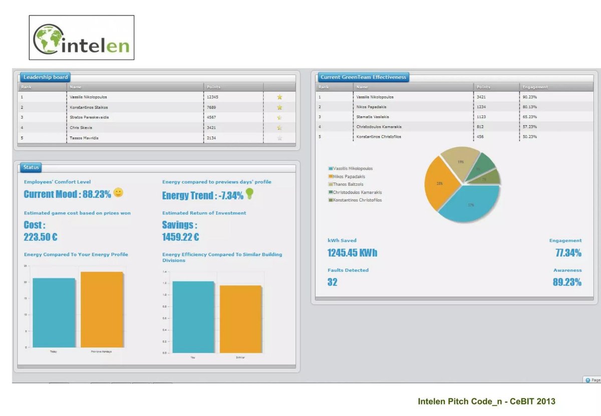
Greek energy-engagement software company (a game that encourages office employees to save energy); page 11 of a 15-page pitch from CeBIT 2013, a product screenshot.
Intelen deck, slide 11. Exact stored slide matched to this analysis.
Our analysis: The only measured-style evidence in the set, with a named baseline and a cost-versus-savings comparison, which is what a customer wants. A screenshot, though, is evidence only if the reader knows whose data it is. Label it and give the period; reconcile the euro and kWh figures.
Evidence and limitation: Directly visible: an absolute kWh saving, a percentage trend against a named baseline (the previous days' profile), and money saved set against the programme's cost (about 6.5 times). Our check: €1,459.22 ÷ 1,245.45 kWh is about €1.17 per kWh, far above typical commercial electricity prices, so the euro savings must include something other than the kWh shown, or come from a different period; the slide does not say. Not stated: whether this is a real client or demonstration data, the period, or the number of buildings.
What a founder can adapt: Caption: "[Client], [n] buildings, [period]: −7.3% vs prior-period baseline, 1,245 kWh saved; savings include [items]."
Supporting analysis
What the deck claims: Dashboard panels: a "Leadership board" of employees and points; "Current Mood: 88.23%"; "Energy compared to previews days' profile — Energy Trend: -7.34%"; "Estimated game cost based on prizes won — Cost: 223.50 €"; "Estimated Return of Investment — Savings: 1459.22 €"; bar charts "Energy Compared To Your Energy Profile" and "Energy Efficiency Compared To Similar Building Divisions"; "kWh Saved 1245.45 KWh"; "Faults Detected 32"; "Engagement 77.34%"; "Awareness 89.23%".
Presentation choice: It shows measured savings with a baseline and a cost comparison, and the label a screenshot needs.
When it does not fit: Don't show a dashboard without saying whether the figures are real or sample data.
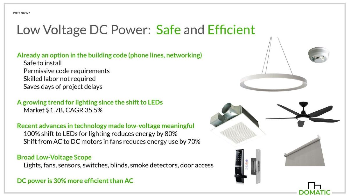
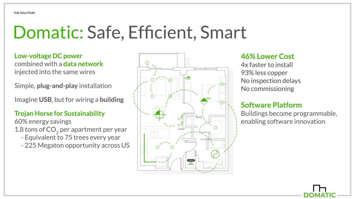
US building-wiring company (low-voltage DC power and data over the same wires); pages 6 ("Why now?") and 7 ("The solution") of a 10-page deck. Our proptech market guide uses a different Domatic page.
Domatic deck, slide 6. Exact stored slide matched to this analysis.Domatic deck, slide 7. Exact stored slide matched to this analysis.
Our analysis: Read together, the two pages show the scope and attribution problem clearly. The component figures are real technology trends, but presenting their sum as the product's "energy savings" claims credit for changes any building can make. A slide that separates the two, and says what share of the apartment's energy the 60% applies to, would be stronger and still impressive.
Evidence and limitation: The 60% has no stated baseline or scope. Page 6 suggests it comes from the low-voltage loads listed (lighting, fans, small devices), which are a part of an apartment's energy, and that much of it comes from LEDs and DC motors, which save energy with or without Domatic's wiring. Our checks: 1.8 t ÷ 75 trees is 24 kg of CO2 per tree a year; 225 Mt ÷ 1.8 t is 125 million apartments, a figure close to all US homes, not apartments alone. Neither the apartment's starting consumption nor the emission factor is shown.
What a founder can adapt: "On lighting, fans and devices ([x]% of apartment electricity): −60% vs AC wiring with incandescent and AC motors; of which [y] points from our DC distribution and controls."
Supporting analysis
What the deck claims: Page 6: "100% shift to LEDs for lighting reduces energy by 80%"; "Shift from AC to DC motors in fans reduces energy use by 70%"; "Broad Low-Voltage Scope: Lights, fans, sensors, switches, blinds, smoke detectors, door access"; "DC power is 30% more efficient than AC". Page 7: "Trojan Horse for Sustainability: 60% energy savings; 1.8 tons of CO2 per apartment per year — Equivalent to 75 trees every year — 225 Megaton opportunity across US"; "46% Lower Cost: 4x faster to install, 93% less copper".
Presentation choice: It shows how a savings headline can borrow general technology gains, and why scope must be stated.
When it does not fit: Don't present the savings of LEDs or DC motors as your product's result.
The four things a savings claim needs, and which each slide provides.
Slide
Baseline
Scope
Evidence type
Unit
Checkable?
Mojave p10
Federal minimum standard
Dehumidification energy
Efficiency chart; test basis unstated
lbs/kWh, then %
Yes, approximately
Intelen p11
Previous days' profile
Building(s) in the game; count unstated
Dashboard; real or demo unstated
kWh, %, €
Partly; € and kWh don't reconcile
Domatic p6–7
Not stated
Low-voltage loads (inferred)
Borrowed component figures
%, t CO2 per apartment
No
Key Takeaways
Name the baseline. A saving against the legal minimum is smaller than one against old equipment, and investors know the difference.
State the scope. "60% energy savings" on lighting and fans is not 60% of a building's energy.
Separate what your product causes from what the technology shift causes. LEDs save energy whether or not a customer buys from you.
Say whether the figure is measured, modelled or borrowed, and from how many sites.
Use a unit a customer pays for: kWh or money per year per building, per site, per item.
Check the arithmetic. A wrong unit can move a result by a factor of 1,000.
Build your savings line
Answer each prompt before you put a savings percentage on a slide.
Baseline. Compared with what: the legal minimum, typical installed equipment, the customer's prior period, or another method?
Scope. Which loads, processes or emissions are counted? What share of the customer's total is that?
Attribution. How much of the saving would happen anyway with standard upgrades, and how much only with your product?
Evidence. Measured (how many sites, how long, adjusted how), modelled (from which specs), or borrowed?
Unit and money. What is the saving in kWh and money per year per building, site or item, against your price?
Arithmetic. Have you recomputed every line, including unit conversions (kWh, MWh, GJ, TJ) and CO2 factors?
Copyable framework: [n] sites, [period], [measured/modelled] vs [baseline]: [scope] energy −[x]% ([kWh] per [unit] a year), about [y]% of total; [money] saved per [unit] a year vs [price].
Illustrative example 1 — written by us
Before: 60% energy savings. 1.8 tons of CO2 per apartment per year.
After: On lighting, fans and devices ([x]% of apartment electricity): −60% vs AC wiring with incandescent lights and AC motors, of which [y] points from our DC distribution; 1.8 t CO2 per apartment a year at [z] kg/kWh.
What improved: Built from Domatic's pages 6 and 7. The scope is our reading of page 6; the bracketed shares and factor are placeholders the deck does not give.
Why investors discount savings percentages
An energy saving is always a difference between two numbers, and only one of them is ever measured: the energy used after the change. The other, what would have been used without it, is a baseline someone chose. That is why professional practice treats savings as an estimate that needs a documented method. The Efficiency Valuation Organization, which publishes the International Performance Measurement and Verification Protocol (IPMVP), describes its mission as ensuring that the savings of efficiency projects are accurately measured and verified. The US Federal Energy Management Program publishes its own M&V guidelines for verifying and quantifying savings from energy-efficient equipment installed under performance contracts.
A pitch deck is not an M&V report. But an investor who has seen many climate decks will ask the questions those protocols answer: compared with what, over what boundary, for how long, and measured how? A slide that answers them in one line earns more trust than a larger percentage that does not.
There are four common baselines, and each gives a different number for the same product. The regulatory minimum (the least efficient equipment that may legally be sold) is conservative for new buildings and easy to defend. Typical installed equipment gives a larger saving and matches what most customers replace. The customer's own previous consumption is the most persuasive to that customer, but it mixes in weather and occupancy changes. A different way of doing the task altogether (remote monitoring instead of site visits, for example) can produce very large savings, but only if the two methods are truly comparable.
Mojave's page is a good example of the first. Its chart compares moisture removal per kWh for its ArctiDry units with "Federal Standard" units, with and without energy-recovery ventilation. Reading the bars, Mojave is about twice as efficient in each pair, which is consistent with its "50% energy savings": the same moisture removed with half the electricity. The baseline is visible, and it is the cautious one.
Scope: what is counted, and what your product causes
A building, a factory or a supply chain uses energy in many places. A saving on one part is honest only when the slide says which part. Domatic's "60% energy savings" headline on its solution page sits in a deck whose "why now" page lists the sources: "100% shift to LEDs for lighting reduces energy by 80%", "Shift from AC to DC motors in fans reduces energy use by 70%", "DC power is 30% more efficient than AC". Lighting and fans are a part of an apartment's energy, not all of it; heating, cooling, water heating and appliances are outside a low-voltage wiring system's scope.
There is also the question of attribution. LED lighting and DC fan motors save energy whether they are wired with Domatic's system or a conventional one. The saving that belongs to the product is the part it alone makes possible, such as avoided conversion losses or software control. A slide that separates the two ("of the 60%, about [x] points come from LEDs and DC motors any building can install; [y] from our DC distribution and controls") is far more credible than one that claims the whole.
Evidence: measured, modelled or borrowed
Every savings figure is one of three kinds. Measured savings come from meters at real sites, before and after, adjusted for weather or usage. Modelled savings come from equipment specifications or simulations. Borrowed figures are general facts about a technology ("LEDs use 80% less") presented as if they were the product's result. All three can appear in a deck; the problem is when a reader cannot tell which is which.
Intelen's page is the only one of the three that shows measured-style figures: a dashboard reporting "kWh Saved 1245.45 KWh", "Energy Trend: -7.34%" against the previous days' profile, and estimated savings of €1,459.22 against an estimated game cost of €223.50. The baseline (previous days' profile) is named. What the slide does not say is whether these are a real client's figures or demonstration data, how long the period is, or how many buildings it covers. A screenshot reads as real; label it either way.
Units, money and CO2 conversions
Customers pay in money and kWh per year, so a percentage should be followed by an absolute figure in a unit they recognise: kWh or euros per year per building, per apartment, per item. Domatic converts its claim to "1.8 tons of CO2 per apartment per year", which is the right kind of unit, but neither the apartment's starting consumption nor the electricity emission factor is shown, so the figure cannot be checked.
Equivalences such as trees need their source. The US EPA's greenhouse gas equivalencies page bases its tree figure on a medium-growth tree planted in an urban setting and grown for ten years, sequestering 23.2 to 38.0 pounds of carbon a year depending on type. Domatic's "Equivalent to 75 trees every year" implies about 24 kg of CO2 per tree a year; that is a different assumption from EPA's, which is not wrong in itself, but the slide should name whichever source it uses. Investors are more interested in the kWh and money than in trees. (US Environmental Protection Agency)
Check the arithmetic before you show it
Showing the working on a slide is the right instinct: it lets a reader test every step. It also means every step will be tested, so recompute each line before the deck goes out. The common slip is a unit conversion. Energy units differ by factors of 1,000 (kWh, MWh, GWh) or by awkward factors (1 GJ is about 278 kWh; 1 TJ is about 278,000 kWh), and a total quoted in one unit and divided into a per-item figure in another can move a result a thousandfold.
A quick illustration of ours, not from any deck: if a sector uses 18,000 TJ a year across 10 million items, that is 1.8 GJ, or about 500 kWh, per item. Printing 0.5 kWh per item would understate the inputs by about 1,000 times. Rounding matters too: 9 kg against 50,000 kg is a 99.98% saving, not 99.8%. Small slips like these rarely change the direction of a claim, but each one invites the question of what else is unchecked.
Worked example: one claim, shown both ways (hypothetical)
This is our illustration, not a figure from any deck. A startup sells a control system for commercial refrigeration. Across 14 supermarkets over 12 months, metered refrigeration energy fell from 410,000 kWh to 324,000 kWh per store on average after installation, adjusted for outside temperature: a saving of 86,000 kWh, or 21% of refrigeration energy. Refrigeration is about 45% of these stores' electricity, so the saving is about 9% of each store's total. At €0.20 per kWh, that is about €17,200 per store per year, against a €9,000 yearly subscription.
Weak version: "Up to 35% energy savings." Strong version: "14 stores, 12 months, metered and weather-adjusted: refrigeration energy −21% (−86 MWh per store per year), about 9% of total store electricity; €17,200 saved per store a year at €0.20/kWh vs a €9,000 subscription."
The strong version is smaller and more fundable. It shows the baseline, the scope, the evidence type, the unit and the customer's net gain, which are exactly the questions diligence will ask.
Common mistakes
No baseline. A percentage saving without its comparison cannot be weighed.
Unstated scope. A saving on one load is not a saving on the whole building.
Borrowed savings. General gains from LEDs or efficient motors are not your product's result.
Unlabelled screenshot. Say whether dashboard figures are a real client or sample data, and the period.
Unit slips. kWh, MWh, GJ and TJ differ by factors of 1,000; recompute every line.
Projection beside product data. Market-wide CO2 figures are projections; label them as such.
Diagnostic checklist
The baseline is named.
The scope is stated, with its share of the customer's total.
Savings your product causes are separated from standard upgrades.
The evidence type is stated: measured, modelled or borrowed, with site count and period.
An absolute figure follows the percentage, in kWh and money per year per unit.
CO2 figures show the emission factor and source.
Every calculation line and unit has been recomputed.
Frequently asked questions
What baseline should I use for an energy-savings claim?
The one your customer would otherwise buy or keep. For new equipment that may be the legal minimum or typical new equipment; for retrofits, the customer's own prior consumption adjusted for weather and usage. Name it on the slide.
Is a modelled saving acceptable in a pitch deck?
Yes, before you have customer data, if it is labelled as modelled and the inputs are available. Replace it with measured results as soon as you have them, with the number of sites and the period.
Only as a secondary illustration, with the source of the equivalence. Investors care more about kWh, money and tonnes of CO2 with a stated emission factor. (US Environmental Protection Agency)
How we chose these examples
Discovery (2026-10-04, run 43): we searched the corpus index for customer outcome measures. Searches for accuracy, time saved and false-positive claims returned topics covered elsewhere or thin evidence; a search for energy-savings terms returned five startup pages, four of which present a savings claim in materially different ways. Closest content read: the live energy solution guide (before-and-after framing, no baseline or scope method), the live climate solution guide (advises stating savings per unit), the live climate product guide and the live proptech and AI market guides (which use other Domatic and Yoona.ai pages). None teaches baseline, scope, attribution, evidence type or checking a savings calculation.
Four pages from three decks were read from images rendered from the original deck files: Mojave 10 (with 9 and 11 for context), Intelen 11, and Domatic 6 and 7. v2 (2026-10-06) removed the Yoona.ai example and every figure derived from it, because the Yoona.ai deck is held under the whole-deck source rule; the arithmetic illustration in its place uses invented round numbers. The three remaining decks were screened on every page edge and in full text on 2026-10-06 with no confidentiality or distribution notice, and no deletion or removal request names them. The images were prepared at 1200px wide and uploaded through the standing slide-image workflow, then re-fetched byte-identical. Set aside: Ziyen 10 (a single bullet in a listed-company structure).
Figures were recalculated from the printed inputs; Mojave's bar values were read against the chart's scale because no values are printed. Where our result differs, both are shown. The worked example is hypothetical. Company figures are reported as printed and not verified. This guide explains presentation, not engineering or investment advice. Slide readings and analysis are an AI editorial model review, not human-checked.