Completion Rate in a Pitch Deck: Define It, Benchmark It
How to present a course or content completion rate in a pitch deck: who counts in the denominator, what 'complete' means, which benchmark is fair.
Completion Rate: Say Who Counts, What Complete Means, and What It Leads To
"30% course completion rate." "8% vs Rosetta Stone's 0.6%." "70% completion." Education and content companies often put a completion rate on the traction slide, because low completion is the best-known weakness of online learning. A completion rate can be strong evidence that people value what you teach. It can also mean almost nothing, depending on who is counted, what counts as finishing, and how long the course is. Three real decks show three ways to present it. DataCamp gives a bare rate beside its growth figures. Hello English compares itself with a well-known rival. Curio compares its format with other formats. This guide shows how to make a completion rate an investor can trust and use.
TL;DR
A completion rate needs four things beside the percentage. The denominator: everyone who signed up, everyone who started, or only people who paid or were assigned the course. The definition of complete: the last lesson opened, every exercise passed, or a final assessment. The unit and length: one 10-minute track and a 12-week programme are not comparable. And the link: what completion leads to, such as paid conversion, renewal, a certificate, a job or measured skill. Then pick a benchmark that matches on all four, and say where it comes from. A rate compared with a rival measured differently is a weak claim even when the gap is large.
Three real completion-rate slides
Each slide below is shown as it appears in the company's original deck, with what it says, what we checked and what an investor still cannot tell. They run from the rate with the most context around it to the comparison with the most to define.
DataCamp traction slide — slide 7
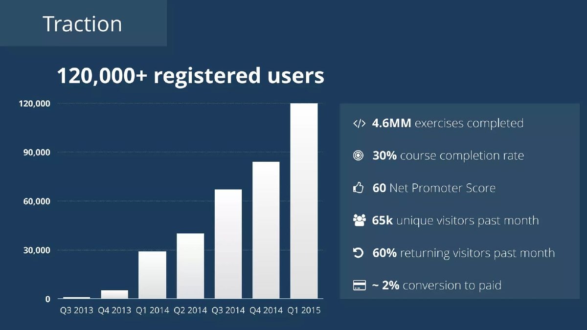
Online data-science course company; page 7, "Traction", from an early deck with quarterly data to Q1 2015.
DataCamp deck, slide 7. Exact stored slide matched to this analysis.
Our analysis: The completion rate sits in the right place, beside conversion, return visits and a usage count, so a reader can see the whole funnel at once. A 30% rate among all registrants would be strong for free online courses; among payers it would be ordinary. Naming the denominator would let the reader tell which.
Evidence and limitation: Our checks: if conversion is measured on registered users, about 2% of 120,000 is roughly 2,400 paying users; the slide doesn't give the base. 4.6 million exercises across 120,000 registered users is about 38 exercises each, an average skewed by active users. The 30% completion rate has no denominator, definition or course length. Not stated: whether 30% is among registrants, starters or payers, and over what period.
What a founder can adapt: "30% of learners who start a course finish it ([n] courses, [period]); ~2% of registered users convert to paid."
Supporting analysis
What the deck claims: Bar chart "120,000+ registered users" by quarter, Q3 2013 to Q1 2015, rising from near zero to 120,000. Side panel: "4.6MM exercises completed"; "30% course completion rate"; "60 Net Promoter Score"; "65k unique visitors past month"; "60% returning visitors past month"; "~2% conversion to paid".
Presentation choice: It shows completion placed alongside conversion and usage, where an investor can read the funnel.
When it does not fit: Don't leave the denominator implicit when other figures on the same slide use different bases.
Hello English (CultureAlley) traction slide — slides 7–18
Indian English-learning app company (CultureAlley, maker of Hello English); page 7 gives the comparison and page 18 repeats it as a headline ratio.
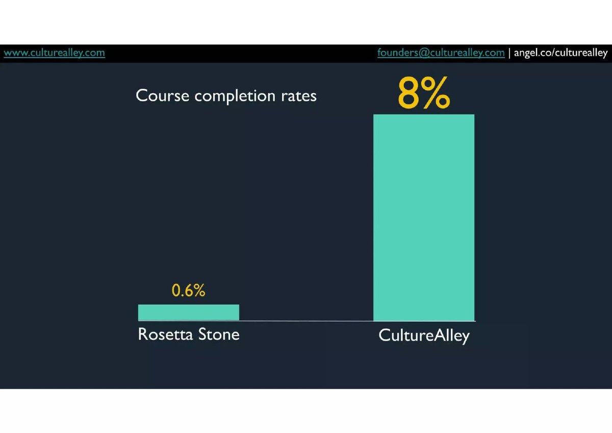
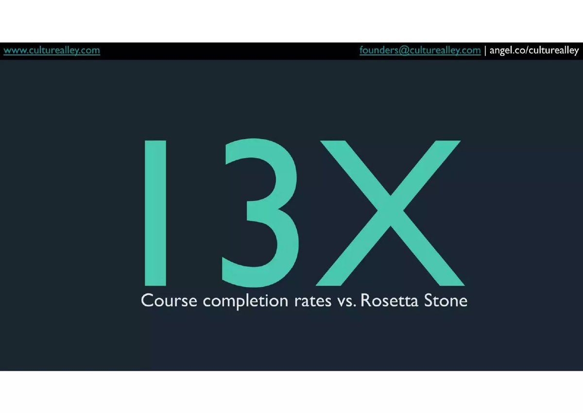
Hello English (CultureAlley) deck, slide 7. Exact stored slide matched to this analysis.Hello English (CultureAlley) deck, slide 18. Exact stored slide matched to this analysis.
Our analysis: Naming a famous rival makes the claim memorable, and the arithmetic between the two pages is consistent. But a ratio is only as strong as its smaller number, and the slide gives no source for 0.6%. Citing it, and stating that both rates use the same denominator, would turn a striking claim into a credible one.
Evidence and limitation: Our check: 8 ÷ 0.6 = 13.3, so the 13X on page 18 matches page 7. Neither page gives the source of Rosetta Stone's 0.6%, the denominator for either figure, the definition of a completed course, or the course lengths. The two products differ in price and format, so part of the gap may come from the products being measured differently.
What a founder can adapt: "Course completion among learners who start: 8% ([n], [period]) vs 0.6% for Rosetta Stone ([source, year], [their definition])."
Supporting analysis
What the deck claims: Page 7: "Course completion rates": Rosetta Stone 0.6%, CultureAlley 8%, as a two-bar chart. Page 18: "13X — Course completion rates vs. Rosetta Stone".
Presentation choice: It shows a rival comparison, and why the benchmark's source and definition carry the claim.
When it does not fit: Don't headline a multiple ("13X") when the smaller figure has no source.
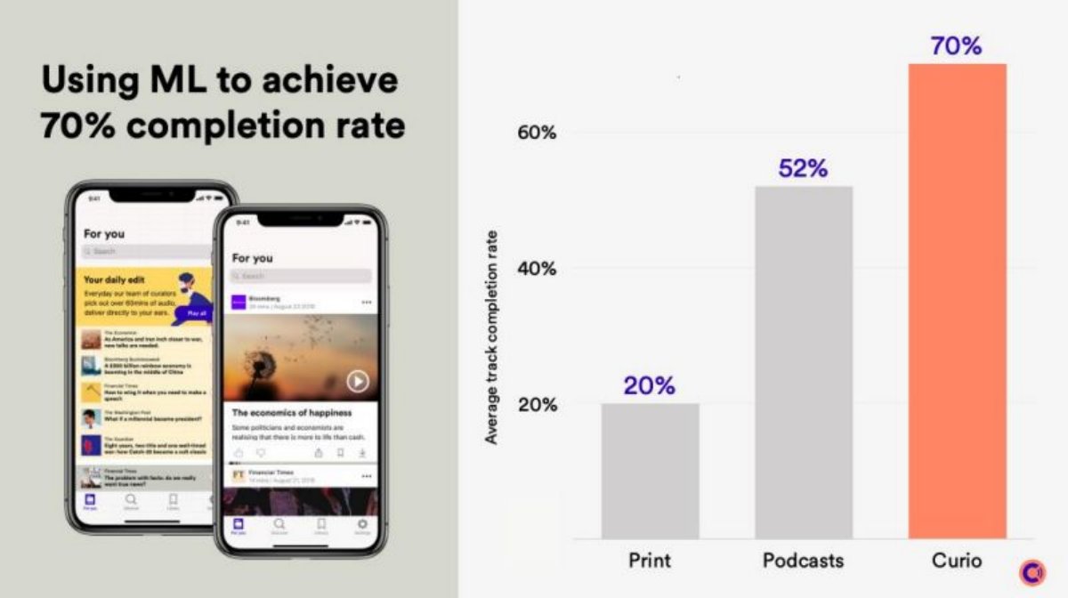
UK audio journalism app (professionally narrated articles); page 14 of its Series A deck. Curio is a content product, not a course, but presents completion the same way.
Curio deck, slide 14. Exact stored slide matched to this analysis.
Our analysis: Comparing formats rather than rivals is a sensible choice for a company creating a new format, and averaging per track is the right unit for content. The headline makes a causal claim (ML produces 70%) that the chart can't support, because it compares formats, not Curio before and after ML. Showing completion before and after personalisation would support the headline.
Evidence and limitation: Our checks: 70% is 1.35 times podcasts' 52% and 3.5 times print's 20%. The slide doesn't say where the print and podcast figures come from, how completion is measured for print (scroll depth or time on page), or how long a typical Curio track is. The headline credits machine learning, but no before-and-after for the recommendation change is shown.
What a founder can adapt: "Average track completion: 70% ([n] plays, [period], typical length [x] min); [y]% before personalised recommendations. Print 20%, podcasts 52% ([sources])."
Supporting analysis
What the deck claims: Headline: "Using ML to achieve 70% completion rate". Bar chart "Average track completion rate": Print 20%, Podcasts 52%, Curio 70%. App screenshots of a personalised "For you" feed.
Presentation choice: It shows a format comparison, and why a causal headline needs a before-and-after.
When it does not fit: Don't credit a feature for a rate unless you show the rate before the feature.
The four things a completion rate needs, and which each slide provides.
Slide
Denominator
Definition and length
Benchmark
Link to revenue or outcome
Checkable?
DataCamp p7
Not stated
Not stated
None
Beside ~2% paid conversion
Partly; base unclear
Hello English p7/p18
Not stated
Not stated
Rosetta Stone 0.6%, unsourced
None
Ratio checks; benchmark doesn't
Curio p14
Per track average
Not stated
Print 20%, podcasts 52%, unsourced
None; ML credited
Partly
Key Takeaways
Name the denominator: signed up, started, paid or assigned. It can change a rate several times over.
Define complete: last lesson, all exercises, or a passed assessment.
Give the length of what is being completed. Short content completes more often than long courses.
Use a benchmark that matches your format and audience, and cite its source.
Connect completion to something investors pay for: conversion, renewal, outcomes or referrals.
Show the period and the number of learners behind the rate.
Build your completion-rate line
Answer each prompt before you put a completion rate on a slide.
Denominator. Who is counted: everyone who signed up, started, paid, or was assigned?
Definition. What counts as complete: last lesson opened, all exercises done, or assessment passed?
Length. How long is what's being completed, in minutes, lessons or weeks?
Window and sample. Over what period, with how many learners, and how long did each have to finish?
Benchmark. What are you comparing with? Same format, audience and definition? Where does the figure come from?
Link. What does completion lead to: payment, renewal, referral, certificate, job or measured skill? Show completers vs non-completers.
Copyable framework: [Period]: [x]% of [denominator] completed [course, length] ([definition]; [n] learners). Benchmark [y]% ([source, definition]). Completers [renew/convert] at [a]% vs [b]% for non-completers.
Illustrative example 1 — written by us
Before: 30% course completion rate.
After: 30% of learners who start a course finish all exercises ([n] learners, [period]); ~2% of registered users convert to paid.
What improved: Built from DataCamp's page 7. The denominator, definition and period are placeholders the slide does not give.
Illustrative example 2 — written by us
Before: 13X course completion rates vs. Rosetta Stone.
After: Course completion among starters: 8% vs 0.6% for Rosetta Stone ([source, year]); both measured as [definition].
What improved: Built from Hello English's pages 7 and 18. The source and definition are placeholders; 8 ÷ 0.6 = 13.3 is our check.
Why investors look for a completion rate, and why they doubt it
Online courses are known for low completion. A 2019 study in Science by MIT researchers, using Harvard and MIT course data on edX, reported that low completion rates in massive open online courses had not improved over six years. An education founder who can show learners finish what they start is answering a question investors already have.
The doubt comes from definitions. A free app counting everyone who downloaded it will report a low rate; a corporate programme counting only employees whose manager enrolled them will report a high one. Both can be accurate. Without the denominator and the definition, an investor can't tell whether a rate reflects the product or the counting.
The denominator is the group you divide by. Common choices are: everyone who registered; everyone who started the course (opened the first lesson); everyone who paid; or everyone who was assigned the course by an employer or school. Each gives a different number for the same product. A free product with casual sign-ups might see a small share of registrants finish but a much larger share of those who started.
Choose the denominator that matches your business model, and say it in the label. If you sell to individuals who pay, completion among paying learners shows whether buyers get value. If you sell to employers, completion among assigned learners shows whether the employer's money is used. If you are free and earn from upgrades, completion among starters, paired with conversion, shows the funnel.
Don't switch denominators between slides or rounds. If you change the definition, show the old and new figures side by side for one period.
Define what counts as complete, and how long it is
"Complete" can mean the last lesson was opened, every exercise was submitted, or a final assessment was passed. These differ a lot: opening the final video is easy; passing a graded test is not. State the rule in a short footnote.
Length matters as much as the rule. Finishing a five-minute audio piece and finishing a twelve-week course are different achievements, and short items will always complete more often. Give the typical length (minutes, lessons or weeks) next to the rate, or report completion separately by length band if your catalogue mixes short and long content.
Also say the time window. "Completed within 30 days of starting" is a different measure from "ever completed", and a rate measured only on recent sign-ups will look low because many haven't had time to finish.
Pick a benchmark that matches on format and audience
A comparison is persuasive only if both sides are measured the same way. Comparing a free mobile app with paid desktop software, or live cohort classes with self-paced videos, may still be informative, but the slide should say that the formats differ and that part of the gap comes from the format rather than the company.
Cite where the benchmark comes from: a published study, the rival's own disclosure, or an industry report, with a date. If the benchmark is a common belief rather than a measured figure, say so or leave it out. A large ratio built on an unsourced benchmark invites the question of where the smaller number came from.
Often the best benchmark is your own history: completion this quarter against a year ago, or after a product change against before. Changes within your own product hold the definition constant.
Connect completion to revenue or outcomes
Completion is an input. Investors care about what it produces: learners who finish are more likely to pay, renew, refer others or reach the outcome they enrolled for. A slide that shows completion beside conversion or renewal, split by completers and non-completers, turns an engagement figure into a business figure.
If you can't yet show that link, put completion next to the revenue measures on the same slide and say what you expect it to drive. If you can, give the ratio: for example, completers renew at a higher rate than non-completers, with both figures and the base.
Keep the comparison inside one cohort where you can. Completers and non-completers who started in the same month, on the same course and at the same price differ mainly in whether they finished, so a gap in their renewal or conversion rates says more about completion than a comparison across products, prices or years. Give the size of each group so a reader can see whether the gap rests on dozens of learners or thousands.
Outcome claims such as "lasting behaviour change" or job placement need their own definition, sample and source, as strict as the completion rate itself.
Show completion by segment and over time
One blended rate hides most of what an investor wants to know. Split it by the groups that drive your business: paying versus free learners, employer-assigned versus self-enrolled, short versus long courses, or new versus returning learners. If paying learners complete far more often than free ones, that supports your pricing; if long courses complete rarely, that tells you where the product needs work, and investors will respect you for knowing it.
Then show the trend. A rate that has risen from one quarter to the next, with the definition held constant, is stronger evidence than a single high figure, because it shows the team can move the number. If you changed something that affected completion, such as reminders, shorter lessons, live sessions or personalised recommendations, mark the change on the chart and give the rate before and after, with the number of learners in each period.
Keep the cohorts honest. Measure each group of learners after the same amount of time, for example completion within 60 days of starting, so that recent learners who haven't had time to finish don't pull the latest figure down and older learners don't flatter the early ones. Say which window you used, and keep it the same from one round to the next so investors can compare decks over time.
Worked example: one rate, three denominators (hypothetical)
This is our illustration, not a figure from any deck. A language app has 50,000 sign-ups in a quarter. 20,000 start the first course, 6,000 finish all 30 lessons, and 2,500 pay. Of the payers, 1,400 finish.
Completion among sign-ups: 6,000 ÷ 50,000 = 12%. Among starters: 6,000 ÷ 20,000 = 30%. Among payers: 1,400 ÷ 2,500 = 56%. All three are true. The slide should name which one it uses and, ideally, show starters and payers together, because the gap between them says whether paying learners get more value.
Weak version: "30% completion, 3x the industry." Strong version: "Q2: 30% of learners who start finish the 30-lesson course (6,000 of 20,000); 56% among paying learners. Completers renew at [x]% vs [y]% for non-completers."
Common mistakes
No denominator. A rate without who is counted can't be compared with anything.
Undefined completion. Opening the last lesson and passing a final test are different measures.
Mismatched benchmark. Live classes vs self-paced, or free vs paid, explain part of any gap; say so.
Unsourced rival figure. A large multiple rests on the smaller number; cite it.
Causal headline from a comparison. Crediting a feature needs a before-and-after, not a comparison with other formats.
"Up to" outcomes. Give the median or average, with how it was measured.
Diagnostic checklist
The denominator is named: signed up, started, paid or assigned.
Completion is defined in a footnote.
The length of the course or content is stated.
The period, sample size and time allowed to finish are given.
Any benchmark matches on format and audience, or the difference is stated, and it is sourced.
Completion is linked to conversion, renewal or an outcome, with completers and non-completers compared.
Outcome claims use medians or averages with a defined measure.
Frequently asked questions
What is a good completion rate for an online course?
It depends on the denominator, length and format, so there's no single figure. Free self-paced courses that count all sign-ups report low rates; employer-assigned or paid programmes report much higher ones. Compare with a benchmark measured the same way, or with your own earlier periods.
Should I use completion among sign-ups or among starters?
Use the one that matches your model and say which. Starters remove casual sign-ups and reflect the product; sign-ups reflect the whole funnel. Showing both, or starters and payers, gives investors the clearest picture.
Are online course completion rates really low?
For massive open online courses, yes: MIT researchers using Harvard and MIT edX data reported in Science in 2019 that low completion rates had not improved over six years. Other formats differ, which is why your benchmark should match your format. (Science (Reich and Ruipérez-Valiente, MIT))
Does completion matter if learners still pay?
Investors use completion as a sign that customers will renew and recommend you. If you can show that completers renew or convert at a higher rate, completion becomes evidence about future revenue rather than engagement alone.
How we chose these examples
Discovery (2026-10-04, runs 112–113): after farming-technology screening found no gap, we searched the corpus for education outcome measures ("completion rate|placement rate|job placement|learning outcomes|test scores"). Closest content read: the live education traction guide (no completion section), the live education solution and problem guides (one line each on outcomes and completion), the education competition draft (one FAQ and one pitfall on comparing rivals' completion), and the live churn/retention and freemium-conversion guides (different measures). None teaches defining, benchmarking and linking a completion rate. Coursmos page 20, already used in the education competition draft, was excluded.
Four pages from three decks were read from images rendered from the original deck files: DataCamp 7, Hello English 7 and 18, and Curio 14. v2 (2026-10-06) removed the Hone example (Hone p10) and every figure derived from it, because the Hone deck is held under the whole-deck source rule; the three remaining decks were screened on every page edge and in full text on 2026-10-06 with no confidentiality or distribution notice. All are published teardowns, none is excluded, and none is a public-company deck. The images were prepared at 1200px wide, uploaded in one batch through the standing slide-image workflow, and re-fetched byte-identical. Deletion and removal requests were checked on 2026-10-06; none names DataCamp, Hello English (CultureAlley) or Curio.
Ratios were recalculated from the printed figures. The worked example is our illustration. Company figures and the benchmarks on the slides are reported as printed and not verified. The Science article was read at its abstract on the publisher and MIT pages; the full text was not retrieved. This guide explains presentation, not legal, education-policy or investment advice. Slide readings and analysis are an AI editorial model review, not human-checked.