Pitch Deck Slide Titles: Write the Conclusion, Not
What should a pitch deck slide title say? Six real slides show why titles that state a checkable conclusion beat labels like "The Future".
Slide Titles: Write the Conclusion the Slide Proves, Not a Label
Most slides in a pitch deck have a title, and most titles are labels: "Traction", "The Team", "The Future". A label tells the reader what kind of slide this is, which they can usually see anyway. A conclusion tells them what to believe after reading it. Investors often skim a deck by its titles alone, so the titles are, in effect, a second summary of the whole pitch. This guide uses six real slides to show how titles that state a checkable conclusion work, and the three common ways titles go wrong.
TL;DR
Make each title a short sentence stating the one conclusion the slide proves, using a figure or a specific claim, and check that everything on the slide supports it. Inato's "Our unique insight: Only 5% of healthcare sites run 70% of trials" does this: the title is the finding, and the chart below, with its source, proves it. Avoid labels ("The Future"), questions ("What makes us better?"), vague claims ("we are in a unique position") and titles that say more than the slide shows.
Six slide titles, read against their slides
Each slide was rendered from the original deck at full size and read in full; Inato and Fashinza reuse full-size reads recorded for earlier guides. Figures are as the slides state them; we did not check them against outside sources.
Inato executive summary slide — slide 4
Clinical trial software. Insight slide.
Inato deck, slide 4. Exact stored slide matched to this analysis.
Our analysis: The clearest conclusion title in the set.
Evidence and limitation: The title states the finding with its figure; the chart and source below prove it.
What a founder can adapt: Write the conclusion first, then cut anything on the slide that does not support it.
Supporting analysis
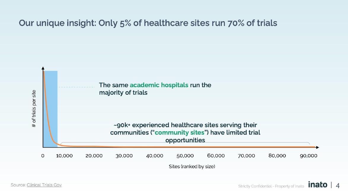
What the deck claims: "Our unique insight: Only 5% of healthcare sites run 70% of trials"; chart of trials per site across ~90,000 sites; "The same academic hospitals run the majority of trials"; "Source: Clinical Trials Gov".
Presentation choice: A reader who sees only the title gets the point.
When it does not fit: Burying the key figure in the chart while the title says "Problem".
Aircall deck, slide 16. Exact stored slide matched to this analysis.
Our analysis: A strong title that would be stronger with its figure in it.
Evidence and limitation: A conclusion title whose effect is shown below; the cause is not.
What a founder can adapt: Bring the headline figure into the title, and claim only what the slide shows.
Supporting analysis
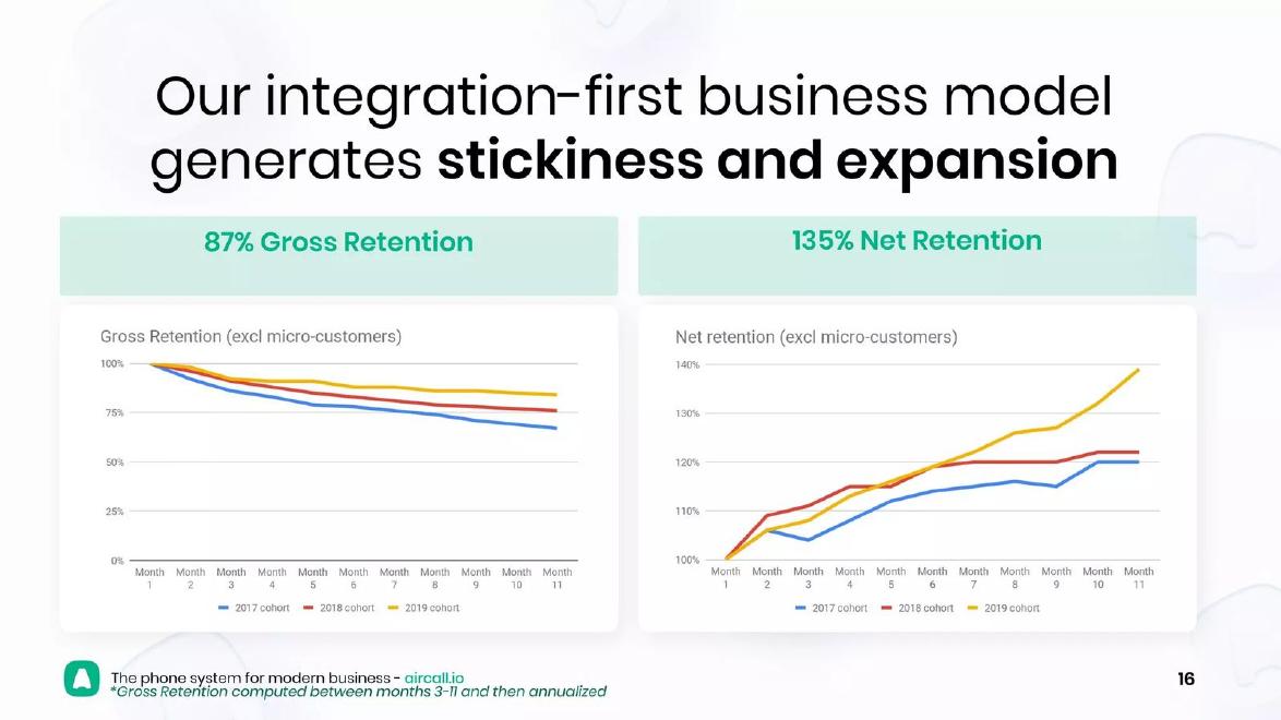
What the deck claims: "Our integration-first business model generates stickiness and expansion"; "87% Gross Retention"; "135% Net Retention"; charts by 2017, 2018 and 2019 cohort.
Presentation choice: The title argues; the slide lets the reader check.
When it does not fit: A cause in the title that no evidence on the slide supports.
Fashinza deck, slide 4. Exact stored slide matched to this analysis.
Our analysis: A warning: the title contradicts the slide.
Evidence and limitation: The title names a region with no customer box and omits the largest one.
What a founder can adapt: Reread the title after the slide is final and confirm every word is shown below.
Supporting analysis
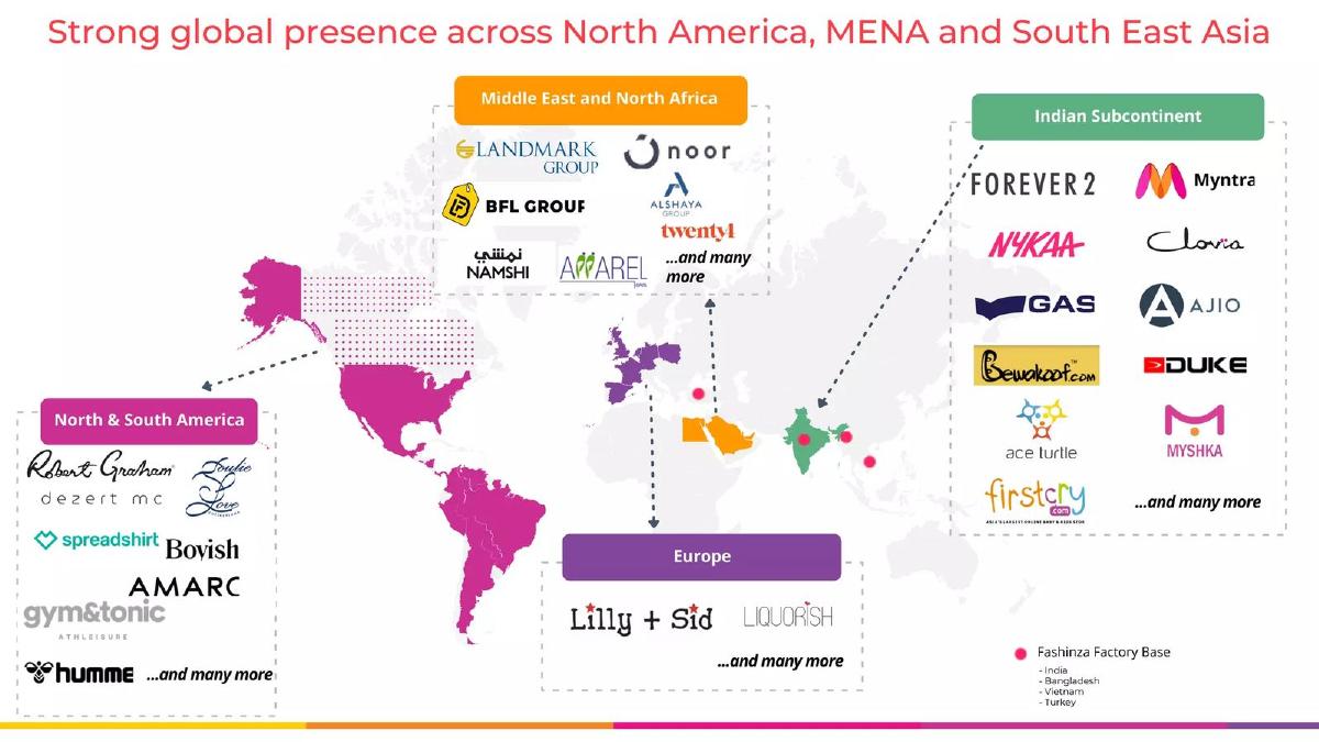
What the deck claims: "Strong global presence across North America, MENA and South East Asia"; boxes "North & South America", "Middle East and North Africa", "Europe", "Indian Subcontinent"; factories in India, Bangladesh, Vietnam, Turkey.
Presentation choice: Readers check the title against the slide within seconds.
When it does not fit: Titles written early and never updated.
Front deck, slide 18. Exact stored slide matched to this analysis.
Our analysis: A vague claim where a checkable conclusion belonged.
Evidence and limitation: A strong specific fact on the slide; a title any company could use.
What a founder can adapt: Title it with the strongest fact: "Teams spend 2.5 hours a day in Front".
Supporting analysis
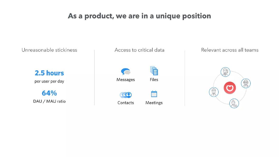
What the deck claims: "As a product, we are in a unique position"; "Unreasonable stickiness: 2.5 hours per user per day; 64% DAU / MAU ratio"; "Access to critical data"; "Relevant across all teams".
Presentation choice: Shows how much a title loses by ignoring the slide's best fact.
When it does not fit: Titles that would fit any startup's deck unchanged.
Whether each title states a conclusion, contains a figure or specific claim, and is fully supported by the slide below.
Example
Title type
Figure or specific claim
Supported by slide
Inato
Conclusion
Yes, figure
Yes, with source
Aircall
Conclusion
Specific claim
Effect yes, cause no
Fashinza
Conclusion
Specific regions
No, mismatch
Front
Vague claim
No
Not checkable
Countingup
Question
No
Answer split three ways
Lunio
Label
No
Nothing to check
Key Takeaways
A title should state the slide's conclusion as a sentence.
Put the figure or specific claim in the title when you can.
Everything on the slide should support the title.
Read the titles alone: they should tell the whole story.
Labels, questions and vague claims waste the most-read line.
Rewrite your slide titles
Work through every slide in order.
Conclusion. What should a reader believe after this slide? Write it as one sentence.
Figure. Is there one figure that proves it? Can it go in the title?
Support. Is every specific word in the title shown on the slide below?
Generic test. Would this title fit another company's deck unchanged?
Title-only read. Listed together, do your titles tell the whole pitch in order?
Copyable framework: [Small section label]
[Conclusion sentence with figure, 6-14 words]
[Evidence that proves exactly that sentence]
Illustrative example 1 — written by us
Before: "Traction"
After: "Revenue tripled in 12 months, with 40 paying clinics"
What improved: Our illustrative rewrite; the figures are invented for the example. The label becomes a checkable conclusion, and the slide below must show both figures.
The question this guide answers
Founders ask what to write in slide titles. Our other guides give title advice for single slide types: the traction guide on headline metrics, the competition guides on comparison tables, the footprint and land-and-expand drafts on matching the title to the evidence. None treats the title as a deck-wide decision: what makes a good title on any slide, how titles work together, and how to test them.
The question matters because titles are the most-read text in a deck. An investor flicking through twenty slides in a minute reads little else. If the titles are labels, that minute teaches the reader nothing. If they are conclusions, that minute delivers the pitch. And a title that claims more than its slide shows is the fastest way to lose trust, because the reader checks the slide against the title straight away.
How we chose and read the examples
Title quality shows up on every slide, so we chose from slides we had already read in full for other guides, selecting the smallest set that shows each pattern clearly: two conclusion titles that work, one that contradicts its own slide, and three that are a vague claim, a question and a label. The six slides come from six startup decks: Inato (clinical trial software), Aircall (business phone software), Fashinza (clothing manufacturing), Front (shared inbox software), Countingup (business account with accounting) and Lunio (ad-fraud protection).
Each slide was rendered from the original deck at full size and read in full. For Inato and Fashinza we reused full-size reads recorded earlier for other guides, since the deck, slide and quoted text are unchanged. This guide uses the slides for a different lesson: how the title relates to the rest of the slide. Quotes are the slides' own; we did not check the figures against outside sources.
The strongest pattern: the title is the finding
Inato's slide is titled "Our unique insight: Only 5% of healthcare sites run 70% of trials". Below is a chart of trials per site across roughly 90,000 sites, with the line "The same academic hospitals run the majority of trials" and the source "Clinical Trials Gov".
This is close to an ideal title. It is a full sentence. It contains the figure, so a reader who sees nothing else still gets the point. It is surprising enough to be worth stating. And the slide below does exactly one job: proving the title with a chart and a source. Nothing on the slide competes with it.
The pattern to copy is simple: decide what a reader should conclude from the slide, write that as the title, then cut anything on the slide that does not support it.
A conclusion title backed by the evidence beneath it
Aircall's retention slide is titled "Our integration-first business model generates stickiness and expansion". Beneath it are two headline figures, "87% Gross Retention" and "135% Net Retention", and two charts by customer year.
The title makes a claim with a cause (integration-first) and an effect (stickiness and expansion). The charts show the effect directly. A reader who sees only the title knows what the slide argues; a reader who looks at the slide can check it.
One improvement would make it stronger still: put a figure in the title. "Integrations keep customers: 87% gross retention, 135% net" carries the proof into the line that gets read most. The cause is also not shown on the slide, which has no breakdown by integration. A title should claim only what the slide below demonstrates, or the slide should add the missing link.
Warning: a title that contradicts its own slide
Fashinza titles its footprint slide "Strong global presence across North America, MENA and South East Asia". The map below has customer boxes for "North & South America", "Middle East and North Africa", "Europe" and "Indian Subcontinent", and marks factory locations in India, Bangladesh, Vietnam and Turkey.
The title names South East Asia, which has no customer box, and leaves out the Indian subcontinent, which has the largest one. Europe appears on the map but not in the title. A reader comparing the two, which most readers do within seconds, finds a mismatch on the first check they make.
This is the most damaging title mistake because it invites doubt about everything else. It usually happens when the title is written early and the slide is changed later, or when a title is copied from another deck. The fix is mechanical: after the slide is final, read the title again and confirm that each word is shown below it.
A vague claim instead of a conclusion
Front titles a slide "As a product, we are in a unique position". Below are three columns: "Unreasonable stickiness" with "2.5 hours per user per day" and "64% DAU / MAU ratio"; "Access to critical data" with icons for messages, files, contacts and meetings; and "Relevant across all teams".
The title sounds like a conclusion but says nothing a reader can check. Almost any company could claim a "unique position". The slide holds a strong, specific fact, 2.5 hours of use per user per day, and the title ignores it.
A better title takes the strongest fact on the slide and states it: "Teams spend 2.5 hours a day in Front". That is shorter, checkable and memorable. As a rule, if a title would fit any startup's deck unchanged, it is not doing its job.
A question instead of an answer
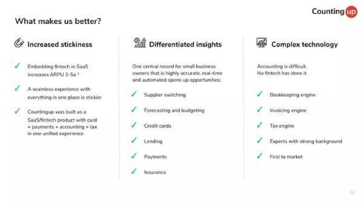
Countingup titles a slide "What makes us better?". Below are three columns: "Increased stickiness", "Differentiated insights" and "Complex technology", each with ticked points.
Question titles are common because they feel conversational, and in a live pitch the founder answers aloud. But a deck read alone leaves the reader to find the answer in the columns and decide which of the three matters most. The title spends the most-read line asking the reader to do the work.
The answer should be the title. If one of the three columns is the real reason, say it: "One app for account, payments and tax, so customers have more to lose by leaving". If all three matter equally, the slide may be trying to do three jobs, and splitting it would help.
Warning: a label
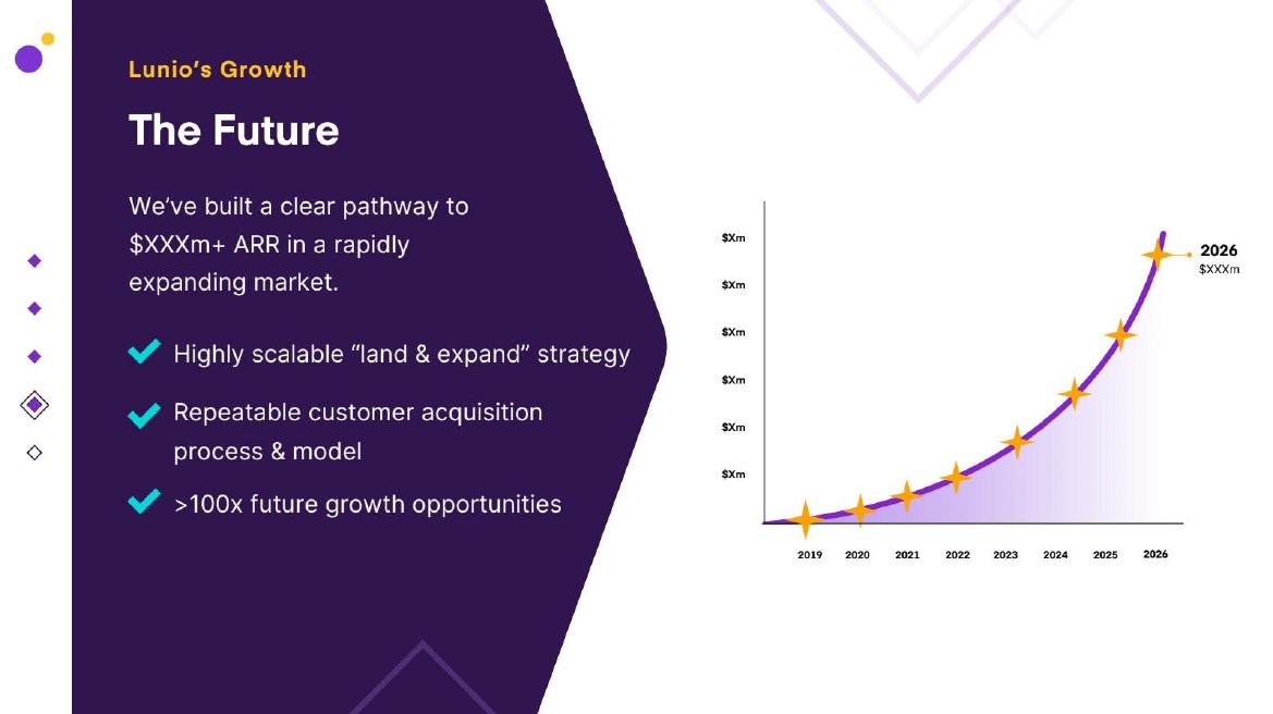
Lunio titles a slide "The Future", under the section marker "Lunio's Growth". Below is "We've built a clear pathway to $XXXm+ ARR in a rapidly expanding market", three ticked points and a forecast curve with every value shown as "$Xm".
"The Future" tells the reader only that this is a forward-looking slide, which the curve makes obvious. The real claim, a pathway to a revenue target, is in the body text, and the figure has been removed. A reader skimming the titles learns nothing here.
A label title is the easiest to fix and the most common. Replace it with the sentence the slide is meant to prove. If that sentence cannot be written, or cannot be supported by what is on the slide, the slide itself may not be needed.
Test your titles: the title-only read
The fastest test for a deck is to copy every slide title into a single list and read it top to bottom. If the list reads like a short, convincing summary of the business, the titles are working. If it reads like a table of contents (Problem, Solution, Market, Team, Ask), every slide is wasting its most-read line.
Read the list again with three questions. Does each title say something a reader could check? Would any title fit a different company's deck unchanged? And does the list tell one story, with each title leading to the next? Titles that fail the first two need rewriting; a list that fails the third often means slides are out of order or one is missing.
Then check each title against its own slide. Every specific word in the title, each region, figure or cause, should appear in the evidence below. This catches the Fashinza mistake before an investor does.
Length, figures and section labels
Conclusion titles are longer than labels, but they should still fit on one or two lines. Aim for a sentence of about six to fourteen words. If it runs longer, the slide is probably making two points.
Put a figure in the title when the figure is the point, as Inato does. Round it the way you would say it aloud, and make sure the exact figure appears on the slide below. Do not put a figure in the title that the slide does not show.
Many decks keep a small section label above the title, such as "Traction" or "GTM". That is useful for navigation and costs nothing. Lunio's slide does this with "Lunio's Growth" above "The Future"; the problem there is the title, not the label. Keep the label small and let the title below carry the conclusion.
Common mistakes
Label titles. Replace "Traction" or "The Future" with the conclusion.
Question titles. Put the answer in the title.
Vague claims. Use the slide's strongest specific fact instead.
Title contradicts slide. Recheck each word after the slide is final.
Figure not on the slide. Never put a figure in a title that the slide does not show.
Diagnostic checklist
Every title is a sentence stating a conclusion.
Key figures appear in titles where they are the point.
Every word in each title is supported below it.
No title would fit another deck unchanged.
The titles read alone tell the pitch in order.
Frequently asked questions
Should pitch deck slide titles be full sentences?
Usually yes. A short sentence stating the slide's conclusion tells a skimming investor far more than a one-word label.
Can I keep labels like "Team" or "Traction"?
Keep them as a small section marker above the title if you like, but let the main title state the conclusion.
How long should a slide title be?
About six to fourteen words, on one or two lines. Longer usually means the slide is making two points.
Is it fine to use a question as a title?
In a live pitch it can work. In a deck read alone, put the answer in the title instead.
How we chose these examples
Corpus: published pitch deck teardowns on StartupFundraising.com. Founder-uploaded private decks are excluded.
Selection (2026-10-01): from slides already read in full for other guides, we chose the smallest set of six slides from six startup decks that shows each title pattern, and used them for a different lesson (title against slide content).
Review: Aircall, Front, Countingup and Lunio were rendered from the source decks at full size and read in full on 2026-10-01; Inato and Fashinza reuse full-size reads recorded on 2026-10-01 for the key-insight and footprint-map drafts, with deck, slide and quoted text unchanged (editorial model review, with AI assistance in drafting). No person has yet completed a human review. Figures were not checked against outside sources.