Where Your ARR Growth Came From: New, Expansion and Churn
How to show the sources of ARR growth on a pitch deck slide: net new ARR versus total ARR, new logos, expansion and churn, values, forecasts and quick ratio.
Where Your ARR Growth Came From: Show New, Expansion and Churn So Investors Can Read It
Two companies can both grow ARR 3x in a year. One did it by signing many new customers while losing some; the other by selling more to the customers it already had. Investors value those differently, so many SaaS decks break growth into its sources: new customers, expansion, and churn. Five real decks show five ways to draw that chart. Pendo plots only each quarter's net new ARR and hatches its forecast quarters. Minut and Juro stack the new pieces on top of total ARR. Cleary's legend promises the split but the bars show one colour. A Rippling page shows a sample report with every value printed. This guide shows which chart answers which question, and what to label so the chart can be read.
TL;DR
To show where ARR growth came from, chart net new ARR per period split into new-customer ARR, expansion, and churn and contraction (drawn below zero), with values printed and periods labelled. Plot the flows on their own axis rather than stacked on top of total ARR, because once a company has grown, each month's new ARR is a thin sliver on a tall bar and the split becomes unreadable. Put total ARR, the split's definitions (what counts as expansion, whether churn includes downgrades) and any forecast marking beside it. One line of arithmetic, such as starting ARR + new + expansion − churn − contraction = ending ARR for the latest period, lets an investor check it.
Five real ways to show the sources of ARR growth
Each slide was read from its original deck page. Our arithmetic is labelled; company figures are reported as printed and not verified.
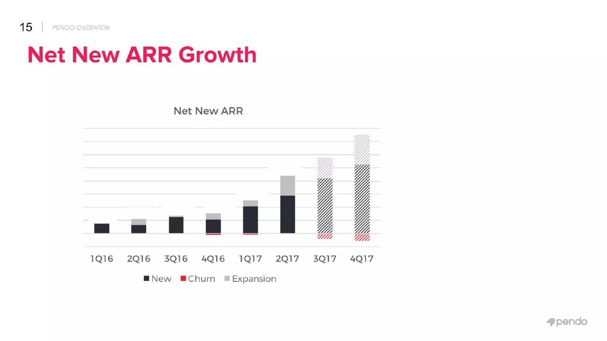
Pendo traction slide — slide 14
US product-analytics software company; page 14 of its Series B deck (printed page number 15), "Net New ARR Growth".
Pendo deck, slide 14. Exact stored slide matched to this analysis.
Our analysis: The right chart for the question: it plots flows, not totals, so the split stays readable as the company grows, and it puts churn below zero. It is let down by having no numbers and an unexplained hatch.
Evidence and limitation: Our reading: new-customer ARR is most of each quarter's growth; expansion is visible from 2Q16 and largest in 2Q17 and the hatched quarters; churn appears as thin red bars below zero in 4Q16, 1Q17 and the hatched quarters. The hatching most likely marks forecast quarters, but the slide does not say so. Without values, the size of any quarter, the split shares or a quick ratio can't be calculated.
What a founder can adapt: Add the quarter's net new ARR above each bar, a split for the latest actual quarter, and "Hatched: plan" in the legend.
Supporting analysis
What the deck claims: Chart titled "Net New ARR", quarters 1Q16 to 4Q17. Legend: "New", "Churn", "Expansion". New is dark, expansion grey on top, churn red below zero. 3Q17 and 4Q17 bars are hatched. No values or axis numbers.
Presentation choice: It shows the flow design that keeps growth sources readable, and the cost of leaving out values and a forecast note.
When it does not fit: Don't rely on a fill pattern alone to separate plan from actuals.
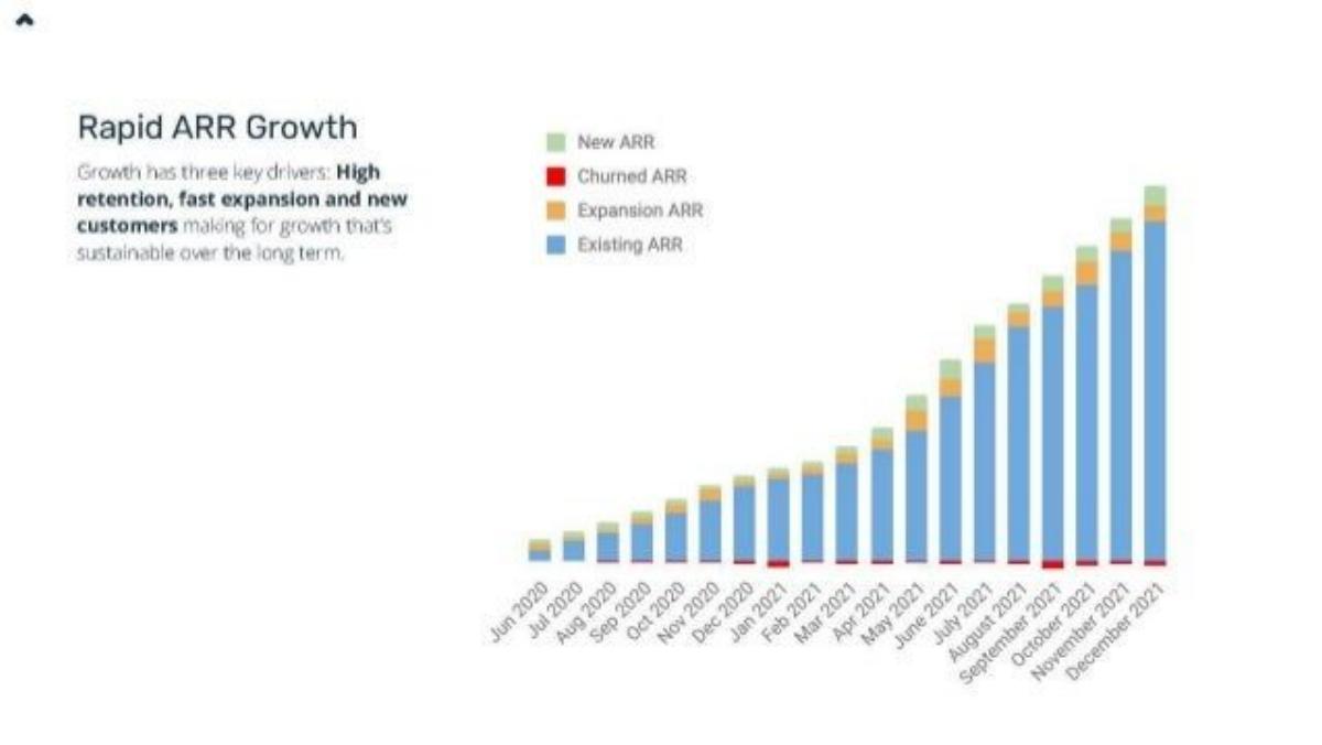
Swedish noise and occupancy sensors for short-term rentals; page 6 of its deck, "Rapid ARR Growth".
Minut deck, slide 6. Exact stored slide matched to this analysis.
Our analysis: The text names three drivers, and the chart contains them, but at this scale the reader sees one blue shape. The claim of "fast expansion" can't be judged from bands a few pixels high.
Evidence and limitation: Our reading: existing ARR (blue) is almost the whole bar from early 2021; each month's new and expansion ARR are thin bands on top, and churned ARR is a thin red line at the base, thickest around January and September 2021. Total ARR rises roughly tenfold over the period by bar height, but no figure is printed, so neither the size nor the split can be checked. The deck's KPI page (page 5) gives ">$1M ARR", without a date matched to this chart.
What a founder can adapt: Keep a small total-ARR line, and chart the monthly new, expansion and churn on their own axis with the latest month's values.
Supporting analysis
What the deck claims: "Growth has three key drivers: High retention, fast expansion and new customers making for growth that's sustainable over the long term." Monthly stacked bars, Jun 2020 to December 2021. Legend: "New ARR", "Churned ARR", "Expansion ARR", "Existing ARR". No values or axis numbers.
Presentation choice: It shows why stacking new pieces on total ARR hides the split once a company has grown.
When it does not fit: Don't claim a driver is "fast" without a figure the reader can see.
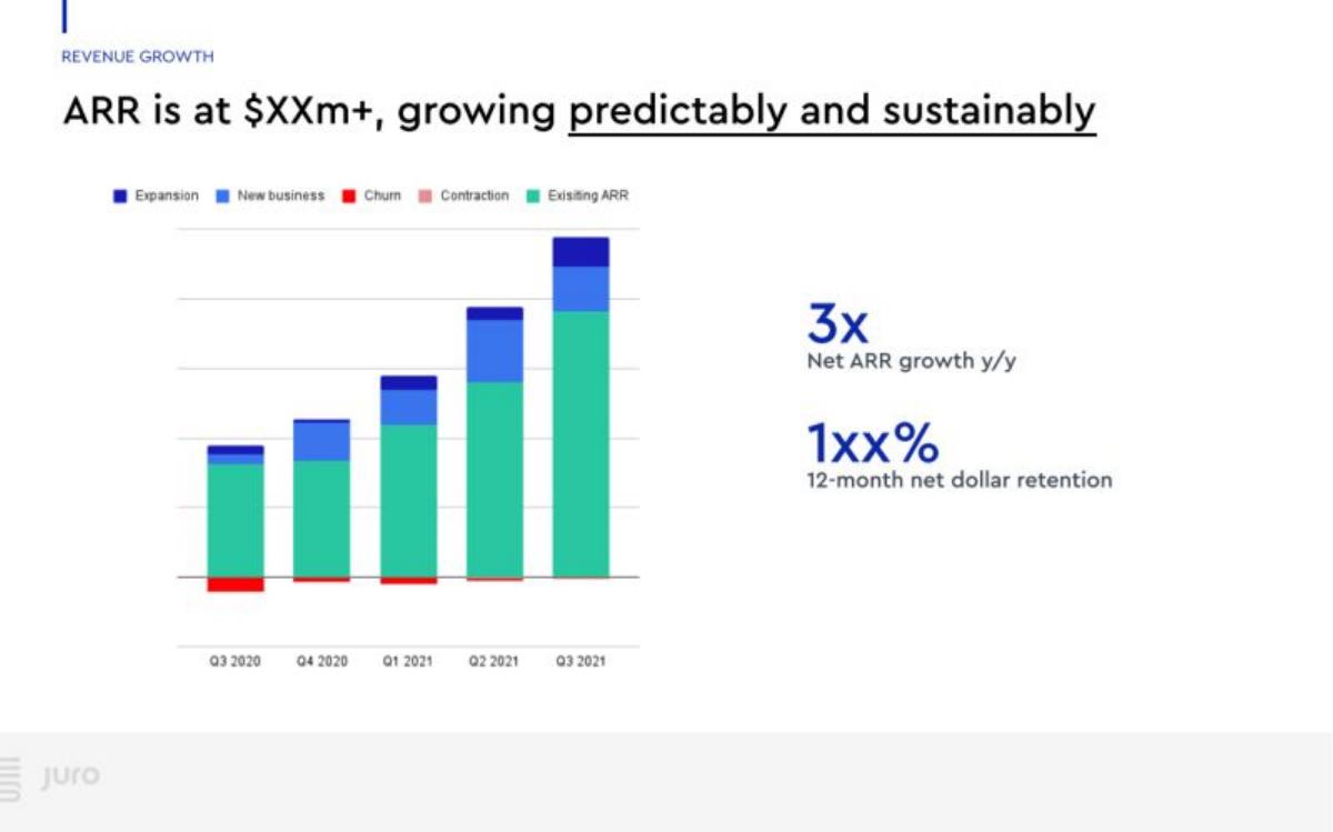
UK contract-management software company; page 6, "ARR is at $XXm+, growing predictably and sustainably", with figures blanked in the published version.
Juro deck, slide 6. Exact stored slide matched to this analysis.
Our analysis: A better use of the stacked design than Minut's: fewer periods keep the bands readable, churn and contraction are separated and drawn below zero, and the two headline figures say what the chart is meant to prove. The page is the model of what to pair with a bridge; the blanked values are the published version's limitation.
Evidence and limitation: Our reading: with five quarters, the new-business and expansion bands are large enough to compare; new business is the bigger piece in most quarters, and expansion grows in Q3 2021. Churn is visible below zero in Q3 2020 and Q1 2021; contraction is barely visible. The headline values are blanked ("$XXm+", "1xx%"), and the chart has no numbers, so the 3x can't be reconciled with the bars.
What a founder can adapt: In your own deck, print the latest quarter's split under the chart so the 3x and the retention figure can be traced to it.
Supporting analysis
What the deck claims: Quarterly stacked bars, Q3 2020 to Q3 2021. Legend: "Expansion", "New business", "Churn", "Contraction", "Existing ARR". Churn and contraction drawn below zero. Beside the chart: "3x Net ARR growth y/y"; "1xx% 12-month net dollar retention".
Presentation choice: It shows a stacked bridge kept readable by using quarters, with separate churn and contraction and the headline ratios beside it.
When it does not fit: Don't merge contraction into churn if downgrades are a real part of your losses.
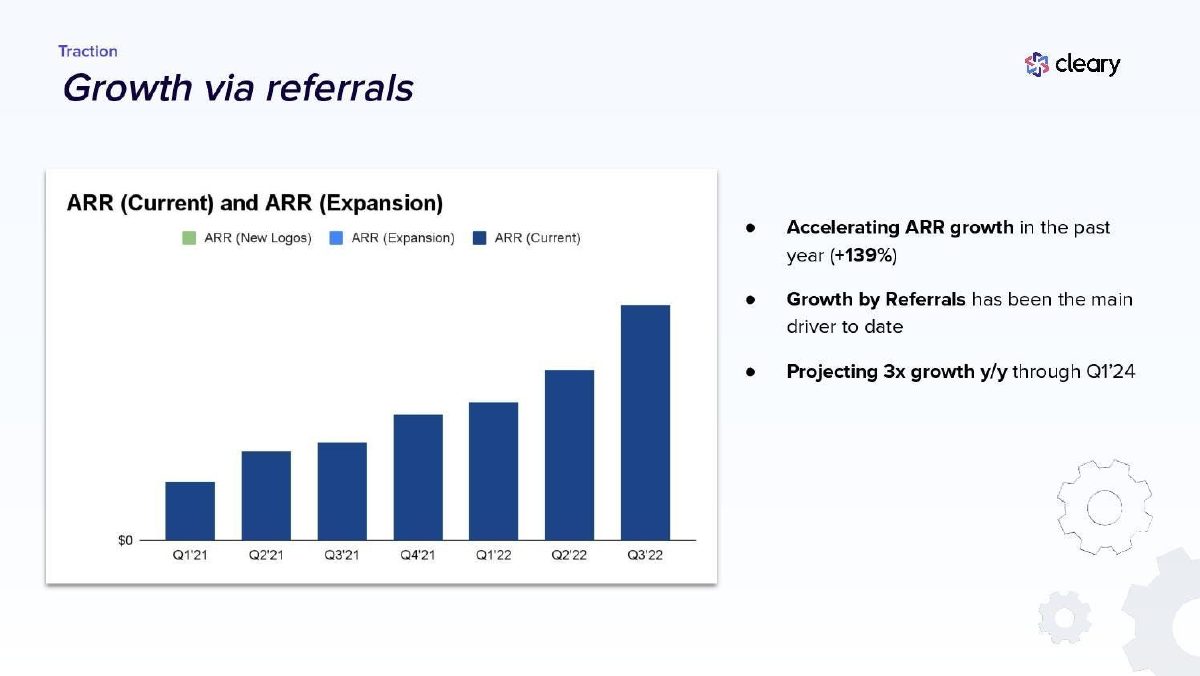
US employee-experience software company; page 12, "Traction — Growth via referrals".
Cleary deck, slide 12. Exact stored slide matched to this analysis.
Our analysis: A common slip: a chart built for a bridge but showing only totals, with a legend that promises more than it shows. It also mixes two different splits, by source of ARR (new or expansion) and by acquisition channel (referrals), which need different charts.
Evidence and limitation: Our reading: the legend names three categories but the bars show one, so either the new-logo and expansion series are empty or hidden, or the chart lost them. By bar height, Q3'22 is a little over twice Q3'21, consistent with +139% if the bars are year-on-year comparable. The referral claim is about a channel, which a new/expansion split can't show in any case.
What a founder can adapt: Either remove the unused legend items and title the chart "ARR", or show the new and expansion pieces; put the referral share in its own line ("[x]% of new ARR from referrals").
Supporting analysis
What the deck claims: Chart titled "ARR (Current) and ARR (Expansion)". Legend: "ARR (New Logos)", "ARR (Expansion)", "ARR (Current)". Quarters Q1'21 to Q3'22; only one colour (current) is visible; axis shows "$0" only. Bullets: "Accelerating ARR growth in the past year (+139%)"; "Growth by Referrals has been the main driver to date"; "Projecting 3x growth y/y through Q1'24".
Presentation choice: It shows what goes wrong when the legend and the bars disagree, and the difference between source of ARR and acquisition channel.
When it does not fit: Don't keep a legend for series that aren't on the chart.
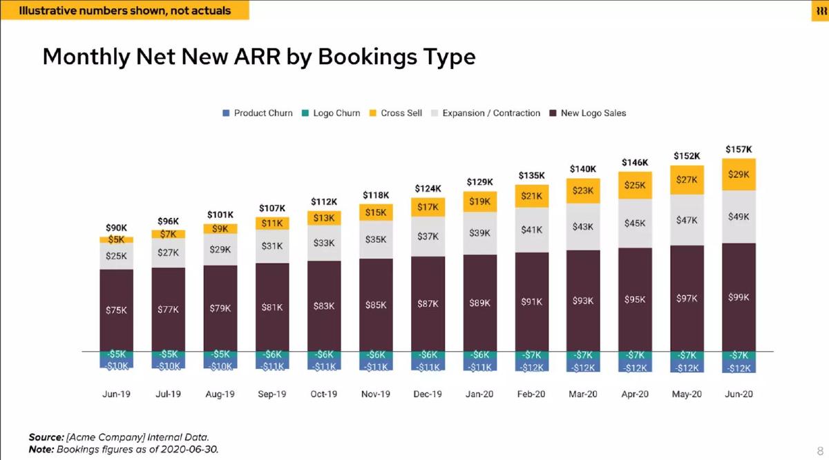
US HR, payroll and IT software company; page 8 of the deck, banner "Illustrative numbers shown, not actuals", source "[Acme Company] Internal Data". It is a sample report layout, not Rippling's results.
Rippling deck, slide 8. Exact stored slide matched to this analysis.
Our analysis: Useful as a layout, not as evidence: it has the features a bridge needs (flows on their own axis, losses below zero, every value printed, a total per bar, a dated note) and shows how much more an investor can do with values than with shapes. Its one design choice to reconsider is netting expansion with contraction, which hides downgrades.
Evidence and limitation: Our checks on the illustrative numbers: Jun-19, 75 + 25 + 5 − 5 − 10 = 90, matching the total. Jun-20, 99 + 49 + 29 − 7 − 12 = 158 against $157K printed, a rounding difference. A quick ratio of (new + expansion + cross-sell) ÷ (logo churn + product churn) gives 105 ÷ 15 = 7.0 in Jun-19 and 177 ÷ 19 ≈ 9.3 in Jun-20; whether cross-sell belongs in the numerator depends on the definition the deck uses on a later page. Expansion is netted with contraction here, so gross expansion is not visible. These are not real company figures.
What a founder can adapt: Use this layout with your real figures, keep the as-of date, and show contraction separately from expansion.
Supporting analysis
What the deck claims: "Monthly Net New ARR by Bookings Type", Jun-19 to Jun-20. Categories: "Product Churn", "Logo Churn", "Cross Sell", "Expansion / Contraction", "New Logo Sales". Every segment and the total are printed: Jun-19 $75K new logo, $25K expansion/contraction, $5K cross-sell, −$5K logo churn, −$10K product churn, total $90K; Jun-20 $99K, $49K, $29K, −$7K, −$12K, total $157K. "Note: Bookings figures as of 2020-06-30."
Presentation choice: It shows a fully labelled bridge whose values can be added up, clearly marked as illustrative.
When it does not fit: Never present illustrative figures without the banner; never borrow a sample layout's numbers.
Design choice, labels, and what can be calculated from each page.
Slide
Design
Losses shown
Values
Forecast marked
Can check
Pendo p14
Net new flows, quarterly
Churn below zero
No
Hatched, unexplained
Direction and mix only
Minut p6
Stacked on total, monthly
Thin line at base
No
No forecast shown
Total trend only
Juro p6
Stacked on total, quarterly
Churn and contraction below zero
Blanked
No forecast shown
Mix by eye
Cleary p12
Totals only; legend lists split
No
"$0" axis only
Projection in text
Growth by bar height
Rippling p8
Net new flows, monthly (sample)
Two churn types below zero
All, with totals
As-of date
Totals and ratios (illustrative)
Key Takeaways
Decide the question first: total ARR shows size; net new ARR shows where growth comes from.
Plot flows on their own axis; stacked on total ARR they shrink to slivers.
Draw churn and contraction below zero so the net figure is visible.
Print values, or at least the latest period's split; unlabelled bars show only direction.
Mark forecast periods differently and say so in a note.
Define the categories, and make the bridge add up from start to end.
Build your ARR bridge
Fill this in for each period before drawing the chart.
Question. Is the slide about size (total ARR) or sources of growth (net new ARR)? Choose the chart to match.
Categories. New customers, expansion, contraction, churn. Do you also split cross-sell or product churn? Define each in one line.
Period. Monthly or quarterly? Use quarters if monthly flows are too thin to read.
Reconciliation. Starting ARR + new + expansion − contraction − churn = ending ARR? If not, what is the difference?
Values. Which values will you print: every bar, or the latest period plus the year's total per category?
Ratios. Will you state a quick ratio, NRR or burn multiple? Say which categories each uses.
Forecast. Are any periods planned rather than actual? How are they marked, and does the note say so?
Copyable framework: [Period]: starting ARR $[a] + new $[b] + expansion $[c] − contraction $[d] − churn $[e] = ending ARR $[f]. Net new ARR $[b+c−d−e]; quick ratio [(b+c) ÷ (d+e)]. [Periods marked hatched are plan.]
Illustrative example 1 — written by us
Before: Net New ARR Growth (bars by New, Churn, Expansion; no values; last two quarters hatched).
After: 2Q17 net new ARR $[x]: new $[a], expansion $[b], churn −$[c]. 3Q17–4Q17 hatched: plan.
What improved: Built from Pendo's page 14. The bracketed values are placeholders the slide does not give, and "plan" is our reading of the hatching.
Illustrative example 2 — written by us
Before: Jun-20: $99K new logo, $49K expansion/contraction, $29K cross-sell, −$7K logo churn, −$12K product churn; $157K.
After: Jun-20 (illustrative): gained $177K, lost $19K, net new $158K (printed $157K, rounding); quick ratio about 9.3, counting cross-sell as gained ARR.
What improved: Built from Rippling's sample page 8, whose numbers are illustrative. The sums and ratio are our arithmetic.
What an ARR bridge answers that total ARR doesn't
A total-ARR chart answers "how big and how fast?". A bridge answers "growth from what?": how much came from new customers, how much from existing customers paying more, and how much was lost. The split matters because the parts have different costs and different signals. New-customer ARR depends on sales and marketing spend; expansion suggests customers get more value over time; churn is a leak the rest has to refill.
Investors use it in three common calculations. Net revenue retention looks at the existing-customer pieces for one cohort (see the NRR guide). The burn multiple divides net burn by net new ARR (see the capital-efficiency guide). And the SaaS quick ratio divides gained ARR (new + expansion) by lost ARR (churn + contraction): a ratio of 4 means four dollars gained for each dollar lost. None of these can be checked from a total-ARR line alone.
This guide is about presenting your own figures clearly. It is not accounting or investment advice, and ARR has no standard accounting definition, so state yours.
Flows or stock: choose the chart that matches the question
There are two common designs. A flow chart plots each period's net new ARR, with new and expansion above zero and churn below, as Pendo does. A stacked stock chart plots total ARR with the period's new pieces on top, as Minut and Juro do. The stock chart shows size and sources in one picture, which is why founders like it. The cost is legibility: when ARR has grown fivefold, one month's new ARR is a few pixels on a tall bar, and churn is a red line at the base.
If the slide's message is about growth sources, use the flow chart, and give total ARR as a number or a small line elsewhere on the page. If the message is size, use the total-ARR chart and put the split in a sentence ("Q3: $1.2M net new ARR, of which 30% expansion").
Labels that make the chart usable
Values. A bridge without numbers shows shape only. If you won't print every bar, print the latest period's split and the year's total of each category.
Definitions. Say what counts as expansion (more seats, a higher plan, cross-sell of another product) and whether churn means lost customers only or includes downgrades. Rippling's sample report separates logo churn from product churn and cross-sell from expansion, which is more detail than most decks need, but shows the choices exist. US securities regulators ask public companies that report a key metric to define it clearly and say how it is calculated; the same discipline helps on a pitch slide.
Forecasts. Pendo hatches its last two quarters. That is a good convention only if the slide also says so in words; a note such as "3Q17–4Q17: plan" removes any doubt.
Reconciliation. For the latest period, starting ARR + new + expansion − churn − contraction should equal ending ARR. If it doesn't (for example because of currency changes or reclassification), add an "other" bar and say what it is. (US Securities and Exchange Commission)
A worked example (hypothetical)
Take an invented company with $2.0M ARR at the start of a quarter. During the quarter it signs $400K of ARR from new customers, existing customers add $150K (extra seats and a plan upgrade), $30K is lost to downgrades and $70K to customers who leave. Ending ARR is 2.0 + 0.40 + 0.15 − 0.03 − 0.07 = $2.45M, so net new ARR is $450K.
From those four numbers an investor can read a lot. New customers supplied about 73% of the gains (400 of 550). The quick ratio is 550 ÷ 100 = 5.5. Losses were 5% of starting ARR in one quarter, which, if repeated, would be close to a fifth of the base in a year, a figure worth explaining. And if the company burned $900K in the quarter, the burn multiple is 900 ÷ 450 = 2.0.
Now draw it two ways. On a stacked total-ARR chart, the $450K is under a fifth of a $2.45M bar and the $100K of losses is a thin strip at the base. On a flow chart, the same quarter is one bar: $400K and $150K stacked above zero and $100K below, with $450K printed on top. The second chart is the one that shows the mix, which is why it suits a slide about growth sources. All figures in this example are invented for illustration.
What investors will ask after seeing it
Is new-customer ARR growing, or is growth increasingly coming from expansion? Either can be good, but they lead to different questions: about sales capacity and acquisition cost in the first case, about how much more existing customers can buy in the second.
Is churn concentrated? A spike in one period, such as the thicker red bars Minut shows in two months, usually prompts a question about one large customer or a product change. Have a one-line answer ready, and consider footnoting it.
Does the bridge match your other numbers? Net new ARR over the year should equal the change in the ARR figure on your traction slide; the existing-customer pieces should be consistent with any retention figure you state; and new-customer ARR should be consistent with the customer count and average contract value you show. If any of these differ because of definitions, say so before an investor finds it.
Common mistakes
Split buried in total ARR. Stacking monthly flows on a tall total makes them unreadable; chart flows on their own axis.
No values. Unlabelled bars show direction only; print at least the latest period's split.
Legend for missing series. Remove legend items that aren't on the chart, or show them.
Unexplained forecast styling. Say in words which periods are plan.
Undefined categories. State what counts as expansion and whether churn includes downgrades.
Bridge that doesn't add up. Start + gains − losses should equal end; explain any difference.
Diagnostic checklist
The chart matches the message: total ARR for size, net new ARR for growth sources.
New, expansion, contraction and churn are separate, with losses below zero.
The latest period's values are printed, at least.
Each category is defined in one line.
The latest period reconciles from starting to ending ARR.
Forecast periods are marked and named in a note.
Any quick ratio, NRR or burn multiple says which categories it uses.
Frequently asked questions
What is net new ARR?
The change in ARR over a period: ARR from new customers plus expansion from existing customers, minus churn and contraction. It equals ending ARR minus starting ARR when nothing else (such as currency changes) moves the total.
What is the SaaS quick ratio?
Gained recurring revenue (new plus expansion) divided by lost recurring revenue (churn plus contraction) in a period. A ratio of 4 means four dollars gained for each dollar lost. Say which categories you include, because definitions vary.
Should I show ARR growth monthly or quarterly?
Use whichever keeps each period's flows readable. Monthly bars work for early companies or a flow chart; for a stacked chart over many months, quarters usually read better.
How is an ARR bridge different from net revenue retention?
A bridge shows all sources of growth in a period, including new customers. NRR looks only at revenue from a fixed group of existing customers over twelve months, so it excludes new-customer ARR.
How we chose these examples
Discovery (2026-10-04): after several runs screening founder search questions without a qualified topic, we searched the deck collection for one chart type, ARR and MRR bridges (new, expansion, churn), across 70,729 pages. Hits and follow-up searches led to Pendo 14, Rippling (both decks) 8 and 11, Minut 6, Juro 6 and Cleary 12; Productsup 3 (one bullet on net new ARR) and Paddle 2 (an NDR formula) were set aside as passing mentions. Closest content read: the live net revenue retention guide (uses a bridge only to support an NRR figure), the live capital-efficiency guide (net new ARR as a burn-multiple denominator), the organic-growth guide (Cleary page 12 as referral evidence), the bookings-versus-revenue draft and the churn and retention guide. None teaches how to choose and label a chart showing the sources of ARR growth.
Five pages from five decks were read from images rendered from the original deck files. All are published teardowns and none is excluded. Minut 6, Juro 6 and Cleary 12 images already existed; Pendo 14 and Rippling 8 were prepared at 1200px wide and uploaded through the standing slide-image workflow. Rippling 8 is labelled illustrative by the deck and is presented only as a layout.
Readings of unlabelled charts are by eye and described as such. Sums and ratios are our arithmetic from printed values. Company figures are reported as printed and not verified. This guide explains presentation, not accounting or investment advice. Slide readings and analysis are an AI editorial model review, not human-checked.