Cohort Charts in a Pitch Deck: Stacked, Indexed or Payback
How to choose and label a customer cohort chart for a pitch deck: stacked revenue by cohort, an indexed cohort table, a before-and-after cohort comparison.
Cohort Charts in Your Pitch Deck: Pick the Layout That Answers the Investor's Question
Four pages from four real decks show customer cohorts in four different layouts. DoorDash's diligence memo stacks monthly order volume by cohort, Kredivo indexes spend per user to its first cohort in a table, Matterport compares two yearly cohorts' starting and current monthly revenue, and eToro sets one cohort's cumulative revenue against the marketing money spent to acquire it. Each layout answers a different investor question, and each leaves out something a reader will ask about.
TL;DR
A cohort chart groups customers by when they started and follows what each group does afterwards. Choose the layout from the question you need to answer: a stacked chart shows how much of today's revenue comes from older customers; an indexed table shows whether each group spends more over time and whether newer groups start stronger; a before-and-after comparison shows expansion inside a group; a cumulative-revenue-versus-spend chart shows how fast acquisition money comes back.
Whatever the layout, label five things: the unit (revenue, gross order value, users, monthly recurring revenue), how a cohort is defined (month or year of first purchase, which customers are excluded), the time axis (calendar month or months since start), the base for any index or percentage, and which figures are estimates. Of the four slides below, Kredivo and eToro label most of these; DoorDash and Matterport leave at least one open.
Four real cohort slides, four layouts
Each page is shown as it appears in the original deck, followed by what it says, what we checked and what a founder can take from it.
DoorDash traction slide — slide 2
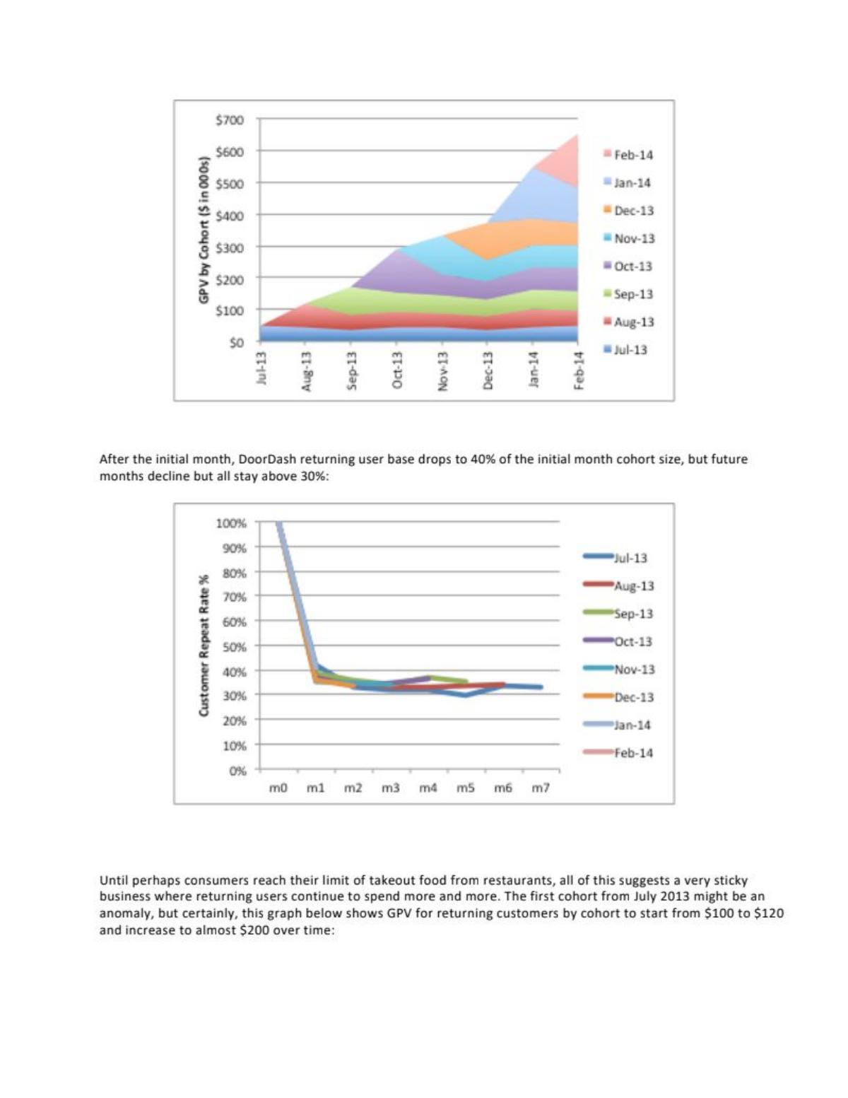
Food delivery, 2014. Our library records this material as a Sequoia Capital investment memo with supporting charts, not a founder-made deck. Page 2 holds two cohort charts; this guide uses the upper, stacked one (the churn and retention guide uses the lower repeat-rate chart for a different lesson).
DoorDash deck, slide 2. Exact stored slide matched to this analysis.
Our analysis: A layer cake on a calendar axis. It shows that older groups keep ordering at roughly the same total volume, so growth is adding new layers rather than replacing lost ones. It cannot show whether that comes from the same customers or from fewer customers ordering more; the repeat-rate chart below it is needed for that.
Evidence and limitation: Directly visible: the top edge rises from about $50K in July 2013 to about $650K in February 2014 (our reading of the axis). The July 2013 band stays roughly the same thickness, about $50K, across all eight months; later bands also stay roughly level after their first month. The chart shows volume, not revenue: at the stated take rate of over 21%, revenue would be roughly a fifth of each band.
What a founder can adapt: Use a stacked chart when your argument is that revenue compounds from older customers. Label the unit and, if it is not revenue, give the conversion.
Supporting analysis
What the deck claims: Upper chart: "GPV by Cohort ($ in 000s)", stacked areas for monthly cohorts Jul-13 to Feb-14, calendar months on the horizontal axis. Page 1 defines gross processing volume (GPV) as order volume, commission, delivery charge and driver tip, and gives a take rate of over 21%.
Presentation choice: Investors can see at a glance how much of the latest month rests on customers won earlier.
When it does not fit: Don't present gross volume as revenue, and don't read the newest, single-month bands as stable.
Buy-now-pay-later and consumer credit in Indonesia. Investor presentation for a later-stage transaction (our library records it as a SPAC presentation). Page headed "Increasing dollar retention over time".
Kredivo deck, slide 30. Exact stored slide matched to this analysis.
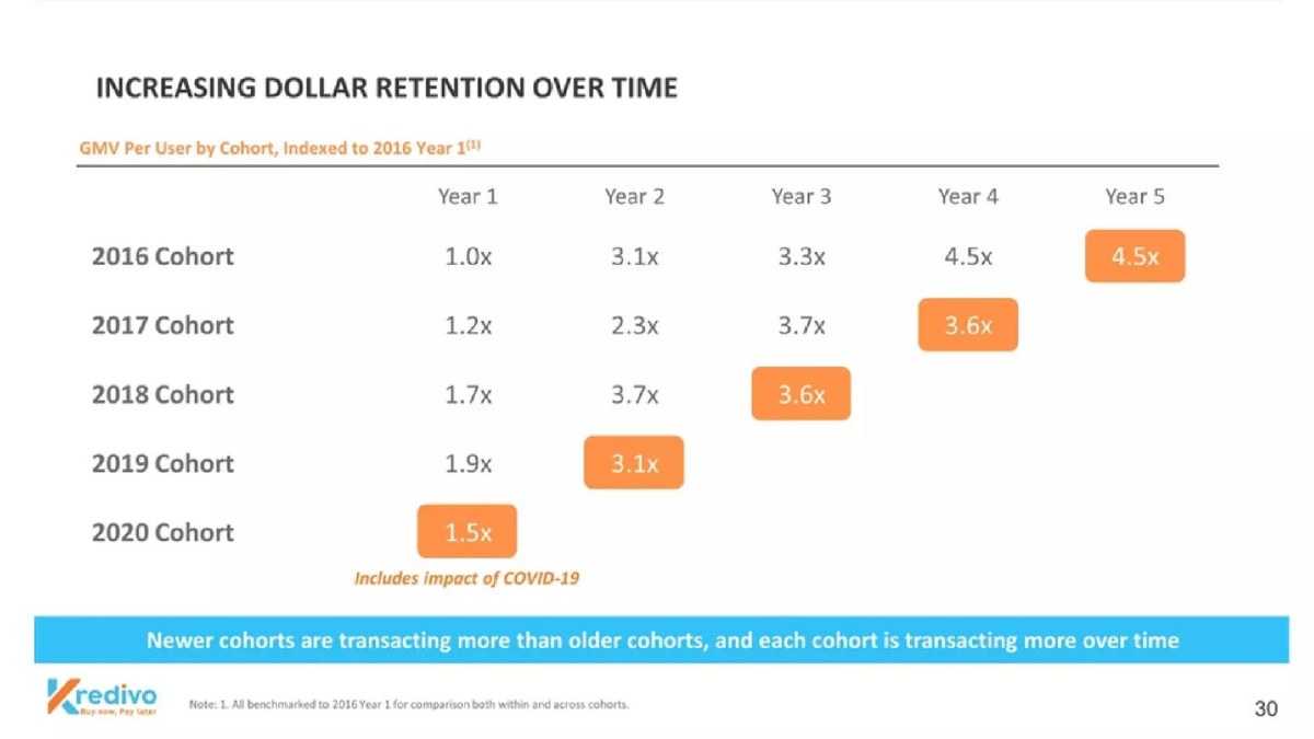
Our analysis: A well-built triangle: one base for every cell, so the reader can compare along rows and down columns. The banner's "each cohort is transacting more over time" holds for most steps but not the last cell of the 2017 and 2018 rows, which the COVID-19 note may explain but labels only for the 2020 row.
Evidence and limitation: Our calculations from printed cells: within the 2017 cohort, Year 4 is 3.6 ÷ 1.2 = 3.0 times Year 1; within the 2019 cohort, Year 2 is 3.1 ÷ 1.9 = 1.6 times Year 1. Year 1 rises from 1.0x (2016) to 1.9x (2019), then falls to 1.5x (2020). The highlighted diagonal appears to be calendar 2020 for every cohort (our reading; not labelled), and the 2017 and 2018 rows dip in that cell (3.7x to 3.6x). The table does not say whether "per user" divides by starting users or active users, and gives no absolute GMV.
What a founder can adapt: Index every cell to one stated base, name the per-user denominator, and label the calendar year of the diagonal if a shock affects it.
Supporting analysis
What the deck claims: Table "GMV Per User by Cohort, Indexed to 2016 Year 1". Rows 2016 to 2020 cohorts; columns Year 1 to Year 5. 2016 cohort: 1.0x, 3.1x, 3.3x, 4.5x, 4.5x. 2017: 1.2x, 2.3x, 3.7x, 3.6x. 2018: 1.7x, 3.7x, 3.6x. 2019: 1.9x, 3.1x. 2020: 1.5x, marked "Includes impact of COVID-19". The last cell in each row is highlighted. Footnote: "All benchmarked to 2016 Year 1 for comparison both within and across cohorts." Banner: "Newer cohorts are transacting more than older cohorts, and each cohort is transacting more over time."
Presentation choice: Indexing to one base cell lets investors compare both growth within a group and starting strength across groups.
When it does not fit: Don't title the slide "dollar retention" unless the figure divides by starting users.
3D capture software for buildings. Investor presentation for a later-stage transaction (our library records it as a SPAC presentation). Page headed "Demonstrated track record of Monthly Recurring Revenue expansion across cohorts".
Matterport deck, slide 27. Exact stored slide matched to this analysis.
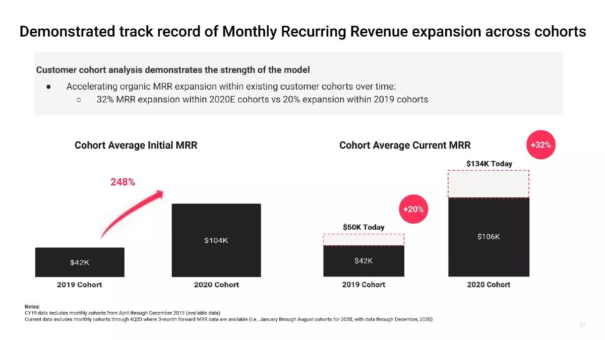
Our analysis: A compact expansion view: starting and current monthly recurring revenue per average cohort. The note explaining which months are included probably accounts for the different 2020 bases, but the slide doesn't print the base each percentage uses, so a reader cannot reproduce +32%.
Evidence and limitation: Our calculations: 2019 cohort $50K ÷ $42K = 1.19, consistent with +20% after rounding. 2020 cohort: $134K ÷ $104K = 1.29 and $134K ÷ $106K = 1.26; the printed +32% matches neither, and the 2020 starting figure appears as $104K on the left and $106K on the right. "248%" equals $104K ÷ $42K = 2.48 times, an increase of about 148%. The bullet calls the 2020 cohorts "2020E", but the chart does not mark which values are estimates. The 2020 cohorts have had at most about eleven months to expand, against up to about twenty for 2019.
What a founder can adapt: Print the base for each percentage, mark estimates on the chart itself, and state how long each cohort has had to expand.
Supporting analysis
What the deck claims: Bullet: "32% MRR expansion within 2020E cohorts vs 20% expansion within 2019 cohorts." Left chart "Cohort Average Initial MRR": 2019 cohort $42K, 2020 cohort $104K, with "248%". Right chart "Cohort Average Current MRR": 2019 $42K base rising to "$50K Today" (+20%); 2020 $106K base rising to "$134K Today" (+32%). Notes: 2019 data covers monthly cohorts April to December 2019; current data covers monthly cohorts through 4Q20 where three months of forward MRR are available (January to August 2020 cohorts, data through December 2020).
Presentation choice: Shows expansion inside a customer group in two bars, without a full table.
When it does not fit: Don't print a ratio as a percentage increase (2.48 times is +148%), and don't compare cohorts of different ages without saying so.
Social investing platform. Investor presentation for a later-stage transaction (our library records it as a SPAC presentation). Page headed "Marketing investment returned in 3.5 months".
eToro deck, slide 34. Exact stored slide matched to this analysis.
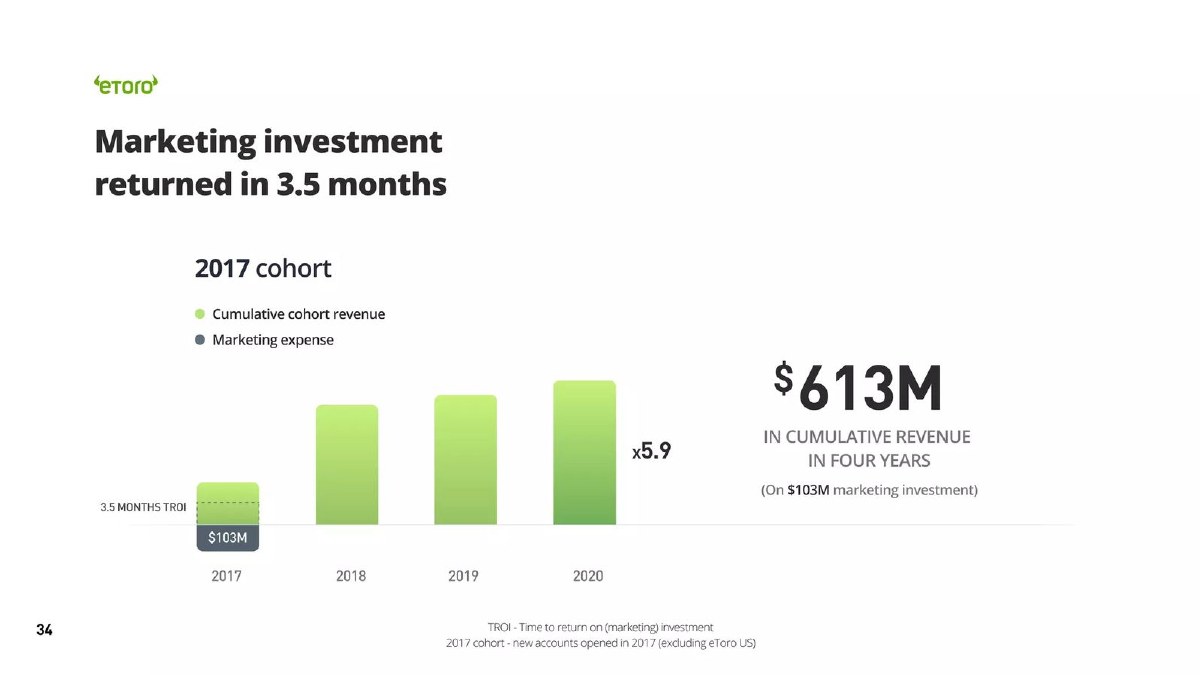
Our analysis: The clearest acquisition-payback layout of the four: one group, its acquisition cost and its running revenue total on the same axis, with a written cohort definition. Because it uses revenue, x5.9 is a revenue multiple on marketing spend, not a profit return.
Evidence and limitation: Our calculation: $613M ÷ $103M = 5.95, printed as x5.9. The 2018 to 2020 bar heights are not labelled and we do not estimate them. The slide does not say when the 3.5 months start (each account's opening date, or the start of 2017), and the return is measured on revenue, not on gross profit or contribution. The cohort definition and the exclusion of the US business are stated.
What a founder can adapt: Show cumulative gross profit as well as revenue, and say when the payback clock starts.
Supporting analysis
What the deck claims: "2017 cohort": bars of cumulative cohort revenue for 2017 to 2020 above a $103M marketing-expense bar, a dashed line marked "3.5 months TROI", "x5.9", and "$613M in cumulative revenue in four years (on $103M marketing investment)". Footnotes: TROI is "Time to return on (marketing) investment"; "2017 cohort - new accounts opened in 2017 (excluding eToro US)".
Presentation choice: Ties the cohort directly to what it cost to acquire, which is the investor's question when the raise funds marketing.
When it does not fit: Don't call a revenue multiple a return on investment without saying it is before costs.
How the four slides label the five things a cohort chart needs, and which question each answers.
Slide
Question answered
Unit named
Cohort defined
Base stated
Estimates marked
DoorDash p2
Revenue built on older customers
Yes (GPV, not revenue)
Partly (month)
Not applicable
Not applicable (actual)
Kredivo p30
Spend over time, within and across cohorts
Partly (GMV per user; denominator unstated)
Partly (year)
Yes (2016 Year 1)
Partly (COVID-19 note)
Matterport p27
Expansion after purchase
Yes (MRR)
Yes (months included)
No (two different 2020 bases)
No (2020E in bullet only)
eToro p34
Acquisition payback
Yes (revenue)
Yes (2017 accounts, excluding US)
Yes ($103M spend)
Not applicable (actual)
Key Takeaways
Pick the layout from the question: revenue base, spend over time, expansion, or acquisition payback.
Name the unit; gross order value, revenue and recurring revenue are not interchangeable.
Define the cohort and say who is excluded.
Say whether a per-user figure divides by starting users or by users still active.
State the base for every index and percentage, and check that printed changes match printed figures.
Mark estimated or partial cohorts, and don't read the last, shortest cohorts as trends.
Plan your cohort slide
Fill this in before you build the chart. A blank line is a question an investor will ask.
Question. Revenue built on older customers, spend over time, expansion, or acquisition payback?
Layout. Stacked, indexed table, before-and-after, or cumulative versus spend.
Unit. Revenue, gross profit, recurring revenue, order volume or users. If not revenue, give the conversion.
Cohort definition. Month or year of first purchase or sign-up; who is excluded.
Denominator. For per-user figures: starting users or active users.
Base. The cell or value every index and percentage is measured against.
Estimates and age. Which cohorts or cells are partial or estimated, and how many periods each has had.
Copyable framework: [Unit] by [month/year] cohort ([who is excluded]), [indexed to / compared with] [base]. Per-user figures divide by [starting / active] users. [Cohorts or cells] are [partial / estimated].
Illustrative example 1 — written by us
Before: GMV Per User by Cohort, Indexed to 2016 Year 1
After: GMV per [starting / active] user by yearly cohort, indexed to the 2016 cohort's first year. Highlighted cells are calendar 2020.
What improved: Built from Kredivo's page 30; the denominator is a placeholder because the slide does not state it. Adds the denominator and labels the diagonal.
Illustrative example 2 — written by us
Before: +32% (2020 cohort, $134K today)
After: +[x]% for January–August 2020 cohorts: from $[base]K initial MRR to $134K (December 2020).
What improved: Uses Matterport's page 27 figures and note; the base is a placeholder. Makes the percentage reproducible.
What a cohort chart shows that a single figure can't
A churn rate, net revenue retention figure or payback period compresses many customers into one number. A cohort chart keeps them apart by start date, so the reader can see whether customers who joined last year behave like those who joined two years ago, whether spending rises or falls after the first months, and how much of current revenue depends on customers won long ago.
That is why investors ask for cohorts in diligence even when the deck already gives retention and payback figures: the cohort view is where those figures come from, and it exposes averages that hide a weak recent group behind a strong early one. This guide is about choosing and labelling the chart. Our churn and retention guide covers defining a retention rate, the net revenue retention guide covers that single figure, and the payback guide covers the payback calculation; the cohort chart is the evidence underneath all three. (Andreessen Horowitz)
Four layouts and the question each answers
Our framework, used throughout this guide.
Stacked revenue by cohort (a "layer cake"). Each band is one starting group; the top edge is total revenue or volume per period. It answers: how much of this month's revenue comes from customers we won in earlier months, and do old bands stay thick? It is weak at showing per-customer behaviour, because a band can stay flat while customers leave and the rest spend more.
Indexed cohort table (a "triangle"). Rows are starting groups, columns are periods since start, cells are a measure relative to a base. It answers: does each group spend more over time, and do newer groups start higher? It needs a stated base and a stated denominator, or the reader cannot tell retention from spending.
Before-and-after comparison. For two or more groups, starting value next to current value. It answers: do customers expand after they buy? It is compact but sensitive to the dates chosen, because younger groups have had less time.
Cumulative revenue against acquisition spend. One group's running revenue total next to what was spent to acquire it. It answers: how quickly does acquisition money come back, and how many times over? It answers on revenue, not profit, unless the chart uses gross profit or contribution.
Per user: starting users or users still active?
A per-user cohort figure can divide by the number of customers who started in the group or by the number still active in each period. The two tell different stories. Dividing by starting users blends retention and spending into one figure (often called dollar retention); dividing by active users shows how much survivors spend and can rise even while most customers leave.
Kredivo's table is titled "Increasing dollar retention over time" but its subtitle reads "GMV per user" without saying which users. If the denominator is starting users, the table is dollar retention. If it is active users, it shows spending by those who stayed, and retention is not shown. The slide does not say, so a reader cannot tell which. Our recommendation: write the denominator into the subtitle, for example "Gross merchandise value per starting user".
Worked example: one cohort, three charts
Hypothetical example, invented for illustration; the numbers are not from any deck. A subscription company's January cohort starts with 100 customers paying $100 a month, so $10,000 of monthly revenue. Twelve months later 70 customers remain and they pay $130 a month on average, so $9,100.
In a stacked chart the January band shrinks from $10,000 to $9,100: 9% thinner. In an indexed table on a starting-customer basis, month 12 is $9,100 ÷ $10,000 = 0.91x. On an active-customer basis, month 12 is $130 ÷ $100 = 1.3x. The same customers produce "down 9%" and "up 30%", depending only on the denominator.
If the company spent $25,000 to acquire the 100 customers, cumulative revenue passes $25,000 during the third month (roughly $10,000, then a little less each month as customers leave). That is payback on revenue. At a 60% gross margin, cumulative gross profit passes $25,000 only during the fifth month. The slide should say which one it shows.
Checking printed changes against printed figures
Cohort slides often print a headline change beside the bars. Recalculate it. Matterport prints "248%" beside starting monthly revenue of $42K and $104K: $104K ÷ $42K = 2.48 times, which is an increase of about 148%, not 248%. Its "+20%" for the 2019 cohort matches $50K ÷ $42K = 1.19 after rounding, but its "+32%" for the 2020 cohort does not match either base shown: $134K ÷ $104K = 1.29 and $134K ÷ $106K = 1.26.
The difference may be explained by the slide's own note, which says current figures cover only January to August 2020 cohorts, so the base for the +32% may be a different set of cohorts from the $104K bar. That is a missing explanation, not a proven error. Our recommendation: when a footnote changes which cohorts are included, print the base each percentage uses.
Common mistakes
Unnamed unit. Order volume, revenue and recurring revenue give different pictures; say which, and convert if needed.
Hidden denominator. Per-user figures can divide by starting or active users; one shows dollar retention, the other only survivors' spending.
No stated base. An index or percentage without a base cannot be checked.
Ratios printed as increases. 2.48 times is an increase of 148%, not 248%.
Young cohorts read as trends. The newest groups have had the least time; label their age and don't extrapolate from them.
Payback on revenue called a return. Cumulative revenue against spend is not profit; show gross profit if you call it a return.
Diagnostic checklist
The layout matches the question the slide answers.
The unit is named, with a conversion if it is not revenue.
The cohort is defined, including any exclusions.
Per-user figures state their denominator.
Every index and percentage has a stated base.
Printed changes recalculate from the printed figures.
Estimated and partial cohorts are marked on the chart itself.
Frequently asked questions
How many cohorts do I need before a cohort chart is useful?
Enough that each has several periods of history. A handful of monthly cohorts with three or more months each can show a pattern; one or two young cohorts are better described in a sentence than charted.
Monthly or yearly cohorts?
Use monthly cohorts when you have under two years of history or a fast purchase cycle, yearly cohorts for longer histories or annual contracts. DoorDash's memo uses monthly cohorts over eight months; Kredivo uses yearly cohorts over five years.
Should the main deck carry the full cohort table?
Often one simplified chart in the main deck and the full table in an appendix or data room works best. Keep the same definitions in both.
Can I use forecast cohorts?
Only if they are clearly labelled as forecasts, separate from measured cells. A cohort chart is persuasive because it is measured behaviour; mixing in estimates without marking them weakens it.
How we chose these examples
Discovery (2026-10-04): a slide-first search of the durable corpus index for cohort layouts (revenue by cohort, layer cake, cumulative cohort revenue, cohort years). Closest content read: the live churn and retention guide (uses DoorDash page 2's repeat-rate chart for a retention-rate lesson and mentions a cohort chart only as a worksheet line), the live net revenue retention guide (single figure), the live payback guide (uses a different Kredivo page and a payback cohort chart for the payback calculation) and the live repeat purchase guide. None teaches choosing and labelling a cohort layout. DISCO page 19 (text only), Hims & Hers page 34 (cohort lifetime value, overlaps the LTV:CAC guide) and Factorial page 2 (single retention figure) were set aside.
Four pages were read from images rendered from the original deck files: DoorDash 2 (stored image reused and compared with the original), Kredivo 30, Matterport 27 and eToro 34 (three new uploads at 1200px wide). All four teardowns are published, none appears in our corpus exclusions, and no removal or deletion request names them. Three are later-stage investor presentations, which we note in each example. Figures were checked by recalculation; unlabelled bar heights are not estimated.
Company figures are not verified. The worked example is invented and labelled. Classifications and recommendations are our editorial reading, not financial advice. Drafted with AI assistance and checked by an editorial model against the slide images; not reviewed by a person.