How to compare your startup's metrics with an industry average or peer group in a pitch deck: pick a comparable peer set, match the definition and period.
Industry Benchmarks in a Pitch Deck: Pick the Peer Group, Match the Definition, Name the Source
"Better than the industry average" is one of the most common claims in a pitch deck, and one of the easiest for an investor to discount. Five real decks show five ways to make it: Mint House compares four hotel metrics with an upper-upscale peer group but switches peer group inside one panel, Kasa plots its occupancy against two versions of the US hotel average, Big Happy uses a named measurement company's benchmark, Atropos Health quotes an unsourced industry range for its Net Promoter Score, and Databook says its retention is 1.5 times the industry average without giving either number. Each choice decides whether the comparison helps or hurts.
TL;DR
A benchmark comparison persuades only when an investor can check four things: who the comparison group is, that both numbers are measured the same way over the same period, where the benchmark comes from, and the actual values on both sides. Put both numbers on the slide, name the source and year in a footnote, and show the gap in the unit that fits (percentage points for rates, a multiple or percentage for amounts). Kasa's chart, which shows its occupancy month by month against two clearly labelled versions of the market average, is the pattern to copy; a multiple of an unnamed average, as on Databook's headline, gives an investor nothing to test.
Five real benchmark slides
Each slide below is shown as it appears in the company's original deck, with what it says, what we checked and what an investor still cannot tell.
Mint House traction slide — slide 6
Operator of apartment-style hotels for business and leisure travellers, September 2022 company overview. The page footer reads "Confidential"; the deck is published in our library and this slide is already used in the live NPS guide for a different lesson.
Mint House deck, slide 6. Exact stored slide matched to this analysis.
Our analysis: A clear one-page comparison against a sensible peer group, let down by details an investor will notice: a percent sign on NPS, a panel that switches comparison group, and no source. Gross operating profit margin also depends on what costs sit above the line; a management company and a traditional hotel may not calculate it the same way, and the slide does not say.
Evidence and limitation: Our checks: occupancy is 22 percentage points higher (70 − 48), or about 1.46 times (70 ÷ 48 = 1.458). GOP margin is 23 points higher. The RevPAR panel compares Mint House with two different groups rather than Mint House with a peer. No source, sample or definition is given for any peer figure, and the NPS panel has no year.
What a founder can adapt: Keep one peer group across all panels, footnote the source and year, and write NPS as a number.
Supporting analysis
What the deck claims: "A better model, outperforming Upper-Upscale Hotel peers on every key metric." Net Promoter Score (NPS): Mint House 70%, Upper Upscale 37%. 2021 Occupancy: 70% against 48%. 2021 RevPAR Index: 1.8x "Mint House vs Total US" and 1.6x "Mint House vs Upper Upscale". 2021 GOP Margin: 60% against 37%.
Presentation choice: It shows how much a single, well-chosen peer group can carry, and how small inconsistencies weaken it.
When it does not fit: Don't put two indexes against different comparison sets side by side as if they were company and peer.
Operator of professionally managed apartments and suites in about 35 US cities. Page 16 sits in a "2020 Q3 Performance Update" section written after the start of the COVID-19 shutdowns.
Kasa deck, slide 16. Exact stored slide matched to this analysis.
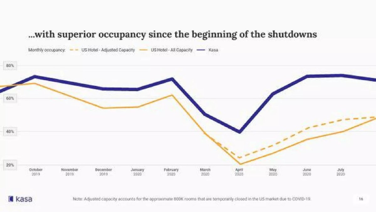
Our analysis: The most useful layout in this set: a time series rather than a single point, and two clearly labelled versions of the benchmark so the investor can see how much the definition matters. The gap is modest before the shutdowns and large after them, which the headline correctly limits to "since the beginning of the shutdowns".
Evidence and limitation: Our readings of the chart: in April 2020 Kasa is about 40%, the all-capacity line about 21% and the adjusted line about 24%; by July Kasa is about 74% against roughly 47% adjusted and 40% all capacity. Before March the Kasa line runs a few points above the market, mostly in the 65% to 73% range. No source is named for the market lines, and Kasa's own occupancy definition and unit count are not stated.
What a founder can adapt: Plot your metric over time against the benchmark, label any adjustment, and add the source and your own definition.
Supporting analysis
What the deck claims: "...with superior occupancy since the beginning of the shutdowns." Monthly occupancy, October 2019 to August 2020, for three lines: "US Hotel - Adjusted Capacity" (dashed), "US Hotel - All Capacity" and "Kasa". Note: "Adjusted capacity accounts for the approximate 800K rooms that are temporarily closed in the US market due to COVID-19."
Presentation choice: Showing the benchmark under two definitions answers the obvious objection before the investor raises it.
When it does not fit: Don't let the headline claim more than the chart supports; Kasa's careful wording is the model.
Advertising company; this page compares its campaign results with an outside benchmark. The benchmark charts are a small embedded image in the left half of the page.
Big Happy deck, slide 9. Exact stored slide matched to this analysis.
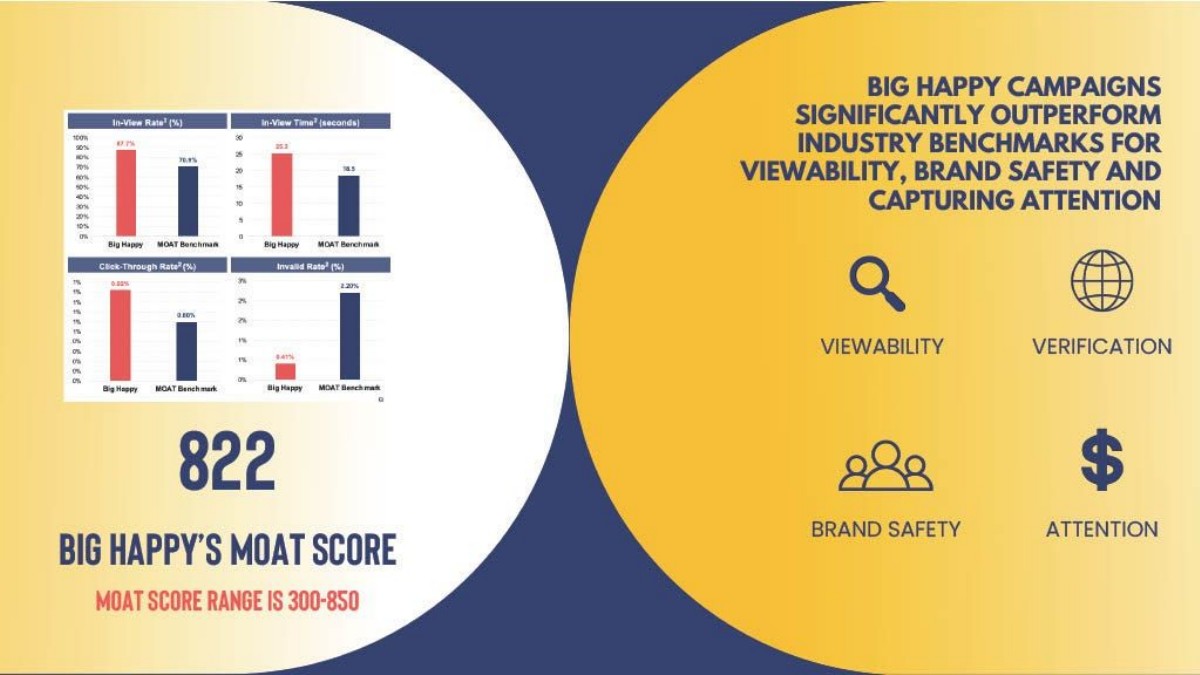
Our analysis: Naming an outside measurement company as the benchmark is the strongest sourcing in this set, and including a metric where lower is better shows a fuller picture. The charts are pasted too small to read on a projected slide, and without the missing footnote the period and campaign sample are unknown.
Evidence and limitation: Our checks, read from a higher-resolution render of the original page: 87.7 − 70.9 = 16.8 points (87.7 ÷ 70.9 = 1.237); 25.3 ÷ 18.5 = 1.368; 2.20 ÷ 0.41 = 5.37, so the invalid rate is about a fifth of the benchmark. The click-through values are too small to read reliably and are not quoted here; the axis labels on that chart repeat "1%" several times, a rounding display error. Each chart title carries a footnote marker, but no footnote appears on the page.
What a founder can adapt: Name the measurer in the label, print the footnote with period and sample, and make the charts large enough to read.
Supporting analysis
What the deck claims: "Big Happy campaigns significantly outperform industry benchmarks for viewability, brand safety and capturing attention." Four bar charts, each "Big Happy" against "MOAT Benchmark": In-View Rate 87.7% against 70.9%; In-View Time 25.3 against 18.5 seconds; Click-Through Rate; Invalid Rate 0.41% against 2.20%. Below: "822 Big Happy's MOAT score. MOAT score range is 300-850."
Presentation choice: A benchmark from an independent measurer carries more weight than one the company assembled itself.
When it does not fit: Don't paste report charts at thumbnail size or leave footnote markers without footnotes.
Healthcare data company producing real-world evidence studies. Page 11 is a four-figure traction summary.
Atropos Health deck, slide 11. Exact stored slide matched to this analysis.
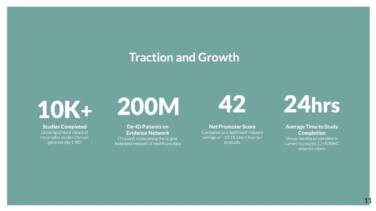
Our analysis: A benchmark that gives the score useful context in one line, but rests entirely on trust. The second comparison, 24 hours against "months", has the same weakness: the comparison point is vague enough that it cannot be checked.
Evidence and limitation: Directly visible: the score is written correctly as a number. No source, survey size, respondent type or date is given for either the score or the industry range, and "healthtech" covers businesses as different as consumer apps and hospital software.
What a founder can adapt: Cite the source of the industry figure and narrow it to your actual peer group, for example clinical analytics software.
Supporting analysis
What the deck claims: "Traction and Growth." 10K+ studies completed; 200M de-identified patients on the evidence network; "42 Net Promoter Score. Compared to a healthtech industry average of ~10-15. Users love our products."; 24hrs average time to study completion "versus months to complete in current standards".
Presentation choice: It shows how a single unsourced range turns a good result into an unverifiable claim.
When it does not fit: Don't benchmark against a category broader than your real competitors.
Sales intelligence software for enterprise sellers, 2020. The page shows six customers' expansion over time as bubbles.
Databook deck, slide 9. Exact stored slide matched to this analysis.
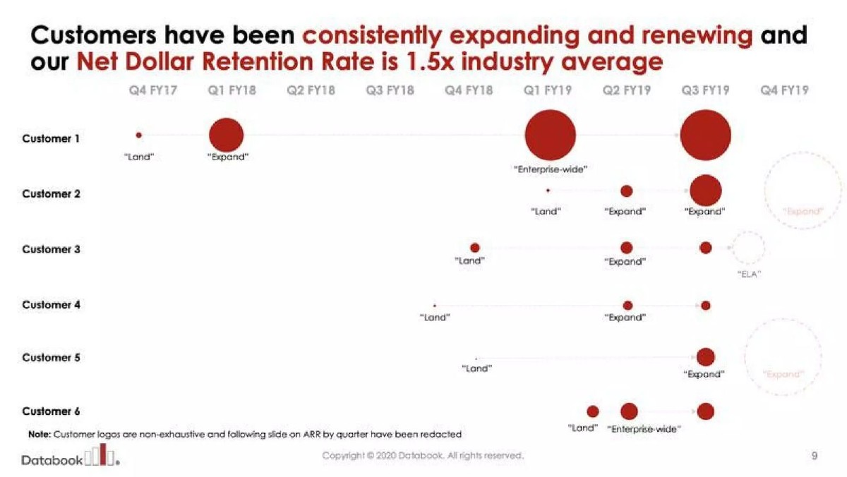
Our analysis: The bubble chart is a vivid way to show accounts growing, and the headline puts it in context. But a multiple of an unnamed average is the least checkable form of benchmark: an investor cannot recover either number from it, and net dollar retention is already a ratio, so "1.5x" of a ratio is easy to misread.
Evidence and limitation: Directly visible: the headline multiple. Not shown: Databook's net dollar retention rate, the industry figure, its source, the period, or a scale for the bubbles. The page itself says the revenue slide behind it was redacted from this version.
What a founder can adapt: Print your rate and the benchmark rate, with source and period: "[x]% against a [y]% median for [peer group], [source, year]".
Supporting analysis
What the deck claims: "Customers have been consistently expanding and renewing and our Net Dollar Retention Rate is 1.5x industry average." Six customer rows from Q4 FY17 to Q4 FY19, labelled "Land", "Expand", "Enterprise-wide" and "ELA". Note: "Customer logos are non-exhaustive and following slide on ARR by quarter have been redacted."
Presentation choice: It shows the cost of stating only the conclusion of a benchmark comparison.
When it does not fit: Don't express a benchmark only as a multiple when the metric itself is a percentage.
The five things a benchmark comparison needs, and which of them each slide provides.
Slide
Peer group named
Same definition shown
Period stated
Source named
Both values printed
Mint House p6
Yes (upper upscale), mixed in one panel
No
Partly (2021 on three panels)
No
Yes
Kasa p16
Yes (US hotels)
Partly (two market definitions; own unstated)
Yes (monthly)
No
Yes (as chart)
Big Happy p9
Yes (MOAT Benchmark)
No (footnote missing)
No
Yes (measurer named)
Yes, small
Atropos Health p11
Broad (healthtech)
No
No
No
Yes (range)
Databook p9
No
No
No
No
No
Key Takeaways
Choose the peer group a sceptical investor would choose, not the one that flatters you most, and keep it the same across every panel.
Match the definition, unit and period. Your occupancy on bookable units against a market figure on all rooms, or your 2021 against their 2019, is not a comparison.
Name the source and year. A footnote such as "Source: [publisher], [year], [sample]" turns a claim into evidence.
Print both values. "1.5x the industry average" with neither number shown cannot be checked.
Show the gap in the right unit: 87.7% against 70.9% is 16.8 percentage points, or about 24% higher. Say which.
Get the metric's own scale right. Net Promoter Score runs from −100 to +100; it is not a percentage.
Build your benchmark comparison
Answer each line before you put a benchmark on a slide. A blank is a question an investor will ask.
Metric. Which metric, calculated how? Write the formula you use.
Peer group. Which businesses would a sceptical investor compare you with? Is your benchmark drawn from that group?
Definition match. Does the benchmark use the same formula, unit and base (for example rooms available, revenue cohort, impressions)?
Period. Same period on both sides? If not, why not, and is the difference stated?
Source. Publisher, year and sample of the benchmark. Can an investor find it?
Gap. Both values, plus the gap in points or as a ratio, labelled as which.
Copyable framework: [Metric] [your value] against [benchmark value] for [peer group], [period]. Source: [publisher, year, sample]. Same definition: [formula].
Illustrative example 1 — written by us
Before: Our Net Dollar Retention Rate is 1.5x industry average
After: Net dollar retention [x]% (FY19) against a [y]% median for [enterprise software peer group]. Source: [publisher, year].
What improved: Built from Databook's page 9; the bracketed values are placeholders because the slide does not give them. Both numbers become checkable.
Illustrative example 2 — written by us
Before: Net Promoter Score: Mint House 70%, Upper Upscale 37%
After: Net Promoter Score +70 ([n] responses, 2021) against +37 for upper-upscale hotels ([source, year]).
What improved: Built from Mint House's page 6; response count and source are placeholders. Corrects the scale and adds what an investor needs to trust the gap.
Why investors discount most benchmark claims
A comparison with the industry is attractive because it answers the question every investor asks of a metric: is this number good? A 70% occupancy rate or a 42 Net Promoter Score means little in isolation. Set beside a relevant average, it tells the reader where you stand.
The problem is that the founder chooses the benchmark. An investor knows that a startup can usually find some average it beats, by picking a weak peer group, a different definition, a bad year for the industry or a source nobody can trace. So the investor's first reaction to "3x the industry average" is not admiration but a set of questions: which industry, which average, measured how, and when. A benchmark slide that answers those questions on the page gets credit. One that does not is quietly discounted, and sometimes counts against the founder's judgement.
Step 1: pick the peer group a sceptic would pick
The comparison group should be the businesses an investor would naturally compare you with: same customer, same product category, similar price point and, where it matters, the same geography. Mint House, which runs serviced apartments, compares itself with upper-upscale hotels, a defensible choice for a premium hotel alternative. Kasa compares its occupancy with the whole US hotel market, a broader group that includes budget and convention hotels; that is easier to source but tells an investor less about Kasa's competitive position.
Whatever group you choose, keep it consistent. On Mint House's page 6, three panels compare with upper-upscale hotels, but the RevPAR index panel shows two Mint House figures, 1.8x against the total US market and 1.6x against upper-upscale hotels. Both may be correct; they are simply two different questions. An investor scanning the page could take the larger figure as the like-for-like one. If you show more than one benchmark, say why, and make the one that matches the rest of the slide the main figure.
Step 2: match the definition, unit and period
Two numbers with the same name can measure different things. Occupancy can be calculated on all rooms or only on rooms available for sale; retention can be measured on customers or on revenue; a click-through rate depends on what counts as an impression. Kasa's page 16 shows why this matters. During 2020 many US hotels temporarily closed rooms, so Kasa plots two market lines: one on all capacity and one on adjusted capacity, with a note that the adjustment accounts for about 800,000 temporarily closed rooms. The adjusted line is the fairer comparison because it removes closed rooms from the base, and showing both lets the investor see the effect of the choice. What the slide does not say is how Kasa calculates its own occupancy, so the reader cannot confirm that Kasa's line uses the same base as either market line.
Period matters as much. Comparing your best recent month with an industry annual average, or your 2023 figure with a benchmark from 2019, builds in a gap that has nothing to do with performance. Mint House labels three of its panels "2021", which helps; the Net Promoter Score panel carries no year. State the period on both sides of every comparison.
Step 3: name the source on the slide
A benchmark without a source is the founder's assertion about other companies. A short footnote is enough: the publisher, the year and, where relevant, the sample. Big Happy's page 9 does the most important part by naming the benchmark in every chart label as "MOAT Benchmark", MOAT being a third-party ad measurement service, so an investor knows the comparison comes from an outside measurer rather than the company's own estimate. The chart labels carry a superscript footnote marker, but the footnote itself does not appear on the page, so the period, campaign sample and benchmark category remain unknown.
Atropos Health compares its Net Promoter Score of 42 with "a healthtech industry average of ~10-15" and gives no source at all. Ranges like this circulate widely and may be reasonable, but on a slide they cannot be checked, and an investor who has seen a different figure will doubt the comparison. If a credible source exists, cite it; if you cannot find one, consider whether the comparison belongs on the slide.
Step 4: print both values and show the gap correctly
The strongest benchmark slides show the two numbers side by side and let the reader see the difference. The weakest show only the conclusion. Databook's page 9 headline says its net dollar retention rate is "1.5x industry average" but the page shows neither Databook's rate nor the industry figure, and its note says the following slide on revenue by quarter has been redacted. A reader cannot tell whether that means 150% against 100%, or 120% against 80%, which are very different businesses.
When you do show both values, express the gap in a unit that suits the metric. For rates and percentages, a difference in percentage points is usually clearest: Big Happy's in-view rate of 87.7% against 70.9% is 16.8 points higher, or about 24% higher in relative terms (87.7 ÷ 70.9 = 1.237). Both statements are true, but they are not interchangeable, and mixing them across panels confuses readers. For amounts such as time or revenue, a multiple or percentage works: 25.3 seconds against 18.5 seconds is about 1.37 times. For metrics where lower is better, such as Big Happy's invalid traffic rate (0.41% against 2.20%), say so in the label so nobody reads the shorter bar as worse.
Step 5: get the metric's own scale right
Some metrics have conventions that a benchmark slide should follow. Net Promoter Score is the clearest example. Bain, which created the measure, defines it as the percentage of promoters (customers scoring 9 or 10) minus the percentage of detractors (scoring 0 to 6), so it runs from −100 to +100 and is written as a number, not a percentage. Mint House prints its score and its peers' as "70%" and "37%"; Atropos Health writes "42". The percent sign is a small error, but investors who use the measure notice it, and it raises the question of whether the score was calculated in the standard way.
The same care applies to indexes. A RevPAR index of 1.8x means revenue per available room 1.8 times that of the comparison set; it is already a comparison, so placing it beside another index against a different set, as Mint House does, needs a label explaining what each bar is indexed to. (Bain & Company)
Where benchmarks belong in the deck, and how they connect to the forecast
Benchmarks usually belong on the traction slide, beside the metric they explain, or in a dedicated comparison slide when several metrics share one peer group, as on Mint House's page. Avoid scattering different benchmarks across the deck with different sources; one peer group, one source and one period, used consistently, is easier to trust.
Investors will also read your benchmarks against your financial model. If your traction slide says your occupancy is 22 points above the market, but your forecast assumes market-level occupancy, explain why; if your forecast assumes you keep the gap for five years, expect that assumption to be tested. A benchmark advantage that is stated once on the traction slide and then carried consistently into the forecast and the use of funds is far more convincing than one that appears only as a headline.
Common mistakes
Convenient peer group. A benchmark drawn from weaker or different businesses flatters you and is usually spotted.
Switching comparison groups. Changing the peer group between panels or metrics makes every gap harder to trust.
Mismatched definitions. Same name, different formula: occupancy on all rooms against bookable units, retention on logos against revenue.
No source. An unsourced industry average is your assertion about other companies.
Conclusion only. "2x the industry" with neither value printed cannot be checked.
Wrong unit for the gap. Mixing percentage points and relative percentages across panels confuses readers.
Diagnostic checklist
The peer group is named and stays the same across the slide.
Both values are printed, not only the multiple or the gap.
The period is stated for both sides.
The benchmark's source, year and sample are footnoted.
Your definition matches the benchmark's, or the difference is explained.
Gaps are labelled as percentage points or relative change, and recalculate from the printed values.
Metrics where lower is better are labelled so.
Frequently asked questions
What if no published benchmark exists for my metric?
Say so, and compare with your own past performance or with the nearest published measure, labelled as such. A clearly explained proxy is better than an invented industry figure.
Can I use a competitor's public numbers as a benchmark?
Yes, if they are published, dated and calculated the same way. Name the source. Be careful with figures from a competitor's own marketing, which have the same weaknesses as yours.
Should I show NPS as a percentage?
No. Net Promoter Score is the percentage of promoters minus the percentage of detractors, so it is a number from −100 to +100. Write +42, not 42%. (Bain & Company)
Is it acceptable to show the benchmark under two definitions?
Yes, and often wise when the definition is disputed or changed, as Kasa does with hotel occupancy during 2020. Make the fairer one the main comparison and label both.
How we chose these examples
Discovery (2026-10-04): full original-deck reading of Bazaar (27 pages), Mint House (12) and Kasa (26), then a targeted search of the durable corpus index for "industry average", "industry benchmark", "vs peers" and "peer group". Closest content read: the live Net Promoter Score guide (asks for a named, cited benchmark for NPS only, and uses Mint House page 6 for a different lesson: NPS beside business metrics), the credit-losses draft (benchmarks for lending loss rates only), the live customer-results guide (before-and-after baselines inside one customer, not industry comparisons) and the peer-benchmark-window and benchmark-to-business-case drafts (one deck's growth path against named leaders, and a technical benchmark carried through a deck). None teaches how to choose, match and cite an industry benchmark across metrics. Demand: no relevant query appeared in the available site search data; demand remains a hypothesis.
Five pages were read from images rendered from the original deck files: Mint House 6 (stored image reused and compared with the original), Kasa 16, Big Happy 9, Atropos Health 11 and Databook 9 (four new uploads at 1200px wide). All five teardowns are published, none appears in our corpus exclusions, and no removal or deletion request names them. Mint House's page carries a confidentiality label from the original deck; the deck is published in our library. Breakout page 3, CreatorDB page 3 and Bazaar page 25 were set aside (reasons in the production log); listed-company and bond presentations were excluded.
Figures were checked by recalculation where printed; chart readings are marked as ours, and unreadable values are not estimated. Company figures and benchmarks are not verified. Before-and-after examples use placeholders where the slide gives no value. Recommendations are our editorial reading, not financial advice. Drafted with AI assistance and checked by an editorial model against the slide images; not reviewed by a person.