Customer Results in a Pitch Deck: "+300%", "3x" and "8x
How to state a customer result such as a conversion lift, savings or ROI on a pitch deck slide: baseline, comparison group, sample, period and definition.
Customer Results in a Pitch Deck: How to Make "+300%", "3x" and "8x ROI" Checkable
Many decks claim that the product improves a customer's numbers: "+300% conversion rate", "3x conversion", "8x ROI". Whether a reader can trust such a claim depends on details that are usually missing: the starting value, what it is compared with, how many customers or users it covers, over what period, and how ROI is defined. This guide compares twelve real slides on those points.
TL;DR
Give the baseline, the comparison, the sample and the definition next to the result. Real Matters does this best: a footnote says its 5.3-day turn time is its actual average for one county over two named fiscal quarters, and that the competitor figures beside it are management estimates. Firework defines each of its three metrics under the number. Bigblue's body text shows the headline is the top of a range ("40% on average and up to 86%"). Experify's and Firework's comparisons are between users who chose to engage and those who didn't, which shows a correlation, not an effect the product caused. Visiblee's "+300%" and EliseAI's "125% more" give no baseline, customer count or period, so a reader can't tell what they rest on.
Customer-result claims on real pitch deck slides
Each example shows the exact stored slide above its analysis and links to the full teardown. Most checkable first. Figures are quoted as shown; calculations are ours.
Real Matters case study slide — slide 5
Appraisal management platform; our library records this as an IPO-stage deck (2017). A four-panel "how it works" slide.
Real Matters deck, slide 5. Exact stored slide matched to this analysis.
Our analysis: The slide separates measured, estimated and illustrative figures, and says which is which.
Evidence and limitation: The footnote says the Real Matters figures are its actual average for a standard interior appraisal in that county during fiscal Q3 and Q4 2016 (April to September 2016), and that the traditional-AMC figures are management estimates of average competitor metrics, not tied to any competitor or region. The market-share panel is labelled illustrative.
What a founder can adapt: Footnote your result with the place, period, measure and the source of the comparison figure.
Supporting analysis
What the deck claims: Panel 3, "Better Performance, Case Study: Prince William County, Virginia": turn time 7–9 days (traditional AMC) vs 5.3 days (Real Matters); defect rate 15–20% vs 5.6%. Panel 4: "Increased Client Market Share (Illustrative)", 2 to 35%. Footnote 1 explains the case-study figures.
Presentation choice: A reader knows the 5.3 days is one county over six months, and that the comparison side is an estimate. That limits the claim, but makes it trustworthy.
When it does not fit: One county's average doesn't show performance elsewhere; don't present a single-market case as company-wide.
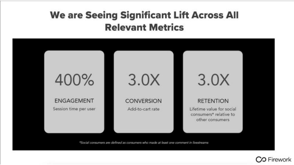
Shoppable live video, Series B (2022 per our library). Three result tiles.
Firework deck, slide 6. Exact stored slide matched to this analysis.
Our analysis: Clear definitions, but a self-selected comparison.
Evidence and limitation: Each metric is defined, and the retention comparison group is defined in a footnote. The comparison is between people who commented and people who didn't. The baseline for the first two tiles isn't stated, and "400%" could mean 4x or +400% (5x). "Retention" is measured as lifetime value, not a retention rate.
What a founder can adapt: Keep the definitions; add the comparison group and sample for every tile, and say whether it was a controlled test.
Supporting analysis
What the deck claims: "400% Engagement: Session time per user." "3.0X Conversion: Add-to-cart rate." "3.0X Retention: Lifetime value for social consumers* relative to other consumers." Footnote: "Social consumers are defined as consumers who made at least one comment in livestreams."
Presentation choice: People who comment in a livestream were probably more engaged buyers to begin with, so higher lifetime value may partly reflect who they are rather than what commenting did.
When it does not fit: Don't label lifetime value "retention", and don't present a users-vs-non-users gap as the product's effect.
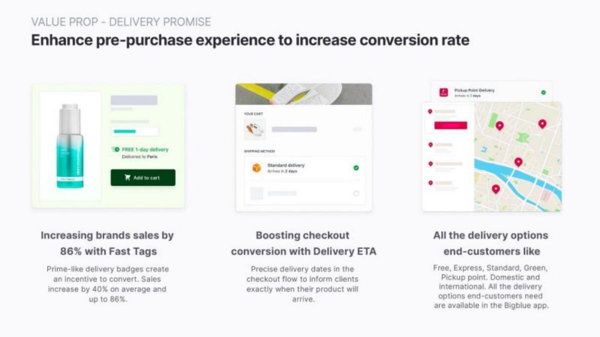
E-commerce fulfilment, Series A (2022 per our library). A three-column value proposition slide.
Bigblue deck, slide 6. Exact stored slide matched to this analysis.
Our analysis: The headline uses the best case; the smaller text gives the typical result.
Evidence and limitation: The body text shows 86% is the maximum and 40% the average. The number of brands, the period and the comparison (before/after or test/control) aren't stated.
What a founder can adapt: Lead with the average and put the range beside it: "+40% sales on average across [N] brands (up to +86%)".
Supporting analysis
What the deck claims: Headline under the first column: "Increasing brands sales by 86% with Fast Tags." Body: "Prime-like delivery badges create an incentive to convert. Sales increase by 40% on average and up to 86%."
Presentation choice: Giving both average and maximum is more informative than most slides, but leading with the maximum invites the reader to take it as typical.
When it does not fit: Don't headline an "up to" figure.
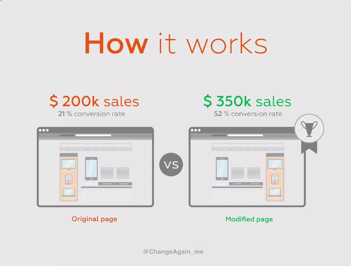
Website optimisation, seed. A "How it works" slide comparing an original and a modified page.
ChangeAgain deck, slide 2. Exact stored slide matched to this analysis.
Our analysis: A before/after that is easy to read, with no customer, period or traffic stated.
Evidence and limitation: Both baselines and results are shown. Conversion rose 31 percentage points (about 2.5x); sales rose 75% (1.75x). With the same traffic and order value, sales would rise in line with conversion, so the gap implies different traffic or order values between the two pages, which the slide doesn't show. It also doesn't say whether this is a real customer result or an illustration.
What a founder can adapt: Say whether it is a real test, name the customer or segment, and give traffic and period.
Supporting analysis
What the deck claims: "Original page: $200k sales, 21% conversion rate" vs "Modified page: $350k sales, 52% conversion rate."
Presentation choice: Showing both values lets the reader do exactly this check, which is a strength even when the check raises a question.
When it does not fit: If the example is illustrative, label it; readers will otherwise take it as a result.
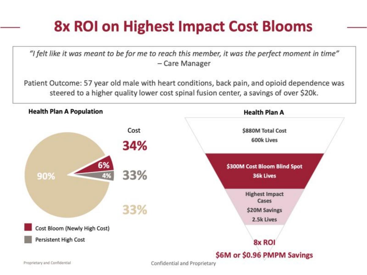
Predictive healthcare analytics (now Prealize Health), Series B (2019 per our library). A pie chart, a funnel and a patient story.
Cardinal Analytx deck, slide 5. Exact stored slide matched to this analysis.
Our analysis: A detailed funnel with the key definitions (ROI, period, member base) missing.
Evidence and limitation: ROI isn't defined. If 8x means savings ÷ cost, the implied cost is about $0.75M ($6M ÷ 8). Spread over 600k members for 12 months, $6M is about $0.83 per member per month, not $0.96; the gap may reflect a different member count or period, which the slide doesn't show. The funnel labels $20M as savings for the highest-impact cases, while the ROI line gives $6M; the slide doesn't say how the two relate.
What a founder can adapt: State "savings ÷ program cost", the period, the member count and how savings were measured (for example against a matched comparison group).
Supporting analysis
What the deck claims: "8x ROI on Highest Impact Cost Blooms." Funnel for "Health Plan A": $880M total cost, 600k lives; "$300M Cost Bloom Blind Spot, 36k lives"; "Highest Impact Cases, $20M savings, 2.5k lives"; "8x ROI, $6M or $0.96 PMPM savings." A patient example cites "a savings of over $20k".
Presentation choice: Health plans judge ROI claims closely, so the definition and period matter as much as the multiple.
When it does not fit: Don't show two savings figures on one graphic without saying which is measured and which is potential.
Peer product demos for brands, seed (2022 per our library). One large figure.
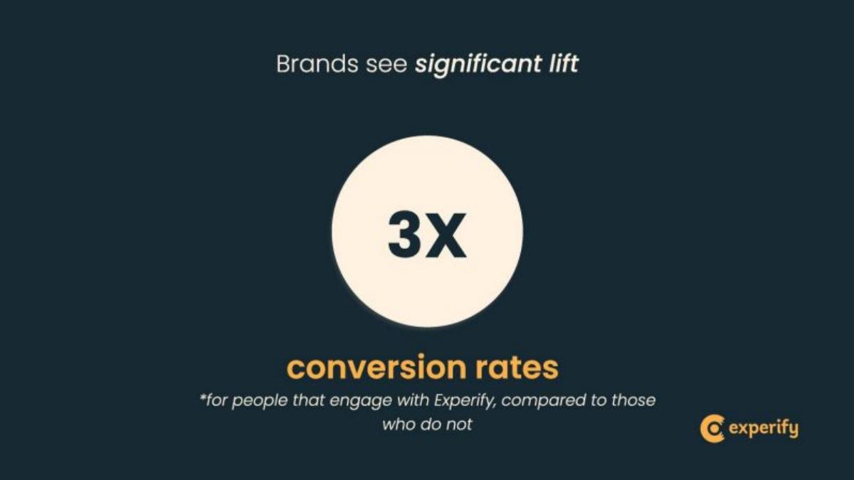
Experify deck, slide 6. Exact stored slide matched to this analysis.
Our analysis: Honest about the comparison, which reveals that it is self-selected.
Evidence and limitation: The comparison group is stated: engaged vs not engaged. No baseline conversion rate, brand count or period is given.
What a founder can adapt: If you can, run a holdout test (some visitors aren't offered the feature) and report that lift.
Supporting analysis
What the deck claims: "Brands see significant lift. 3X conversion rates *for people that engage with Experify, compared to those who do not."
Presentation choice: Shoppers who seek out a peer demo may already be closer to buying, so part of the 3x may be who engages rather than what the demo does.
When it does not fit: Don't imply a causal lift from an engaged-vs-not comparison.
Ad marketplace, Series A (2021 per our library). A "who benefits" slide for three sides of the marketplace.
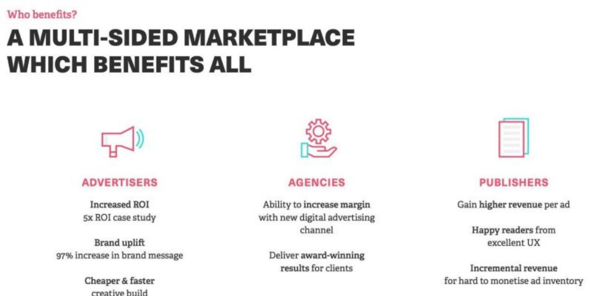
Picnic deck, slide 5. Exact stored slide matched to this analysis.
Our analysis: Results cited as supporting points, with the case they come from left out.
Evidence and limitation: "5x ROI case study" signals one case; the customer, the ROI definition and the period aren't given. "97% increase in brand message" doesn't name the measure (recall? association?) or the comparison.
What a founder can adapt: Name the customer or campaign, the measure and the comparison, or link to a case study slide.
Supporting analysis
What the deck claims: Advertisers: "Increased ROI, 5x ROI case study"; "Brand uplift, 97% increase in brand message."
Presentation choice: Saying "case study" is honest about the sample size; the reader then needs the case.
When it does not fit: Don't state a lift without naming what was measured.
Autonomous farm vehicles, Series B (2021 per our library). A three-phase adoption slide.
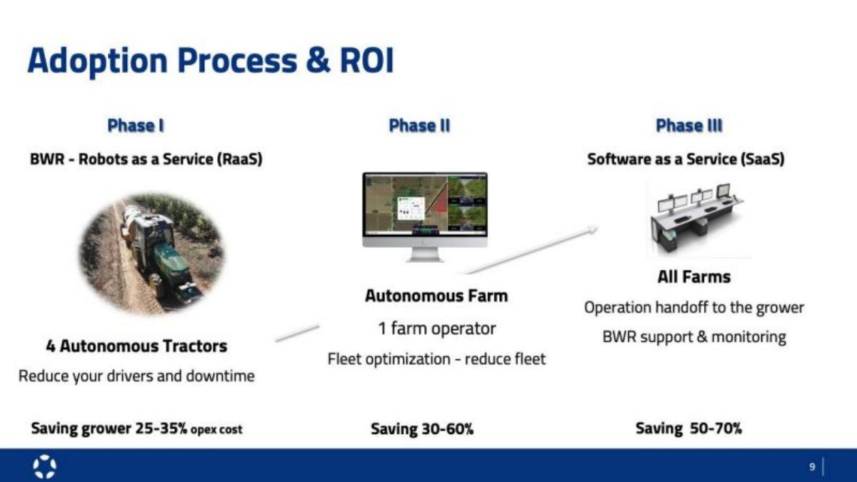
Blue White Robotics deck, slide 6. Exact stored slide matched to this analysis.
Our analysis: Savings ranges that read as a plan; their basis isn't stated.
Evidence and limitation: Savings are given as ranges per phase. The slide doesn't say whether they are measured on customer farms or projected, what cost base they apply to in Phases II and III, or over what period. Despite the title, no ROI figure is shown.
What a founder can adapt: Mark each range as measured (with farm count) or projected, and name the cost it applies to.
Supporting analysis
What the deck claims: "Adoption Process & ROI." Phase I (Robots as a Service): "Saving grower 25–35% opex cost." Phase II: "Saving 30–60%." Phase III (SaaS): "Saving 50–70%."
Presentation choice: Ranges are more honest than a single figure, but later phases are likely to be forecasts and should be labelled as such.
When it does not fit: Don't title a slide ROI without an ROI figure.
AI for property operations, Series D (2024 per our library). Two figures beside a product screenshot.
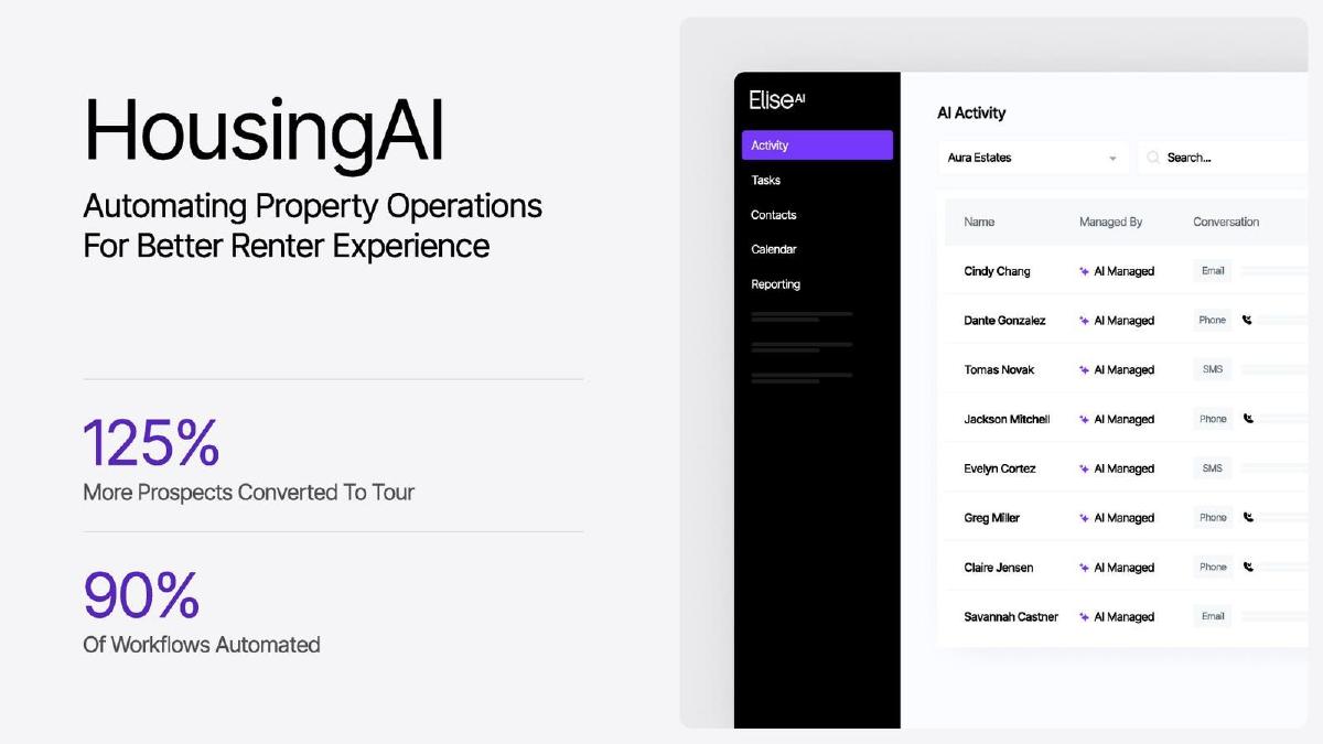
EliseAI deck, slide 5. Exact stored slide matched to this analysis.
Our analysis: A strong-sounding lift with none of its inputs shown.
Evidence and limitation: "125% more" implies a comparison (2.25x the baseline), but the baseline, the comparison (before/after or vs non-users), the number of properties and the period aren't given. "90% of workflows" doesn't say which workflows are counted.
What a founder can adapt: "Tour conversion rose from [X]% to [Y]% across [N] properties, [period], vs [comparison]."
Supporting analysis
What the deck claims: "HousingAI." "125% More Prospects Converted To Tour." "90% Of Workflows Automated."
Presentation choice: At later stages, an investor will ask for the underlying data; the slide gives nothing to anchor that conversation.
When it does not fit: Don't give a relative lift without its baseline.
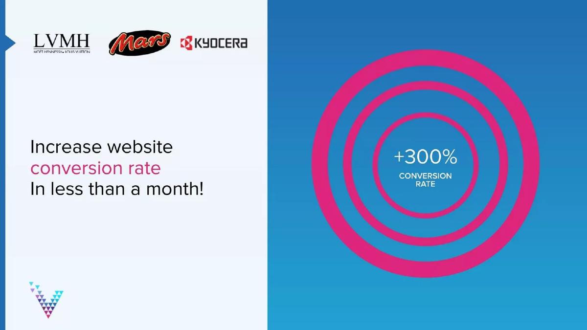
Website conversion software, seed (2014 per our library). Customer logos beside a large result.
Visiblee deck, slide 3. Exact stored slide matched to this analysis.
Our analysis: A large lift paired with logos, with no stated link between them.
Evidence and limitation: No baseline, customer, sample or comparison is given. Placed beside three logos, the figure may be read as applying to those companies, but the slide doesn't say it does.
What a founder can adapt: Attribute the result: "[Customer]: conversion from [X]% to [Y]% in [N] weeks".
Supporting analysis
What the deck claims: LVMH, Mars and Kyocera logos. "Increase website conversion rate in less than a month!" "+300% conversion rate."
Presentation choice: Readers tend to attach a result to the logos next to it. If it came from one smaller customer, the layout overstates it.
When it does not fit: Don't set an unattributed result beside logos.
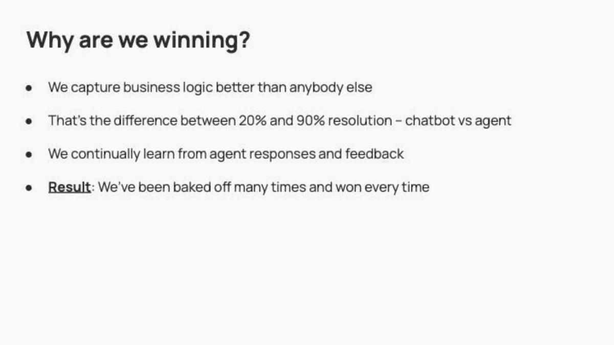
AI customer support agents, Series A (2024 per our library). A four-bullet "Why are we winning?" slide.
Decagon deck, slide 4. Exact stored slide matched to this analysis.
Our analysis: A category comparison used as a customer result.
Evidence and limitation: The 20% vs 90% contrasts two categories (chatbot vs agent), not a measured before/after for named customers. "Resolution" isn't defined, and the number of bake-offs isn't given.
What a founder can adapt: Give the measured resolution rate for your customers with its definition, and the bake-off count ("won [N] of [N]").
Supporting analysis
What the deck claims: "We capture business logic better than anybody else." "That's the difference between 20% and 90% resolution – chatbot vs agent." "Result: We've been baked off many times and won every time."
Presentation choice: Bake-off wins are a strong signal when counted; here the reader doesn't know how many.
When it does not fit: Don't present a category benchmark as your own result.
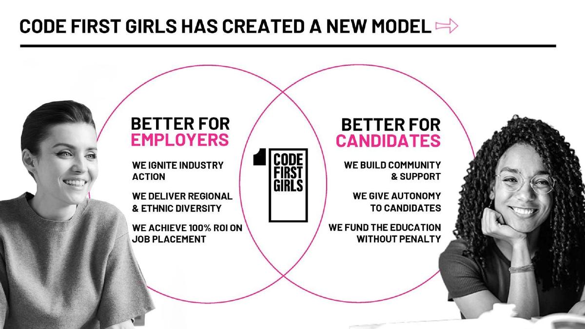
Tech skills programmes for women, Series A (2023 per our library). A Venn diagram of employer and candidate benefits.
Code First Girls deck, slide 5. Exact stored slide matched to this analysis.
Our analysis: An ROI claim used as a benefit statement, with no definition.
Evidence and limitation: ROI isn't defined: whose return (employers'?), what is counted as return and cost, and over what period. "100% ROI" usually means the return equals the cost (money doubled), but readers may take it as "every placement pays off".
What a founder can adapt: "Employers recover [X]x their fee within [N] months, based on [measure], [N] placements."
Supporting analysis
What the deck claims: Under "Better for employers": "We achieve 100% ROI on job placement."
Presentation choice: An employer audience will want the calculation; without it the figure reads as a slogan.
When it does not fit: Don't use "100% ROI" in a way that can be read as a success rate.
Whether each result states its baseline, comparison, sample, period and definition.
Example
Claim
Baseline shown
Comparison
Sample / statistic
Period
Main gap
Real Matters
5.3 days vs 7–9 days
Yes
vs estimated competitor average
One county, average
Apr–Sep 2016
Single market
Firework
400%, 3.0X, 3.0X
No
Commenters vs others (retention)
Not stated
Not stated
Self-selected groups
Bigblue
+86% sales
No
Not stated
Average 40%, max 86%
Not stated
Headline is the maximum
ChangeAgain
21% → 52%
Yes
Original vs modified page
Not stated
Not stated
Real or illustrative?
Cardinal Analytx
8x ROI
Partly
Not stated
One health plan
Not stated
ROI and PMPM basis
Experify
3X conversion
No
Engaged vs not engaged
Not stated
Not stated
Self-selected groups
Picnic
5x ROI; 97% uplift
No
Not stated
"Case study" (one)
Not stated
Case and measure unnamed
Blue White Robotics
25–70% savings
No
Not stated
Ranges
Not stated
Measured or projected?
EliseAI
125% more tours
No
Not stated
Not stated
Not stated
Everything
Visiblee
+300% conversion
No
Not stated
Not stated
"< 1 month"
Attribution to logos
Decagon
20% vs 90% resolution
No
Chatbot vs agent (category)
Not stated
Not stated
Not a customer result
Code First Girls
100% ROI
No
Not stated
Not stated
Not stated
ROI undefined
Key Takeaways
Show the baseline: "from 21% to 52%" can be checked; "+148%" alone can't.
Say whether a percentage is a relative change or percentage points.
Say how many customers or users the result covers, and whether it is an average, a median or the best case.
Name the comparison: before vs after, a test vs a control group, or users vs non-users. Only a controlled test isolates the product's effect.
Define ROI: savings ÷ cost, or (savings − cost) ÷ cost, and whose costs.
Label estimates, projections and illustrations as such.
Write your customer-result line
Fill in each line before putting a customer result on a slide.
Metric. What was measured: conversion rate, sales, turn time, cost. Define it in a few words.
Baseline → result. Both values. Say whether the change is relative (%) or in percentage points.
Comparison. Before vs after, test vs control group, or users vs non-users. Say which.
Sample. Which customer(s), how many, and whether you report the average, median or best case.
Period. Start and end dates, and how long after launch the result was measured.
ROI definition. Return ÷ cost or (return − cost) ÷ cost; whose return and cost; over what period.
Copyable framework: [Metric] went from [baseline] to [result] ([relative change]) for [customer / N customers, average], [period], compared with [comparison].
Illustrative example 1 — written by us
Before: 125% More Prospects Converted To Tour
After: Tour conversion rose from [X]% to [Y]% across [N] properties, [period], compared with [the same properties before launch].
What improved: Our illustrative rewrite; not EliseAI's wording. Bracketed values are placeholders, and the comparison is an assumption for illustration. It gives the baseline, sample, period and comparison, so the lift can be judged.
What this guide adds
The case study slide guide covers telling one customer's story: who the customer was, the starting point and what changed. This page covers the numerical claim itself, whether it comes from one customer or many: how to express a lift, a saving or an ROI so a reader can tell what it measures and how much weight it can bear. Real Matters also appears in the case study guide; here it is used for its footnote, a different lesson.
Five details every customer result needs
Baseline and result. Give both values. "Conversion from 21% to 52%" is 31 percentage points, or +148% relative. A bare "+148%" hides which.
Comparison. Before vs after can reflect seasonality or other changes made at the same time. Users vs non-users compares groups that chose differently, so the gap may reflect who they are, not what the product did. A randomised test (control group) is the only one of the three that isolates the product's effect.
Sample and statistic. One customer, the average of all customers, or the best one? "Up to" is a maximum, not typical.
Period. Over what time, and when. A result in "less than a month" may not persist.
Definition. For ROI, say what is counted as return and as cost. "8x" can mean savings are 8 times the cost, or savings minus cost are 8 times the cost.
How we read each slide
We quote figures as shown and use only arithmetic on visible numbers. Where the slide doesn't say what a figure is based on, we say so; this doesn't mean the figure is wrong. Where two figures on a slide don't reconcile on our arithmetic, we show the calculation and note that an undisclosed input may explain it.
Common mistakes
No baseline. "+300%" from 1% to 4% and from 20% to 80% are very different results.
Points vs percent. 21% → 52% is +31 points or +148%; say which.
Best case as headline. "Up to" is a maximum; lead with the average.
Self-selected comparison. Users vs non-users shows a correlation, not the product's effect.
Undefined ROI. State return, cost and period.
Result beside logos. Readers attach the number to the logos; attribute it explicitly.
Diagnostic checklist
Baseline and result both shown.
Relative change vs percentage points stated.
Comparison type named (before/after, control group, users vs non-users).
Sample size and statistic (average, median, best case) given.
Period given.
ROI or savings definition stated; estimates and illustrations labelled.
Frequently asked questions
How we chose these examples
Corpus: published pitch deck teardowns on StartupFundraising.com. Founder-uploaded private decks are excluded.
Selection (2026-09-25): we searched stored slide text on slides 2–8 for ROI, lift, uplift, before/after, case study, results and conversion wording with a percentage or multiple, excluding market-size and disclaimer slides, kept only slides with a stored slide image, and inspected sixteen candidate images. We kept slides where the company presents a result it attributes to its product and each shows a different choice of baseline, comparison, sample or definition. Considered but not used: Chili Piper p4 (third-party industry statistics, not a customer result), RewardMe p5 (a market-opportunity claim not attributed to its own customers), StackCommerce p5 (already analysed in the case study guide for the same point), and Prealize Health p5 (the same slide as Cardinal Analytx p5 under the company's later name).
Figures are quoted as shown in the stored slide images. Calculations are ours and use only visible numbers: relative change = result ÷ baseline − 1; implied cost = savings ÷ ROI multiple (assuming ROI = savings ÷ cost); PMPM = savings ÷ (members × 12). Where two figures don't reconcile, an undisclosed input may explain the difference; we don't claim a figure is wrong.
Deck years and stages are from our library index and given as context only.
Review: stored slide text and images were checked on 2026-09-25 and matched to company, deck and slide number (editorial model review). No person has yet completed an editorial review of this page. We make no claim that any slide caused a fundraising outcome.