How to show Net Promoter Score in a pitch deck so investors believe it: trend, sample, benchmark and the behaviour behind it.
NPS in a Pitch Deck: How to Show Customer Love Investors Will Believe
Net Promoter Score (NPS) is the most common customer-satisfaction number in pitch decks, and one of the easiest to ignore. This guide compares eight real slides to show what turns an NPS figure into evidence an investor can use.
TL;DR
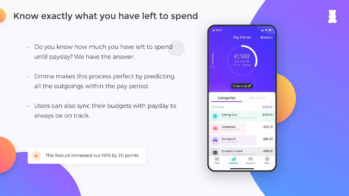
Give the score with what makes it checkable: a trend, the number of responses, a named comparison and a behaviour that backs it up. Disco shows its score rising from 17 to 30 to 52 over three years and the full 0–10 response chart behind the latest figure. Everside Health puts its +85 next to an industry average of −1.7 in the same table. Mint House compares its score with upper-upscale hotels beside occupancy and margin. Orbital Witness pairs an NPS of 75 with 65% weekly log-ins and 120% net revenue retention. Emma ties a 20-point rise to one feature. The weaker slides give a bare number: Heal's +76 sits in a list with no survey details, and BetterManager calls its 90 "industry-best" without saying compared with whom. Honeycomb shows a different use: incumbents' low NPS as proof of the problem.
NPS on real pitch deck slides
Each example shows the exact stored slide above its analysis and links to the full teardown. Stronger examples first. Scores are quoted as shown on the slides; we have not verified the surveys behind them.
Disco traction slide — slide 4
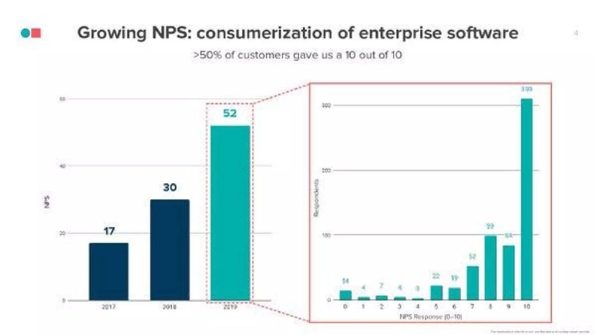
Employee recognition software. A whole slide about NPS: a three-year trend and the response chart behind the latest year.
Disco deck, slide 4. Exact stored slide matched to this analysis.
Our analysis: The strongest NPS slide in this set: a trend, the raw answers and a clear headline.
Evidence and limitation: The response chart shows the sample size and the spread of answers, with 10 the largest bar (above the 300 line on the respondent axis). The individual bar labels are too small to read exactly in the stored image, but the bar heights are roughly consistent with a score near 52.
What a founder can adapt: If you survey regularly, show the score for each period and the count of responses for the latest one.
Supporting analysis
What the deck claims: "Growing NPS: consumerization of enterprise software." ">50% of customers gave us a 10 out of 10." Bars show NPS of 17 (2017), 30 (2018) and 52 (2019); an enlarged chart shows the number of respondents for each answer from 0 to 10.
Presentation choice: Showing the distribution answers the investor's first question, how many people answered, before it is asked. The rising trend shows the product is improving, not just that one survey went well.
When it does not fit: Make the bar labels large enough to read, and state the survey month and who was asked (all customers or a sample).
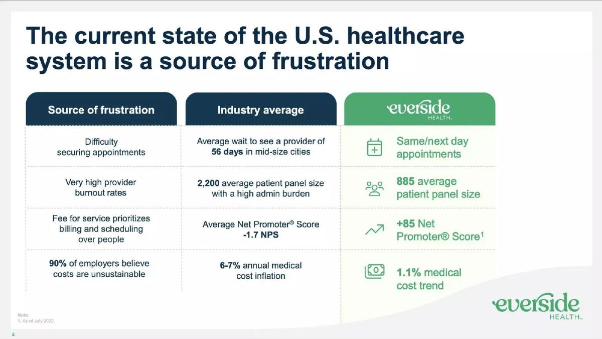
Primary care clinics for employers. A three-column table: source of frustration, industry average, Everside.
Everside Health deck, slide 4. Exact stored slide matched to this analysis.
Our analysis: NPS used as one row in a before-and-after table, where each row makes the same argument.
Evidence and limitation: The score has a date and a benchmark in the next column. The −1.7 industry figure has no source on the slide.
What a founder can adapt: Put your score in a table next to the industry figure and next to the operating reasons it is higher.
Supporting analysis
What the deck claims: "The current state of the U.S. healthcare system is a source of frustration." Industry average: "Average Net Promoter® Score −1.7 NPS." Everside: "+85 Net Promoter® Score" with a footnote, "As of July 2022." Other rows compare appointment waits (56 days vs same/next day), panel size (2,200 vs 885) and cost trend (6–7% vs 1.1%).
Presentation choice: Putting the benchmark beside the score tells the investor what +85 means in this industry, without a second slide.
When it does not fit: Cite the industry average; an unsourced benchmark weakens a strong comparison.
Apartment-style hotels. Four bar charts comparing Mint House with upper-upscale hotels.
Mint House deck, slide 6. Exact stored slide matched to this analysis.
Our analysis: NPS placed next to financial results, so customer satisfaction and business performance point the same way.
Evidence and limitation: A 33-point gap in NPS against a named peer group, shown beside occupancy and margin. The NPS values carry a % sign, and no source is given for the peer figures.
What a founder can adapt: Show NPS in the same row as the business metrics you expect it to drive, against the same comparison group.
Supporting analysis
What the deck claims: "A better model, outperforming Upper-Upscale Hotel peers on every key metric." Net Promoter Score (NPS): 70% vs 37%. 2021 occupancy: 70% vs 48%. 2021 RevPAR index: 1.8x vs 1.6x. 2021 GOP margin: 60% vs 37%.
Presentation choice: An investor cares about NPS because it should lead to repeat business; showing occupancy and margin beside it makes that link visible.
When it does not fit: NPS is a score, not a percentage; write 70, not 70%. Say where the peer numbers come from.
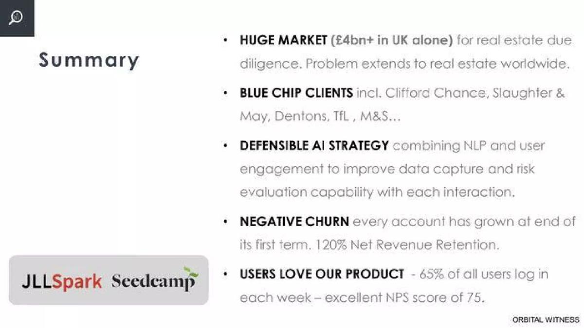
Property due-diligence software. A five-point summary slide.
Orbital Witness deck, slide 6. Exact stored slide matched to this analysis.
Our analysis: The score is backed by what customers do, not only what they say.
Evidence and limitation: The NPS sits beside two behaviour measures: weekly log-ins and revenue retention. The survey size and date are not given.
What a founder can adapt: Put your NPS in the same line as one usage number and one retention number.
Supporting analysis
What the deck claims: "NEGATIVE CHURN every account has grown at end of its first term. 120% Net Revenue Retention." "USERS LOVE OUR PRODUCT – 65% of all users log in each week – excellent NPS score of 75."
Presentation choice: Behaviour is harder to influence than a survey. When usage and expansion agree with the NPS, the investor has less reason to doubt it.
When it does not fit: "Excellent" is the founder's judgment; let the comparison or the behaviour make that case.
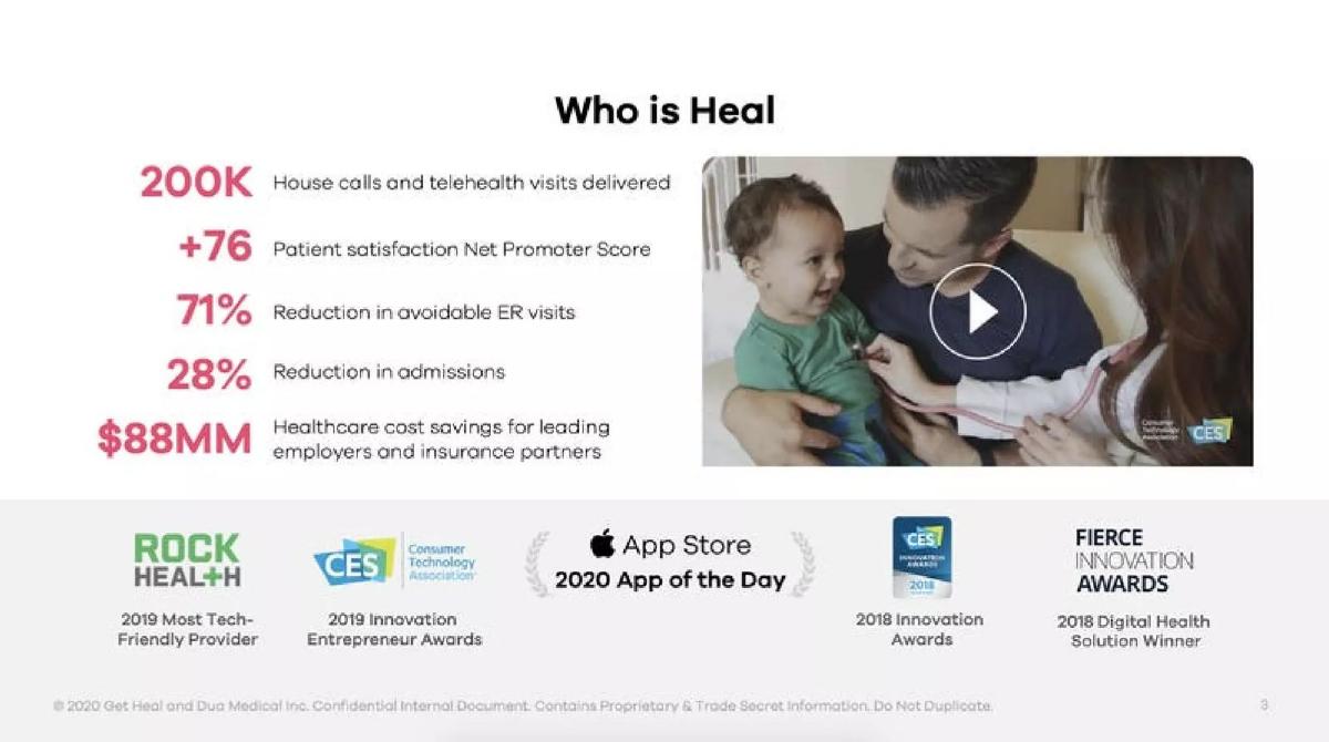
House-call doctors and telehealth. A "Who is Heal" slide with five headline figures, a video still and award logos.
Heal deck, slide 3. Exact stored slide matched to this analysis.
Our analysis: A good score presented as one of five equal claims, so it gets less attention than it could.
Evidence and limitation: A correctly written score (+76) in a list with visit volume and outcomes. No survey size, date or benchmark.
What a founder can adapt: If your volume is large, say how many customers responded; it turns a claim into a measurement.
Supporting analysis
What the deck claims: "200K House calls and telehealth visits delivered." "+76 Patient satisfaction Net Promoter Score." "71% Reduction in avoidable ER visits." "28% Reduction in admissions." "$88MM Healthcare cost savings for leading employers and insurance partners."
Presentation choice: The 200,000 visits suggest a large base of patients who could have been surveyed, but the slide doesn't say how many answered.
When it does not fit: Add the survey period and the number of responses under the score.
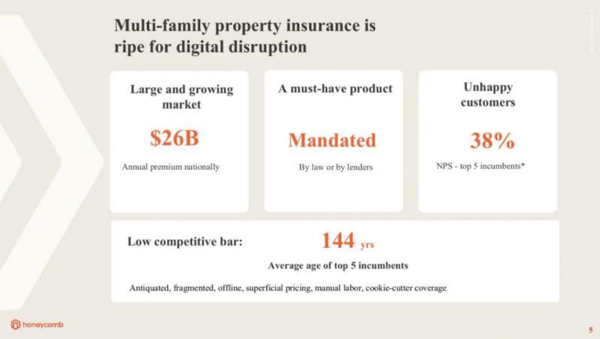
Commercial property insurance. A problem slide with three cards and a competitive-bar strip.
Honeycomb deck, slide 5. Exact stored slide matched to this analysis.
Our analysis: A different use of NPS: measuring how unhappy customers are with the current options.
Evidence and limitation: The incumbents' NPS used as evidence of the problem, with an asterisk pointing to a source note that is not legible on the slide.
What a founder can adapt: If an industry NPS study exists, quote it on your problem slide with the publisher and year.
Supporting analysis
What the deck claims: "Multi-family property insurance is ripe for digital disruption." "Large and growing market: $26B annual premium nationally." "A must-have product: Mandated by law or by lenders." "Unhappy customers: 38% NPS – top 5 incumbents*." "Low competitive bar: 144 yrs average age of top 5 incumbents."
Presentation choice: Contrast: a competitor's NPS can show the opening in a market, and it needs a source even more than your own score.
When it does not fit: Write the score as 38, not 38%, and make the source readable.
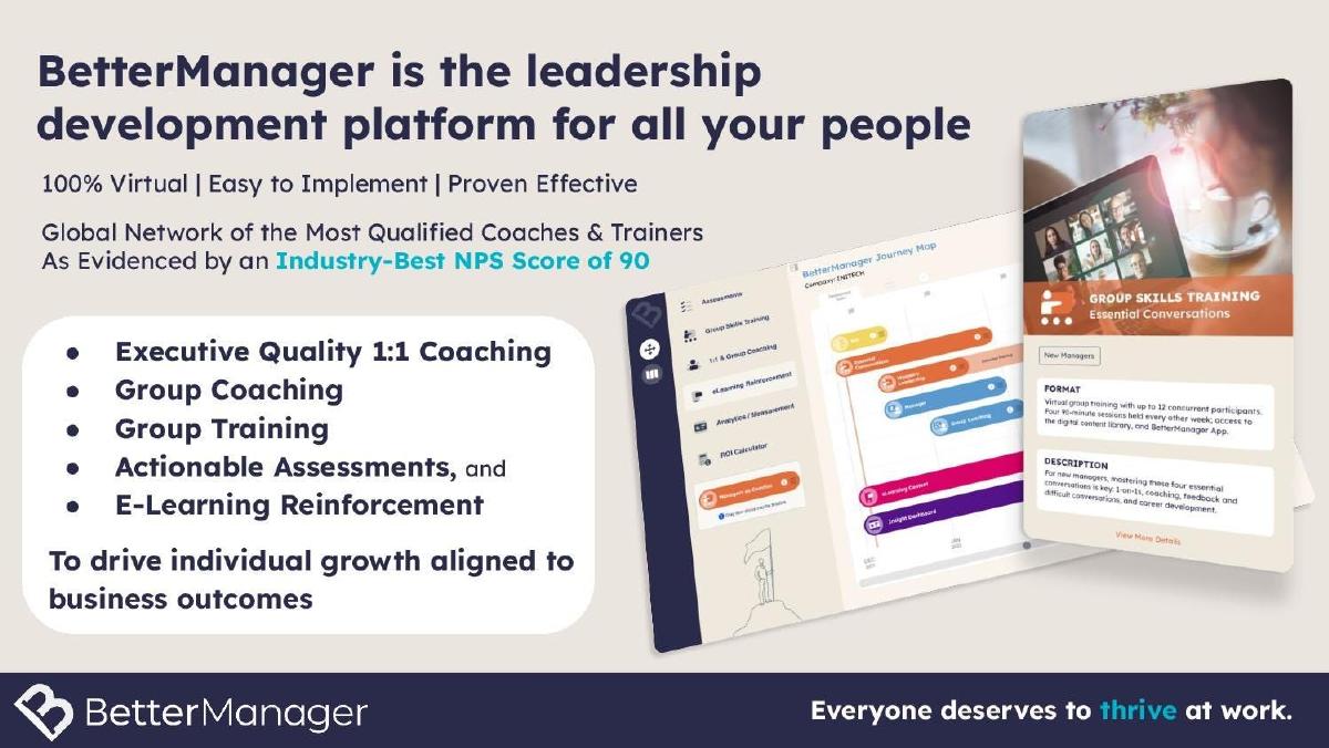
What improved: Our illustrative rewrite; not BetterManager's wording. It replaces the superlative with a sourced comparison and adds the survey size and a behaviour measure.
What this guide adds
The traction guides cover revenue, growth and retention charts, and the testimonial guide covers customer quotes. None explains how to present a satisfaction score. This page covers that one metric: when it helps, what to put next to it and the mistakes that make investors skip it.
Heal and BetterManager also appear in the clinical evidence and HR solution guides for other lessons; here we look only at how each presents its NPS.
What NPS measures, and why investors discount it
Customers answer one question: how likely are you to recommend us, from 0 to 10. The score is the share who answered 9 or 10 (promoters) minus the share who answered 0 to 6 (detractors). It ranges from −100 to +100.
Investors discount it because the founder chooses who is asked, when and how many answer. A score of 80 from twelve friendly early customers says little. The same score from several hundred paying customers, repeated every year, says a lot. The slide has to show which one it is.
Where NPS belongs in the deck
On a traction or customer slide, beside the metrics it supports. It works best as a supporting number next to retention or revenue, not as the headline of an early deck with little usage.
On a problem slide, a low industry NPS can show that customers are unhappy with current options, as Honeycomb does. Cite the source, because the investor has no other way to check it.
Common mistakes
A bare number. A score without survey size, date or comparison is hard to believe.
Percent sign. NPS is a score from −100 to +100; writing 70% suggests you don't know how it works.
Unsourced benchmark. An industry average or "industry-best" needs a publisher and year.
Score as headline without usage. Early on, retention and usage persuade more than a survey.
Change without a baseline. "Up 20 points" needs the starting score and the period.
Diagnostic checklist
Score written as a number, not a percentage.
Number of responses and survey date.
Earlier scores, if you have them.
A named, sourced benchmark.
One behaviour metric beside it.
Frequently asked questions
How we chose these examples
Corpus: published pitch deck teardowns on StartupFundraising.com. Founder-uploaded private decks are excluded.
Selection (2026-09-25): we searched stored slide text for "NPS" and "Net Promoter" and kept only slides with a stored slide image (42 slides), then inspected the images. We kept slides where the score is a visible claim and each teaches a different presentation choice. Excluded: slides where NPS appears only as a product feature or a vague phrase (for example AI Rudder, Devoted Health, Fynd), and Cloudsmith, whose score is redacted.
Heal and BetterManager also appear in other guides for different lessons; our production rules allow reuse when the lesson is materially different.
Figures are quoted as shown in the stored slide images; where the extracted text differed from the image (Orbital Witness's weekly log-in figure), we used the image. We have not verified any survey, benchmark or source behind these scores. Disco's bar labels are too small to read exactly, so we did not recompute its score.
Review: stored slide text and images were checked on 2026-09-25 and matched to company, deck and slide number (editorial model review). No person has yet completed an editorial review of this page. We make no claim that any slide caused a fundraising outcome.