GitHub Stars on a Pitch Deck: 6 Real Open-Source Traction
How open-source startups show GitHub stars, Slack members and contributors on a pitch deck: six real slides, what each number proves.
How to Show Open-Source Community Traction on a Pitch Deck
Six slides from real open-source startup pitch decks that use GitHub stars, community members or contributors as traction. We record what each slide states, where its numbers come from, and what it leaves out.
TL;DR
A GitHub star costs a developer one click. It shows that people noticed a project, not that they use it or would pay for it. Open-source founders put stars on their traction slide because they are public, easy to chart and often the first number that grows. The six slides here show that a star count does the most work when it sits beside something harder to earn: developers actually trying the product, companies building on it, people contributing code, or a named comparison. Encore puts stars at the top of a short list that ends with five startups building on the product. Airbyte's later deck charts stars, Slack members and code contributors against three named competitors. Airbyte's earlier deck, Lago and Onyx show star-history charts. MindsDB compares its star count with two partner projects.
None of the six slides puts stars next to paying customers or revenue. If you lead with stars, add at least one usage number (active installs, weekly users, companies running it in production) and say where every figure comes from and when it was taken.
Open-source community slides from real pitch decks
Each example shows the exact page from the original public deck above its analysis and links to the full teardown. Figures are the companies' own claims unless a public chart source is printed; chart values are read from the image and approximate. Page numbers are PDF pages.
Encore traction slide — slide 16
Backend development framework. Traction slide one month after the open-source launch.
Encore deck, slide 16. Exact stored slide matched to this analysis.
Our analysis: Stars, trial and real use are listed in order, so a reader can see the funnel and its ratios.
Evidence and limitation: "Trying out" is not defined, and there is no revenue or retention figure.
What a founder can adapt: Put a trial or usage number directly under your star count, with the timeframe.
Supporting analysis
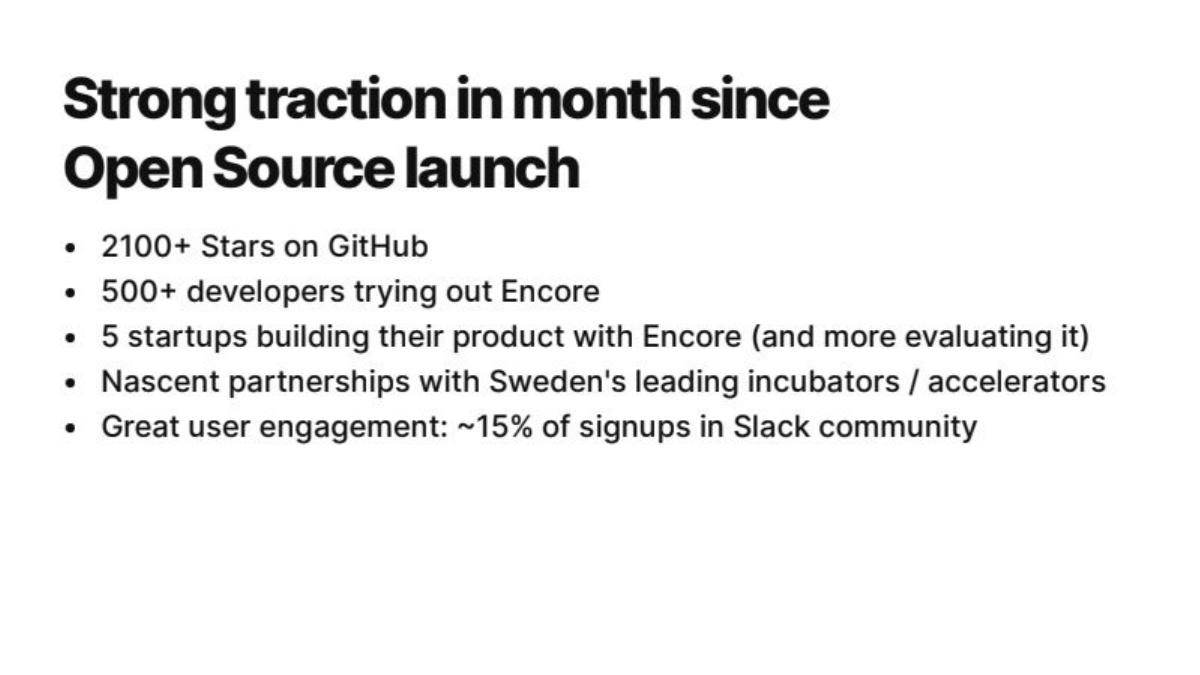
What the deck claims: "2100+ Stars on GitHub"; "500+ developers trying out Encore"; "5 startups building their product with Encore (and more evaluating it)"; "~15% of signups in Slack community".
Presentation choice: Stars, trial and real use are listed in order, so a reader can see the funnel and its ratios.
When it does not fit: "Trying out" is not defined, and there is no revenue or retention figure.
Open-source data integration. Early deck; a single star-history chart.
Airbyte deck, slide 12. Exact stored slide matched to this analysis.
Our analysis: The chart's source and repository are printed, so anyone can reproduce it.
Evidence and limitation: No year on the axis and nothing about use; on its own this shows early attention only.
What a founder can adapt: Name the tool and repository under any star chart.
Supporting analysis
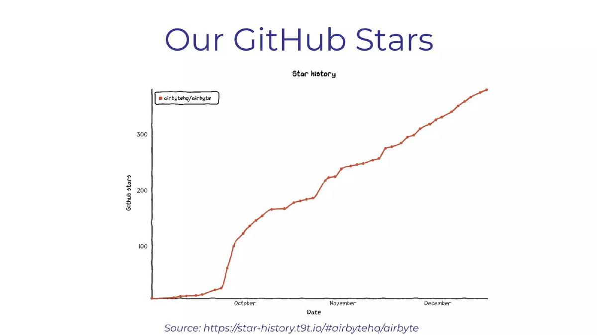
What the deck claims: "Our GitHub Stars": star history for airbytehq/airbyte, about 0 to about 380 from October to December, with "Source: https://star-history.t9t.io/#airbytehq/airbyte".
Presentation choice: The chart's source and repository are printed, so anyone can reproduce it.
When it does not fit: No year on the axis and nothing about use; on its own this shows early attention only.
Same company, Series B deck. Three community charts against named competitors.
Airbyte deck, slide 12. Exact stored slide matched to this analysis.
Our analysis: Adds contributors, a harder measure than stars, and names the projects it is compared with.
Evidence and limitation: Competitor data source and year are not stated; "biggest" holds only against the three shown.
What a founder can adapt: Chart the same measure for named rivals, and include contributors if you have them.
Supporting analysis
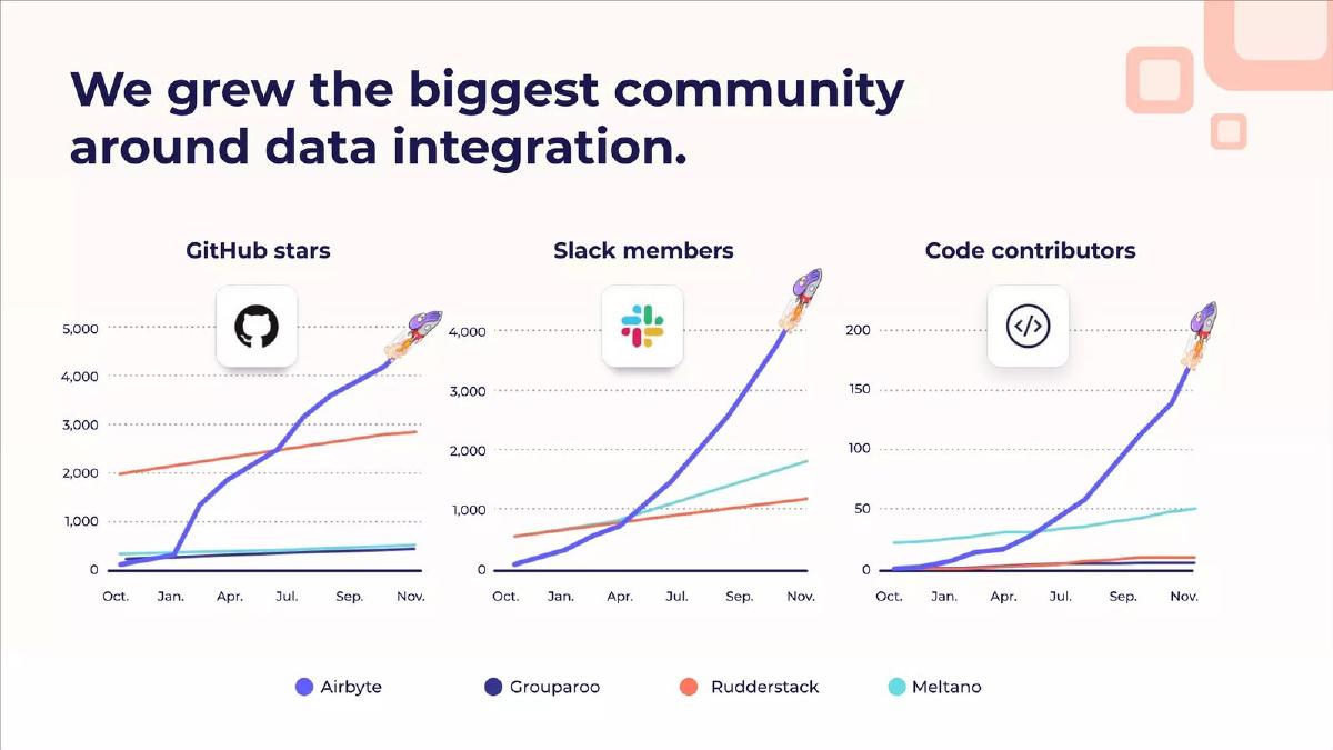
What the deck claims: "We grew the biggest community around data integration." GitHub stars (about 4,300), Slack members (about 4,000) and code contributors (about 170), October to November, beside Grouparoo, Rudderstack and Meltano.
Presentation choice: Adds contributors, a harder measure than stars, and names the projects it is compared with.
When it does not fit: Competitor data source and year are not stated; "biggest" holds only against the three shown.
Lago deck, slide 10. Exact stored slide matched to this analysis.
Our analysis: A dated, checkable star chart sits beside the headline count.
Evidence and limitation: The superlatives have no comparison set, and "1200+ Product Managers" is not defined.
What a founder can adapt: Back every "best" or "largest" with the comparison on the same slide.
Supporting analysis
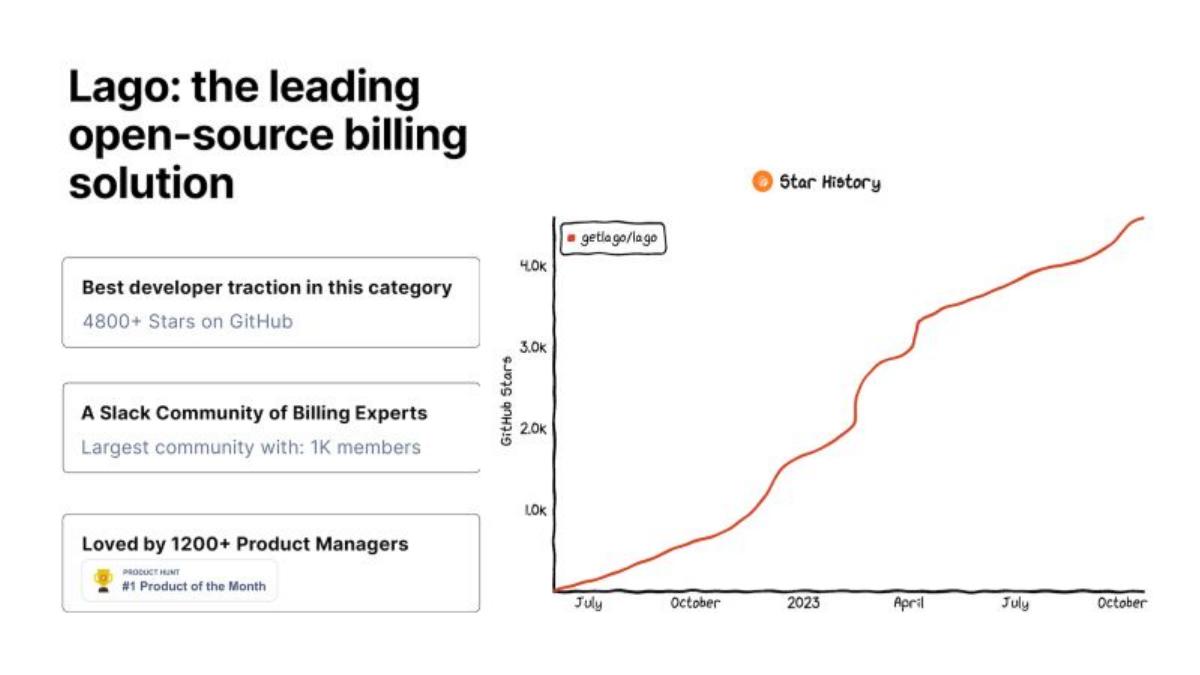
What the deck claims: "4800+ Stars on GitHub"; Slack community "Largest community with: 1K members"; "Loved by 1200+ Product Managers"; Product Hunt "#1 Product of the Month"; star chart July 2022 to October 2023, ending near 4,500.
Presentation choice: A dated, checkable star chart sits beside the headline count.
When it does not fit: The superlatives have no comparison set, and "1200+ Product Managers" is not defined.
Open-source AI search and assistant software. Early traction slide.
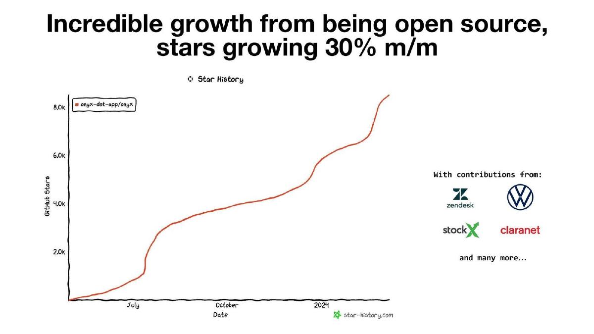
Onyx deck, slide 3. Exact stored slide matched to this analysis.
Our analysis: Named contributing companies are a stronger signal than stars alone.
Evidence and limitation: The 30% monthly figure is not steady across the chart, which has flat stretches and one large step.
What a founder can adapt: State the period a growth rate covers, and say what a named contributor contributed.
Supporting analysis
What the deck claims: "Incredible growth from being open source, stars growing 30% m/m"; star-history chart to about 8,500 by early 2024; "With contributions from:" Zendesk, Volkswagen, StockX, Claranet.
Presentation choice: Named contributing companies are a stronger signal than stars alone.
When it does not fit: The 30% monthly figure is not steady across the chart, which has flat stretches and one large step.
Each cell reports only what the slide itself states. "Not stated" means the page gives no figure.
Example
Stars
Stronger signal on the slide
Source or date given
Comparison
Encore
2100+
500+ trying, 5 startups building
Timeframe (one month)
None
Airbyte (early)
About 380 (chart)
Not stated
Chart source printed; no year
None
Airbyte (Series B)
About 4,300 (chart)
Slack members, code contributors
Months only; competitor source not stated
Three named rivals
Lago
4800+
1K Slack members (claim)
Chart dated 2022 to 2023
"Largest", no set stated
Onyx
About 8,500 (chart)
Named contributing companies
Chart watermark; early 2024
None
MindsDB
16.3k
Not stated
Not stated
Two partner projects
Key Takeaways
Stars show attention, not use. Encore follows "2100+ Stars on GitHub" with "500+ developers trying out Encore" and "5 startups building their product with Encore", which reads as a funnel from interest to use.
Name the source of the chart. Airbyte's early deck and Onyx print the star-history tool they used, so a reader can check the curve against the public repository.
Comparisons need named rivals and a date. Airbyte's later deck charts itself against Grouparoo, Rudderstack and Meltano on three measures; MindsDB compares 16.3k stars with DBT (6.8k) and Airbyte (10.3k). Neither slide gives the date of the figures.
A growth rate should match the chart beside it. Onyx's title says "stars growing 30% m/m"; its own chart rises from about 1,000 in July to about 8,500 by early 2024, which is fast growth but not 30% every month.
Community size claims need a definition. Lago's "Largest community with: 1K members" and Airbyte's "biggest community around data integration" are superlatives with no comparison set stated (Airbyte at least charts three rivals).
Contributors are a stronger signal than stars. Airbyte's code-contributor chart (to roughly 170) and Onyx's named contributors (Zendesk, Volkswagen, StockX, Claranet) show people investing work, not just a click.
Write your community line
Fill one line per number. If you can only fill the first, add a usage figure before you lead with it.
Number. Stars, members, contributors or active users: which, and how many?
Source. Where does it come from (GitHub, your analytics, Slack), and can a reader check it?
Date. When was it taken, and over what period did it grow?
Next step. How many of these people use the product, and how many companies run it?
Comparison. Which named projects, measured the same way and on the same date?
Copyable framework: [Number] [measure] on [source] as of [date], up from [x] in [period]; [y] developers active and [z] companies in production.
Illustrative example 1 — written by us
Before: Huge community, 5k stars
After: 5,000 GitHub stars (Oct 2024, up from 1,200 in May); 600 weekly active developers; 8 companies in production
What improved: Dates the count and adds two usage numbers, so stars become the top of a funnel.
Illustrative example 2 — written by us
Before: Largest community in the category
After: 1,000 Slack members, against 400 and 250 for [rival A] and [rival B] (public counts, Sept 2024)
What improved: Replaces the superlative with the comparison behind it.
What a star, a member and a contributor each prove
Open-source projects collect several public numbers, and they are not equal. A GitHub star is a bookmark: anyone with an account can add one in a second, and stars never expire, so a star count only goes up. A Slack or Discord member has joined a conversation, which takes a little more intent, but members also rarely leave. A code contributor has written and submitted work to the project, which is a much stronger sign of commitment. Active installs, weekly users and companies running the software in production are usage, which is what an investor ultimately cares about because usage is what converts to paid plans.
Our explanation: this ordering (stars, then members, then contributors, then usage) is general knowledge about how open-source projects grow and is not stated on the slides. It is useful because it tells you which number to lead with. If you have only stars, show them honestly as early attention. If you have usage, lead with usage and put stars underneath as context.
The developer tools traction guide covers revenue and free-to-paid conversion for tools sold to engineers. This guide is narrower: how to present the community numbers that come before revenue in an open-source company, and how to stop them being mistaken for revenue.
Star-history charts: what the shape does and does not tell you
Three of the six slides use a chart from a public star-history tool. These tools plot the date each star was added to a public repository, so anyone can reproduce the line. That makes them more checkable than most traction charts in a deck. Airbyte's early deck prints the source address under the chart; Onyx's carries the tool's watermark; Lago's shows the repository name in the legend.
The shape is what readers look at. A sudden step usually marks a launch or a post that reached a large audience: Airbyte's line jumps from under 50 to about 100 in early October, and Onyx's jumps near July. A steady slope after the step suggests ongoing interest rather than a one-day spike. Our explanation: a reader cannot tell from the chart alone what caused a step, so if the step matters to your story, name the event in one line on the slide.
What a star chart cannot show: whether the people who starred use the product, how many of them are at companies that might pay, or whether interest is still growing this month. Because stars never fall, a curve that has flattened can still look like growth at a glance. Give the most recent month's added stars, or a usage number, if you want the chart to say something about now.
Encore: stars at the top of a short funnel
Source facts: on "Strong traction in month since Open Source launch", Encore lists "2100+ Stars on GitHub", "500+ developers trying out Encore", "5 startups building their product with Encore (and more evaluating it)", "Nascent partnerships with Sweden's leading incubators / accelerators" and "Great user engagement: ~15% of signups in Slack community".
Why it is useful: the first three lines step down from attention (stars) to trial (developers trying it) to real use (startups building on it). Our calculation: 500 trying out is roughly a quarter of the star count, and 5 building is 1% of those trying. Those ratios are what an investor will work out anyway, and the slide gives enough to do it. What the slide does not state: what "trying out" means (a signup, a deploy, a week of use), whether the 15% figure is of all signups or a period, or any revenue. The timeframe (one month since launch) is stated, which helps.
Airbyte, two decks: from a single curve to a comparison
Source facts, earlier deck (PDF page 12): "Our GitHub Stars" is a star-history chart for the airbytehq/airbyte repository, rising from near zero to about 380 between October and December, with a sharp climb in early October. The source line reads "Source: https://star-history.t9t.io/#airbytehq/airbyte". Values are read from the chart and approximate; no year is printed on the axis.
Source facts, Series B deck (PDF page 12): "We grew the biggest community around data integration." Three charts run from October to November: GitHub stars (Airbyte to about 4,300), Slack members (to about 4,000) and code contributors (to about 170), each with lines for Grouparoo, Rudderstack and Meltano. Values are read from the charts and approximate.
Why the pair is useful: the earlier slide is a typical first open-source traction chart, honest and sourced but showing attention only. The later slide adds two harder measures and named competitors, so a reader can see the project is ahead on contributors as well as stars. What the Series B slide does not state: where the competitor figures came from, the year of the axis, or how Slack members are counted. "Biggest community" is supported only against the three projects shown.
Lago and Onyx: star charts with claims attached
Lago (Series A deck, PDF page 10). Source facts: "Lago: the leading open-source billing solution"; three boxes read "Best developer traction in this category — 4800+ Stars on GitHub", "A Slack Community of Billing Experts — Largest community with: 1K members" and "Loved by 1200+ Product Managers" with a Product Hunt "#1 Product of the Month" badge. A star-history chart for getlago/lago runs from about July to October 2023, ending near 4,500.
Onyx (PDF page 3). Source facts: title "Incredible growth from being open source, stars growing 30% m/m"; star-history chart for onyx-dot-app/onyx rising to about 8,500 by early 2024, with a step near July; "With contributions from:" Zendesk, Volkswagen, StockX and Claranet, "and many more…".
What the two share: a real, checkable chart, with claims beside it that the chart does not fully support. Lago's "best" and "largest" have no comparison on the slide, and "1200+ Product Managers" does not say how they were counted. Onyx's 30% monthly rate does not match its own chart over the whole period (our reading: roughly 1,000 to 8,500 over about seven months, which averages near 35% a month but includes flat stretches and one large step). The contributor logos are the stronger part of Onyx's slide, though it does not say whether they are employees contributing code or the companies themselves.
MindsDB: a star comparison with partners
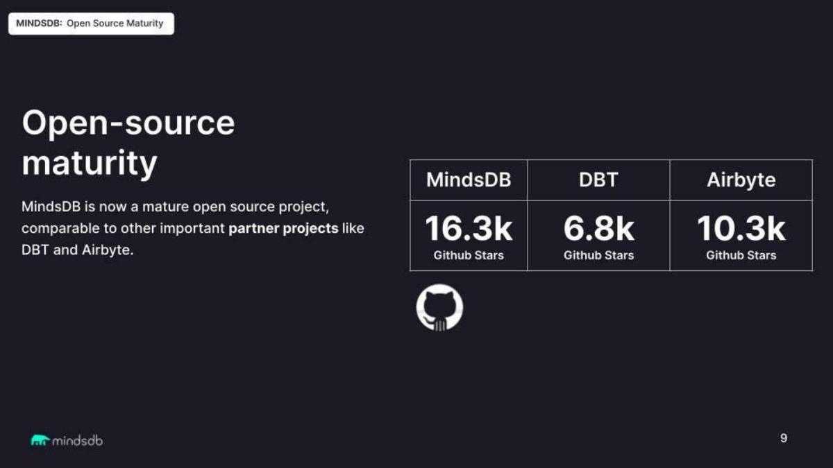
Source facts: "Open-source maturity": "MindsDB is now a mature open source project, comparable to other important partner projects like DBT and Airbyte." A table shows MindsDB 16.3k, DBT 6.8k and Airbyte 10.3k "Github Stars".
Why it is useful: placing your count next to well-known projects gives a reader a scale they recognise. What the slide does not state: the date of the figures, which repositories were counted (DBT has several), or any usage figure. Stars measure attention, so the comparison says MindsDB has drawn more attention, not that it is more used or more mature. Comparing yourself with projects you call partners is also softer than comparing with competitors.
How to present your own community numbers
Recommendation: lead with the strongest measure you have. If you have production users or companies running the software, put that first and stars second. If stars are all you have, say so plainly, show the chart, and add one line on what you are doing to turn attention into use.
For every community number give the source (GitHub, your own analytics, a Slack workspace count), the date it was taken, and what is counted. For charts, name the tool and the repository so a reader can check it. For comparisons, name the projects, date the figures, and compare like with like: stars with stars, contributors with contributors.
Keep superlatives only if the slide shows the comparison behind them. Airbyte's "biggest community" is backed by three charted rivals; Lago's "largest" is not. A growth rate in the title should match the chart beneath it over the period shown, or name the period it covers.
Common mistakes
Stars as revenue. A star is a bookmark. Show usage or paying customers beside it.
Unsourced charts. Name the tool and repository so the curve can be checked.
Superlatives without a comparison. "Biggest" or "largest" needs the named rivals on the slide.
A growth rate the chart contradicts. State the period the rate covers, or show the monthly numbers.
Undated comparisons. Star counts change every day; date every figure you compare.
Undefined members or users. Say what counts as a member, a user or a developer trying the product.
Diagnostic checklist
Every community number has a source and a date.
Star charts name the tool and repository.
At least one usage number (active developers, installs, production companies) sits beside the star count.
Comparisons name the projects and use the same measure and date.
Superlatives are backed by the comparison on the slide, or removed.
Any growth rate states the period it covers.
Frequently asked questions
Do GitHub stars count as traction?
They count as attention. A star takes one click and never expires, so it shows people noticed the project, not that they use it. Encore's slide shows how to make stars useful: it follows them with developers trying the product and startups building on it.
How many GitHub stars do I need before raising?
These slides can't answer that. They range from about 380 (Airbyte's early deck) to 16.3k (MindsDB), at very different stages. What matters more is what sits beside the count: usage, contributors and, later, revenue.
Should I use a star-history chart?
It is one of the more checkable charts you can put in a deck, because anyone can reproduce it from the public repository. Print the tool and repository name, as Airbyte and Onyx do, and give the most recent month's added stars if you want to show current momentum.
Is a Slack or Discord community worth showing?
Yes, if you define it. Encore gives the share of signups who join its Slack (about 15%), which says something about engagement. Lago gives a member count with a "largest" claim and no comparison. Give the count, the date and what members do.
How should I compare my project with others?
Name the projects, use the same measure and date for each, and prefer competitors to friendly partners. Airbyte's Series B slide charts three named rivals on three measures; MindsDB compares stars with partners and gives no date.
How we chose these examples
Search (2026-10-01): the durable corpus index (docs/seo/artifacts/corpus-search, 70,729 unique pages, deduplicated by deck-file sha256 + page) was searched for GitHub stars, stars on GitHub, community members and Discord members.
Left out: ArangoDB (PDF page 9) and Netmaker (PDF page 8), because the original deck files are not in our source library and their slides could not be checked against an image; SolChicks, an NFT game whose Discord counts are not open-source traction and which is already used in another guide; decks already used in the developer tools traction guide. Six pages were rendered from the original public deck files and read against the text: Encore 16, Airbyte 12, Airbyte Series B 12, Lago Series A 10, Onyx 3, MindsDB 9. Airbyte Series B page 16, Lago pages 3 and 12 and MindsDB page 11 appear in other guides; the pages used here do not.
Our explanations: the ordering of stars, members, contributors and usage, and how star-history tools work, are general knowledge and not stated on the slides. Chart values are read from the images and approximate. Ratios for Encore and the monthly-rate check for Onyx are our calculations.
How we built this: drafted and checked with AI assistance (editorial model review against the original slide images); no human editor has reviewed this guide.